Greetings and a good Sunday morning, Uni Watch readers. I hope everyone had a pleasant Saturday and you enjoyed both of yesterday’s NFL Wild Card games, particularly the late game comeback heroics by the Jags (if you weren’t watching: Duval was down 27-0, and came back to win 31-30 on a last second field goal). And, we’ve got three more games today, plus one more tomorrow evening!
Now then…
Long-time readers may recognize the name Oliver Kodner. Way back in 2013 (almost ten years ago), I featured Oliver on Uni Watch, and he brought to our attention an incredible trove of St. Louis Cardinals uniform and logo history, as well as an interview with his father — Gary Kodner — a creative consultant for the St. Louis Cardinals for 30 years. Gary worked with Bill DeWitt, III, himself president of the St. Louis Cardinals of Major League Baseball since 2008, to consult with him on his idea and desire to refresh and contemporize the Cardinals catalog of logos beginning in 1997.
Here’s a link to that Uni Watch article (unfortunately all the in-line graphics are no more, but the article itself and most of the links contained therein are still good).
Fast forward to 2016, when Gary and Oliver published a book, St. Louis Cardinals Uniforms and Logos: An Illustrated History, which includes a forward by Bill DeWitt, III.
And while that book is a tremendous asset and would make a fantastic addition to any uni-lover’s library, as Oliver notes below, “it’s static,” meaning that as updates and changes have been discovered since publication, the book itself cannot be updated.
Fast forward again, to today. Oliver has now created an incredible online database (similar to the Gridiron Uniform Database or Dressed to the Nines), in which Oliver “redrew all our uniform models and reincorporated all of our new research,” to create the most comprehensive collection of the logos and uniforms of the Cards!
I think you know where this is going, but I don’t want to steal any more of Oliver’s thunder, so I’ll turn it over to him now so he can describe how the project finally came to fruition. Following that, some highlights from the website and finally, the new database itself.
Cardinals Uniforms and Logos Database
by Oliver Kodner
We first published an article with you and Uni Watch back in 2013. My dad and Bill DeWitt III had been working on a project, probably 2 years at that point, to draw a selection of old logos and catalog some old uniforms from the Cardinals history. They had big binders, a huge pile of research, and a nice handful of logos. And I said, you’ve done nothing, yet. So that launched us into 3-4 years more of research until we published our book in 2016, Cardinals Uniforms and Logos.
We had done a smattering of research between 2016 and 2020, just making minor edits, until we started getting a flurry of research done in 2021 and 2022. We were making a lot of changes to our models, and a lot of changes to our style guides, but they only got seen internally within the Cardinals organization. People who own our book aren’t seeing the edits we’re making, and our book is becoming inaccurate the more edits and discoveries we make.
In 2022, I decided to take it online and make a website similar website to SportsLogos and Dressed to the Nines. Our book is a fantastic piece, but it’s static, we can’t make edits and changes as our research develops. For the site, I redrew all our uniform models and reincorporated all of our new research, and by January 1, 2023, our website is the most complete and up-to-date collection of Cardinals uniforms and logos.
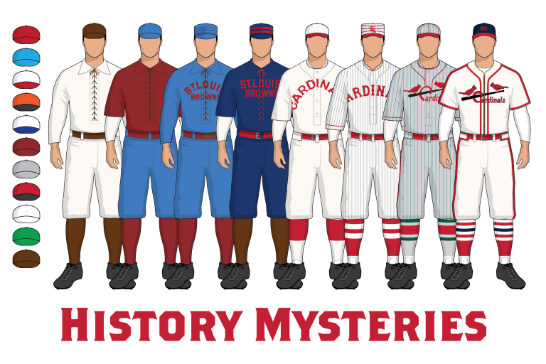
We’re also hoping that by making this publicly viewable, people will see some photography or drawings and recognize something, and perhaps they have some photography and information they’d like to share. We have a number of gaps in our research, history mysteries as we call them, and we think someone out there has some missing links.
Recently we’re excited about a few discoveries.
We finally found proof and maybe a fuzzy photograph from the newspaper that the Cardinals indeed wore a crepe bow on their sleeve to honor the death of Stanley Robison in 1911. But we think they only wore it for a single game, in a Spring Training exhibition game against the Browns in St. Louis.
We recently collaborated with Jeff Scott of birdbats.com to cross reference a number of photos and uniform numbers in 1923. The newspaper claims the Cardinals wore a single bird uniform on weekdays and the Birds on the Bat on Sundays. However, after identifying some photos we have made the determination based on Jeff’s uniform number research, that the newspaper had it backwards. The single bird was a Sunday uniform, the Birds on the Bat was the primary uniform.
We had a number of claims that the Cardinals wore green pinstripes for their road uniforms in 1927, which was ultra confusing to us. But Jeff Scott actually has photos of a 1927 road uniform from a private collector, which I haven’t been given clearance to post, and it indeed has these greenish turquoise looking pinstripes. And then the socks in 1927 caught our eye, we had always thought the road socks were solid red. We never noticed until the last couple months that they had three stripes on them similar to the home uniform, but the hue of green is so similar to the red that it’s nearly invisible. A newspaper article corroborates the photography, and says the sock stripes were also green. So the 1927 Cardinals on the road went out looking like the Christmas Cardinals dressed in red and green.
And we have a lot more projects on deck, we’ll keep uploading things periodically. I have a strong interest in focusing on the St. Louis Giants and St. Louis Stars in the coming years. Modern throwbacks don’t match what we see in the photography.
I chatted a bit more with Oliver and he confirmed to me the green pinstripes uniform does exist, but at present the “photo I got is a photo from a private collector who sent it to some one, who sent it to another person, who sent it to me. I’d love to get in there and take some professional photos of it, it’s in great condition. Plus the guy has the entire uniform, cap, jersey, pants, and socks. Crazy.” Hopefully at some point Oliver will be able to publish this as well!
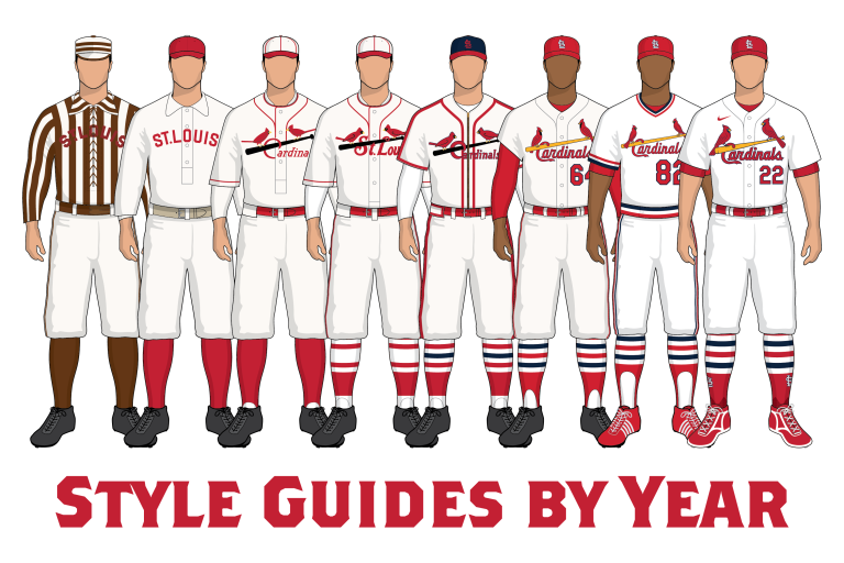
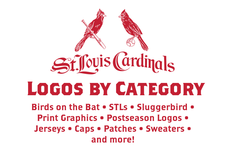
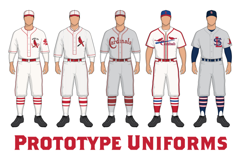
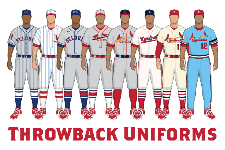
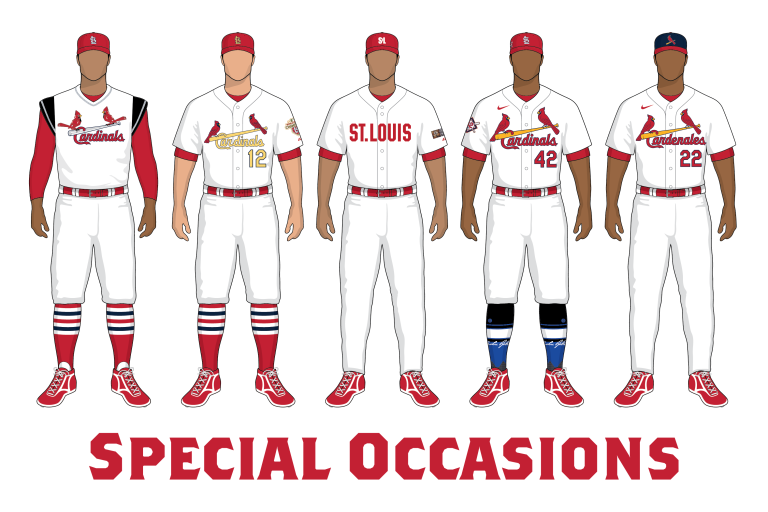
Before I take you to the new database, I wanted to show you some of the incredible artwork Oliver has created for the “chapters” or segments. Basically the website is broken up into eight categories: “Style Guides by Year,” “Logos by Category,” “History Mysteries,” “Prototype Uniforms,” “Throwback Uniforms,” “Special Occasion Uniforms,” plus an “About” and “Contact” section.
Here’s how the artwork looks on the site:
Style Guides:
Logos by Category:
Mysteries:
Prototypes:
Throwbacks:
Special Occasions:
Clicking on “Prototypes,” for example, takes you to this page, where various uniforms never worn on the field are discussed. Clicking on any one of those links leads to another page with even more facts, figures, and often photos and diagrams are included. You may have known that in 1927 (after winning the 1926 World Series over the Yankees — the one that ended with Babe Ruth being thrown out on an attempted steal!) the Cards wore pinstriped uniforms featuring a small bird on bat logo with “WORLD CHAMPIONS” as a chest logo. But Oliver and Gary have unearthed a prototype uniform that is similar, but without pinstripes and the words “WORLDS CHAMPIONS” — a prototype that never saw the field.
All that and SO MUCH MORE can be found in the new database — and I guarantee you you can spend hours (and probably days) just poking through the site. If this isn’t a uni nerd’s fantasy, then I don’t know what is.
So…you’re DYING to visit the new database, right?
(I’ll see you in a few hours)
Oliver concludes with this: “It is our intention to bring other researchers and collectors forward who might have artifacts or stories or clarifications, plus we’d like to ‘flood the market’ with correct logos. We notice there’s still of a bunch of junk merchandise out there with fake logos, incorrect graphics, etc.”
I hope everyone will check this out, and bookmark the database. If any readers out there ever have any St. Louis Cardinals uni/logo information that for some reason is not (yet) covered, there’s a “Contact” button right there where you can share your info with Oliver.
Words cannot express just how great (and important) this new treasure trove of Cardinals uni and logo information is — both to uni aficionados and historians/collectors as well.
Please give Oliver a standing “O” in the comments below for this amazing database, and be sure to connect with him if you ever have any new or additional uni/logo information to share! Thanks Oliver!!!!

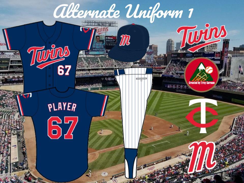
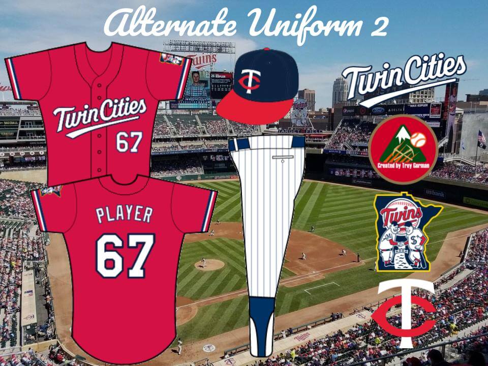
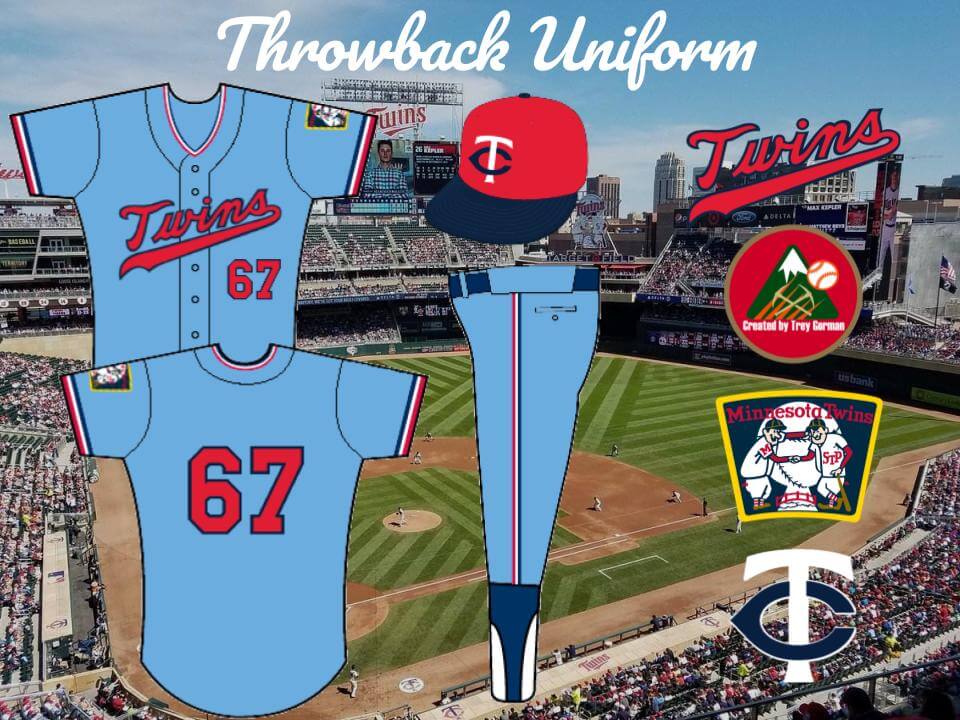
Wow, great work, Oliver! Some very impressive research there.
Thanks, Phil!
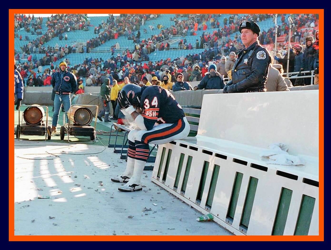
GTGFTU – Chicago vs. Washington, playoffs after 1987 season. Darrell Green with the punt return TD.
Walter Payton’s Last Game.
And, if you look in the background, note the artificial turf: the last game played on that turf before Soldier Field went to grass in 1988.
Last NFL game for ‘Roos, too?
Think Payton had the ball on the Bears’ final down when he narrowly missed getting the first down. Think he slid off the field on the icy turf, he deserved a more fitting end to his career. I think Washington won 20-17 and ultimately won Super Bowl XXII 42-10.
GTGFTU: Walter Payton is sitting all by himself. Maybe he was pitching a no-hitter.
I just had a look at the no bird on bat 1956 Cardinals uni page and it’s absolutely amazing! Great work, Oliver!
Phil, please delete my previous comment. Thanks
Wow, Oliver, just a spectacular project for a very worthwhile subject. Of all the “legacy” baseball teams, St. Louis has the most detailed uniforms with changing details nearly every season. The Gold Standard!
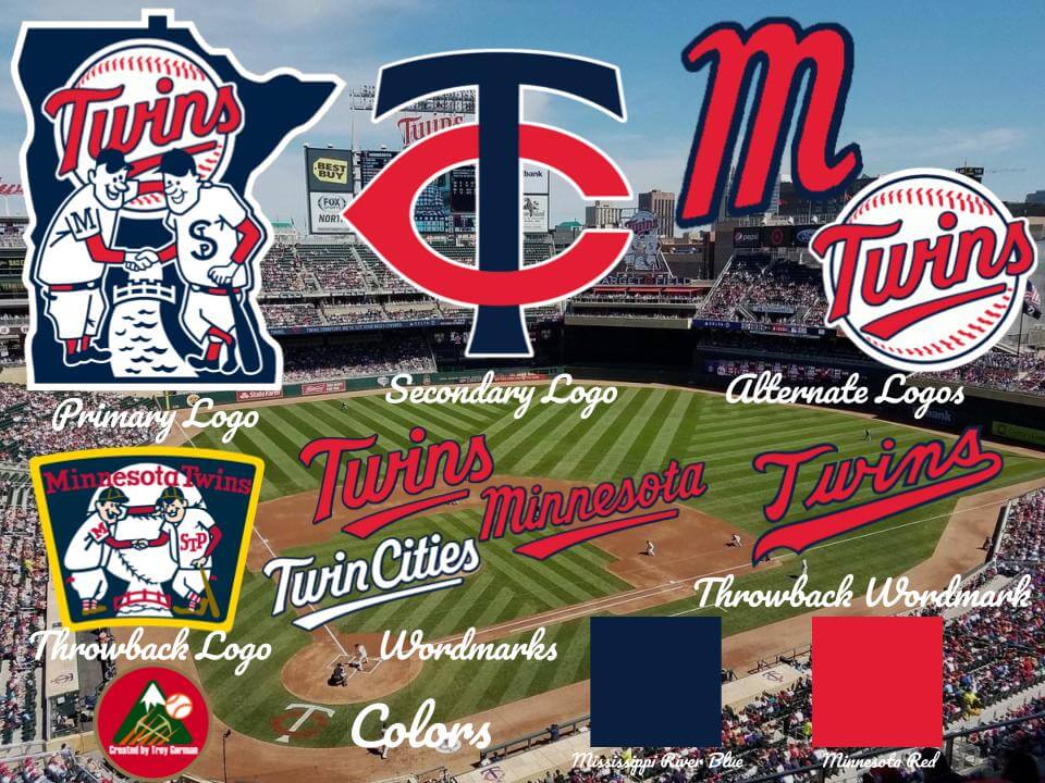
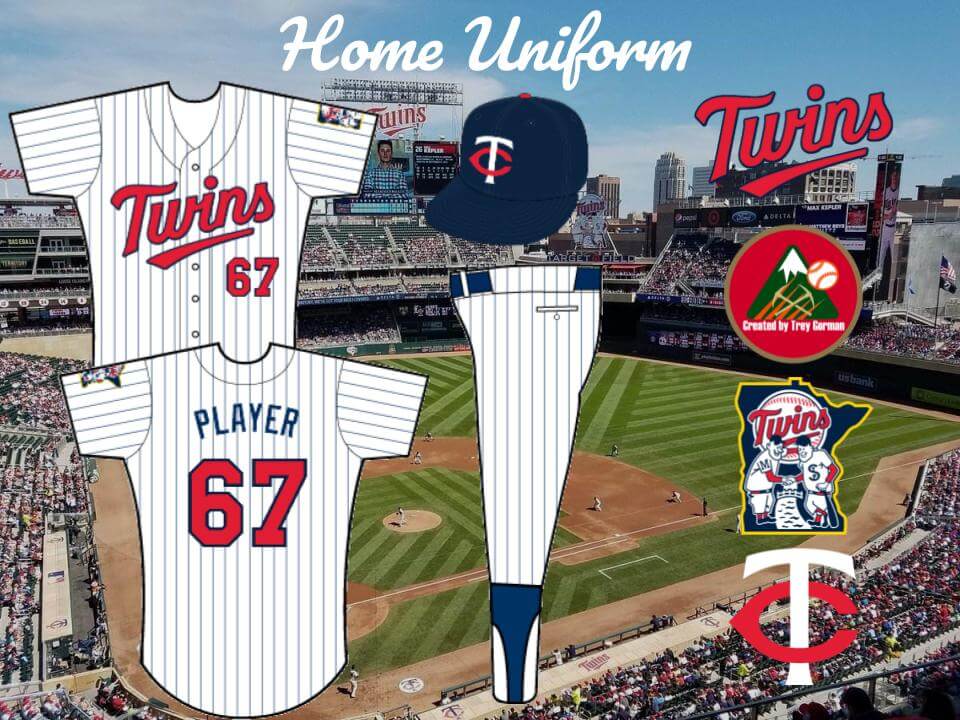
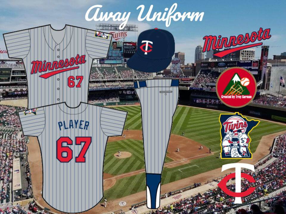
Trey, your Twins’ concept seems like an effort to force the genie back into the bottle, though I agree Minnesota should never have dropped the pinstripes. The emphasis of their new uniforms was to eliminate all the two-color graphics.
Wonderful article on the Cardinals uniform history as well as a tweak on the Twins update. Thanks, Oliver, Trey and especially Phil for bringing it to us!
Jerry Reuss
That’s an amazing Cardinals database!
I’m wondering; has any progress been made on confirming the numbers worn on the sleeves in the 1920s, before teams started putting numbers on the backs later in the decade? There are a few photos floating around such as this one of number 15: link
…and Baseball Reference sometimes has them if you look up individual players’ records, such as that of pitcher Fred Toney, #49:
link
They even have Burt Shotton’s #24 for the only game he played in while wearing a number:
link
These pioneering teams deserve more recognition for assigning player numbers. I’d love to see more research into this, particularly the relation between the numbers on the players’ sleeves and the numbers assigned to them on scorecards.
The M on the proposed new hat for the looks much too similar to one used by a particular bagel shop:
link
…Twins…
One seeming inconsistency I’ve come across in the (amazing) Cardinals database:
In the 1966-1970 page, he mentions that the Cards changed the top of the “T” in their cap logo from a trapezoid shape to a rectangular shape from 1966 on. But then, farther down the page, there are photos labeled “1968 Ted Simmons” and “1969 Bob Gibson” that both seem to show the trapezoidal “T”.
Sorry, a link probably would have been helpful:
link
Great job, Trey. I like your version a lot better than the garbage Nike came up with. The M hat they’ll be wearing is pure garbage. The script on all the jerseys looks atrocious. Especially the blue (more like black jersey) that screams Timberwolves. Thanks for your rendition. Now if only we could convince them to pull the junk they’re going with and replace it with yours.
Huge improvement of the current Twins rebrand, but we will have to live with the eyesores the Twins will be wearing for a long time I guess. The Cardinals site is amazing. Their uniforms have always been my most beloved ones out of the entire MLB history.