
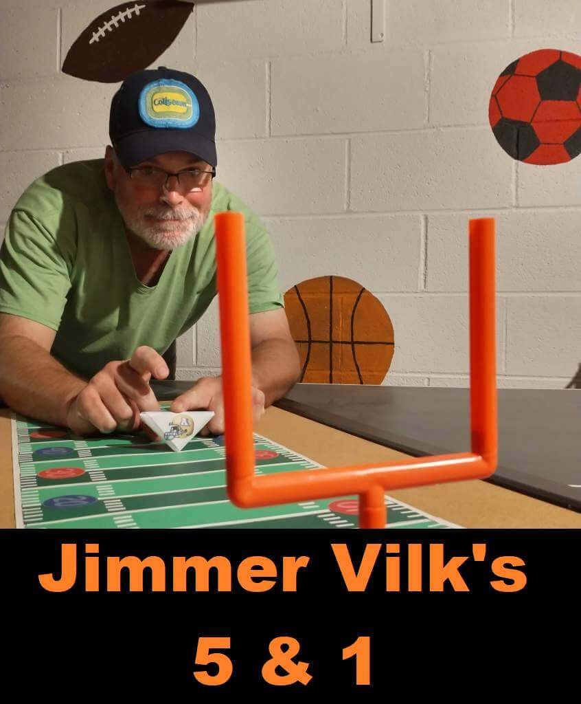
Jimmer Vilk’s 5 & 1
Welcome to the Five and One for 2022!
After more than a decade in hiatus, Jim Vilk (the original “5 & 1” decider) returned! And he’s back again for 2022.
The concept of the 5&1 is simple: Jim will pick five good matchups (not necessarily the five best anymore… he will have categories that will change from week to week) and one awful matchup.
You may agree and you may disagree — these are, after all, just opinions and everyone has one. Feel free to let him know what you think in the comments section.
If you have a game you feel is “worthy” of consideration for the 5 & 1, please either post it in the comments below or tweet Mr. Vilk @JVfromOhio.
Here’s today’s 5 & 1:
Usually picking the &1 is pretty easy, and making up The Five is a chore. Championship Week turned out to be exactly the opposite. Did I pick on the Boise Stealth Broncos again, or did I call out yet another boring MACtion matchup? Stay tuned!
5. The “You Know It’s A Slow Week When This Made The List” Matchup:
Purdue/Michigan
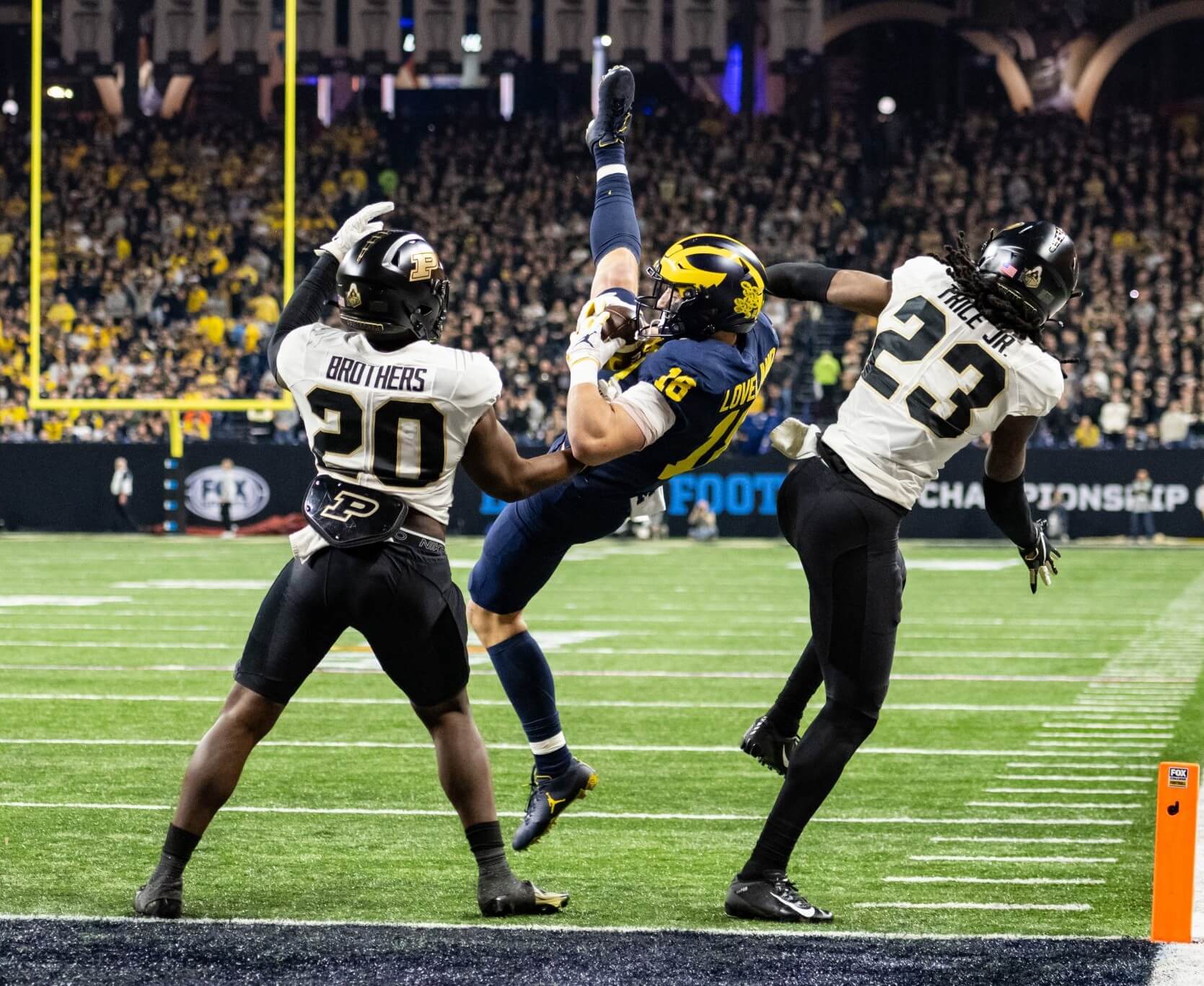
Love the photo, but I would have loved gold helmets vs maize pants more.
4. The “I’m Going To Get Yelled At Again In The Comments And I Don’t Care” Matchup:
Utah/USC
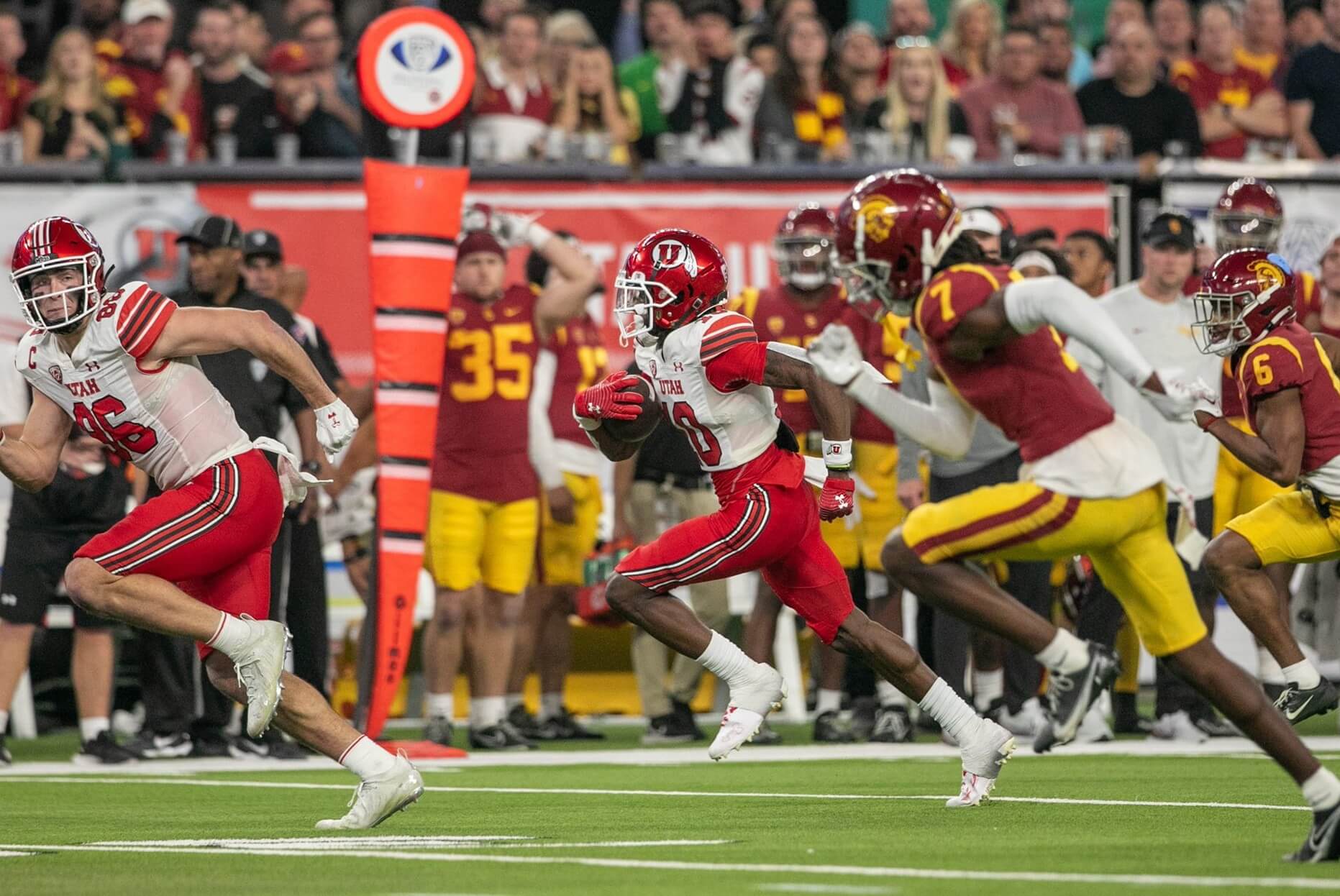
Yeah, yeah, both uniforms look great, but crimson and cardinal aren’t as great of a color contrast as, say…
3. The “Optimal Contrast” Matchup:
Coastal Carolina/Troy
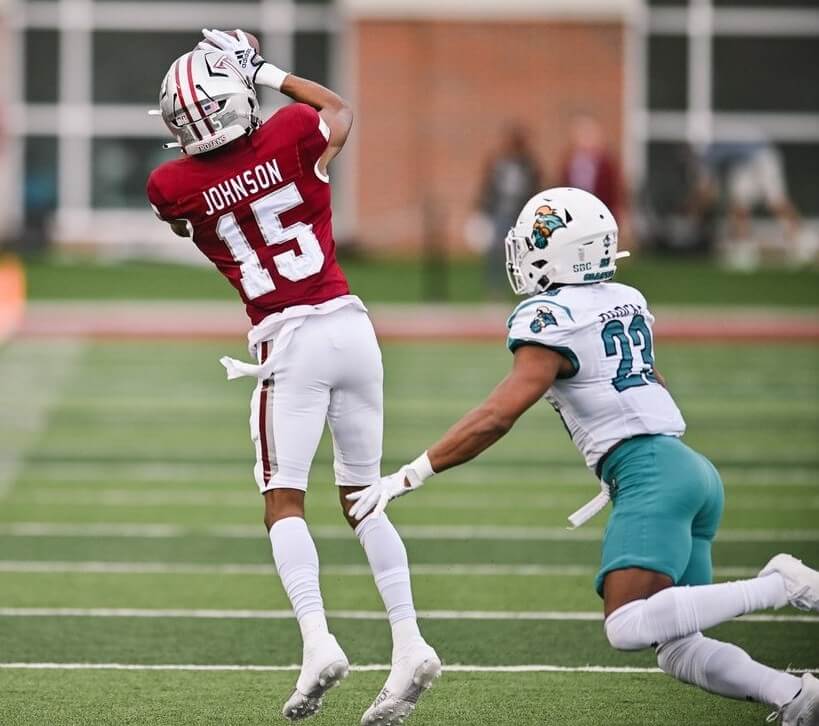
Glad to see this game easily cleared the low bar I had set for it.
2. The “Orange Britches Are Back!” Game:
Clemson/North Carolina
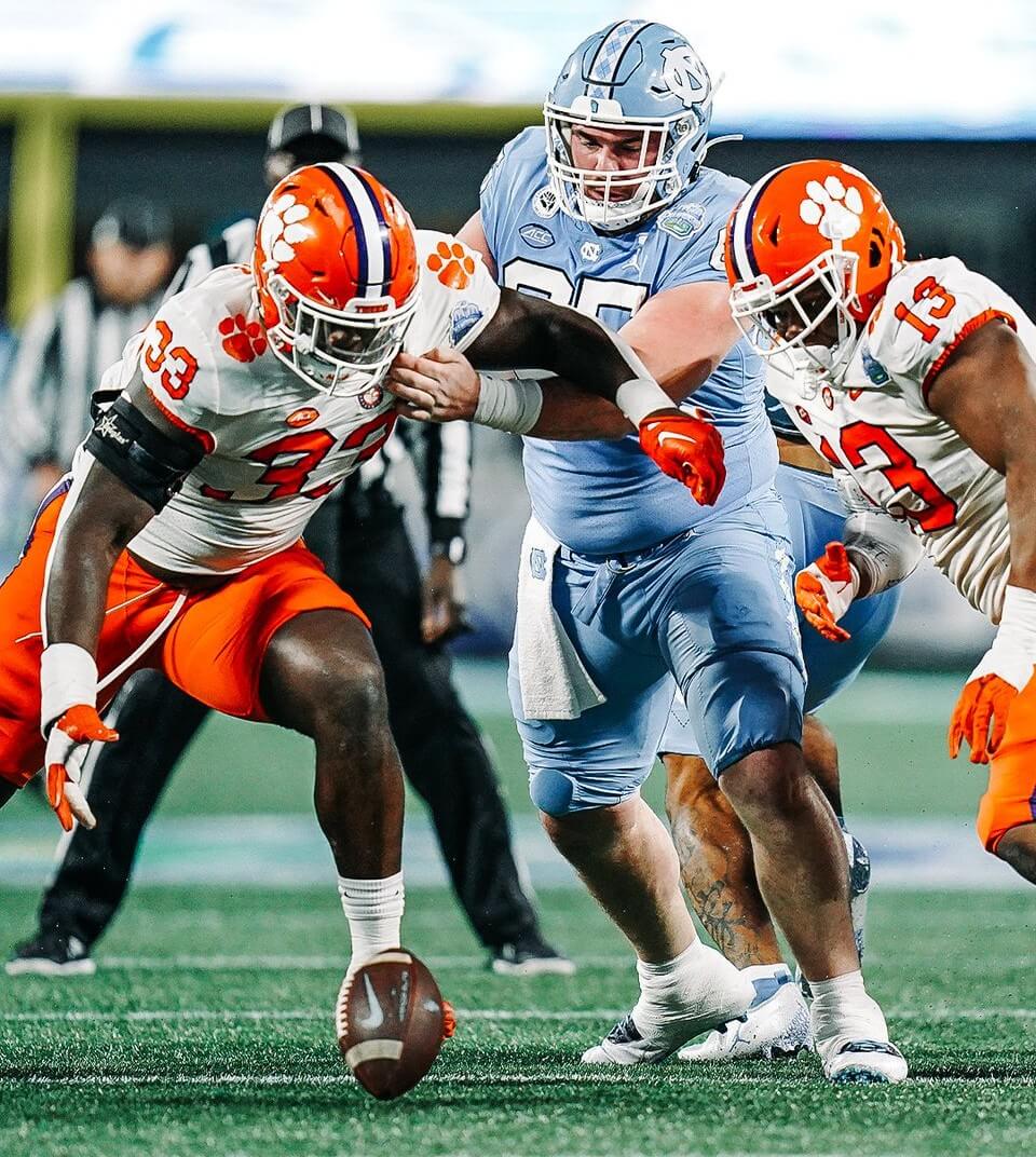
Always nice to have the Tigers in a title game so we can see those pants.
1. Simply The Best:
LSU/Georgia
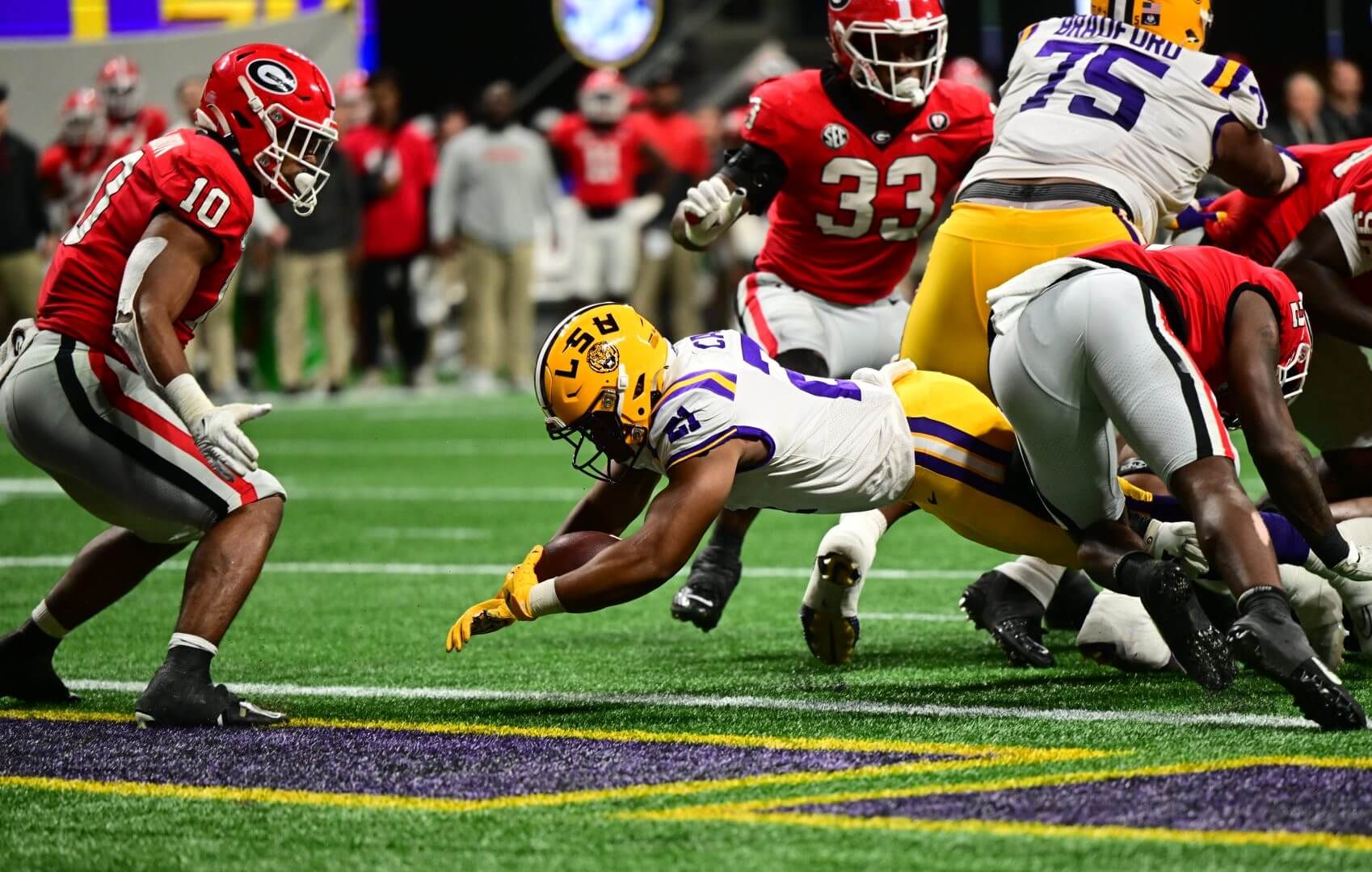
Simply
Exceptional
Contrast.
&1.
Toledo/Ohio
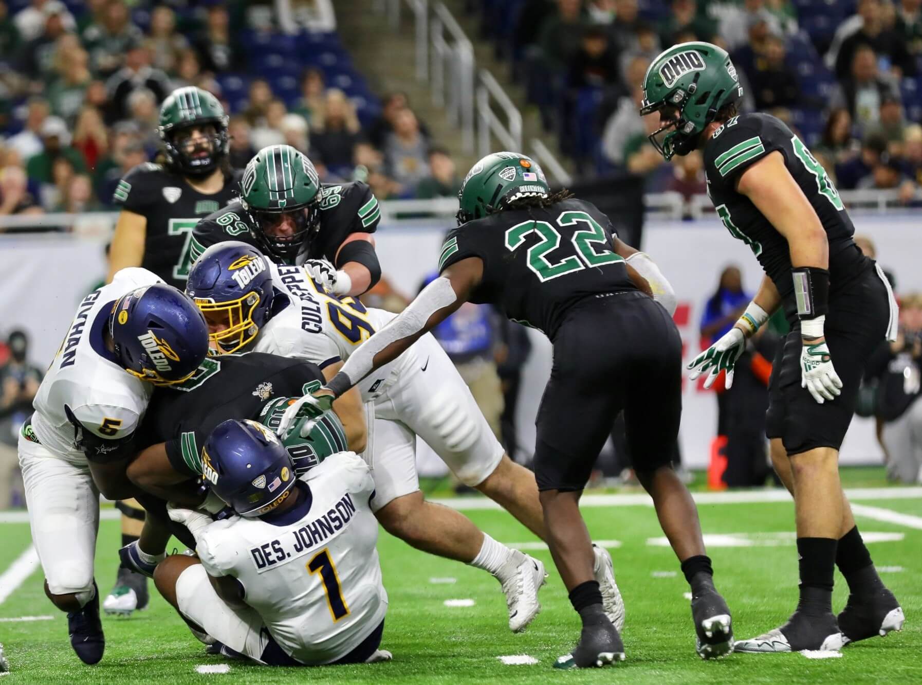
I’ll bet you the house no one in Athens will consider this played-out loser mess of a uniform “unlucky” and they’ll trot it out again next year.
See you in Bowl Season!
Thanks, Jim! OK readers? What say you? Agree or disagree with Jimmer’s selections? Let him know in the comments below.
LSU is the ultimate utility team providing nice contrast against most of its opponents. Alabama, Georgia, Auburn and so many others almost all look better when facing LSU. Is there another school in the country who does this better?
I like the way you put that.
They’re my go-to “pencil them in until I see the rest of the games” school, so I’m with you. Off the top of my head I can’t think of anyone who elevates other teams better.
Georgia Tech should be under consideration with LSU in this category.
The white uniform being the key.
The problem with Tech, IMO, is the striping and other frills they’ve added over the recent years.
They made a decent attempt this year, and are back in my good graces.
Now get rid of the shiny gold, and they’ve got a winner.
That uniform will mesh will with just about everybody that doesn’t go BFBS.
When they drop the shiny gold numbers they’ll be in my good graces.
I won’t be yelling at you about the USC Utah game. I agree that both uniforms look great, but together not so much. I will say that it wasn’t as bad as I thought it would look, but Utah should have worn their all white uniform and helmet. I don’t understand why schools with many uniform options don’t consider what their opponents will be wearing? ASU many times have selected their maroon helmets when playing USC, instead of a contrasting color.
To clarify my &1 comment,
You ever notice how BFBS gets a pass when a team loses a big game?
(I’m looking at you, Oregon and the Arizona Cardinals)
Come out in some bright, garish outfit and lay an egg, and you’ll never see that look again. But so many teams lose so many big games when they go ninja and they keep coming back to it.
I’m not condoning superstition…I’m just asking those who are to be consistent about it.
Really, really hating those biking shorts football pants we’re starting to see. Man, today’s players continue to find new ways to look as crappy as possible on the field.
Regarding the Utah-USC game: I’m yelling at you. And you don’t care.
About the consequences, no.
About the readers, always.
But I gotta call it as I see it.
Not enough games next weekend for a full 5&1, but we have the FCS playoffs coming Friday and Saturday on ESPN. We’ve got Bison, Jackrabbits, etc so some of the more unique names in college football (although the Spiders didn’t make it). Check it out!
As an Ohio undergrad, I was disappointed to turn in the TV and see the Bobcats in black.
I really liked the Akron unis. The Ohio ones are pretty awful.
Akron? Were they wearing these unis for the MAC Champ?
link
If only the school name were on the blue helmets in that shot…
Well, I owned myself *facepalm*
*Toledo
Michigan has got to lose the blue pants. Yuck! Who in Ann Arbor thinks that’s a good look?
And while they’re at it, ditch the white pants too. Not as awful as the blue, but why? The classic maize pants are beautiful.
IT WASN’T BROKE, PEOPLE!!!
I’m starting to think that mono blue is the standard home look for Michigan. B1G championship was a dreary affair – the worst looking game by far of the power 5 games (Purdue takes more of the blame, but Michigan went all out to look their worst).
I’ve yelled at you before, but not today.
Well, just a little.
North Carolina’s effort shouldn’t earn them a spot at No.2
Monochrome Carolina Blue is a bad look, White pants there, and they challenge the SEC game.
Well done to Clemson, though.
Jim is totally right about the opponent uniform enhancing qualities of the LSU outfit. Perfect balance between gold helmet and pants, white shirts and socks. Lakers in their gold uniforms do the same thing in the NBA. Even any OKC uniform, the current Utah sets (soon to be scrapped, thankfully) or the Portland airport carpet look halfway decent against the Lakers in gold and purple. And I am even not a Lakers fan (or LSU, for that matter).
Utah USC would have been better with Utah in non-red helmets.