Good Saturday morning, Uni Watchers! I hope everyone has had a pleasant week!
I’m on the road this weekend, curling in a bonspiel in Connecticut (with lodging in Massachusetts), and in fact, by the time some of you read this, I’ll likely be at the club and on the ice. Depending on how my rink does today, it’s possible I’ll be curling in a final tomorrow…and of course, it’s also just as possible we will have been knocked out of the tournament at some point today. Either way, there will be a smaller-than-usual SMUW tomorrow, since we’ve reached that point on the schedule where most schools in the FBS are either done with their regular schedule, or are playing in Conference Championships (plus there are playoffs for some FCS schools). Depending on how things go, how many games we play, and how late I’m at the club, I may (or may not) have a ticker tomorrow.
Now then.
I’m pleased to welcome back graphic designer Chris Diamond, whose work (not just uni concepts) has graced the Uni Watch blog several times before. Today, Chris begins the first of what will be a three-part project — a “What If…” — and this one should be a lot of fun. I’ll let Chris take it from here…
by Chris Diamond
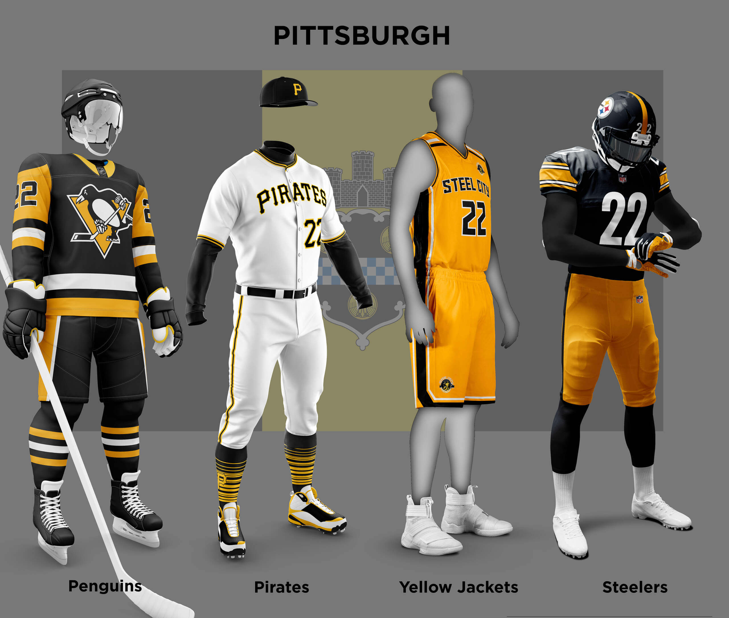
Of all cities with “big four” sports teams, Pittsburgh is famous because its teams (mostly) sport the black and gold (yellow) that are the colours of the City of Pittsburgh. The city flag and colours come from the arms of William Pitt, whom the city is named after. The NHL Pirates were the first in 1925, followed by the Steelers in 1933 (also as the Pirates) to don the black and gold. Ironically at the time the baseball Pirates wore navy and red, only changing to black and gold in 1948. The Penguins also didn’t start in black and gold, only changing in 1980, although their logo from 1967 featured the black and gold skating penguin.
Finally, although they aren’t major league, the ABA’s Steel City Yellow Jackets also chose the black and gold (as well as the USL Riverhounds). I’m a Steelers and Pirates fan and have always liked the fact that they share the same colours, and it got me wondering why other cities aren’t the same?
And if they were, what would it look like? UW of course already has form in this area! “Our own Phil Hecken” wrote a couple of great pieces waaay back in 2010 which considered what would the American League and National League be like if the teams all wore city colours? Sadly all of his graphics are lost now, but you can still read his descriptions and the comments, where certain of the “usual suspects” were around 😊
Philadelphia
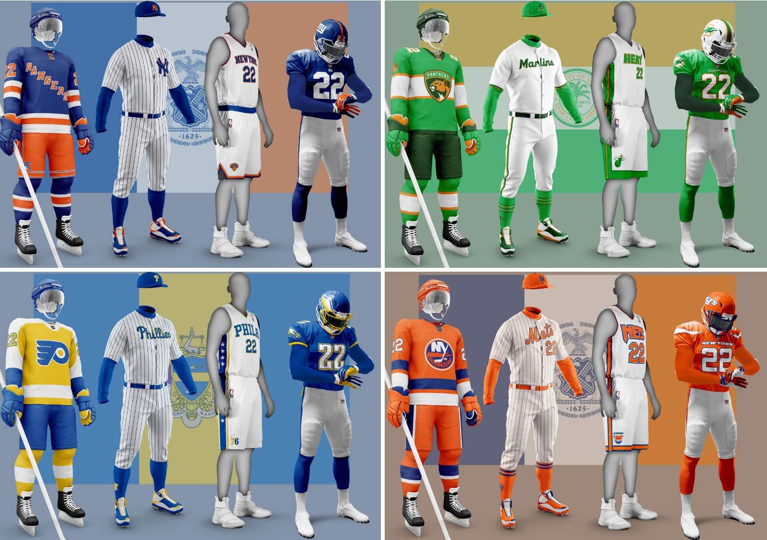
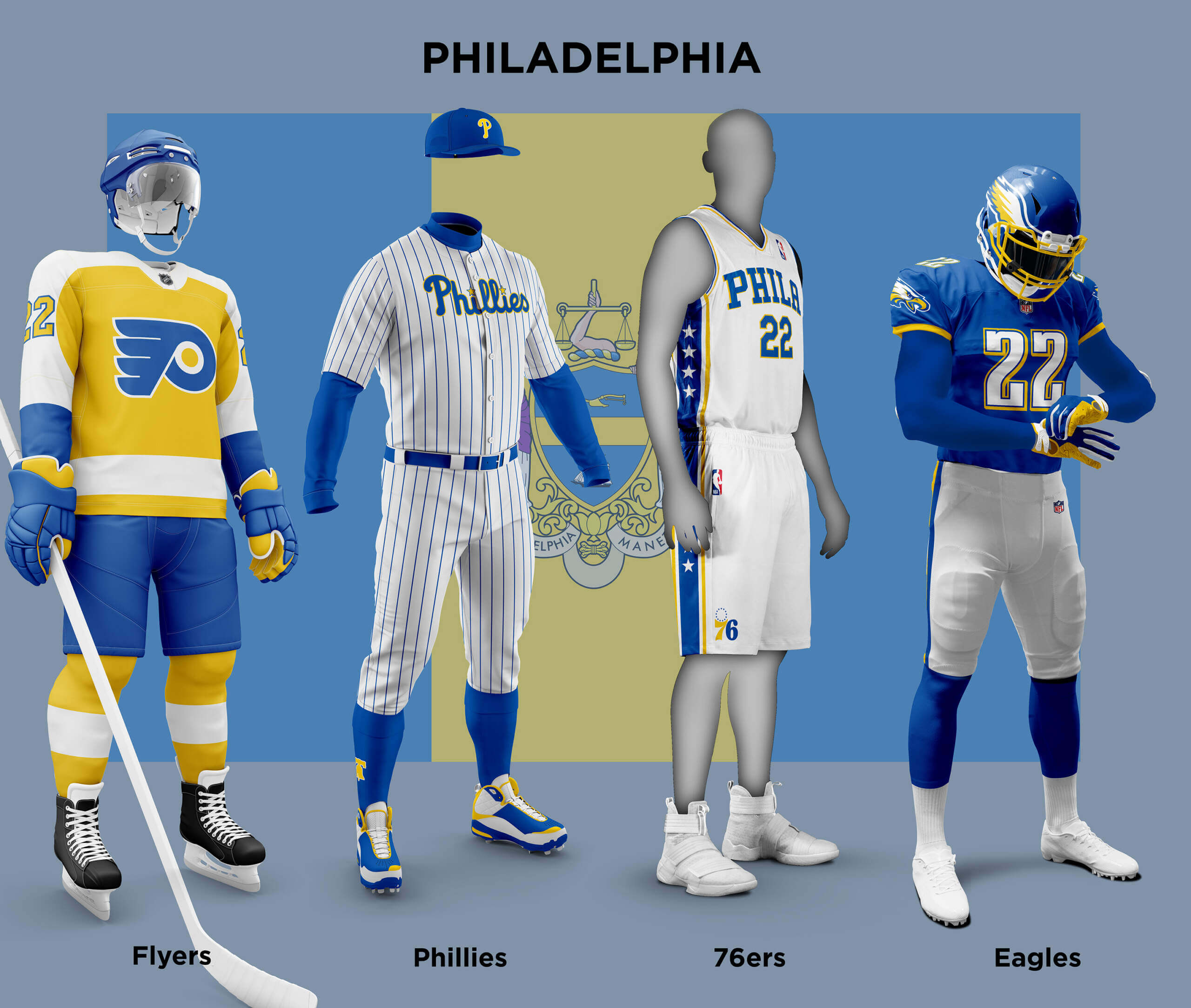
The City of Philadelphia’s colours are blue and yellow which come from the area’s Swedish heritage. Blue and yellow are about as far away as you can get from the current teams’ unis, but two of them have history with the scheme. In 1938 the Phillies wore those colours for one year to celebrate the tercentennial of the Swedish arrival in Philly. And blue and yellow was the Eagles original colour scheme which they did a throwback to in 2007. The Flyers have never deviated from black, orange and white, and (apart from their BFBS flirtation in the 90/00s) the 76ers haven’t strayed much from red, white and blue (not surprising given their patriotic name!). The teams were reasonably easy to translate to the new scheme apart from the Eagles where I had to do a bit of jiggery-pokery to exorcise the black!
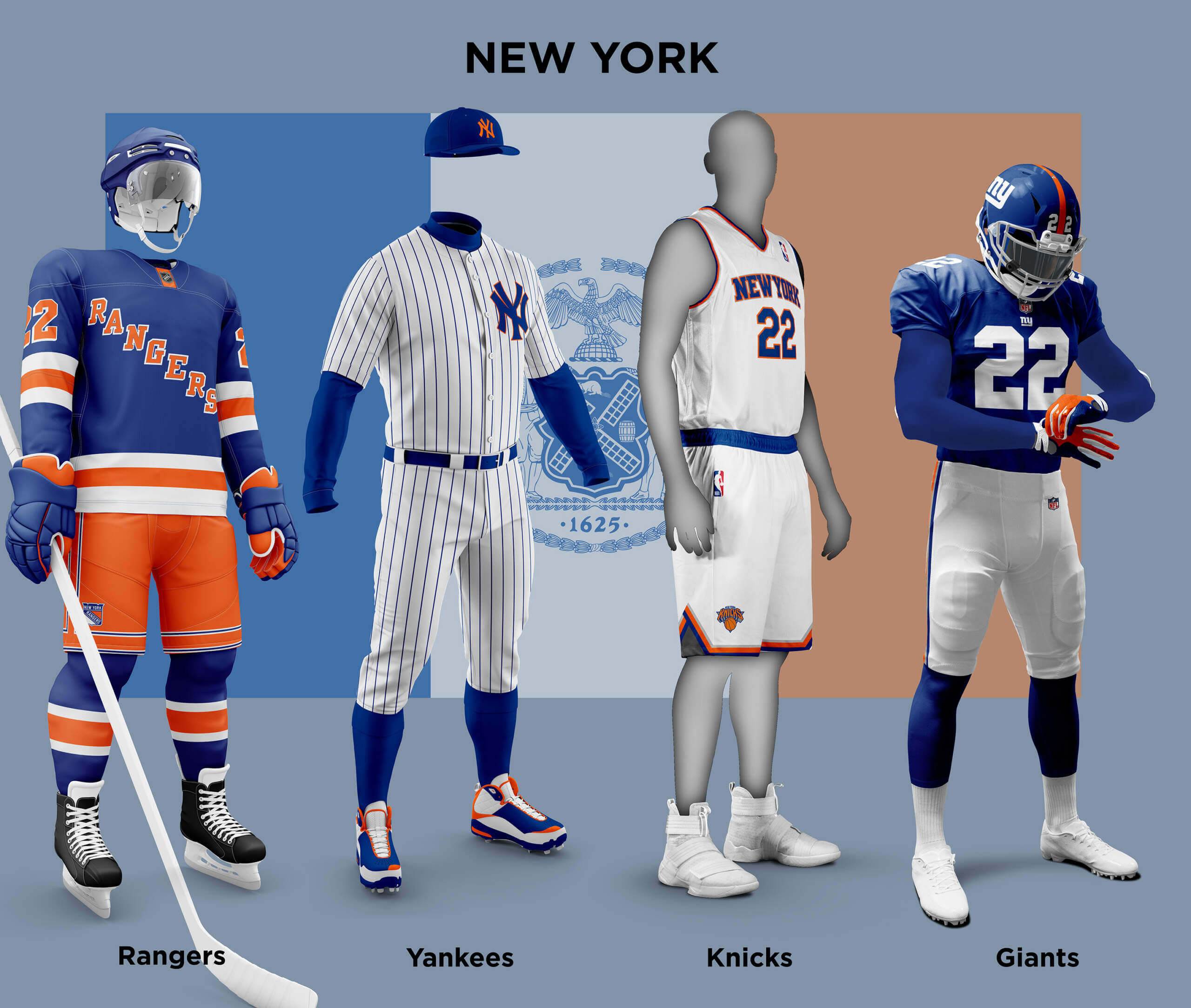
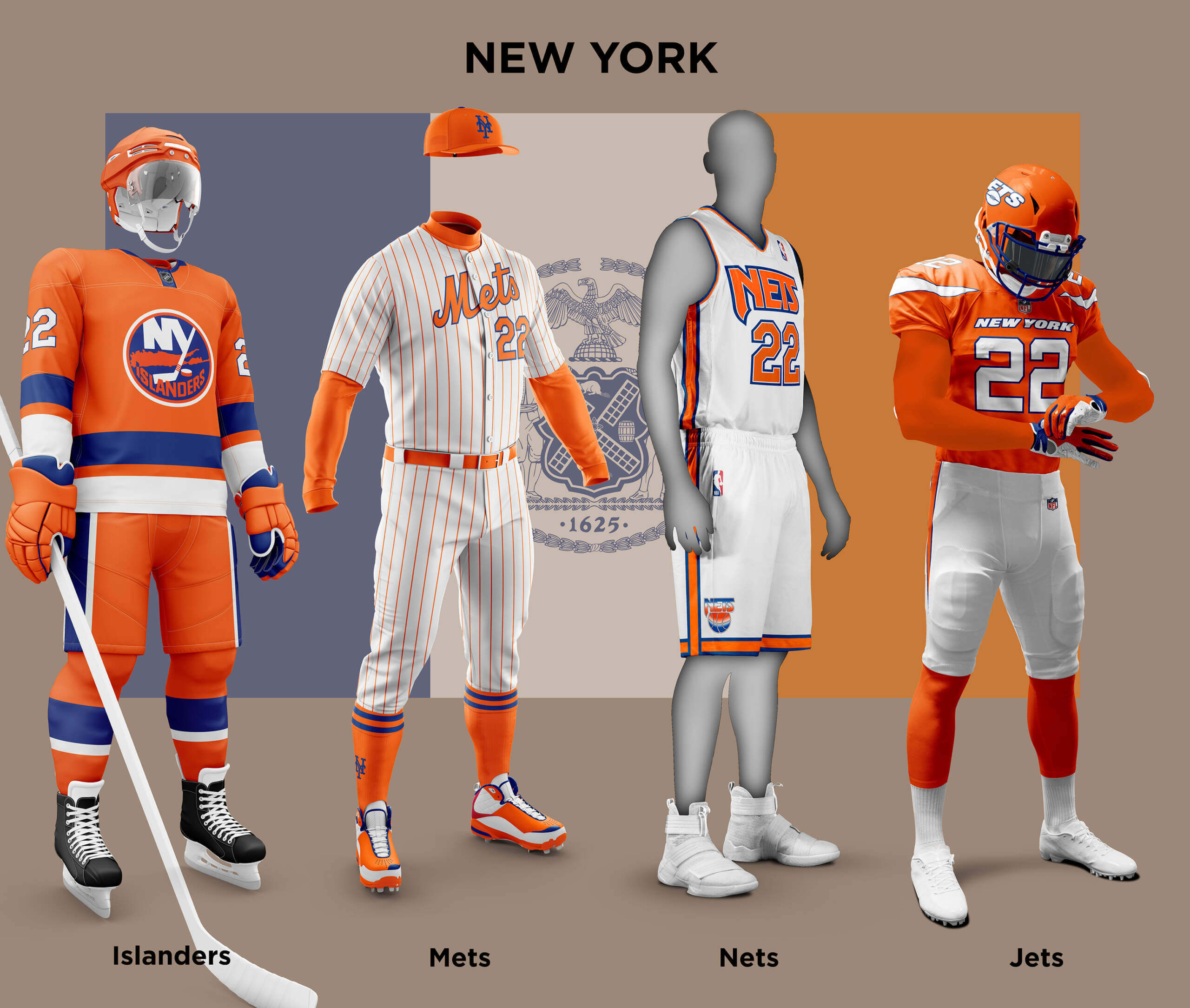
New York’s colours are blue, white and orange and come from the city’s Dutch heritage. Of course the Mets, Knicks, and Islanders already use this colour scheme, and the Giants wear blue and red which is not too far away. But having a double set of teams poses a problem for this concept. All the teams in each sport started out in different leagues (Giants NFL, Jets AFL, Rangers NHL, etc.) so having the same colours wouldn’t be an issue initially. But all have ended up in the same league, so at some point each would want to distinguish themselves from their cross-town rival. So I have assumed the older teams stuck with blue as the primary and orange as the secondary and the younger teams vice-versa. Giving us the “blue teams” — the Giants, Yankees, Knicks and Rangers and the “orange teams” – the Jets, Mets, Islanders and Mets. Of the blue teams because of the current use of orange/red and blue, most don’t look that different anyway. Only the Yankees in Mets colours is likely to set both teams’ fans teeth on edge! The orange teams also mostly look sane for the same reason – the Islanders and Mets unis look like alternates and the Nets could almost be a regular uniform (note I used the old style logos rather than the modern minimalist look they have in Brooklyn). The Jets in orange really stand out though. Given how disliked the current unis are, I don’t know if this is better or worse!
Miami’s flag is green, orange and white. It was chosen in 1933, but there is no official explanation as to why, although Miami U has been using similar colours since 1926. All the Miami teams use a three colour+white palette so I’ve added a darker shade of the green to the scheme to make things flow a bit smoother and not look forced. The Dolphins already wear aqua and orange (originally called coral by the team) so the unis don’t look that different. And in fact sometimes, especially on old TV broadcasts, the jerseys can look quite green anyway! The only change I made was a thin dark green outline to the numbers and stripes as the orange and green shades are close in value so they need something to separate them. The Marlins originally had aqua (aka Marlin blue) and orange in their scheme but over the years have become more black-outed until now the other colours barely get a look-in! In the city colours, I feel the Marlins’ look is closer to their origins, and at least the cap logo is easier to see! I also couldn’t resist putting Marlins on their home jersey (as it should be), making sure to #RespectThePlacket! The Panthers and Heat have never had any truck with the city’s colours (apart from the Heat’s bLaCKmAiL [sorry, City] edition jersey). For the Panthers I swapped out their Florida Flag based sleeve patch for their palm trees one as the former makes no sense in green! For the Heat I used the same thin outline as for the Dolphins to separate the orange and green.

That’s it for Part 1, I hope you enjoyed these as much as I did creating them and thanks for looking!
Readers? Your thoughts?
The Islanders were never in the WHA or the WHL as it reads above.
Also, Mets are listed twice in one spot instead of one being the Nets (the “orange teams” – the Jets, Mets, Islanders and Mets)
Right. The Islanders were granted an NHL expansion team to stop the WHA’s plans to put a team on Long Island, so they often get confused with the WHA teams which ended up in the NHL, but they aren’t one of them.
That said, I think this is an excellent feature. While it’s hard to make it work for New York (and will be for LA as well), it’s an interesting thought experiment and I appreciate the background information on the origins of the color schemes and their use in the teams’ histories.
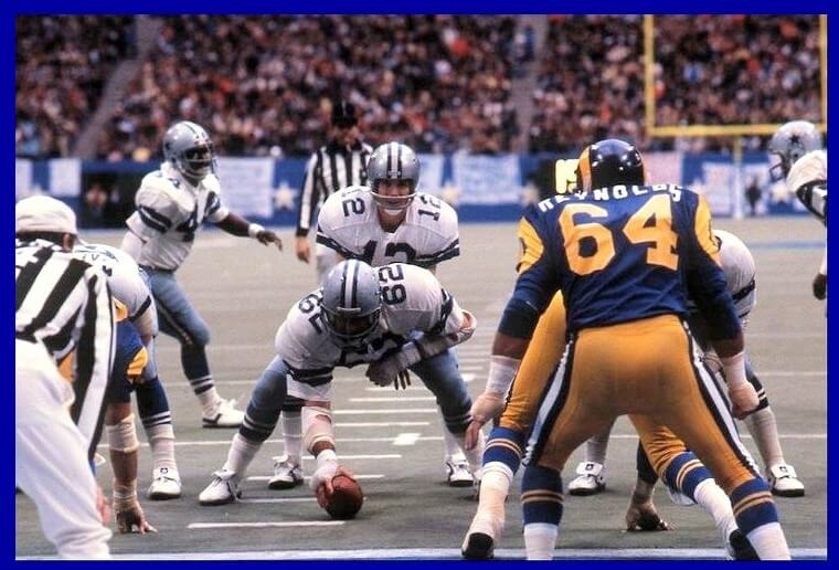
My GTGFTU guess is that it’s the 1973 NFC Divisional round game between the Rams and the Cowboys at Texas Stadium. The Cowboys won the game 27-16.
Chris Diamond says there’s only 2 NYC teams with blue and orange (Mets and Islanders) but the Knicks fall in that camp too. He incorrectly says their color scheme is Blue and Red. Otherwise I love the concept! Let’s make the Jets blue and orange already!
Great work! I love this idea and I can’t wait until the next part!
Thanks Memal!
the Knicks most assuredly already wear orange, not red
The Flyers need new ownership and front office, not a new color scheme.
Agreed, but we can’t solve that problem here. #firechuck #selltheteam
They need to realize “Chuck Fletcher” isn’t two names, it’s a verb and a name.
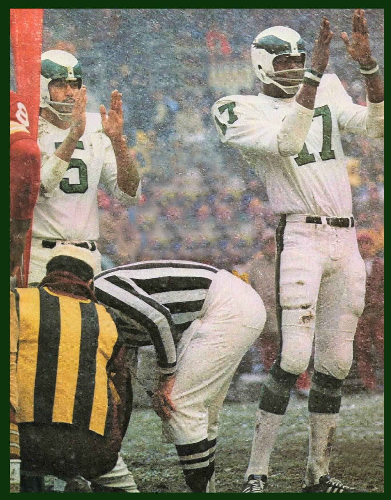
Pretty sure that Rams-Cowboys photo is from the 1979 divisional playoffs. Rams 21-19, Texas Stadium, December 30, 1979. Roger Staubach’s last game.
I agree with JP. I was there. One of the coldest games I’ve ever been to.
Love the “Pittsburgh” segment! I think the game is the 1979 NFC Championship Game, Staubach’s last game.
Toronto’s teams are another Pittsburgh-like example, with the Raptors being the one team that doesn’t use the predominant blue and white of the city flag. Can’t wait to see how you “fix” the Raps!
I’d start by renaming the team…
!979 Divisional Playoff Game December 30, 1979, It was Staubach’s last game-although we didn’t know it at the time (He retired about 3 months later.).
Yog got it Charles! Roger’s last pass was a 4th and 20 incomplete pass to Drew Pearson, ending the Hall of Fame career of Captain Comeback.
AKA The Billy Waddy Game.
Hollywood Henderson said in his book that if he was still with the Cowboys, he would have been right in the spot to meet Waddy, but he was released earlier in the season after the Washington game.
My guess for the game from the uniform is the 1979 NFC Divisional playoff on December 30 1979. Dallas Stadium, LA Rams 21. Dallas 19.
“The Marlins originally had aqua (aka Marlin blue) and orange in their scheme but over the years”
This is true of the minor league Miami Marlins. The original MLB Florida Marlins did not have any orange in their color scheme at first (teal, black, and white).
Hi Alexander, it wasn’t as big a part as the current Miami Marlins that’s true. But according to TruColor it is a supporting color link . I think it must be the stitches on the baseball in their logo link
This was a fun post man! Marlins should go back to teal and dolphins should never change…but the panthers and heat uniforms look pretty fun
The “legacy” New York teams look fine, but the non-legacy teams took a beating here. Leave the Mets alone, and the Jets in orange? No, thank you.
Haha! I was wondering which of the uniforms would turn people’s stomachs!
Although we only have two of the “Big Four”, Nashville also has an MLS team and two of our 3 pro teams, the Predators and Nashville SC, use the colors of our city flag, blue and gold.
I’ve long thought that the Titans would be better served by a slight rebrand that ditches the red and incorporates gold to better tie with the city and its other teams.
Do we have to use a city flag’s colors for the template? Pittsburgh’s works great, and in many cases, civic colors flow from the flag. I love the idea of Philadelphia in blue/gold (University of Delaware does it well for the same reasons of Swedish history) but as our first capital and the home of the Declaration of Independence and Constitution, it is hard to argue that Philadelphia shouldn’t be red, white and blue.
But when I think of Miami, I think of light blue and neon pink. The Heat have embraced it with their Vice alternates, and the Marlins aren’t far from it. The Dolphins could go orange to coral to pink, leaving the Panthers as the only team to have to make a major change.
Similarly, Seattle makes me think “Emerald City” and green; their civic flag is more a teal/white design. Houston would be blue and white, but the Astros and Dynamo make great use of orange and the Oilers made light blue and red work.
Regardless, nice idea, well executed. Cannot wait for the rest.
Thanks MJ! You make a good point, a city’s colors don’t necessarily come directly from the flag. Sometimes the flag alone isn’t suitable as a base (for various reasons) and I will cover those cities in later parts :)
There’s something that just doesn’t work with a team called the “Heat” having green- a “cool” color– as one of their colors, much less the primary uniform color as done here. Orange (a “warm” color) would work better in their case.
Yes you’re right in this case it makes more sense for the Heat to have orange as their primary colour. I showed their association jersey, but of course the icon or statement jerseys could be orange.
while i understand chris diamond’s concept for new york (older team is the ‘blue’ team, newer the ‘orange’) if a team already IS a city flag color team (the mets, knicks, and islanders) why the heck are you messing around with them? just ‘fix’ the teams that don’t fix the scheme.
that being said, the jets’ ‘color rush orange’ looks awful. even with your concept, you could have given the jets some more blue in that scheme, either in the helmet or the pants. the islanders too could have had blue pants with orange stripes, which would have made them look more like the NYC flag (even though they play on long island). and while your decision to make orange the mets’ primary color in this thought experiment is one thing, the orange pinstripes makes it all a bit too much.
one thing you did get correct… yankees fans would be apoplectic wearing the mets’ colors.
as an aside… in a similar but somewhat different theme… has anyone ever noticed that in baseball, the SF giants, the tokyo yomiyuri giants, and the busan lotte giants (KBO) ALL have black and orange as their team/uniform colors?
Not sure if city flag colors is the best way to determine the colors for the teams located in those cities. I would venture to say most people don’t know and don’t care what their city flag is.
As someone who has lived in the Chicago suburbs my whole life, I am very aware of the Chicago flag with its white field, light blue stripes, and red six-pointed stars.
I’d put the Sox, Hawks, and Bulls in red, black, and white. The South and West side teams. It’s only a minor change for the Sox. Then the Arlington Heights Bears and the Cubs in the Chicago flag colors. Bring back that Oilers color scheme.
I’m not sure this should really be seen as “from the flag”, Rick. Even if people don’t know the flag, they can still know city colours (e.g. Black and Yellow/Gold for Pittsburgh). It’s just that in the cases so far, the city flag uses the city colours. Later on we will see cities where this isn’t the case.
In New Zealand, regions have well-established consistent sporting colours across almost traditional sports (where the teams may now be franchises but originated as regional representative teams). Often there’s minimal flag connection. Auckland sporting colours are dark blue and white. There’s no particular flag-based reason for that as the flag features other colours just as prominently. And sometimes the sport defines the flag! Otago is blue and yellow and these colours had been in sporting use for well over a century before they decided to create a regional flag in blue and yellow in 2004.
In my experience, this depends entirely on the nature of each individual city’s culture. I lived in Pittsburgh for nine years and (ironically) don’t recall ever seeing the city’s flag. In fact, I’m pretty sure I didn’t even know Pittsburgh had an official flag until sometime after I moved away. If you had asked me the local significance of black and yellow, I would have just said that it was the color scheme of the city’s sports teams.
On the other hand, I also lived in the Denver suburbs for four years, and it was almost impossible to go into the city and not see a Denver flag somewhere. I would be shocked if anyone in Denver (or at least anyone who’s remotely paying attention to their surroundings) couldn’t picture what the city flag looks like in their mind. (Incidentally, the Denver flag is beautiful, but that’s beside the point.)
I love this. I quite like the Miami rendering.
Thanks, Mike!
If there is a Baltimore entry in the future it’s going to look a lot like Pittsburgh because the City of Baltimore flag is also black and gold.
As a Philadelphian, I was particularly interested to see how my teams turned out. (Of course, if we were to extend out to MLS, the Union, though they play in Chester, regularly have a baby blue and gold kit, so they’re easy enough to pull into this exercise.)
The Flyers just look like a badly washed-out photo of the normal jersey. They take an absolute beating as a result of this. On the flip side, the Phillies, Sixers, and Eagles all look brilliant in these colors. Excellent work!
Thanks! I thought the same about the Flyers when I had done it – I think it’s the eyes playing tricks because you *know* it’s really black and orange!
I almost cannot think of anything that would satisfy my slight OCD tendencies more than all of the major sports teams in every major city having matching color palettes. Nice work.
Thanks Tim! Yes I’m definitely with you on that one. I’m sure my adoption of the Steelers and Pirates must have had something to do with them wearing the same colours. I remember feeling quite thrilled when I found out some years later that the Penguins wore black and gold too (this was in the 80s in the UK with no internet or TV coverage of the NHL).
Point of clarification: The “Miami” section references “Miami U,” but Miami University (founded 1809) is in Ohio. The one in Florida, aka “the U,” is called University of Miami (founded 1925.)
Great work with the Philadelphia teams. Somehow the Eagles uniform ended up being good despite the awfulness of that 2007 Eagles blue/yellow throwback. Gonna chalk it up to your rendering basically looking like the Chargers unis.
I’m really not a fan of the current color scheme for most of the Philly teams. To be fair, I don’t mind it on the players. I just don’t personally like wearing Phillies red or Eagles green. Most of the team merch I end up buying is the throwback stuff. Maroon Phillies gear and kelly green Eagles stuff.
Appreciate the effort, good job with the unis. Regarding the Miami teams, only the Marlins and Heat are in the city of Miami, but they and the Fins are in Miami-Dade county. The Panthers reside in Sunrise, one county north in Broward county.
Miami-Dade’s colors are sea blue and a lime green. Not really sure if Broward or Sunrise have proper flags, or are just county logos and/or typography on a banner
Thanks! I get what you’re saying, they’re not technically in Miami. But the same is true of a lot of other teams (e.g. 49ers, Giants/Jets). So I’ve tried to go on the colours of the city they represent, rather than where the stadium actually is.
I’m pretty sure that Miami’s city colors come from the colors of the orange tree (green, orange, white).
I’m curious what the re-designs of the Denver franchises will look like, as I doubt maroon or purple adorn the city flag.
Part 2 :)
Chris is going to have a helluva time with the Detroit teams.
Would be great to include MLS in these. A soccer jersey is a completely different look than the other 4, so it feels like we are missing a big part of the spectrum. The cut off between soccer and hockey seems arbitrary since MLS has grown so much recently. The lede even mentioned the Pittsburgh soccer team (albeit minor league). Also, MLS has put an effort into using city or state colors for some teams.
I’d love to see soccer added to future rounds of what looks like a great project. Part 1 is impressive.
Love the Jets ORANGE!!!
When you get around to it, you’ll see that three of Washington DC’s teams (the Nationals, the Wizards, and the Capitals) wear red, white, and blue. Only the Salamanders wear a different color scheme. That should be an easy fix for you!
My Tudor Electronic football game as a kid was the GTGFTU Cowboy – Rams matchup!
Could you imagine the Bengals in red, white and blue?
Cincinnati’s city flag is red, white & blue.
The Reds, FC and the Cyclones yes, the Bengals not so much.