Here’s the second part of John Benson’s defunct NFL franchise concepts; the first part ran earlier this morning. Be sure to click to enlarge each concept, as there are additional historical notations on each graphic. Enjoy!
Staten Island Stapletons
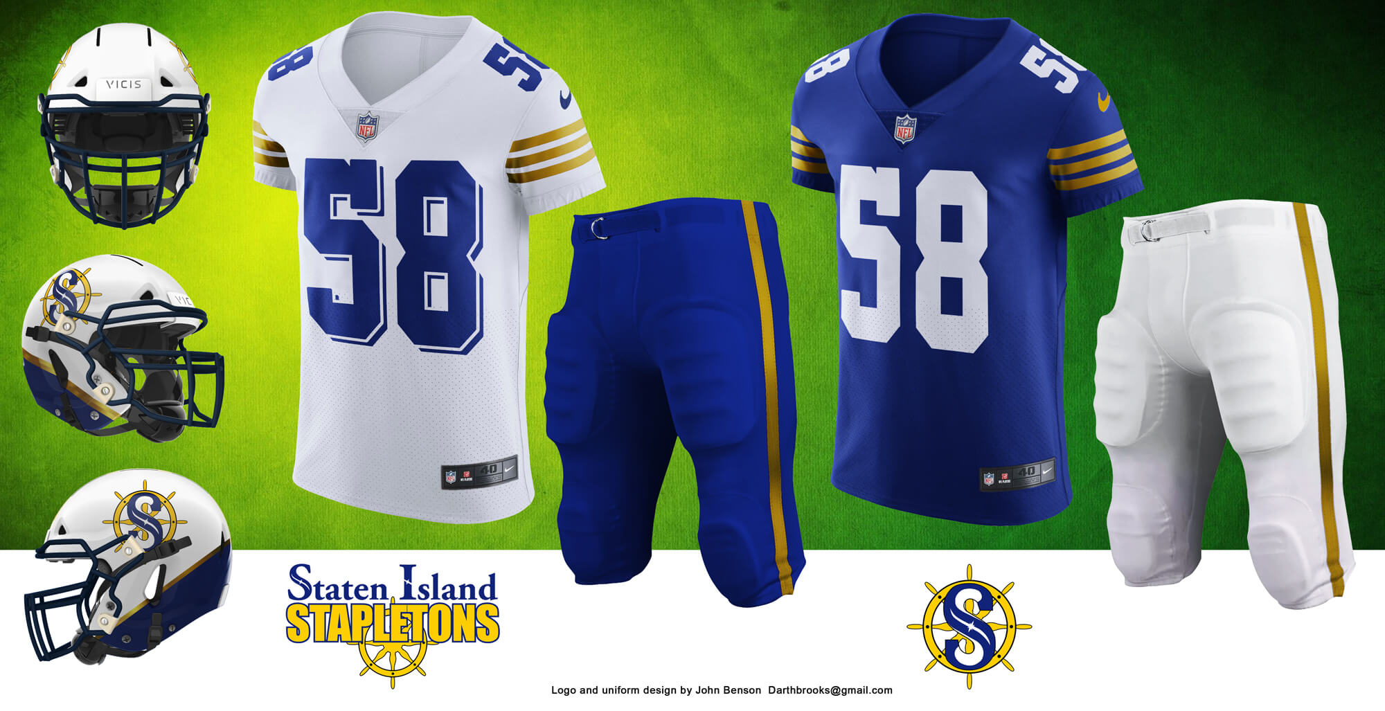
The design for Staten Island plays with a nautical theme and borrows from Navys’ helmet design from a few years back. The S logo is new and draws some inspiration from orcas and compass roses.
Rochester Jeffersons
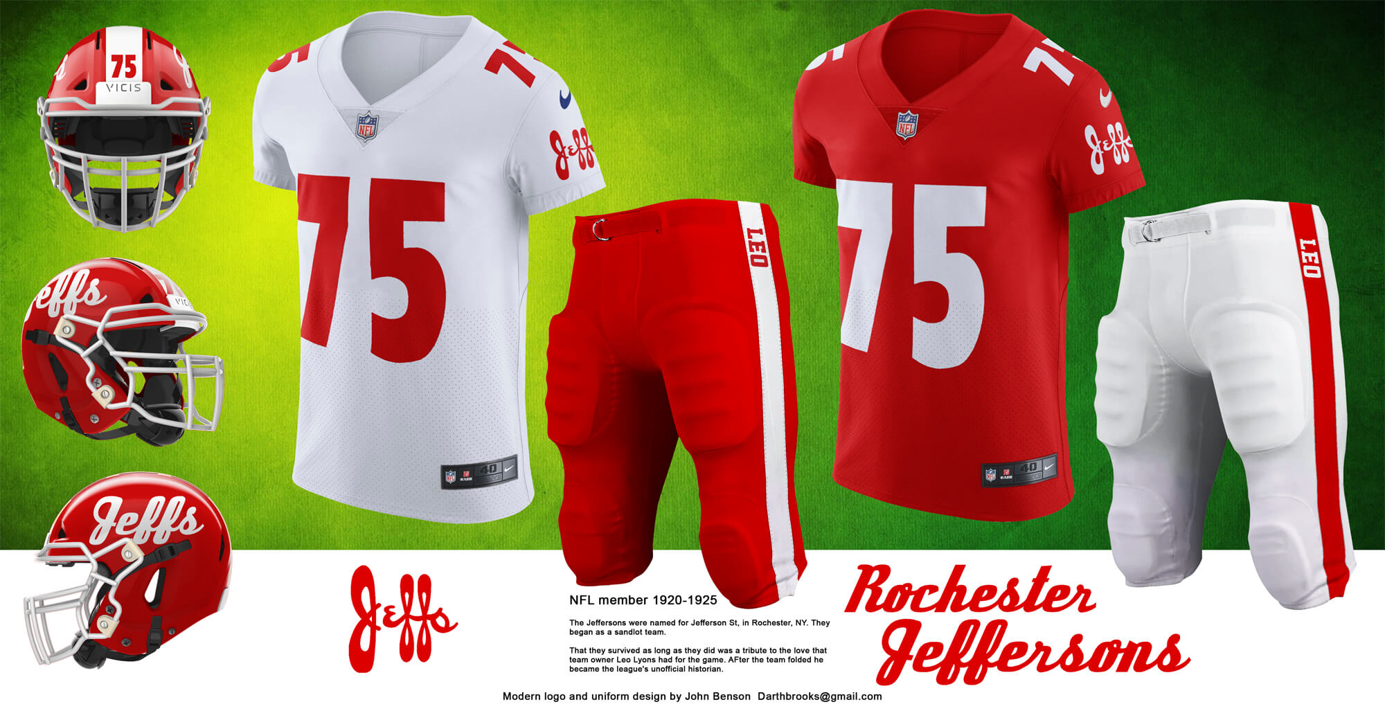
The Rochester Jeffs had a historic logo made up of the name “Jeffs” and while the font is updated this uniform features the name as well. The team’s owner, Leo Lyons, became the NFL’s unofficial historian and contributed many of the items in the NFL Hall of Fame when it opened.
Boston Yanks
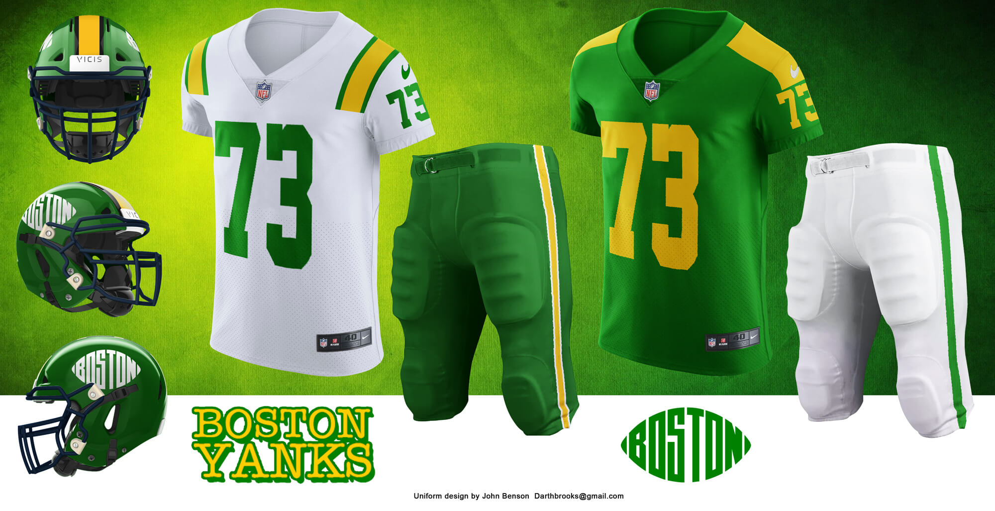
The Yanks are part of a confusing chain of teams that lead from the Dayton Triangles to the Indianapolis Colts. Along the way as teams were sold back to the league, moved or merged with other teams the assets and players moved from the Boston Yanks, the Yanks, New York Bulldogs, New York Yanks and Dallas Texans. The uniform and logo are the ones the team used for the most part, with a few modifications.
Hammond Pros
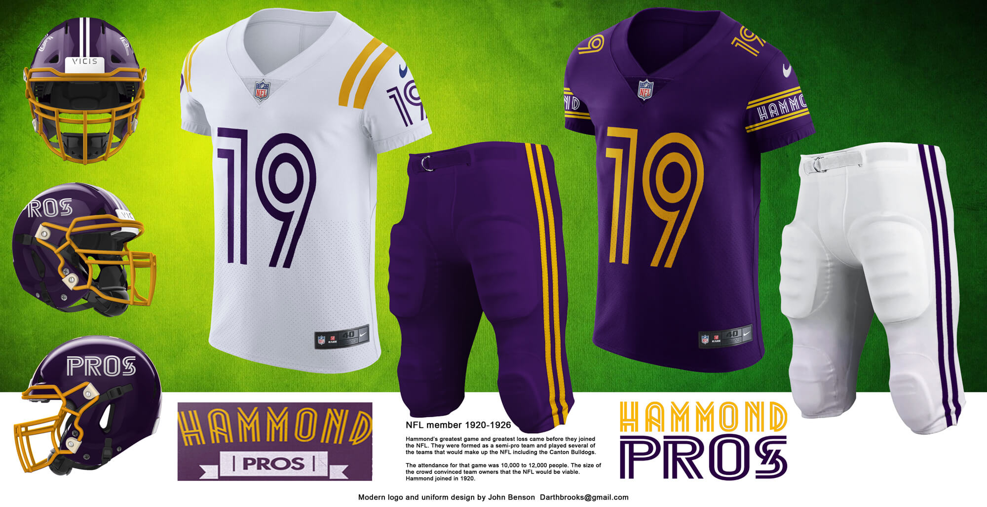
The design of the Pros uniform was extrapolated from the twin lines of their original logo., along with the original colors of purple and yellow.
Milwaukee Badgers
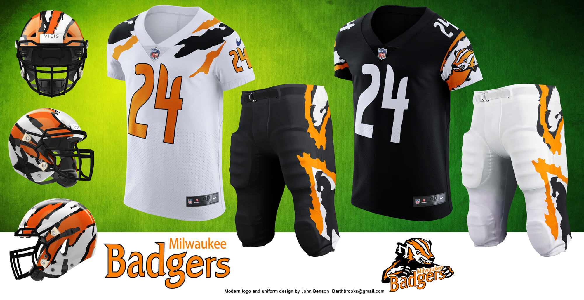
There is a bit of mystery involved with the Milwaukee Badgers logo. It looks too modern for a team that quit playing in the twenties. The team was involved in the chain of events that lead to Pottsville having their championship stripped from them. The jersey designs are complementary, with the graphic element on the sleeve with black and off the sleeve with white.
New York Bulldogs

The Bulldog logo is the historic one, altho the wordmark and uniform are completely new. The uniform and helmet design draw inspiration from NYPD and taxi services. The sleeve numbers are something unique to this design.
New York Yanks
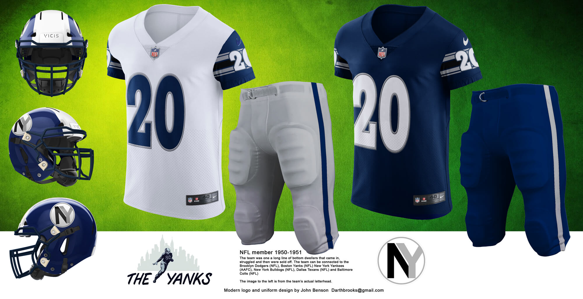
The historic wordmark was featured on the team’s letterhead. The uniform and NY logo are new. I wanted to make something that would or could have existed if the team had continued to exist. It had to be simple but iconic.
St. Louis Gunners
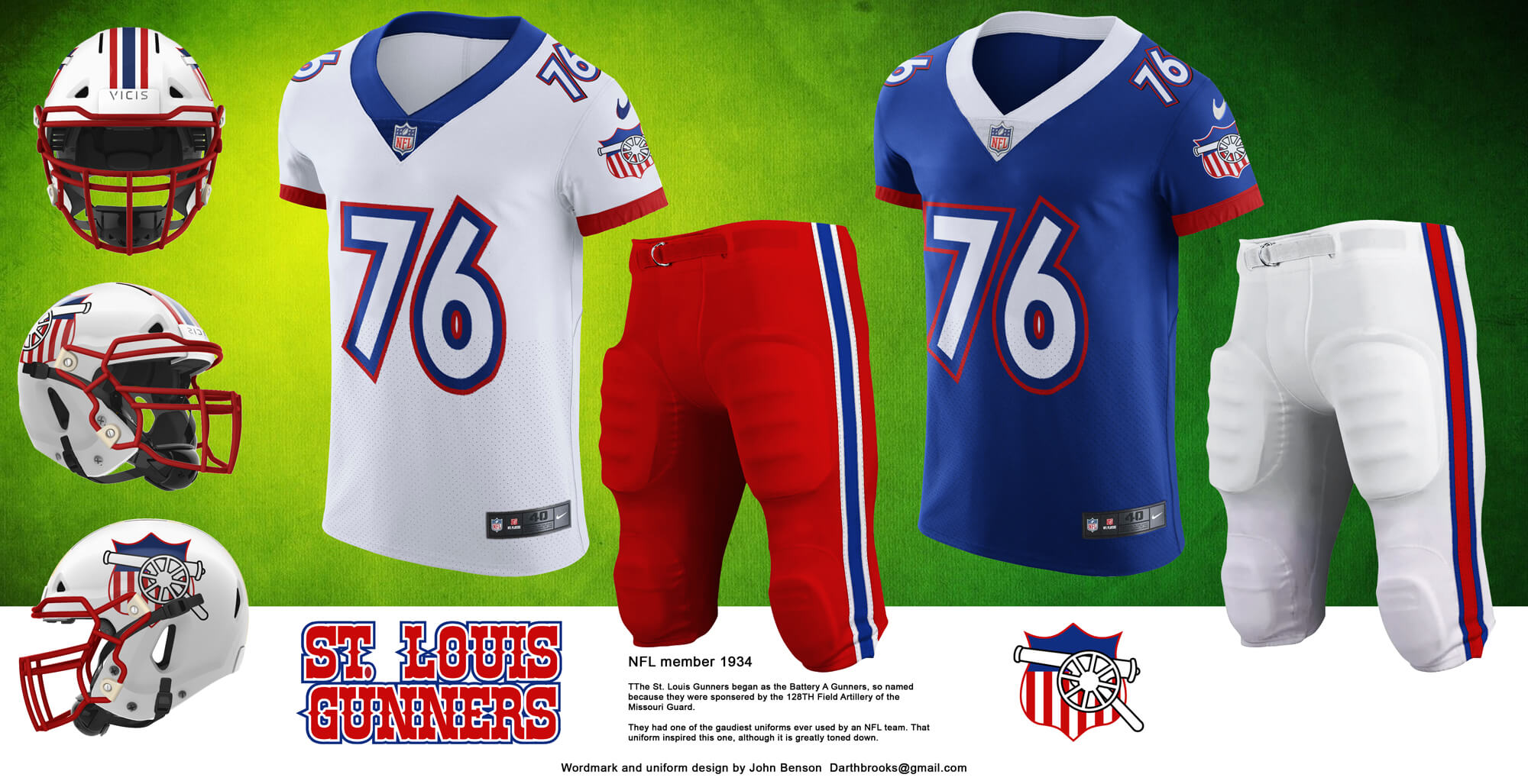
The St. Louis Gunners had one of the most garish uniform designs that an NFL team ever fielded. The design tones that down quite a bit while retaining the red white and blue of the original. The gun carriage is arranged so the gun is always pointing forward.
Tonawanda Kardex

Tonawanda played one game as an NFL team and were beaten so badly they left the league afterwards. The Kardex part of their name comes from American Kardex, a highly successful indexing card manufacturer. IF the owner of the company had decided that having a football team named for his company, the team could have been the most cash rich and corporately backed team in the NFL.
Brooklyn Tigers

One of the challenges of creating modern uniforms for defunct teams is the way that color schemes repeat, A lot of teams used burgundy and gold, or red / maroon or black and orange. When the team colors are the same as the Cincinnati Bengals and the team’s theme (tigers) is the same as the Cincinnati Bengals it can be troublesome to make a Bengals uniform. Having said that, I may have made the best Cincinnati Bengals uniform the Bengals never had.
Brooklyn Dodgers
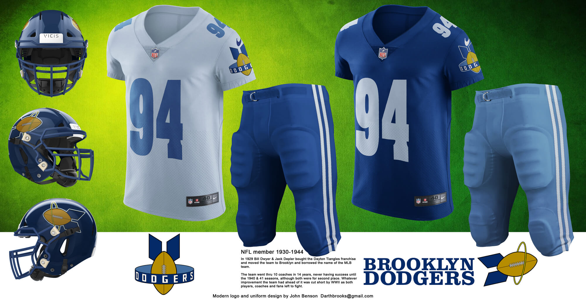
The Dodgers logo with the football bomb dropping into a ring is historic. It also didn’t fit well on a football helmet which is why it was re-imagined as a forward pass. Some inspiration came from John Deere, who changed their logo so the deer was leaping upwards.
Detroit Heralds

While the original team wordmark may look hand drawn it was actually a font. For the modern version of the wordmark it was boldend, italicized and otherwise sexed up. The logo is an old English “H” with a horn hidden in it, inspired a bit by the Detroit Tigers use of an old English “D”.
Thanks, John! Great stuff. Really enjoyed this trip back to the future. Readers, what do you think?

Please do a Part III with the Evansville Crimson Giants
John a great effort! The Dodgers can walk on the NFL field today and play.
That Boston football logo is simple and gorgeous!
For both of these posts it would have been nice to tell us where a lot of these obscure locations are,
Can we change the names of the Titans, Panthers, Commanders, Texans, and Jaguars to Jeffersons, Gunners, Heralds, Triangles, Steam Rollers, and Panhandles? Those names rule.
Nice work again!
Some great work there John in both parts, I particularly like the Rock Island and Providence designs. I sometimes wish there were more helmet designs like those two teams (and the Bengals, Eagles, Rams, Chargers and Vikings) in the NFL that don’t just feature a logo either side of the helmet.
The other thing with this sort of piece is trying to work with teams from an era where uniform design was very immature so there often isn’t much to go on and evolve.
Had a quick question for Paul or anyone with knowledge regarding the bucks cream jerseys/superimposed ads debacle.
How is the NHL able to work in the digital ads on ice as well as the boards with white jerseys when it’s on a mostly white background but the bucks had to can the cream jerseys because of the same problem?
Very interesting to hear of the one-and-done Kardex team. My office used to have one of these filing systems but we scrapped it a few years ago for more cube farms.
For some reason, the St Louis Gunners’ jerseys give off a strong soccer vibe. I’d much rather Nike have dressed the USMNT in something like those unis compared to the kits we ended up with for the ongoing World Cup.
Very nice concepts, just like in part 1. But colored side panels and armpits should be avoided at all time.
It would be great to see a design from Connecticut’s Hartford Blues — a team that used to play at a bicycle velodrome in East Hartford.