Good Saturday Morning, Uni Watchers. I hope everyone is enjoying a long weekend (at least in the States) and those of you who celebrated had a Great Thanksgiving as well.
Now then. Today I am pleased to introduce John Benson, who — believe it or not — is going to be the second Uni Watcher to bring us modernized concepts for former NFL franchises. Those of you who read during August may remember I ran a series from Jonah Ward who used his photoshop skills to recreate defunct franchises. Today’s graphic artist, John, has taken a slightly different approach, but one that’s also pretty awesome. John has recreated 26 franchises (with 27 recreations), so today we’ll take a look at the first half with the early morning article, and later on this morning, Part II will show off the remaining teams. Be sure to click to enlarge each concept, as there are additional historical notations on each graphic.
I’ll let John take it from here. Enjoy!
Defunct NFL Franchises Brought Back To Life
by John Benson
I’ve always had an interest in the design work surrounding NFL teams. From helmets to logos to football cards I found them fascinating. In looking for a logo for a project I found the sportslogo.net forum. People were posting their versions of NFL teams, tweaking various features. I considered doing the same but realized that the designs were so iconic that there weren’t many improvements to make. But the premodern, defunct teams didn’t have that problem. If those teams had a logo it was usually fairly crude, and very few of them even had helmets designs, so it was an open field to play with. For each team I did what research I could find, from colors to logos to team histories. I set out to do eight. They were the ones who had either been champions or very close and most of them had logos of some sort. From there I started adding teams. Some teams just didn’t have very interesting stories and so were shelved for a while. At times I went back and revised earlier designs.
The idea was to create an iconic look. It had to be simple, clean but also unique. A good logo is itself and not anything else. It had to be something school children could draw on the back of their notebooks but also something that could be identified at distance.
Akron Pros
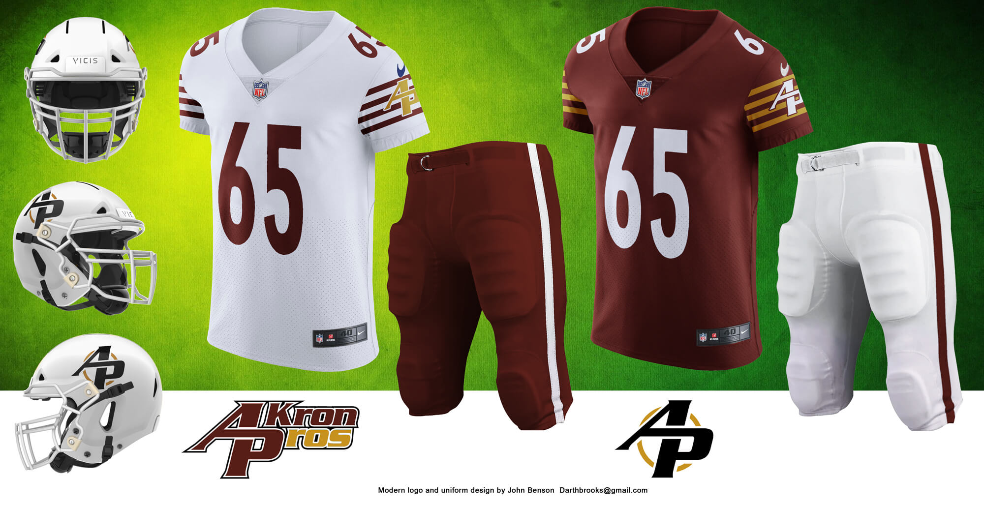
The importance of the Akron pros to the early NFL can be attested to by the fact that the minutes of the meeting establishing the new league was written on Akron Pros letterhead. They were the first NFL champions and featured the first black superstar, Fritz Pollard. If the team had survived they would have been NFLGeneric, the team and that is what inspired the uniform design. I did some variations on an interlock A and P before hitting this one. When I saw it I did a quick google search to see if any other logo used the same arrangement. It seemed so iconic that I worried it had been sitting somewhere in the subconscious and had just now popped up. After searching for some time it became obvious that the design was unique.
Canton Bulldogs

The NFL was founded in Canton, Ohio, in an auto showroom owned by the owner of the Canton Bulldogs. They were the first three time champions in the NFL, although the last came after they moved to Cleveland. The uniforms featured a white stripe that went around the jersey and that inspired the helmet stripe. The logo was a recreation by Ren69.
Rock Island Independents
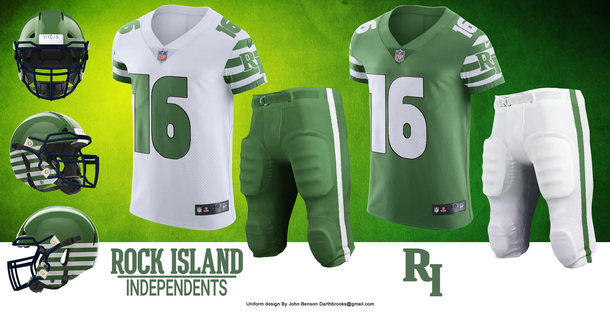
Rock Island’s design was inspired by the sleeve stripes that nearly every early team featured. Oddly this is the design I’ve had the most positive feedback on. It’s very simple and yet very unique.
Columbus Panhandles
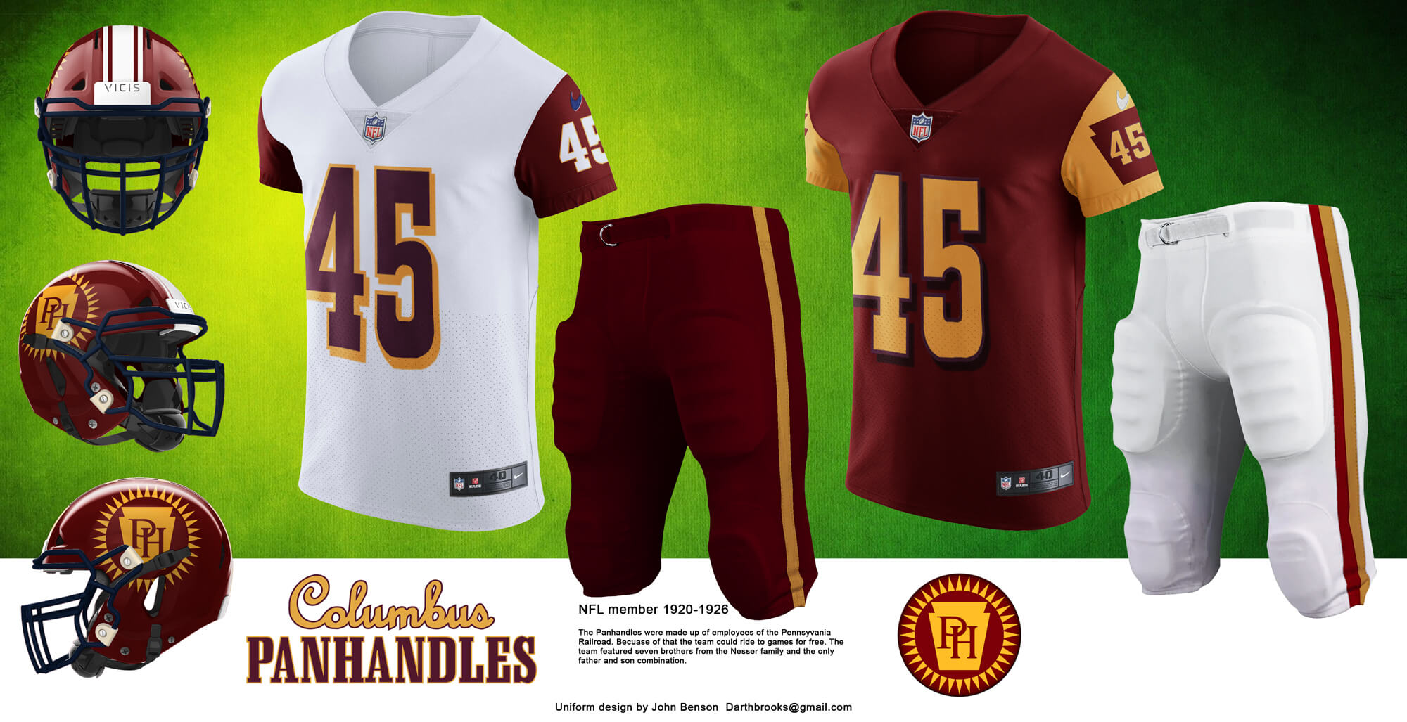
The Panhandles colors were burgundy and yellow, as were a few of the early teams. The most famous team to use those colors was the Washington Football Team, and they existed for a long time. WTF left a wide road that needed to be avoided in making a unique uniform.
Frankford Yellowjackets
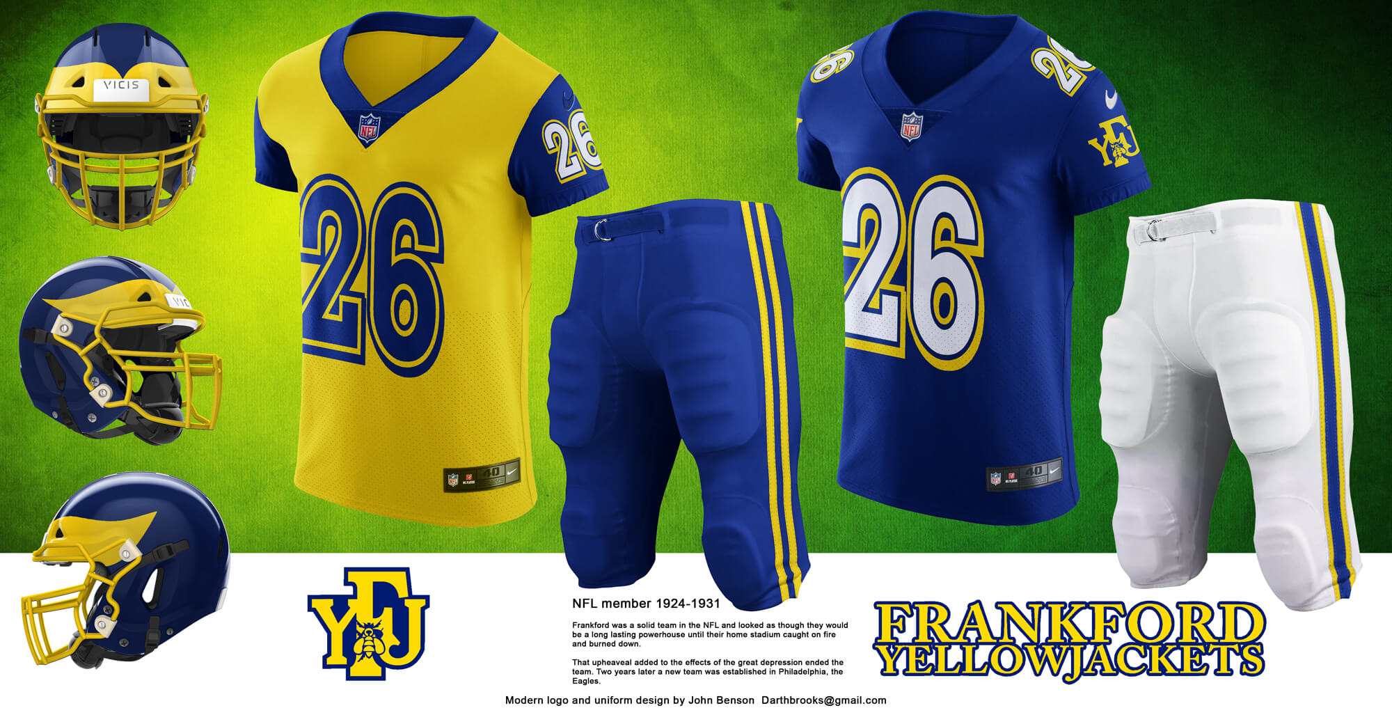
Frankford is the design that has given me the most fits. I’ve done several versions of the uniform before this one. It’s partially based on the throwbacks the Eagles had a few years back. I used the team colors and ditched the temptation to use black and yellow stripes.
Duluth Eskimos
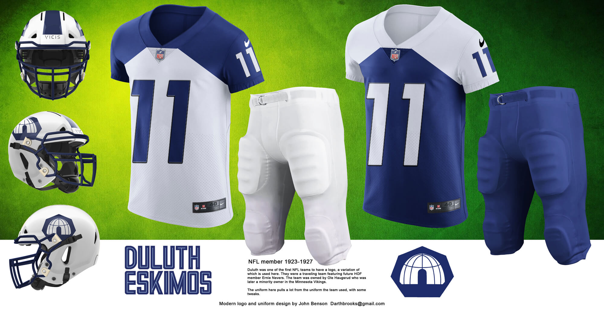
Duluth’s uniform is inspired by their historical uniforms. They featured one of the first logos on a team uniform. I debated replacing the Eskimos name but nothing better presented itself (The Duluth Kelleys? The Ernie Nevers?).
Providence Steam Roller
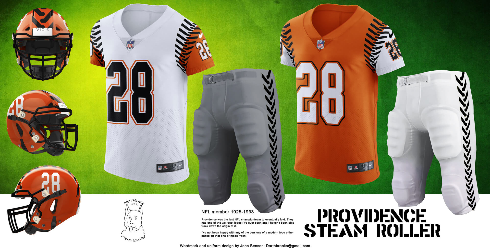
The Steam Roller logo is one of the strangest I’ve run across. Is it a husky? Is it a dog/man? I made some versions of a modern logo based on the Steamroller name but nothing I was happy with, so the uniform doesn’t feature a logo, going instead with a tread theme.
Oorang Indians
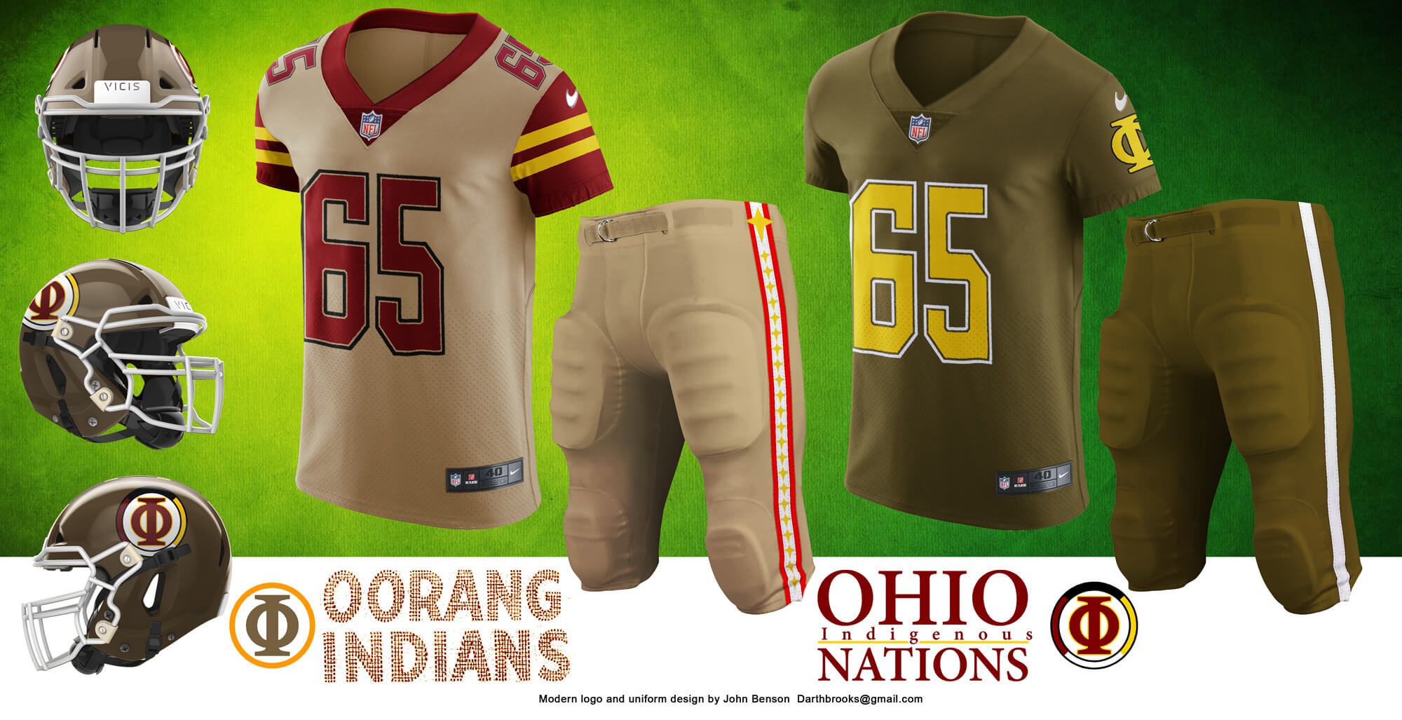
Oorang has one of the strangest stories the NFL has ever seen. Founded to promote a dog kennel, the team was made up of an entirely Native American roster. The modernization features the only name change. If they had survived at some point the connection to the kennel would have been dropped in favor of Ohio and then the Ohio Indians would have been changed again to the Ohio Indigenous Nations.
Racine Legion
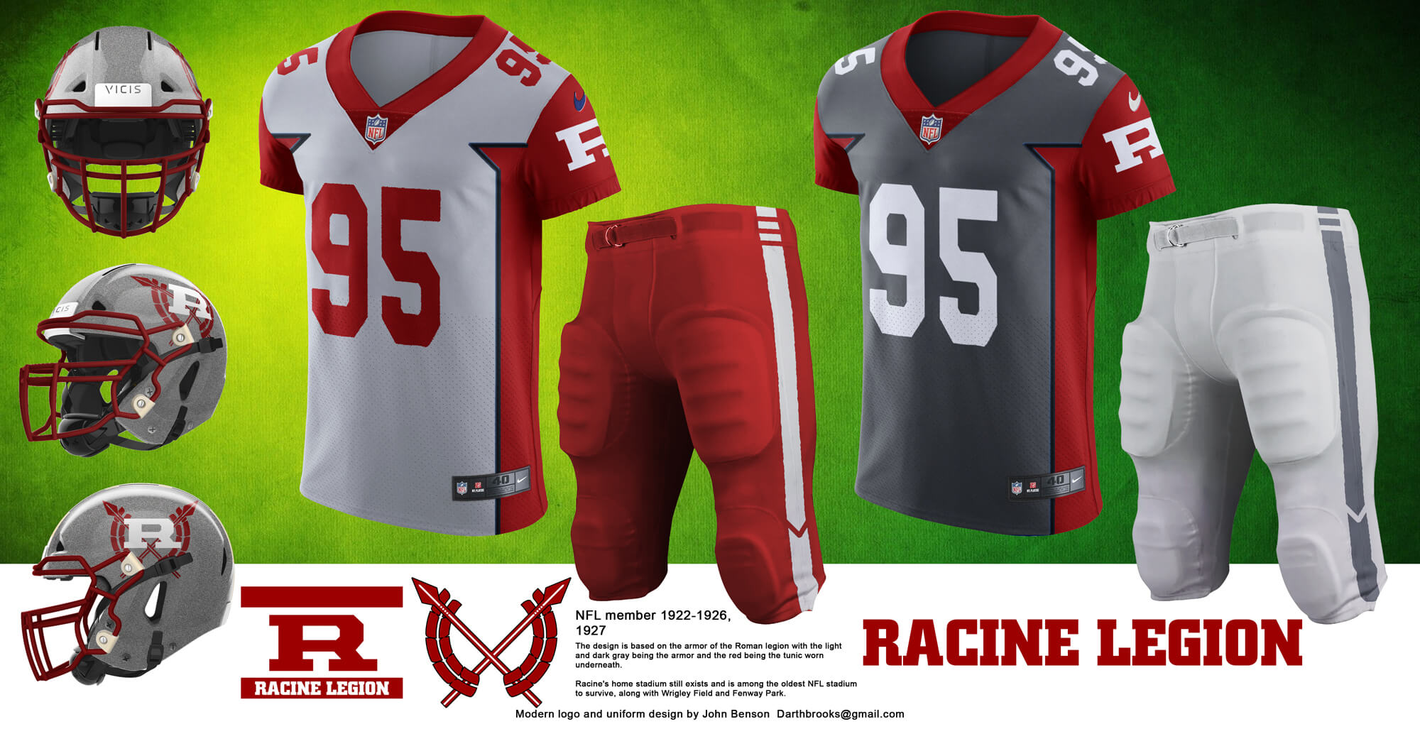
Racine’s uniform and logo take clues from the Roman legion. The grey represents the soldier’s armor, the red represents the red tunic under the armor. One of the unique features of this design is that the red is the same on both the light and dark jersey.
Pottsville Maroons
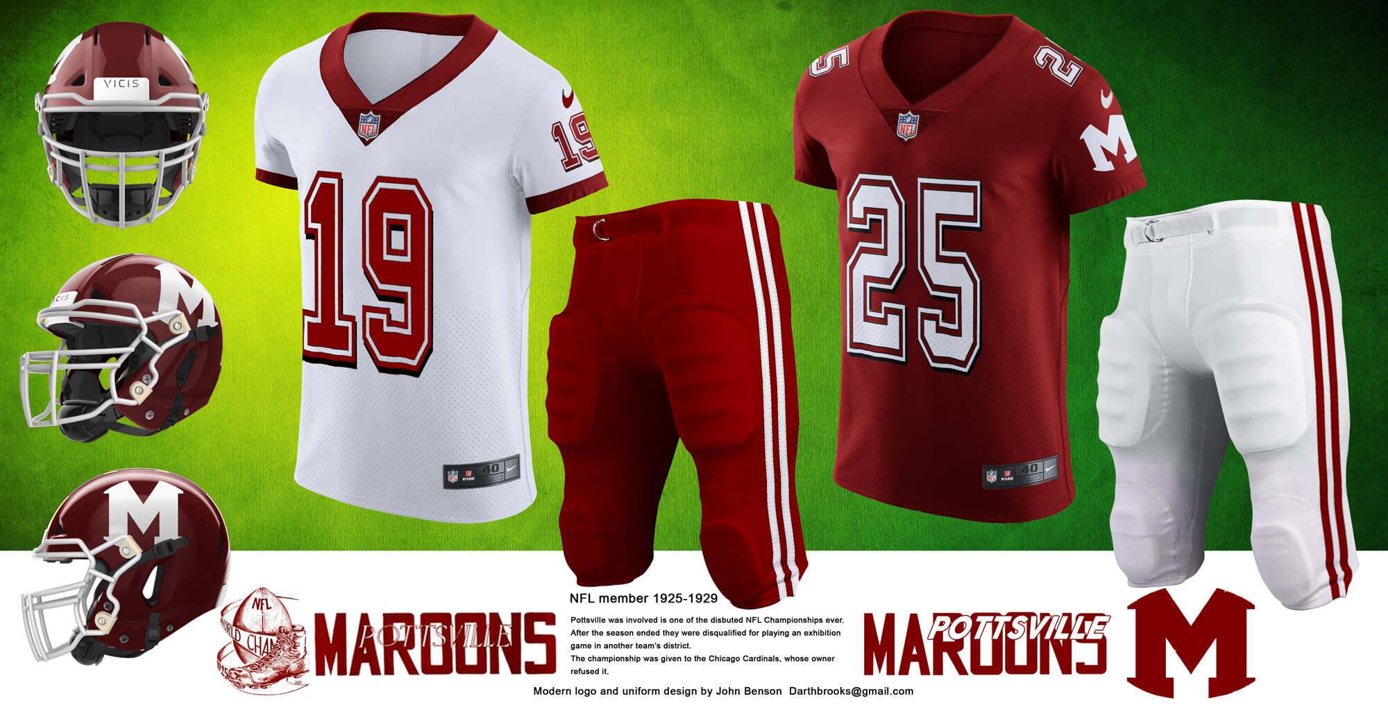
The Maroons logo was a complex image of a foot kicking a ball. For a modern logo, I made a simple M confined in the shape of a football.
Orange Tornadoes
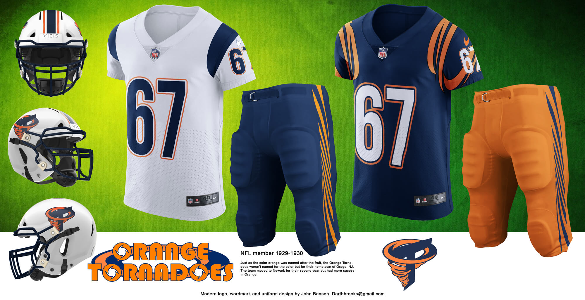
The Tornadoes had a crude orange tornado that I redesigned to wrap around a T and also include a football shape in it’s center. The wordmark is also new.
Buffalo All-Americans
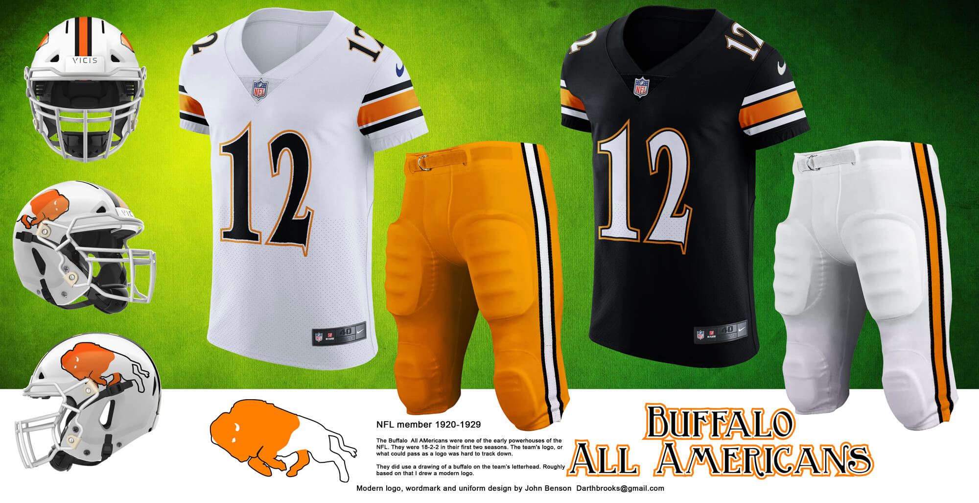
Buffalo features another new logo. It’s partially based on the image of a buffalo on their letterhead. It took some multiple attempts to get something that looks like a solid logo.
Dayton Triangles Modern
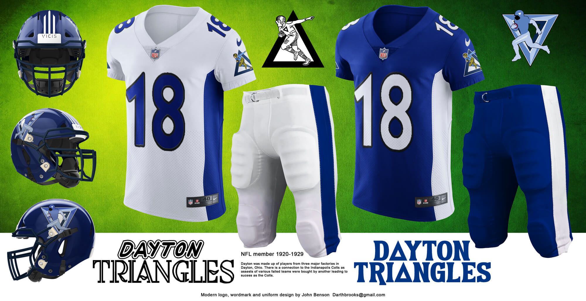
Dayton had a logo of a player running with a football within a triangle shape. If the team had survived it’s very likely that the player would have been updated as the decades went by. The modern version of the tyeam features this modern player and a stripe that goes from the arms to the knees.
Dayton Triangles Retro
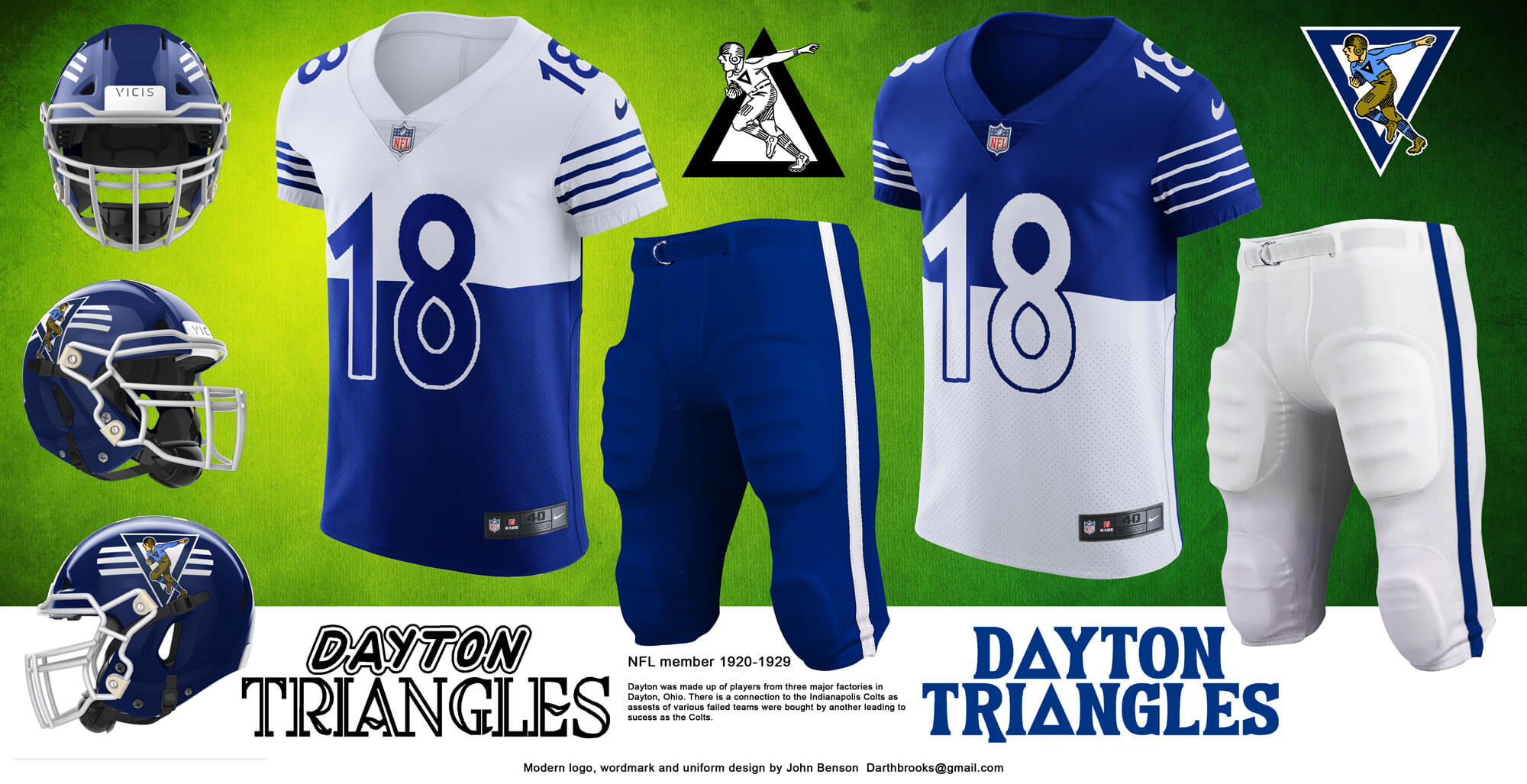
This jersey is a more direct translation of the historic Dayton Triangle’s uniform, including the split colors. It used the historic Dayton logo in the throwback logo. The Triangles used blue for the uniform color just as the team that may be linked to them, the Indianapolis Colts, do today.
And that’s it for Part I — thanks, John! We’ll take a look at the rest of your recreations later on this morning. Readers? What do you think?



Concepts are beautiful, can’t wait to see the rest.
One minor beef: the Frankford Yellow Jackets wore Philadelphia’s city colors, which were based on the Swedish flag. That blue is too dark.
They started with a darker blue. link 4 I tried using a lighter blue but it didn’t look right. Philly went that route and it was awful.
Hmmm. Good find and thanks for the knowledge. I assumed that if Philadelphia teams wanted to go the Pittsburgh route, they could. The Union do a pretty good job with their flash kit. The Eagles did not.
Enjoyed it
GTGFTU
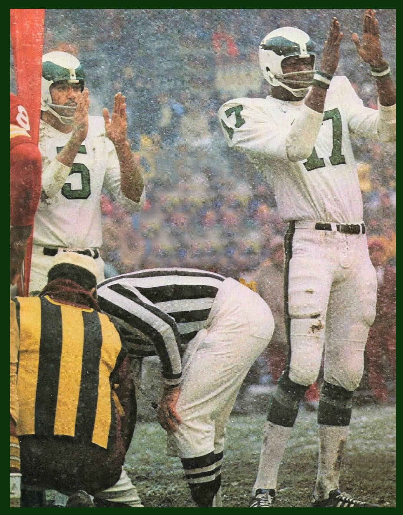
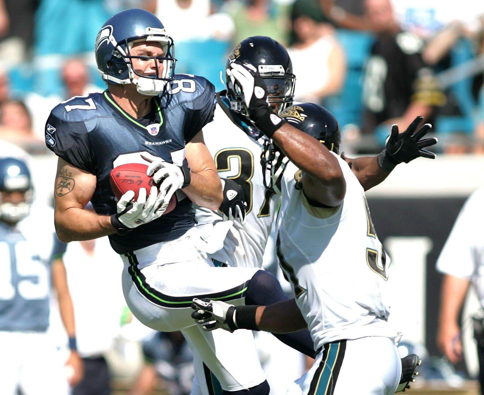
Opening week 2005. Jags vs Seahawks
Great concepts! A fun little history lesson as well!
*Bison
Love your work. Always learn something.
Buffalo and bison aren’t the same. No buffalo in the USA.
Your depiction of the Buffalo All-Americans is of a bison.
I bring it up since you stated you created it.
Hope you had a nice Thanksgiving. Keep doing what you do.
While it’s more correctly called American Bison, at the time the term Buffalo was common. As the song says, “Give me a home where the buffalo roam”, not “Give me a home where the American Bison roam.”
Staten Island Stapletons???
Stapleton is a neighborhood on Staten Island. The “Stapletons”, named after the neighborhood they played in, started as a semi-pro team in 1915. They joined the NFL as a pro team in 1929. Their last year in the NFL was 1932.
Make the Ohio team just The Ohio Nations. The first peoples probably didn’t consider themselves indigenous, but they had a sense of being separate nations.
GTGFTS:
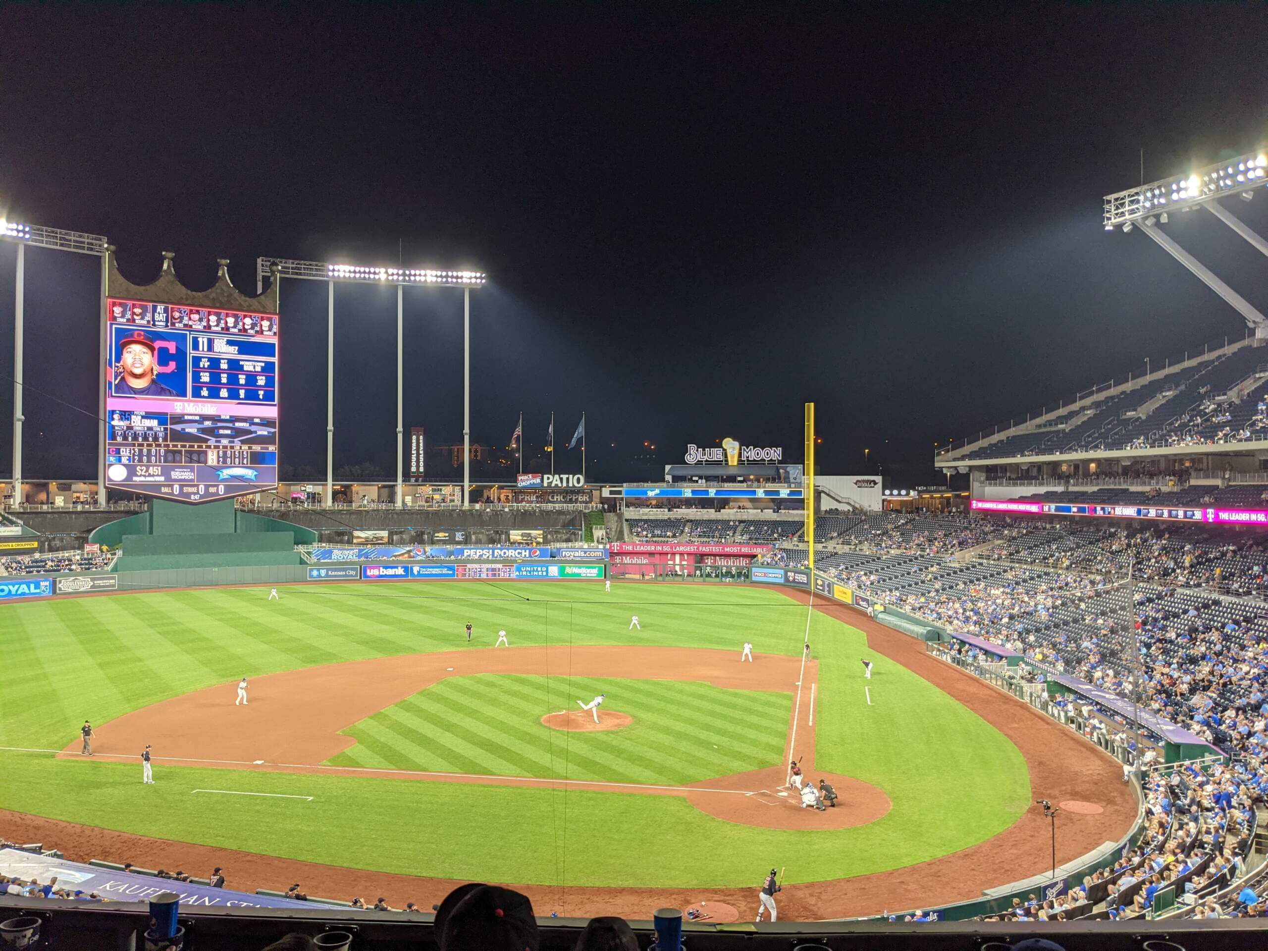
Cleveland @ KC
6-4 Royals
Sept. 28, 2021
This is one of the most random, meaningless games there are. Nicky Lopez tripled in the go-ahead run in B8, then scored himself on a WP.
Great concepts except for the colored side panels on the jerseys. That is a no no with any sports uniform except for basketball.