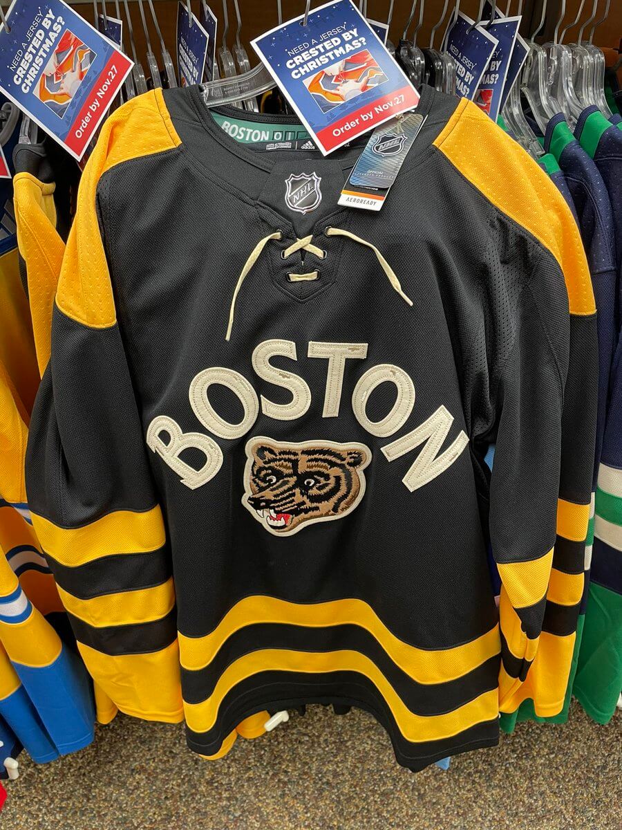
The jerseys for this season’s NHL Winter Classic are scheduled to be unveiled on Friday. But as is so often the case, a retailer has jumped the gun and given us an early view of one of the designs.
The photo you see above was taken by a Uni Watch reader at a store in Canada. It is, obviously, the Bruins’ Winter Classic jersey. The basic design is no surprise, since the bruin’s head logo and “Boston” lettering were both included as part of a Winter Classic logo set that was unveiled three weeks ago. Still, it’s nice to see the full treatment, especially with all those stripes. (For the history-minded, the bruin’s head was originally used as a shoulder patch from 1976 through 1995. This is its first appearance as a full-fledged crest.)
Here’s a look at the inner collar, which is based on the scoreboard at Boston’s Fenway Park, where the game will take place:

No leaks yet for the other Winter Classic team, the Penguins — at least so far.
The Winter Classic will be played at Fenway Park on Jan. 2. The league is deviating from its usual protocol of holding the game on New Year’s Day because Jan. 1 falls on a Sunday, so they don’t want the Winter Classic to conflict with NFL games.
(Special thanks to the anonymous reader who took these photos.)
The ***AHEM*** “vintage white” being constrained to the wordmark, the laces (which I would just yank out 1973-74 Bobby Orr style), and presumably the numbers and NOB doesn’t bother me too much.
I am just anticipating loathing Pittsburgh’s sweater if “vintage white” should be the base. Then again, I’ve commented often over the past decade-plus about how much I don’t care for the artificial dirtying of hockey jerseys to make them look fake-old. It’s less annoying to me if it’s constrained to trim and yellow-adjacent (see the 2010 Bruins WC and the Sabres 40th jerseys), but otherwise, it tends to stand out like a sore thumb, especially if the base color is that color (see 2012 Rangers WC). I’d kind of hoped we were moving away from that trend… but I guess not.
I’m picking nits here but the Bruins switched to a V-neck sweater in 73-74 so you were imitating Bobby prior to that season.
I know that’s an incredibly nerdy and anal comment but, hey, this is Uni-Watch! :)
You’re right, I sometimes forget about the 67-74 yellow-shoulder jerseys having V-necks in their final season, 72-73 it is!
It looks like the Leafs Reverse Retro in black and yellow. Disappointed because the Bruins have a rich jersey history with unique striping they could have drawn on. The wordmark and logo look good as well. Missed opportunity in my opinion.
This lettering & logo layout is reminiscent of a vintage Boston University jersey design.
link
Not a Bruins fan but I like it. Nice striping, lettering, logo and the Fenway Park scoreboard in the collar.
I always love seeing collar laces that actually lace up, rather than being elastic bands or just fake accoutrements to look like laces.
It’s a good sweater.
“Leaked” Stop trying so hard with your verbiage. When you post a picture of a jersey on a retail rack one can assume it was long ago “leaked”
It’s the first time we’ve seen it, and it’s several days ahead of its official unveiling date. So yes, that’s a retail leak.
That’s not “trying so hard”; it’s pretty standard throughout the uni-verse.
The fact that the Bruins have never worn a throw back with just a uni number on the front and back is a travesty
link
This jersey looks better than I anticipated. Hoping the Penguins jersey exceeds expectations too. Like the shoulders and the Fenway touch on the inner color is sharp
Against all odds, the much-maligned “Pooh bear” logo currently residing on their Reverse Retro jersey is somehow not the worst bear head logo this team is currently wearing.
This jersey is nothing if not an emphatic testimony to the power of nostalgia. This particular bear is objectively one of the most poorly designed logos in the history of the NHL. (Just look at the proportion of his muzzle to the rest of his face!) But because the team wore it for a long time, people are now happy to see it come back just because.
SO disappointed in these. The crest is nice, but the striping seems so…. cheap looking. Like something you’d find at TJ Maxx.