Time for more Uni Tweaks from the UW readership.
I hope you guys like this feature and will want to continue to submit your concepts and tweaks to me. If you do, Shoot me an E-mail (Phil (dot) Hecken (at) gmail (dot) com).
Today’s concepts come from John J. Woods. These were actually sent on three separate dates, but I’m showing them all here in one shot for a giant JJW concept section!
Phil,
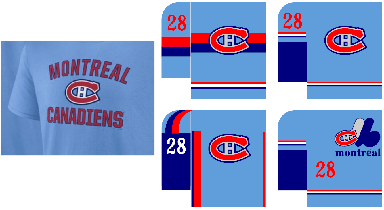
Expos/Canadiens Concepts
The baby blue Special Edition Wheelhouse leak with the Expos tribute.
Concept in upper left looks to be best of both teams. Upper right is Jarry Park years.
Lower left has the number not over racing stripes. Lower right has the Frankenlogo. EeeeekJohn J. Woods
Phil,
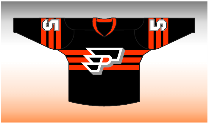
Flyers concepts.
Flyers logo where you see the F…then the P…then the F…
Originally meant as an alternate, like those FOX jerseys from the 90s.
Striping follows the three stripes in logo. Orange and black versions.
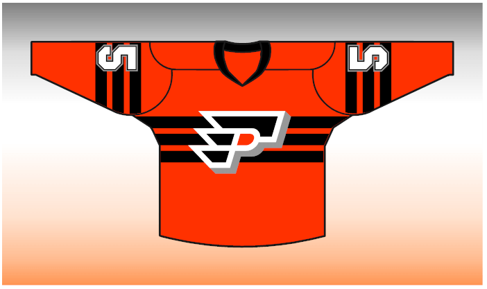
White jersey has striping go under the logo but also created a standard jersey with lower stripes.
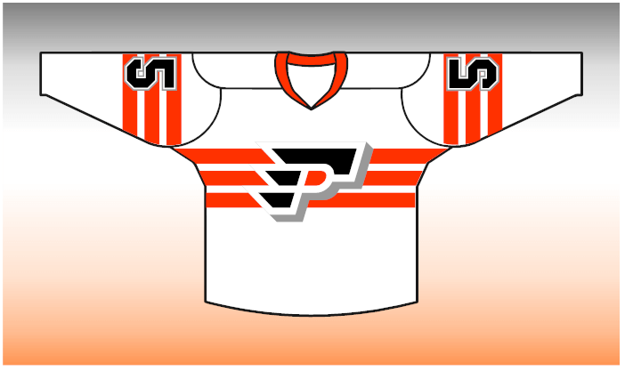
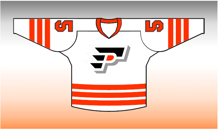
The Canadiens have dark striping on a dark jersey but not on their standard white (to make back number more readable).
Also, I like where one jersey is not identical to others, like the 80s Viking jerseys.
Sadly, this jersey may be too “adidas-like” with three stripes in the same color, same width.
John
Phil,
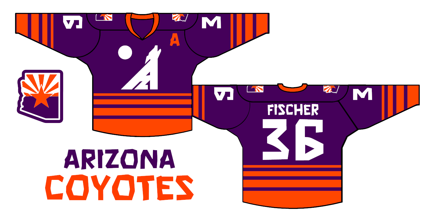
AZ Coyotes concept
Start with the Suns’ purple and orange. D-Backs should use it too. It’s Arizona’s.
The body of the baying coyote is made up of an A and a Z. The vertical and diagonal lines continue up to form the open mouth.
Yes, we are sewing a white cloth circle on the front of the jersey, separate from the logo.
I looked up a “desert” font and got Rock Boulder. It’s legible and it works, since the numbers, name and logo are the only white on the body of the jersey. State outline with flag on shoulders.
The jersey is a desert night scene. There is no option for a white jersey.
John
OK readers (and concepters). If you have some tweaks or concepts, shoot ’em my way with a BRIEF description of your creation and I’ll run ’em here.
That Coyotes logo is terrific. Complex and simple. Cool work. -C.
Who do you think you are? I AM
I like all of these, upper left Expos/Canadiens, and the first white Flyers jersey are favorites, really like how the Flyers logo integrates with the orange stripes, and the black numbers on the sleeve stripes.
Not a Coyotes fan. No link to Arizona whatsoever. But this is a solid concept. Creative, thoughtful, and distinct. I absolutely agree it would be good for all Phoenix area teams, and maybe other cities should take note, to adopt a single scheme.
Well done!
Flyers jersey looks too much like a gun. Would never “fly”. I feel it’s like one of the once you see it you can’t unsee it
Is it a gun pointing down? A gun pointing right with spikes in your palm?
I don’t see it, but I’m from Buffalo where professional designers spent a lot of time perfecting logos that looked like a goat head and a slug.