
Time for more Uni Tweaks from the UW readership.
I hope you guys like this feature and will want to continue to submit your concepts and tweaks to me. If you do, Shoot me an E-mail (Phil (dot) Hecken (at) gmail (dot) com).
We have a few concepts today. The first come from Andrew Wagner:
Hi Phil,
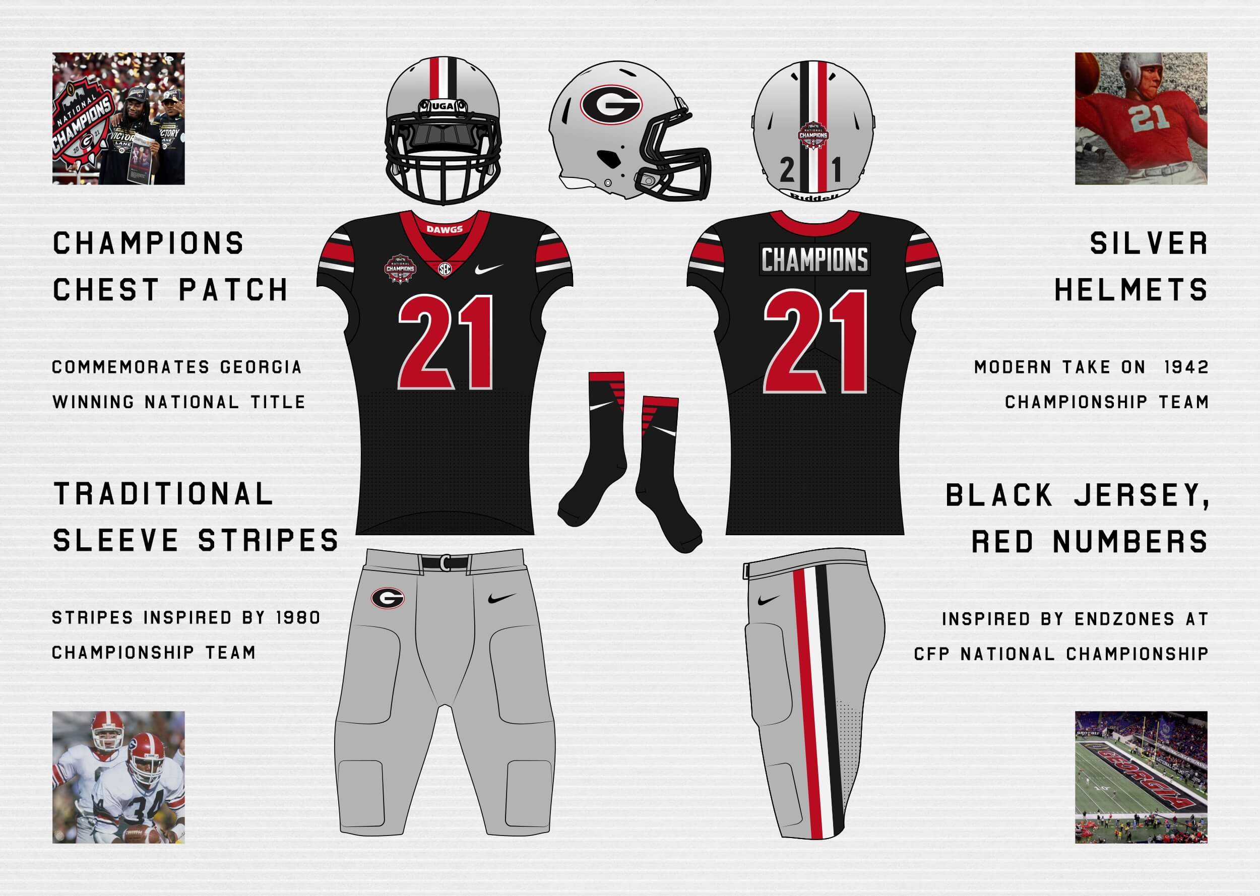
I’d like to toss my concept into the ring. With college football underway, I’ve a special design to commemorate Georgia’s first national title in four decades. The design takes various sources of inspiration from all three title winning teams in Georgia’s history (1942, 1980, and 2021) to create a unified look. I created this before it was announced the team would revert back to classic block numbers. The “Bulldog Bold” numbers seem fitting, though, as that’s what the team wore when they defeated Alabama 33-18 up in Indy. Go Dawgs!
Thanks,
Andrew Wagner
Next up is Trey Gorman:
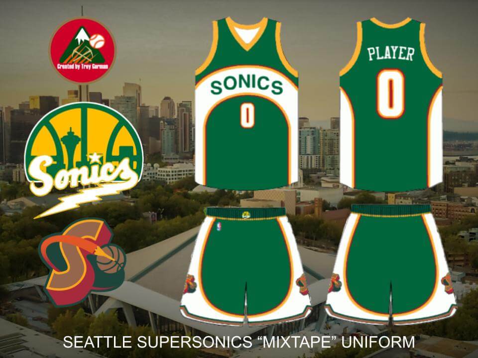
Hi Phil! For the NBA’s 75th season, teams had a uniform which was a mashup of their past uniforms. So, I decided to create one for the now defunct Supersonics. The base of the uniform is based off their uniforms from 2001-2008. The base color of the lighter green is from their unis from 1977-1995, as is the wordmark. The darker green on the waistband is representative of the darker green used from 1967-1973 and 1995-2008. A bit of maroon is added for the 1995-2001 look, as is the number font. The plain yellow trim on the arms and neck is from their 1973/1974 unis. The logo on the belt is a mashup of their 1975-1995 primary logo and their wordmark from 1967-1969. Finally, the logo on the shorts is a mashup of their 1995-2001 alternate logo and 1967-1970 primary logo.
Trey Gorman
OK readers (and concepters). If you have some tweaks or concepts, shoot ’em my way with a brief description of your creation and I’ll run ’em here.
It was incredibly sad as a Sonics Fan back then watching them go to the finals with those terrible Christmas colours and word art on steroids look!
Sadly, it was part of the Association’s 1990s “let’s change a good logo to a s—ty logo” phase.
One day (hopefully soon) the Sonics shall return!!!
McKinney
Would be look better/worse/same if the top and bottom outlines of the white area of rhe wording part were as thick as the armhole and neckhole trims?