[Editor’s Note: Paul is on his annual August break from site (although he’s still writing his weekly Bulletin column and may pop up here on the blog occasionally). Deputy editor Phil Hecken is in charge from now through the end of the month.]
A good Wednesday morning, Uni Watchers. Today’s my last day manning the UW helm for August weekdays. I’m sure there are some of you who are just as happy as I am that Paul’s returning tomorrow! It’s been a fun month, but it was also a grind — I’m glad it’s almost over.
To close things out, this morning we’ll have a final guest article, this time from long time reader Kyle Campbell, who kinda-sorta has a Part II to an article he penned more than five years ago (he links to it below), and it’s on possibly one of the quirkiest of the quirky “uniforms” out there: unicycle basketball! Yes, you read that right.
It’s pretty intricate, so I’ll just stop here for now. Please enjoy Kyle’s…
UNICON 20 Overview
by Kyle Campbell
The 20th World Championships of Unicycling — ‘UNICON’ — wrapped up in Grenoble, France earlier this month. Nearly 1,900 competitors from roughly 40 countries registered for the event. Normally a bi-annual event, this was the first UNICON since 2018, when the event took place in Ansan, South Korea. Longtime Uni Watch readers might remember my preview of UNICON 18, which took place in 2016 in San Sebastián, Spain; today’s entry serves as a “Part II” to the chronicling of the athletic aesthetics of unicycle basketball.
This year there were 12 teams competing for the title of ‘Monocycle Champion du Monde’. Eleven teams hailed from France, and the lone international entrant was the United States contingent — Calfrico.
Calfrico Section
“Calfrico” is a portmanteau of “California” and “Puerto Rico”. Our eight-person team consisted of a California-based contingent and one player each from Puerto Rico and Italy. The team’s experience ranged from someone attending their 18th UNICON, to two players who were attending their first.
Our logo was designed to mirror our name; it combines the typically representative bear of California with the similarly beloved rooster of Puerto Rico. The crown atop the RoosterBear’s head is a homage to the King Charles Troupe. The RoosterBear is dribbling a ball, and I think it serves as a solid base with which the ‘brand’ could hypothetically expand depending on the sport or context.
The King Charles Troupe, and unicycle basketball itself, was founded by Jerry King from the Bronx, New York. He named the troupe after his son Charles, and they went on to become a very successful circus act and were inducted into the Circus Ring of Fame in 2020. Their uniform history is colorful and merits a Uni Watch article of its own!
Calfrico’s uniforms were white with red and navy blue accents. The basketball helped anchor a 13-item ring that encircled the RoosterBear on the the front of the jersey (12 stars and 1 basketball). The neckline and quarter-arm side panels were rendered in the navy blue. Five larger stars lined each side of the shorts.
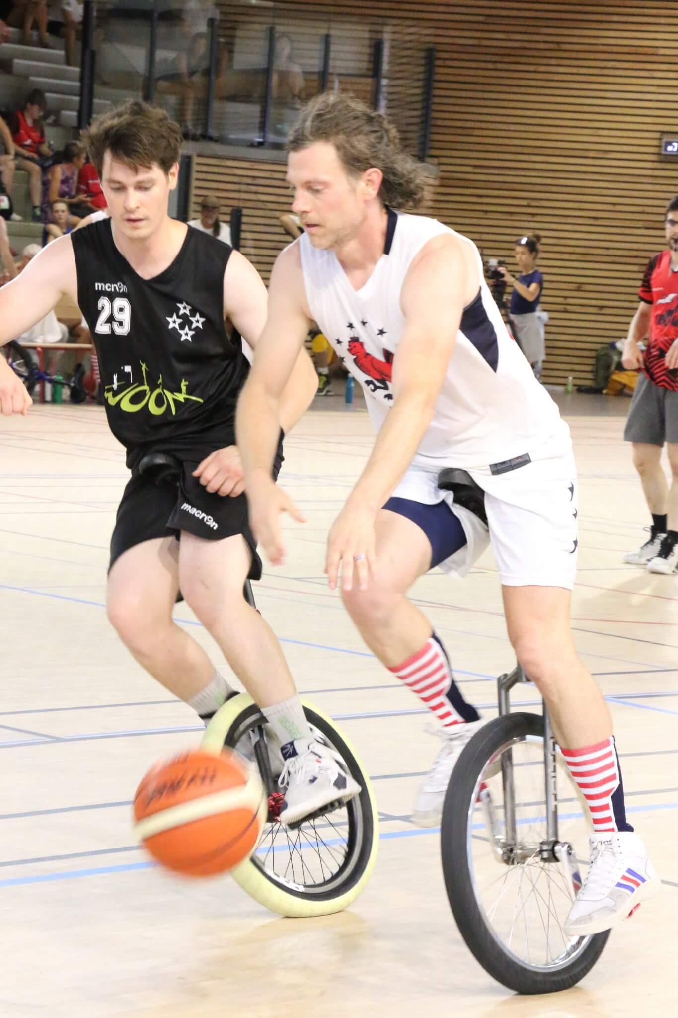
The NOB and numbers on the back of the jersey were in a classic athletic font and were printed in red. Some players chose with nickname-on-back, some had first-name-on-back, and others went with last-name-on-back; all three are common in the sport.
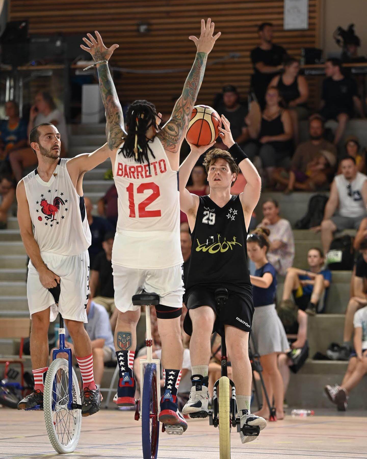
Last but not least, the players of Calfrico all had matching mid-calf socks. The backs of the socks had three bars and four stars, and the fronts of the socks had a red-and-white striped pattern. The socks reminded me of the infamous New Orleans jerseys where the overall vibe and presentation depended if you were looking at players from the front or back. Additionally, the socks (red front, blue back) inverted the main pattern of the jersey (red back, blue front), ensuring a healthy mix of red and blue whether viewed from the front or back.
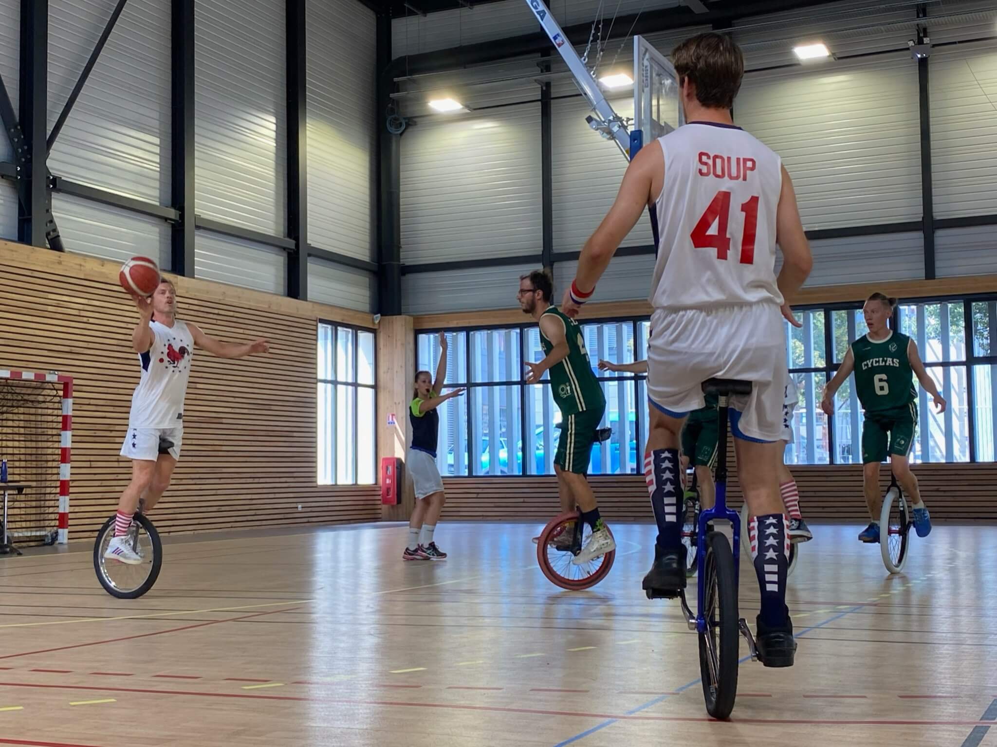
Calfrico went 10-3 in the four-day tournament and defeated Woom Blanc (more on them later) in the bronze medal match. Given that we had three different native languages (English, Spanish, Italian) and didn’t meet until gametime, we were happy with the results. It was satisfying to come home with actual hardware; something notable about the medals is they still have “UNICON 2020” printed on them, yet another temporal quirk in these crazy last few years.
Cycl’as Section
The silver medalist team – Cycl’ass – drastically rebranded their uniforms between UNICON 19 and UNICON 20. Some readers might remember their loud and ‘swirling’ uniforms from before. Where Cycl’as’ uniforms used to be some of the most wild and daring, they are now among the most traditional.
I would describe their rebrand as a mix between the Milwaukee Bucks and Iowa State Cyclones. I think their vertically arched wordmark was heavily inspired by the Cyclones current set. Cycl’as had both cream and forest green jerseys, and wore green when they were ‘home’. Both sets consisted of only two colors, the base with names and numbers in the other color.
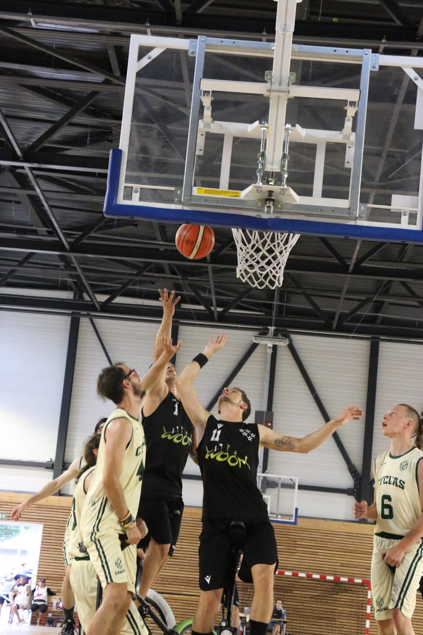
They had block athletic numbers centered both on the front and back of their uniforms, a logo on the front chest of their uniforms, and I think (but am not sure) it is something that represents their larger club.
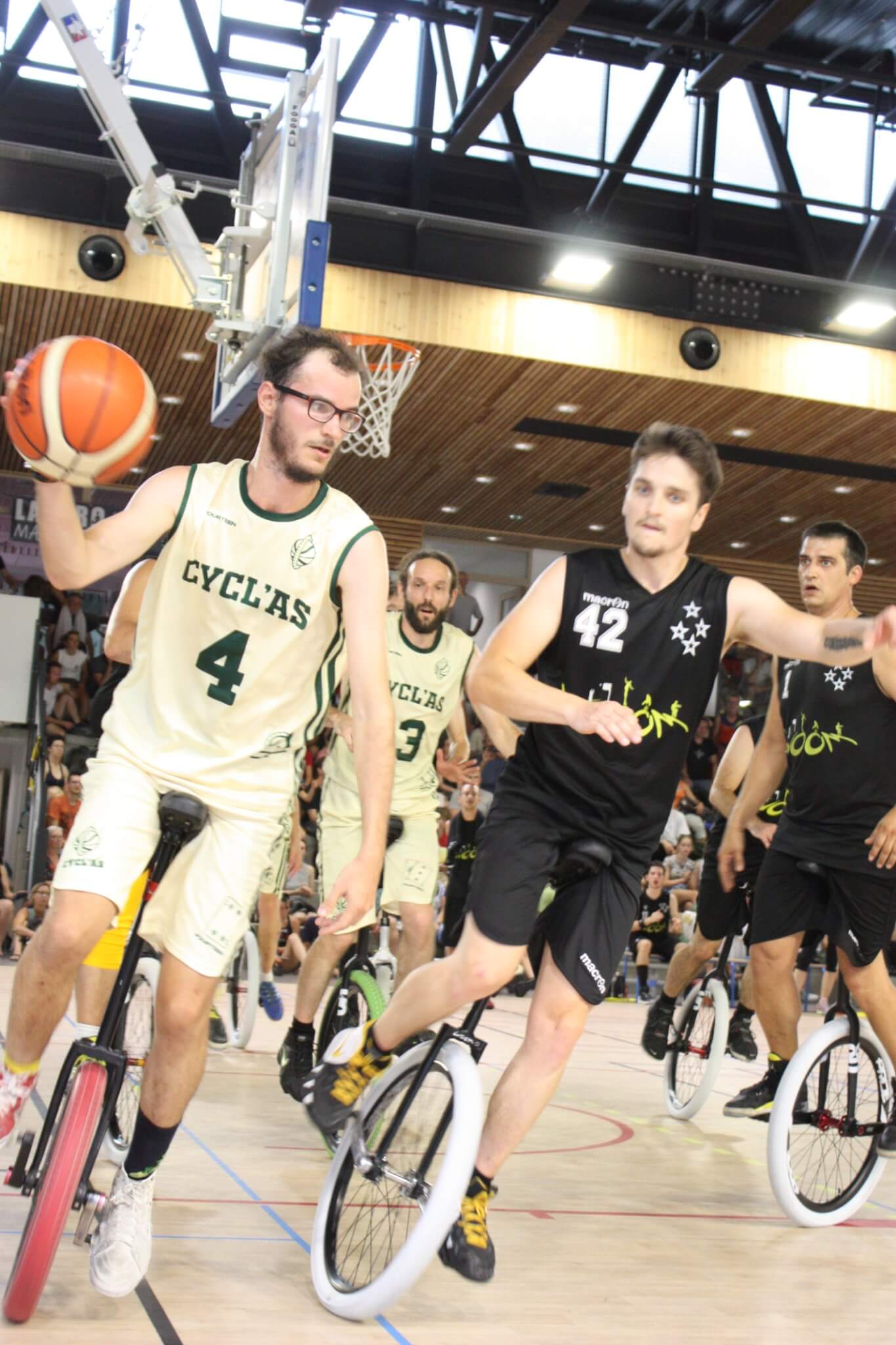
The NOBs were straight. They had a double-stripe running the length of the sides of the uniform. One of the younger teams in the top of the sport, I find that their rebrand seems to have coincided with growth in their game and players (they all seem taller!), and it was quite a surprise to see.
Woom Section
Woom Noir (Woom Black) defeated Cycl’as in the gold medal match 50-48. Woom came to UNICON from just up the road in Lyon, France. Given the proximity, Woom brought their ‘B’ team Woom Blanc (Woom White) as well as a large fan base. In a first for them, Woom placed both of their teams in the semi-finals.
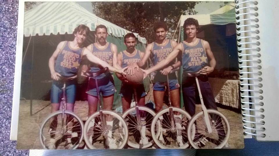
With the win, Woom Noir has now won six gold medals in a row, a streak that began in 2010. Going into UNICON they were tied with the Puerto Rico All-Stars for the most consecutive UNICON championships at 5. Puerto Rico was dominant in the ‘90s and early 2000’s, and their colorful uniforms deserve an entire Uni-Watch entry themselves.
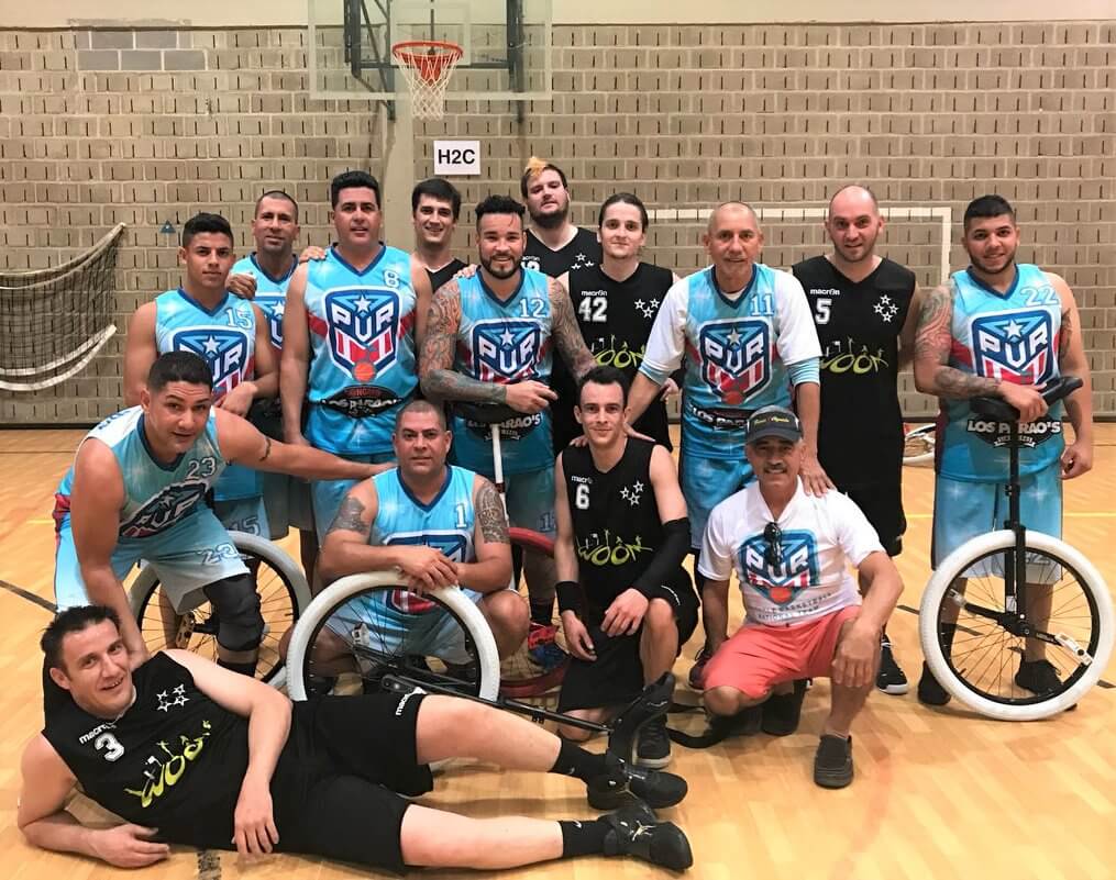
Throughout their streak, Woom has been adding stars to the left-chest area of their uniforms for each championship. Although they were sitting on five championships, Woom players on both teams wore jerseys with varying amounts of stars throughout the tournament.
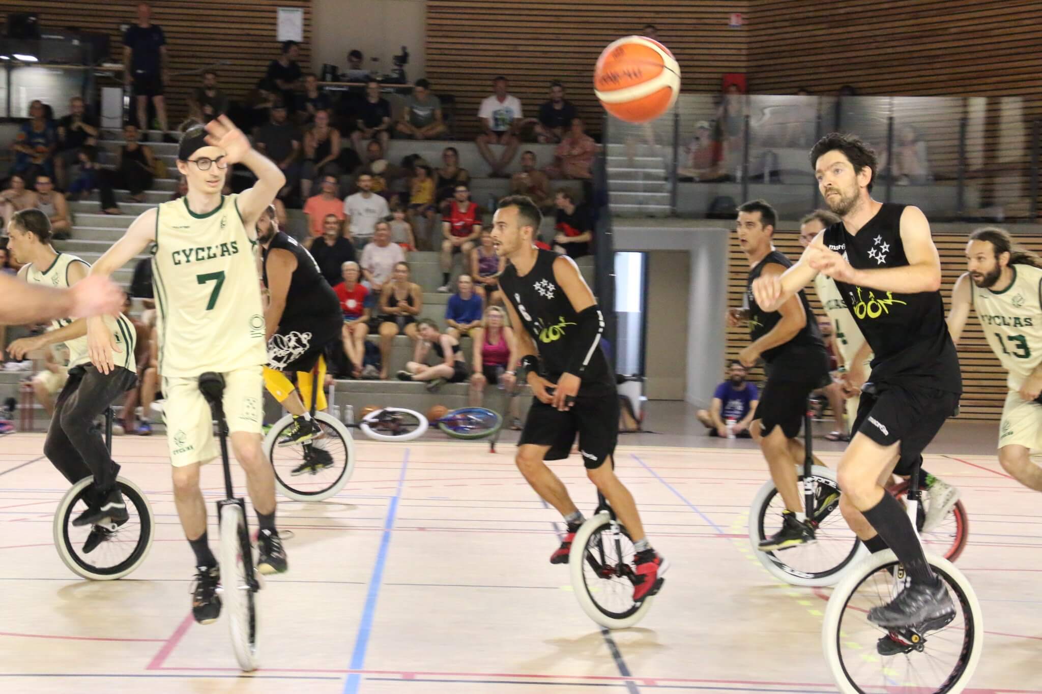
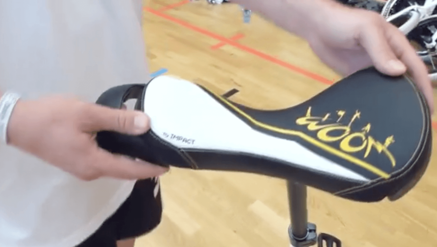
Their look remains largely unchanged from 2016 and 2018. The black jerseys feature a yellow wordmark and NnOB. Their white uniforms have black word mark and NOB. Their numbers are a block font with a thin outline. One interesting aspect about Woom is that their uniform consistency extends to their unicycles, with embroidered saddles and machines tires.
The Woom teams were confusingly interchanged during their semifinal. Woom Noir wore white and Woom Blanc wore black. This is due to all of the players receiving a main uniform (black) while usually only the ‘A’ team players require a second uniform (white) in tournaments.
Finally, there were aspects during UNICON of remembering Woom’s founder and captain, Olivier Dupre, who tragically passed away last year.

Olivier was a part of the original group that eventually became Woom, a group that lost 44-0 against Puerto Rico in China in 2000. Upon returning to France he motivated and led a dramatic growth of Woom, and unicycling in Lyon in general.
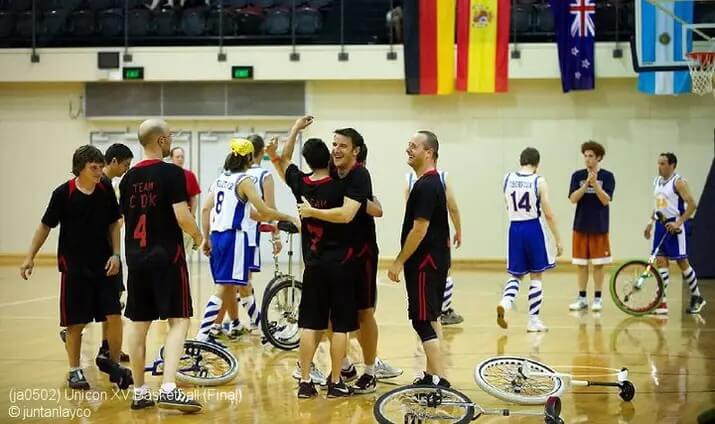
His #3 uniform hung from the wall during Woom’s intra-team semifinal and was present in UNICON ceremonies. There have been petitions to the League du Monobasket (LMB), the sport’s European organization, to change the sport’s logo to an outline of ‘Nene’, and some players wore added this logo to their uniforms.
The King Charles Troupe and the Puerto Rico All Stars
As mentioned earlier the King Charles Troupe basically founded the sport of unicycle basketball. Their history has been chronicled extensively elsewhere and they have quite the colorful uniform history. Today’s lede photo comes from when Jerry King gifted a unicycle to Bill Russell after a game in the 1960’s.
The Puerto Rico All Stars, once the dominant force in the sport, continue to inspire and motivate players across the world. They have an extensive uniform history, and the scene in Puerto Rico is still very active. Clubs from different towns have carried on the tradition and uniqueness of the islanders’ uniforms.
Additional Teams
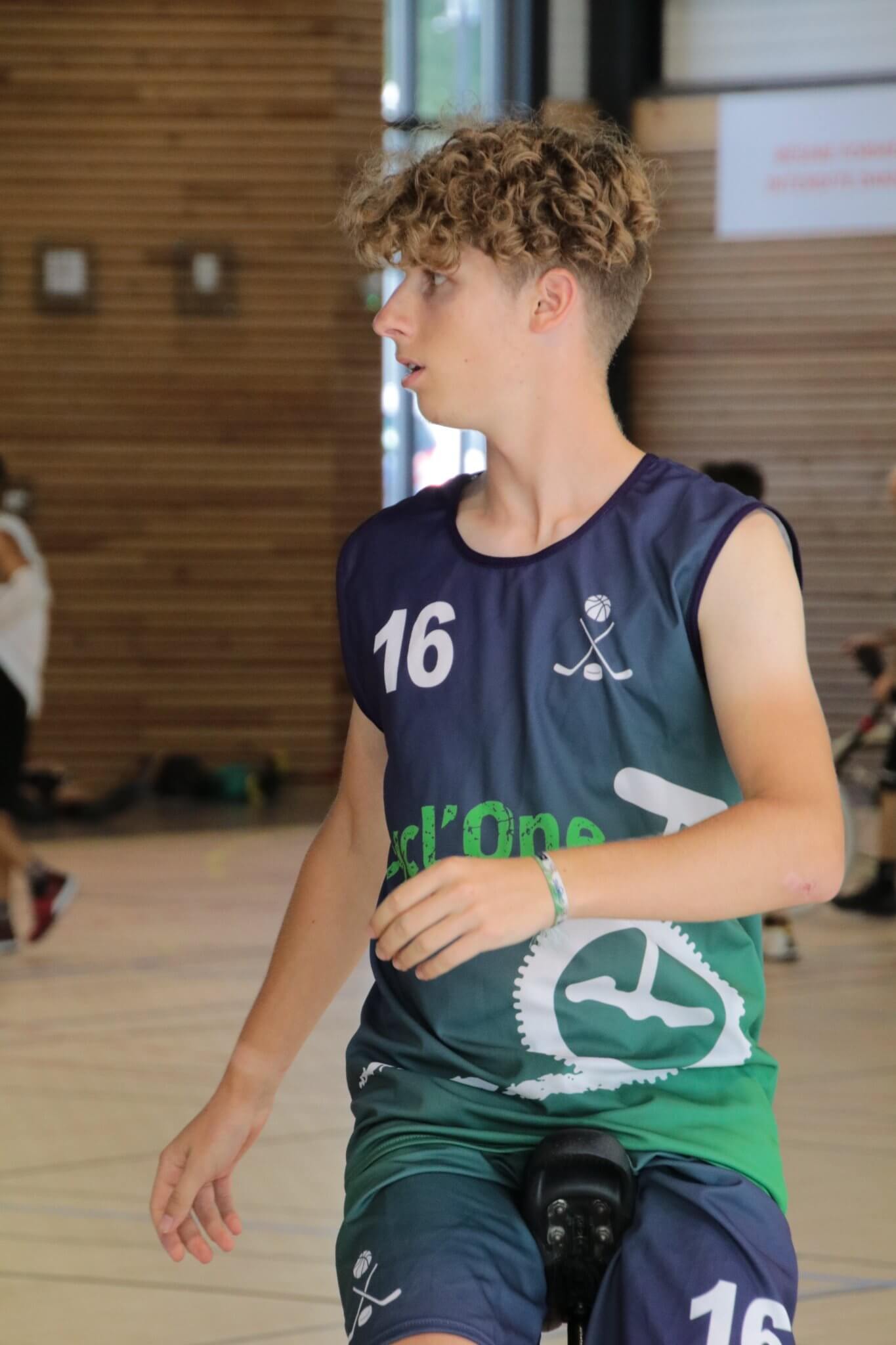
Some new entrants at this UNICON included Cycl’One. Cycl’One – which works as both “cyclone” and “cycle one”- is Cycl’as’ ‘B’ team. Their color scheme still included blue, which pairs nicely with the green and cream of the main team. Cycl’one’s uniforms, in a reflection of their players, included visual references to some other events at UNICON. A hockey stick and and a sublimated mountain-unicycling reference shows how Cycl’Ones players compete in other events. They were a tough team with excellent riders, and I believe their players earned medals in many other disciplines at UNICON.
Flip Flap was a new team from Paris. Their black-and-yellow color scheme was applied to uniforms that had organic ‘lava’-looking veins running horizontally.
Many of the other teams, including Troubadour, Roule Ta Bille, Rennes Monostars, and Anima’Fond, came to UNICON 20 with looks that were unchanged since 2016.
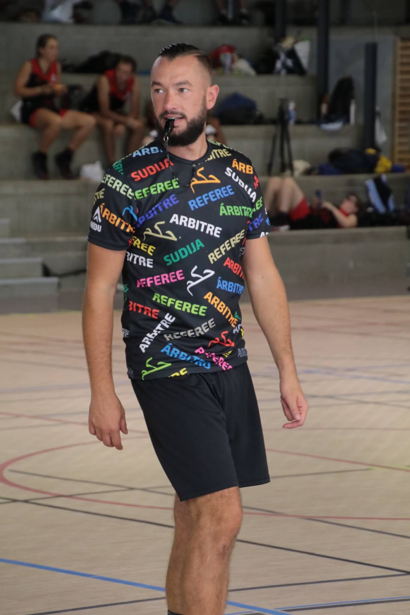
Finally, the hired professional referees wore these tops given the mix of colors and languages at UNICON.
Next UNICON
The International Unicycle Federation (IUF) selects the UNICON host cities. Recently the pattern has been an eight-year cycle, where the location alternates as Europe – North America – Europe – Asia. The last North American UNICON was in Montreal in 2014, and North America is once again up to host in 2024. Although things can change, it is likely that UNICON 21 in 2024 will be held in Minnesota. American Uni-Watchers will get have a chance to catch this sport, and all of the other events, in person in late July and early August 2024!
The United States-based players are already talking about team formations and figuring out who can represent the United States at UNICON 21. It will be interesting to see what the American uniforms look like in Minnesota – will they be based on the SLO Ballerz, Calfrico, the Berkeley Revolution, the Minnesota Timberwolves, or something else entirely? Finally, it will be interesting to see which European teams (possibly the Belgians, Italians, or Swiss?) attend and what rebrands, tweaks, and additions they’ve made to their uniforms by then!
Thanks, Kyle. That was a fun look at one of the odder sports out there! Good stuff!


Thanks for all the work this month Phil!
Those “fan made broncos uniforms” are just their old uniforms. As usual. I’m tired of people harping on a return to what they used to wear. Yes they need a redesign in a bad way (only the Seahawks are harder to look at). Yes they could stand to tone down the orange and navy (preferably by just mixing in a little more white), yes their old uniforms were better (but only because those damn armpit slashes on the current jerseys are so dumb). But frankly their old logo is just another awesome retro logo that had its day and does not need to return full time (hello pat patriot and bucco Bruce). Their new logo is so much better, and it was the archetype for the modern nfl logo and still remains the best of those redesigns. Yes they need a new look, but I’m so tired of “the old look” being the favorite option, or being touted as a new look.
Sorry. I’m grumpy this morning.
I followed out the tweet- this is just the throwback from the creator’s concept set. His primary uniform concepts use the current logo on a metallic royal blue helmet with the throwback white/orange/white stripes. The jerseys are a nice mashup of the 1965/66 jerseys with the contrasting sleeves and the “mountain range” hem stripes from the Avalanche’s sweaters. He’s got royal blue/orange sleeves a white zigzag stripe separating the blue and orange, orange/blue sleeves(white zigzag) and white/blue sleeves (orange zigzag). Generic stripes on the pants (he’s got white, blue and orange pants). Actually it’s a nice concept; too bad only the throwback is shown in the tweet.
I’ll eat crow on this one. Yes these are a totally new design with a throwback added. Actually I saw basically this design on a sportslogos forum a while ago. Not sure if it’s the same designer (much different template than what I saw earlier) but I’ll definitely eat my words. I do like this concept. The poster on sportslogos actually mocked it up on a player and it looks great, if anyone wants to go look for it.
Well done, Phil! Thanks to you and the whole crew all month long!
I am not into circus acts at all but this unicycling basketball looks very good. I loved that old dunk from the cycle picture.
And Phil, many thanks for being a good caretaker of my favorite website.
Good work this month Phil!
Phil, you delivered another outstanding August. A nice mix of diverse content and not afraid to go outside the box sometimes. Well done!