Time for more Uni Tweaks from the UW readership.
I hope you guys like this feature and will want to continue to submit your concepts and tweaks to me. If you do, Shoot me an E-mail (Phil (dot) Hecken (at) gmail (dot) com).
Hey Phil:
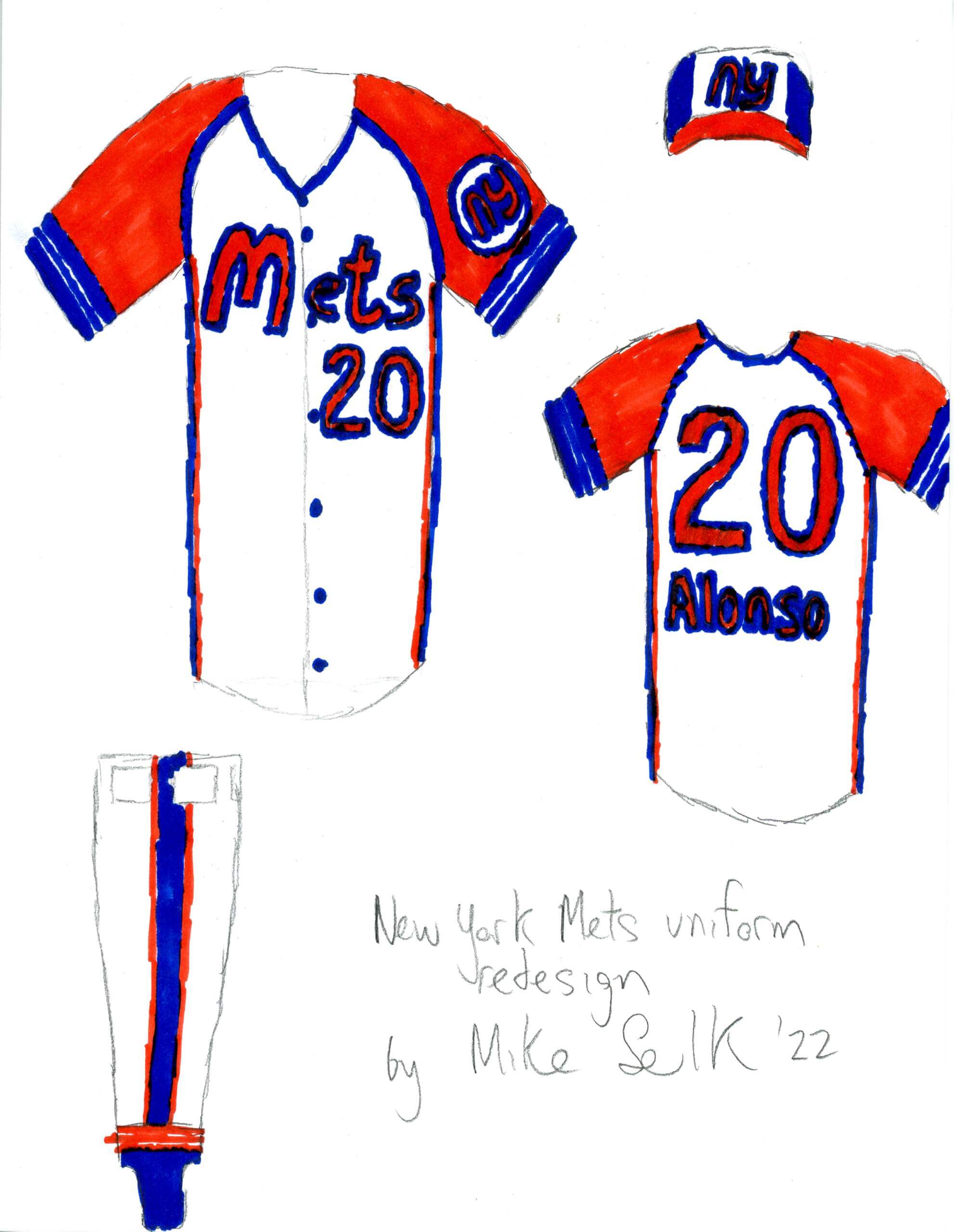
It’s bothered me for the longest time that the Mets uniform hasn’t been substantially altered in the 60-year history of the club. I understand the original concept of the uniform – blue representing the departed Dodgers, orange for the Giants, and pinstripes for the Yankees – but I feel that after all this time the Mets have established an identity and a history of their own, and as such deserve an overhaul of their uniform. I feel that this year could be the beginning of an exciting new chapter for the team and I’d like a new uniform to reflect that.
The new uniform incorporates some design elements I’ve enjoyed from uniforms from other teams. For example, the orange sleeve wings recalling the Braves’ and Padres’ uniforms of the 70’s. A bold new typeface, representing the slight break from the past I’m doing here, and emphasis on orange rather than blue as the primary color. The orange-blue-orange racing stripes down the sides of the jersey and the pants reminiscent of the dominant 80’s teams the Mets fielded. And two features I incorporated from uniforms past that I really liked – uniform numbers on top (a la the 60’s Reds’ uniforms), and player NOB in upper and lower case (from the ABA’s Kentucky Colonels).
Have a grey version for the road uniform (alternately with the lower-case NY logo on the left chest and the uni number on the right), and a black alternate (as an homage to the teams of the 90’s and 2000’s), and you’re all set.
Enjoy!
Mike Selk

OK readers (and concepters). If you have some tweaks or concepts, shoot ’em my way with a brief description of your creation and I’ll run ’em here.
link
I’m not following the logic here. The argument is that the Mets look (which borrowed elements from other NY teams) needs to change so they have own identity, and the solution is to switch to a look based on elements from the Braves, Padres, Reds and Kentucky Colonels?
I was thinking the same thing as I read the article.
I do like the look though.
Very 1970s. I like it.
I don’t like the Mets but I have always liked their look. I give you credit for thinking outside the box but I’m not feeling this. It’s a mishmash of elements appropriated from other teams, and maybe the kitchen apron template from when Reebok made NHL sweaters. Sorry.
A mess. I have always thought a Met home alternate as a cream color like the Giants with the Mets in cursive and NO PIPING.
I really didn’t like the description but the drawing design is good…
Way better than I thought….would like to see some of that UniWatch CG magic on it….