[Editor’s Note: Paul is on his annual August break from site (although he’s still writing his weekly Bulletin column and may pop up here on the blog occasionally). Deputy editor Phil Hecken is in charge from now through the end of the month.]
Good morning, Uni Watchers. It’s Friday — we made it!
Yesterday afternoon, to not much fanfare, the Brooklyn Nets (re)introduced their absolutely classic “Stars and Stripes” uniform — easily their greatest, and one of the greatest uniforms in NBA (and ABA) history. Even ESPN had it ranked in their Top 10 of the greatest uniforms jerseys of all time.
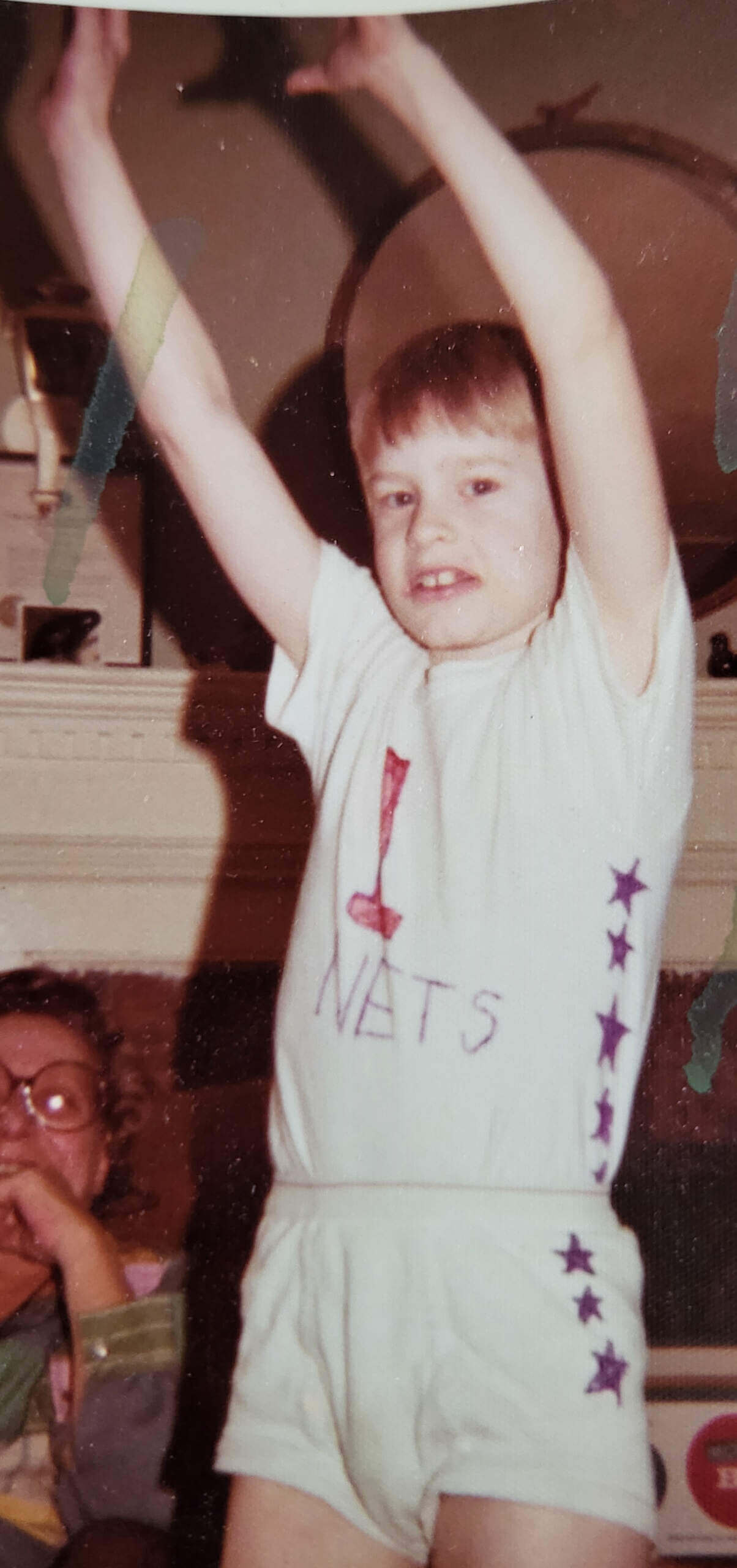
If you’re a weekend reader, you’ll know that I recently called it the best patriotic uniform the NBA has ever had. I personally loved it. So much so, as a seven year old, I “made” my own version of it:

But I digress.
Onto the uniform the Nets reintroduced yesterday. Unfortunately, the team didn’t give a lot of looks at it — and surprisingly no hype video.
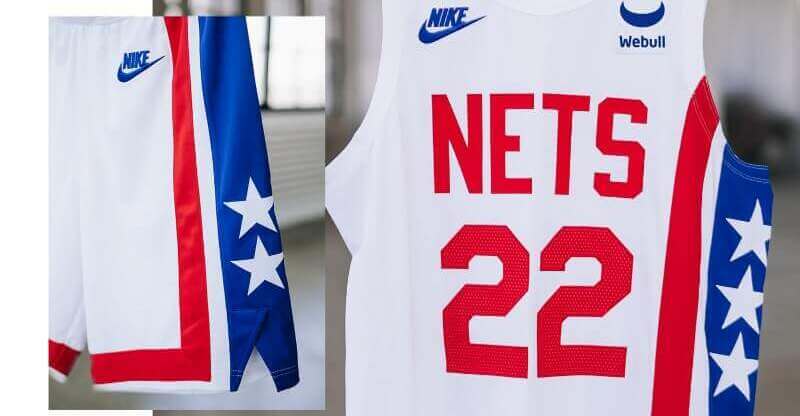
Those are our best looks at both the jersey and pants. They also included some closeups of the details:
The jersey boasts the red NETS wordmark across the chest and the signature blue stripe with three white stars is flanked by two red stripes down the left side panel. The pattern continues through the shorts, which feature two white stars.
There is a fairly long history with this uniform. It debuted during the 1972-1973 season (which means the 2022-23 season marks its 50th Anniversary)…
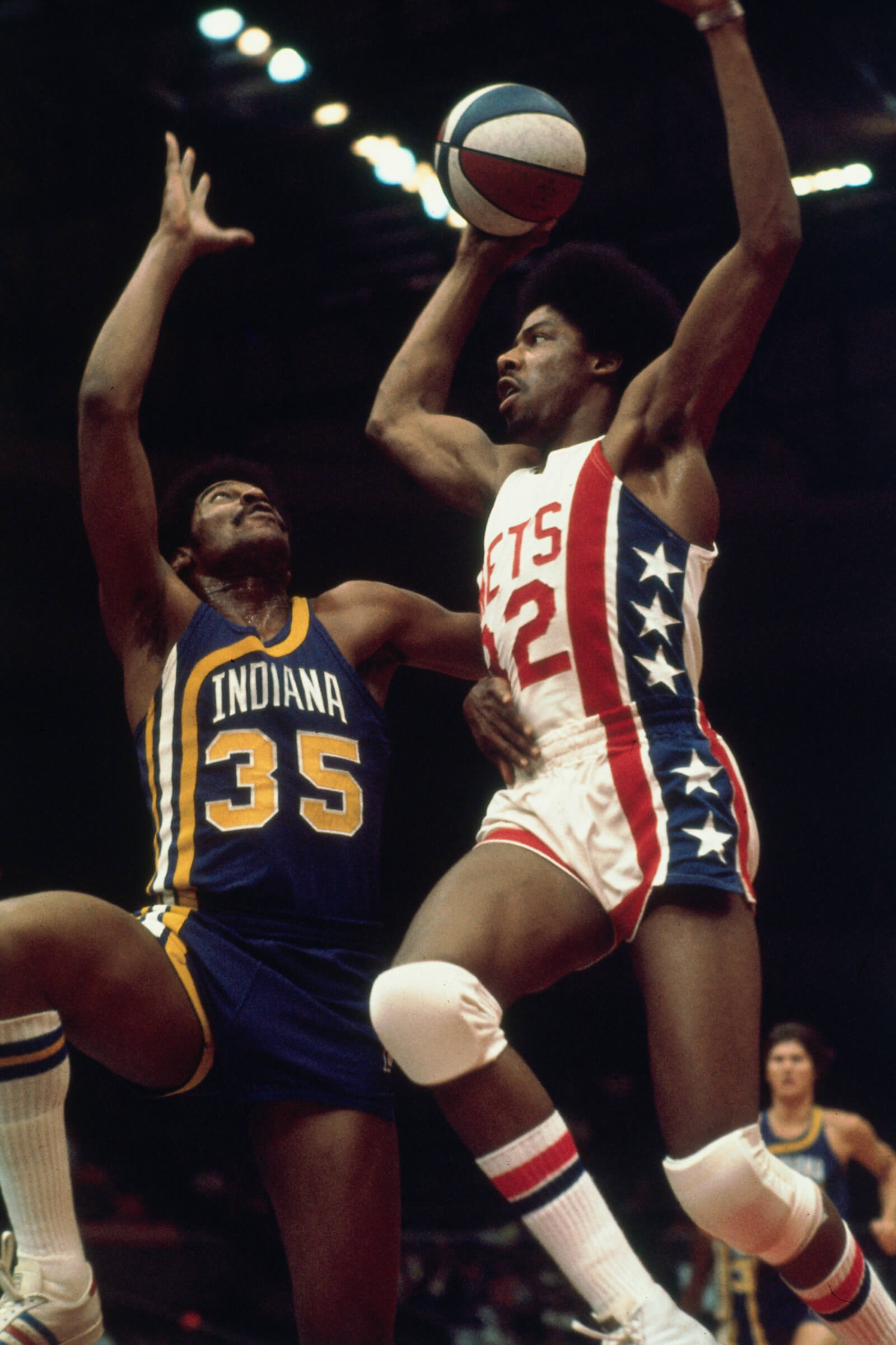
…and after its debut, the (then) New York Nets, still in the American Basketball Association, began to get really good. Stars such as Julius “Dr. J” Erving and John Williamson famously rocked the Stars and Stripes. The team won ABA titles in 1974 and 1976.

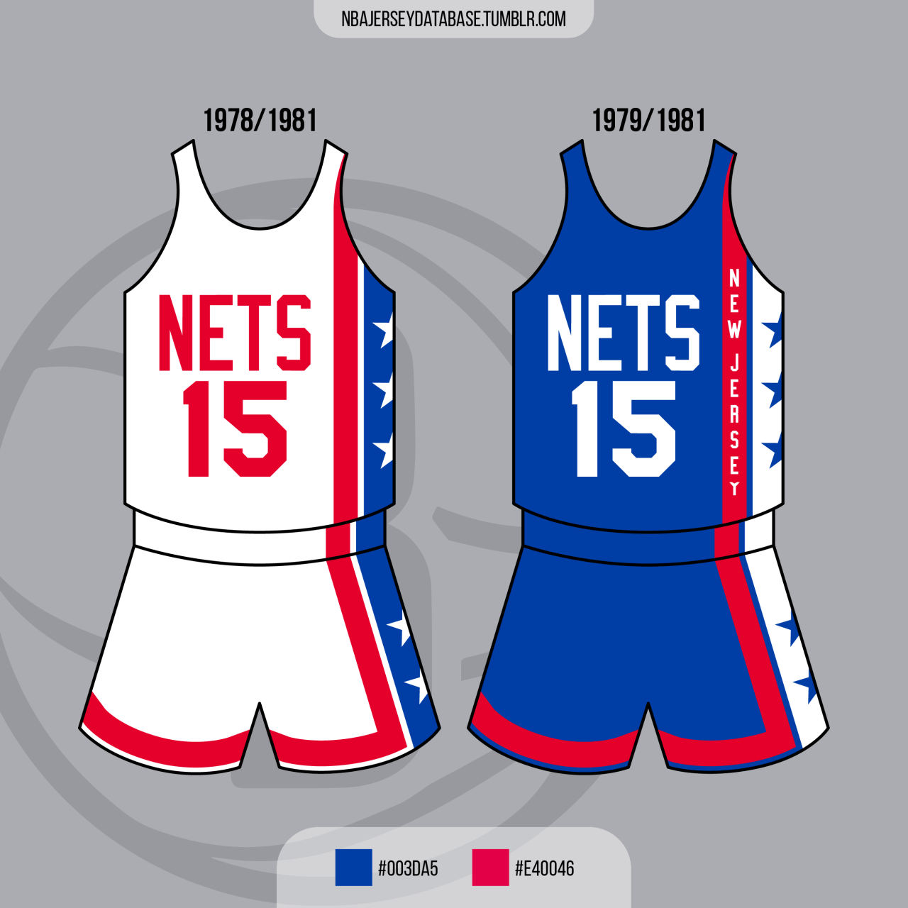
The Nets wore this uniform through the 1976 season, after which the ABA merged with the NBA. Unfortunately, after they won the ABA title, things got messy for the Nets, and they moved (returned, actually) to New Jersey. They’d continue to wear this uniform while playing in the Garden State, eventually adding “New Jersey” to the road uniform in 1979.

After a brief moment of insanity period where they got new uniforms, the team returned to wearing basically the 1972 uniforms from 1983 through 1990, before finally retiring it for good (although they have occasionally broken it out as a throwback).

According to Andrew Karson, Senior Vice President of Brand Marketing, Strategy and Solutions at BSE Global, (the parent company of the Brooklyn Nets and Barclays Center), “The revival of the Stars and Stripes uniform is exciting for both the longtime supporters of the Nets and an entirely new generation of fans. This uniform was immensely popular and has become synonymous with one of the greatest periods in Nets history, and we’re looking forward to seeing its return to the hardwood in front of our fans in Brooklyn this season.”
While I’m not really into the NBA anymore, the Nets are still my favorite team, and this is by far and away my favorite NBA uniform, so I’m thrilled it’ll be returning as a throwback. I spent my formative years living literally in the shadow of the Nassau Coliseum (where both the ABA Nets and New York Islanders played), and was privileged to watch a young Dr. J and his cohorts play some outstanding basketball.
Some of the NBA throwbacks (“Classic” uniforms) that have been introduced for the upcoming season have been fan favorites — others, not so much. But it’s hard to argue with this one. Easily one of the greatest basketball uniforms of all time (and a design the Nets never should have veered from).
You can check out the entire Nets uniform history here.
Your thoughts?


This is always the look I associate with the Nets. They keep straying in different directions (tie-dye, navy/silver, now black/white), but they always come back.
They know this is the best ever Nets uniform, they must know it.
Completely agree that this is one of the best (if not the best) basketball uniform ever, even without a team logo on the shorts, which I usually prefer. As a Dutch fan I first saw a photo of this uniform on the cover of a notepad in a local department store as a 10 year old. Had my mother buy all six available copies. We should have bought many more at other outlets of the HEMA store. Lost all six after 45 years and still regret not buying more copies back then. As for this version: the only things annoying me are the Webull ad (I can live with the Nike logo) and the spilt of the shorts not being centered (as is the case with every pair of Nike NBA/College shorts in this template).
Love this look on the Nets!!
YES!
Love those 70s uniforms. Much less excited about that Nike mark and ad patch. Always enjoy seeing how clean and unadorned old uniforms are. Sigh, those were the days.
While I did very much like the Nets 1997 rebrand & the look of the diamond pattern (net shaped) detail within the side stripe.
I think everyone agrees this represents the Nets best look. An absolute classic. Nets = stars & stripes. This is a beautiful throwback & reminder of their greatest player, the legend Dr. J
They wore that in the 2003 Finals? I had no idea…
The 2003 Finals were the first matchup between two former ABA teams (the Nets and Spurs), so breaking out the throwbacks was a pretty good idea. They should have used the red-white-and-blue ball as well, frankly.
My guess is that the Nets didn’t produce a hype video because pretty much all of their players have been in trade rumors all summer. I still think about when the Suns revealed their “Valley” unis with Kelly Oubre posing with a horse… and then traded Oubre a few weeks later for Chris Paul.
Seeing these comments I’m definitely in the minority of not liking these jerseys. At. All.
I’d never seen the early 80’s script set. That’s a nice set. Also, that 2021 city edition, pulling aspects of all their previous ones, is pretty cool.
You’re not alone, my friend. I mean I can’t argue that these are a clean simple classic design… for ANY team, at ANY level of play, prior to the 1980s. But they don’t show much more design creativity than the new Jazz sets. It’s a generic red, white, and blue patriotic jersey is all it is to me. It looks good for what it is but that’s about it.
I got one liked the idea that, with the move to Brooklyn, and the big acquisitions of Irving and Durant, that they were going with a new style. The black and white, subway tile, hip hop inspired team motifs were a cool departure especially since they were specifically embracing Brooklyn as opposed to Nee York or New Jersey at large.
You’re not alone. The love for this uniform set strikes me as pure nostalgia, which is totally understandable! But yeah. The design screams “generic 70s pablum”.
It is a nostalgia trip, you are totally right about that. The remix uniform of last season was also very good. The current uniforms are nice enough in its simplicity (with the herringbone floor detail in the striping as an understated detail) but this simplistic, be it generic, be it overpatriotic uniform does is it every time I see it. Screams: here comes the Doctor flying in. Julius is my all time favorite player.
Is by far the best uniform the Nets ever had and wish they would ditch the boring Black/White and make this the permanent uniform
I don’t think anybody actually watched the 2003 Finals so it stands to reason which uniforms the teams wore would be a new revelation.
Ben, now that’s funny!
There seemed to be a relationship between the ABA Nets and the NBA Seventy-sixers, Philadelphia wearing a symmetrical version of the New York uniform. Washington had a different take on the flag motif, but all three teams were anticipating America’s Bicentennial.
Nice throwback uniforms. As a New Jersey native, I wish the Nets moved back to New Jersey.
That Nets/Pacers photo with Dr. J is pure beauty.
Yeah, the Net’s uniform is a beaut. Almost as nice as the Pacer’s uniform.
My dad took me to many Pacer’s games when I was a kid. Unfortunately I never got to see the Net’s. Lots of games versus Kentucky and Utah.
They seem to be using the number font I most associate with these. Combined with what the football Giants are doing with their throwback, this is a positive development.
I wish they would go back to the more offset wordmark/number of the ’70s uniforms. That asymmetrical-stripe look actually originated with the Hawks (also used by Buffalo), but found a perfect home in the ABA with the Floridians, Nets, and Pacers.
Were it not for the fabulous “The City” uniform of the San Francisco Warriors, the Nets’ “Stars and Stripes” would be the best uniform in basketball history, IMHO. Glad to hear it will return.
WoW! I feel like it’s 1975-76 and I am back at Bells Mill Elementary school reading my Sports Illustrated with Dr J on the cover against the Denver Nuggets. Those were my two favorite basketball uniforms and my two favorite players of all time Dr J and David Thompson. I got to meet them both as a kid, so much cooler than the football players I met.
I like this uniform, but I don’t have it anywhere near the top. There are too many little flaws, and the asymmetry knocks off a lot of points. And this is better asymmetry than most. Due to the small amount of real estate, basketball uniforms are the only ones that I can tolerate having mega asymmetry, and I prefer it pretty blown-out like the Nets. Kersey’s Pacers design of of the 90’s was another good one.
80’s Hawks is another great one. Initial Wizards, not so much.
I have always loved these unis but I think they look a little dated, besides the blue ones they came up with last year are smoking. Looking back I think the gray and blue looks good too. i would like them to de emphasize the black and white color scheme or just keep one and make the red and blue the primary team colors and the definitely keep the gray with the stars the alternates.
My favorite basketball jersey and a great way to pay homage to their ABA roots. Hopefully player t-shirts will be available as M&N did including Erving and Williamson.