
Time for more Uni Tweaks from the UW readership.
I hope you guys like this feature and will want to continue to submit your concepts and tweaks to me. If you do, Shoot me an E-mail (Phil (dot) Hecken (at) gmail (dot) com).
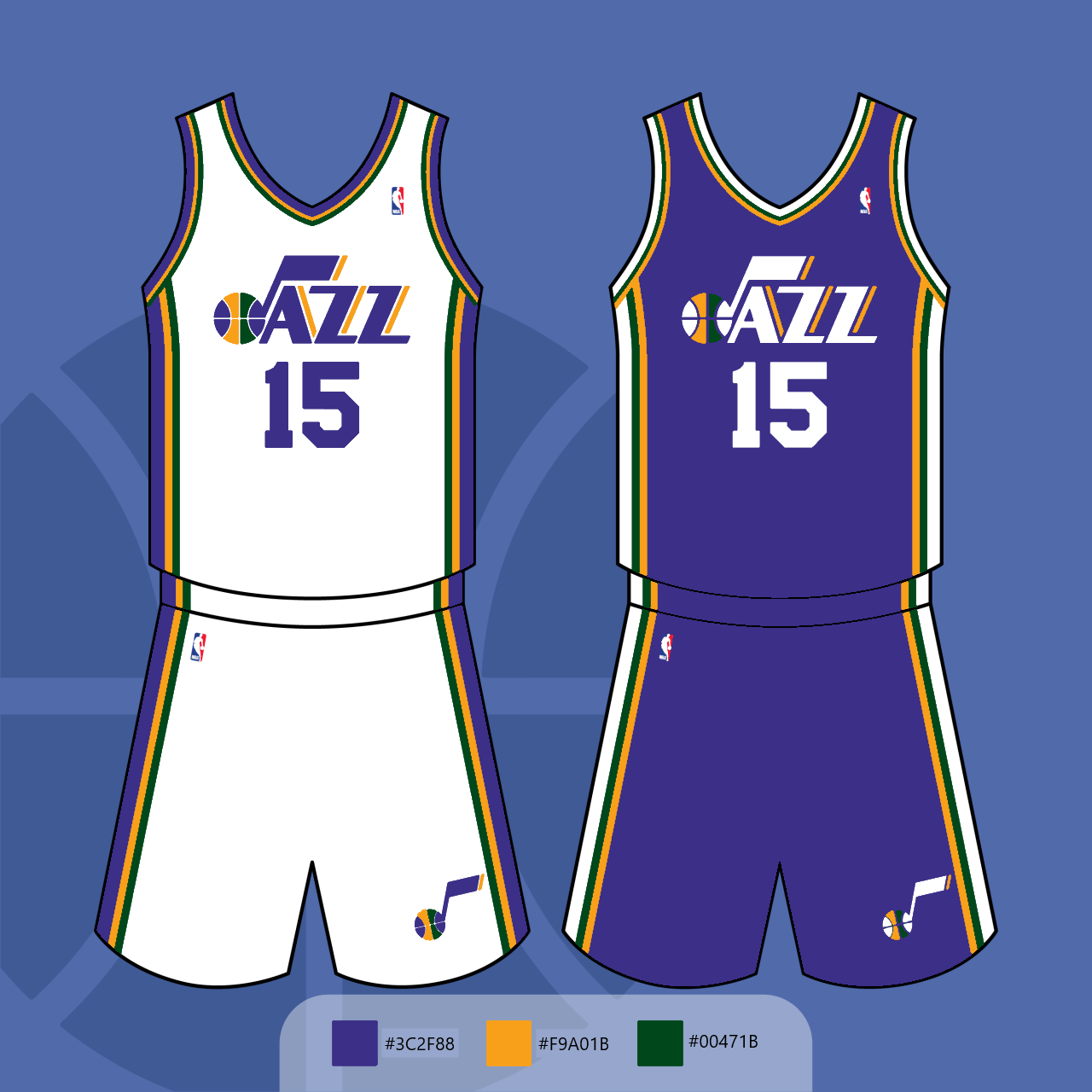
Hi Phil,
I have a uniform concept related to the Utah Jazz. Now, I have to admit that I’ve been a fan of the team since May 8, 2010 (when I attended my first Utah Jazz home playoff game). I also know that the team unveiled its new jerseys for the 2022-23 season on June 17. However, I can say that I’m not alone in saying that I hated what was unveiled. Anyways, my concept is based off the uniform design from 2010, but re-colored using purple, yellow & green as the base colors. The reason why I used purple as the base color was because of team owner Ryan Smith’s tweet that said “purple is who the Utah Jazz are”. I think these uniform concepts look so much better than what was actually unveiled, but what do you think?
Charles Thompson
OK readers (and concepters). If you have some tweaks or concepts, shoot ’em my way with a brief description of your creation and I’ll run ’em here.
Way, way better than their real new uniforms! Nicely done.
When I think of Utah Jazz uniforms, this is what I would expect. Not sure why they’re messing around with anything else.
Classic. They would have a better brand if they stuck to these.
I like those – but I’d prefer if the basketball segments had the colors in a rotational pattern rather than mirroring the top half exactly.
The Jazz sunrise jerseys they’ve been wearing are some of the best in the league too – they should have made those permanent.
Very clean and classic.
Good one!
I feel like it’s a Lakers Cheapie…