
Time for more Uni Tweaks from the UW readership.
I hope you guys like this feature and will want to continue to submit your concepts and tweaks to me. If you do, Shoot me an E-mail (Phil (dot) Hecken (at) gmail (dot) com).
Phil,
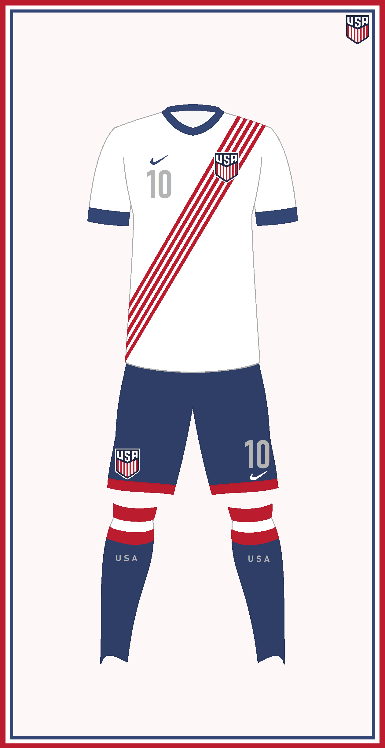
Here’s my concept for a USA Men’s Home Kit.
I think this would finally give us a great identity.
Combines all the little attributes we all pretty much like.
* White shirt.
* Sash made up of individual stripes.
* Blue cuffs/collar & silver numbers (reminiscent of the centennial jersey)
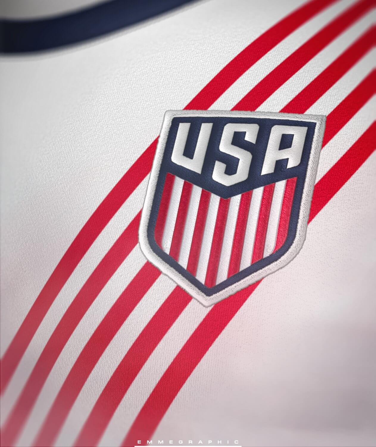
I also made a minor tweak to the crest, which I think makes quite an improvement.
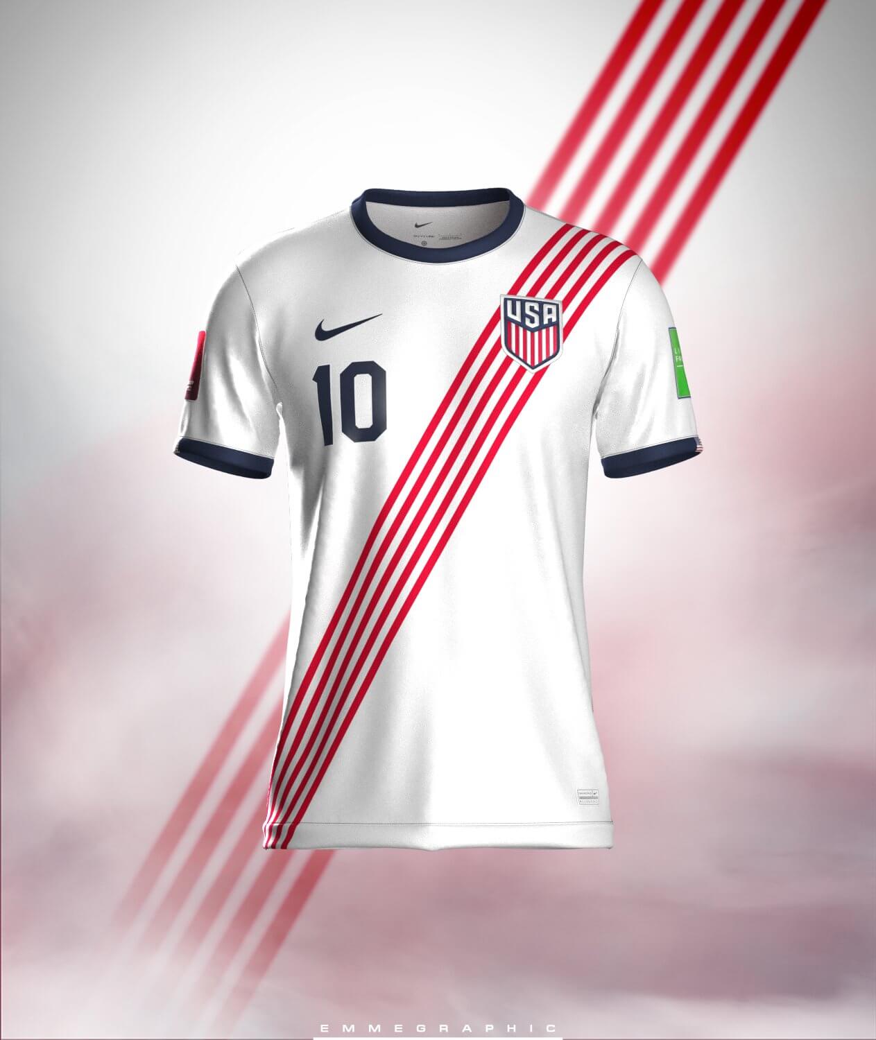
I asked Twitter for a better rendering, since I only have MS Paint to work with. I gotta say, this would be a great identity that I’d be happy to finally spend some money on!
Thank you!
Jerry Chavez
OK readers (and concepters). If you have some tweaks or concepts, shoot ’em my way with a brief description of your creation and I’ll run ’em here.
Wow. Making the sash out of stripes is the kind of detail that’s so perfect in its simplicity that I can’t believe no one has ever thought of it before. This kit is basically perfect.
Amazing! This shirt is better than most official USMNT designs. My only improvement would be white socks since I like sock color to match the shirt.
These are a major upgrade on anything we’ve seen in years. I always liked the waldo shirts & the northwestern style chest stripe, but this is classic styling with a modern twist.
The red & white striped sash is great! It would also look very good on the navy away shirt, meaning we could have a consistent identity.
I’m glad the rendering switched the numbers to navy, as silver wouldn’t show up very well on the pitch.
As for the socks, I agree with those saying they should be white. Thin red stripes would be a bonus!
Beautiful! Would be even better with the new swoosh on the sleeves rather than on the chest style Nike is doing this World Cup
I think instead you should make a random blue triangle at the neck and mini NE-patriots inspired striped on the sleeve – said no one, ever. This looks GREAT and I wish it was what USMNT was wearing instead of the leaks. Great work.
This is perfect. US Soccer, take a look at this!
Well done..simple..nice and very retro. Naturally it would never get done in a Nike universe.
That’s fantastic. Too bad we will never get anything that good.
The only slight tweak would be to go with the full 13 stripes. Just like the shield. Absolutely gorgeous!
I agree with navy > silver numbers but this is really good. No changes needed, it would be a great look. Maybe use the Waldos (my favorite shirt of all) as a clash kit and a navy job for a third with the sash?
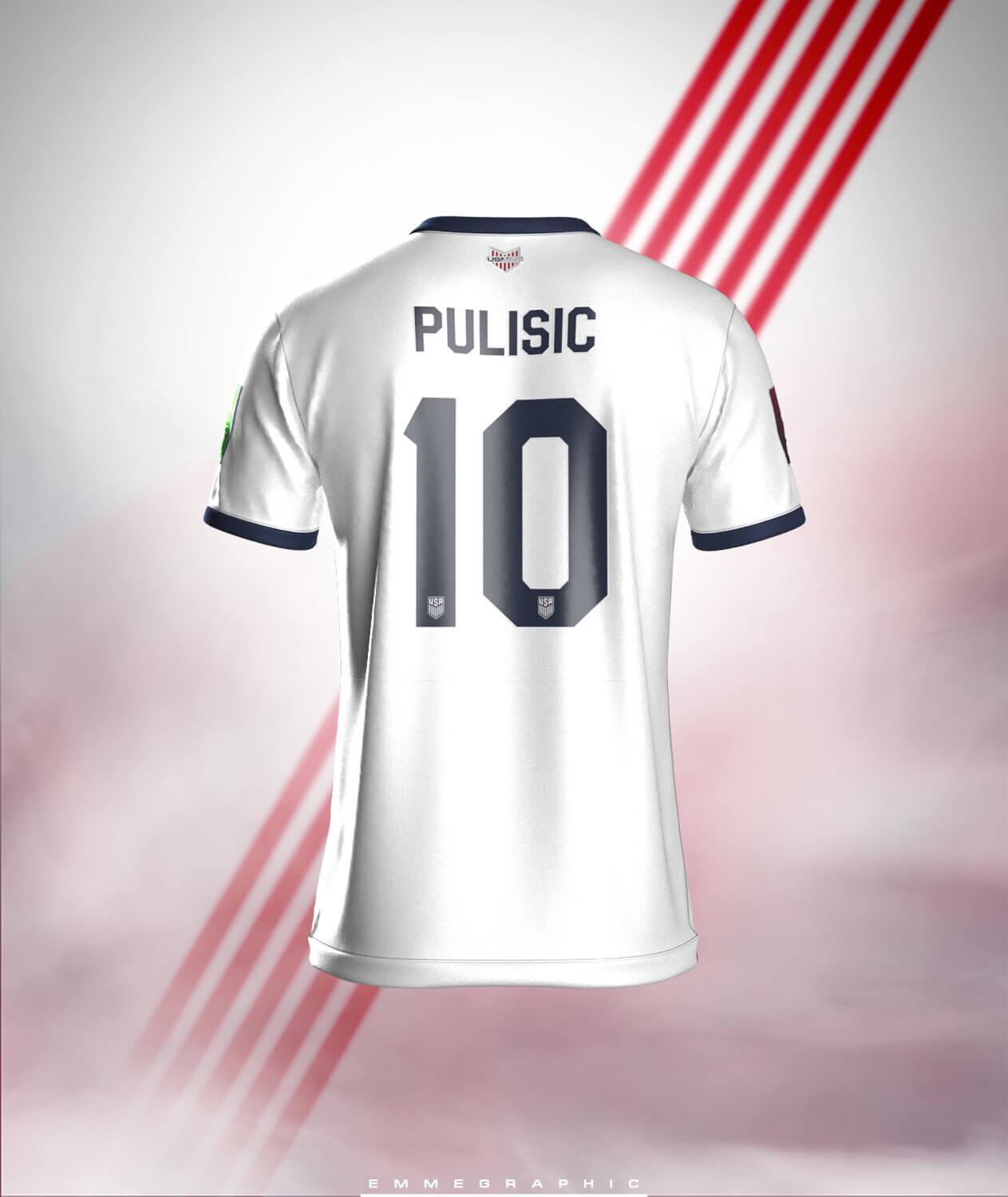
I am on board with this. Would only add red trim to back letters and numbers. But that’s a minor quibble. Well done.
It looks so clean and timeless without looking too simple or boring. Even without the badge, the first country that comes to mind would be US.
This is excellent, the sash/stripes is brilliant, and should be adopted as the unique design element the US kit needs. Love the big, block numbers on the back too, it’s the font of American sports.
The main thing USA needs is consistency. Pick a basic home uniform format and stick with it for the next decade. Personally, I favor Waldo, but white with a red sash and blue shorts is my next choice, and this particular implementation of that look is as good as any I’ve seen. Kudos! And unlike the Waldo hoops, the sash lends itself well to carrying the same basic format into away and third unis as well.
Pretty much unanimous.
This is awesome, love the white top/navy shorts as the signature element (despite the Tottenham association lol). And the red sash composed of stripes is genius, brilliant job!
This is amazing. Love the stripe sash idea, but something seems a little hard on my eye as the stripes cross behind the patch. I think it’s the edges of the patch not aligning with the strips, just doesn’t suit my eye; but I LOVE the idea. Otherwise the stripes at the top of the socks *chef’s kiss* also the red cuff of the shorts, amazing detail. I’m a little worried about the red cuff of the shorts and the top red stripe of the socks though, but since players wear their socks differently it doesn’t matter much.
Bravo. This is amazing. Pair this with the previous blue kit and we have a set.
Personally I think the home jersey should be the Waldo, but this is a great design. I think a blue variation would be excellent for a change kit.
This concept is promising but one simple change would improve it dramatically. Flip the sash to run the other direction. The US has never worn a sash in that orientation. It should run from the swoosh to lower hip on the other side. This would also help with the clashing of diagonal stripes in the sash and the vertical stripes in the crest. Right now, they are competing for too much attention. Flipping the sash’s orientation makes it both much more historically accurate and fixes the stripe issue.