Late Sunday evening, the Washington Huskies unveiled a new white road uniform, to be worn for one game, which they have dubbed “Husky Royalty,” presumably due to the copious amounts of shiny gold on it. Or perhaps because purple is considered the color of royalty. In any event, that’s what they’re calling it.
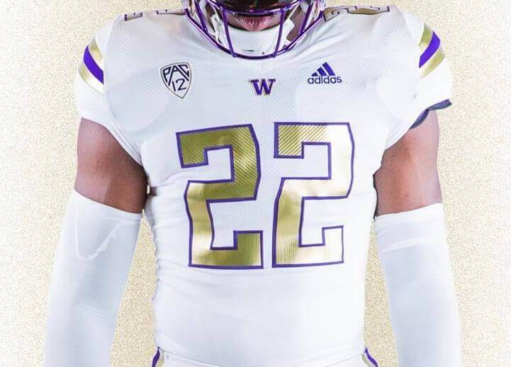
The uniform has two things going for it: it’s in school colors and it’s pretty good looking. Let’s take a look:
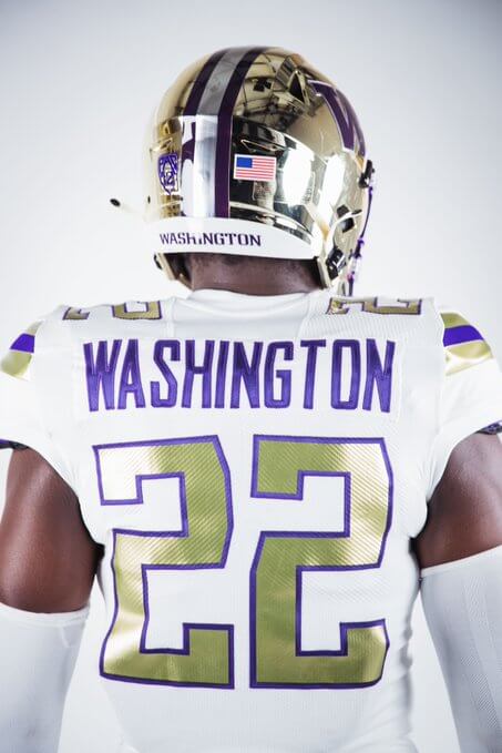
The uniform features a shiny gold helmet with two purple stripes, and what appears to be a silver-white center stripe. The facemask is purple, and the sides of the helmet have the classic “W” Husky logo. “DAWGS” appears on the nose bumper.
The jersey is white with metallic gold/purple/metallic gold stripes on the sleeve caps. Numbers are gold with thin purple outlines. TV numbers in the same style as the front numbers are on the shoulders.

The jersey back features NOB in purple in a block font, and rear numbers are in the same style as the TV and front numbers. There is a small purple “W”, outlined in gold, at the base of the collar.

Pants are also white, featuring the same gold/purple/gold striping pattern found on the sleeve caps. On the right hip there is also the team’s “W” logo in purple outlined in purple.
And of course, there’s the hype video which gives some better looks at the uniform:
THE HUSKY ROYALTY UNIFORM
Ready to paint the city GOLD when we hit the road.#NoLimits x @adidasFballUS pic.twitter.com/fCFijnyxgo
— Washington Football (@UW_Football) August 15, 2022
The team have announced they will wear this uniform for one game only, but have not announced in which game it will be worn. According to the Huskies,
A tribute to UW’s dominance at home and away, the ‘Husky Royalty’ jersey stays true to the Dawg mentality: let your game do the talking, no matter where you are.
It showcases all the classic features in gold, highlighted with touches of purple — bringing a classic design into 2022.
As far as one-off alternates go, I like this one a lot. For an all white uniform, there is plenty of color, and it’s not overdone or gimmicky. I look forward to seeing it on the field.


The one good thing is there’s no black.
Waiting for them to put DOGE on the nose bumper.
Just my opinion, a one off college uniform doesn’t deserve it own entry onto Uni-Watch. Ticker item, or maybe tweet of the day, no more.
I don’t know if this uniform is overdone or not, but one off uniforms are by their very nature “gimmick-y”.
Lee
And just why not? The Field of Dreams unis (for example) were one-offs…would you say they don’t deserve an entry? There are a few NFL teams who introduce a (usually single game) throwback, should we not cover those? And certainly not every new NCAAFB team gets its own entry (for example link and link). I thought these Huskies unis were good enough for a small entry. It’s possible they could wear them for a second game this year or next season as well.
“one off college uniform…”
Lee
Oh, so it’s the fact that it’s college is what’s bothering you. Got it. I happen to like college football and all of its uni machinations (even if I’m not a fan of too many), so I’ll continue to cover those as I see fit. I’d just as soon NOT cover all the NBA garbage, but it’s what we do here. If you don’t like posts on college football unis, feel free to skip them!
I don’t necessarily agree with Lee, but I think his point might be that there are 100+ D1A schools alone, seemingly a majority of them are putting out a new alternate every year. Unlike the pro leagues (minus NBA) where there are more strict rules in place on alternate uniforms and how long alternates stay in rotation. Also it doesn’t seem ALL of the alternates get their own feature, so it seems somewhat difficult to determine why some are featured and some aren’t.
I think the simple answer would be 1) is there something about the alternate that Paul/Phil find specifically noteworthy to feature, and 2) how busy of a uni-news day is it. ( I think these now sort of applies to NBA alternates as well).
I’d suggest this alternate does deserve a mention simply because it is a really good looking alternate with a classical design, as opposed to the parade of gimmick nonsense that usually gets rolled out.
+1 to what Phil said – the new layout of the site makes it easy to skip while also giving a small entry for those who are interested.
As far as I’m concerned, the more content, the better. If you or Paul or someone else wants to write a whole entry on a one-off junior high school softball uniform, great. Especially with the new format, it’s not taking away from anything else and it’s easy to ignore if you’re not interested.
I’m a UW fan, I personally enjoyed reading the breakdown. I just scroll past articles I don’t want to read.
Am I old because I’m annoyed with ‘Dawg mentality’ or he’s a dawg?
Shininess aside this is just a version of what they usually wear. But I like it.
I’m surprised we don’t see more of this in NCAAFB — essentially take the usual uniform and change the finishes to add a novel effect, like something shiny, glow-y, etc. I think maintaining school colors while giving something for players to get excited about (and, of course, increase retail opportunity) is a decent middle ground amidst the visually brutal wild west of college football alternates.
A departure, yes, but you can still recognize this team as Washington.
The uniform features a shiny gold helmet with two purple stripes, and what appears to be a silver-white center stripe.
It’s a chrome finish. If my eyesight is working, the facemask may have a chrome finish as well.
Adidas usually does a nice job with metallic gold in regard to jerseys. It seems they can extend this to pants stripes as well.
This is by far the best uniform UW has ever worn. Hopefully more schools will follow suit and have matching stripes while still appealing to recruits. I’m 100% on board for this!
In regard to why show “one off” unis…..I am more than happy to read uni news about any sport. .keep feeding and I’ll keep reading.
Same with me – it’s the purpose of the site to watch unis!
Not a bad uniform but the silver center stripe on the helmet looks out of place. And by the way, I’m getting sick of the Mylar balloon helmets. When will this fad die?
i might be in the minority but if one of your colors is gold or silver, you should only have that color as the pant color, especially if it’s also the helmet color already. no reason for gold helmeted teams to have white pants. looking at you, shitty 49ers throwbacks that everyone seems to love. this would have worked better if they had a white helmet or if the pants matched the lid. also, i like a decent shine on a helmet (not everyone pulls off the matte) but this chrome crap needs to stop. just awful.
Agreed. But Nike can’t get metallic pants right. The Raiders (and UGA) are a matte gray now, and the Cowboys look more like Carolina blue at home. So many teams looked better in metallic pants. But everyone gave themselves over to Nike.
I love the uniform. Purple makes a great combination with the gold.
I hate the helmet. I dislike the shiny helmet look – unless it is a solid color (like Notre Dame) with no logo or stripes.
The Ravens need to do a version of this ASAP
Solid look for a great color combo. Interesting they choose to wear it on the road.
I think it is a pretty good uniform! At least it is using school colors and not BFBS or GBGS. But, I don’t understand the “sales pitch” with all these uniforms these days. I either like them or I don’t. The sales pitch has never skewed my opinion.
Better then those damn purple pants and purple helmets! We are not Northwestern or Kansas state. Purple and Gold, not White!!!!
These special uniforms needed gold pants, possibly purple numbers.