[Editor’s Note: Paul is on his annual August break from site (although he’s still writing his weekly Bulletin column and may pop up here on the blog occasionally). Deputy editor Phil Hecken is in charge from now through the end of the month.]
A good Thursday morning to you today, Uni Watchers. I hope everyone is having a good week.
Yesterday was another slow uni-news day, but things will pick up later today when the Wizards are expected to release the white version of their inaugural “Wizards” uniform, for the “Classic” (throwback) edition of their 2022-23 unis. Depending on when it’s released, I’ll try to have coverage of the release today. And of course, tonight the Reds and Cubs hook up in the second edition of the “Field of Dreams” Game, and if the on-field unis look as good as the unis they unveiled earlier this week, it should be a stellar looking game.
I’ll be on the road for a good chunk of the afternoon, so please play nice in the comments!
Now then — today I’m joined by Colin MacIntyre, a Canadian CFL fan, who will be ranking the uniforms of the Canadian Football League. Prior to becoming a dad of two kids, Colin ran this offbeat website, which he describes as “a ‘not-scientific-whatsoever’ method of measuring when, and if, one should be wearing a pair of thermal long underwear.” That might not be of major interest for an article running in the middle of one of the hottest summers in the Northern Hemisphere, but check it oot nonetheless.
Here’s Colin with his…
2022 CFL Uniform Rankings
by Colin MacIntyre
While 99.98% of Uni-Watch readers are no doubt very excited for the start of NFL and College Football (and all the various Uni Combos which fill the tickers), I thought it might be fun to do a ranking of on-field uniforms of the Canadian Football League (CFL). Overall the CFL is slightly above average when it comes to uniforms, though there are some snoozers, and the majority of teams have a black or navy helmet (5 out of 9 in fact!). In any case, here is a not scientific whatsoever ranking of all 9 CFL uniforms (home and away, no alternates).
9. B.C. Lions
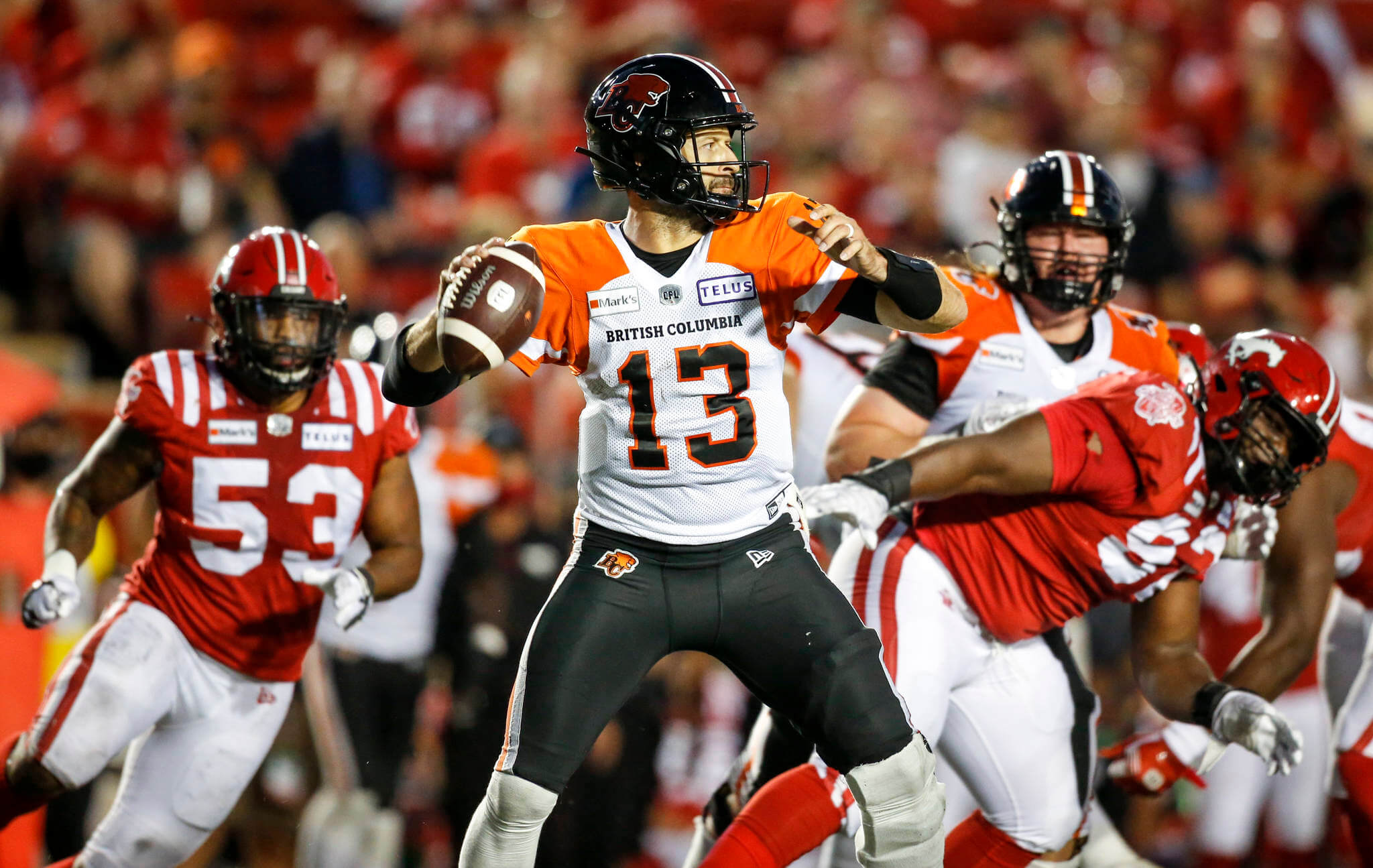
I’m no uni-scientist, but I feel like a pretty standard rule of thumb for a sports uniform is a) have a primary color and b) a secondary color is used as a highlight. The problem with the Lions current look, is that both the Orange and Black are battling for supremacy, within our eyeballs. This makes the whole thing look a bit of a mess. The Logo, while clever, is also a bit dated, and needs a bit of a refresh.
8. Ottawa Redblacks
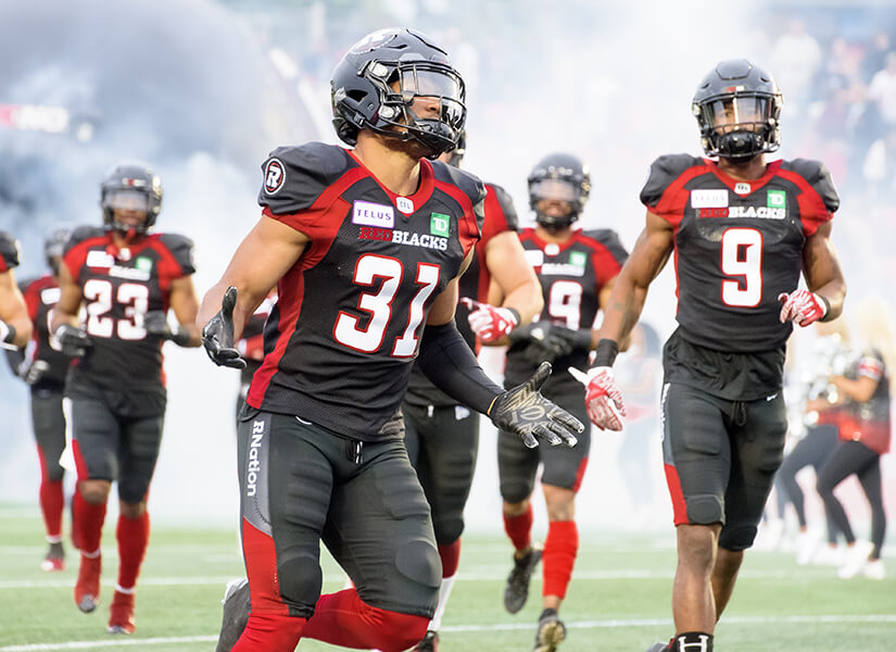
I guess when your team name is literally REDBLACK (and yes, officially, the team name is in uppercase letters), you somewhat limit your palette. The main problem with Ottawa is the uniform set comes off as looking very high school football. The one bright spot here is a plaid pattern that they use on the side panels, which adds to a Lumberjack theme (Logo is a buzz saw blade, and they cut off pieces of a tree with a chainsaw during home games. Hey, it’s Canada!). They could use plaid look more, or, they should do what the Ottawa Senators won’t, and go full barberpole baby!
7. Toronto Argonauts

Toronto’s oldest professional sports franchise has a great colors (navy and sky blue), a great looking modernized retro logo. All the ingredients to look prestigious for Toronto’s oldest sports franchise. However, the lack of any stripes on the jersey, helmet or pants, make the Argos the most boring looking uniform in the CFL. I’d lean into the white here (white helmet, white pants) to make the blues pop.
6. Calgary Stampeders
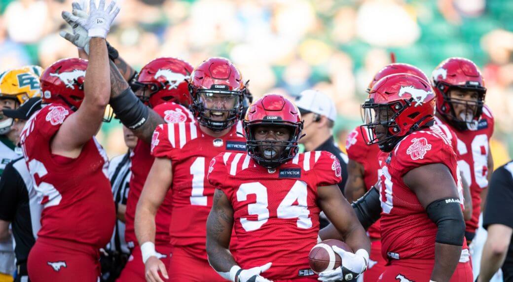
What do you get when you cross a fantastic home field look with an uninspired road look? The Stamps. The Home look is great: look at those shoulder stripes! Two stripes on the pants too? Bonus! However, the Stampeders seem to be unwilling or unable to ditch BFBS (as evidenced in the face mask), and then the road uniform looks almost identical to the REDBLACKS (Calgary vs Ottawa games look very much like intersquad games). If the Stamps would double down on white and red, they’d be top 3 easy, plus you can let the REDBLACKS keep Red and Black!
5. Montreal Alouettes
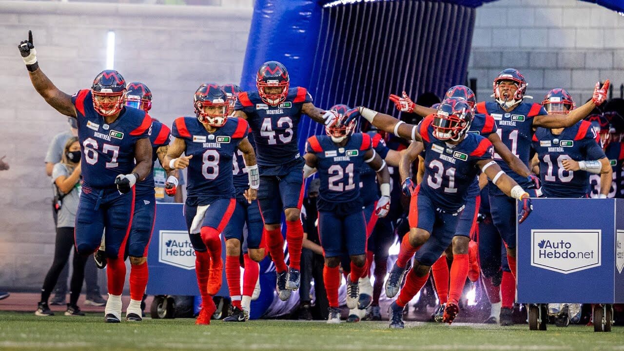
Fun fact: when I started thinking about this topic, the Als were actually last! While their look isn’t exactly whiz bang exciting, I came to appreciate it’s very clean, and more polished than the above 4 teams. The dark colors could use some white or silver to make them pop. The newish logo also isn’t great, and while one could argue they needed a logo refresh from this, I yearn for the return of the 2000’s era unis, which were instantly recognizable.
4. Edmonton Elks

You can forgive the Elks a bit as they’ve been going through a re-branding exercise over the last couple years, trying to find their way after transitioning from their old name to a new one (Eskimos to Elks). The 2022 version sees the return of the ‘Double E’ (though no longer restrained by an oval), on the helmet, replacing the one season and done ‘Antlers’. Also, stripes on the sleeves! However 2 major flaws keep this from being a top 3 uniform: Single color numbers, new to the Elks Era (the team always had gorgeous drop shadow numbering). The second is the ‘antlers’ on the leg stripes which comes across as being a lobster claw.
3. Hamilton Tiger-Cats
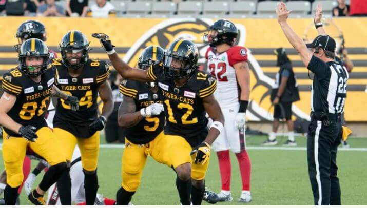
Do you know what is to love about the Tabbies? Pretty much all of it. Everything about this look screams’ intimidating: from the Black and Gold, the modernized legacy logo, the helmet and jersey stripes. The Ti-Cats (yes their nickname has two nicknames) could use a some stripes on the pants the gold pants though (and forget the black pants exist) and dare I say a contrasting color on the numbers. All in all though, a great look. Oski Wee Wee!
2. Saskatchewan Roughriders

I’ll admit my bias here as someone who is born in raised in Saskatchewan, so green blood wants me to put the Riders in first, and the The ‘Green and White’ actually have a great onfield look! Surprisingly, looks modern but not boring! The side panel stripes and the leg stripes come across as a seamless look, and helmet logo is oversized. If you aren’t going to have a classic football look, then look to Saskatchewan for inspiration. But if you want the BEST look CFL Uniform football look, then you need to look to (takes deep breath) east to the…
1. Winnipeg Blue Bombers
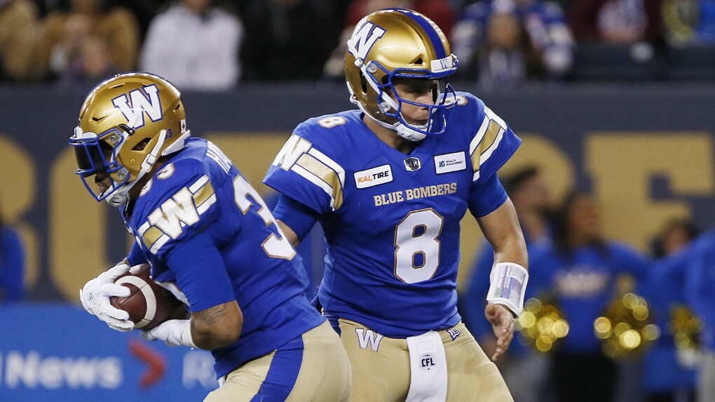
As much as it pains me to say it, the Winnipeg Blue Bombers the best dressed team in the CFL, and I would argue, top 5 in all Football, period. The blue and gold colors are unique to the club, the jersey, pants and socks have all the right stripes in the all the right places, and a block letter logo on the helmet. If you look up ‘football uniform’ in the dictionary, you should see a picture of the Bombers. The defending back to back Grey Cup champs are winners and dress like it too.
Well there you have it. No doubt you will all agree 100% and leave no comments whatsoever.
Enjoy the American football seasons! Remember to tune into the Grey Cup in late November!
Thanks, Colin. Interesting set of rankings. I’m sure the readers will want to weigh in!
Sorry, but I have to agree to disagree. How can BC be last when you have the Edmonton mishmosh, Calgary BFBS and Toronto’s plain jane unis as stronger contenders for worst uniforms?
The only one I really agree with is Winnipeg at #1. Those are great uniforms.
I have to kind-of agree with your pick for No. 1. Winnipeg’s colors are great. But honestly, I’m not floored by the design. I wouldn’t say they got it “right,” but they definitely didn’t get it “wrong.” It’s a solid, classic design, but nowadays it feels a little dated to me. Or maybe it’s just timeless?
You used obsolete photos of the Lions, Stampeders, and the Alouettes.
The Lions got rid of the helmet stripes this year, the Stampeders have a single helmet stripe tapered in the front now (the pic of them with 2 stripes was from last year and the one with no stripes was I believe from this years’ pre-season), and the Alouettes switched to a logo on each side of the helmet along with center stripes.
I won’t comment on the rankings as everyone’s got their own opinion. I personally would put Toronto and Edmonton at the bottom.
I loved the Elks antlers on their helmets, I was really bummed when they got rid of it.
Yeah, I’m a Philadelphia Eagles fan why do you ask?
Personally, I think they should bring them back as an alternate! It’s creative, and I know of no other deer themed teams in football!
Yea this was my thought too – great look on the helmets, but I’m guessing the double E connects with the long time fans better. The antlers on the pants are rough tho – mayyyyyybe better if they do one long antler on either pant, but elk antlers are curvy and either way it probably will just look dumb
I gotta say tho, since I’m a CFB fan, the Winnipeg look is very “generic college team” to me. The gold helmet does that if you’re not ND. Nevertheless, not knowing much about the CFL,there are 7 good looking squads up that way.
Did Ottawa look towards Italy and say “Well, there’s the nerazurri and neroverdi and, most importantly, the rossoneri, so we can do the same!”?
Would not agree with Lions logo needing a refesh. It has been a stalwart and needs to stay.
Technically, the Argos are Oxford and Cambridge blue but sometimes colours need to be described differently for all to understand.
Many may well be aware already, but I am a big Riders fan as well from back in the days of growing up in Regina. I cannot agree that current Riders uniform is great. Sure, back in just green and white, but not a fan of mono green, side panels, 4 stripes on one side in leg stripe. The original idea we thought was that we would see more of the preferred green jersey over white pants when this uni unveiled in 2016 and I think we have seen that once.
The Riders’ shield logo was designed (original version in 1985) that way to accommodate for the wraparound helmet logo which they do not have anymore. Would in a heartbeat bring back a modern version of 1985-89 uniforms. Back to the awesome wraparound helmet logo and a little bit of silver and black back.
link
Toronto is too low. I’d have them ahead of Montreal and Calgary.
Call me an old curmudgeon but I still long for the look of the CFL teams from the 70/80’s. I could do without the side panel stripes, and the work marks on the front. All too many of them now are either trying to do too much or too little.
I agree that Winnipeg is #1. They would probably be in the Top 5 (at least the Top 10) if they were in the NFL. Here’s my rankings:
1 Winnipeg
2 Toronto – I like the blue on blue
3 Hamilton – black and gold almost always looks good together
4 Edmonton – need to get rid of the pants stripe.
5 Saskatchewan
6 Montreal
7 BC – might be higher with a better helmet
8 Calgary
9 Ottawa
I can’t unsee those lobster claws now.
I’ve always enjoyed the CFL unis, largely because it’s one more set to enjoy and think about. Having said that, overall, I think there’s too much mono for me with teams having solid/dark jerseys and pants at the same time (I hate this look at all levels, HS, college or pro) and I’m not a fan of the BC/almost sports bra look with the colored sleeves. Several teams have this, and I’ve never liked it. I think it’s partially a tayloring thing, in that it’s just too much color encroaching into the torso, if that makes any sense. If you are going to do that, the contrasting color looks better lower down the sleeve (think classic NY Jets).
I’m also not pleased with two of the teams’ helmet logos. I really dislike the Argos’ logo. It just looks really strange. I know it’s retro and all, but the brown boat/football looks really out of place to me and is like a bloated Mr. Hanky being sailed away. The other issue is with BC’s lion head logo. On one side, the head is actually facing backwards. That bugs me to no end on football helmets. If you are using a log that “points” or looks one way, it should be forward on both sides to me. I understand in some cases you have to have two separate designs to do that, but a backward facing logo looks really bad, at least to my eyes, since it’s in the opposite directly the player is moving, at least most of the time.
The updated Argos vintage logo introduced in 2021 does not have the brown. The football is blue.
link
Thanks, Wade. Swapped in your link.
Oops, you are correct. One of the photos shows the brown version. Still don’t like it as well as prior logos, but it’s certainly better.
“Overall the CFL is slightly above average when it comes to uniforms”
I feel like me and Colin have different definitions of the concept “above average”.
Winnipeg is definitely #1 but I would have Edmonton at 2, Hamilton at 3, and Calgary at 4, only because of their beautiful home uni because their roadies are awful. Montreal is 5th. Toronto can look decent but not with the light blue pants and the navy home jersey combo. Saskatchewan’s uni is an ugly mess. They look great in their Lancaster-Reed era throwbacks. BC has changed their look so many times over the decades it’s next to impossible to keep track. Their current set is too busy for my liking but it isn’t terrible. The less said about Ottawa the better.
The Argos need to go back to the Theismann-era unis (think the Washington football team during the Theismann-Riggins-Gibbs heyday, but in blue) with the Boatmen logo. Perfection. The Elks as well – back to the Moon-Campbell, ho-hum-another-Cup unis. Three stripes on the sleeves is a bit boring; four or more screams CFL.
Those new Detroit City FC kits look like the could have been inspired by Jorge Campos’ famous wardrobe back in the 90s!
link
Colin, Great article on the CFL unis! Good to see some in-depth coverage on the outstanding yet unappreciated league north of the border.
However, just a couple notes. You really can’t use the term BFBS in reference to the Stamps, as black has been part of their color palette for over 40 years.
link
link
And I’m afraid you’re showing your age by saying Edmonton has “always had gorgeous drop shadow numbering.” To us oldtimers, we know that the drop shadow numbers are a relatively recent addition, as the Eskimos had a simple yellow or green number (with no outline until the 90’s) for the first 50 years of their existence.
link
link
link
Nonetheless, outstanding job! My next suggestion… each CFL team’s best uniform in franchise history. Some of my favorites (and here’s my chance to show my age!):
link
link
link
link
For Edmonton, the outlines were added to the numbers in 1987. As seen here in 1987 Grey Cup. Jerry Kauric rocking the swag here that a kicker should. Strong wristband game, single bar, barely wearing shoulder pads.
link
Sorry to say but every CFL team is completely underwhelming in logos, uniforms and even names to me. Even the league logo is clunky. It must be the British heritage of Canada, as team logos and names for American sports teams are equally awkward and clumsy in the UK, Australia, New Zealand and other Commonwealth countries. Most traditional football, rugby and cricket crests are very nice in these countries (with more of a heraldic background), but when it comes to gridiron, basketball, baseball and hockey I have not seen a memorable logo, name or uniform yet. Exception: the Birmingham Bulls, the longest running football team in the UK. Their current logo is allright.
Typo alert in the Montreal header – it’s “Alouettes” with one “l”
Thanks. Now fixed.
Sorry, but they all look like crap with the 2 giant ad patches on their chests. Gross!
The CFL operates on less than 1/10th the budget the NFL does. They have to get their money from wherever they can. As to uniform rankings, mine:
1. Hamilton (#1-5 are fairly interchangeable to me, but Hamilton always stands out well to me)
2. Winnipeg (a pretty classic look, great color use, no real quibbles)
3. Toronto (the Double Blue could use some white, but it’s still a great, plain look)
4. Edmonton (the Elks rebrand was a chance to do things well, and they came through)
5. Saskatchewan (only at #5 because I’m not a fan of green; a solid look)
6. Ottawa (simply too busy in terms of uni’s; the helmets are tight, though)
7. Calgary (needs to be rid of black, adopt a truly consistent look)
8. Montreal (hasn’t had a decent look in decades, frankly)
9. British Columbia (aged helmet logo, poor use of colors)
I’m not sure there’s ever any reason to describe the dreaded drop-shadow as ‘gorgeous.’ Drop-shadow is, has been, and always will be a plague upon the eyes.
Winnipeg looks like legacy Washington Huskies. Not a #1 in my book.
My $0.02…
1. Winnipeg
2. Hamilton
3. Edmonton
4. Saskatchewan
5. Montreal
6. BC
7. Calgary
8. Ottawa
9. Toronto
Nice job on the unis of the CFL rankings. Became a CFL fan when they had Rough Riders and Roughriders in competing cities. The summer start and November ending is a plus.
Ti-Cats and Blue Bombers are the best.
Having been a CFL fan here in America since the 70:s I pretty much agree with the rankings. And yes the Bombers uniforms and Color scheme is the best in professional football.
Saskatchewan moves into #1 mostly because of the awkward shoulder yoke on Winnipeg’s away uni, BC should be a lot higher and that classic logo does not need a refresh (imagine if they refreshed your Riders logo? Blasphemy!), And Calgary should be last due to infuriating stubbornness with keeping black. Lose the black altogether or change it to grey and they move into the top 4
At first I thought the Argos ‘Toronto’ wordmark was the same as the Leafs’ crest used to have. Not quite, but would have been cool if it were since the Leafs aren’t using it anymore.