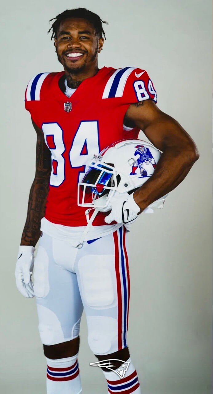
Click to enlarge
The Patriots made it official yesterday and officially announced that they’re bringing back the Pat Patriot throwbacks for this season. The Patriots Hall of Fame had already spilled the beans on this development way back in December, so the announcement isn’t exactly a surprise, but at least now we know the plans haven’t been scuttled by supply-chain issues or anything like that.
Some notes and thoughts:
• No word yet on which game(s) will feature this uniform.
• Pat Patriot first appeared on the Pats’ helmets in 1961 — the franchise’s second season — and remained as the team’s headwear logo until 1993, when it was replaced by Flying Elvis.
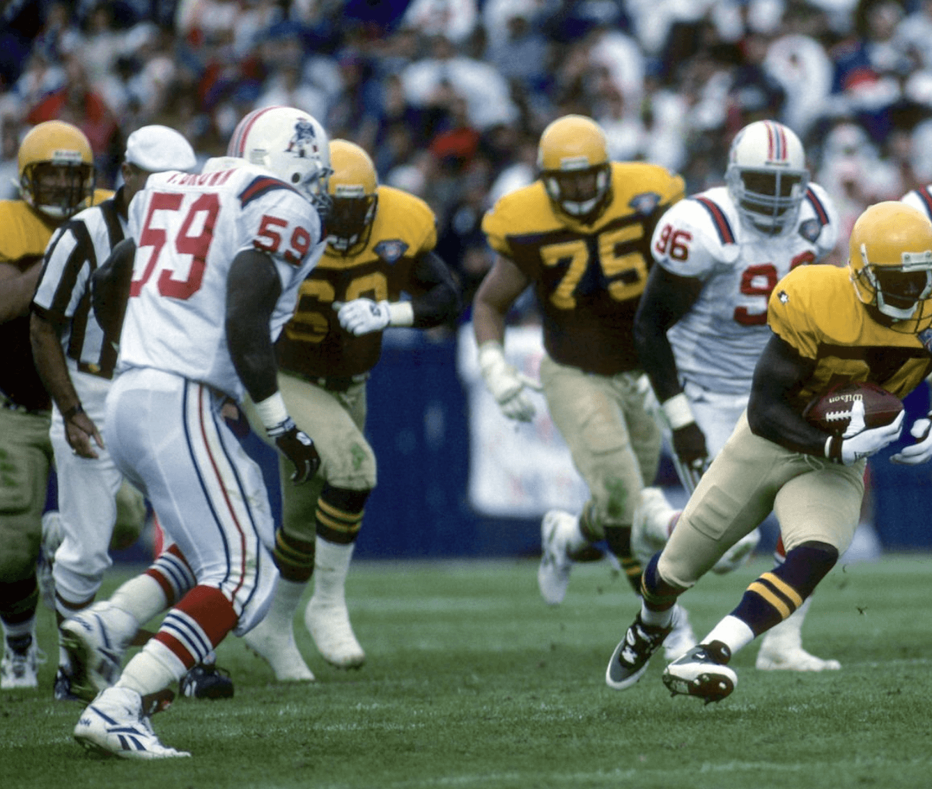
• Pat’s first appearance as a throwback came as part of the NFL’s 75th-anniversary throwback program in 1994 (but with the white jersey):
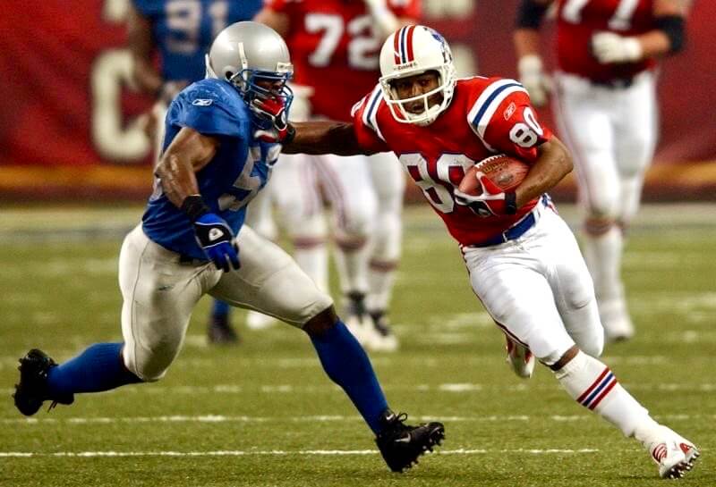
The red jersey’s first throwback appearance came during a Thanksgiving Day game against the Lions in 2002:
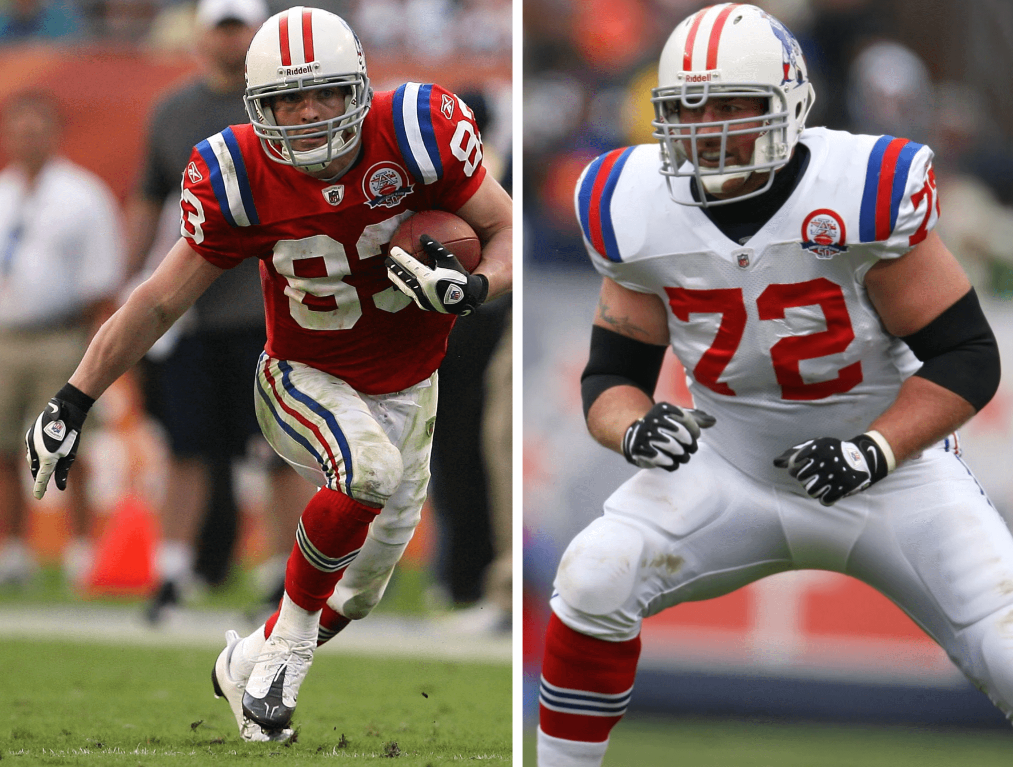
• The throwback uni didn’t appear again until 2009, when the Pats wore both home and road versions of the design as part of the AFL 50th-anniversary program:
• The red throwback reappeared in 2010, 2011, and 2012 before falling victim to the NFL’s one-shell rule.
• If you look at those photos, you can see that they paired the red jersey with white socks every year except 2009, when they wore red. Which is more historically accurate? It depends on which era you’re trying to simulate, because the Pats originally paired the red jersey with red hose but changed to white in 1984. (The new throwbacks have white socks.)
• Another detail about the 2009 throwbacks: The UCLA striping on the jersey was blue-white-blue, while all the other throwbacks (including the new ones) have white-blue-white. Different helmet striping, too. Again, that’s because the striping changed on the original jerseys and helmets back in the day, so the throwback striping reflects the specific era being simulated.
• Another thing you can see in the photos is that the throwback helmet has consistently been slightly off-white — a very light cream. It’s hard to be 100% certain from the promo pics they released yesterday, but the shell looks like more of a true white to me.
• Speaking of the promo pics, they released a fun shot of center David Andrews posing like Pat Patriot:
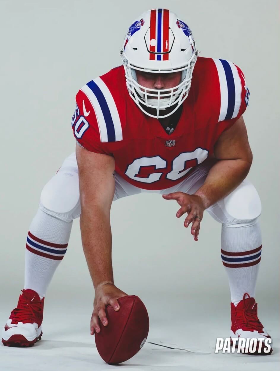
• According to this article, the Pats were lobbying for years to get the one-shell rule lifted so they could revive this throwback.
• That article also says they considered going with a red facemask (which the team wore in 1991 and ’92 but has never been used in a throwback capacity) but ultimately opted to stick with white.
• The one turd in the punchbowl: those truncated UCLA stripes. If Nike can fix this for the Panthers, why not for the Pats?
———
One final thought: I know everyone loves Pat Patriot — so do I! — but I’d also love to see the team use the (off-)white shell color to bring back the tricorn hat logo that they wore in 1960:
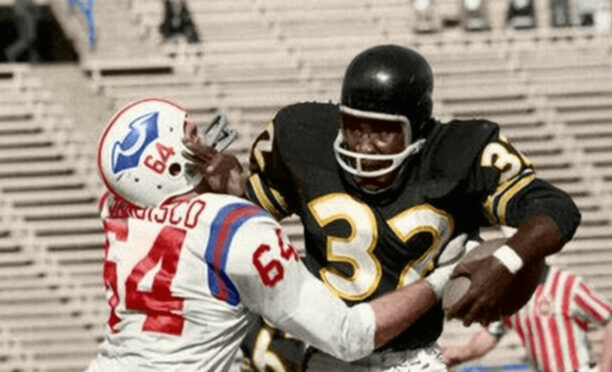
That design has never been worn as a throwback, and it would be great to bring it back for a game at some point. I know everyone’s excited about Pat, so let’s enjoy his return for a season or two. But after that, how about a tricorn cameo? Here’s hoping!
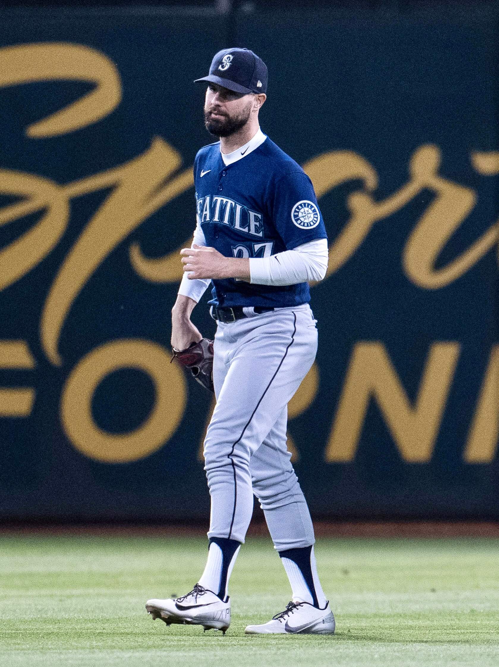
Photo by Neville E. Guard, USA Today Sports, click to enlarge
Blast from a different past: Mariners outfielder Jesse Winker last night wore a pants/stirrups style rarely seen nowadays, reminiscent of the mid-’70s or early ’80s. Not my favorite look, but interesting to see someone reviving that mid-shin pant length!
Here’s a close-up, showing that he was clearly wearing tube socks, not traditional thin sanitaries:
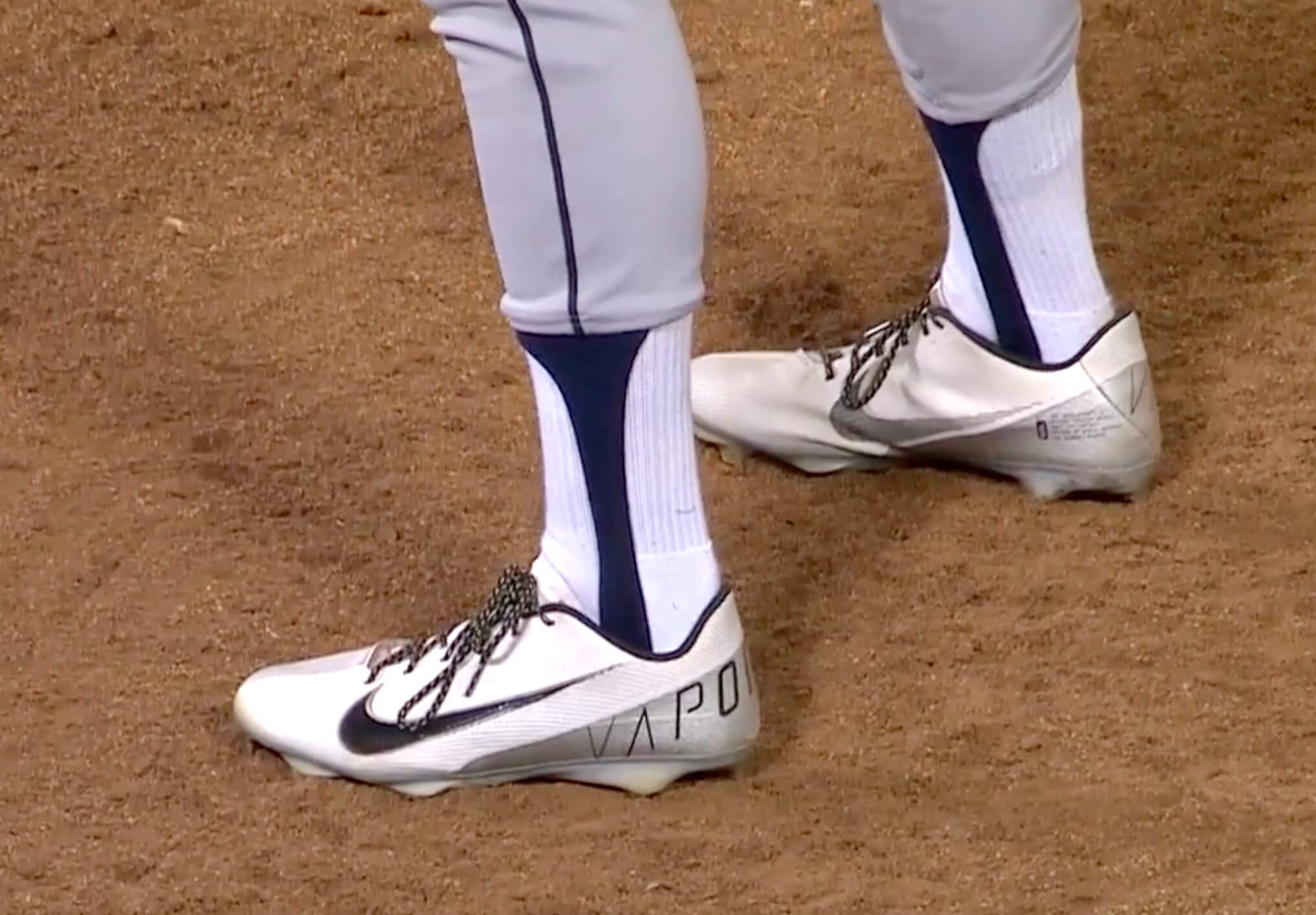
(My thanks to Bo Baize for alerting me to this one.)
Click to enlarge
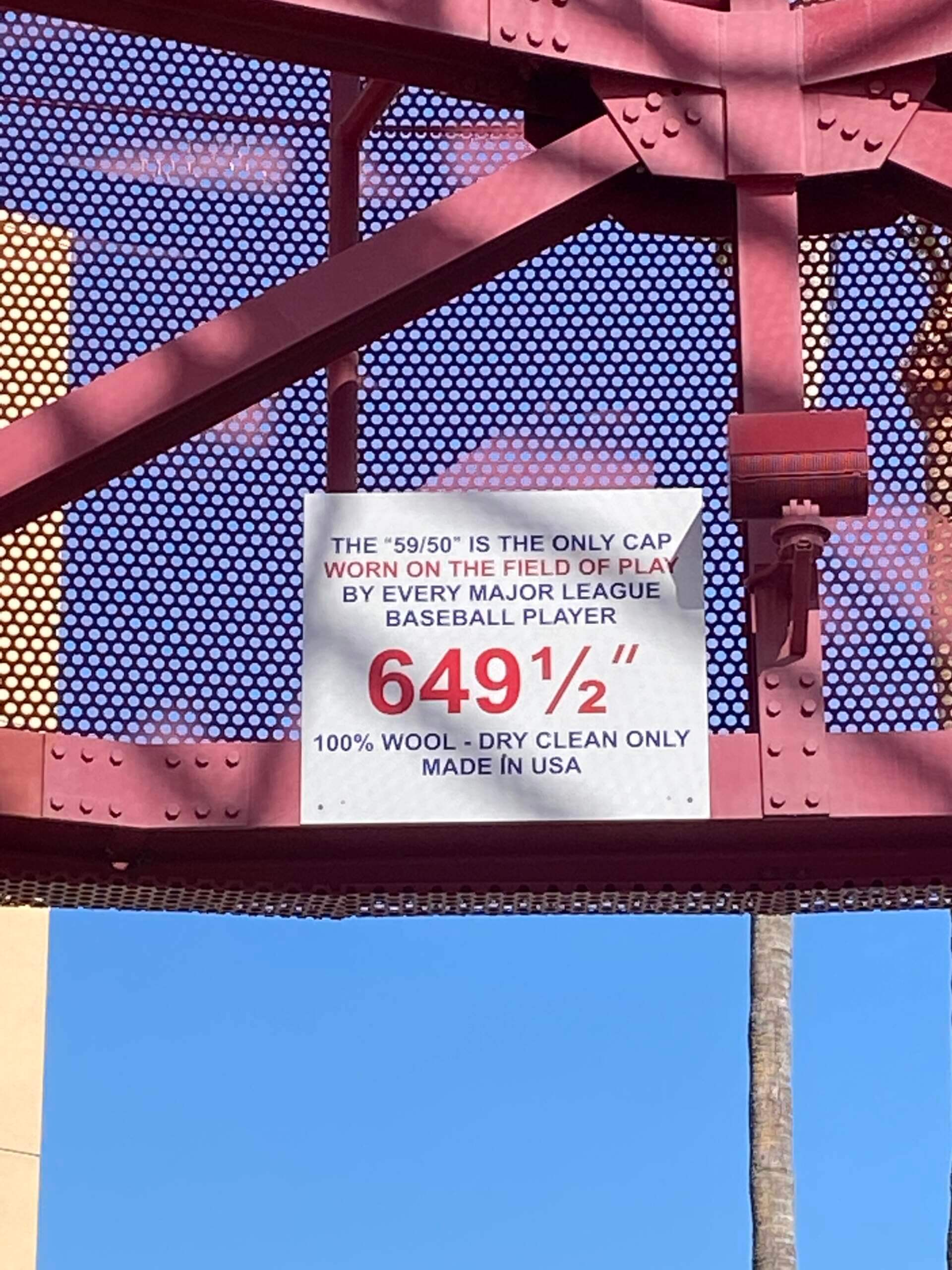
Does Bruce Bochy know about this? Following up on yesterday’s item about the giant caps at Angel Stadium, reader Benji Boyter reports that the caps have giant size tags on the inside. That’s pretty cool!
As an aside: Ballparks named after teams usually have the team name in the singular — Yankee Stadium, Dodger Stadium, Oriole Park at Camden Yards, Angel Stadium (and the now-defunct Tiger Stadium). The one exception is Nationals Park. Personally, I’ve always thought Angels Stadium would sound better (even with the double-s sound) — it just feels more natural to me. Can’t explain why. But I’m okay with the other singular constructions — again, can’t really explain why. It’s an interesting sub-topic!
Click to enlarge
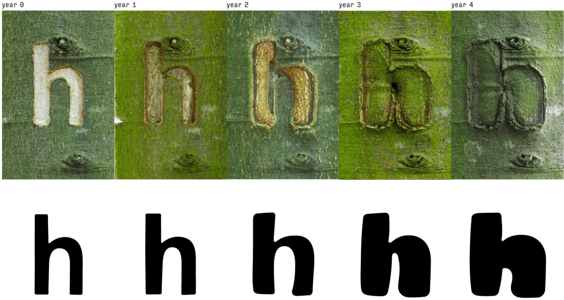
Too good for the Ticker: A Dutch artist came up with a genius creative project: He carved a full alphabet into the bark of a tree, documented how the letterforms morphed from year to year as the bark healed and regrew, and created digital fonts based on the progressions. So the fonts were essentially designed by the tree:
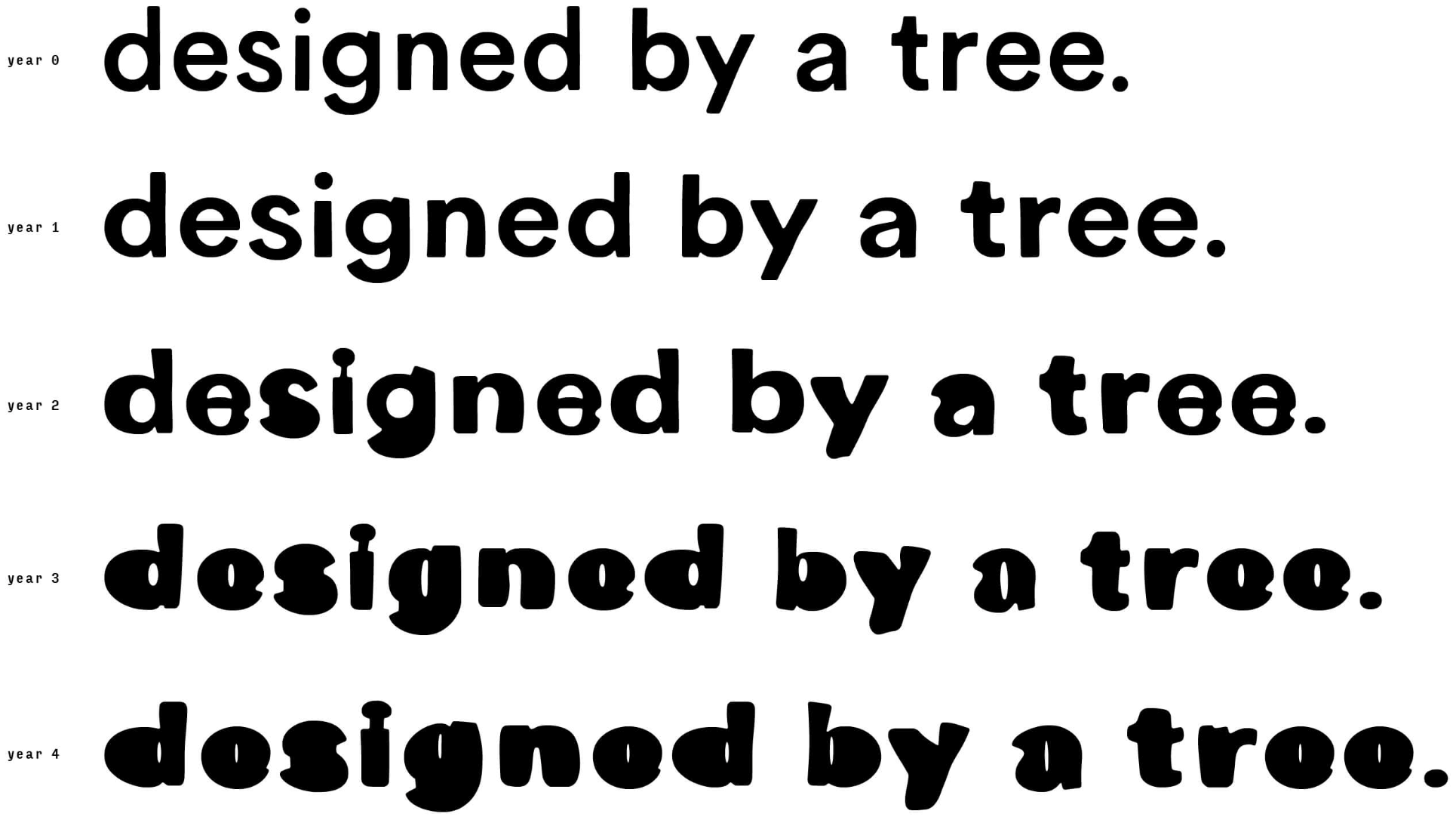
How cool is that? Fascinating additional details here.
(Mega-thanks to Michael Hochman for this one.)

Thank you: Yesterday I mentioned that I’m staring down the barrel of an insane health insurance premium increase and asked that those of you who haven’t previously supported Uni Watch please consider either making a donation or purchasing a Bulletin subscription (if you want to do it without Facebook, email me), a membership card, or some of our fine products.
The initial response was very promising. Thanks so much to all of you who pitched in, and doubleplusthanks to two readers who were particularly generous (they know who they are) — you’re all aces.
The Ticker
By Paul
Indigenous Appropriation News: Chamberlain High School in Tampa, Fla., will no longer call its teams the Chiefs (from Kary Klismet). … Also from Kary: The Saint Regis Mohawk Tribe is publicly backing legislation to prohibit Native-themed team names and imagery for schools in New York state.

Baseball News: The Angels added cap patches last night to mark the 20th anniversary of their 2002 World Series title (from Jorge Cruz). … Here’s how Mets P Max Scherzer looked in his Binghamton Rumble Ponies uniform for a recent rehab start. … Unusual Orioles logo on this cap, which was apparently for a team-sanctioned kids’ fan club. Fun variation on the MLB logo on the back, too (from Greg Bensinger). … The new team in the Prospect League will be called the Jackson Rockabillys (from Phil Santos). … The Red Sox gave away Hebrew-lettered jerseys last night (from Jeff Israel). … Guardians 3B Jose Ramirez has a necklace pendant with a picture of himself holding said necklace (from Mike Chamernik). … Pretty funny story about how MLB really botched an ad featuring the NYC subway (from Gabriel Luis Manga).
College Football News: Boise State is asking fans to wear specific colors for certain games (from Kary Klismet). … Ole Miss coach Lane Kiffin may have accidentally leaked his team’s latest camouflage uniform (thanks, Phil).

Basketball News: Here are the uni numbers for Virginia men’s new players (thanks, Jamie). … Española Valley High School in New Mexico has unveiled a new court design (from Kary Klismet).

Soccer News: New away kit for Belgian side Club Brugge (from Ed Zelaski). … Also from Ed: New kits for fourth-tier English side Carlisle United. … New home kit for Scottish club Dunfermline Athletic (thanks, Jamie). … The rest of these are all from Kary Klismet: New men’s national team home kits for Papua New Guinea and Cambodia. … New home kits for Atlético Madrid. … New logo for Pau FC of France’s Ligue 2. … New kits for 2. Bundesliga sides FC Heidenheim and Hannover. … New home kits for Birmingham City of the English Football League Championship. … New uniforms for the Offenbacher Kickers of Germany’s fourth-tier Regionalliga Südwest. … New home kits for Leyton Orient of England’s League Two:

Grab Bag: I feel like we may have had this before, but just in case: New logos for Brown University athletics (from Joel Mathwig). … Here’s something I’ve never seen before: The equipment staff at Prairie View A&M — that’s an HBCU in Texas — is going on strike, citing being “overworked and underappreciated” (from Ben Whitehead). … Here’s one writer’s pick for the worst uniforms in Denver sports history. … Here’s an interesting thread on why it took so long for Ohio State to successfully trademark the word “The” (from James Gilbert). … New package design and brand name tweak for Kraft Mac & Cheese (thanks, Brinke). … A dentist combined Nike’s slogan and one of those floss pick thingies to create a really funny dental hygiene reminder (from Mike Chamernik). … Interesting article about how Title IX has affected the design of women’s sports uniforms over the past 50 years. … Seattle is the latest city where police officers can march in the local Pride parade but not in uniform. … Here’s a very entertaining thread in which the text of various familiar brand logos is changed to match the imagery. … DC Comics has a new Batman logo. … New 50th-anniversary logo for Atari.
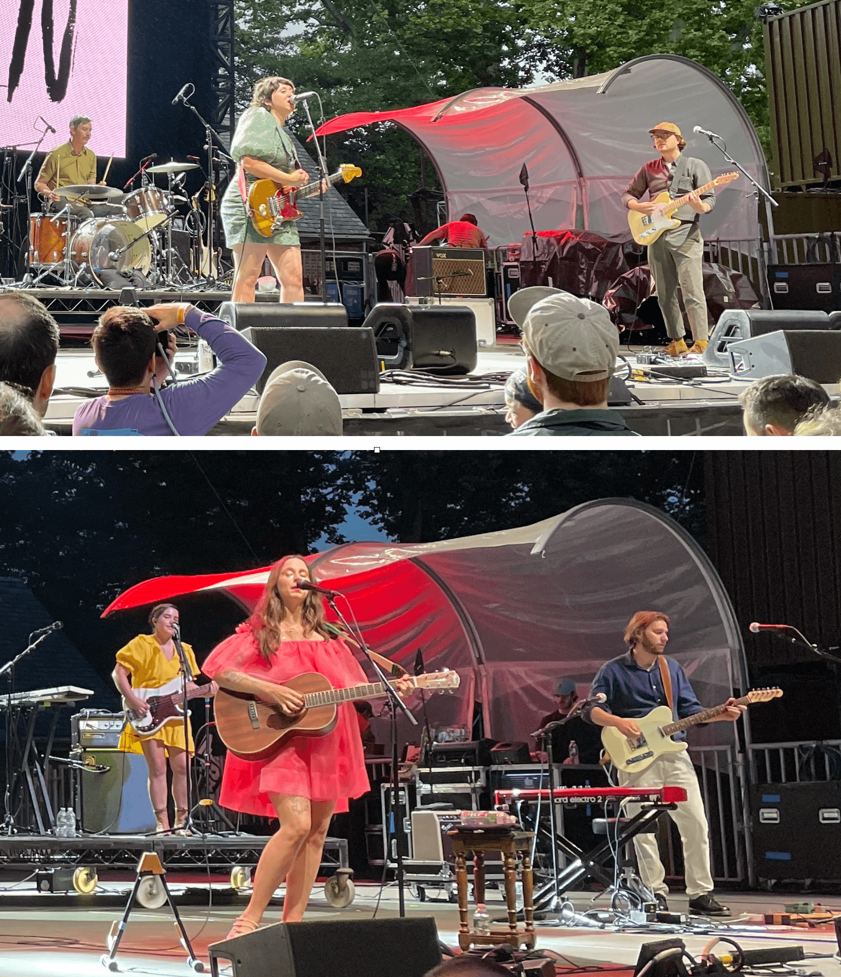
Click to enlarge

What Paul did last night: Really fun indie-rock family-affair double bill last night, as Swearin’ (fronted by Allison Crutchfield, top photo) opened for Waxahatchee (fronted by Allison’s twin sister, Katie Crutchfield) as part of Central Park’s free summer concert series. Waxahatchee has gotten more press and has a bigger following, but Swearin’ was by far the better band last night. Killer tunes, righteous energy.
Big shout-out to reader Rick, who recognized me during the show and said hi. Good meeting you, buddy — thanks for the kind words!
Truncated UCLA stripes are a pet peeve of mine. As for Batman’s new logo, I was shocked to see that comic books are now $5 each!
Batman rips off Stranger Things… ugh.
My reaction as well.
Five bucks for the regular cover. DC charges six for variant covers. The new creative team coming in on Detective Comics with that new logo looks amazing, but the only thing I see with that logo is “Stranger Things” – which itself is an homage to early Dungeons & Dragons graphics.
I don’t care for the truncated stripes, either, but the newest generation of football fans might see them as a feature, not a bug.
That Orioles dugout club hat is based on the “baby bird” logo the team wore as a sleeve patch in ’02 and ’03.
link
I think the main reason that ballparks named for teams go singular (Oriole Park being a weird exception) is what Paul hinted at with the Angels. The S-pause-S is difficult to pronounce, especially for those of us with even slight lisping tendencies. Just like how most people pronounce a name like Alex Smith as “Alec Smith” or “Alex Mith,” the default pronunciation for Angels Stadium would essentially be Angel Stadium. I agree with Paul that it does look better in print though. If the Nats used Stadium instead of Park, I bet it would be National Stadium. Good thing they went with park!
Ha! Of course it’s Nationals Park. It couldn’t be National Park, they’d have rangers instead of ushers. ;)
Well done!
One note about the 2009 Pats throwbacks – while their usual throwbacks were based on the 1980s unis (i.e. the period of their first Super Bowl appearance), the 2009 red throwbacks have some subtle differences besides the socks, as they were throwing back to the AFL – specifically the 1961-63 Pats. The key differences are the lack of a center blue stripe on the helmet, and the blue-white-blue UCLA stripes.
Yup, I just added a note about the UCLA striping.
I was hoping for “if they are patriots, why are they wearing redcoats?” headline.
Very happy to see Pat the Patriot back, but at the same time, bummed that such a gorgeous uniform will only be worn once or twice compared to their current set. Navy blue, IMO, is the most overused color in the NFL with BFBS coming in a close second. You have Houston, NE, Seattle, Chicago, Denver, Dallas, Titans all in navy and 5 of them go mono navy. Royal blue on the other hand isn’t used enough. Buffalo and LAR. The Colts and Giants blues seem to be a shade darker.
With the TV and camera photography we have today, the vibrant colors that teams used to wear come off so much better.
The Patriots, Eagles, Rams, Bucs, Seahawks, Falcons, Broncos, Titans and Giants would all look WORLDS better in their throw backs full time. All took advantage of bright colors rather than the dreary looks they sport today.
Pat peeve: It is not “Pat the Patriot”; it’s just “Pat Patriot”!
My mistake. Pat Patriot>Flying Elvis.
Side Note. I find it interesting that Jeff Lurie was another one of the owners pushing for the one shell rule to be lifted, I think the Eagles actually submitted that rule change a few years back, yet he “missed” the deadline to have a throwback for 2022, instead going for a black helmet.
With the new wordmark rolling out, I have a conspiracy theory that the Eagles are preparing for a full re-brand in 2023 with Kelly Green being the main color, and the black helmet they are using this year as their 2nd shell.
“Royal blue isn’t used enough”
I know this isn’t a popular opinion, but the Patriots look right after Pat Patriot didn’t get enough love.
Bright colours, unique stripe pattern, giant shoulder logos.
link
Agreed. One of my all-time favorite modern gridiron uniforms.
Agreed. I really loved that uniform. I liked it during Drew Bledsoe’s rookie year when they used the silver facemask instead of red.
If only a uniform columnist had written an article about that design….
link
;)
“and it’s a safe bet that the uniform, which is now linked to multiple Super Bowl titles, will still be around long after Brady eventually retires”
Brady isn’t even retired yet and they’ve already revamped their look.
Indeed! (I still find that very surprising.)
For the literal branding thread, it’s interesting that the designer used “dunk” for the Jordan logo (plus it’s called jumpman). I thought the brand name was pretty spot-on for an image of him, especially when he wasn’t dunking when they took the photo to design it.
I realize now that I’m overthinking this…
A couple more notes on the excellent write-up of the Pats throwbacks. I think it should be “red” at the end of this sentence…
“If you look at those photos, you can see that they paired the red jersey with white socks every year except 2009, when they wore RED.”
Also it’s interesting to note that in 1994, during just the second season of the “Flying Elvis” era, New England wore Pat Patriot throwbacks three times as part of the 75th Anniversary commemoration. Each time they wore white jerseys and they looked to be throwing back to the 1964-65 version of the Pat Patriot uni.
Right you are. Fixed.
In 1994 the team just were inaccurate with the 1961 throwback by including the blue center stripe. In 1964-65 they had different pants stripes – 3 thin red stripes with faint blue outlines. Technically the 1961 pant stripes should have been baseball-style piping but they used those thin stripes instead. A lot of the 1994 throwbacks were inaccurate; the Patriots were closer than some of the others. The Patriots 2009 version was more accurate. And the red socks were accurate for 1961.
You’re right that the ’94 throwback pants stripe is clearly an attempt to represent the ’61 version. It’s always been hard for me to distinguish exactly what those Patriot pants stripes were like in the early and mid ’60s, they were so thin. Other than that, the ’94 throwbacks do approximate ’64 and ’65 pretty accurately (though marred as always by those painfully truncated UCLA stripes that we’re haunted by to this day).
The 75th Anniversary season was visually one of the best the NFL has ever had. The patch was great, the throwbacks were for the most part great, and it was before the mid-90s black or dark accent rebrands were done for so many teams who had great traditional uniforms.
One of my favorite SI covers was Natrone Means in the true powder blue throwbacks.
link
Agreed, I was in heaven during many of those ’94 throwback games, especially those featuring the Pats, Chargers, Broncos, Oilers or Saints.
That top photo shows what a gorgeous uniform the throwback is. I mean, when they are designing the new garbage, do they not see how the simpler design concepts of past classics like this just look better?
Personally I’d like to see them with basically that red jersey, paired with the current logo, with silver helmets and pants. Sort of combining both eras, while also being visually unique, since no NFL team uses silver and red with blue trim combo.
One more for the “MLB Ballparks Using the Plural Team Name” file:
The Kansas City Royals played at “Royals Stadium” before it was renamed for team founder Ewing Kauffman in 1993.
and the Marlins played in Marlins Park until last year
And the Nationals almost have to play in Nationals Park, lest the singular be confused for the car rental company, or an actual national park.
Regarding the Naming Wrongs shirts, do any other Atlanta fans still call the new stadium “The Georgia Dome?” I know it’s not the same building and it has a convertible roof, but I refuse to call it by the advertiser’s name and the name “Georgia Dome” is pretty cool IMHO.
That being said, I believe an “I Still Call It/I’m Calling It the Georgia Dome” shirt would be more appropriate than an “I Miss the Georgia Dome” shirt – which is REALLY a stretch for most of us bc the new stadium is rather lovely, regardless of the wretched name.
Thoughts?
1) Hope that the Patriots’ UCLA stripes look better than the Panthers. The current shoulder stripe is too thin … was much better when the middle color panel was much thicker. Then again, the Panthers logo on the sleeve used to be screened and is now stitched.
2) That healthcare service carriers continue to gouge – that’s the word … no beating around the bush – customers is wrong. Most of them are swimming in billions in their war chests because people who have anything not life- or limb-threatening hasn’t been able to address it because hospitals and other healthcare facilities have had to concern themselves with COVID-19 cases … and making sure that other don’t contract the virus. I’m sorry, Paul. No excuse for their spiking your premium.
I agree that the truncated UCLA stripes stink, but I find it hard to agree with the sentiment that Nike has “fixed” anything with regard to the Panthers’ jersey template. The TV numbers have gotten ridiculously small over the last couple years.
Agreed, the Panthers stipes aren’t really UCLA style, but a different striping on the shoulders.
UCLA itself was able to render the shoulders just fine in 2020 with under armor, there is no excuse for the truncation, other than the NFL teams not insisting they be done right, which I assume UCLA did insist on.
link
Related to the singular/plural stadiums. I noticed during the NCAA Tournament that UNC uses “Tar Heel Basketball” instead of “Tar Heels Basketball.” It immediately reminded me of baseball stadiums.
link
Not so sure “accidentally” is the proper term on the Lane Kiffin tweet.
Looks like a perfectly framed and staged photo to me :)
Paul, regarding your health insurance, have you looked into Obamacare coverage? I believe NYS has navigators to help you through the process. If your plan is through the Obamacare exchange, what part of the Affordable Care Act is actually “affordable?” Anyhow, just a thought.
Yes, my plan is already from the NYS exchange.
Definitely don’t want to get into a political debate but the ACA (Obamacare) has helped raise the costs of healthcare significantly. Or it hasn’t made it more affordable like it was supposed to.
I always say, “If you don’t want to start a political debate, don’t start one” and particularly one that starts with “I don’t want to start a political debate” right before you start one.
Paul, from the linked article on the Patriots lobbying for the one shell change:
Jonathan Wright joined the NFL in 2014 as the Senior Director of Uniforms & On-Field Products – one year after the rule was changed.
“I’m a uniform geek, what am I going to say,” Wright said. “It’s a weird little niche that I’ve fallen into but I love it.”
He would be a great interview subject.
Way ahead of you, Brad!
Sweet
Kudos to the Red Sox and Patriots. I saw the Red Sox’ CC unis last night, and while it is all gimmicky, as a runner I loved the tie in with the Boston Marathon. And of course I love the Patriots’ throwbacks. Imagine how much better the NFL would be visually if the Patriots, Dolphins, Falcons, etc. just always wore their throwbacks.
Red Sox CC unis look like UCLA got lost in Boston.
I’m surprised you didn’t mention the two different red and white jerseys the Patriots have used as throwbacks. One has outlined numerals and one does not.
Hey, I’ve ALSO seen Swearin’ open for Waxahatchee! This was back in 2015. I’m not sure if she’s still doing it, but at the time Allison Crutchfield was in Waxahatchee’s touring band, so after doing her set with Swearin’, she joined her sister on stage to play guitar for Waxahatchee.
One day I’d love to see ’em do a show of PS Eliot material. That band rocked.
Allison is not currently in Katie’s touring band (which is a shame, because the guitarists Katie’s currently using are just boring, emotionless technicians). But after Wax’s set, Allison came out and they did do one P.S. Eliot song together — just the two of them.
I imagine that is due to Saint Cloud’s much more personal focus on her — a far less band oriented album than the previous work. I can see how it could be a less engaging show, but that album was a keystone for me surviving the early pandemic. Sounds like a great evening!
Following up on yesterday’s item about the giant caps at Angel Stadium, reader Benji Boyter reports that the caps have giant size tags on the inside. That’s pretty cool!
Football mini-helmets also used to have the accurate hat size on the shell.
Will various modern helmets make the throwback Patriot logo difficult to apply? The logo has a lot of nooks and crannies.
Has anyone taken a look at how equipment managers handle the application of difficult logos on various helmet models?
I’m guessing they’re in no hurry to update the 5950 hat tag to “100% polyester” and “made in Bangladesh”
That picture of Julius Adams and Neil Lomax is a thing of beauty.
Winker’s been all over the place with hosiery this year
Pajama
link
Above the knee, no stirrups, solid blue
link
Fauxback with stirrups, sox above the knee
link
Jackie Robinson Day, Grey JR sox above the knee
link
Striped sox above the knee
link
etc.
Regarding Jesse Winker’s lower leg stylings, it helps the whole aesthetic quite a bit that he wears what I’d call “soccer style” cleats which are much sleeker with a thin or non existent mid sole. Most modern baseball cleats are pretty chunky – sneakers with spikes on the bottom essentially. The soccer style is much more evocative of the era evoked by the stirrups. The modern style cleat with stirrups always just slightly looks off.
It’s funny — when I started following football in the early 1980s, Pat Patriot looked horribly dated. Now he’s retro-cool. I’m not sure how that works, but I’m glad the throwbacks are back.
You weren’t wrong. I mean, I love Pat Patriot, but it is objectively a very era-dated helmet logo. I don’t love Flying Elvis, but I cannot think of a single honest argument I could make on any grounds whatsoever for preferring Pat Patriot to Flying Elvis. Yet, I do. I can like a thing without having to pretend that it’s also good; some bad things, I enjoy. And yes, I’m specifically arguing that Pat Patriot is the Def Leppard of gridiron helmet logos.
But I’m with Paul in wishing that the earlier tricorn helmet logo would make a comeback. Even better than Pat Patriot, which was just a team logo slapped on a helmet, whereas the tricorn and number were a highly distinctive helmet treatment that played with form, not just content. The tricorn helmet was closer to a Vikings or U Michigan helmet in that regard.
The Boise State themed section thing is nothing new, they’ve done it before
Nobody claimed it was new. We’re just showing the colors and dates for this season.
The tricorn hat logo would be such a fun promotion for the Semiquincentennial in 2026!
You just wanted to say, “semiquincentennial”! (And who could blame you?)
In all seriousness: You’re right, that would be perfect.
Regarding the Kraft Mac & Cheese, here’s an article on some history of the product design
link
I like the Pat Patriot throwbacks, but something occurred to me today that I never thought about before…why is the primary jersey color red? The Patriots for which the team is named fought against the British “redcoats.” Pat Patriot himself is wearing a blue jacket. Seems like it would make more sense to have blue jerseys with red trim (basically like their current modern unis).
The mistake is seeing the football uniform as a skeuomorph of a rebel soldier’s uniform. Perhaps they were ready to go with blue jerseys in 1960 but saw all the other teams that had them and switched to red.
I’m still calling it Kraft Dinner.
Still known as Kraft Dinner in Canada.
Though the packaging has shifted more to emphasize “KD” than Kraft Dinner, Kraft Dinner is still front and center on the box.
link
Regarding Jesse Winker: I’m surprised he chose to wear white sleeves with his blue jersey. I don’t recall the last time I saw them. I’m not up-to-date on MLB rules regarding white sleeves but I bet a pitcher wouldn’t be allowed to wear them.
Talking Patriots jerseys bring me back to an 1971 white M & N Reggie Rucker throwback jersey I have somewhere….about as plain wrap a jersey that you can imagine, but it has an odd, simple elegance to it….it can still evoke imagines of a pre-arm injury Jim Plunkett zipping the ball in there…..
One thing i noticed with the different variations of the Pat Patriot throwback is the [’02, ’10-12, ’22-] versions of had a white facemask, while the [’94, ’09] versions had a gray facemask. Are these details accurate with the rest of the changes between versions of the uniform?
Yes. The Patriots went to white facemasks from gray in 1982. The 02, 10-12, 22 on are throwing back to 1984-1990 (they switched to red facemasks for 1991-92 but didn’t change anything else) and the 94 and 09 are supposed to be 1961.
I love the Pat Patriot helmet. My second favorite Patriots helmet is the tricorn. I wish they’d bring back Pat as the full time logo/helmet. I also love this throwback uni combination. But if they bring back Pat permanently, they could keep the blue jerseys, I wouldn’t mind.