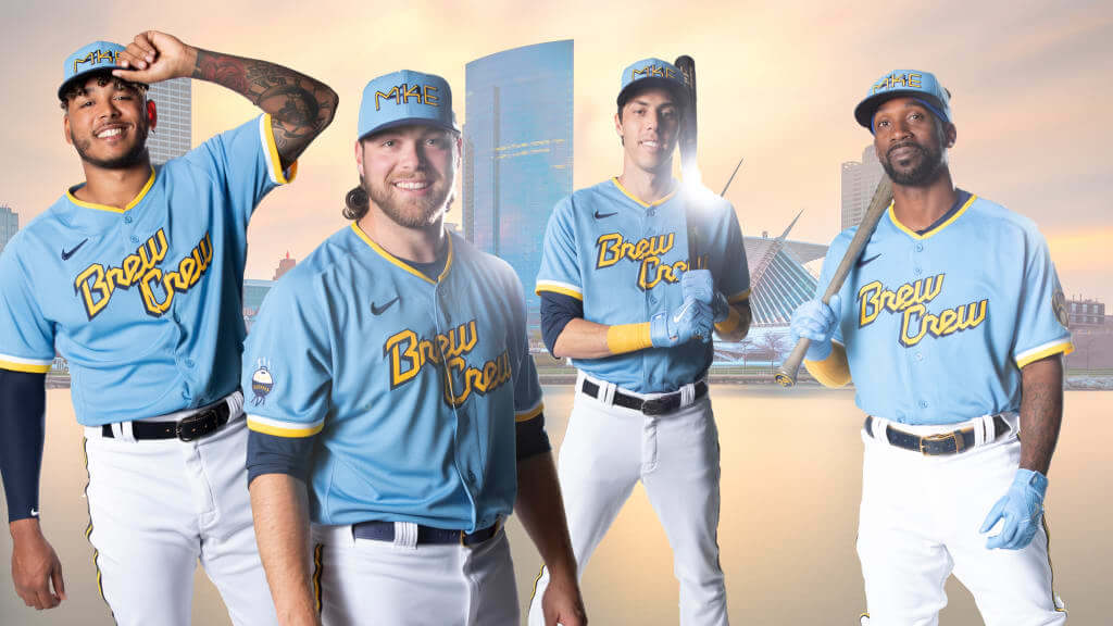
Click to enlarge
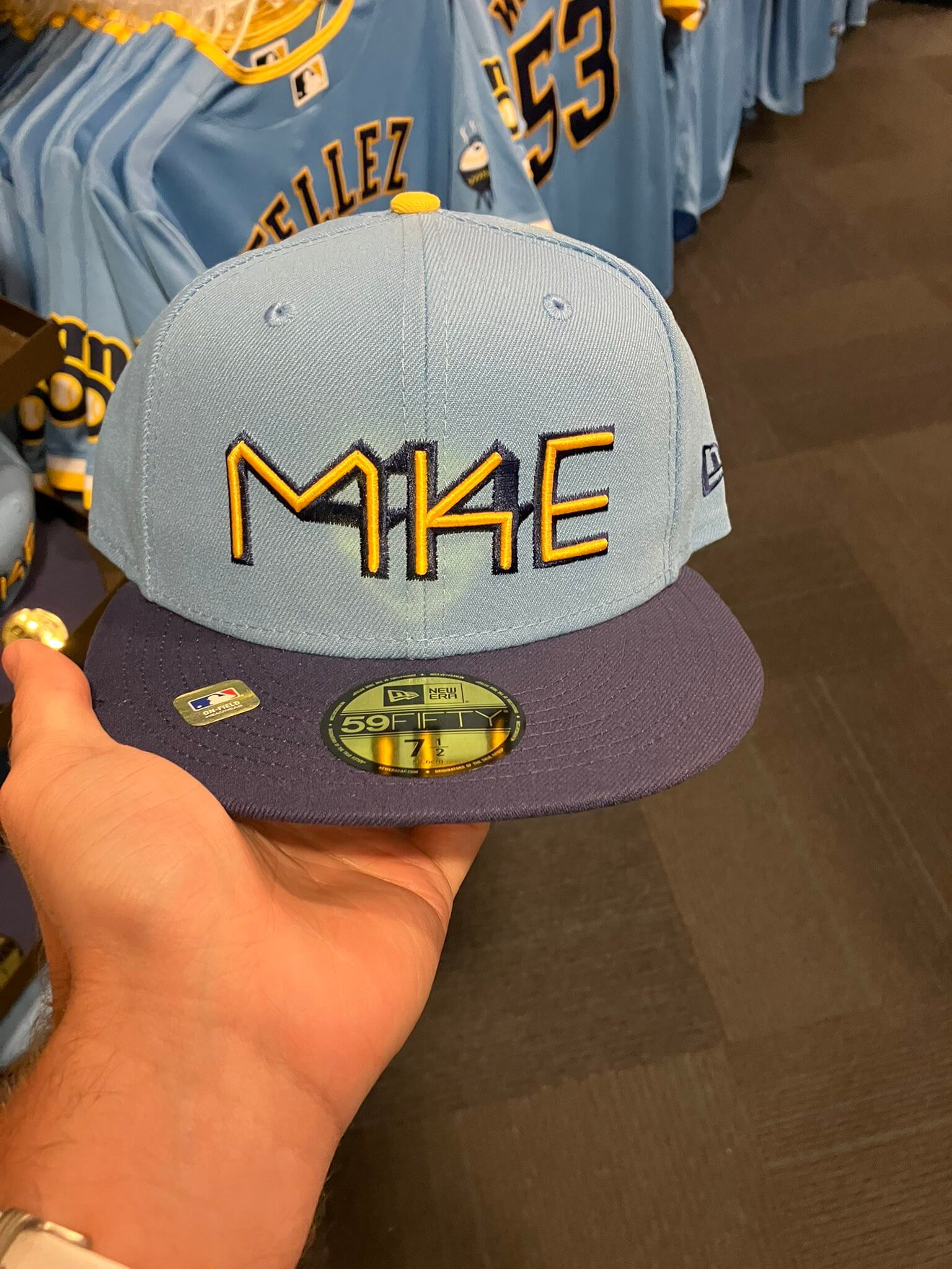
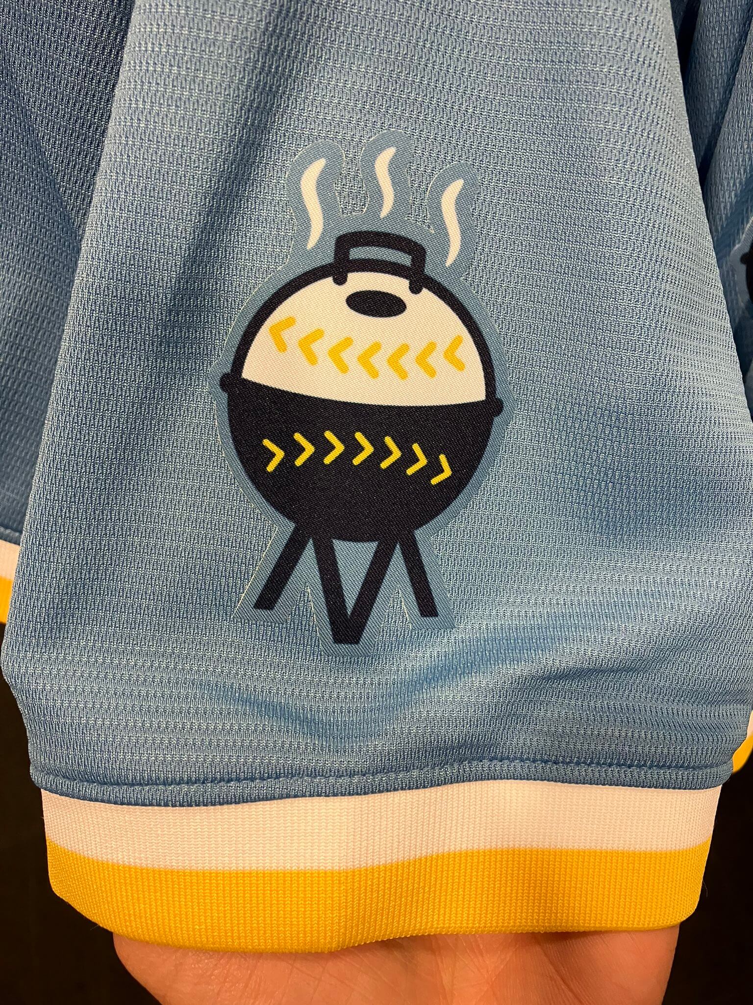
Good morning! Last Friday I promised that I’d have a full assessment of the Brewers and Jazz unveilings, so let’s get into that, beginning with the Brewers. Their “Brew Crew” City Connect design is shown above, and here are some additional pics showing the socks, cap, sleeve patch, and rear view:
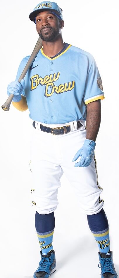
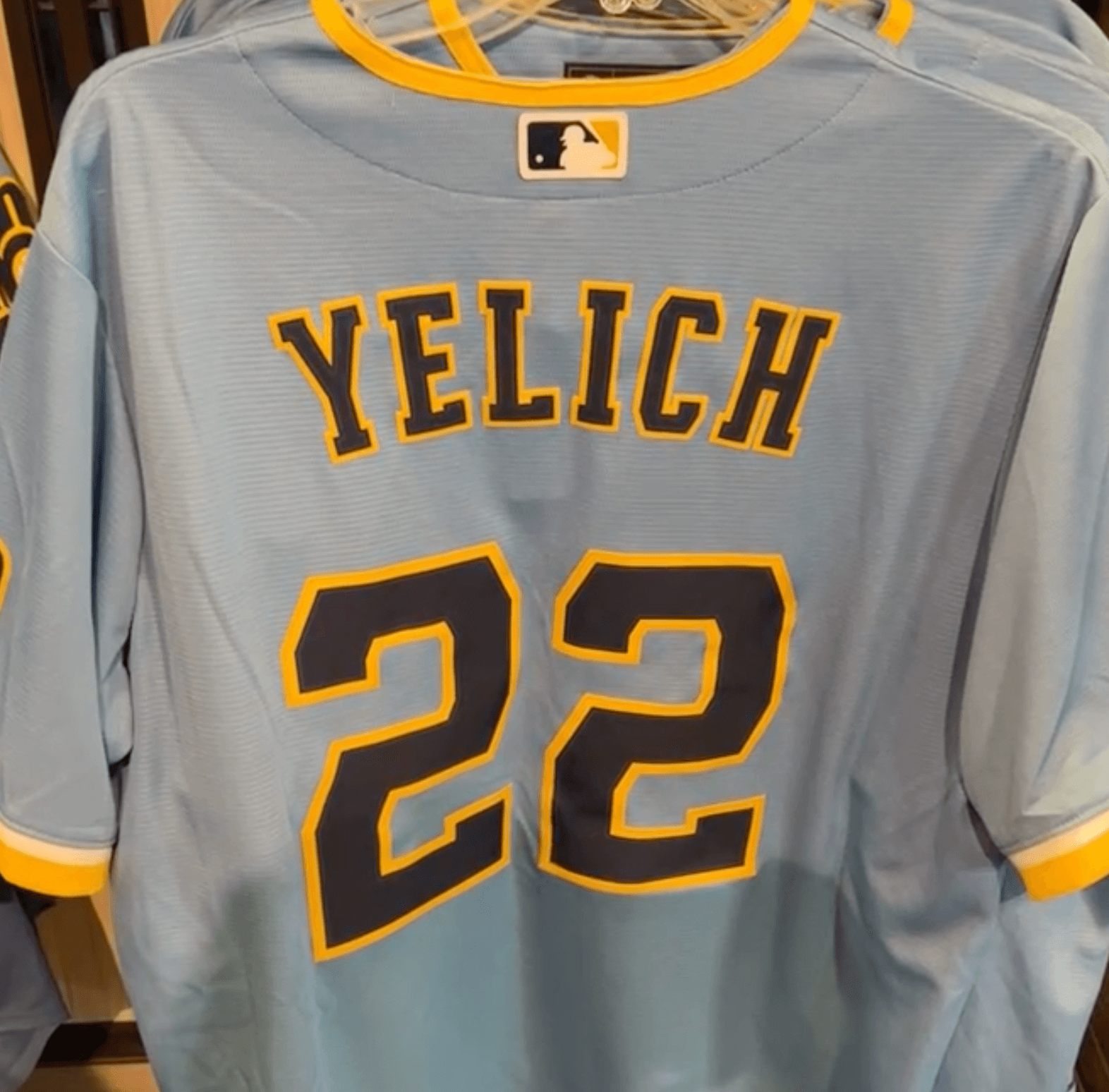
Some thoughts:
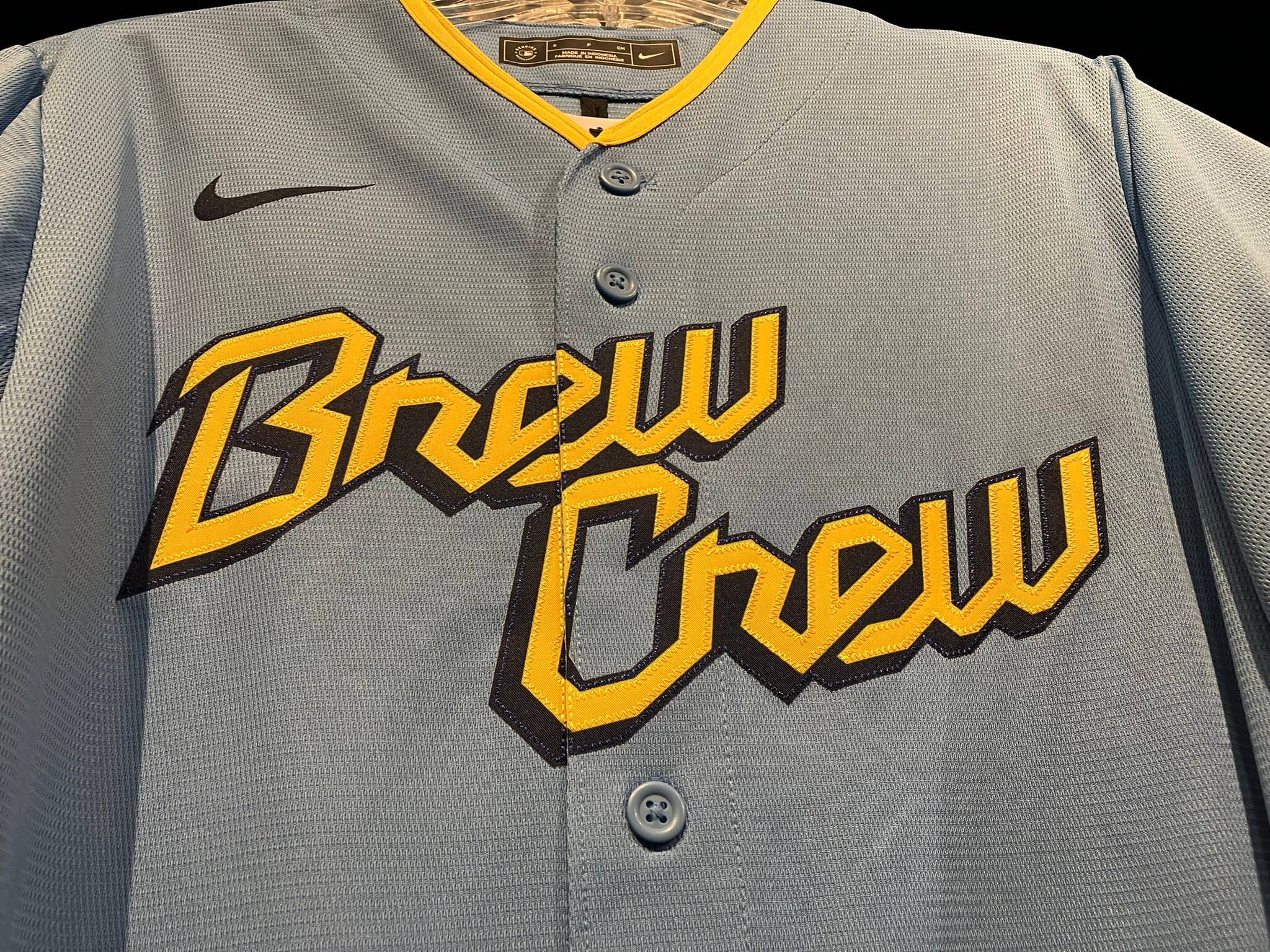
• Everything about the chest insignia feels minor league at best, amateurish at worst. A nickname like “Brew Crew” loses a lot of its vernacular charm when you institutionalize it on a jersey. The whole point of it is that it’s informal, unofficial, conversational, organic. On a DIY T-shirt, it’s awesome; showcased on a jersey, it feels like just another piece of corporate branding. Pfeh. Plus the script is really clunky-looking, plus-plus it breaks very awkwardly across the placket:
• The cap is just brutal, with the “MKE” and “414” shoehorned together in a way that feels way too forced. Feels like a (non-winning) submission to a design contest. Plus area code branding, which has always felt stupid to begin with, doesn’t even make sense anymore because people move around the country and take their existing phone numbers with them.
• The socks, like most CC socks, are embarrassing.
• The grilling patch is a really fun design (it would look great on a hat or T-shirt, right?). The problem is that the idea behind it is too broad-based to work as a team logo. I mean, even if you accept the notion that Milwaukee fans tailgate more than other fans (which is the supposed idea here), tailgating and grilling are still universal concepts. If the grill had brats on it, then it would work as a Brewers patch. But the simple combination of baseball and grilling? Milwaukee has no monopoly on that — it belongs to everyone. Hell, every team could (and should!) make their own version of this logo, rendered in their own team colors.
In short: I’m not a big fan of this design. But the most interesting aspect of this uniform isn’t even mentioned on the team’s unveiling page, and I wouldn’t have known about it myself if former Uni Watch Ticker-er Mike Chamernik hadn’t brought this tweet to my attention:
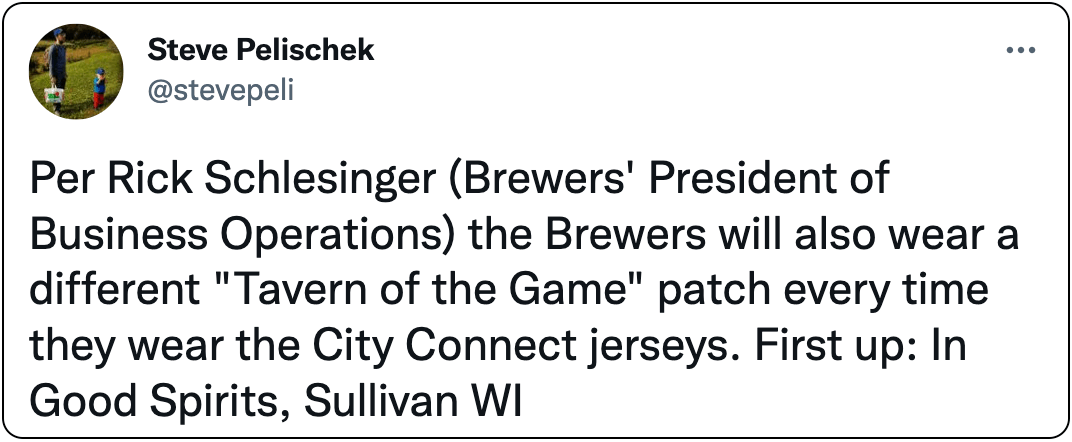
This move — an extension of the team’s existing “Tavern of the Game” promotion — will make the Brewers the second Big Four team to offer free advertising space on its uniforms to local businesses. (The first was the Devils, last winter.)
Now, you’d be hard-pressed to find a bigger fan of Wisconsin’s tavern culture than me. I’ve had some of the best times of my life in Wisconsin taverns! But do I want to see the names of those taverns on jersey patches? No, I don’t (just like I don’t want to see the Mets wear patches promoting my favorite NYC pizza joints, or the Dodgers promoting L.A.’s best taco joints, or whatever).
I don’t want to be a killjoy here. The team’s impulse — providing free promotion to local businesses that are a big part of the local culture — is obviously laudable, and I salute that impulse. Is it better than wearing a big, honking corporate logo on your sleeve in return for gobs of money? Sure. But it’s still an ad patch and doesn’t belong on the uniform. If you want to support local businesses, there are other ways, better ways, of doing that.
Also, it’s interesting that MLB is okay with the Brewers wearing patches that essentially promote alcohol. Hmmmm.
We’ll have to wait and see what these tavern ad patches look like. But we won’t have to wait long — the CC uniforms are slated to make their on-field debut this Friday, June 24. (They’ll be worn for all three games this weekend, and then for Friday home dates after that.)
———
Okay, now let’s move on to the Jazz. Here’s a look at the four uniforms they unveiled on Friday:
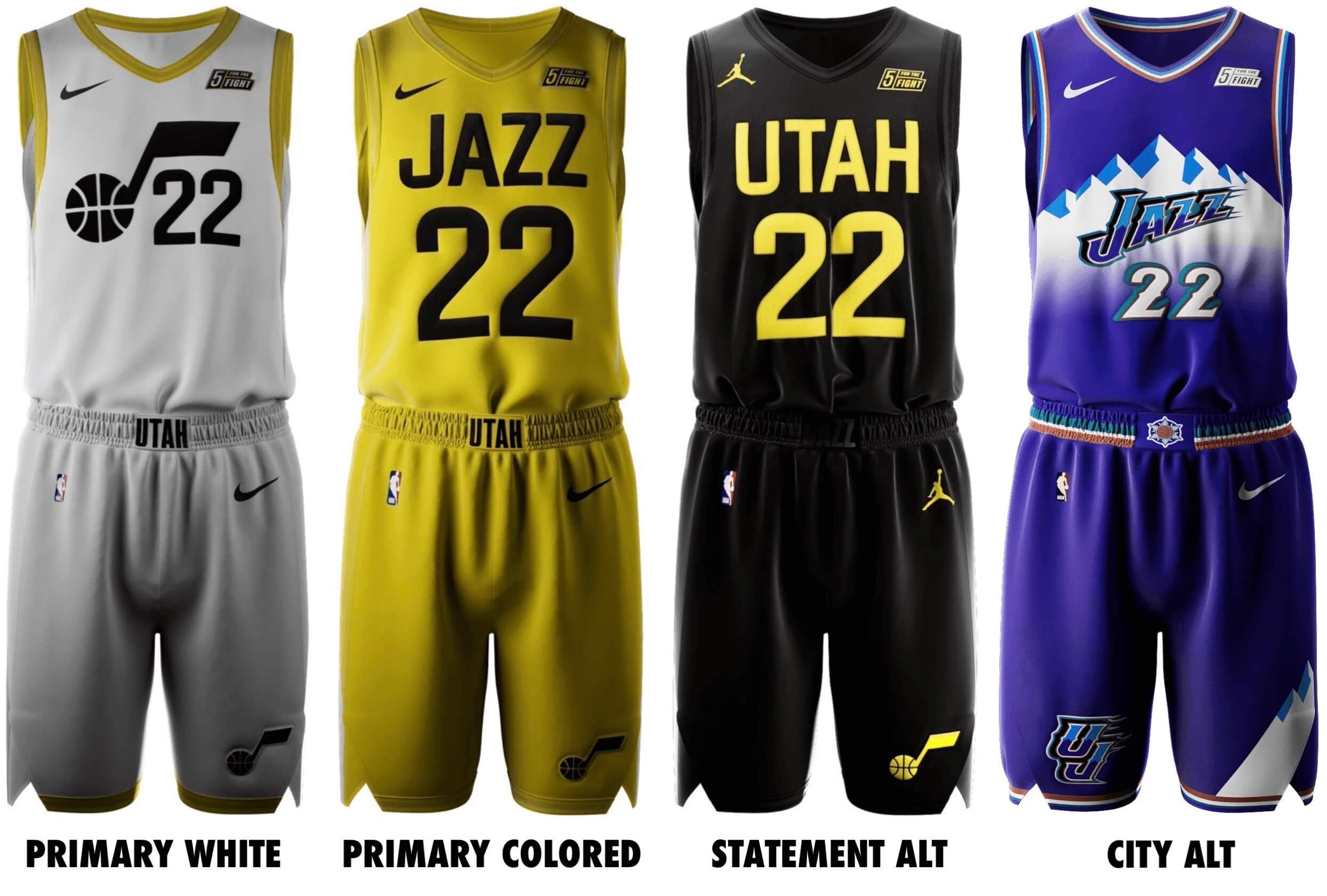
So they’re basically going with an assortment of designs that look like weekend rec league uniforms, supplemented by a revival of the ’90s-est design ever. Got it.
What a brick. I can sorta/kinda get behind the white design because I’ve always liked it when they use the jazz note and number by themselves. But the previous versions of that approach were much better. This new design, and this whole set, feels so rote and uninspired by comparison.
The “purple mountains” throwback will be this season’s City alternate, and then they plan to have a new purple City design every year. The one for 2023-24 — the franchise’s 50th season, dating back to its days in New Orleans — will apparently be this:
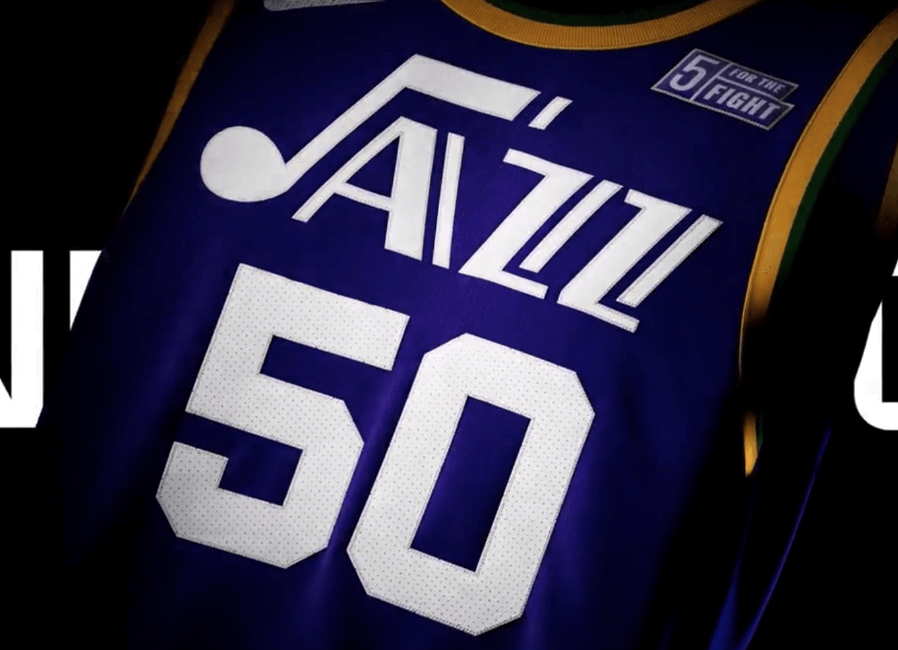
Want a good laugh? Check out this hilariously pathetic “storytelling” (quoting from this page):
The white and black uniforms symbolize the white and black keys on a piano, a significant element in the history of jazz music. The yellow jersey represents the spotlight designated to the greatest performers in history, a nod to the fact that Utah embraces being in the spotlight with all eyes watching.
Hahahahahahahahahahahahaha!
These uniforms will be worn with two new court designs:
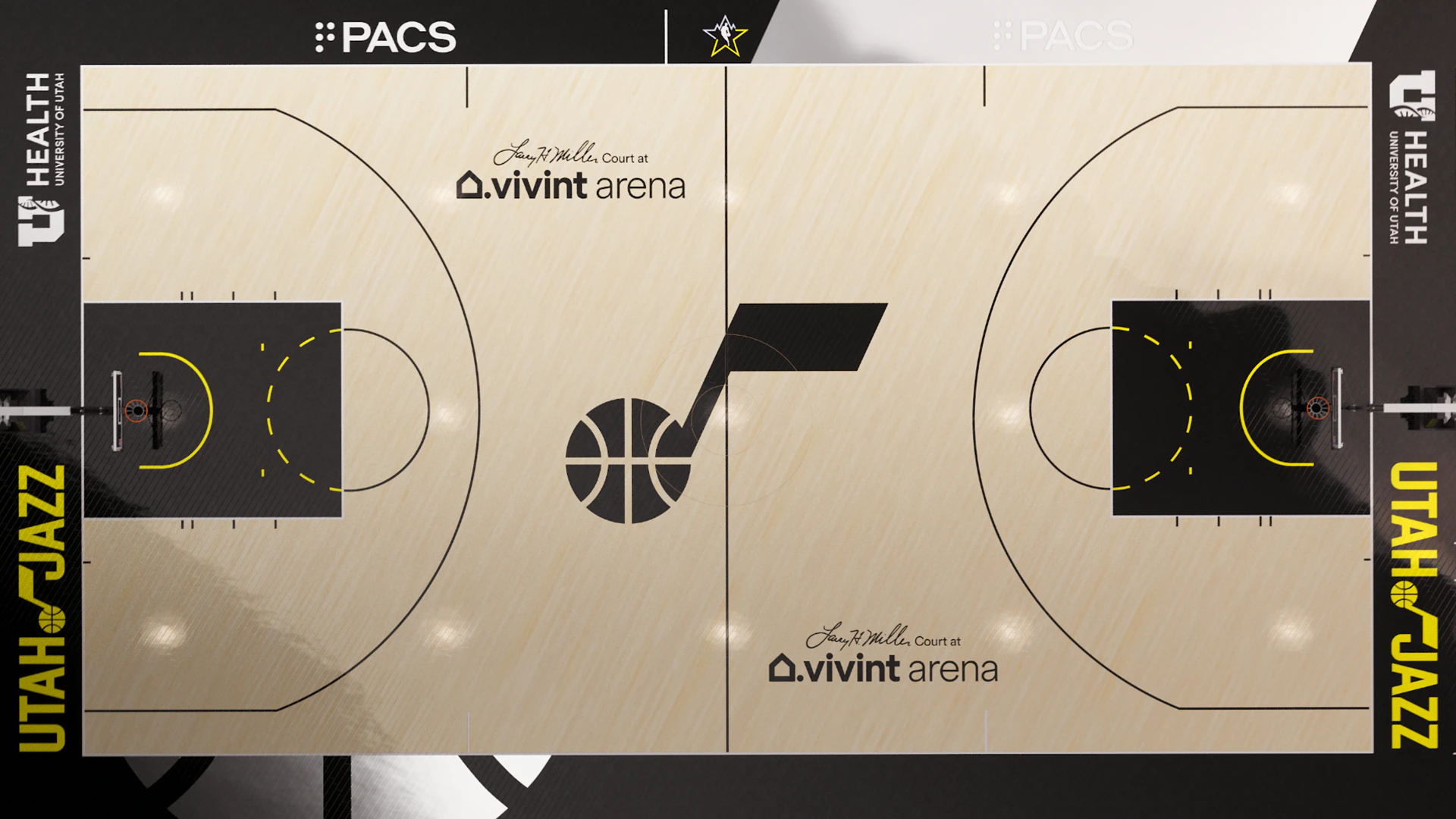
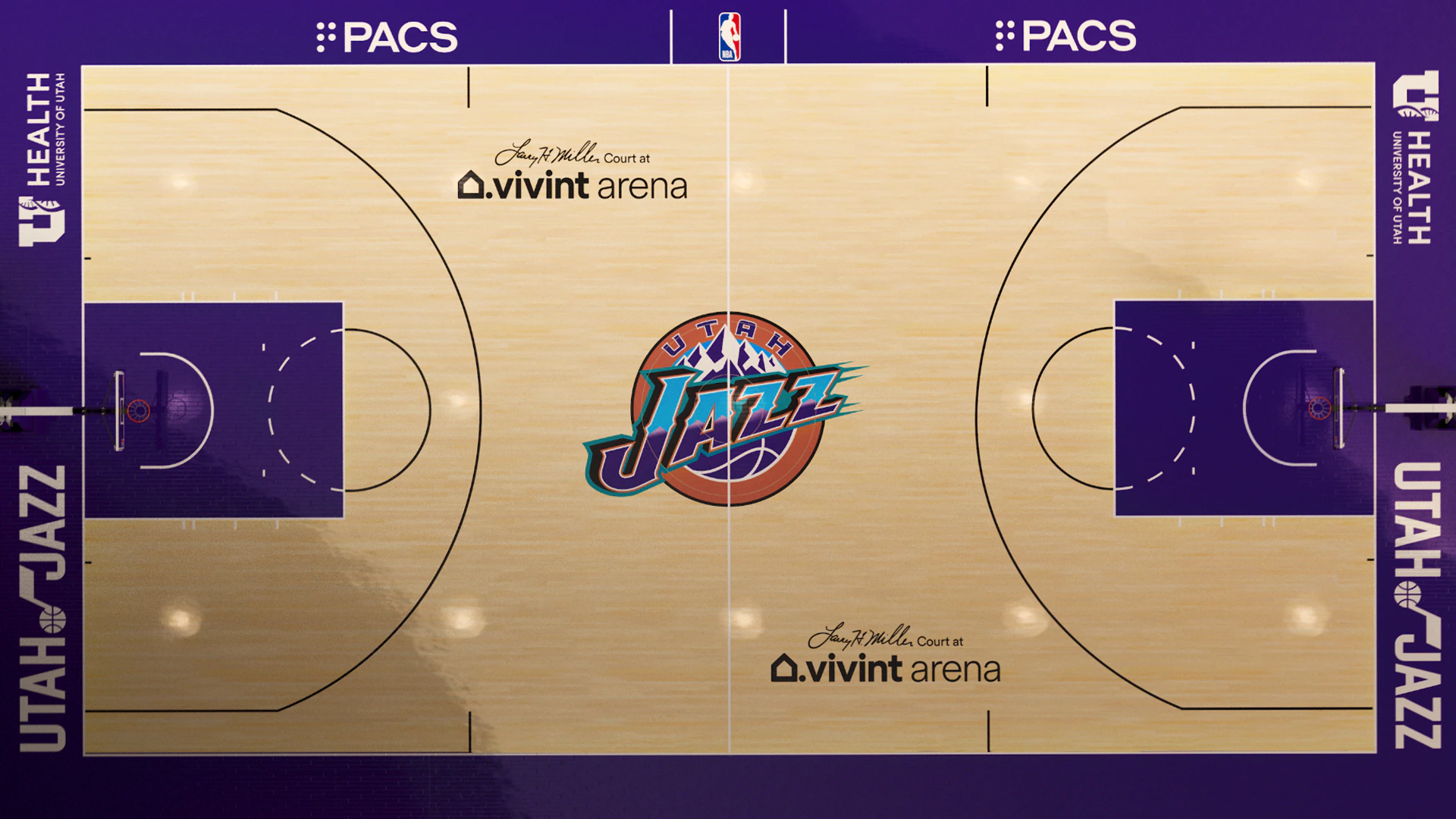
Additional info and hype here, if you dare.
So how was your weekend?
An umpire asked pitcher Graham Ashcraft to take his wedding ring off of his glove hand pic.twitter.com/D5h2oFQVjA
— Jomboy Media (@JomboyMedia) June 18, 2022
Ring around the collar: Interesting scene on Saturday, as the umps made Reds pitcher Graham Ashcroft remove his silicon wedding band, so Ashcroft attached it to his necklace instead.
There’s a good recap of the situation — including the rarely enforced rule that the ring does indeed violate — here. (Meanwhile, longtime readers may recall that I did an in-depth piece back in 2011 on players in various sports who wear their wedding bands during games.)
(My thanks to our own Alex Hider for this one.)
Click to enlarge
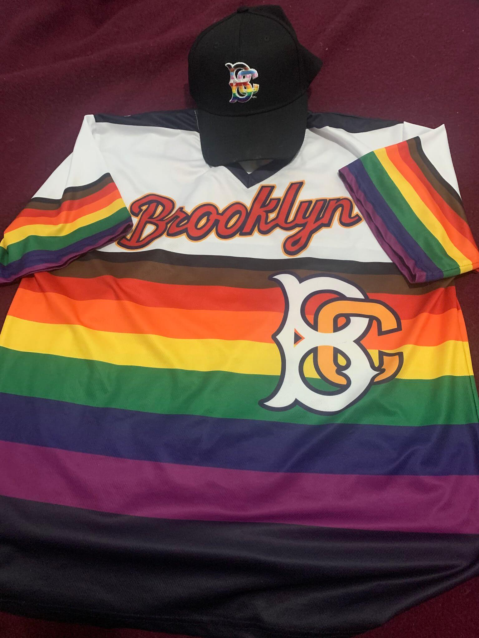
LGBTQuila sunrise: The Single-A Brooklyn Cyclones gave away this Pride jersey (but did not wear it on the field) the other day. Has any other team combined the Pride rainbow with the tequila sunrise template? Seems so obvious once you see it executed like this, but I’m not sure I’ve ever seen it done before.
(My thanks to Robert Brashear for this one.)
Uni Watch Hit Parade: Yesterday was Juneteenth. A few days before that, my favorite radio DJ, WFMU’s Dave the Spazz, heralded the holiday by playing this old song by Gladys “Fatso” Bentley, “Juneteenth Jamboree.”
It’s so good — an instant party, and a great holiday anthem that I’d never heard before. Enjoy!
The Ticker
By Jamie Rathjen

Baseball News: MLB players wearing Nike cleats had a common Father’s Day design (from Luke Mendheim). … Yankees manager Aaron Boone had two different pairs of Father’s Day shoes, one for before the game and one for during it (thanks, Brinke). … Also from Brinke: Nationals OF Juan Soto’s cleats were based on a picture of him with his dad after what looks like one of the games of the 2019 NLDS. … Nationals P Steve Cishek had “dad shoe” cleats that looked like sneakers (from multiple readers). … The collegiate summer Western Canadian Baseball League’s Brooks Bombers wore plaid jerseys for Father’s Day (from Wade Heidt). … With the Nationals retiring No. 11 for Ryan Zimmerman on Saturday, William F. Yurasko sends us the story of how Zimmerman got the number in college at Virginia. … A Nationals usher has a cane made from a Louisville Slugger bat. “He says the guests in his section bought it for him,” says Max Weintraub. … The Dodgers revealed a Sandy Koufax statue on Saturday (from multiple readers). … Cardinals OF Harrison Bader had a hole in his leggings, or something, yesterday (from Andy Zare). … The Atlantic League’s Southern Maryland Blue Crabs wore Baltimore Elite Giants Negro League throwbacks for Juneteenth (from John Cannon). … Hamtramck, Mich.’s Hamtramck Stadium is one of the few Negro League stadiums still standing and is being rededicated today with a tribute game (from Kary Klismet). … The next two are also from Kary: The collegiate wood bat Northwoods League’s Battle Creek Battle Jacks have a new costumed mascot. … Former Iowa men’s basketball player Keegan Murray threw the first pitch at the Cubs game last Wednesday and had a jersey with his NOB and No. 15. (from Kary Klismet). … Denver Broncos QB Russell Wilson and former QB Peyton Manning came to Rockies batting practice the other day wearing full Rockies uniforms. … Speaking of the Rockies, their CC jersey looks a lot better when paired with white pants (from Paul Munoz). … A new Red Sox-themed ice cream is studded with little hanging socks-shaped chocolate pieces (thanks, Brinke). … The Mariners and Tigers both wore Negro League throwbacks on Saturday for Juneteenth. The Tigers’ opponents, the Rangers, were supposed to wear throwbacks as well, but that plan was scuttled by supply-chain issues.

Football News: The Cowboys have a new alternate helmet — presumably the return of the white throwback — in the works. … Some NFL players have been busy appearing in other teams’ uniforms over the past few days: Cross-posted from the baseball section, Broncos QB Russell Wilson and former QB Peyton Manning came to Colorado Rockies batting practice wearing full Rockies uniforms, while Buccaneers C Ryan Jensen is from Colorado and came to Game 2 of the Stanley Cup Final(s) with an Avalanche/Lightning frankenjersey (from Kary Klismet). … Also from Kary: Michigan revealed its Big Ten championship rings. … Brashear High School in Pittsburgh poaches the Texans’ logo (from Andrew Cosentino).

Hockey News: Cross-posted from the football section: Tampa Bay Buccaneers C Ryan Jensen is from Colorado and came to Game 2 of the Stanley Cup Final(s) with an Avalanche/Lightning frankenjersey (from Kary Klismet). … Also from Kary: The NHL now has a interactive 3D model of the Stanley Cup, though you need your phone or something with a touchscreen to view it properly.

Basketball News: These three are all from Kary Klismet, and the first one is cross-listed from the baseball section: Former Iowa men’s player Keegan Murray threw the first pitch at last Wednesday’s Chicago Cubs game and had a jersey with his NOB and No. 15. … What is claimed to be the oldest extant basketball court in the world, from 1893, is in St. Stephen, New Brunswick, and a group is hoping to turn it into a museum (from Kary Klismet). … Also from Kary: A public court in Philadelphia in memory of Kobe and Gianna Bryant opened last week.

Soccer News: The NWSL’s Washington Spirit wore warm-up shirts on Friday supporting the Black Women Players’ Collective, an association of Black current and former NWSL players. … OL Reign also had a Juneteenth-themed captain’s armband, but I’m not sure if any other teams did. … In the same league, it was the Kansas City Current’s turn to wear rainbow numbers. … Meanwhile, the Orlando Pride had artist Diana Al Shammari, who embroiders soccer shirts, create a piece based on the Pride’s second shirt. … St. Louis City, who won’t start playing in MLS until next year but have a reserve team playing in MLS Next Pro, wore Juneteenth warm-up shirts on Friday saying, “Support Black Dreams.”. … New shirts for Belgium’s KAA Gent, England’s Lincoln City, Mexico’s Club Tijuana, and Poland’s Ruch Chorzów (from Ed Żelaski). … New second shirt also for Scottish club Partick Thistle. … More new shirts for Germany’s St. Pauli and Turkey’s Galatasaray (from Kary Klismet). … In England, both Norwich City and Crystal Palace updated their crests. Palace dug further in on their alleged connection to the first Crystal Palace club founded in 1861 by putting that year in the crest instead of 1905, the year the modern club is usually taken to date from (the latter of those is from Trevor Williams). … Another from Kary: The English Football League has a new number/NOB font, and we can tell because it appeared on a shirt Ipswich Town used to reveal a new men’s team signing. Ipswich also revealed next season’s shirts. … New home shirt for Austrian side SK Rapid (from Ed Zelaski). … La Liga’s Real Valladolid has a new shield design (from @stickyjuan).

Grab Bag: Aston Martin Formula One driver Sebastian Vettel has brought attention to social or environmental issues in F1 host countries a few times this season by wearing T-shirts during the race weekend. He targeted Alberta’s oil sands for yesterday’s Canadian Grand Prix, and his helmet design also tied into that theme. … Reader William F. Yurasko points out that with the Nationals’ retirement of No. 11 for Ryan Zimmerman on Saturday, three D.C. pro teams have retired No. 11 and the Mystics surely represent a future fourth for Elena Delle Donne. … English field hockey’s Teddington Hockey Club, which claims to be the oldest in the sport, celebrated its 150th anniversary by reenacting a match as they say it would have been in 1871. Players used modern sticks and boots but it looks like the game was even played on grass, which the sport has long since abandoned in favor of artificial turf. … “Here’s a cool story about how fashion design students at The New School in New York City are helping to create adaptive and inclusive uniforms for Special Olympics athletes,” says Kary Klismet. … Jared Buccola’s weekly PLL report: “”Business as usual for Redwoods vs Chaos and Cannons vs Archers, while Whipsnakes wore their red jerseys for the first time this season vs Atlas. Chrome wore new matte grey helmets over a black/grey gradient uni combo. Waterdogs wore full lavender with new white helmets.”
The most hilarious thing about the Jazz reveal (and I guess about having a team called the “Jazz” in Utah) is the tortured way they try to link the name to the city when in reality it was just a matter of “we couldn’t be bothered to change it to something relevant in 1979.”
It would be like the Colorado Avalanche moving to Miami and not changing their name, yet somehow worse.
I remember reading that when the Vancouver Grizzlies were planning to move, and were considering a move to New Orleans, there were plans for them to swap names with Utah. The Utah Grizzlies makes more sense, even though I don’t think grizzlies are in Utah anymore.
There was a perfect chance when the Bobcats got the Hornets name back, who wouldn’t have said no to a 3 team trade where:
Hornets -> Charlotte
Jazz -> New Orleans
Bobcats -> Utah
Absolutely no one
I promise you not a single Utah Jazz fan is saying, “If only they’d let us change our name to Bobcats”. Not. One.
Bobcats were named after their original owner, and IMHO a weak name.
I read somewhere about the new Jazz uniforms, that the Jazz were esentenally bullied by fans into bringing the purple throwback back because black and yellow didn’t cut it as Jazz colors.
Makes sense, given that the other three jerseys have NO sign of purple whatsoever, but they claim that “purple will always be our identity”. Sounds like reiterating the complaints of fans to assure them that they are on the same page. Also the purple jersey is just a reissue of an old jersey, so probably they panicked at the criticism and just grabbed something they already had designed (a uni concept that has far more attractive variants in the team’s uni history).
The amount of storytelling backflips they are doing to explain the yellow tells me that, were they being forthright about the redesign, the black/white/yellow would have been the city design and purple would have been the main sets’ base color.
If they had said Utah and it’s dominant Mormon population famously use bees as a symbol of their values and ethics and so they chose yellow and black to represent the team. I would at least buy the “story” of the design. Instead they said yellow represents the spotlight because Utah loves having the world’s attention focused on them, which is A: laughable in a league that has teams from Los Angeles, New York, and Miami (cities that ACTUALLY do welcome the world’s attention) and B: Utah was literally chosen by the Mormons because it was an otherwise undesirable location and thus they were free to practice their religion without being pushed around or scrutinized by the rest of the country, not that the Jazz basketball team is a representative of the Mormon faith but that culture is of paramount importance to the location and has influenced these sorts of aspects of the broader culture.
Also, if I hear one more person point out that jazz is not from Utah, I might snap. There’s no lakes in Los Angeles either, and at this point, personally, I think the lack of jazz culture in Utah makes that naming quirk even more interesting than if there were jazz in Utah.
I agree you with you 100% about people pointing out how the name “Jazz” and Utah don’t fit. It’s so overtired and predictable and the morons who declare it act like they invented it.
The Jazz brand became synonymous with Utah because Utah did what New Orleans didn’t: It supported the team.
In re “Also, it’s interesting that MLB is okay with the Brewers wearing patches that essentially promote alcohol. Hmmmm.”
I understand that it’s not an apples to apples comparison, but MLB venues include Coors Field, Miller Park and Busch Stadium, so the promotion of alcohol horse has long since left the barn. Heck, the Cardinals even stopped calling the place “Busch Memorial Stadium” because they didn’t think they needed the fig leaf of a long dead business owner to cover up the advertising.
There’s a difference between selling/promoting alcohol in other aspects of the industry and promoting it on the uniform, replica versions of which are purchased/worn by kids.
As you yourself said: Not apples:apples.
Absolutely, promoting alcohol with text on the uniform is a radical new step for MLB and the Milwaukee, um, Brewers. It would be shocking to see children wearing a jersey with lettering that promotes alcohol. I tease, but for a team that literally promotes alcohol with the front-of-jersey lettering this does seem more like Granny Smith and Fuji than apples and oranges to me. I’d be a lot more cool with the tavern promotion thing than Paul if we didn’t have the context of ongoing spread of paid advertising on uniforms. It’s that context, not the kids wearing vaguely alcohol-promoting merch, that bugs me.
I’d be a lot more cool with the tavern promotion thing than Paul if we didn’t have the context of ongoing spread of paid advertising on uniforms. It’s that context, not the kids wearing vaguely alcohol-promoting merch, that bugs me.
Just to be clear, that’s the part that bugs me too. I didn’t say I had a specific problem with alcohol being promoted on the uni; I said it was interesting that *MLB* apparently didn’t have a problem with it. The NBA, e.g., does not allow alcohol advertising for its uni ads, and it’s been widely assumed that MLB wouldn’t either. That’s all.
“It would be shocking to see children wearing a jersey with lettering that promotes alcohol”
Like they have for the past 52 seasons? Other than a situation such as the New York City Red Bulls (The Schlitz Baseball Club), it’s hard to be more obvious than BREWERS. They ain’t brewing apple cider…
I know I’m from this drinking state, and I’m not being defensive. I just think it’s been pretty obvious it’s been alcohol on the chest for decades …
Besides, it’s not like the retail versions will have an ad that reads “I closed Wolski’s.”
> Miller Park
not for about a year and a half now. link
Agreed. Ham-handed editing on my part. I should have typed something like “have included” instead of “include.” Thanks for setting me straight.
My eyes tricked me when I first saw the Cowboys helmet tweet. I thought the blank helmet with the question mark was the design, not realizing I was looking at a question mark, obviously.
It just occurred to how much the Brewers will look like a beer league softball team with those ad patches.
I’m not sure if this is where we wanted to head, as it feels like a regression, butI guess it’s where we’re going.
Am I the only one bothered by the “City” uniform category applied to teams named for a different geographical entity?
Jamming a ring finger is not fun. It can lead to swelling and likely destruction of the ring.
Probably not as much of a factor with the silicon rings, which is why you see more players of all sports wearing them these days.
Does the NBA limit the number of “Classic Edition” uniforms around the league? Plenty of city editions have had throwback elements, but I don’t remember anybody else sneaking in old uni in its place. From arguably the best city fits in the league a few years ago, to yearly purple fauxbacks? PASS
To my knowledge, there is no limit on the total number of throwbacks across the league in any given season. But teams are not supposed to have a throwback unless it is commemorating a milestone team anniversary (i.e., a multiple of five years).
Or at least that’s been the rule in the recent past.
Ok, that makes sense in the context then.
I was in Milwaukee last weekend, and had planned our American Family Field tour on Friday morning, not realizing the team was unveiling the uniforms that day. It was pretty neat, with mannequins on the concourse wearing the new uniforms and cardboard cutouts of players.
A lot of activity in the team sore. I bought one of the caps because I liked the design and wore it for the rest of the trip. Just about everywhere we went — Public Market, zoo, Public Museum, Mitchell Park Domes, a beer garden in a park, even a cheese store — someone asked me about the cap. (Yes, we did all the touristy things.)
So it seems to be resonating with the locals.
Brewers do a good stadium tour, by the way. It starts with a Selig Experience with either a projected or holographic Bud appearing in a mock up of his office at the end. Bob Uecker is the narrator, and if he had said, “Juuuuuuust a bit over the top,” he would not have been wrong. But the rest of the tour was fun.
Anyway, Milwaukee is a fun place to visit. I liked the cap.
A lot NBA teams currently have an identity crisis and it shows how truly unnecessary it is to have a New jersey design every year. While they may sell a lot, it has led to many uninspired designs.
Soccer teams around the world have found this out, they get 3 new jerseys a year and the lack of non-templated bespoke designs shows more and more every year with diminished returns.
While I agree with Mr Furious that Utah, should have changed their name when they relocated, I like the boldness and simplicity of the new uniforms. Has there been an NBA team that used black and yellow as their primary colors?
The Utah Jazz uniform change was unnecessary. It seems like they just changed colour schemes really recently.
It was like they realized that unbelievably no NBA team wears the common black and yellow colour scheme you see in most all leagues. So let it be us and we will design the uniforms in like 10 minutes.
I think that 2023-24 City alt with the original colour scheme would be fantastic as the new primary uniform for the Jazz.
Maybe black/gold was being saved for Pittsburgh ever getting a team. Utah was probably like the rest of us saying “that’s never gonna happen”
Doug, why is that? If Pittsburgh can support MLB/NFL/NHL teams, why not NBA?
My guess? There are essentially 2 spots for expansion teams to get to 32, which is a nice round number (16 x2, 8 x3, 6 x4, depending on how you want to break it up).
Seattle, San Diego and St Louis are all bigger cities and bigger markets. The NBA wants Las Vegas, even though it is smaller. Pittsburgh has never clamored for an NBA team that I have heard. I think Pittsburgh would make a great 4-team pro town but it never seemed to be under serious consideration.
Paul, this seems to be a deliberate, if unspoken, NBA policy for franchises. They prefer two kinds of locations for their franchises: a) enormous markets where there are plenty of sportsgoing dollars to go around, and b) tiny markets where they’re the only game in town, or close to it.
The logic seems to be that middling markets like Pittsburgh, Cincinnati, St. Louis, etc. give you the worst of both worlds: you have to compete with the NFL and/or MLB, and most fans with limited entertainment budgets will choose them over basketball.
Pittsburgh and St. Louis get some of the strongest “local” television ratings for their NHL clubs, 50+ years of being the only winter sport, has made them hockey towns. Could that change with the NBA…. for sure, but there’s probably better bets. NHL, for all it’s weaknesses, have overall been successful in entering into mid-size markets without a NBA team and making it work. Nashville, Raleigh, First in Vegas, etc. The town I’ve heard some rumblings a few years back on is Austin Texas, i.e. if the NHL finally gave up on Phoenix – that could be a destination (they need a rink though) It’s wealthy, growing and lacks a pro sports team other than soccer.
Why on earth would the NHL take the Coyotes to Austin instead of Houston?
I don’t profess to be an expert but I believe the reasons are this
1. Austin on a per capita basis is wealthier, it’s growing at a faster rate.
2. Being the first of the big 4 sports to be in Austin. Houston has the other sports, and a bit of a spotty record of support
3. NHL tends to like university towns(Raleigh, Columbus and one could argue Nashville – Vanderbuilt. The NHL fan demographic is wealthier than any other North America sport – even golf.
Sorry it’s a late response but I think others have responded far better than I would have. I’ll add a few bullet points:
*I just don’t think the market is big enough to support four major league franchises. NBA tickets run fairly expensive. NHL does too, but for the time being, the team is winning. I suspect attendance figures, especially in this current economy, will dip in the post Crosby/Malkin/Letang era.
*Playing a little on the prior point, Pittsburgh supports its teams, but it more importantly supports winners. Just seeing the dip in support for Pitt basketball tells this story. The two ways to get a new team (expansion or franchise moved) are likely to give you a losing team from the word “go”.
*The NBA is more of a personality driven league than any other in my opinion. There is a robust minority of NBA fans in the burgh, but they tend to watch the good games without really a team to support in the terms of traditional fandom. I don’t think getting a subpar team would move the needle as much as a Steph Curry vs. LeBron James matchup would.
Re the Jazz and Brewers’ new uniforms: what a depressing start to the week. Ugh! As if Mondays weren’t already bad enough!
I am a lifetime Jazz fan, and this rollout may be one of the worst new uniform rollouts in the history of sports. It begs so many questions:
Why keep the yellow/black/white scheme and simultaneously use this URL for the uniform announcement: link?
What do the Jazz intend to use as their primary logo? They leaned hard into the 90s mountain design, but presumably still the music note logo? And in what color? Right now it is blue!
The local AAA baseball team (the Bees) already uses black, white and yellow as its color scheme. Why copy a minor league team?
Does botching this roll-out make it more likely that Donavan Mitchell eventually leaves? (Kidding…I think).
Oops..I now realize that there is in fact a new logo, and it is the simplified Jazz note in black-and-white? That certainly got lost amid all PR speak!
did they officially announce a new logo?
It’s not clear to me from the press release: link
The end of this SL Tribune article seems to imply that the black and white J-note is the new primary logo, and it is being featured prominently on the team webpage and the new court design: link
Why keep the yellow/black/white scheme and simultaneously use this URL for the uniform announcement: link?
If you belive this Salt Lake Tribune column:
link
…it’s because the team focus-grouped the new uniforms after they were already designed and finalized, realized the fans hated them, then tried to bury the lede on the new uniofrm announcement by distracting everyone with all that “purple is back!” hype. I don’t remember the NBA’s rules on how long has to wait before changing uniforms, but you can bet the Jazz will be ditching these eyesores approximately 0.00001 seconds afer that time limit expires.
You might be understating the use of area codes in marketing just a tad. While the point you make about phone numbers traveling with you is 100% true, the area code will always be an alternate way for some to state where they’re from.
Agreed with this — I actually think the portability of area codes has increased people’s affection for them, because it’s a small way to stay connected with/rep the place you’re originally from.
“The white and black uniforms symbolize the white and black keys on a piano, a significant element in the history of jazz music. The yellow jersey represents the spotlight designated to the greatest performers in history, a nod to the fact that Utah embraces being in the spotlight with all eyes watching.”
So, how do we describe the attempt at storytelling?
1) It falls … flat
2) Not too … sharp
3) Does not sound … natural
4) Off … key
I’ll see myself out …
Even if no one else did, I appreciated your puns.
The white and black uniforms symbolize the white and black keys on a piano, a significant element in the history of jazz music. The yellow jersey represents the spotlight designated to the greatest performers in history, a nod to the fact that Utah embraces being in the spotlight with all eyes watching.
No way. They actually wrote that! I guess it makes sense in an oblique way- Utah being a jazz mecca, after all.
PS Congrats Milwaukee on a truly horrendous CC set. If I have to stare that hard at a cap logo to understand what it means- it’s too complicated.
I don’t think the Brewers CC socks are embarrassing. I wouldn’t have put the text on them, but the color pattern is nice.
Meanwhile, the Jazz have somehow produced the world’s least jazzy uniform. Way to go, guys.
The fact that Steve Cishek’s Dad Shoes are identical to most of the shoes in my closet leaves this old man wondering if I should be flattered or embarrassed. ‘-)
Minor bit of uni-watching in the professional golf world: Matt Fitzpatrick is surely the first player to win a major tournament while wearing braces: link
The Single-A Brooklyn Cyclones gave away this Pride jersey (but did not wear it on the field) the other day.
Teams who wore rainbows on the court (Denver Nuggets) and Field (U. of Hawaii football Rainbow Warriors) should market replicas of their jerseys as pride accessories.
not sure if anyone else hear this but the sleeve stripe on the Brewers CC jersey is supposed to be foam and beer
I’m thrilled to finally see a Black & Yellow NBA team (Ha, ha, we’re from Utah, so we’re bees). Hope an Orange & Black one isn’t far behind.
As bad as the Brewers CC alternates all, I prefer them to their current “Boy Scout” alternate uniform. At least the CC Unis feel fun and somewhat original. But both are bad. Feels like a case of trying too hard (CC Alternate) versus not trying at all (Boy Scout Alternate).
People don’t poke fun at the fact that there are no lakes in Los Angeles, yet they retained that name when they relocated from Minneapolis. The fact is, like Lakers, the Jazz is a fantastic nickname and now that the the team has been in Utah for OVER 40 YEARS it’s probably time for people to get over it. Oh, and I like the clean simplicity of the new uniform set too.
People don’t poke fun at the fact that there are no lakes in Los Angeles…
Actually, yes, they do.
OK Paul, fine, fair enough. But just like Lakers has become synonymous with Los Angeles basketball, so has the Jazz to professional sports in Utah. And as you can tell by all of the passion about the new uniform set and colors, Jazz fans in Utah are passionate about their team. It is just so tired to have to hear these “no Jazz in Utah” jabs every time someone wants to put down the state. 40+ years of Jazz basketball with a passionate fan base and a (moderately) successful team should mean it’s time to put away that boring put down.
You don’t need to repeat all of that, Jace. I was simply disagreeing with that one point you made about people commenting on the Lakers’ name, because that point was false. That’s all.
Actually I’m not willing to concede that point Paul. While I’ll acknowledge that LA does get some commentary about being called the Lakers while having no lakes, the underlying intent is different. The ridicule for the Jazz moniker comes from a much more mean-spirited place which is what I was pointing out.
Sigh. Now you’re moving the goalposts. You didn’t originally claim that it was “more mean-spirited”; you simply said, “People don’t poke fun at the fact that there are no lakes in Los Angeles,” which is false. That’s what I was responding to.
This is silly. Let’s please move on. Thanks.
How many other cities have a number retired across multiple teams, like DC with #11? Milwaukee has #4 retired for Paul Molitor (MLB), Sidney Moncrief (NBA), and Favre has it retired up in Green Bay. #1 is effectively retired in Wisconsin too, but I don’t count that because Bud Selig was never a player and Curly Lambeau’s number isn’t officially retired. Any other cases of this?
I immediately thought of #23, which is retired by the Chicago Cubs for Ryne Sandberg, and by the Chicago Bulls for Michael Jordan. I did a search for all of the Chicago retired numbers and found the following:
3 – Blackhawks, Bears, White Sox
4 – Bulls, White Sox
9 – Blackhawks, White Sox
10 – Cubs, Bulls
14 – Cubs, White Sox
23 – Cubs, Bulls
35 – Blackhawks, White Sox
56 – Bears, White Sox
42 is also retired by the Bears and by both baseball teams, but that is because it is retired across all of MLB.
Here in Vancouver, I can think of number 22 retired by more than 1 team.
Daniel Sedin for the Canucks and QB Joe Kapp for the BC Lions.
Bucks have #14 for Jon McGlockin, Packers have #14 for Don Hutson.
Philadelphia…
#1: Phillies (Richie Ashburn), Flyers (Bernie Parent).
#2: 76ers (Moses Malone), Flyers (Mark Howe).
#4: Flyers (Barry Ashbee), 76ers (Dolph Schayes).
#15: Eagles (Steve van Buren), 76ers (Hal Greer), Phillies (Dick Allen).
#20: Phillies (Mike Schmidt), Eagles (Brian Dawkins).
#32: Phillies (Steve Carlton), 76ers (Billy Cunningham).
#34: 76ers (Charles Barkley), Phillies (Roy Halladay).
#99: Eagles (Jerome Brown), Flyers (NHL retired it for Gretzky).
In Houston, 34 has been retired by the (since departed) Oilers for Earl Campbell, the Astros for Nolan Ryan, and the Rockets for Hakeem Olajuwon.
In Denver #33 is retired by the Avs (Patrick Roy), Nuggets (David Thompson), and Rockies (Larry Walker). Javante Williams currently wears #33 for the Broncos — he’s got a lot of work to do.
#21 in Pittsburgh:
Roberto Clemente – Pirates
Michel Briere – Penguins
Paul, looks like you missed one of the Jazz unis. There’s a brief (literally 1 second) flash of a modern looking purple mountain jersey with the words “next year” behind it at the 0:48 mark of the YouTube video.
To sum up the disastrous Nets-plus-highlighter Jazz uniform/identity refresh and the laughable, backtrack-filled rollout:
Say you’re a non-championship-caliber franchise without saying you’re a non-championship-caliber franchise.
The Jazz identity — or lack thereof says exactly that, and this has played out on the court and sideline as well.
It’s too bad the Finals run couldn’t have come in the classic J-note uniforms, which might have spared us all everything that’s come in the 25 years since…
I didn’t think it was possible for a team to come up with more craptastic uniforms than some of the most recent NFL offerings. (Rams, Falcons, I’m looking at you.) But those were cases of teams trying too hard and over-thinking it. This Utah effort is the exact opposite…they didn’t try hard enough.
It was always a very weird choice not to change the Jazz nickname when they moved to Utah decades ago. But if you’re going to keep that nickname, how bizarre is it for a team named after one of the most colorful, free-flowing, improvisational music forms, to have such bland, boring, overly-minimalist uniforms? If ANY team should have uniforms that lean toward the bombastic side, it’s a team named the “Jazz”. So disappointing. Hopefully they can ditch these quickly.
Those uniforms would be more appropriate if the team was named the Utah Smooth Jazz.
“Smooth Jazz,” which goes everywhere from Kenny G to India.Arie.
Golly, I miss the Quad Cities Swing!
Paul wins the internet today with “LGBTQuila sunrise”. That’s perfect! Love it!
To answer Paul’s original question, I have only seen two Actual Rainbow Jerseys in the UltraStripe template.
One was the York Revolution, who wore a Pride jersey in 2019. There was also the Vallejo Admirals, a collegiate wooden bat team, who wore a Pride jersey sometime around 2017.
link
That Brewers look sure is MKE Mouse.
I’d be OK with the Mariners changing their scheme to either the old Steelheads uniforms (black/white) from the weekend, or to the Cream Alternates (Blue/Yellow) and permanently ditching the Blue/Green junk.
I’m surprised the Brewers CCs used the standard number and NOB font. Typically these things look nothing like the team’s standard identity.
The only other exception I can think of is the Dodgers, which I would expect to keep the design fairly mainstream. I imagine the Yankees will also not get too radical when their turn comes, but every other team seems like fair game to make the team unrecognizable.
I think because they’re so bad, everyone is missing the worst part about the new Jazz uniforms, the grey/silver stripes on the side!! Like what is that? They wanted to simplify their color pallet with this new rebrand, so it makes perfect sense to add a random color that isn’t a part of your new rebrand on you uniforms? It’s especially brutal on the white one. Ouch!!
There’s an M for Milwaukee holding up that kettle grill! Those Jazz unis are atrocious. Maybe they’re slow playing a name change to Utah Bees.
Riley Greene was called up by the Detroit Tigers this past weekend and has worn 3 different uniforms in his first 3 games: Detroit Stars on Saturday, regular home uni on Sunday and road set tonight in Boston.
I could be mistaken, but I believe that tailgating before MLB games was something that started in Milwaukee, and spread after the ’82 World Series gave the practice nationwide attention.
It’s certainly associated with the Brewers in a way that it isn’t with other baseball teams (hence the patch).
All I see is “Bnew Cnew.” Betcha can’t unsee it now …
I first read the numbers on the cap as 44, and thought is was a Hank Aaron tribute.
As someone who *isn’t* a rootless urbanite and chooses to stay in his hometown with his family, the area code gimmick is cute and meaningful enough. I support it in principle even if the design in this case is ugly and forced.
Lifelong Jazz fan. Hate the new unis – especially the use of highliter yellow. Ouch!