Click to enlarge
Ever since it was confirmed last month that MLB jersey ads would be coming in 2023, people have been wondering what the ad patches would look like.
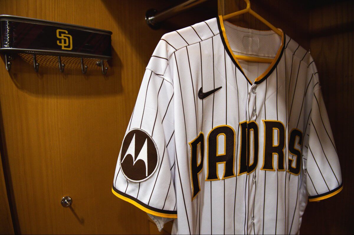
And now we know, because the Padres yesterday announced that they’ll be wearing an extremely subtle and not even slightly distracting Motorola patch on their jersey sleeves next season. As you can see above, the ad is so tiny and nuanced that it’s almost invisible to the naked eye, but if you retrieve your monocle from your vest pocket and squint really hard, you can juuuuuust barely make out the ad in these next few pics:
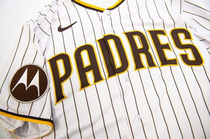
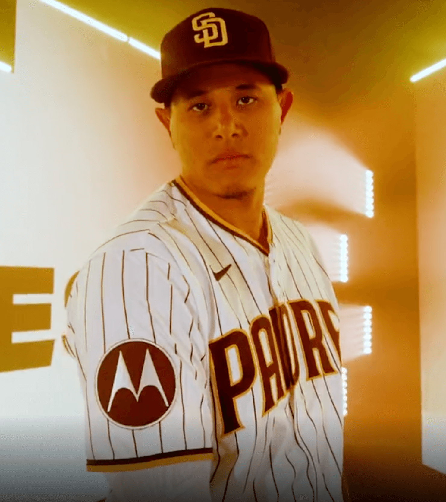
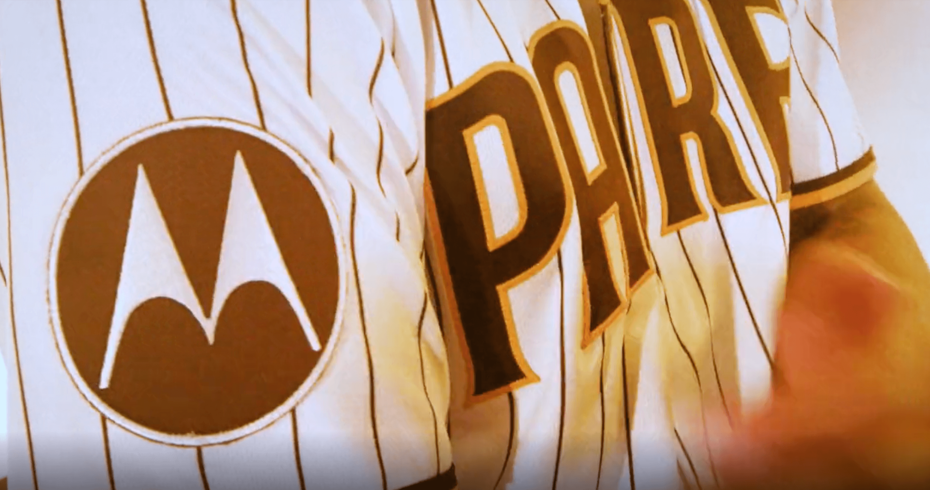
Ewwww. Note that all of these pics take pains to avoid showing the team logo patch on the other sleeve, presumably because they don’t want anyone to figure out that the ad patch is larger than the team patch.
A few other notes:
• According to what’s been previously reported, the ad can appear on either sleeve depending on the player’s handedness. So the team patch will presumably flip-flop from sleeve to sleeve as well.
• It seems inevitable that this will result in fewer anniversary and memorial patches, or else maybe those will move to the chest. And/or perhaps black memorial armbands will make a comeback.
• As others have noted in recent weeks, this can’t be good news for the Phillies’ TV numbers.
• Motorola has really gone all-in on uniform advertising. They already rent space on three NBA teams’ jerseys — the Bucks, Nets, and Pacers — and now they’ve established their first foothold in MLB. A good company to boycott!
• I’m always puzzled when teams like the 76ers, Capitals, and Padres race to get out ahead of everyone else and announce their uni ad a year before it’ll even be worn on the field. It’s like being the idiot blog commenter who posts, “First!”
Meanwhile: The Padres weren’t the only Big Four team disgracing their uniform yesterday. Over on the ice, the Penguins became the third NHL team to announce a uni advertiser for next season:
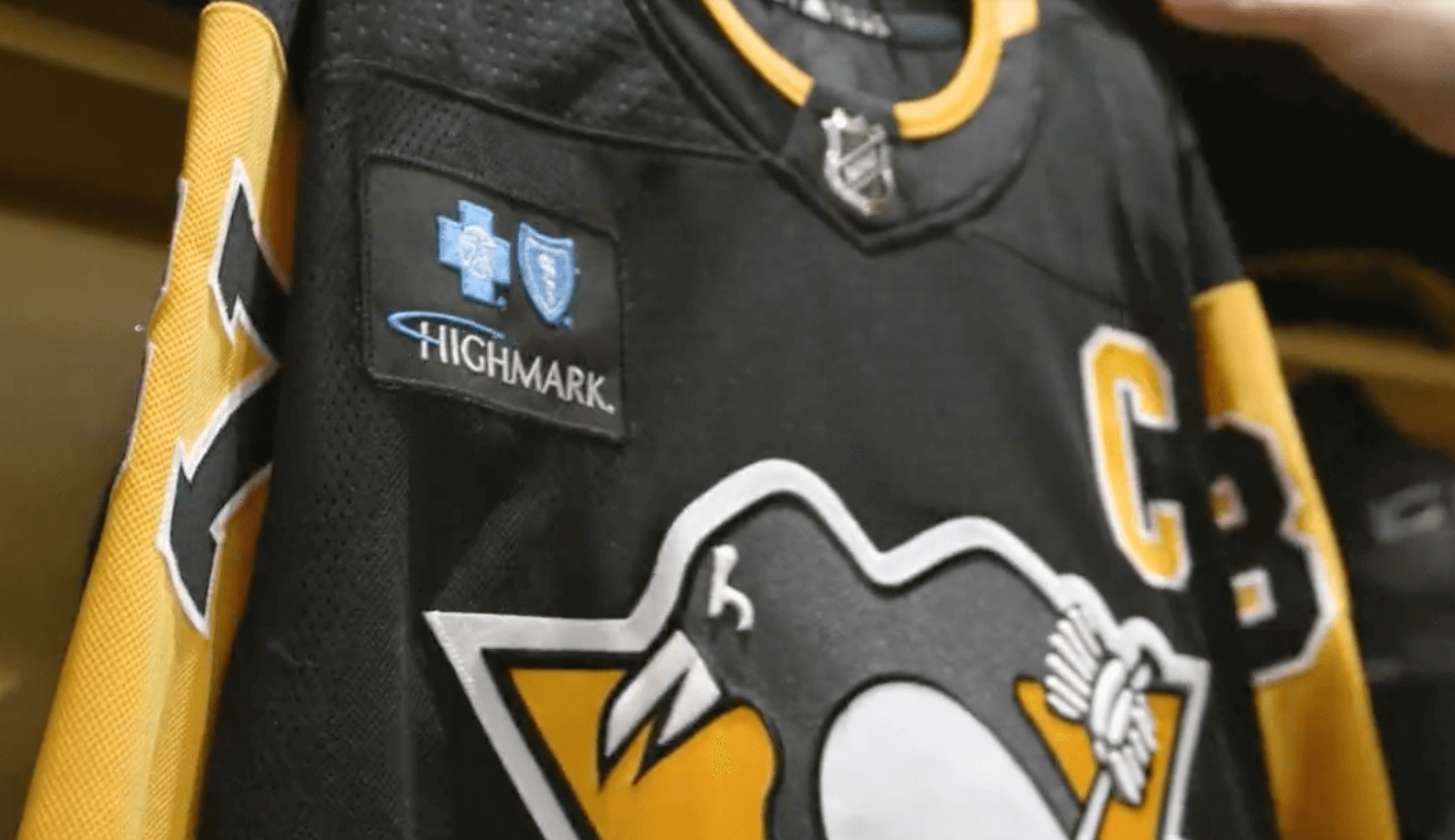
All NHL teams will presumably be doing this next season, but so far only the Pens, Blue Jackets, and Capitals have announced anything.
And just to complete a very depressing trifecta of developments yesterday, the Dodgers announced that they’ve hired a marketing agency to help secure the team’s 2023 uni advertiser as well as a “presenting partner” advertiser for the Dodger Stadium field (so it’ll be called Douchebag Inc. Field at Dodger Stadium, or whatever). Sigh.
Ah well. Enjoy this last season of ad-free MLB uniforms while you can! Meanwhile, if you haven’t watched Idiocracy or read Jennifer Government, this might be a good time to do so.
(My thanks to Gary Moore for bringing the Dodgers item to my attention.)
Click to enlarge
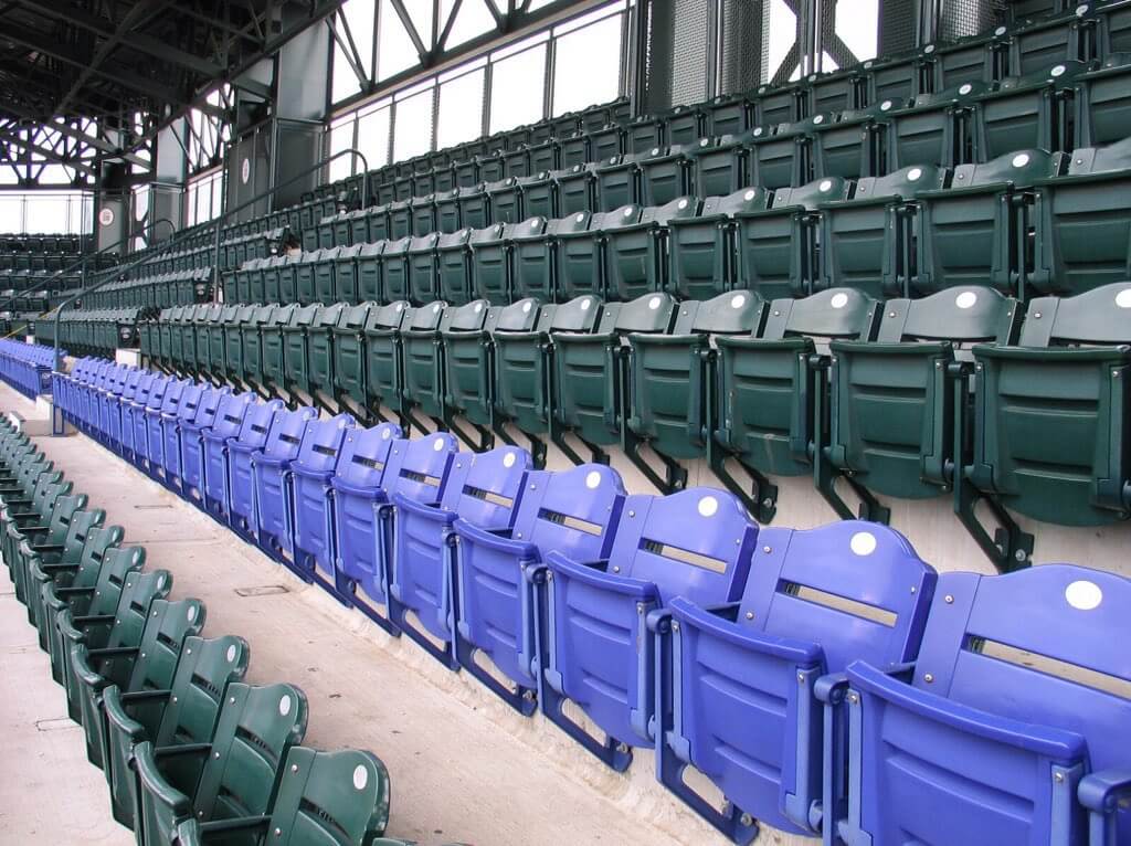
ITEM! Purp Walk update: Although the uni-verse is crumbling around us, our comm-uni-ty remains strong. Case in point: Yesterday I posted a bunch of plans about this year’s Purple Amnesty Day, which will feature, among other things, a Uni Watch party in Denver. (If you missed that news, get caught up here.) That prompted a comment from longtime reader Kenny Ocker, who wrote, “Perhaps you could try to get a group ticket package for the famed Purple Row up in the nosebleeds and watch the Rockies game from exactly 5,280 feet above sea level.”
Kenny was referring to, of course, the row of purple seats at Coors Field, which is exactly one mile high and extends across several sections in the upper deck. I’ve known about those seats (duh), but for some reason it hadn’t occurred to me to incorporate them into our Denver Purp Walk activities — a major oversight on my part. Thankfully, Kenny had my back!
I loved the idea of continuing the night’s activities in the purple seats, so I called Tim Cox — the reader who’s my co-conspirator for the Denver plans — and asked him what he thought. Not only did he love the idea, but he had some additional good news: As a season ticket holder, he’d just received an email from the Rockies offering him 20 free upper-deck tickets to an upcoming game of his choice. Could we apply that to the purple seats on May 17? Tim did some checking and determined that we could indeed do that. So we’ll have 20 free purple seats for Purp Walk!
Some of those tickets are already spoken for, but we’ll definitely have plenty left over to give away. Here’s what I’m thinking:
• If you want a free ticket, you must attend the party at Blake Street Tavern. You can’t just show up at the game — you need to meet us at the party.
• I expect that demand for the free tickets will outstrip availability, so I’m going to raffle off the freebies. If you plan to attend the party and would like a free ticket, send an email to the raffle in-box by 8pm Eastern this Friday, April 22. Limit one email per person, but indicate in your email if you want one ticket or two tickets. (Sorry, no more than two.) Again, please do not enter this raffle unless you plan to attend the party at Blake Street! Over the weekend, I will contact all the raffle winners to let them know that they’ve won, and I will also notify the non-winners so they can purchase tickets if they want to join us at the game.
• Our party at Blake Street will begin at 5pm (I’m thinking I might even move it up to 4:30pm), and the game begins at 6:40pm (so early!). People who want to go from the party to the game can head to the ballpark whenever they like. I will remain at the party until at least 7:30-ish, so I can keep kibbitzing with people and greet any latecomers, and then I’ll head to game probably around the third inning.
Meanwhile, remember that if you want the deluxe version of this year’s Purp Walk shirt, which includes a special logo on the back, you must pre-order the shirt now and then attend the party to receive it.
I think that’s it for now. Thanks for all the enthusiastic response to the Denver plans, and doubleplusthanks to Kenny Ocker for suggesting that we sit in the purple seats (which I really should have thought of myself!).
Click to enlarge
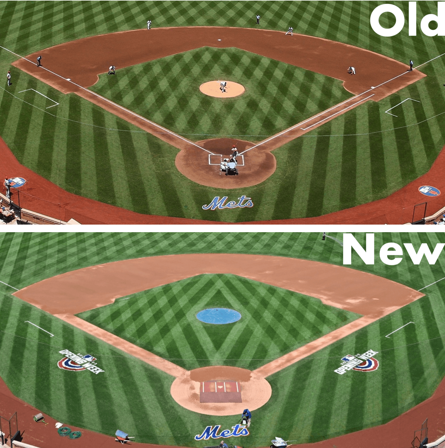
Field notes: Notice anything different about the infield at the Mets’ ballpark this year? The infield cutouts near each of the bases, which used to be curved, are now formed by straight lines. Here’s a closer look:
Definitely not as visually pleasing. Why did they make this change? I didn’t hear it myself, but reader Gabriel Luis Manga says Mets radio broadcaster Howie Rose talked about it during Sunday’s game:
Rose said he talked with the head of the grounds staff and was told that it’s because the stadium will be hosting soccer games this year (ironically, for the Yankees-owned NYCFC), and that the straight lines are easier to re-sod/deal with than the rounded edges.
So there you have it. The so-called beautiful game ruins the look of another game!
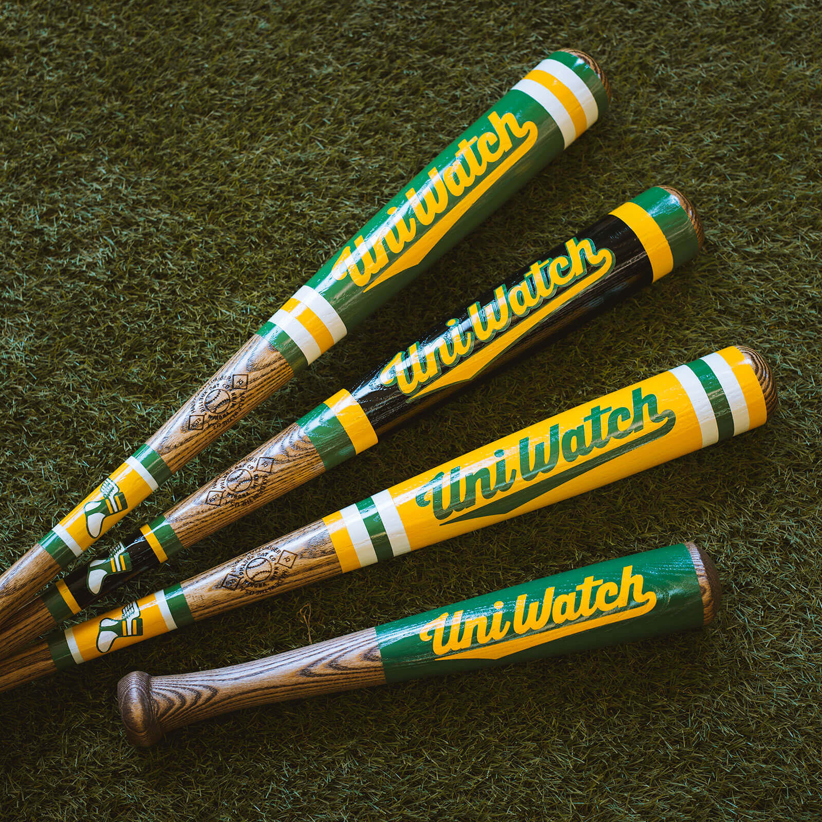
Click to enlarge
Bat reminder: Uni Watch Baseball Bats are now available from the Pillbox Bat Co. They’re available in green, yellow, BFBS, and miniature. Check them out here.
The News Ticker
By Lloyd Alaban

Baseball News: Astros 2B José Altuve’s American League championship ring has “Altuve Linares” stamped into it. Linares is his mother’s surname (from Tyler Kepner). … Red Sox SS Xander Bogaerts wore a City Connect-colored base layer last night under the team’s red alternate jersey (from multiple readers). … Brewers C Victor Caratini wore the PitchCom device on his shinguard last night, instead of on his forearm (from John Dankosky). … Former MLB P Jake Peavy pitched for the Savannah Bananas, a collegiate summer club, with his actual Gold Glove, which he won with the White Sox in 2012 (from Jon Vieira). … Another Mother’s Day cap has leaked, this time for the White Sox (from Ken Bartelt). … SNY used a previously unseen Giants logo for a social media post last night (from Raul Cerdas). … New uniforms for Pericos de Puebla of the Mexican League (from @RUNCMD52). … Yellow caps for Arkansas last night to promote childhood cancer awareness. … Virginia baseball is retiring No. 11 for Ryan Zimmerman (from our own Jamie Rathjen). … The Cleburne Railroaders of the American Association of Professional Baseball will call themselves the Lone Star Railroaders for Sunday night games. … The Wichita Wind Surge, affiliate of the Twins, will become the Turbo Tubs for select games (from Trent Guyer). … John Marshall High School in L.A., whose team name is the Barristers, uses the Brewers’ ball-in-glove “mb” logo (from Pedro Naranjo). … Here’s 1983 game video of Pirates broadcaster Lanny Frattare explaining why P John Candelaria had a sticker on the bill of his cap (from our own Jerry Wolper). … Padres P Mike Clevinger, currenly on a rehab assignment with the Triple-A El Paso Chihuahuas, wore his Padres road pants last night instead of El Paso’s (from Tommy Morris).

Football News: Two Commies players have new numbers (from our own Jamie Rathjen). … The mighty Gridiron Uniform Database now has coverage for the CFL from 1945 through 1960. Subsequent seasons will be added soon. Additional info here.

Hockey News: Last night provided our first look at the Islanders’ dual memorial patches for Clark Gilles and Mike Bossy on the team’s home jersey, and they look just as awkward at home as they do on the road whites (from John Muir). … The AHL’s Providence Bruins have a nice historical display about the old Rhode Island Reds at their arena.

Soccer News: Liverpool and Manchester United wore black armbands in their match yesterday to honor United F Cristiano Ronaldo’s late son (from our own Anthony Emerson). … New logo for the Monterrey Flash of the Major Arena Soccer League (from Ken Tomasch). … New 30th-anniversary kit for the J1 League’s Shimizu S-Pulse (from Jeremy Brahm).

Grab Bag: Tennis player Jannic Sinner has a new personal logo, complete with some storytelling (from Mark A. Brieve). … NASCAR driver Noah Gragson will wear a Wendy’s-themed uniform for the Geico 500 (from John Flory). … New 75th-anniversary logo for FIVB, the world governing body for volleyball (from Jeremy Brahm).
Paul, are teams being forced to put the ad patch on the MLB uniforms depending on whether the player is righty or lefty? For instance, could the Phillies just choose not to disturb the numbers on the left sleeve and just have all the ad patches on the right sleeve?
Either way, this is horrible. Hard to believe we’ve reached this point.
Nothing is forced.
Boycott a company just because of where they spend marketing dollars…dumbest thing ever posted on this site.
Actually, the whole point of a boycott is to protest a company’s business practices. This particular business practice — advertising on lots of professional sports uniforms — may not seem odious to you, but some people may feel differently. Agree to disagree.
2 reasons to boycott Motorola-
1. The Batwing M is one of the worst things to see on anything, which leads to
2. Anything with a Batwing logo on it is horrible.
No, you boycott them for intruding upon your sensibilities. And their unabashed, tacky greed. -C.
Wouldn’t boycotting MLB be more appropriate? They’re the ones who allowed Motorola in the first place. Plus, MLB has allowed encroachment of ads on the back of the mound, the foul territories, the Nike mark on the chest, the NE mark on the side of the hat, etc.
Everything’s so easy for Pauline.
+1 for the Neko Case reference. Great song from maybe my favorite album of hers.
Wa…word ‘em up…
1. Second!
2. SNY seems to be making roundel graphics for whoever the Mets play. They did the same thing in the series against the Phillies and it is the same basic design as this one.
I’ve seen those roundels before and I assumed they were inspired by a similar logo the Padres had before they rebranded, complete with the same font. I’ve definitely seen a version made for the New York Yankees.
I think Manny Machado’s unbridled enthusiasm says it all. -C.
Wow, the ad patch is comically large. The idea that they’d actually place the patch to maximize visibility depending on how the player hits is maddening. Does this mean that teams who typically already have a left sleeve logo patch would drop that patch? Would the team logo patch be used on the opposite sleeve of the ad patch so righties and lefties would have flip flopped uniforms? Grossss
All that said, pretty awesome that Uni Watch Purple Amnesty Day will be celebrated from the purple row at Coors Field.
Makes you wonder why the team owners don’t just do away with the pretense and rename the team the Motorolas. I’m half serious. I mean, why not maximize the “partnership”? Sickening.
Exactly my thoughts. Or they will go the Korean and Japanese baseball way and add the sponsor/owning company to the team name: Motorola Padres, Coca Cola Braves, Target Twins, MyPillow Yankees.
That is where it is eventually headed. Which is to say, you’ll just call a team by it’s locale, the nickname/logo will have long since become an afterthought to the add covered uniforms (think soccer across the pond), and it will sort of end up like pro sports at the start of the 20th century. The nicknames will be just that, nicknames, because the identity will have been overwritten by the corporate sponsors. Red Bull New York will seem quaint compared to Twin Cities Targets or Seattle Starbucks.
True story: When I was a kid, I was unaware of the Japanese baseball team naming conventions. That is to say, I didn’t know that some teams use advertiser followed by mascot instead of location followed by mascot. This being the case I thought that the mascot of the Nippon Ham Fighters was “Ham Fighters.” I pondered that for quite a while until some kind soul set me straight.
I was today years old when I learned the mascot of the Nippon Ham Fighters was not “Ham Fighters.”
1) Penguins are actually the third NHL team to whore out their jerseys. Capitals first, Blue Jackets second.
2) Where’s Mr. Yuck when we need it?
Forgot about the Blue Jackets! Will fix.
I’d argue just showing the Motorola patch serves a better purpose to show how bad and tacky it looks.
Purple seats are an excellent addition to what will surely be an excellent Purple Amnesty Day!
May I add one more movie to the list?
link
Probably the best ever movie dedicated to advertising where ads should NEVER appear (like a school bus). Highest recommendation.
Also. Happy 4:20!
Everything about uniform advertising disgusts me but for some reason the relatively minor detail of them switching the placement depending on the players’ handedness strikes me as especially disturbing and dystopian.
“Everything about uniform advertising disgusts me…”
So, the Lakers logo on the jersey, the NY on the Yankees and Mets hats, the G on the Packers and U of Georgia helmets, the alligator on the U of Florida helmets and all the other ads disgust you and you want no logos at all just blank everything except for numbers and maybe but not always names of players.
Got it
Even though you are only a faceless Internet person to me and I have no idea who you are IRL, I can still say with confidence that there is absolutely no way that you don’t see how there is a major difference between your examples and what I’m talking about. Define “advertising” however you want, but a team placing its own logo on their uniform and placing that of a smartphone manufacturer in exchange for cash are not the same thing and you know it
Don’t be a jerk, Albert. She’s obviously referring to third-party transactional ads, not the team branding.
Jeez.
There’s a coding glitch in the first paragraph of the Purp Walk update. Passing the cursor over it reveals an attempted hotlink.
Thanks. Fixed.
-The baseball ad patch seems so large. Should be half the size. Even at half the size the message will get across as it will be seen on TV.
-Man, I would love the go to the Purp Walk party. Flight from Vancouver to Denver quick and easy. Only unfortunate thing is May 17 falls on a Tuesday. Can’t make it. No holidays left to book. Will make it to one of these parties someday.
-OMG! Big-time applause to Gridiron Uniform Database!Awesome news this morning. Adding CFL uniforms! Going to be a lot of research.
Already has been! It’s taken since October just to nail down 1945-60 as good as we’ve done. Finding photos, uncovering kickoff times, making the graphics…
Thanks for the tip about Regina. We knew the green/white in ’48 was ‘for sure’ but we hadn’t been able to find someone who could pinpoint pre-’48 for us.
Re: CFL Gridiron Uniform Database. When Regina Roughriders wore black in the 1940s, it was with red and not green.
We’re up for it (research) !!
Yeah man! CFL on GUD is a gift better than any Christmas present I could ask for. Really looking forward to the rollouts for later years.
If you’d like to help out as a ‘special contributor’ for our CFL project, I encourage you to make contact with GUD using our ‘Contact Us’ tab. We’d love to get some CFL-knowledgeable folks on board.
Not sure if this guy is already involved with CFL on GUD or not but someone on the Chris Creamer forum was at one point trying to put together a CFL uniform database:
link
Another note on the Mets’ new infield configuration: They simplified the shape of the running lanes at first and third base. My guess it’s for the same reason as the cutouts at each base. Truth be told, in the era of the Three True Outcomes, the new running lanes aren’t much of a practical difference.
Wow great catch! I would imagine you are right in regards to the motivations
The new cutouts look horrible and I immediately flashed back to the sad Met teams of the late 70s as Shea deteriorated.
link
Actually that shot is from the early 80s based on the seat color and the pennant placement on the outfield fence.
But now I am WICKED curious about the evolution of Shea field configurations…
Paul, don’t be surprised when teams rush to announce an ad a year ahead of wearing it. Look at all the exposure they have received, including on this site. It would not surprise me if the company paid a bit extra and or made the deal contingent on a big splash starting now.
Count me as very grateful for Ebbets Field Flannels (among a few other places) that still create great sports fan gear without garish brand logos in sight.
Many MiLB players wear MLB pants. It’s just usually not so obvious because the pants are either white or gray. But if you look at an MiLB game (especially at the AAA level) you’ll see the MLB logo on the back beltloop of many players
Yes, but as you yourself point out, those are usually standard white or grey, so they match what the rest of the team is wearing. But Clevinger was wearing the Padres’ tan road pants with Padres-colored piping while the rest of the El Paso team was wearing grey. Different situation.
I somehow didn’t catch the difference Paul pointed out in the Mets’ infield. I first noticed that the base paths are straight in the new picture (instead of wider at first and third base), and the grass cutting is a bit different. I missed the most obvious one, ha.
Purp Walk 2022 is shaping up to be a real doozy!
Wish I was Denver-local.
Thank you, GUD for adding tracking of the CFL!
MLB is stepping on their own toes with the anted-up advertising encroachments. NASCAR-ifcation has taken hold.
Noah Gragson’s helmet to have pigtails and bows?
I think the wrong party is getting branded with the douche label for naming the playing surface. The issue is with the team selling it rather than the company buying it.
If people are offended by the practice, there issue is with the company that offered the naming rights, and cashed the check for the naming rights. Be angry at the Dodgers all day if that’s the beef — though I’m glad they are not changing the name of the stadium.
I work in communications and marketing for a college. We have advertising with each of the teams in our city. We’re not on uniforms, but we do a lot of other advertising with them — outfield ads, scorers’ table LED board, we were on the boards at the hockey rink until moving to a different kind of advertising.
We definitely benefit by having the college name out there. But we also like to think of it as us supporting our local teams, which need the advertising support to get by.
I don’t go into a meeting demanding we put our name anywhere. But if the team offers me something, I consider it. Sometimes it works for us, sometimes not.
If that makes me a douche, so be it, I guess.
I was just using “Douchebag Inc.” as a shorthand name for an as-yet unknown company. We already know the name of the team selling the rights. And yes, selling the rights is a douche-y thing for them to do. Plenty of that to go around.
Is “I used to Call it Dodger Stadium” the next Naming Wrongs shirt?
It’ll still be Dodger Stadium. It’s the field name that they’re whoring out, not the stadium name.
If we are stuck with an advertiser’s name, we can only hope it will end up being called Ebbets Field (Flannels) at Dodger Stadium.
Man, wish I could go to the Denver get together. Only an hour up the road in Fort Collins but a weekday night could be tough for me, especially since it would be a shorter happy hour before the game. Yes, two hours is short, ha ha. Love the shirt and the purple seat idea!
What’s the protocol when the patch being so large causes star player X to complain? Mike Trout says it’s messing with his swing mechanics. Then what?
I’m serious.
We’ve seen large patches before and nobody has ever complained.
The Wendy’s NASCAR suit is a thing of beauty. I wore that same look when I worked there in the 1980s.
On another note, may I suggest looking for Rockies tickets in a group of maybe 8 in the Purple Row(20) and 6 in rows 19 and 21… Might be easier than an entire section’s purple seats and it puts is in more of a group. We can trade seats every couple of innings.
And yes, I will be there!
I second Ron’s proposal on seat locations. It would be easier to mingle as a group if we’re stacked rather than spread out, single file, in one long row of purple seats.
For what it’s worth, Motorola is also the jersey advertiser for Chicago Fire FC in MLS.
So in theory, for the Phillies, if they go by handiness for which side the patch will be on, there go the jersey numbers on the left sleeve. Totally ruin the idea the team had when they created the current uni’s.
Great scoop, Paul! A question, though: I assume that in the third bullet under miscellaneous notes, it should read “Padres'” where it has “Phillies'”?
Thanks, but this wasn’t a scoop — I didn’t break the story.
I meant “Phillies.” In other words, the advent of sleeve advertising will pose problems for the Phillies, who are the one MLB team with TV numbers.
Yes…that shot is early 80s but the cutting corners, literally, began in the late 70s.
Your post today about uniform ads is a reminder why I care less about professional sports with each passing day.
I miss when Mr Yuck would block out the ad patches you shared. One vote here to bring back Mr Yuck!
This was the first-ever MLB uni ad (aside from the non-USA/Canada games). It seemed important to show it.
At what point will these unishenanigans result in the joy/interest in uniforms finally be killed? My uni-watching enthusiasm started to be diminished when they started becoming costumes. Then more joy was lost when the Brewers, etc started having more than three uniforms. The next step down was the addition of the ads. I almost don’t care anymore, but I think when I’ll really give up is when professional teams start with the alternative identities that minor league baseball has perfected or when we get to the point where different players on the same team have different jerseys. I can imagine the addition of personal logos, companies buying ads for specific players, etc.
Good food for thought. I must admit I have stopped caring as much about the current Met uniform and logos. To most observers, the Mets have the same jerseys and logos as they did say in 1969, except for the NOB, orange squatchee and alternates. To my eye though, the script is not really the same, the logo is not the same, the Mets script is off center in the sleeve patch and the front 6’s and 9s are distorted as well. The people in charge of these things probably don’t even realize these downgrades, they don’t care and they likely will never correct the issues. Now we have the makers marks and ads to further ruin things.
Once again, the Savannah Bananas playing now are NOT a summer collegiate team! This team is a professional, Harlem Globetrotters-esque team.
I wonder how long it will be before some franchise makes switch hitters change jerseys mid-game so the ad still shows if they are hitting from the other side.
I’m self employed and this pandemic kicked me in the nuts.
My work of business is still strong in demand but having to shutdown due to government regulations 10 months out of 18 months during the pandemic set me back a ton so if one of my product companies came to me to advertise their product with a logo on my name with added profit to my pocket then yes I would totally agree with advertising income on my product.
Who wouldn’t?
Who wouldn’t?
If a company offered me $$$ to add their logo to the Uni Watch name at the top of this site, or to say my tweets were “presented by” them, or anything of that nature, I wouldn’t do it. Just answering your question.
But the bigger issue is that MLB teams are not struggling, self-employed operators who are desperate for cash. They’re billionaire-owned enterprises that enjoy a federal antitrust exemption, municipal tax breaks, public funding for their stadiums, and other advantages that neither you nor I enjoy. So while I sympathize with your position, I don’t think it’s a very good analogy when applied to MLB.
The Padres ad is putrid and betrays so much of what attracted me to baseball in the first place.. But MLB of course baseball moved on from old school type fans ages ago anyway..
As bad as the ad patch is:
1. It is in team colors
2. It is not a wordmark
If we are having ads, I’d rather them be logos than wordmarks.