By Phil Hecken
Follow @PhilHecken
Good Sunday morning, Uni Watchers. I hope everyone had a pleasant Saturday.
Earlier this week, the Los Angeles Angels unveiled their “City Connect” (CC) uniforms, becoming the fifth club to do so this year (the Brewers and Padres are the two remaining clubs who have yet to unveil theirs). If you missed it, Paul had a nice writeup on the drop, with some good commentary on the storytelling (if you haven’t read that, you may wish to do so now).
I’m generally in agreement with Paul’s assessment, and overall I thought these were one of the best CC unis yet — precisely because they seemed to take just one theme (surfing) and designed a pretty good looking uniform around it. It’s not like there was no storytelling; in fact, the team crammed a lot of elements onto the jersey — but it wasn’t overdesigned and unlike many of the prior CC unis, and as such, actually looked pretty good as a uniform. Our pal Chris Creamer had a great graphic explaining all the “surfer” elements:
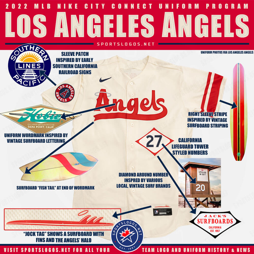
Between that and Paul’s article, I won’t need to explain anything further. But no matter how good the unis looked in the photoshoot, there was still the need to see them on the field. And since the Angels were playing my New York Mets last night, I was able to watch virtually the entire game. And let me tell you, the uniforms looked GOOD on the field. Let’s have a look-see:
The helmets were custom-designed to match the caps (white panel on a red cap with an “A” logo). As reported by Paul, the “A” on the cap (and helmet) did not match the “A” on the jersey, and normally something like that would bother me, but for some reason, it didn’t. While definitely noticeable, it wasn’t so “off” as to be off-putting.
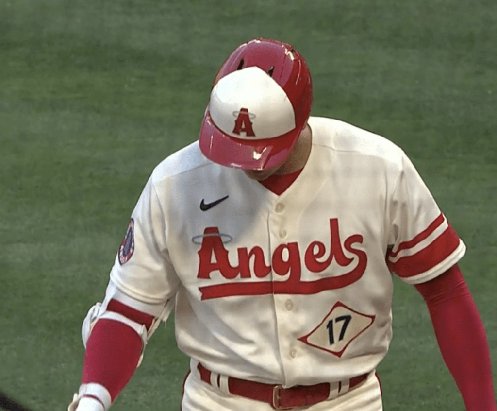
One thing that does bother me is how the tail of the “g” in “Angels” merges into the underline. Actually, as “playful” and “fun” as the wordmark portends to be (yeah, the “surfboard script”), I really am not terribly fond of the script. That’s really about my only complaint — well, that and the MOTB on the right chest. But I LOVE LOVE LOVE the front number inside the diamond):
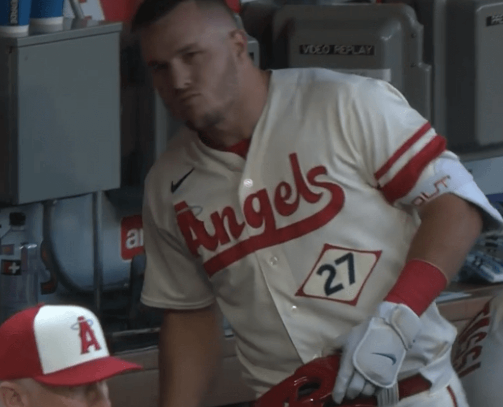
Despite the lack of symmetry, I also thought the wide/narrow stripe pattern only on the left shoulder was well done. Now, it’s not something I want to see often, but as kind of a one-off, it’s a cool touch.
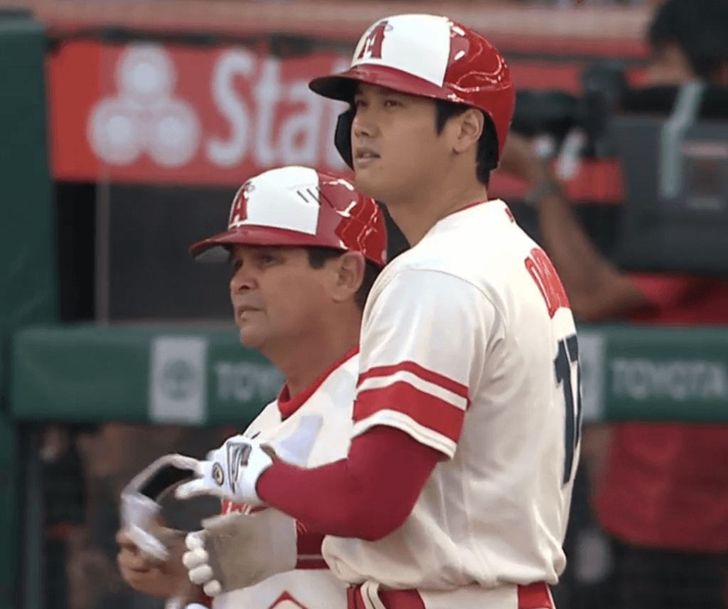
Here’s a look at the right sleeve, featuring the patch reading “LOS ANGELES ANGELS” — which marks first time the Angels have used the words “Los Angeles” on their uniforms since reclaiming L.A. as their hometown in 2005.
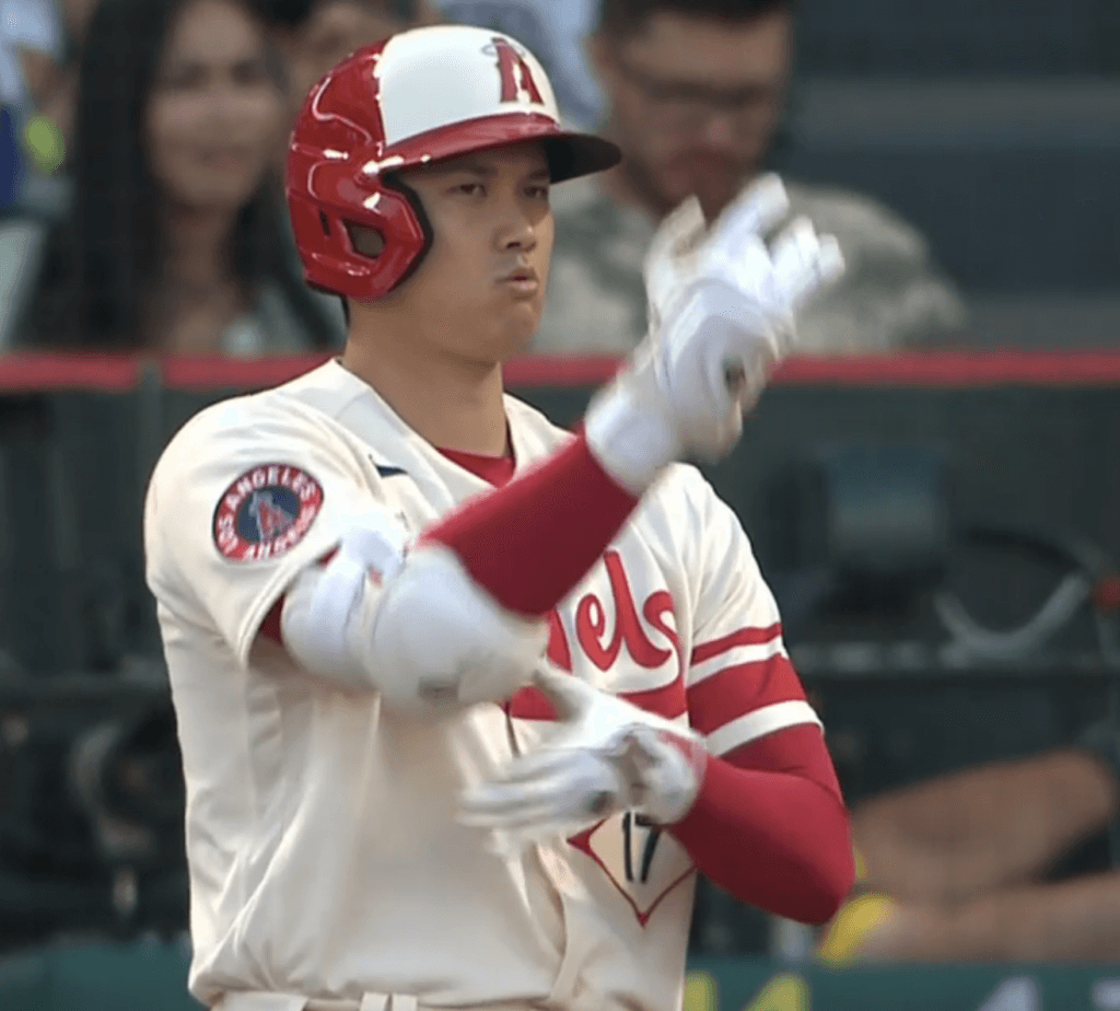
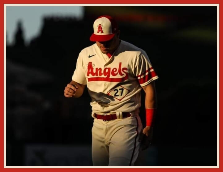
And I’m also generally one who doesn’t like a contrasting uniform number on the jersey back (or front, Dodgers excepted), but the navy blue numbers really popped on the cream uni with otherwise all-red trim:
As far as the overall uniform. I thought it was really nice and well assembled. The cream pants matched the jersey (have I mentioned I like monochrome unis in baseball?), and the pants piping in matching red tied it together well:
It also appeared as though the piping on the pants was the same width as the smaller stripe on the left jersey sleeve.
While most players elected to wear their pants pajama style, a few, like Brandon Marsh (below) went high cuffed and wore CC socks, which I thought looked great.
Like when the Rockies unveiled their CC unis and I asked Colorado resident (and ticker stalwart) Kary Klismet to give his thoughts, today I invited our own Brinke Guthrie (who contributed several of the photos seen above as well!) — a California resident (more NoCal than SoCal, but he’s been there long enough to have a perspective of SoCal culture) for his thoughts on the Angels CC unis. So let me turn this over to him now:
My Thoughts
by Brinke Guthrie
I spent last night watching two baseball games, my San Francisco Giants beating the visiting Los Angeles Dodgers (because it’s a matter of life and death here), and the Los Angeles Angels hosting the New York Mets because of the new City Connect unis.
I’ve been rather ambivalent about the whole City Connect series. I tend to me more of a traditionalist as far as MLB uniforms go, but I understand the marketing aspect, and how the game needs to evolve to grab the attention of the younger demo, Just Do It, mwah mwah mwah. Baseball is entertainment, and it competes for your attention just like TikTok does. Attention spans are short, and baseball is doing this to get a bit of buzz. When the Yankees go CC, there will be buzz.
My take on the Angels look? I love it. They took the surfer beach thing and made it their own, embarrassing the crosstown blueberry Smurfy pajama-clad Los Dodgers look in the process. Sure, the Dodgers are in first and the Angels dropped 14 in a row- but that’s not what we’re concerned with here.
The Angels creamy color scheme blends well with the cherry red. Cream works well as a mono look — it’s here in SF after all. Did I say mono look? To me, the all dark navy of the White Sox (or is it black?) and the dark forest green of the Rox is oppressive and gloomy. The Dodgers all blue? No thanks. Same for the Astros though their cap is a keeper. And the White Sox and that gothic vibe? (Shudder.)
No, give me sunny SoCal surfing’ 60s here. I love the little box around the front number- taken from the lifeguard towers. It’s just so retro, reminiscent of the Brian Wilson-powered SoCal 1960s, with surf boards, beach bunnies, drive-in burger joints and ice cream stands. There’s some whimsy to these, a bit of a knowing nod to California back in the day. There’s even a surfboard with a halo on the jock tag- that’s a nice detail! The only thing I’d change is adding the stripe to the other sleeve.
Northern California has a totally different vibe than Southern California; the Giants have their orange fog togs, and the Angels are goin’ “Surfin’ USA.” Either way- they’re both Golden State all the way. Now pass me the Coppertone.
Thanks, Brinke! Always nice to get a the perspective of someone from California!
You can see LOTS more photos of the uniforms here.
Your thoughts?


Guess The Game…
from the scoreboard
Today’s scoreboard comes from Marc Brandanowicz.
The premise of the game (GTGFTS) is simple: I’ll post a scoreboard and you guys simply identify the game depicted. In the past, I don’t know if I’ve ever completely stumped you (some are easier than others).
Here’s the Scoreboard. In the comments below, try to identify the game (date & location, as well as final score). If anything noteworthy occurred during the game, please add that in (and if you were AT the game, well bonus points for you!):
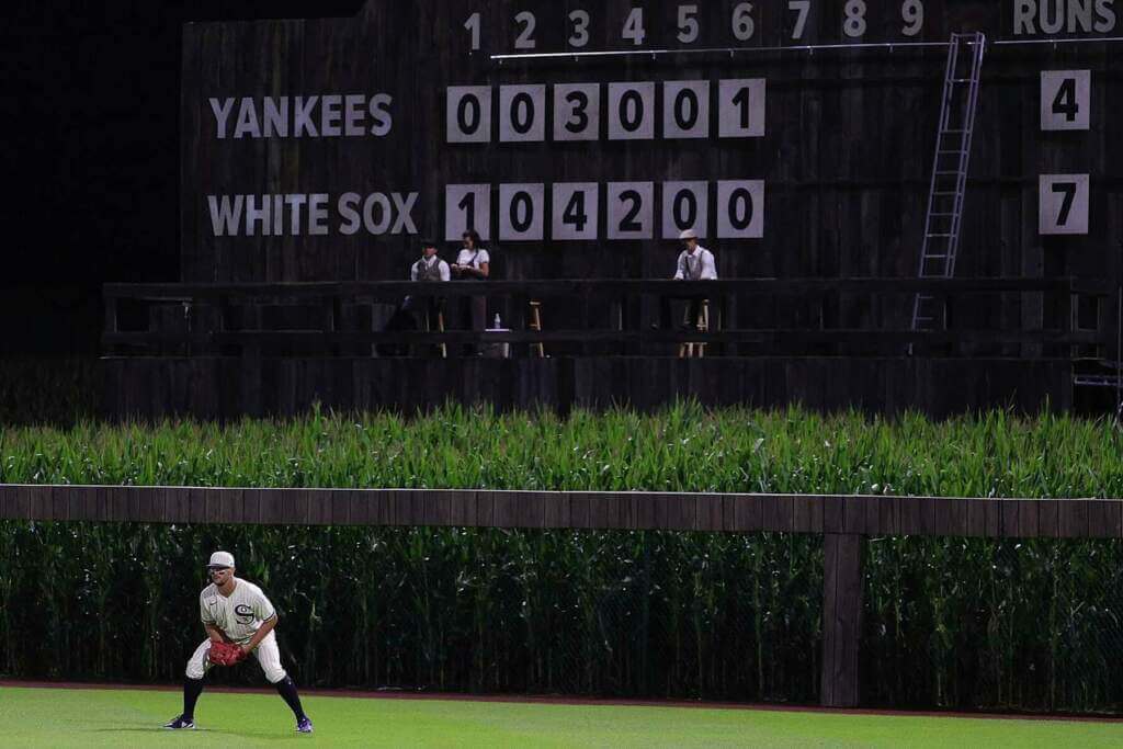
Please continue sending these in! You’re welcome to send me any scoreboard photos (with answers please), and I’ll keep running them.


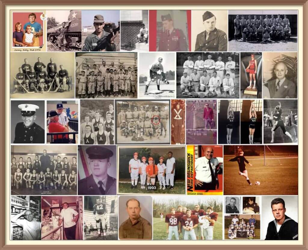
Calling All Sons and Daughters (and Grandsons, Granddaughters, Nephews and Nieces)!
Father’s Day is coming soon (June 19), and I’ll once again be posting photos of Uni Watch readers’ “Dads In Uniform,” a tradition that began in 2013 (and has continued every year since then). This is always a very special day, and I’d love for as many readers as possible to participate — especially those of you who haven’t done so before. A few of you have reached out to me saying “I’ve run out of photos of my Dad” (from years’ past), so if you want to resubmit a photo used before, please do so! Because Flickr terminated my account without explanation a few years ago, any photos sent in before 2020 no longer exist on UW, so if you had sent in something before then, feel free to re-send!
To take part in this annual tradition, select one photo of your father (or grandfather or uncle) in uniform (it can be sports, military, work — as long as it’s a uniform) along with a short description of 100 words or less. Then email the photo — again, only one, please — and text to phil.hecken@gmail.com with the subject line “Uni Watch Father’s Day 2022” by TUESDAY, JUNE 14, midnight Eastern. I’ll run all of the submissions on Father’s Day. Thanks!


Uni Watch News Ticker
By Phil

Baseball News: Pretty epic scene on Friday night, when the Padres Joe Musgrove and and the Rockies Chad Kuhl squared off in a game of “Tic Tac Toe” on the mound (from Jon Vieira. Here’s a bit more on that. … In case you hadn’t noticed, the leaked Independence Day Caps (which Paul had on here and tweeted about) are getting brutalized. Even Barstool Sports chimed in — interestingly, the author of that article lauds Paul as “the sports uniform GOD.” … The University of Louisville has unveiled renderings of planned upgrades to its baseball stadium (from Kary Klismet). … Kurt Rozek asks, “Can anyone recall another MLB team besides the 1970s-early-80s Texas Rangers having such wide pants striping more commonly seen in football?” … The Rangers and the White Sox featured a Burger King matchup Friday evening (via Paul). … The Austin Weirdos, an Independent Baseball team and members of the Pecos League, have a very cool tie dye cap (from Paul). … You guys probably know this, but Babe Ruth wasn’t the only Yankee to wear #3 — in fact, he wasn’t the last one to do so (from Bruce Menard). … The Vols of Tennessee and the Fighting Irish of Notre Dame played a colorful game featuring orange vs. green jerseys (from Jeremie Smith). … Think in-game ads in baseball have gotten bad? How about an ad in the strike zone box? (from J.A. Scott). As Paul says, Grosser than gross. … The Jupiter Hammerheads, Class-A Affiliate of the Miami Marlins, are wearing special jerseys for “Space Night” (from Minor League Promos). … Check out these beautiful Redbirds throwbacks for the Louisville Bats (from Josh Claywell). … Ed Kendrick (whose uni tracking I’ve featured on here) has compiled a database of what dates all alternate/city connect/throwback jerseys have been worn in MLB up to May. … Here’s one I know we’ve seen before: Yankee coaches and players wearing different texture batting helmets (from McGirt).
.

Football News: The Winnipeg Blue Bombers unveiled their 2021 Grey Cup Championship banner at Friday’s home opener. Submitter Wade Heidt notes, “It is see through. Really hoping we will not see a three-peat banner.” … Jeff Ingalls noticed a UNC oddity: When the Tar Heels unveiled their current uniform set, the mannequin was missing the argyle striping on his helmet. … The website “RamsWire” is speculating that the LA Rams are quietly fading out the “bone” jersey they’ve worn as their primary road jersey for the past two seasons. If that’s actually the case, that’s a good thing. The dishwater was (and remains) a terrible look. … Here’s an illustrated history of Alabama’s football helmet over the years. Submitter Kary Klismet says, “Somewhat surprisingly, it’s not just one photo.” … According to James Gilbert, UNC’s first female drum major (1940) wasn’t allowed to march at first, but eventually got on the field. … Did Woody Johnson hint at the New York Jets bringing back a classic helmet design? Obviously the Jets now (again) have a green helmet, but it’s a shiny metallic, not the glossy number they once wore. Could they be hinting at Sack Exchange throwbacks? … CFL’s BC Lions have their logo painted in the end zone. From their home opener at BC Place in Vancouver. Normally nothing has been painted in end zones for many seasons (from Wade Heidt).

Hockey News: Now that the Edmonton Oilers are out, the WHL’s Oil Kings have put their logo at center ice at Rogers Place. They are still playing in the WHL finals (from Wade Heidt). … Still watching hockey (or even if you’re not): here are the stories behind the goal songs for the New York Rangers, Tampa Bay Lightning and Colorado Avalanche (from Paul).

Basketball News: “I know you mentioned this in the ticker last week about YouTube TV using the Larry O’Brien trophy as the progress icon on the progress bar,” writes Aaron Wiens. “But it is the old trophy. They must not have got the memo about the change.” … The San Antonio Spurs have installed a Spurs-themed basketball court for a local youth organization (from Kary Klismet). … The boys’ basketball team from James Monrose High School in Lindside, W. Va., received their state championship rings (also from Kary Klismet). … Unless there’s a mysterious fold we can’t see, this NOB definitely is off-center (from Jonathan Snaggletooth).

Soccer News: The New England Revolution 2023-24 secondary kit has leaked. It’s not terrible. The new jersey will replace the white “Community Kit” that debuted in 2021. … These next three items are all from Kary Klismet: 1) Here’s a ranking of the top five scariest mascots in MLS; 2) New uniforms for Balestier Khalsa of Singapore’s Premier League; and, 3) New home kits for the Sardinian men’s team.

Grab Bag: The following four items are all from ticker stalwart Kary Klismet: 1) New uniforms for the St. Paul (Minn.) police; 2) The NCAA has ranked the best track & field uniforms as chosen by fans; 3) The City of Laredo, Tex., has unveiled the logo for its new Buena Vista Sports Complex designed by a local artist; and 4) New costumed mascot for Joe Nuxhall Miracle League Fields, an adaptive sports complex for kids with special needs in suburban Cincinnati (thanks Kary!). … Sonoma Raceway changed the colors of their rumble strips. They were blue and gold for the alma mater of the track’s old GM (Cal Berkley). They are now green, gold, and white for the new GM’s alma mater (Cal Poly) (from Cork Gaines).


Uni Tweet of the Day
Same
I love these uniforms.
pic.twitter.com/5FaOjKrh5k— Soto ⚾️ (@SotoP_23) June 12, 2022


And finally… that’s it for me for today and for this week. Thanks to Brinke for his perspective on the LA Angels CC unis!
Next weekend, I’ll be curling up in a bonspiel (the GNCC Arena Nationals) way up in New Hampshire, so Paul’s given me Saturday off. But I’ll be back on Sunday with our annual Father’s in Uniform special for Father’s Day (if you haven’t submitted an entry, the deadline is soon — and it’s a hard deadline since I’ll be away for a good part of next week). Hope you’ll all check that out!
Yesterday at the summer place was mostly cloudy all day, so I wasn’t expecting a sunset…but the clouds literally broke to the west just as the sun was going down, producing one of the best sunsets I’ve seen in some time. The weather gods shown down on me for this one!

Wow.
Everyone have a great week, and I’ll catch you for Father’s Day next Sunday!
Peace,
PH
To me, the all dark navy of the White Sox (or is it black?)
It’s neither. It’s a very dark charcoal/slate/stone gray.
Aha! Well, there you go. I should add, for some reason, maybe to to the shade, the Wrigleyville mono is fine with me. Or maybe it’s the contrasting blues. But yeah, that gothic whatever of the White Sox, aye yi yi.
The Angels, though, that’s a home run.
Your opinion, of course. Sox fans LOVE it; you see the corresponding t-shirts, jerseys, and caps a lot here.
I would ditch the Sunday 83 fauxbacks (except for rare special occasions), and go with the City Connects on Sundays. They at least do not dilute the silver-and-black team branding like the 83s do.
Does it bug anyone else the ’83 uniforms have no Sansabelts?
Lifelong Angels fan and dedicated Uniwatch reader here…
This is easily the best look since they ditched the navy and red sets they wore through 1992.
One vote here to make these the base uniform.
This Uni does several things: (1) it breaks Arte Moreno’s obsession with red on red on red to try to compete with the Dodgers, (2) it has several unique features found nowhere else, (3) it is indeed true to Southern California in a way that few of the other teams’ unis are, and remember, except for the Angels and the Kings, the other major sports franchises are transplants to LA, and oh yeah, (4) it looks beautiful.
There’s a model of a 1949 Ford Woody wagon with a surf rack on my bookcase. It’s amazing how many if the surf details they hit on the spot, including the asymmetrical stripes of a surfboard transferred to the jersey sleeve. Chef’s kiss!
The white insert on the cap finally redeems the red-on-red look. I finally like the cap logo (as opposed to the one from the ’80s).
“Can anyone recall another MLB team besides the 1970s-early-80s Texas Rangers having such wide pants striping”
– As wide as that is, it looks more like opening day bunting than stripes.
The fat pants’ stripe was perfect for the Rangers as it reinforces the “Things Are Bigger In Texas” trope. Only two other major league teams came close: The 1976-79 Padres, and the 1975-80 Houston Astros.
“The more we make it look like a football uniform the more Texans will like it.”
How does the group feel about the Angel’s CC hats? I think they might have looked a little better if they were all red. It would have given a good contrast to the rest of the uni. In any event, they are not bad the way they are. This is one of the better combos.
I think something like the 2015 All-Star Game cap would’ve worked.
link
Change the front panel to cream to match the jersey, and maybe change the double stripe to the surfboard stripe like on the left sleeve. (Or have it just on the cap instead of the sleeve to solve the symmetry issue.)
Angels usually OD on red. This set is better balanced.
Their everyday hats would work because the faceted “A” also appears on the sleeve patch. I think white-paneled hats ought to be saved for unusually complex logos (Toronto, Baltimore).
Cap looks more ‘souvenir’ than ‘big league’…I’da went all red and topped it with a navy squatchee.
I’m still a little confused why Artie Moreno went for the Surfer theme on these instead of something more Angelino. He’s been trying to identify as an LA team for so long, it almost seems like he waved a white flag and let them finally just be an Orange County team.
Most people in LA County don’t give a shit about the Angels, and even fewer feel any association with surfing culture. Not that it’s a good thing or a bad thing, just something of note.
As far as the uniforms, my thoughts:
1. I hate cream uniforms. Let the Giants keep that terrible idea.
2. The font is goofy and fun. Definitely Angels! But also definitely not LA. Keep the font, and go back to being the California Angels.
3. I graduated from Huntington Beach High School, the literal home of surfing, and if you gave me 1,000 guesses, I never would have said “Surfboard stripes” when asked what the sleeves represented. Design: Meh. Reasoning: Terrible.
4. The contrasting numbers DO pop! But any Angels fan knows that the hats and striping should be heavier on Nave Blue, with Red lettering, numbers, stirrups (or socks), and undershirts. Basically a flip of this.
Link for the Redbirds throwbacks is broken.
It’s worth noting also the strike zone ad was a glitch, but definitely gave Rob Manfred an idea.
GTFTS: link
That UNC helmet photo is from Nike and shows an incomplete uniform. In some of the photos of other uniforms from the Nike set numbers don’t even seem to be completely attached.
The live reveal on 4/20/2015 showed the helmet stripe. link
I think it’s strange that the current Angels dominant color is red, the color most associated with the devil. It’s kind of like when the Patriots wore red jerseys for decades, which was the primary color of the enemy British (red coats).
At the time, it was commonly mentioned red was Gene Autry’s favorite color. For years, the Angels resembled the Red Sox and I think the mission was now to make them look more like the Cardinals. As for the Patriots, that was merely a gut reaction to too many blue teams.
Love the Angels’ CC unis. I like having only one sleeve with stripes. The hat may be the only weakness but overall I think they’re great unis. As an East Coast guy who likes to visit Huntington Beach, this uni says SoCal/OC to me.
Cmon Jersey B…show us a Sack Exchange throwback!
Former southern Californian here. The Angels have looked terrible since they ditched the navy for an all-red look. The CC unis are still a big fail, and the “story-telling” is asinine.
I love that number font on the Angels’ uniforms. So readable; if you took the serif off the “1” it would look a lot like what Otis Shepard designed for the Cubs before their font started morphing into the squarer Eurostile look they have now.
I really wish the Angels would embrace the “angel” motif and ditch the over-used red for some more yellow or gold. Imagine these cream uniforms in light yellow!
And while I would never have picked up on the surfboard logo thing, the diamond reminds me of link.
One nitpick on Chris Creamer’s take on the Angels uniforms: the right sleeve patch is reminiscent of the Pacific Electric logo. The PE was the transit system in SoCal until killed by suburban growth in the late 50s.
link