By Phil Hecken, with Walter Helfer
Follow @PhilHecken
Top o’ the Saturday morning to you all, Uni Watchers. I hope you’ve all have a good week and are looking forward to the weekend.
Last Saturday, I brought you Part I of a fantastic project from the one and only Walter Helfer in which he explored custom numeral fonts for Major League teams. If you missed that (or just want a refersher), you can click here. Walter returns today to complete his look at MLB (he’ll also be featured in the future with a look at custom and bespoke fonts for NFL teams). I’m going to include Walter’s short introduction again for Part II, so you don’t need to click on Part I, unless of course you missed it or enjoyed it so much you want to check it out again (it is worth it!).
So, without further ado, here’s your look at…
A Beauty Pageant for Numerals
by Walter Helfer
If there is a common factor among all the team sports, perhaps the most iconic is the basic octagonal numeral. They bond pro baseball, varsity football, ultimate frisbee, volleyball, and more. Designed with a ruler, it offers function and beauty; readable from long distances, it can be rendered plainly or in multi-colors without sacrificing legibility. But I would regard a world decorated only by these no-nonsense numbers in the same way I would consider rock & roll played only on acoustic guitars. Capable, but lacking in imagination. In a few months, I hope to examine the numerals of NFL teams in the same manner.
In MLB, the most commonly used font is Athletic Block, with a few teams using the more formal Sand Knit face. Many of you would pick these as the winners of the pageant, but that would simply be too easy. There are rabbit holes to inspect. Each font will receive a score of 5 through 0: 5- Excellent 4- Good 3- Okay 2- Poor 1- Godawful 0- Booby Prize.
Montreal Expos:
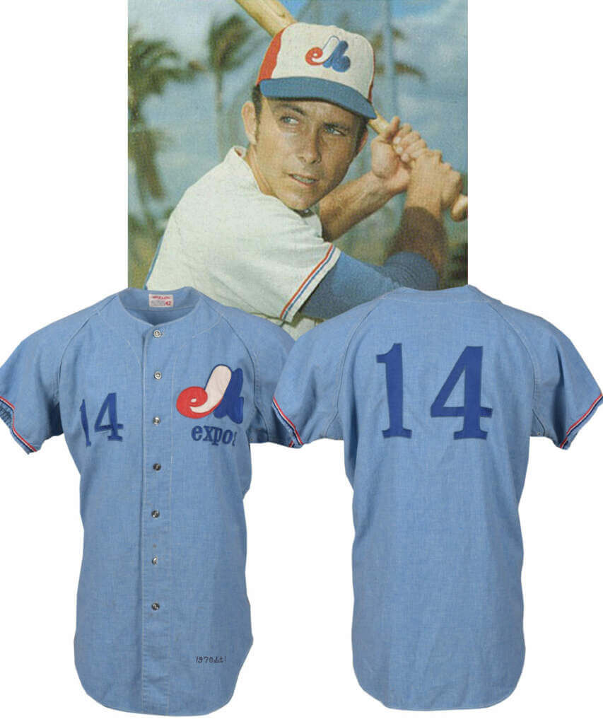
The Artist who goes by the name Washington Nationals, nowadays, really upset the apple cart in 1969, providing European-looking uniforms full of unique character. The style was organic; the different bits didn’t seem stuck on. One of the details was a fancy display font for the player numbers. One hesitates to call it “bespoke” because 1. It bears more than a passing resemblance to Clarendon Condensed, with several features altered to avoid paying the foundry for its typeface, and 2. The Oakland A’s ended up putting them on the fronts of their pullovers in 1972. In 1992, the entire look of the team was changed to make it look more “American”, and something special was lost.
My score: 5
Pittsburgh Pirates:
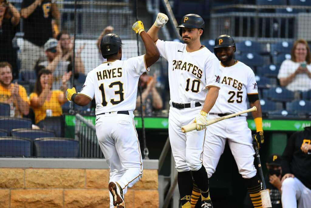
In 2001, Pittsburgh undertook a change to make their uniforms resemble the ones the team wore winning the 1960 World Series. A crucial change, though, was a customized, elongated number font to bring the numerals more in line with the lettering on the front of the jersey. Those exaggerated corners are called “punking”, and are a style shared with the graphics of the San Francisco Giants. The numbers aren’t completely bad; in fact, except for the “2” and “7”, they’re fine. They’re hurt by the extra outlining of the black jerseys, though.
My score: 3
Houston Astros:
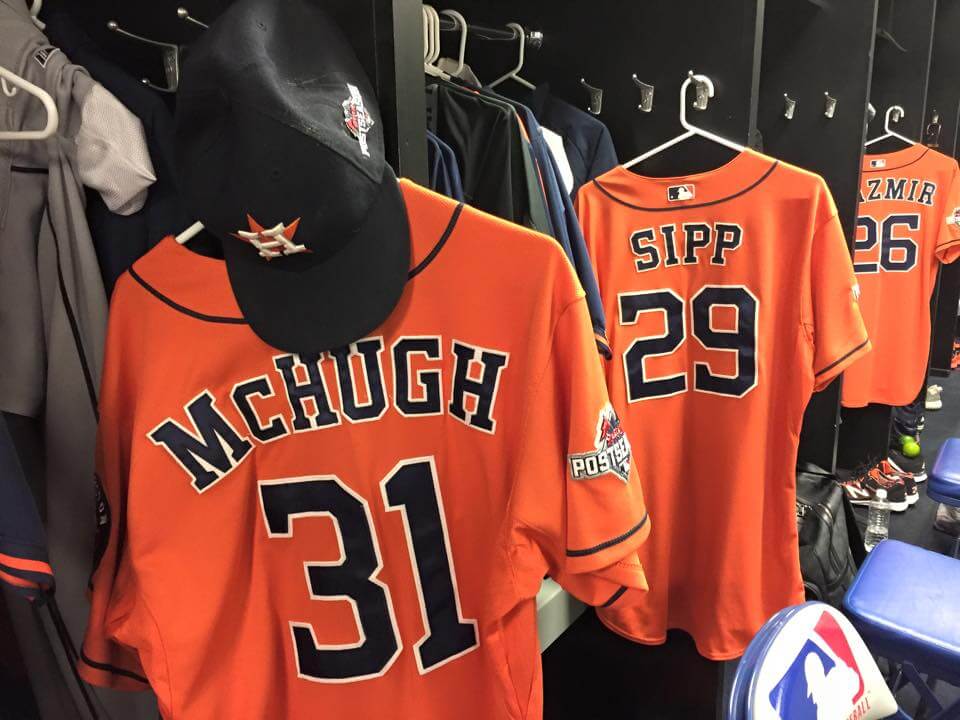
The tequila sunrise look brought with it a design inspired by race cars for the jersey backs; a white “meatball” interrupted the orange stripes. Does that font look familiar? It should: it was the one from the 1972 Braves uniform. At least rendering it in one color lent a cleanness lacking in Atlanta’s case. That “7” is brutal, though.
In 1994, the whole colorful angle was dropped in favor of navy & old gold uniforms, stark in their design. The new numbers were Eurostyle Condensed, lending a sleek, futuristic appearance (which, by the way, ended up on the jerseys of another team with rocket theming, the 1995 Seattle Supersonics) I wasn’t crazy about the uniforms, but it sure wasn’t the fault of the numbers.
The 2000 move to Enron Field was accompanied by a dramatic restyling, comprising pinstripes and all-new colors. Numerals were very oblong and compressed, possibly bespoke (I haven’t seen them anywhere else). I liked ’em fine, they even stood up to extra outlining.
2013 brought a transfer to the American League, and with it, a new look inspired by their 1960s uniforms. A custom font was commissioned whose main features were serifs shaped like hammers. Not bad, but totally unnecessary. The look is so close to Sand Knit, they would have been well-advised to use the traditional face.
My scores: 3 (1975); 4 (1994); 4 (2000); 3 (2013)
San Diego Padres:
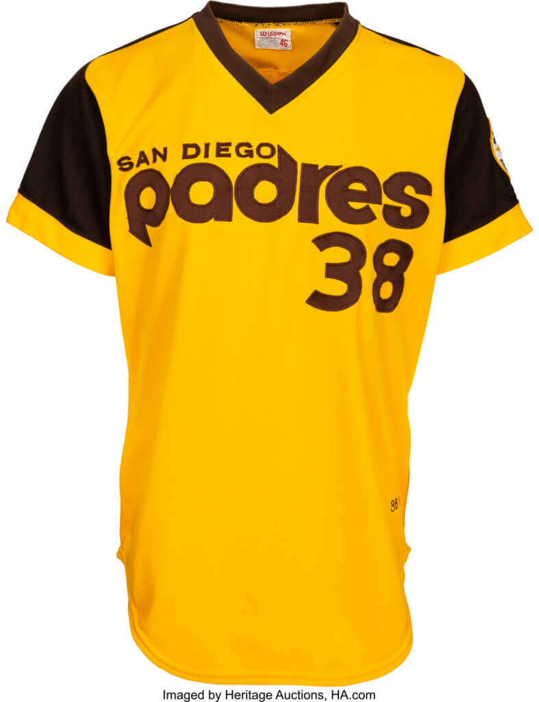
A better name might be the San Diego Waffles, based on their sartorial history. Their numerals reflect it. The year of their first All-Star Game brought saddle-shouldered uniforms and numerals familiar to fans of college football; University Gothic. These curvy, legible numbers continued right through their World Series year; by then, they were three-colored for the Pods’ home uniform.
1985 brought a tradition-minded uniform with pinstripes, at home and on the road. Gold was excised, and crisp, Helvetica Condensed numbers were put on the players’ backs. It was a look influenced by the San Francisco Giants (and frankly, a bit derivative, when you consider how often casual sports fans tend to confuse the two teams) but these suits have nice details, the numerals among them.
After an uninspired foray into dark blue & orange uniforms, San Diego trotted out a new look in 2004 with a very sleek-looking script and khaki as a trim color. As far as I can tell, the number font was commissioned by the team to echo the architecture found in the city’s Gaslight Quarter. Bearing a passing resemblance to the 90’s Brewers’ numerals, the font was narrower and more streamlined. It gave the team a useful trademark, but, naturally, was tossed overboard in 2012 in a bid to make the team look plainer and more ordinary. Conservative tastes won the day…
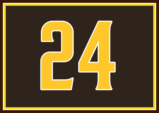
Until 2020, when the team’s original colors of brown and gold were reinstated. Will things be different this time? Will the Padres commit to the traditions that make this team unique? A good sign is that they brought back their bespoke font, albeit with a “4” that has a closed counter. The new lettering of the players’ names gives the appearance that this uniform was created from whole cloth, but we know better. Can’t argue with the results, though!
My scores: 5 (1978-84); 4 (1985); 4 (2004); 4 (2020)
Miami Marlins:
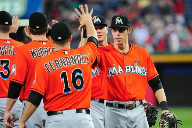
In 2012, the Florida NL team was renamed the Miami Marlins and moved into its new digs on the site of the old Orange Bowl. New colors, new logos, new fonts. The numerals were rendered in a chunky, formal-looking typeface (with a flat-topped “3” and an open-countered “4”). It did not match the Futura Bold of the team’s script, though, and the vertical drop shadow made it somewhat hard to read.
Miami hit the reset button in 2019, toning down the palette and trying to make the graphics resemble neon lighting. The new numerals looked like rectangles with rounded corners and windswept serifs, usually a huge mistake, were added with restraint. It’s a nice look, but most people wouldn’t realize it was customized in any way.
My scores: 2 (2012); 3 (2019)
San Francisco Giants:
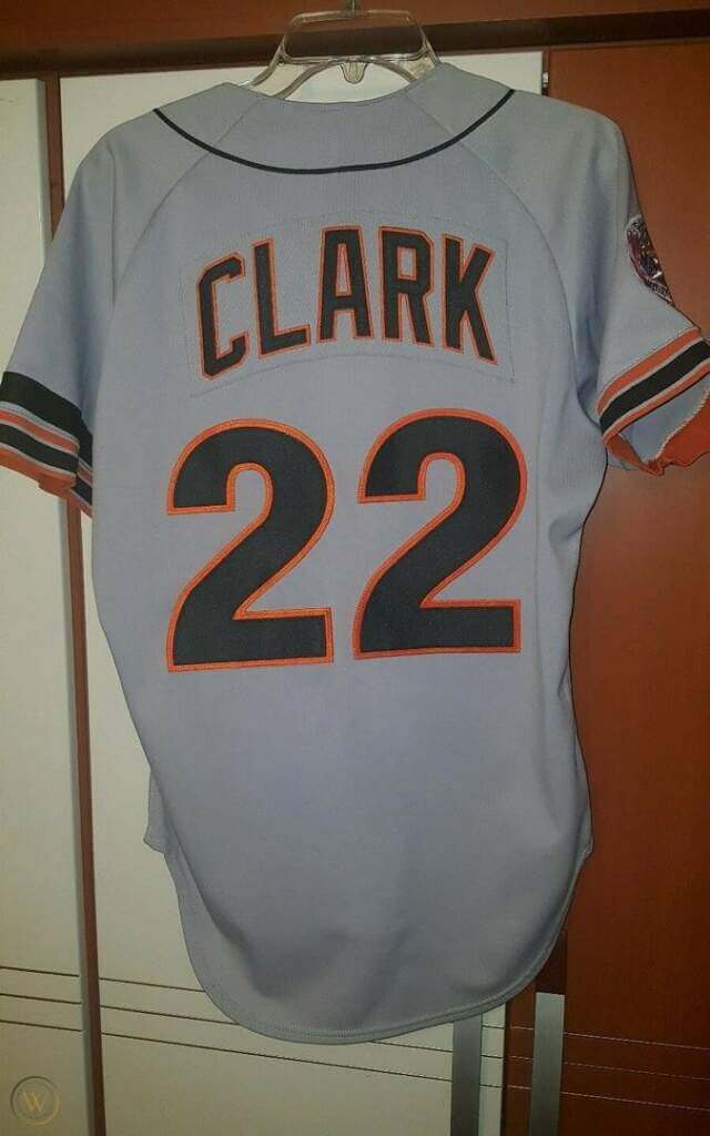
The Giants franchise celebrated its 101st anniversary in 1983, and celebrated with a top-to-bottom makeover. The home jersey bore a fat, curvy, and fun script across the chest; the backs got a bold set of numbers which bore a resemblance to the Phillies’ characters. They were, in fact, Helvetica (like Philly) but in a bolder style with heavy vertical strokes. It looked great. So much so, that when these suits were tuned up in 1994, the backs were left unchanged. It was a good decision.
My score: 5
Seattle Mariners:
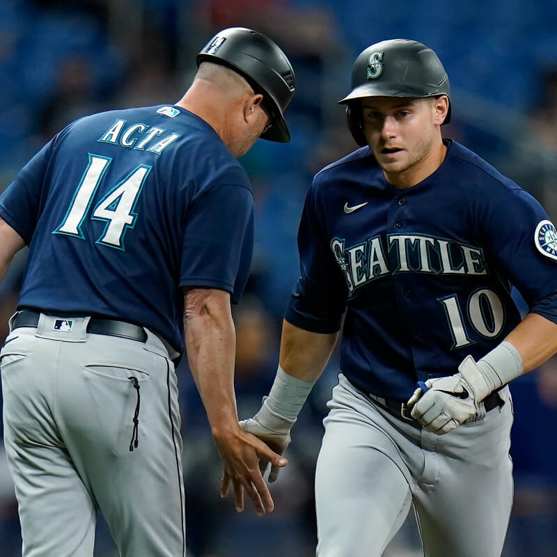
In year one, the M’s arrived with a conservative look; royal blue and yellow on a white background. Numerals appeared on the front and back in a curvy University Gothic typeface. Crisp and modern. This look lasted until 1981, when 3-color Varsity Block came into use.
In 2003, Seattle added a navy blue alternate jersey to its vintage-1993 set (still in use) with a font that matches the chest typeface. Serifs were triangular and bore a resemblance to the first Diamondbacks’ numerals. For this reason, I doubt they are customized. They are readable enough, but the colors don’t have much contrast with the jersey fabric. 3-coloring is superfluous. Don’t blame the font.
My scores: 5 (1977); 4 (2003)
Cleveland Guardians:
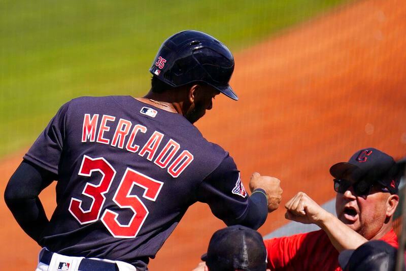
A new broom sweeps clean, and the Guardies lay new graphics over the colors of the team that preceded them. Very much a custom font, the numbers take on the look of the extended hexagon which governs the shape of the cap insignia and “Cleveland” lettering. I get the wish to be consistent, but I find this font odd-looking, and not all that Art Deco.
My score: 3
Los Angeles Angels:
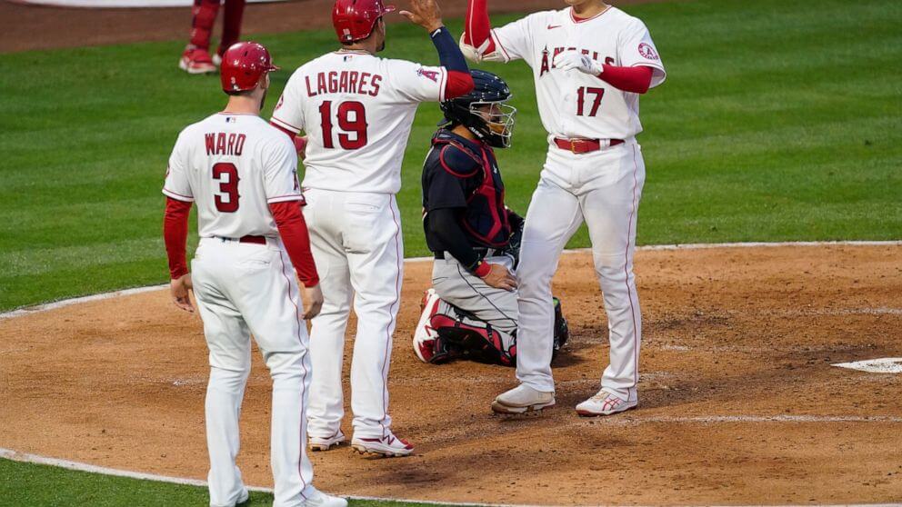
In 1997, Disney took a controlling interest in the Angels and replaced their somber (read: classic) uniforms with something more festive (garish). Among the myriad changes were a bespoke typeface with an Art Deco look. It was the best part of a uniform that didn’t have much going for it. Disney backed out in 2002 and a uniform resembling the Cardinals’ took its place. To give the jerseys a distinct appearance, a new typeface was commissioned using rounded-off rectangles, thin serifs and a “burr” on each side to make it look antique. They are the jersey’s signature and have been a part of the Angels’ iconography longer than the McAuliffe numbers (from 1961 to 1978).
My scores: 4 (1997); 4 (2002)
Thanks, Walter! Fantastic deep dive into just the kind of minutia that Uni Watch is all about — looking forward to your foray into NFL fonts in the near future!


Will The Commies Mix ‘n Match?
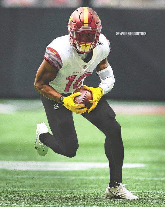
As you’re probably all aware, back in February, the Washington Commanders revealed their new name, logos and uniforms. Paul had a short piece on that, and a more in-depth look the uniforms on Bulletin later on. In pretty much every photo, OTA workout, and portrait, we’ve basically seen the team in mono uniforms (either all black, all white or all burgundy).
Some have speculated that we’ll see only those three combinations throughout the season, and indeed, it doesn’t appear as though the uniforms were made to be mixed and matched. I’m pretty sure the general consensus (at least round these parts) has been that the mono unis don’t look particularly good (at least as either all burgundy, all black, or all white with a burgundy helmet). But the team has two helmets, three jerseys, pants and sets of socks. So, could they mix and match? Absolutely — but how might that look.
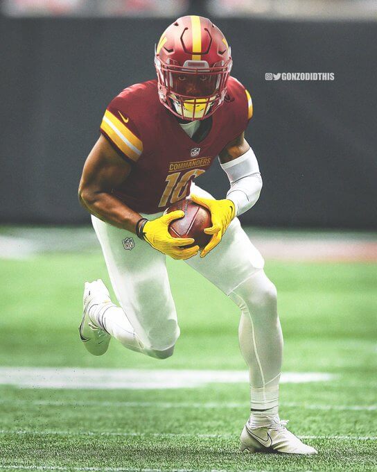
I recently found some mix/match mockups by @GonzoDidThis, which show a few possible combinations other than mono. I think there’s some decent potential mix/match combos — and Gonzo didn’t show them all (he left all the socks the same color as the pants — which is one of the things I’d immediately nix), but here are a few of the possibilities.
If you look at the splash photo, you’ll see a potential combo of burgundy/white/black (and black socks). I think if the team paired this with maroon or white socks, it’s palatable.
Let’s look at a couple more:
Burgundy/White/Burgundy
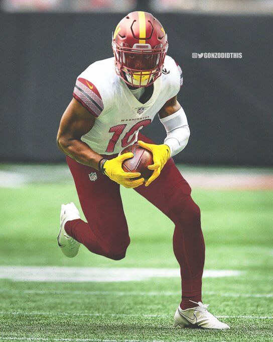
This would be my favorite (and preference). Again, the socks would need to be white (or even, heaven forbid, striped), but I think this would/will look good on the field.
Burgundy/Burgundy/White
Another great possibility. Just pop some burgundy socks with this and it’s good to go.
I’d also like to go on record that I’m more than OK with the burgundy/white/white (just wear burgundy socks) combo the team has already unveiled.
Clearly the burgundys and whites can (and should be mix/matched). But what about the black? We already saw black pants mixed with the burgundy and white. What about some other combos?
Burgundy/Burgundy/Black
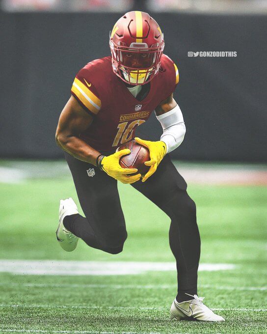
Nope.
Black/Black/Burgundy
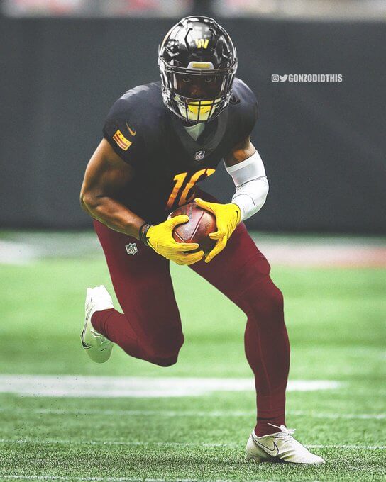
Double Nope.
Black/Black/White
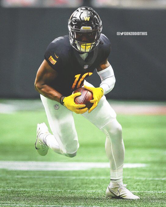
It would need black socks, but it could work. Doesn’t remind me in the least of a Washington team, but sure, it’s doable.
One of the combos Gonzo didn’t show was black/white/black. My same sentiments as above stand — it would work, but where’s the burgundy & gold?
Honestly, I’d like to see the black elements as little as possible (other than the two-three times we’ll see the mono-black this season), but I think if the team mix/matches the burgundy and white elements, especially if they wear contrasting socks, the unis will look better than the full mono shown in the unveiling.
Your thoughts?


Guess The Game…
from the scoreboard
Today’s scoreboard comes from ojai67.
The premise of the game (GTGFTS) is simple: I’ll post a scoreboard and you guys simply identify the game depicted. In the past, I don’t know if I’ve ever completely stumped you (some are easier than others).
Here’s the Scoreboard. In the comments below, try to identify the game (date & location, as well as final score). If anything noteworthy occurred during the game, please add that in (and if you were AT the game, well bonus points for you!):
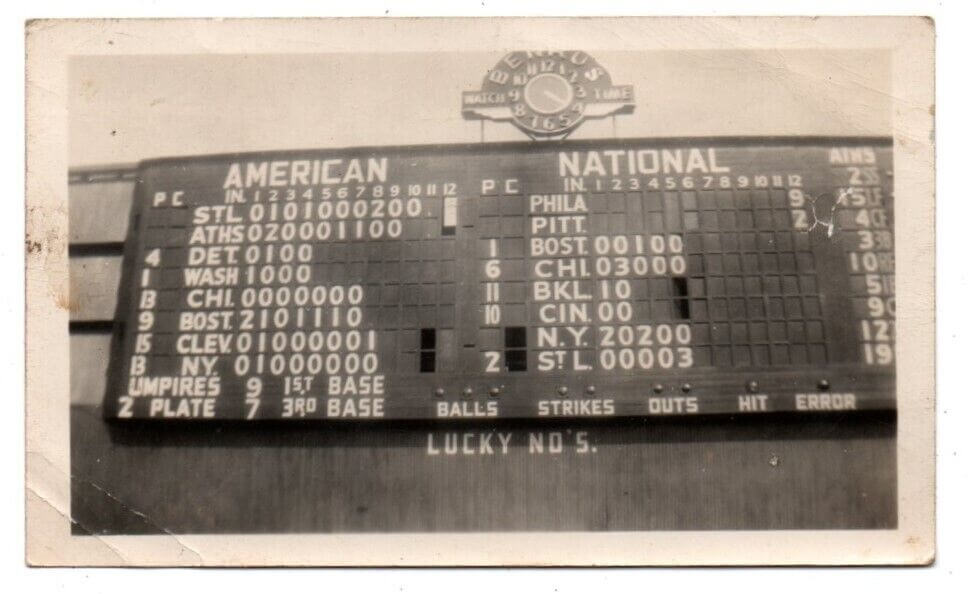
Please continue sending these in! You’re welcome to send me any scoreboard photos (with answers please), and I’ll keep running them.


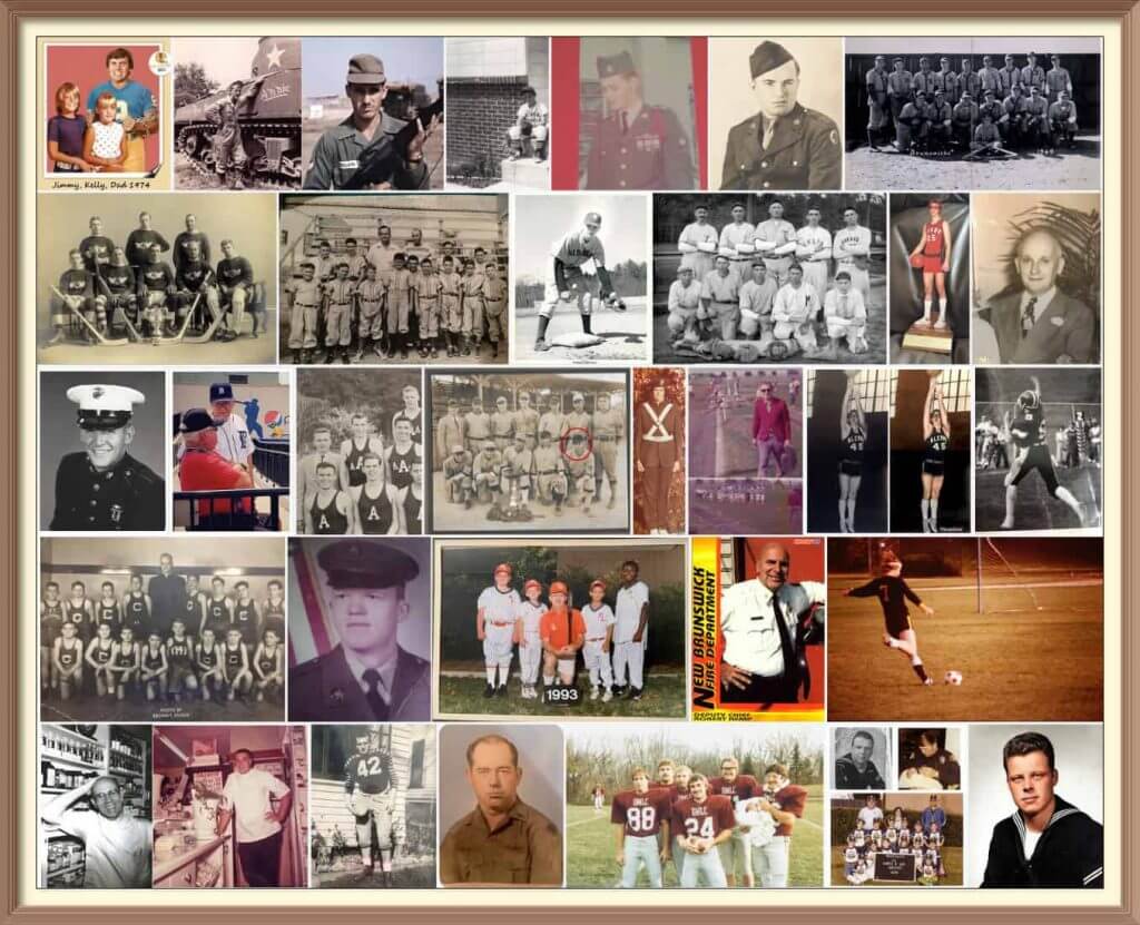
Calling All Sons and Daughters (and Grandsons, Granddaughters, Nephews and Nieces)!
Father’s Day is coming soon (June 19), and I’ll once again be posting photos of Uni Watch readers’ “Dads In Uniform,” a tradition that began in 2013 (and has continued every year since then). This is always a very special day, and I’d love for as many readers as possible to participate — especially those of you who haven’t done so before. A few of you have reached out to me saying “I’ve run out of photos of my Dad” (from years’ past), so if you want to resubmit a photo used before, please do so! Because Flickr terminated my account without explanation a few years ago, any photos sent in before 2020 no longer exist on UW, so if you had sent in something before then, feel free to re-send!
To take part in this annual tradition, select one photo of your father (or grandfather or uncle) in uniform (it can be sports, military, work — as long as it’s a uniform) along with a short description of 100 words or less. Then email the photo — again, only one, please — and text to phil.hecken@gmail.com with the subject line “Uni Watch Father’s Day 2022” by TUESDAY, JUNE 14, midnight Eastern. I’ll run all of the submissions on Father’s Day. Thanks!


The Ticker
By Paul, pinch-hitting today for Anthony Emerson

Baseball News: Angels P Noah Syndergaard was spotted wearing a headband with a throwback Angels logo. … The Triple-A Durham Bulls will wear Durham Black Sox throwbacks for Juneteenth (thanks to all who shared). … Jake Kessler’s daughter recently got a copy of the Story of Baseball Coloring Book. If you click on “Look inside” and scroll through the resulting interface, you can see that the book provides color-guide instrux for the various uni components. The book also includes more modern players. … Cubs 3B Patrick Wisdom homered in four consecutive games after changing to a new bat (from Jon Vieira). … The Rockies will be wearing their CC uniforms for Sunday home games going forward. … Overalls-themed uniforms — or maybe we should call them faux-veralls — for the Olney Cropdusters of the Cal Ripken League (thanks to all who shared).

NFL News: Reader Eric Schmid recently found this set of NFL paper footballs on eBay. … FNOB alert! That’s Leonard Smith (obviously) of the 1988 Cardinals. Their roster also included Lance Smith and J.T. Smith that season (from @_AVBSports).

Hockey News: The Sabres plan to retire Ryan Miller’s No. 30 at some point next season. No firm date yet. I’m hoping Oxford Pennant will get to make this one, like they did for the recent Rick Jeanneret banner (thanks, Phil).

Basketball News: If you didn’t already know the story behind the Celtics’ parquet floor, here’s a background on that (from Kary Klistmet). … Here’s some rare video footage of NC State’s infamous one-piece uniforms from 1989 (from Kelly Fitzgerald). … New uni number assignments for Creighton. … We’ve already mentioned San Jose State’s new court, but I’m not sure we’ve mentioned that it has a glow-in-the-dark feature. This gimmick might matter more if basketball were actually, you know, played in the dark (from Kary Klismet).

Soccer News: To make things easier for colorblind fans, EFL teams have been given permission to wear their away kits at home (from @koTenSixtySix). … The rest of these are from Kary Klismet: German club VfL Wolfsburg has unveiled a kit commemorating the 25th anniversary of its ascent to the Bundesliga. It will be worn in an exhibition match featuring alumni from the 1996-97 team that won promotion. … New home kits for Real Zaragoza of Spain’s Segunda División. … New home kits for French side RC Lens.

Grab Bag: New logo for the National Air and Space Museum (from Kim Kolb). … Here’s a ranking of U. of Illinois sports uniforms across all sports. … The rest of these are from Kary Klismet: New uniforms for the Sydney Roosters of Australia’s National Rugby League. … The logo and mascot for the 44th Chess Olympiad in Chennai, India, have been revealed.


Uni Tweet of the Day
I’m dreading the Mets CC unveiling. Because I could see it being something like this…
I'm pretty sure it takes years of work and planning to design the "City Connect" uniforms, but as a fun project here is what my vision would be I could design them. #LGM #NYMNeonProject pic.twitter.com/gzMHeawPLq
— Athlete Logos (@athletelogos) June 9, 2022


And finally… that’s it for today. Big thanks (again) to Walter for sharing his wonderful look at custom fonts. Great stuff and I’m looking forward to his future take on the NFL!
I’ve said it before, but I’ll say it again. Despite a really nice sunset both Thursday and last night, sometimes the most pleasing shots are from the gloaming…

Everyone have a good Saturday and I’ll catch you tomorrow.
Peace,
PH
Mixing and matching can’t save those Commanders uniforms. They make no sense. It’s like one design team did the helmet, one did the home jersey, one did the away jersey, another did the pants, and no one talked to each other during the process. With apologies to the Cardinals, Washington easily has the worst Uni set in the league. It’s not close.
The only thing wrong with the Commanders’ identity package was the nickname (and accompanying logo). The colors were good and the basic design was solid as far as stripes and trim. (And I say that as an Eagles fan who doesn’t like the team no matter what you call them.) The gratuitous BFBS and wild inconsistency from one set to the next is weird; trying to make it a mix & match set when they’re inherently mismatched by design is weirder.
The only thing wrong with the Commanders uniforms is everything, full stop. Concur with the assertion that they’re the worst in the NFL, and in contention for worst in the “Big 4” of NFL, MLB, NBA, & NHL.
It’s amazing how none of those uni combos are visually appealing. You’d think that one would work if only by accident, but nope.
They have great colors, except for the black, but have terrible execution. They also really need yellow pants, which would help for these weak uniforms.
Giving up on the yellow pants before the name change was a huge mistake.
How soon before the old uniform comes back, piecemeal?
Maybe it’s because I grew up a Phillies fan during their Helvetica years but I could always appreciate a clear difference between their number set and what the Padres and Giants wore, and I always thought that the Padres and Giants had slightly different number fonts.
Pretty sure what the Pads have now is not a previous bespoke font, though it is close. (The wording suggests it is the old font.)
The Pirates definitely need to fix their “7”s. It ruins the set for me.
I nearly went crosseyed trying to compare the Padres’ typefaces. None of the differences (save the 4) really stood out. It’s plain that they based the new font on the previous one.
It looked as though the Phillies wrote their numerals inside a square, the Giants inside a rectangle, and San Diego inside a narrower rectangle.
I don’t know, seems a black city disconnect uniform would be too easy for the Mets. For some reason, I’ve been figuring the uniform will lean into the Big Apple imagery, so lots of red and perhaps a little green.
Thanks for another terrific look at baseball’s numbers, Walter!
My pleasure. And a round of thanks to Phil, who cooled off my hot takes.
No disrespect to PH but I would like to see the unvarnished hot takes. This was thoroughly researched and well done.
Contemplate a chipmunk record being played at 78 rpm… and there’s a lot of spittle.
I’ve said it before, but I’ll say it again. Despite a really nice sunset both Thursday and last night, sometimes the most pleasing shots are from the gloaming…
Yesterday’s sunset looked beautiful from New Rochelle, too!
The scoreboard is link, Athletics beat the Browns in 10 innings on Saturday, August 28, 1948 at Shibe Park in Philadelphia.
In re GTGFTS, beats me. But I find it curious that it appears the Browns’ city is abbreviated in the usual manner of “STL” but the Cardinals’ city is abbreviated with a full height capital “S”, a compact capital “T” sitting on top of a period and a full height capital “L”.
I believe the Browns’ “St.L” also has a capital “T” sitting on top of a period, it’s just hard to see the space in the photo. Now, whether the Browns’ “St.L” has a period or a long bottomed “L” is hard to determine.
The two “N.Y’s” are completely different, while the CHI’s and BOST’s are consistent. Seems WASH is the only one definitely without a period.
I wonder what’s hanging over the A’s 12 inning score boxes?
Can the Commies start over, completely?
Name : F
Uniforms : F
Owner : F
Name : F
I wanted them to consider “Firebirds”. Did it ever come up?
By most accounts, their stadium is an F as well.
I thought about the possibility that this Commanders slop was a stop-gap until the team moved to Virginia…at which point they’d rebrand again…but it may be that Jack Del Rio’s recent non-football comments have put the stadium deal in jeopardy, at least for now.
link
Ironically, RFK Stadium hasn’t gone anywhere. It’d be funny if FedEx Field met the wrecking ball before the old bowl.
Another great installment, Walter!
I’m not an Indi…err, Guardians fan but absolutely love their number font (why they don’t use it on rear of their helmets though?).
Agree that it’s not Art Deco, but does sorta/kinda harken back to the franchise history in that it (to me) resembles the feather found in the old logo.
Well, to be honest, the silhouettes of the Guardians of Traffic also match the outline of Chief Wahoo’s feather, so if nothing else American League Cleveland Baseball has been consistent. Hexagons are their “thing”.
My childish exploitation of aforementioned silhouettes: link
;)
Another great post Walter! For the Guardians, you described them as hexagonal which is true. But my impression is they are meant to look like the sides of a cube in isometric projection. The cubic blockiness meaning to echo the construction of the Guardians themselves. link
You nailed it. It could make things problematic if a new team down the road goes with an apian theme (The Bees, the Buzz, the Stingers) and uses a honeycomb graphic.
Always though the “punking” (another new term to me) Pirate flourishes were supposed to reflect PA’s Keystone State nickname.
Thanks for the intel!
“Punk” and “Bloat” used to be menu commands in Illustrator; recently, “Punk” was changed to “Pucker”.
GTGFTS:
Saturday, August 28, 1948 (D) at Shibe Park
Philadelphia Athletics 5, St. Louis Browns 4
Camo vs Camo tonight in Biloxi MS. (Brewers AA vs. Cubs AA) Biloxi Shuckers hosting the Tennessee Smokies.
link