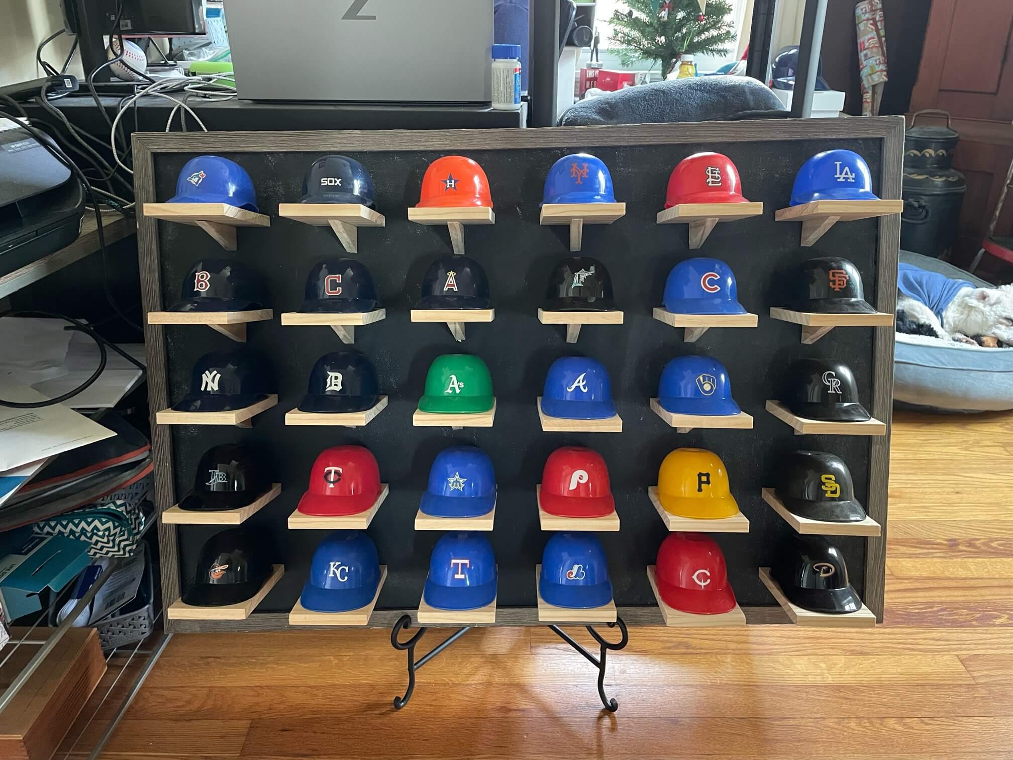
Click to enlarge
[Editor’s Note: Today we have a guest entry from reader Brent Suereth, who’s going to tell us about a very cool DIY project he recently completed. Enjoy. — PL]
By Brent Suereth
Sometime last summer, I stumbled across someone selling a set of vintage MLB ice cream helmets, which included every pre-Marlins/Rockies team. They were a little beaten up, but I’ve spent $20 on worse, so I decided to make them my own. I didn’t really know what I was going to do with them, but I eventually figured they’d be great to use as part of a custom standings board that my girlfriend and I could update each day.
After making a couple of stops at various craft stores, we scrapped the idea of using a premade shelf and decided we’d be better off making something ourselves to better match the aged look of the helmets.
So after getting our hands on helmets for the Nationals, Diamondbacks, Rays, Marlins, and Rockies, we spitballed a few ideas and landed on what you see at the top of the page. We started by getting a 24″ by 36″ magnetic metal plate at Lowe’s and painting it with a few layers to give it an aged look. Then we procured a weathered 24″ by 36″ frame that was sturdy enough to hold the extra weight
To display the helmets themselves, we cut long boards of pine down to 3.5″ by 5″ slabs, glued some heavy-duty magnets onto each of them, and then cut a few supports to give the shelves the needed strength to support the helmets. (Unfortunately, it didn’t occur to me to take any photos documenting each phase of the project.)
For now, we have the display resting on an easel. We’ll eventually hang it up, but we don’t have the space to do that where we are now. We update the standings first thing in the morning. If two teams are tied, we use the order shown in MLB’s app. (Our two at-home mascots, Blake and Jack, sometimes wreak a bit of havoc by knocking the helmets off their pedestals.)
Between the two of us, we probably spent about $120 and labored for no more than three or four hours. We’re quite happy with the results, although it’s a drag to see our favorite teams’ helmets down in the lower reaches of the display. You see, I’m a Pirates fan and she’s a Red Sox fan — probably not our year.
Click to enlarge
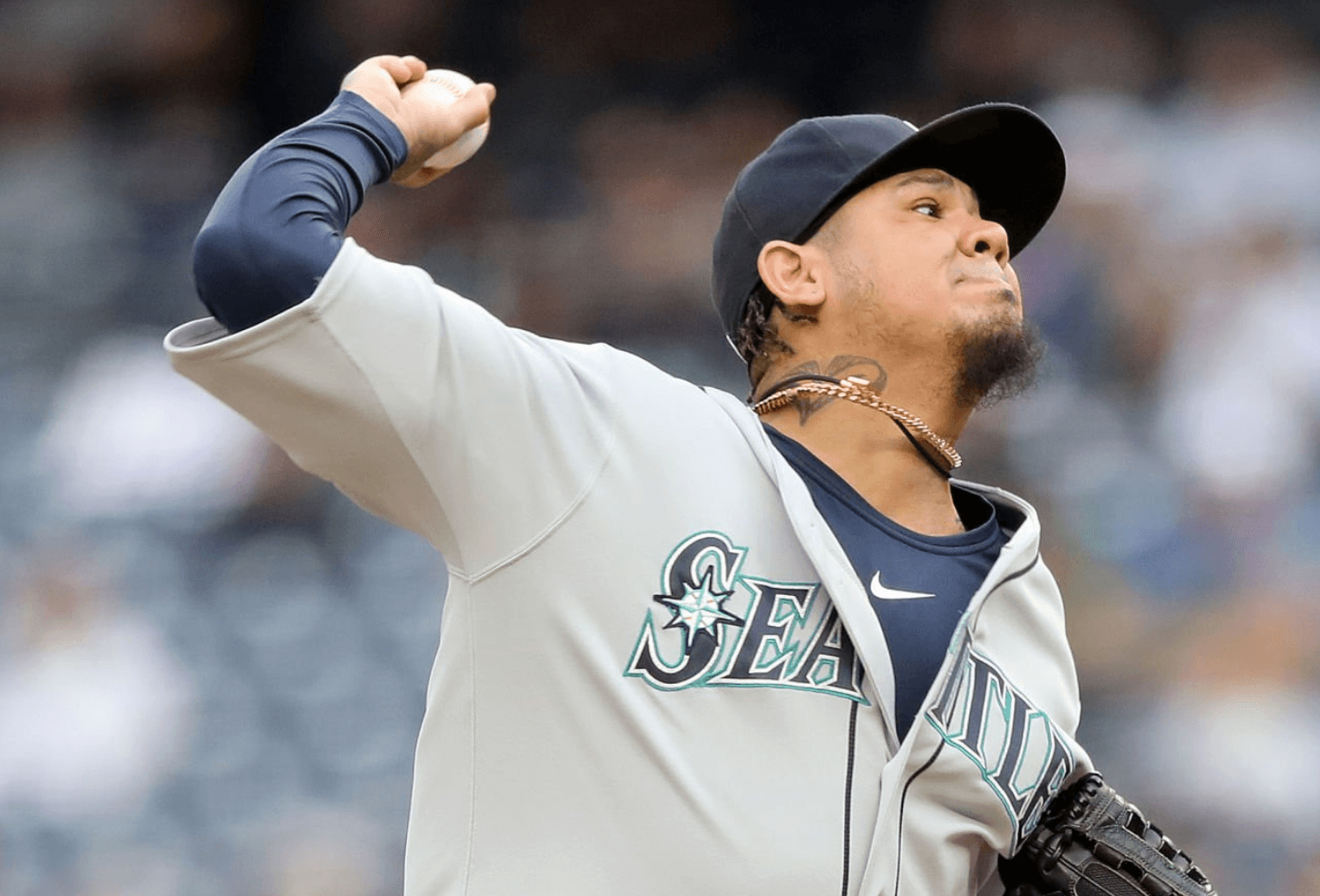
The King’s attire: When I was interviewing Mariners equipment co-managers Chris DeWitt and Joe Van Vleck for last week’s Bulletin article about the team’s troublesome NOB font, we also talked about a few non-typography topics. At one point we had this exchange:
Uni Watch: Have you ever worked with a player who had a really unusual request regarding his uniform?
Van Vleck: Felix Hernandez was slow to adapt to the weight of the Cool Base jersey. So he was actually wearing a traditional double-knit for years after everyone else was wearing Cool Base.
UW: So he preferred that, even on a hot day?
Van Vleck: Yeah. It was more about the weight of the jersey — he just liked the way it felt when he pitched.
Sure enough, if you look at the photo shown above, which is from 2019 (Hernandez’s final season), you can see that his jersey has a traditional side seam instead of the flex panel you’d see with a Flex Base jersey. An interesting detail about King Felix!
Click to enlarge
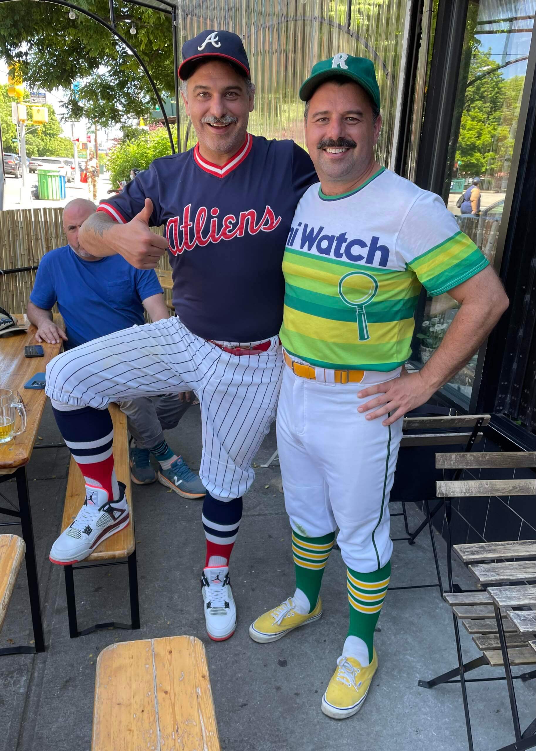
Blast from the Uni Watch past: It was great to hang out yesterday with longtime reader and former Uni Watch neighbor Marty Buccafusco (above left), who now lives in Atlanta but was in NYC for the weekend. We had drinks with his brother, Chris, who looked resplendent in a Uni Watch tequila sunrise jersey, among other green/yellow finery.
(In case you’re wondering, Marty and Chris did not wear baseball uniforms just for me. They had played in a ballgame earlier in the day.)


ITEM! Membership raffle: Jamie Rathjen, who compiles the Tickers that appear on Mondays, celebrated his birthday yesterday. And instead of getting a present, he’s giving us a present by paying for a membership card for me to raffle off, with one stipulation: The winner must choose a card design from a women’s sports team.
This will be a one-day raffle. No entry restrictions except for the above-mentioned women’s team design. To enter, send an email to the raffle in-box by 8pm Eastern tonight. One entry per person. I’ll announce the winner tomorrow. Please join me in thanking Jamie for doing this!
Uni Watch Hit Parade: Kentucky singer-songwriter S.G. Goodman has a new album out, called Teeth Marks. Much of it is a little slower and more atmospheric than I’d prefer, but the second track, “All My Love Is Coming Back to Me,” is a knockout that centers her otherworldly vocal wail in a snappy arrangement anchored by an instant-classic guitar riff. One of those songs I can listen to a dozen times in a row without tiring of it.
Goodman is playing tomorrow night at the Mercury Lounge here in NYC. I have a competing social obligation but will try to get there, if only to see her perform this song.
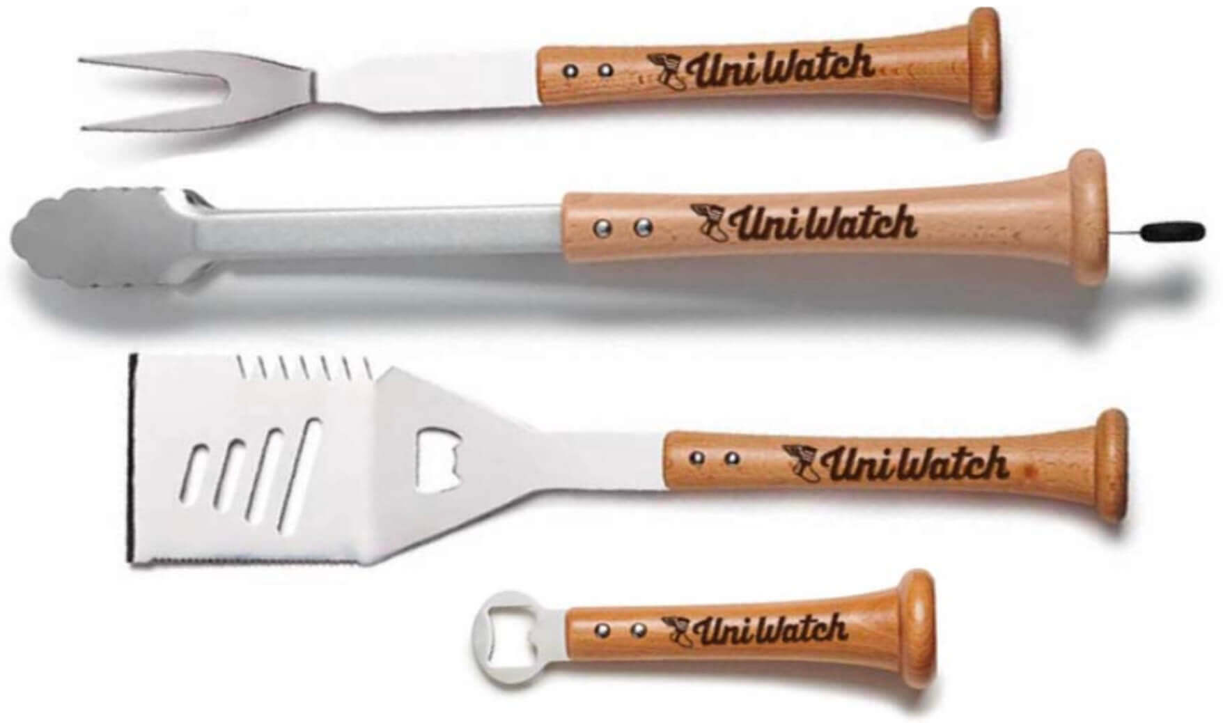
Click to enlarge
Father’s Day deadline reminder: If you want to get any of our cool Uni Watch grilling tools in time for Father’s Day delivery, you must get your order in by today. The products, with handles made from real baseball bats, are available here.
Sorry, no Ticker today, as birthday boy Jamie Rathjen had yesterday off. The Ticker will return tomorrow.
I’ll be visiting my Mom today, so I won’t be participating much in the comments. Play nice while I’m away. Peace. — Paul
Just between me and you, your mama and your cousin too, shouldn’t the ATL be in caps, Marty?
FYI, BigBoi, the Braves did use a lower case version of the “atlanta” wordmark in this font from 1976-1980.
Are we dabbling in double entendre?
As soon as I started reading your comment, the music began playing in my mind :-)
Great job on the board Brent! I love standings boards like that.
Happy birthday, Jaime, Wahoowa. Shame about the Baseball ‘Hoos this weekend. How kind of you to send something out for your birthday. And thank you for all of your updates especially UVa related.
Thanks!
Happy belated birthday to fellow Tottenham supporter Jamie! There are literally dozens of us.
Paul, if you happen to see this, what is the green cap with the white R that Chris is wearing in that photo?
Thanks!
Well done, Brent! Thanks for sharing
Question for the experts, was there ever an ice cream helmet with Chief Wahoo logo? A quick Google search showed a bunch with the “C” like Brent’s.
I found several on eBay. You may have to include the word Cleveland in your search.
I figured todays lede would be the Rays story. Maybe that will be Paul’s Bulletin story this week.
Phil had it yesterday.
I think perhaps his concern was more about the players who made the “faith-based decision” to not wear rainbow-colored logos on their uniforms during the game, rather than the pride logos themselves. YMMV
Yeah, I meant a think piece/commentary from Paul more than just a news item.
I didn’t see yesterday’s post, so didn’t realize Phil covered it. My bad.
I saw S.G. Goodman in December. Hope you make it to the show, it’s a good one! \m/
I’m surprised to be the first to mention the Angels’ CC unveiling, curious what everyone thinks. I personally like them, I especially like the cap logo, they should keep it. I’ve never loved the two tone A. I am an Angel fan, full disclosure.
I think they’re pretty good, but I must say I was hoping to see some navy blue (and perhaps yellow used) to reference the past and differentiate the uniform further from their current set.
Also I feel it’s a missed opportunity not to go with Halos on the chest and the small a with halo on the hat…the hat is basically the same
I don’t care what the “inspiration’ is or how close technically they are to some beach, ain’t no one thinking “surf” or “beach” when it comes to Anaheim.
As far as I’m concerned, the City Connect program is for people who don’t actually like baseball uniforms, so it isn’t for me, so whatever.
Lee
If forced I take the Angels City Connects to those awful things the Dodgers wore last night.
Like them a lot actually. Cool elements that are authentic to SoCal/OC beach/surfing culture.
I think it looks fine, but to me, it gives off the vibe of a “normal” alternate uniform than a City Connect uniform.
I have to say that initially I didn’t particularly care for them. But after reading about design elements, I actually really like the uni.
Surprised they identify themselves with Los Angeles after taking pains for years not to be specific about geographic locators.
Is that helmet display missing Cincinnati and Washington? I’d love to do something similar but ya know, cats.
I assume that the Nats are represented by the Expos, and the Reds are right beside them – both on the bottom row.
Looking at those AL West helmets with the Mariners’ trident logo instead of their current S, it strikes me that ASHMAT isn’t quite as catchy as ASSHAT.