For all photos, click to enlarge
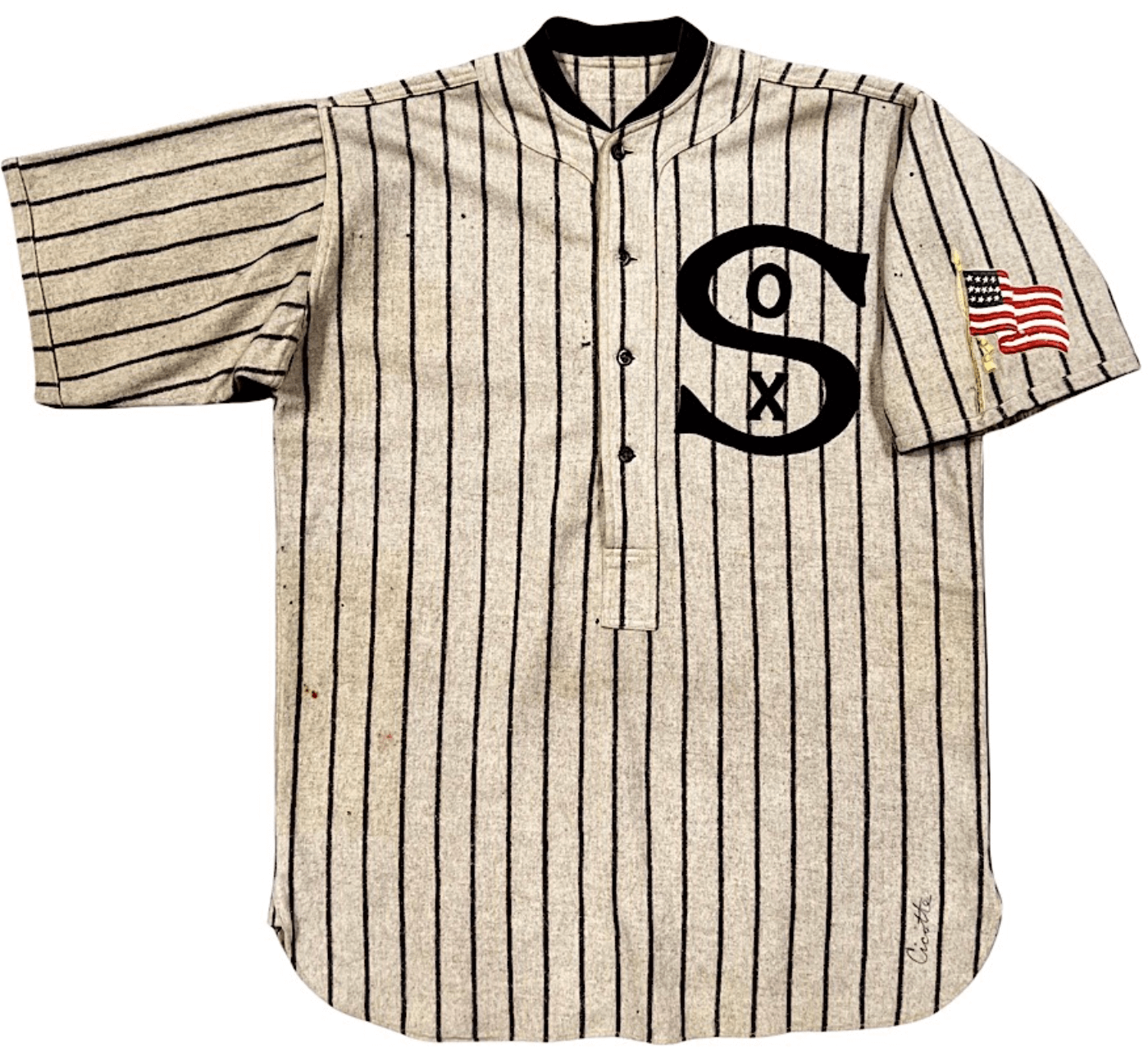
As you may have noticed in the left-hand sidebar, our friends at Grey Flannel Auctions are running another catalog auction. One of the most interesting items is the 1917 White Sox jersey shown above. Let’s take a closer look at that American flag patch, which was added to show support for America’s involvement in World War I:
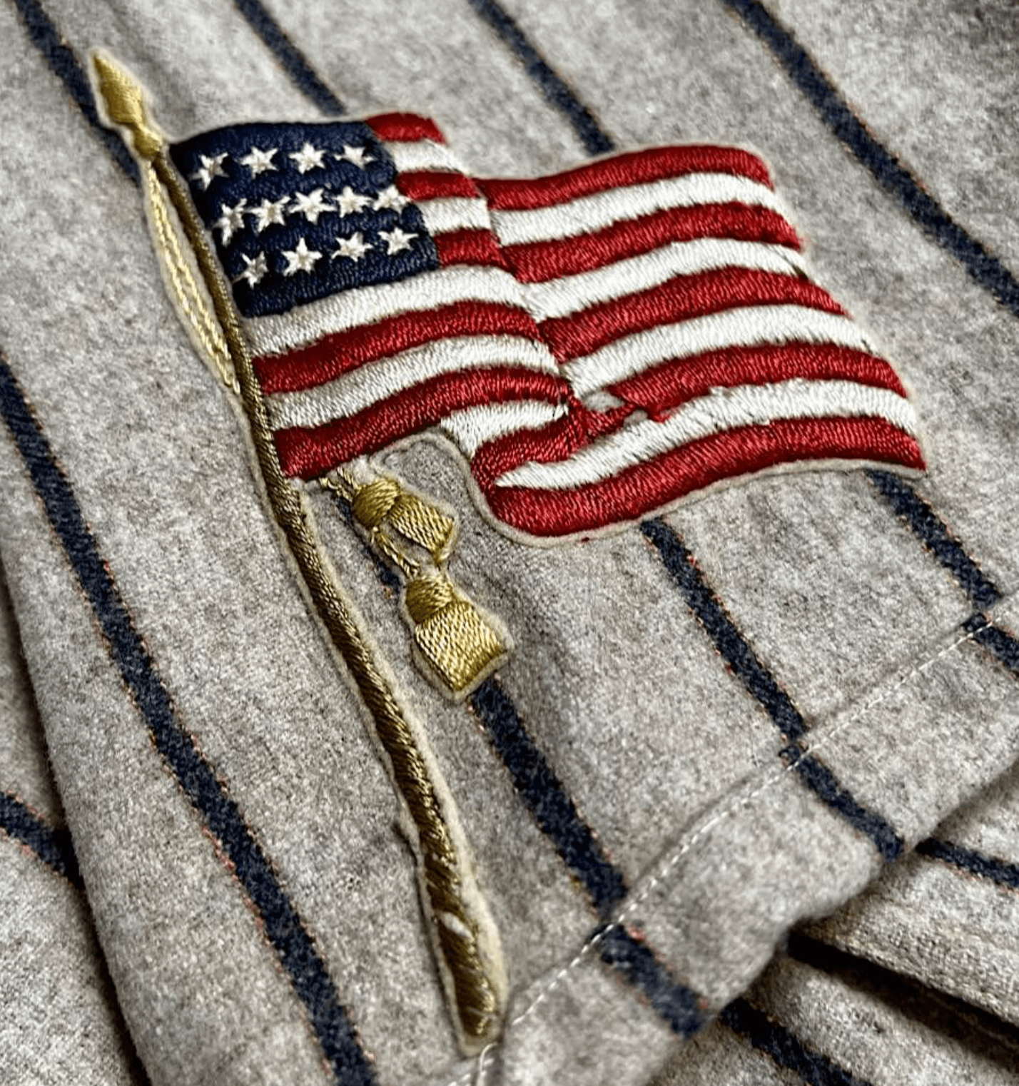
Oh, man. So much detail! Also, look how the navy pinstripes are outlined with a subtle bronze ticking stripe — I’d never realized that before.
Here are some of the other items in this auction that caught my eye:
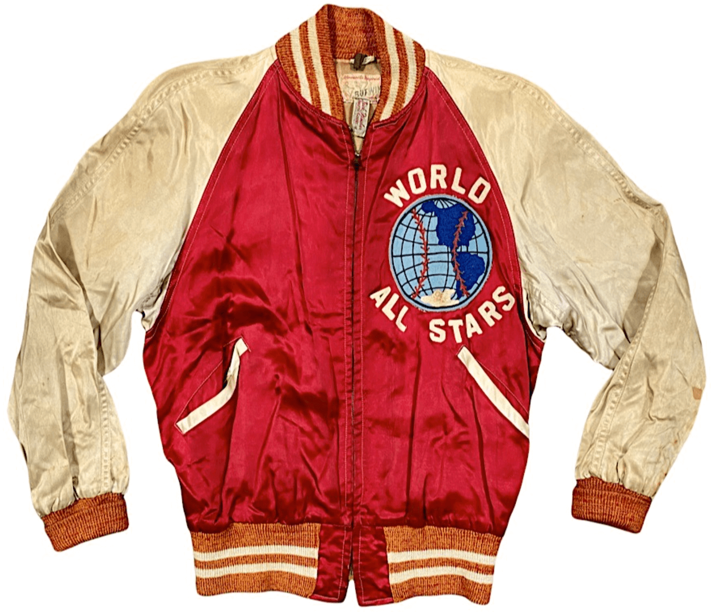
• From 1946-50, The Brooklyn Eagle newspaper sponsored a youth/amateur baseball all-star game at Ebbets Field, dubbed “Brooklyn Against the World.” The photo at right shows the magnificent 1947 World jacket, which is part of a lot that also includes the World jersey, pants, and cap.
• Look at the “SF” logo on this 1961 Giants cap worn by Willie Mays. The strokes of the letters are sooooo much thinner than what we’re used to seeing today.
• Incredible texture on this 1962 Cardinals uni worn by Stan Musial. Be sure to click-enlarge the photos to get the full flannel effect!
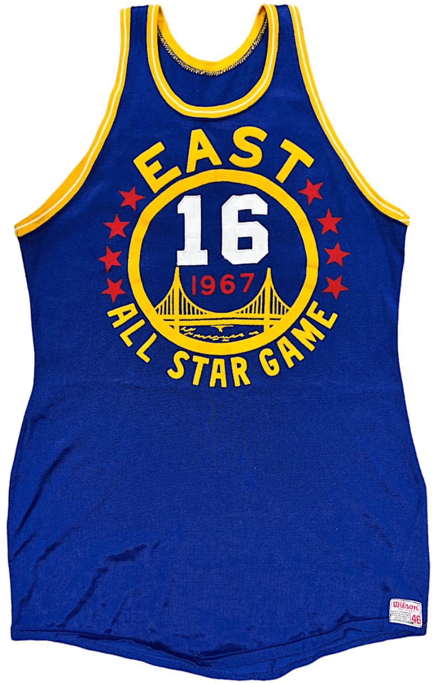
• Here are two NBA All-Star jerseys from Hall of Famer Jerry Lucas — one from 1967 (shown at left; my favorite NBA ASG uni design) and the much plainer design from 1969.
• Here’s something I’d completely forgotten about: In 1995, the Mariners wore a Negro Leagues 75th-anniversary patch, as seen on this A-Rod gamer.
• Oh man, I loved it when the Knicks had that gorgeous vertical arching on both sides of the jersey.
• Interesting collar style on this 1976 New York Cosmos jersey worn be Pelé.
• If you’re into NHL All-Star jerseys, here are some gamers from 1951, 1977, 1992, and 1998.
• Good view of the New York Rangers’ 50th-anniversary patch on this 1975-76 jersey worn by the great Brad Park.
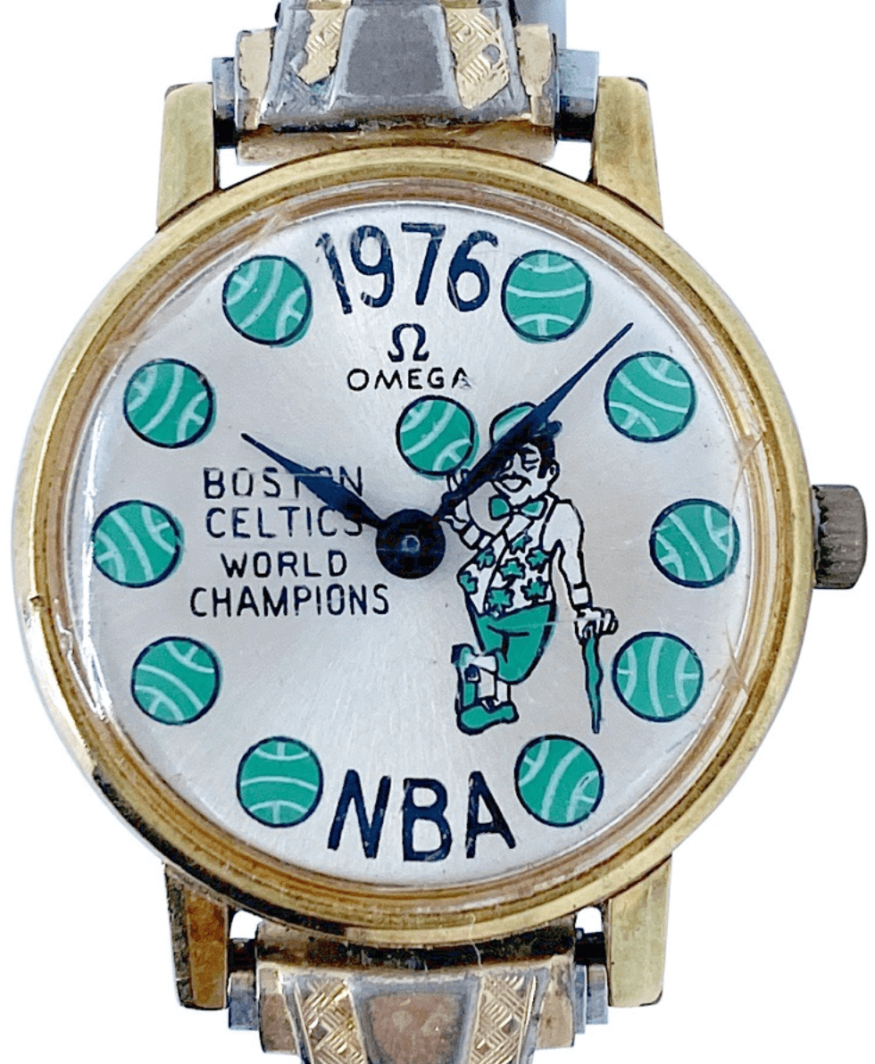
• Gotta like this 1976 Celtics wristwatch (shown at right), given to player Steve Kuberski’s wife.
• It’s not clear whether Larry Bird actually wore this 1972 warm-up suit from Springs Valley High School in Indiana. Either way, the embroidered mascot on the front and the lettering on the back are spectacular.
• Making fun of Comic Sans is pretty much a cliché at this point, but there’s no getting around how weird it looks as the NOB font on this 1972-73 Winnipeg Jets jersey worn by Bobby Hull.
• Which NFL team was the first to put its name on its nose bumpers? I don’t know the answer to that question, but I’d have to think the early-1980s Steelers are in the running, as seen on this old Franco Harris helmet.
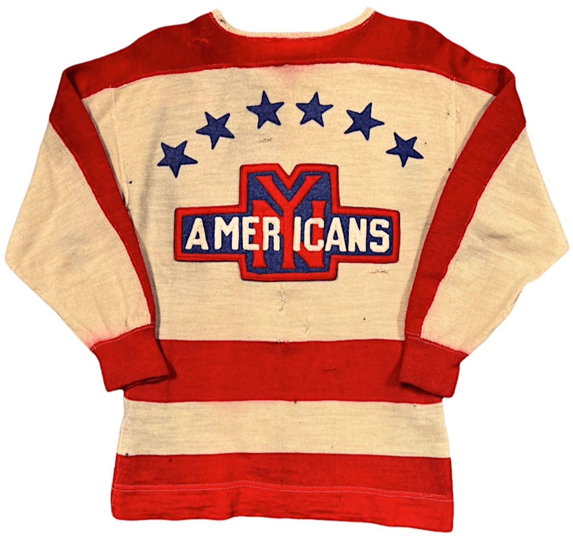
• Last but definitely not least, check out this incredible New York Americans hockey sweater from 1936:
———
Those are the items that made the biggest impression on me. Want to see more? Check out the full catalog here.
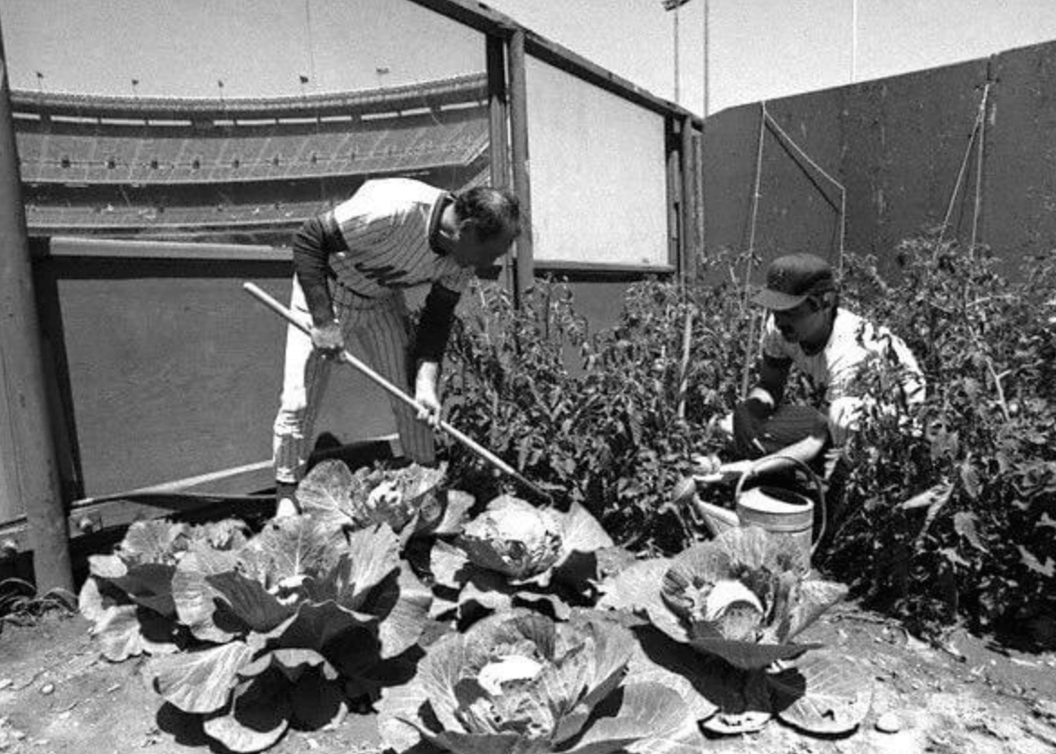
As ye sow…: Former MLB player and Mets coach Joe Pignatano died yesterday at the age of 92. He was famous in the 1970s for planting tomatoes, and then a full vegetable garden, in the Mets’ bullpen at Shea Stadium. Here are a few more photos:
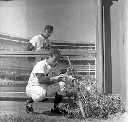
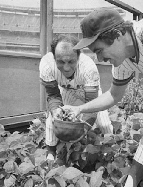
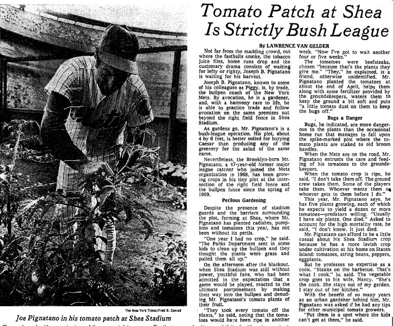
I think it’s safe to say that we’re unlikely to see anything like that ever again. R.I.P.
Click to enlarge
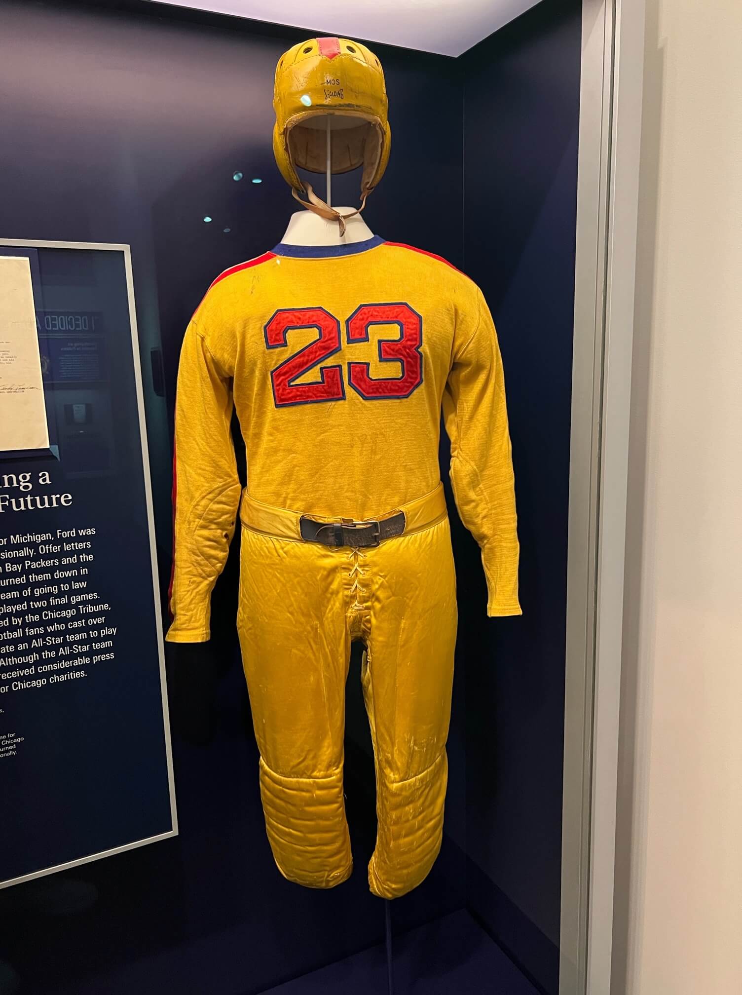
“Bring me the ball, Liberty”: We all know Gerald Ford played football at Michigan, but did you know he also wore this mono-gold uni as part of a college all-star team that played against the Chicago Bears?
Reader David Staples took that shot during a recent visit to the Ford Presidential Museum in Grand Rapids, Mich., where they also had Ford’s Michigan helmet and letter in which the Packers tried to sign him after he left college. Good stuff!
Click to enlarge
Collector’s Corner
By Brinke Guthrie
Follow @brinkeguthrie
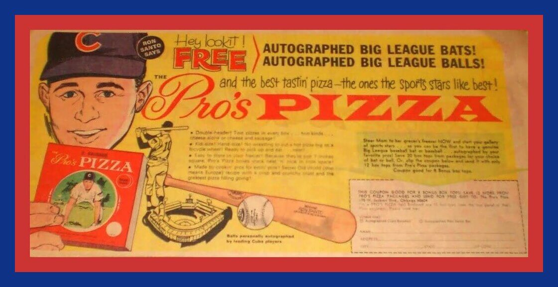
This 1967 comics ad is for Pro’s Pizza. I love how the ad copy starts with “Ron Santo says, ‘Hey, lookit!'” and also refers to the pizza being “as big as a bicycle wheel.” And my favorite part: They’re made from a “Secret Old World (that means Europe) recipe.”
Now for the rest of this week’s picks:
• The great pop artist Peter Max is your “official artist” for this 1996 NHL All-Star Game program. This auction also includes a few additional ASG-related items.
• Speaking of hockey, here’s a 1960s Budweiser promo patch featuring New York Rangers goalie Lorne Worsley. You might be more familiar with Lorne’s all-time great nickname, “Gump.” (A childhood friend thought he resembled a comic strip character bearing the same name.)
• There’s no year associated with these Tasco Sports Glasses (will guess mid-1970s to mid-1980s), but they carry the NFL’s “Officially Licensed Product” logo and a snappy stripe design.
• Some more generic football player art to be found on this 1970s NFL Jumbo Pen. The seller says “Patriots” for this one, but you can see a tiny 49ers helmet if you look closely. Maybe No. 81 is Russ Francis, who played for both teams?
• This Phillies 2005 Opening Day towel was sponsored by Modell’s. The opponent that day was the Washington Nationals, playing their first-ever game.
• Here’s a set of 20 Topps baseball card posters from 1970. Some big names in this batch.
• Packers fans, this (will guess late-1990s) Packers gear bag from Starter is built to last. Haul the brats and brewskis to the Lambeau tailgate party in this one!
• This is a can of 1987 Los Angeles Dodgers Diamond Dust. You know what “Diamond Dust” is? Dirt from the infield! Proof that people will buy anything.
• Ah, I used to get these: Here’s a copy of the 1979 National League Green Book, a spiral-bound breakdown of MLB stats for baseball nerds (and sportswriters). Nowadays? Just pull out your phone and say, “Hey, Siri!”
That’s it for this time around. Next week, we’ll feature something I’ve been waiting to use since last year. Why did I have to wait? Stay tuned.

Membership update: As usual, we received a lot of membership orders on Purple Amnesty Day, and card design Scott M.X. Turner has been hard at work on the first batch of them (including Brandon Curtis’s new card, shown at right, which is based on Juventus’s 2021 keeper’s kit). That batch has now been added to the membership card gallery, and I should have the printed/laminated versions ready to mail out by the end of this week.
Ordering a membership card is a good way to support Uni Watch, and fun to boot. And remember, a Uni Watch membership card entitles you to a 15% discount on any of the merchandise in the Uni Watch, Uni Rock, and Naming Wrongs shops. (If you’re an existing member and would like to have the discount code, email me and I’ll hook you up.)
As always, you can sign up for your own custom-designed card here, you can see all the cards we’ve designed so far here (now more than 3,200 of them!), and you can see how we produce the cards here.
The Ticker
By Alex Hider

Baseball News: The Astros wore camo-accented 3D batting helmet logos on Sunday as part of the weekend-long MLB G.I. Joke cosplay promotion (from Susan Freeman). … San Diego brewery Green Flash Brewing is selling cans of beer that include a baseball with a Padres-inspired logo (from @spadilly). … The Dodgers are giving away a promotional Justin Turner shirt that includes his signature pine tar stain on the back (from Trevor Williams). … The Double-A Corpus Christi Hooks will wear “Blue Ghosts” uniforms this weekend, an annual event that honors those who served on the USS Lexington (from Ignacio Salazar). … Mets reliever Colin Holderman somehow cut his thumb cuticle during last night’s game against the Giants. He kept wiping the cut on the back of his pants, leaving him with a blood-stained buttock. … From that same game: Mets broadcaster Keith Hernandez said he didn’t like the team’s late-1980s road uniforms, which he wore as a Met (thanks to all who shared). … Speaking of the Mets: The Long Island Railroad recently posted a tweet encouraging fans to take the train to the ballpark. The tweet featured a photo showing the Mets’ costumed mascot, Mr. Met, boarding a train while wearing the team’s old “snow white” uni, which hasn’t been worn on the field since 2014 (from Paul Braverman). … The mayor of Anaheim has resigned in the wake of a corruption scandal involving the Angels’ ballpark.

Football News: The Commies, who’ve long been eyeing a new stadium deal, have purchased 200 acres of land in Woodbridge, Va., about 25 miles south of D.C. proper (from Tom Turner). … The Cardinals tried to flex when they posted photos of new rookie TE Trey McBride in his uniform. Many fans used it as an opportunity to implore the team to overhaul their threads (from Phil). … The Patriots have announced number assignments for their rookie class (from our own Anthony Emerson). … The Pro Football Hall of Fame is now selling wall signs depicting the signatures of great players and coaches (from Jeff Ash). … A Michigan blog ranked all the helmets in the Big Ten (from Phil). … NFL.com ran a video segment on numbers that teams should retire.

Hockey News: This blog ranks the best (non-goalie) helmet styles worn throughout league history (from Phil).
in Athlone,.

Basketball News: The Spurs have unveiled three new alternate logos, some of which will reportedly be used on uniforms as soon as next season (thanks to all who shared). … The NBA has fined the Mavericks $100,000 for violating bench decorum rules because several inactive players on the bench wore white shirts — the color the Warriors were wearing during Game 2 on Friday. Warriors players claim the inactive Mavs players were calling for the ball in the hopes of duping them into a turnover. At one point the ref even asked Mavs bench player Theo Pinson to change his shirt (from Mike Chamernik).

Soccer News: With the Premier League’s 2021-22 season all wrapped up, Football Kit Geek has a breakdown of league/team records by kit design. Of note, home/first kits were worn 74% of the time this season (from our own Jamie Rathjen). … TSS Rovers and Varsity FC — two teams in Canada’s newly formed semi-pro League1 BC — have unveiled their new uniform designs (from Wade Heidt). … Sporting goods company Erreà has unveiled new kit designs for UEFA teams Andorra, Belarus, Cyprus, Faroe Islands, Liechtenstein, Luxembourg, Malta and San Marino ahead of the Nations League and Euro 2024 qualifiers (from Germán Cabrejo). … New uniforms for Greek club AEK F.C. (from Ed Żelaski).

Ukraine News: A group of Czech hockey fans had been flying the Ukrainian flag in the stands at the IIHF World Championships. They were told to stop because the Federation prevents flags of non-competing countries from being displayed in the stands during games. However, the Czech fans figured out a clever loophole (from L.J. Sparvero and R. Scott Rogers).

Grab Bag: Hong Kong’s postal service has altered a photo used on a stamp commemorating the 25th anniversary of the city-state’s handover to China to change student uniforms from yellow to white. Yellow has come to represent the pro-democracy movement in the region (from Kenneth Traisman). … Tennis player Marton Fucsovics is turning heads at the French Open with a shirt/shorts combo that ESPN describes as “tattoo tech” (from Brinke). … LGBTQ+ officers from San Francisco’s police and sheriff’s departments plan to boycott the city’s annual Pride parade because they won’t be allowed to march in uniform. The mayor plans to skip the parade as well. … New logo tweak for Instagram.
I believe Earl Weaver or one of his coaches had a tomato garden at Baltimore’s Memorial Stadium in the 60’s/70’s.
link
Yes to tomato garden at Orioles’ ballpark.
From the Ticker item on Patriots’ rookie numbers:
“So, expect most of the numbers to change after the preseason.”
I could be mistaken, but I believe the rookies will be assigned appropriate numbers *before* the preseason, though they may change again after final roster cutdowns.
Regarding the Mavericks’ “bench decorum” fine.
FIFA requires bench players to wear a distinctive-colored shirt/pinny to prevent confusion between themselves and those already on the field.
Pretty soon, FIBA/NBA are going to do the same thing. But it makes me wonder if they are going to police what high-dollar courtside ticket-holders wear.
FYI: first link on Grab Bag section is hyperlinked with the first primary link.
“Making fun of Comic Sans is pretty much a cliché at this point, but there’s no getting around how weird it looks as the NOB font on this 1972-73 Winnipeg Jets jersey worn by Bobby Hull.”
Comic Sans for NOB seemed to be a thing for Canadian WHA teams in the early to mid 1970s.
Edmonton Oilers:
link
Vancouver Blazers:
link
Is it Comic Sans, though? It looks to me like a variation of Dom Casual, which has more of an old-style grocery store sign painter (and was used, IIRC on 1987 Topps baseball cards).
It still looks weird on uniforms, though.
In re the Musial jersey auction: Today I Learned that “birds on a bat” (using an indefinite article) is an acceptable locution for the Cardinals’ logo. Heck, it might even be the proper locution. For decades, I – and quite literally everyone I have ever known to mention it – have said “birds on the bat” (with a definite article).
Regarding the Franco Harris helmet I think the “Steelers” lettering was a Rawlings thing not a Steelers thing. I’ve seen a few other Rawlings RTS helmets with the team name on the bumper in that same font. I spotted a Saints RTS helmet with “Saints” in the same font on the bumper. Also I believe this model was from 1980 or 1981, and that must have been an option as you’ll also find them with the “Rawlings” logo.
I always love Auction Action, and this latest offering from Grey Flannel is no different. That jersey is a beauty!
That flag patch on the sleeve got me thinking, though. I love it for the detail and for the historical significance of it. But as someone who has had my fill of pandering to the military “virtue-signaled patriotism” on sports uniforms, why am I okay with this display but not all the stars-and-stripes alternates I see in today’s uni-verse?
Maybe it’s the fact that patriotic displays on uniofrms were much less prevalent 100 years ago, so it seemed to carry more significance on the rare occasion when a team did it. Or maybe it’s not that I so much like the flag as a piece of design on that old White Sox jersey as I find it an interesting historical artifact. In any event, there’s no denying I don’t have the same type of eye-rolling reaction to this uniform as I do to MLB’s latest red, white, and blue merch dump.
The radio broadcast of Pignatano’s debut is on youtube link
Not to be nit-picky, but that Hull NOB is not in Comic Sans. The font was issued in the 90s by Microsoft. I wonder if the letters were chain-stitched by hand (beautifully!) given the inconsistencies in the two Ls and the uneven spacing around the U.
Came here to say the same thing – CS was introduced in 1995 for the hilariously goofy looking Microsoft Bob
In the baseball ticker, regarding Justin Turner, “pine tar stain” is duplicated. One is plain text, the other is the hyper link.
Fixed.
Some great stuff in the auction. My favourites are the Meloche Seals jersey and the Paul McCartney bass!
Watching the Guardians-Astros game last night, I noticed that the Astros had appearances by pitchers wearing numbers 66, 77 and 88 (though not in that order, and #61 also pitched). Just a quirk that caught my eye.
Spring Valley High School should be Springs Valley High School in the Larry Bird auction section. (Reference the warmup jacket itself.) Beautiful jacket, by the way!
Fixed.
Anyone have any more info about this “1977 Boston Red Sox “2nd Place Champs” Ring (Gift From Yankees Steinbrenner)?”
Were these a snuff to the Sox?
link
Best hockey helmet listing really general and not the best. The author just lists brands without many specifics. The Nike helmet cited was also a Cooper or Bauer helmet at different times depending on the hockey equipment business owner at the time.
I didn’t get a chance yesterday to comment about the Purp Walk wrap-up. Kudos to everyone involved as it looked like a great time. Good timing too since I received my 2022 Purp Walk t-shirt in the mail yesterday. Looks great and can’t wait to rep it! As an aside, I was driving on I-75 Sunday and passed through Uniopolis. I should have stopped to get a photo.
This blog ranks the best (non-goalie) helmet styles worn throughout league history (from Phil)
No Stan Mikita helmet?!? Weak sauce.
Though I am loathe to say it, Errea are making more effort to give the kit-assistance nations more distinct kits than Adidas did. But uniqueness isn’t good in itself – they need to be good designs too. Some are nice (Belarus with the indigenous pattern, Malta with the cross sublimation). But some of the rest are over patterned dogs’ breakfasts! Luxembourg especially the three shirts all have different sublimated patterns AND different designs. Including one with a cross which would more suit Finland. And this is the sort of design ethos that is starting to infect North American sports (e.g. Washington Commanders).
I applaud those creative Czech hockey fans with their version of the Ukranian flag. What a silly rule by the hockey federation, by the way.