By Phil Hecken
Follow @PhilHecken
Good Saturday morning, Uni Watchers. I hope everyone has had a safe and pleasant week.
While the NFL has been rather quiet this past off-season, uniform-wise (so far, only the 49ers have announced any changes, and those were just tweaks), up north in the Canadian Football League, the Edmonton Elks (formerly the Eskimos) released a new and updated set of uniforms yesterday.
If the CFL and/or the name “Elks” is not familiar to you, that is because two years ago, the team announced it was changing its name from “Eskimos” — they were known as the EE Football Team and Edmonton Football Team from 2020 until last year, when “Elks” was selected as the new team name.
If the parallel to the Washington Football Team transitioning to an interim name before settling upon “Commanders” sounds familiar, it’s because both teams took similar paths in seeking to divest themselves of a name many considered insensitive at best, and racist at worst. Like Washington, the Elks chose to retain their previous color scheme of green and gold, tweaking their uniforms twice before settling on a new uniform set.
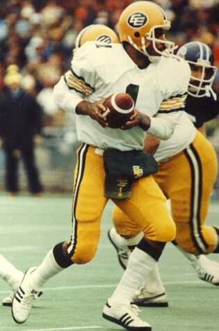
Prior to the change, the team featured rather Packer-esque uniforms, with the popular “EE” logo on the helmets and “ESKIMOS” as a wordmark on the chest.
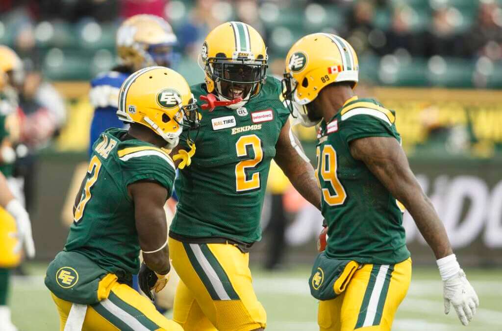
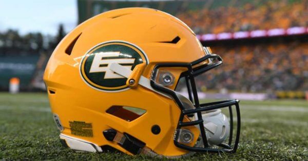
Their helmet was considered a classic among fans:
Following the name change in 2021, the team introduced slightly different uniforms — the new helmets featured a graphic of Elk horns, while “ESKIMOS” was removed from the jersey, replaced by “EDMONTON.” Numbers changed from gold to white on the green home uniform.
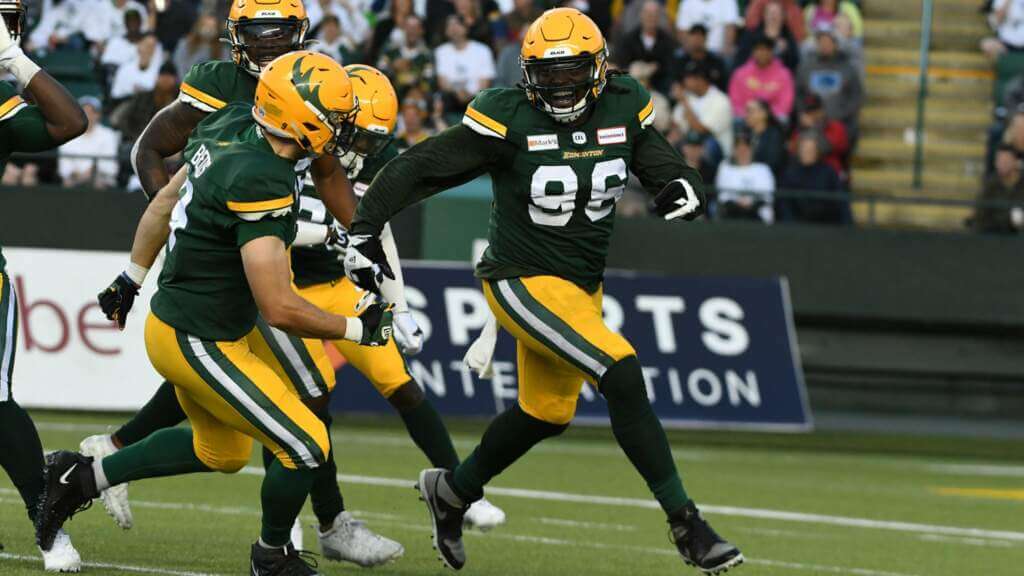
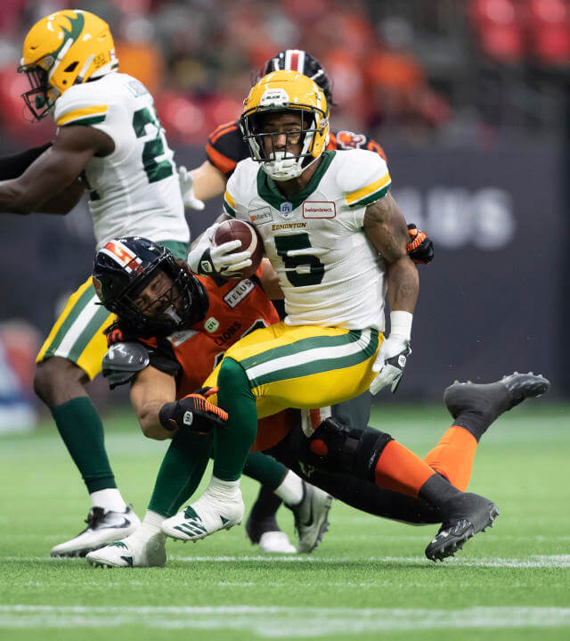
The team also introduced a third (alternate) jersey and altered helmet, the jersey featuring the popular “EE” logo emblazoned on the chest.
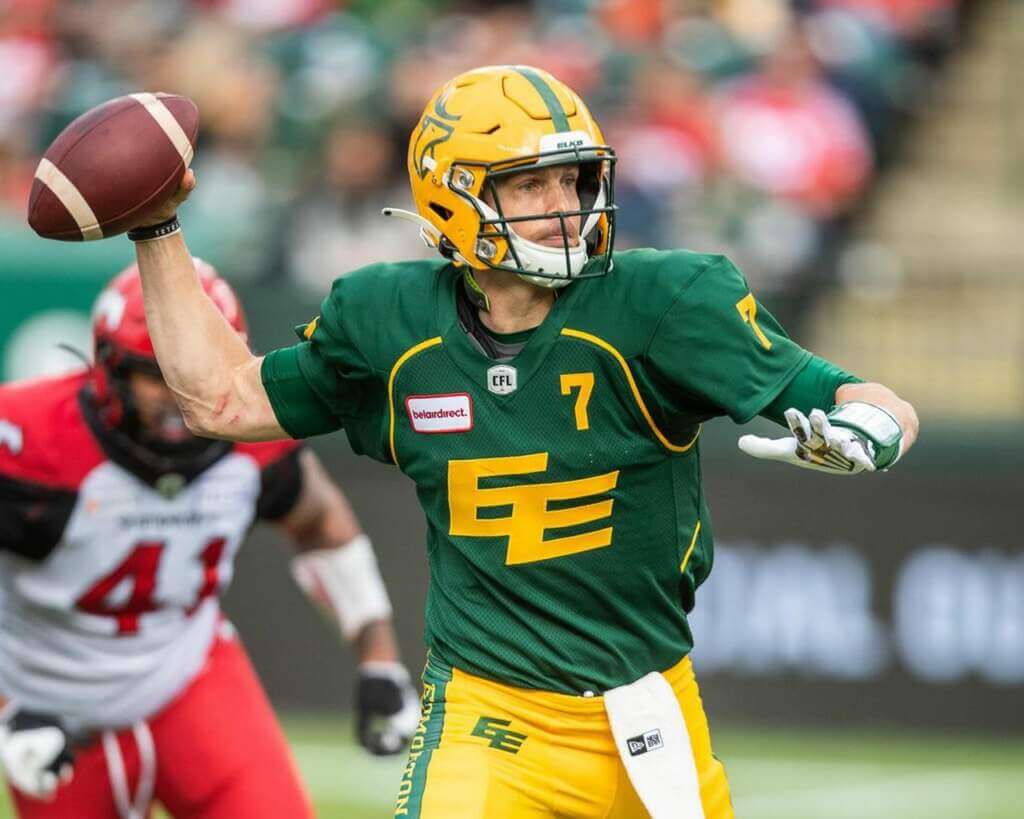
Those changes did not prove particularly popular with fans, so the team sought to further tweak the uniforms going into 2022. Those changes began in March of this year, when the team introduced a new helmet featuring the return of the popular (and slightly modified) “EE” logo:
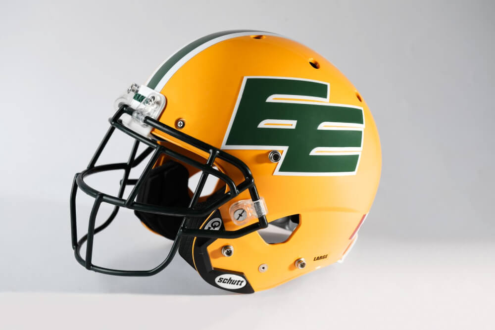
From there, yesterday the team unveiled the further changes to the uniform.
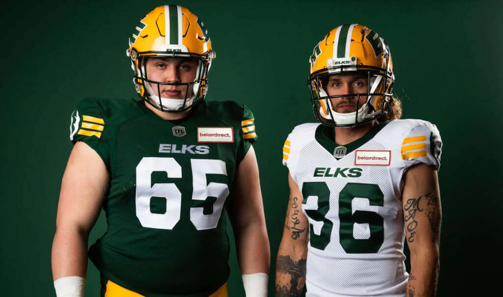
As you can see, the team retains both green and white home/away jerseys, retaining the white numbers on the home jersey, and green ones on the white. The new number font introduced in 2021 was retained, but other changes followed.
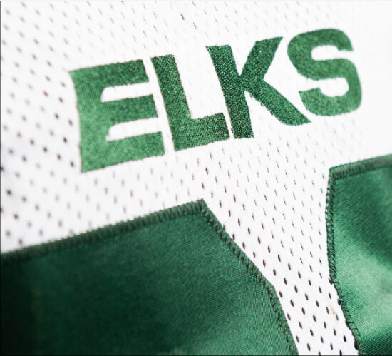
Gone was the “EDMONTON” wordmark on the jerseys, replaced by “ELKS”:
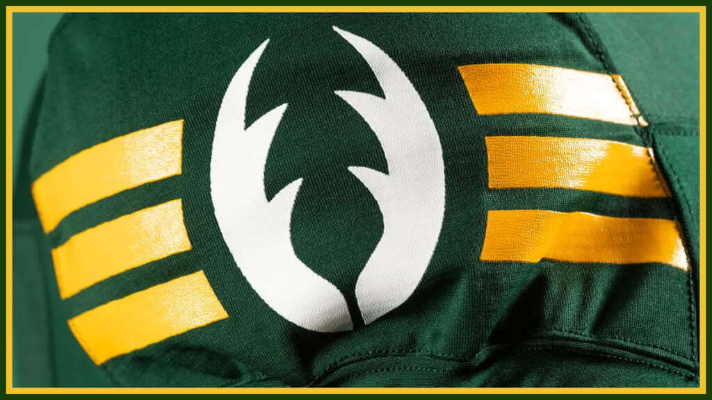
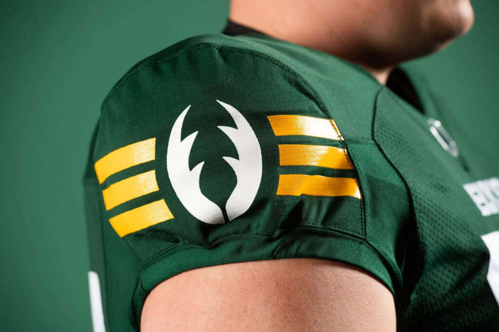
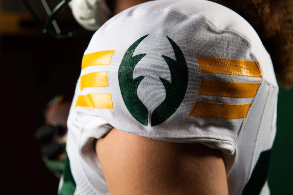
Shoulder stripes (gold/white on the green jersey, green/gold on the white) have now been replaced by three solid color stripes, bisected by a new logo, a set of antlers. Numbers on the white jersey are green and numbers on the green jersey are white:

The green jersey features three gold stripes (mimicking the “E” of the “EE” logo) with white antlers, while the white jersey has gold stripes and green antlers:
The back of the jersey features NOB in a block font in the same color as the number (white on green jersey, green on white jersey):

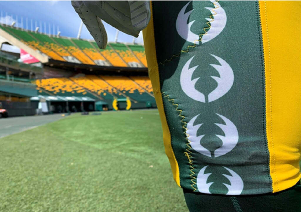
Unfortunately, the green/white/green striping on the pants has now been replaced by a solid green panel, decorated with the new elk antler logo found on the shoulder caps:
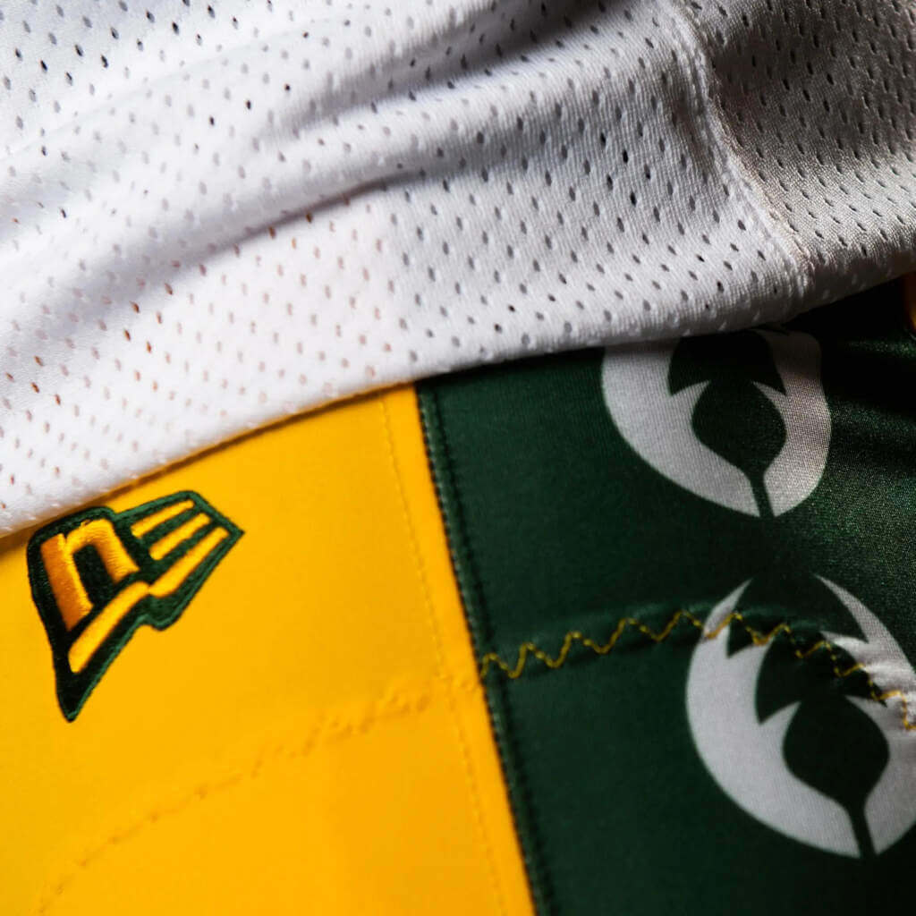
You can get a slightly fuller sense of the new uniforms in this video, which also features the uniforms of local high school teams:
According to the CFL,
Three stripes adorn both the home and away jersey sleeves, harkening back to the Club’s most successful period during the 1970s and 1980s, including the team’s five-in-a-row Grey Cup run from 1978 to 1982. The entire look is capped by the return of the highly popular Double E on the team’s helmet, which binds the past with the present.
All in all, I very much like the new uniforms, save for the pants panel featuring the new antler logo. The team will debut the new white jersey uniforms on the road in Winnipeg on May 27th, as well as at home on June 3 against Calgary — both preseason games.
We can probably expect some more NFL uniform news as the season approaches: we know the Rams will be releasing one final new uniform (after adding a white jersey last season, to fill in the 2021 image); while I have no inside information, I believe the team will either introduce a yellow (“sol”) jersey and/or white pants for 2022; additionally, with the lifting of the “one shell” rule, we can probably expect a few teams to release new throwbacks (for example, we believe the Falcons will unveil a red helmet this season). But as far as wholesale changes to uniforms this season? Looks like we’ll need to wait until 2023 for that.
Your thoughts on the Elks new duds?


Guess The Game…
from the scoreboard
Today’s scoreboard comes from Charles Carson.
The premise of the game (GTGFTS) is simple: I’ll post a scoreboard and you guys simply identify the game depicted. In the past, I don’t know if I’ve ever completely stumped you (some are easier than others).
Here’s the Scoreboard. In the comments below, try to identify the game (date & location, as well as final score). If anything noteworthy occurred during the game, please add that in (and if you were AT the game, well bonus points for you!):
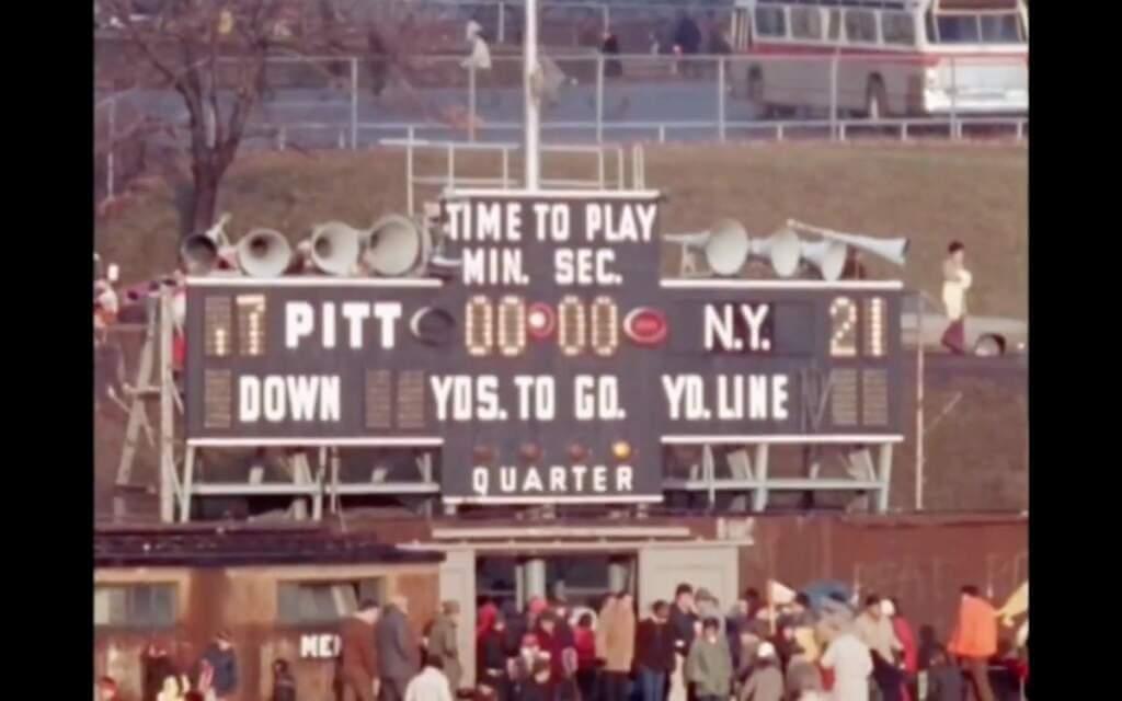
Please continue sending these in! You’re welcome to send me any scoreboard photos (with answers please), and I’ll keep running them.


The “BEST OF” Kreindler’s Korner
Hey guys & gals. You’ve enjoyed Kreindler’s Korner for several years now, mostly on the weekends, on Uni Watch, and we’re still doing the “Best of” until Graig can re-devote his efforts to new writeups for paintings you haven’t seen. Hopefully that will be soon!
Here’s today’s offering:

Title: “Frazee Finds Fortune”
Subject: Babe Ruth, 1918
Medium: Oil on linen
Size: 34″ x 30″It’s still interesting to me that a lot of people tend to forget Babe Ruth started his big league career with the Boston Red Sox. Perhaps more often than not, baseball fans are exposed to him as an aging superstar with a big belly, wearing those pinstripes of the New York Yankees. Certainly those years of the early 1930s – when he was the absolute focal point of sports in our culture – are rife with more images of him doing more things in and out of uniform than perhaps at any time in his career. Perhaps because of the ubiquity of THAT Babe Ruth, when I see an image of him with the Red Sox as a young, svelte upstart, I’m always very attracted to it.
This particular image depicts the man-boy at Chicago’s Comiskey Park during the 1918 season, when he had almost doubled the amount of games played from the year before, splitting time between the outfield and the mound. The motif of him looking into the camera with a bat on his shoulder was cool enough, but when coupled with such bright light, I couldn’t say ‘no.’
It was that quality of light that I really tried to push here. Whenever I had seen photography or video footage of old Comiskey Park, more often than not, the sunlight was of a blinding quality. So much so that it often washed out the light plains in the very reference I looked at. Obviously, it’s not ALWAYS bright in Chicago, but in my head, I wanted the sunlight in this painting to mimic what I had been used to seeing. As a result, the painting was treated as an exercise in painting something high-key in its value structure – in other words, those values would inevitably stay in the upper (brightest) shades on the scale, with the exception of whatever accents I chose to plug in. I kept most of those in his face and bat where I wanted the viewer’s eyes to be drawn to; but otherwise, there are a lot of very bright areas with seemingly lost edges
The result of this kind of thinking made for a painting that I thought pretty well captured the memory of seeing and feeling that blinding Chicago sun. But I suppose having a 23-year old George Herman Ruth on there helps with the coolness factor, too.
Thanks, Graig! You can (and should!) follow Graig on Twitter.


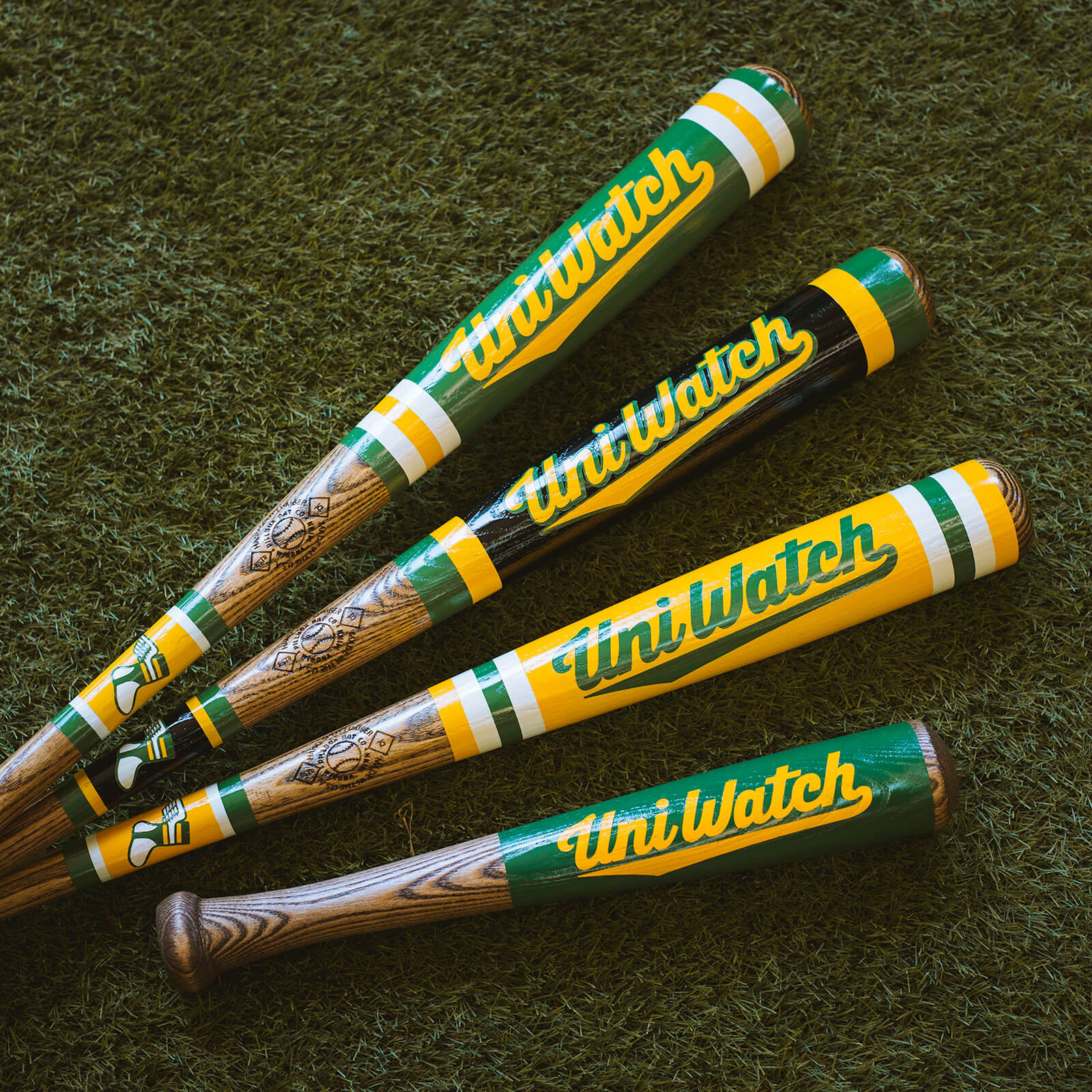
Father’s Day deadline reminder: Paul here. In case you missed this news earlier in the week, the folks at the Pillbox Bat Co. tell me that if you want one of the custom-painted Uni Watch bats in time for Father’s Day, you must get your order in by this coming Monday, May 23. The bats are available here, so move fast if you want that special gift for dad.
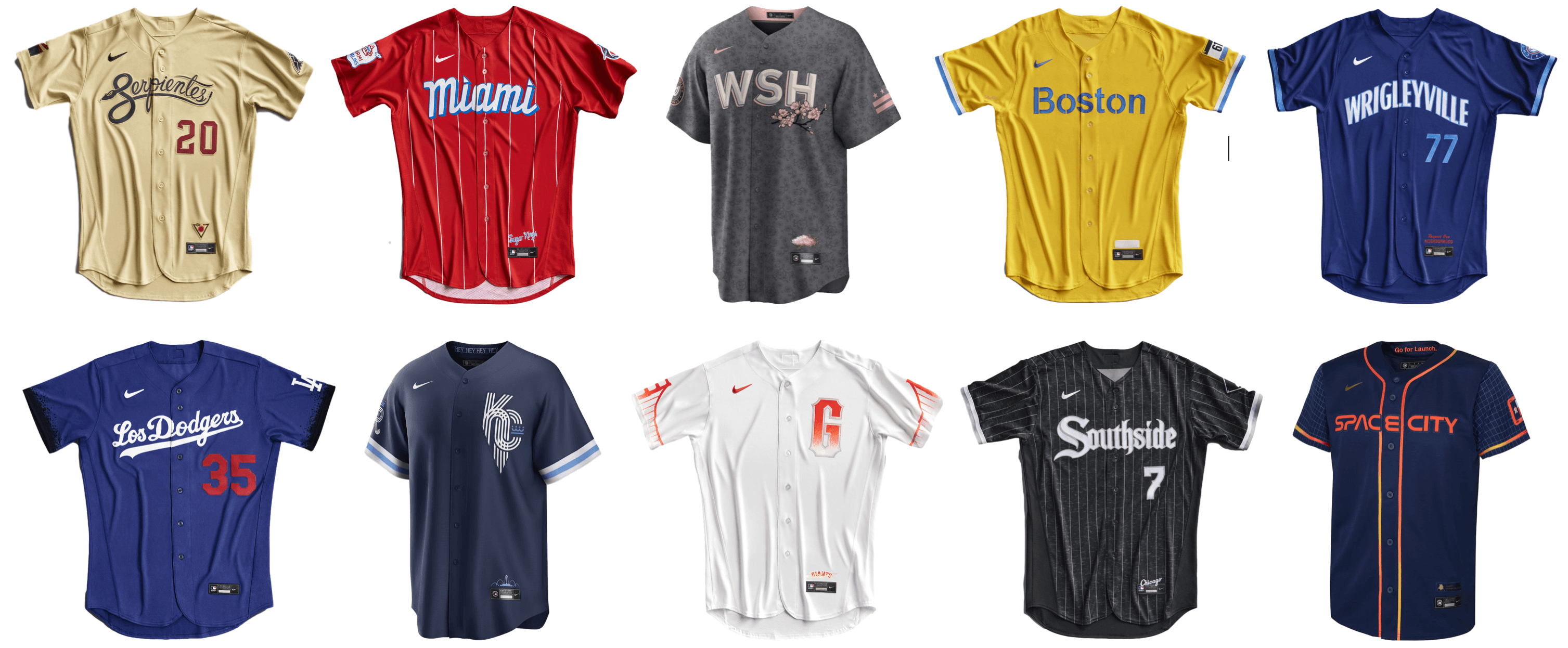
Also, while I have you here: My latest Bulletin article is a worst-to-first ranking of the 10 MLB City Connect uniforms that have been released so far. My premium subscribers can read the article here. If you haven’t yet subscribed, you can do that here (you’ll need a Facebook account in order to pay). Don’t have or want a Facebook account? Email me for workaround info.
Okay, now back to the rest of today’s content.


Uni Watch News Ticker
By Anthony Emerson

Baseball News: Phillies C JT Realmuto was wearing a black helmet behind his mask during last night’s game, rather than the usual red. Perhaps it has something to do with the camo caps and catcher’s gear? (from multiple readers). … Red Sox 2B Trevor Story wore his Rockies elbow guard and batting gloves during Thursday’s game against the Mariners. He hasn’t been wearing them in previous games, so maybe he was wearing them to try to bring some of his Colorado success to Boston after a slow first month (from Andreas Papadopoulos). … Staying in the Sox/M’s series, NOB kerning issues are still impacting the Mariners’ blue alternates, with Robbie Ray the latest victim (from @LevityNYC). … The Cubs wore a patch for their Fergie Jenkins statue unveiling for yesterday’s game (from multiple readers). … The Somerset Patriots, Double-A affiliates of the Yankees, will wear camo jerseys over the weekend (from John Cerone).

Hoops News: The Newfoundland Growlers and Montreal Alliance, the newest Canadian Elite Basketball League teams, have unveiled their unis (from Wade Heidt and Moe Khan). … New court design for Bowling Green (from Pat Dougherty).

Soccer News: From our own Jamie Rathjen: “Newcastle United men’s manager Eddie Howe publicly commented on the club’s not-yet-released third shirt, saying he assumes it’s a reference to Saudi Arabia’s colors and by doing so basically confirming its existence.” … Polish second-tier side Stal Rzeszów will wear ’90s fauxbacks this weekend (from Ed Zelaski). … The mayors of San Jose and Sacramento have agreed to a bet for the US Open Cup match between Sacramento Republic and the San Jose Earthquakes: the losing mayor must wear the winning team’s jersey to a city council meeting (from our own Lloyd Alaban).

Grab Bag: The Washington Post has a good article on the glut of crypto advertising in sports, and what those deals means as the entire crypto market struggles to recover from last week’s tailspin (from Tom Turner). … All 18 Australian Football League teams have revealed their indigenous guernseys. You can check them out here (from @JeffChrz).


Uni Tweet of the Day
Much as I have fond memories of two Supes in (basically) these unis, I still think their current home unis are close to Top 5 in the league…
Definitely winning a Super Bowl in these uniforms.#TogetherBlue pic.twitter.com/Ar6TswehBP
— Tommy (@TommyG105) May 21, 2022


And finally that’s it for today. Lots of playoff puck & hoops this weekend, plus the Preakness and PGA today, and of course, baseball. Enjoy the unis in whatever you so choose to watch. Catch you tomorrow!
Peace,
PH
I love the new Edmonton Elks duds, and that logo is straight fire. The E’s with the rounded internal corners and the antlers make all the difference. Of all of the team name changes made to address Native American concerns, that’s my favorite.
Prior to the change, the team featured rather Packer-esque uniforms
Actually, prior to the change they were distinct in that they had yellow numbers on the green jersey. *Now* they look like the Packers.
I love everything else about the new unis, including the antlers down the pants stripe. I’ll miss the antler helmet (guess I’m in the minority), but c’mon, bring back the yellow numbers!
I liked the antler helmet too Vilk, still holding out hope for it returning as an alt. I do appreciate the history of the EE logo though. A friend of mine works for the team, maybe I should be the bug in his ear!
Jim, I have a feeling we may see yellow numbers in 2 to 3 years now with new regime taking over the team. Some things I hear.
Historically, they have worn yellow numbers on green jerseys and makes all the sense in the world that they should go back to it.
While I liked the antlered helmet in theory, the design they originally chose I was only so/so about.
While I preferred the old 5 stripes on the sleeve, with the lack of sleeves these days I can see why they went with the three thicker stripes.
One thing I’ve never liked from its inception is a word mark above the front numbers. Unfortunately at this point in time it seems to be the default. If your logo(s) and colours aren’t enough to have your recognize the team, you’ve got bigger problems. Adding a word mark in my opinion always looks bush league at best.
I liked the antler helmet too, thought it just needed to be tweaked a bit, bigger antlers, with the base of each antler starting at/”growing out of” the front bumper of the helmet, would draw it up if I could.
Really like the secondary antler logo on the sleeves and pants, and that it’s shaped like a football. Overall, a really good job in my opinion.
Lots of playoff puck & hoops this weekend, plus the Preakness and PGA today, and of course,
baseballUSFL football. Enjoy the unis in whatever you so choose to watch.Fixed, buddy. ;)
GTGFTS: Dec. 14, 1969 – the Steelers’ last game at Pitt Stadium. The Giants handed Pittsburgh their 12th consecutive loss, 21-17, on a 4-yard pass from Fran Tarkenton to Ernie Koy with 48 seconds left.
Some things further to the article about the Elks.
The newly altered EE logo was introduced last year during the initial name change and used as a secondary logo. You may notice the alternate jerseys from last year had the old EE version on the chest. These were not new jerseys. Had been worn as an alternate jersey by the Eskimos for years. The wordmark on the pants changed for 2021 for the alternates and of course the helmet decals.
This jersey previously worn with green alternate helmet:
link
Then with yellow helmet after CFL went one-shell rule:
link
The antlers logo on the sleeves and pants (which make the shape of a football) was also another secondary logo introduced in 2021 but did not appear on the uniform before. The logo on the pants reminds me a bit of what the Seahawks do on their pant striping.
What I find interesting about these uniforms and the team’s situation. They have 2 logos on the uniform. Neither of them is technically their primary logo. Though the EE logo was the primary for so logo it is basically 1B primary logo.
Further to the Montreal Alliance new home uniform post, here are the light blue road uniforms.
link
Graig Kreindler is great artist (not just a painter), looking forward to seeing more of his paintings. He’s up there with Picasso, Rembrandt, Van Gogh, Monet and Da Vinci in my book.
Much as I have fond memories of two Supes in (basically) these unis, I still think their current home unis are close to Top 5 in the league…
Not with THOSE sleeve numbers, and I’d rather see the “ny” on the helmet. The GIANTS wordmark looks good on the jersey, however.
Yeah, no one can win with sleeve numbers that small…
Everything else looked good though.
Interesting you used Es***os but not Reds***s in describing the former team identities.
Eskimos is not, to my knowledge, considered racist or pejorative. R**skins, on the other hand, is. However, both would be considered indigenous appropriation.
Why did they make the Elks wordmark grey on the green jerseys? So pointless.
Also, re: Realmuto’s black helmet – I noticed Danny Jansen of the Blue Jays was wearing a navy helmet under his mask with the blue jerseys. Not sure if that’s normal or if I’ve just never noticed.
Did not realize that logo was antlers until I read it. I thought it was a tree.