Click to enlarge
[Editor’s Note: Today we have another guest entry from baseball jersey restorer extraordinaire Bill Henderson and his business, the Dream Shop. Enjoy. — PL]
By Bill Henderson
For many years, my goal as a collector has been to collect one example of every jersey each MLB team wore from 1972 to the present. But as I spent years researching game-worn MLB jerseys from the doubleknit era, I noticed that there were some jerseys that simply didn’t seem to exist in the collector’s market. For example, the 1972-73 Oakland A’s gold jerseys with white/green lettering and the odd Expos-font front numbers were nowhere to be found. Ditto for Cleveland’s jerseys from the 1972-74 period, or most Padres road jerseys of the 1970s. What happened to them all?
As I eventually learned, these missing styles had all been sent to the minor leagues, stripped of their MLB identification, and then usually worn into oblivion and often discarded.
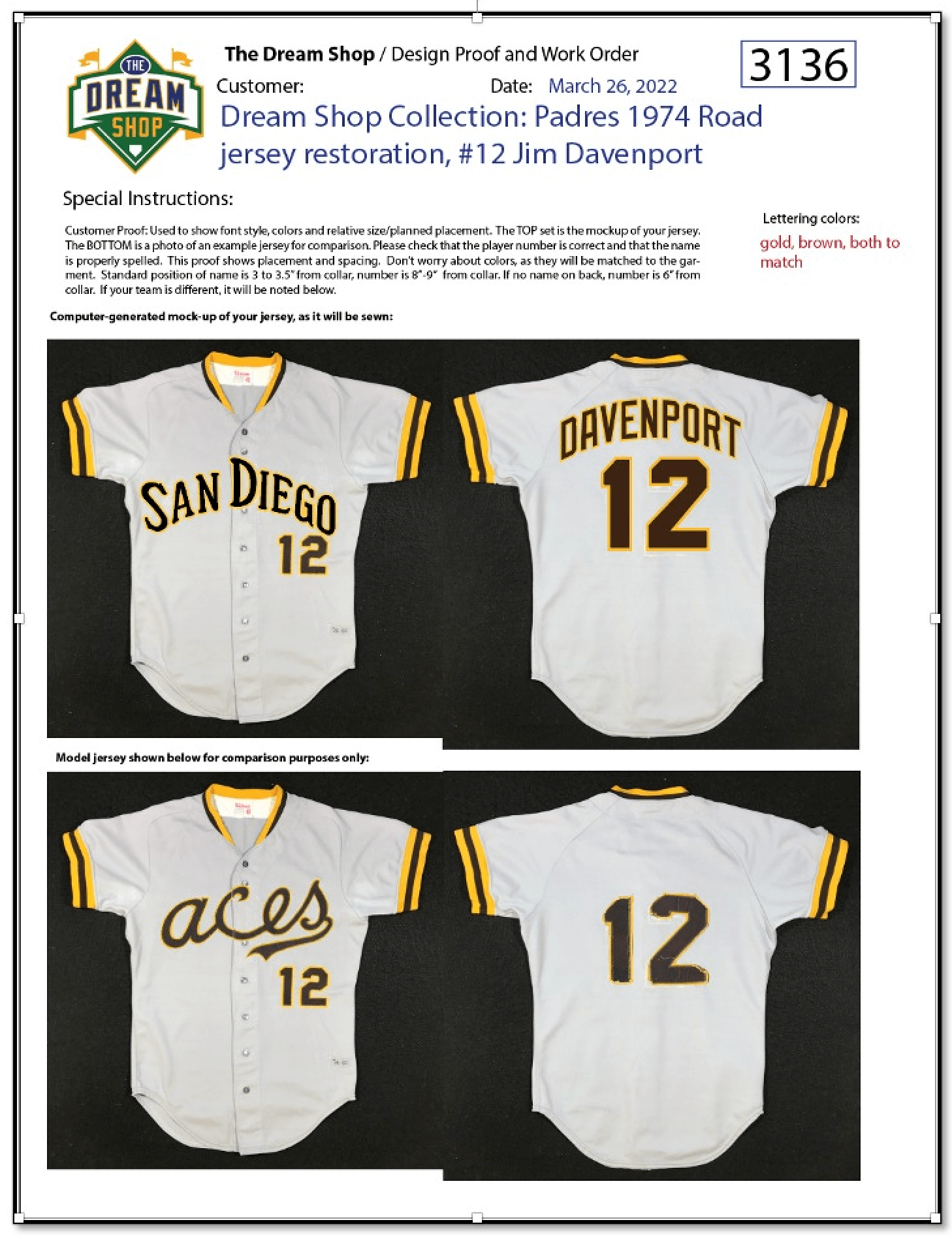
The Padres were a particularly difficult nut to crack. Search as I might, I could not find a single example of their grey road jerseys from 1974 and ’75. I eventually concluded that they simply did not exist any more.
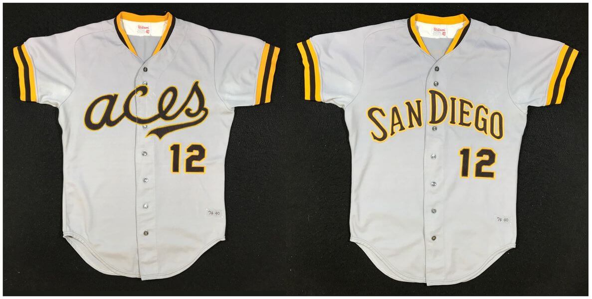
Fast-forward to last summer: A friend contacted me and suggested I take a look at an eBay auction for a 1974 Alexandria Aces road jersey. The Aces were the Padres’ Double-A farm team at the time. “Could this be an elusive Padres 1974 road jersey?” he asked.
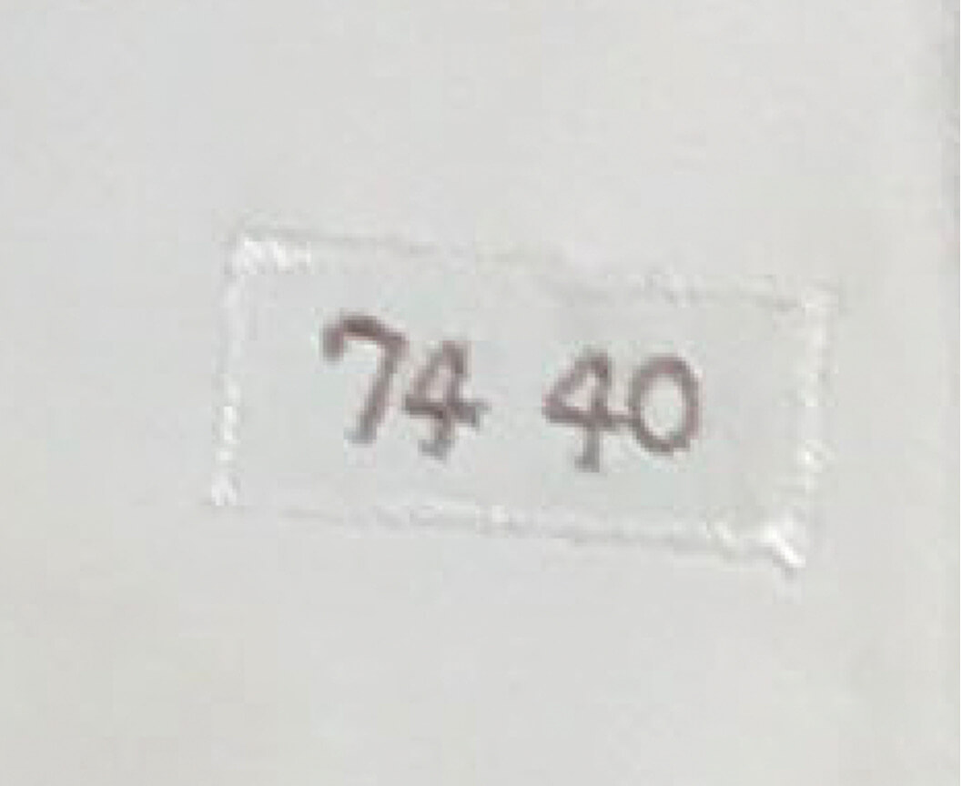
What intrigued me was a grainy photo of the tagging. Minor league teams generally did not year tag their jerseys, so this tagging suggested that the jersey had originated with the big league parent club:
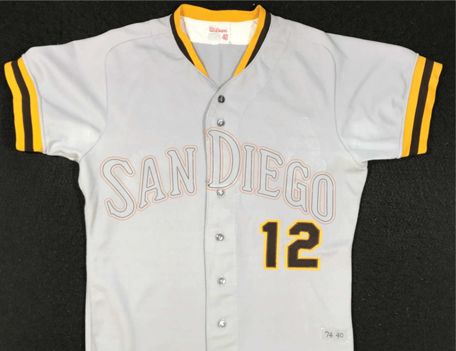
I placed a bid and won the auction. When I received the jersey, I could tell that the “12” on the front (which remained in good condition) and the “12” on the back (not so good) were original to the jersey. The “Aces” wordmark had clearly been sewn on after something else had been removed from the front, but it was so worn that I couldn’t make out enough details to confirm its origin.
Once I removed the “Aces” lettering from the front, it immediately became apparent that the words “San Diego” had indeed been on there before! The clearest evidence was the burned in glue imprint of the center letter “D” that had been right on the button placket. As is often the case, this is a spot where the thickness of the cloth and the heat and pressure from the original heat press was the greatest, thus leaving an indelible mark. (If you look closely, you can see the “D” outline on the previous photo as well.)
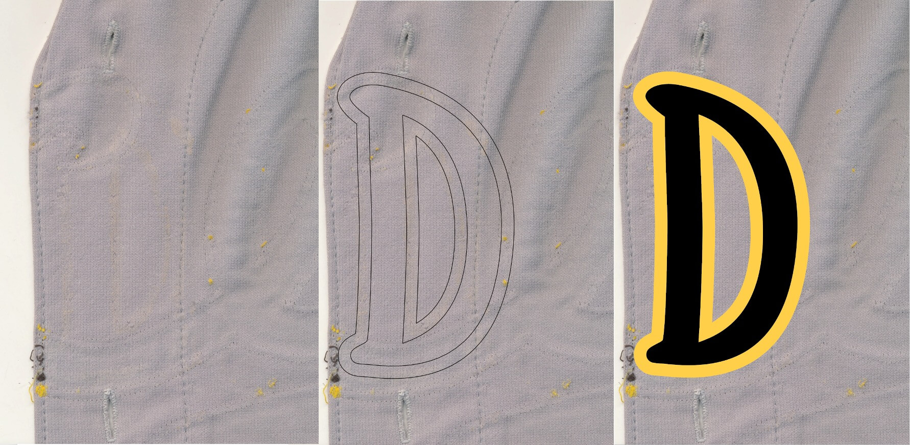
Luckily, I already had a recreation of the Padres road insignia, scanned from a rare original I had restored and authenticated some months earlier. As I overlayed the lettering template onto the Aces jersey on the light table, I could see several other places where the “San Diego” lettering had been originally stitched, some 46 years ago.
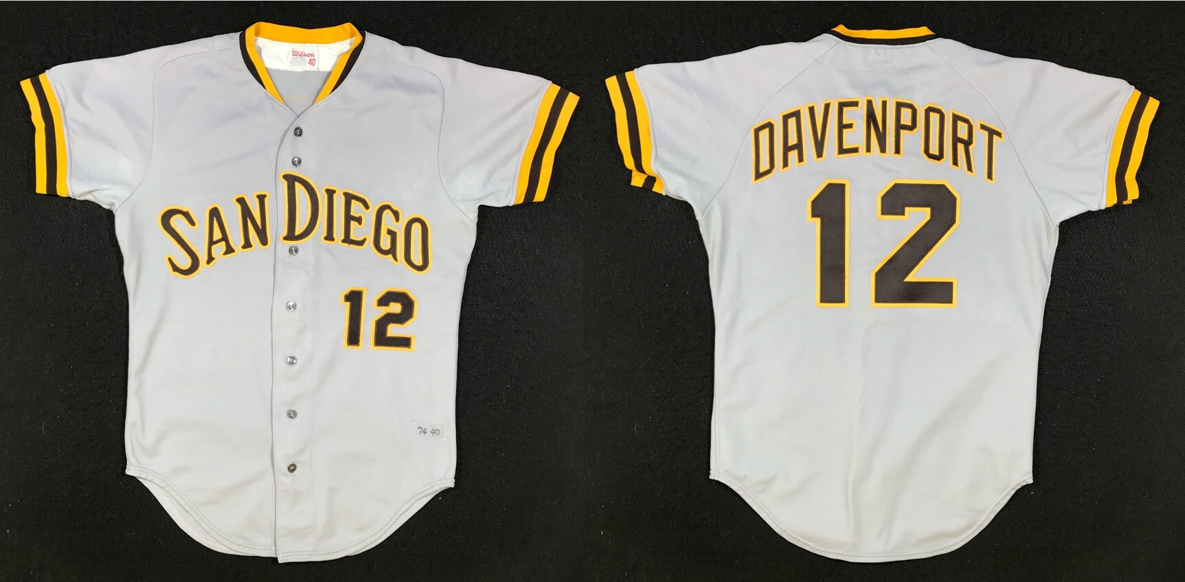
Who originally wore this jersey? Some quick research indicated that No. 12 was issued that year to coach Jim Davenport. A search of other jerseys he wore during his playing career show that they were size 40 — the same as the jersey I was now working on.
As is often the case with minor league jerseys, this one was filthy. It was probably washed 200 times in a commercial machine along with 50 other filthy uniforms, and the dirt compounded into the fabric with each wash. A hand scrub, then a long soak in a bucket of warm, soapy water (Woolite and OxiClean powder is my magic formula) and then a machine wash brightened the garment considerably. It was ready to be relettered.
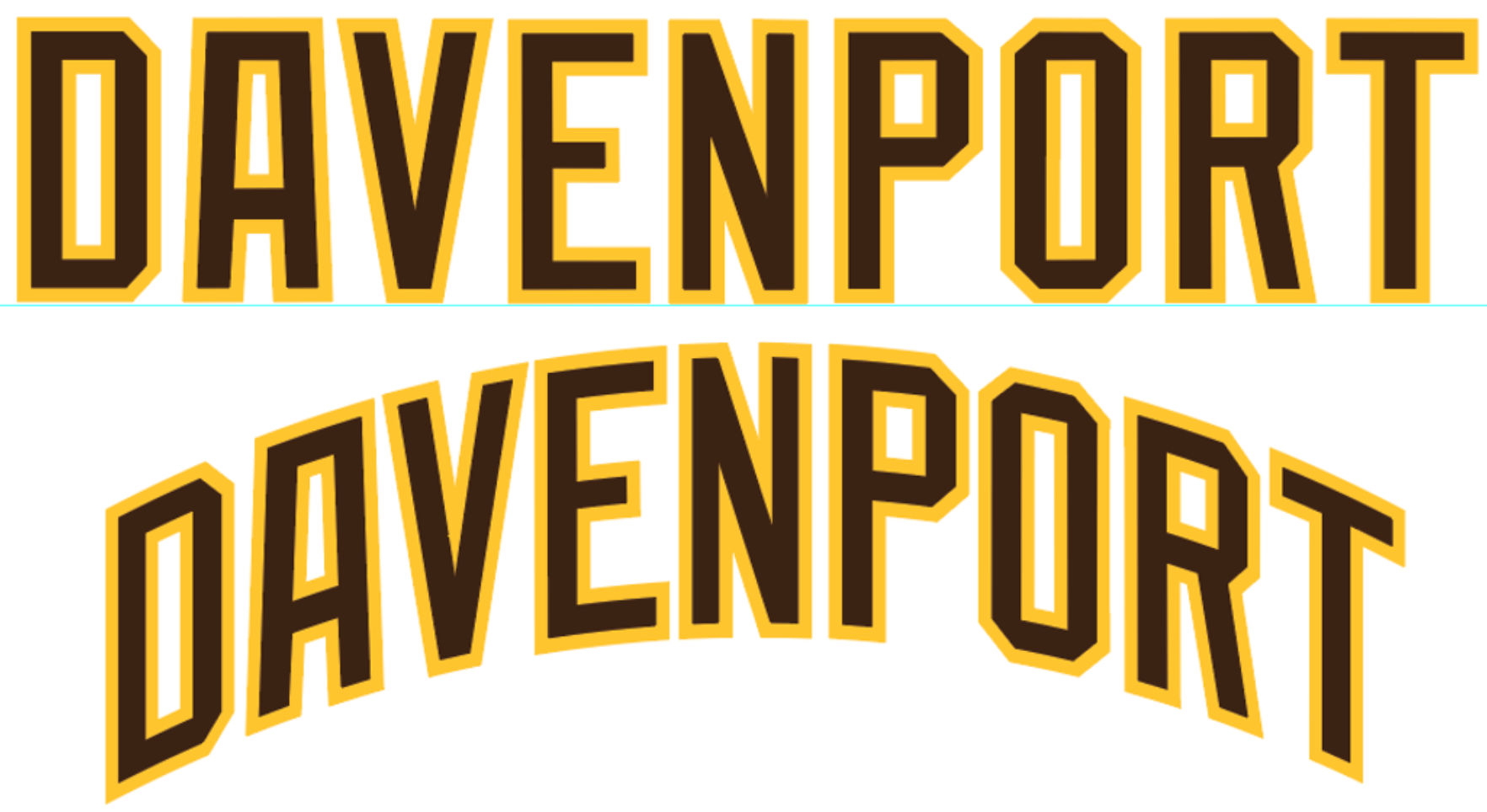
I cut and stitched a replacement “San Diego” wordmark for the front. The original back numbers were truly awful, so I decided to replace them, along with creating a matching “Davenport” NOB in the Padres distinctive vertically arched style. The long surname and the small jersey size required some careful narrowing and tight spacing to make all the letters fit.
I’m very pleased with the final product. Although I certainly can’t wear it (I last fit into a size 40 in eighth grade), it will display nicely, and it fills what had been a gap in my collection.
Here’s my cutting proof — every order that goes through the shop gets one, even mine:
As a coda to the story, I was contacted by the other person who was bidding against me in the eBay auction. He was a historian for the Alexandria Aces and had wanted the jersey for display in their museum. I promised him I would take the Aces lettering that I’d removed from the jersey and use it to make a reproduction Aces jersey for him.
———
Paul here. I love these stories so much. Big thanks, as always, to Bill Henderson for sharing his expertise with us. You can see more of Tales From the Dream Shop here.
Bulletin reminder: In case you missed it on Thursday, my latest piece on Bulletin is a worst-to-first ranking of the 10 MLB City Connect uniforms that have been released so far.
My premium subscribers can read the article here. If you haven’t yet subscribed, you can do that here (you’ll need a Facebook account in order to pay). Don’t have or want a Facebook account? Email me for workaround info. Thanks!
Click to enlarge
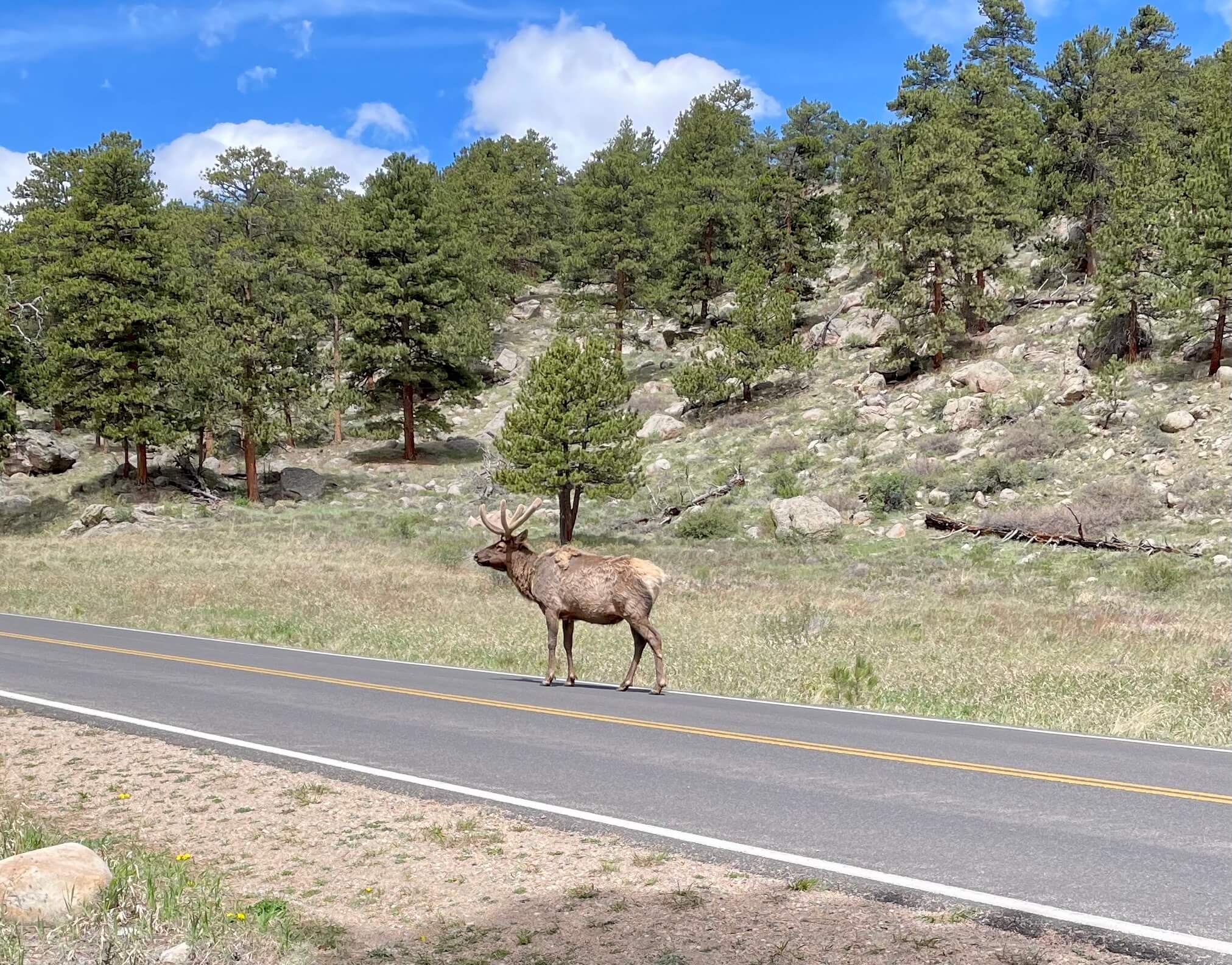
We don’t see many of these in Brooklyn: A buddy and I spent most of yesterday in Rocky Mountain National Park in Colorado, where we encountered this handsome elk!
We had hoped to spend the entire weekend exploring the park, but they’re expecting some serious snowfall there today, so we high-tailed it back to Denver and I’ll be flying back to NYC this morning.
Uni Watch News Ticker
By Anthony Emerson

Baseball News: While exploring the archives of the Manitoba Baseball Hall of Fame’s website, Will Scheibler found an undated photograph of a baseball jersey made out of a flour sack as the team was unable to afford the cost of new uniforms. Considering the circumstances, I would guess that the jersey dates to the Depression. … In 1988, the Reds wore a black strip on the sleeve of their unis during their first homestand to honor Ted Kluszewski, who died shortly before the season began. The thread goes on to detail how the Marge Schott-owned Reds did little, however, to honor Hall of Famer Edd Roush, who died a week before Kluszewski (from David Thomas). … The chairs in the dugout box seats at Jacobs Field still have the old Cleveland logo on them (from Ben Teaford). … The Jersey Shore BlueClaws, High-A affiliates of the Phillies, will wear Spider-Man uniforms next Thursday (from John Cerone). … The Cascade Collegiate League have shamelessly stolen the 2021 MLB All-Star Game logo for their 2022 All-Star Game.

Football News: Cartersville High in Georgia is adding QR codes to seniors’ uniforms for today’s scrimmage. When scanned, the QR codes bring you to the player’s recruiting information (from Gerry Dincher).

NBA News: The Warriors have revealed their Western Conference Finals uniform schedule (from Carlos Montalvan).

Soccer News: Manchester City have revealed their new 2022-23 home kit, going with a rare center-oriented club badge and maker’s mark. … Arsenal have launched their 2022-23 home kit (from multiple readers). … If you’ve lost track of the major clubs who’ve revealed their new kits, goal.com has you covered (thanks, Phil). … The Bundesliga has revealed their 2022-23 match ball (from Ed Zelaski).

Grab Bag: Czech sporting officials are currently debating a unified national name across all sports (thanks, Phil). … Syracuse’s dome has a new corporate name (from multiple readers).
Wow,a historian for a AA minor league team. That’s fandom for you.
And a AAA team that hasn’t been part of Minor League Baseball since 1975 at that.
“my goal as a collector has been to collect one example of every jersey each MLB team wore from 1972 to the present.”
Roughly how many jerseys would that be?
That was my first thought. That’s an insane amount of jerseys!
I love reading about Bill and the Dream Shop. Such an interesting combination of art and detective work. Fly safely, Paul, I’m glad Purp Walk/Week was a success!
Same here. The guy is definitely great at what he does and it’s fun to read about how it all works.
Bill, that’s a great story and thanks for sharing! Question: I’m a former Alexandria resident. Can you tell us anything about the museum where your reproduction will eventually be displayed?
Love the Bill Henderson stories. I would love to be able to do this.
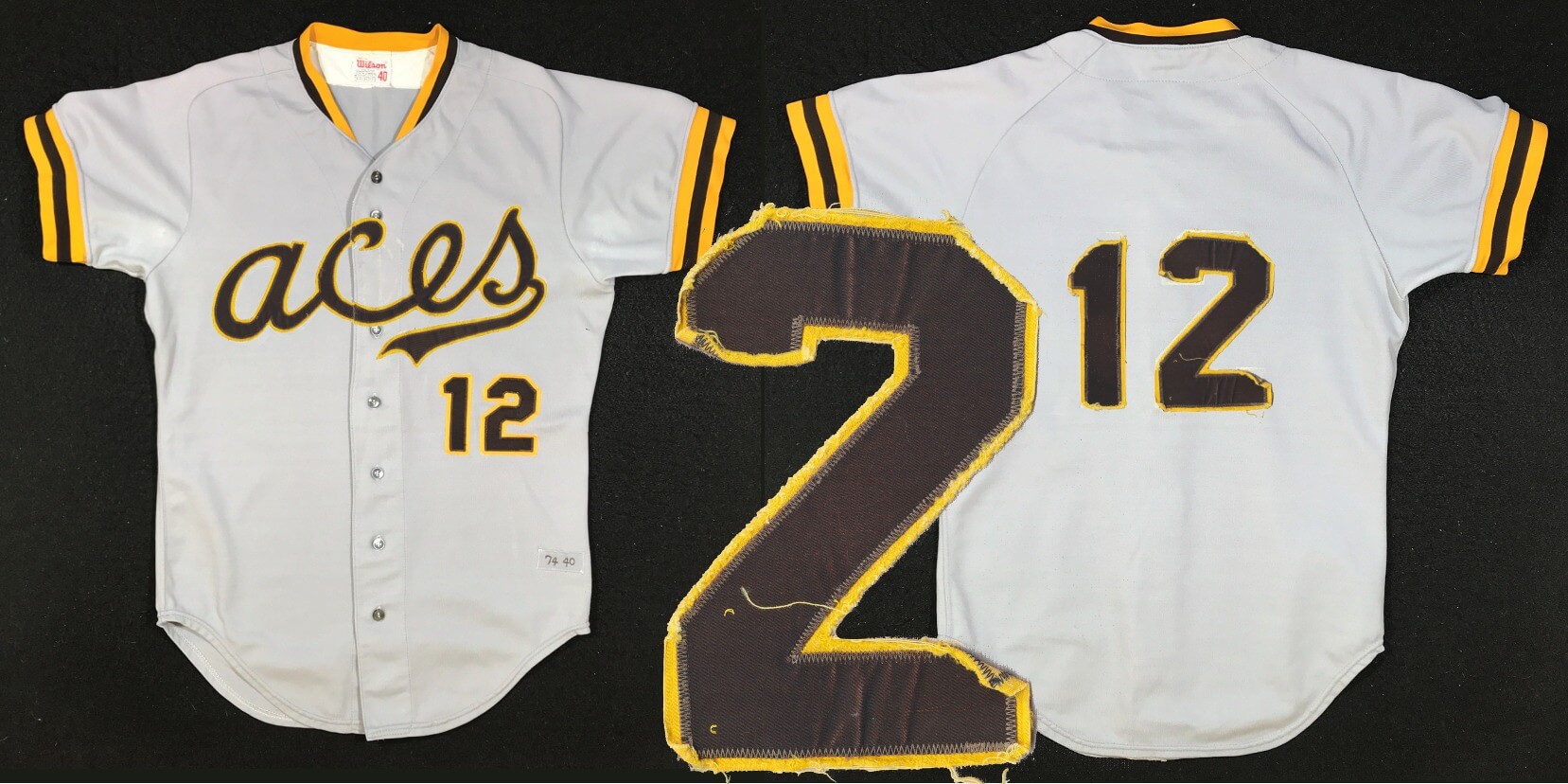
One question: the “2” on the front of the jersey has a horizontal midsection but the one on the back has a diagonal stroke. It would not surprise me if this kind of oversight happened before jerseys became a big deal (and the Grizzlies do it intentionally on their Vancouver throwbacks), but was this what the Padres actually did on their jerseys?
Was wondering the same
I noticed that right away, because if you click on the link to Bill’s database page about the yellow 1970s Oakland jerseys with the completely different number fonts on the front and back, you’ll unconsciously be primed to notice the not-completely-but-slightly different number fonts on the Padres’ jerseys.
Re: BlueClaws
its not a Spider-Man uni they’ll be wearing. its actually a Dr. Strange next Thursday followed by a Thor inspired one in July.
someone dressed as Spider-Man will be there but the unis aren’t made to look like Spider-Man
Always appreciate Bill’s guest entries.
As an employee, I’m obligated to remind you the old Cleveland logo is on the dugout box seats at Progressive Field, not Jacobs Field. ;)
indians/guardians fan and its funny how people are all about “still calling it the Jake” when Jacobs Field was a corporate name too
Wasn’t Jacobs Field named after the owners at the time? I still have a ticket stub from the 1994 season when it was called Indians Park, I guess as a placeholder until they had a “real” name for it.
yes it was the last name of the guy who owned it, but it was a corporate sponsored named after his company, The Jacobs Group.
The best part of Bill Henderson’s story is that Bill is making a reproduction for the historian. Great story and great work.
NBA conference finals: Celtics and Warriors are two of the oldest teams; too bad Lakers and Knicks didn’t round up the top 4.
link
Bill Henderson is a genius with jawdropping skills. On another note, I will always think of the home of the Orange as the Carrier Dome, even with a different sponsor name. That is admiration (for Bill) and loathing (for evil Coach Boeheim, not for the Dome or the team itself) in one reply.
Paul, great Bulletin article. The Dodgers missed an opportunity to go with powder blue uniforms for the CC uniforms. Also, if they wanted a different cap logo, why not just use a D?
I’m also a fan of the San Diego sand-colored road uniforms. It’s something different then plain, old grey.
On my drive back from Denver, I spotted a pair of elk along the road in northern New Mexico. They are quite a sight.
Also, this Sunday is the final day of the English Premier League season, when all of the games kick off at the same time. This is also when the clubs break out their new kits for next season, if you want to check them out.
Safe travels Paul! Enjoy always Bill Henderson’s sharing of his craft.
Keith Hernandez spots Zach Wilson, QB of the NY Jets at Citi Field wearing a custom, Zach Wilson #2 Mets jersey.
Keith Hernandez – “Ah, he likes the Mook”
Gary Cohen – “Keith, either that, or it’s his own name”
link
As a lifelong Syracuse fan, I’m still calling it the….oh never mind.
Also, I think those Manchester City kits are really sharp–the burgundy accents work really well. The only Puma kit I can think of in recent memory that look good.
JMA Dome? Boy does that roll off that tongue.
I dunno, “JMP Wireless Dome” just kind of rolls off the tongue, don’t you think?[/sarcasm]
So the “San Diego” jersey you won was an authentic Aces jersey, worn by an Aces player, intended for display at a museum, but you instead added new materials to it to turn it into a non-authentic Padres jersey because it no longer had the original lettering.
Huh. Okay.
Yeah, these stories are always kind of weird to me. I would think the Aces jersey would be considered more authentic than a Padres-then Aces-then turned back into Padres jersey in 2022 would be. But…I’m not a collector and don’t know the rules, so I could be wrong.
agreed
Not quite. It WAS an authentic 1974 Padres jersey that the team gave to minor league affiliate, who removed the Padres’ identifiers for their own team. Bill simply restored the jersey to its original look. Like restoring a classic car. And this is his collection, he isn’t selling these.
Glad you got to enjoy just a little bit of Rocky Mountain National Park, Paul. We had an elk encounter there last year when we turned the corner on a trail and accidentally came within a few yards of mama and baby elk. Mama was not happy that we intruded so we turned around quickly. Sorry the storm is shortening your plans. Travel safely.
Hey Paul! I enjoyed your article on the City Connect jerseys. You were correct about how I would feel about it. We agree that Miami has the best jersey, but we disagree about everything else (except that the Dodger’s jersey is pretty bad). That is what makes it fun. Appreciate it!
Actually, I did not rank any team’s jersey; I ranked their *uniforms.*
;)
Fan of the Padres’ brown here; in fact, I like the color better than the team and look upon the dark blue years as the club’s Dark Ages. The ’74 road uniform is perhaps my least favorite of the brown years, but I love the vertical arching. Kudos to Bill for living the dream!
Elk are awesome.
Check out that winter coat coming off and that antler velvet!
The weird thing is that in the Canadian rockies I’ve never see ONE elk – they seem to stick pretty hard to their herds and you see either none or three dozen of them.
An interesting addendum to the story of the A’s 1972 jersey, which had Expos-style numbers on the front and a block number font on the back, is that the front numbers were added in the second half of the season.
Early season:
link
Late season:
link
The addition of the front number happened after the All-Star Game. We can see here that the team did not have the front number during the All-Star Game itself.
link
(Ticker)
The Jersey Shore BlueClaws will be wearing Dr. Strange inspired jerseys on May 26th, not Spider-Man.
Bill’s work is always a real treat to see. That Aces script is pretty wild, especially with the lower case A.
Bill…Who was the Aces historian? I am curious, because I played for the Alexandria Aces for two years. Thanks…Dan
Thank you Paul for running my story, and to all of you who read and commented. Let me reply to the questions asked.
My original intention was to collect one of every MLB jersey (including BPs) from 1972 to present. I even kept up with the plan when the first Turn back the Clock Events happened in the early 1990s. But when teams started wearing special uniforms for holidays and you-name-it, I decided that sending my children to college was more important than chasing a moving target. I currently have about 1500 or so examples, probably 85% of everything EXCEPT Mothers Day/Fathers Day/Memorial Day for every team. And I need to say that I have a very patient and understanding wife.
Next, the diagonal stroke 2 on the front matched with the non-diagonal 2 on the back is a hallmark of these 70s Padres uniforms, and while this is a Wilson jersey, it seems that that “mismatch” started with Sand Knit who was often less careful about such things, and carried over to the Wilson jerseys. Back then it didn’t seem to matter as much.
And finally, I would have been disappointed if someone didn’t bring up/complain about the issue of changing-back a minor league jersey to its MLB origin. This is a common topic in collecting circles, and it all goes to what the collector wants. In my case, this is what I wanted. I took it back to how it looked in 1975 because that was what had value to me.
Your an artist and a technician. Thank you for the lede and your answer!
Regarding the Grab Bag article about how Czech officials are debating whether to make the native “Česko” or the international/Latin-based “Czechia” the standard name for their sports teams: I have to vote for Česko, because we’ll get to see the haček diacritical mark get a whole lot more attention if that’s what they choose!
Seconded.