Click to enlarge
Greetings from northern Colorado, where I’m currently spending a few days doing outdoorsy stuff (but may have to high-tail it due to an approaching storm — we’ll see).
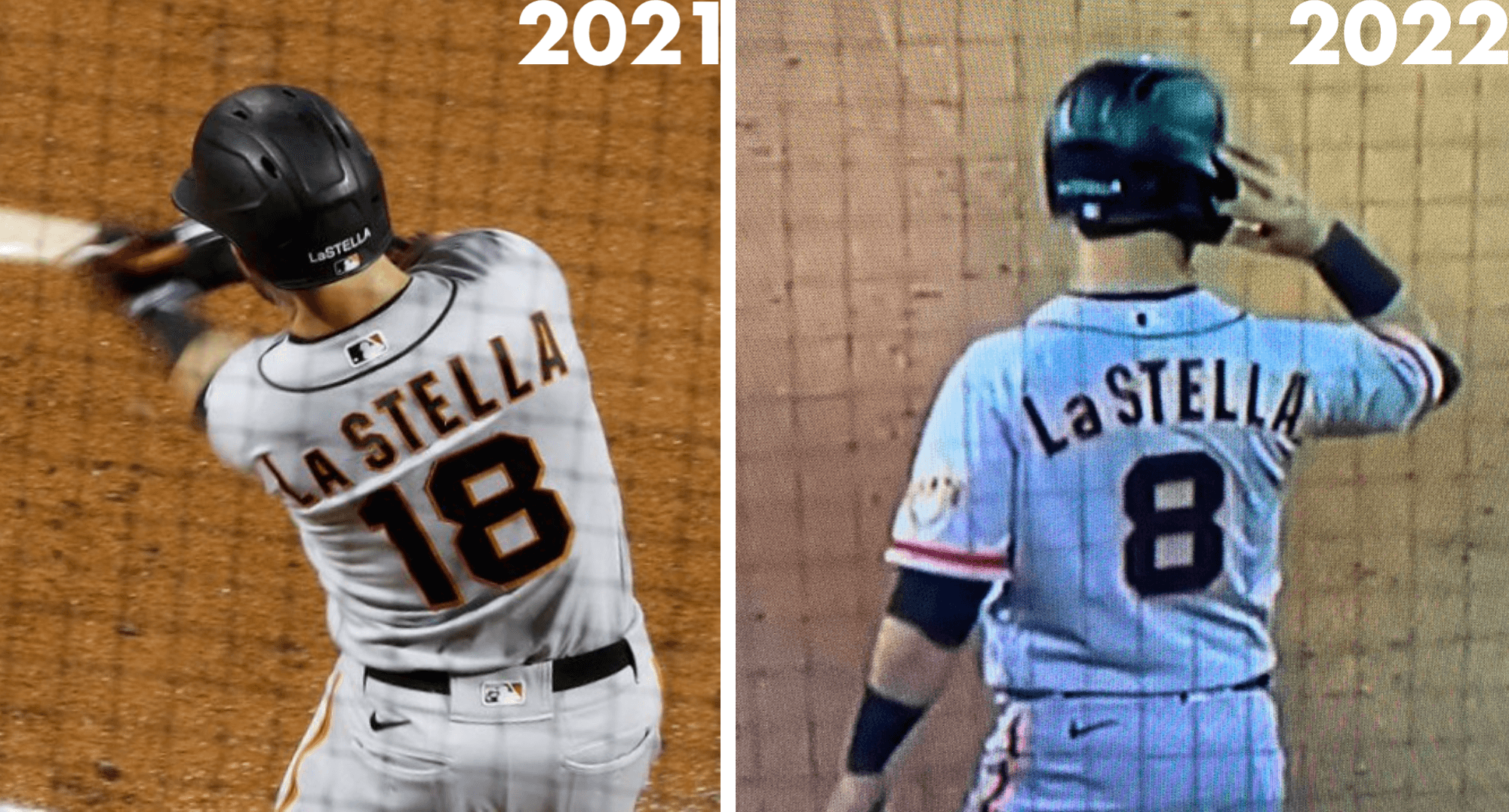
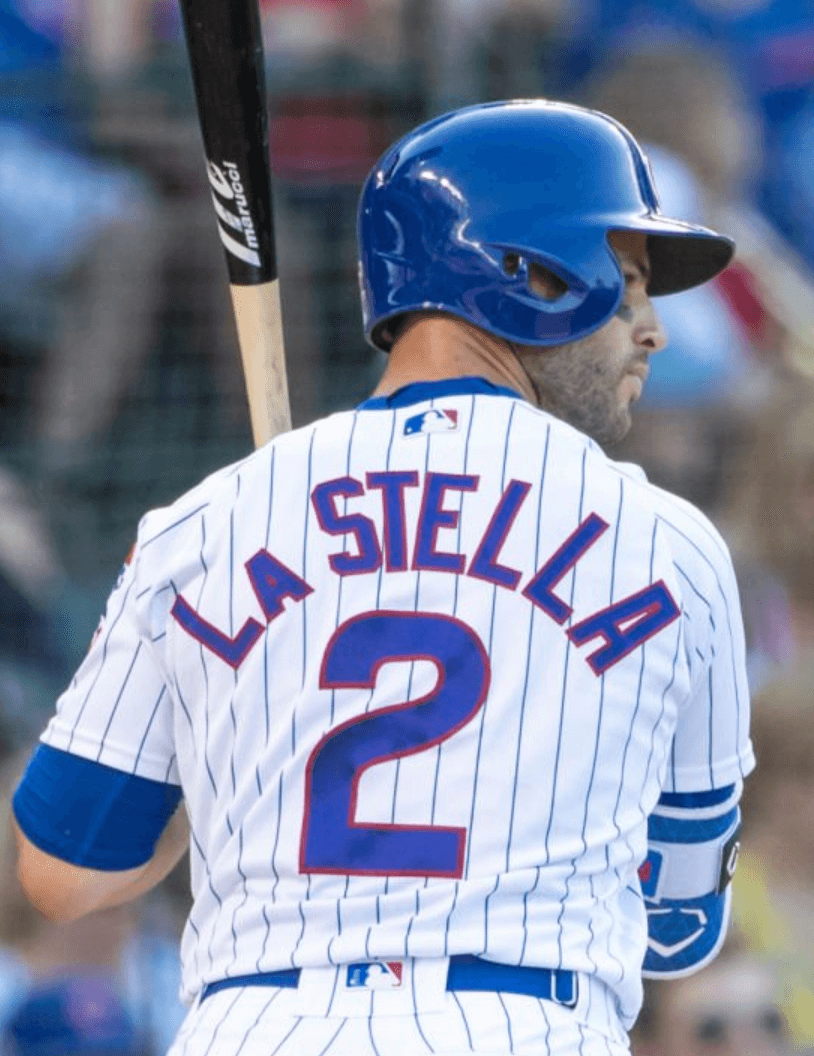
Anyway: While a bunch of us were watching the Giants/Rockies game at Coors Field on Tuesday night, we were so busy being purple-sociable that we missed an important uni detail: Giants infielder Tommy La Stella now has a lowercase “a” on his NOB! (He actually made his season debut on Monday, but nobody noticed it then either.)
His official surname includes a space between the “La” and the “Stella,” but the NOB doesn’t appear to have a full space — it’s more like a hint of a space, like they’re trying to have it both ways. Hmmmm.
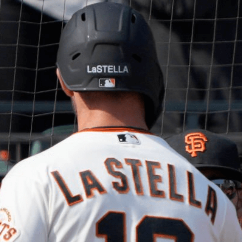
Amusingly, La Stella has always had the lowercase “a” (without the space) on the back of his Giants batting helmet:
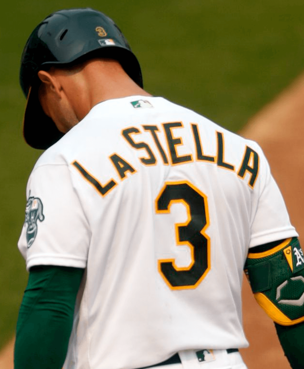
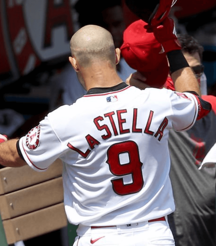
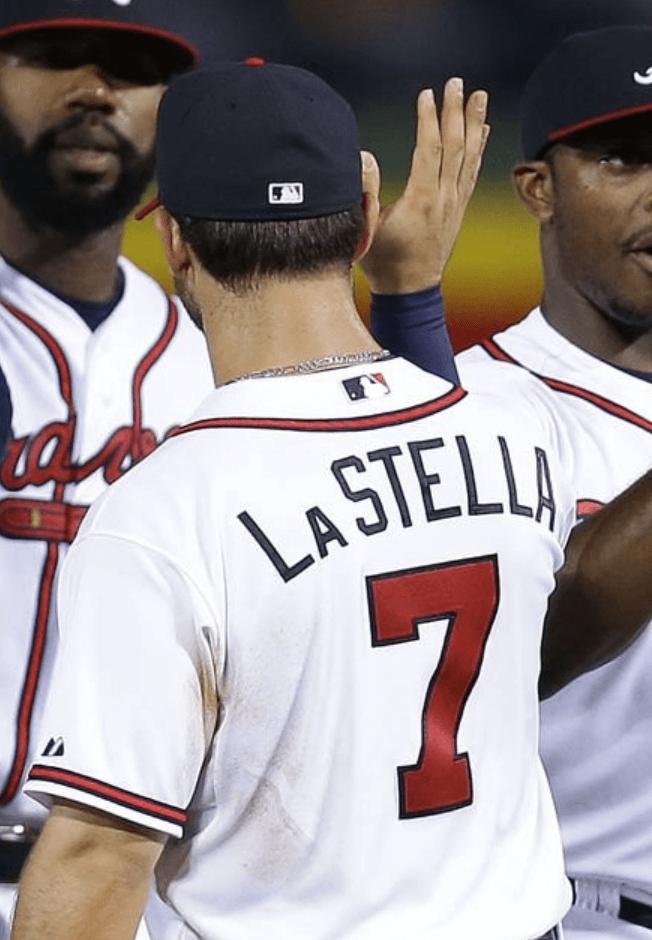
Up until now, La Stella has always worn a small-cap “A” on the back of his jersey — not just with the Giants, but also during his stints with the A’s, Angels, Cubs, and Atlanta. The spacing was variable (often it varied even more within a given team’s assorted jerseys):
I’m trying to decide whether I prefer the lowercase “a” or the small-cap “A,” and I’m thinking I don’t like either of them. What I’d really like to see is a slightly larger small-cap, so it doesn’t look quite so diminutive. Maybe someone could Photoshop that for us?
(My thanks to Sean Presley and Twitter-er @ABL_LoSox for letting me know about La Stella’s new NOB.)
ITEM! City Connect Power Rankings: For my latest piece on Bulletin, I’ve done a worst-to-first ranking of the 10 MLB City Connect uniforms that have been released so far.
My premium subscribers can read the article here. If you haven’t yet subscribed, you can do that here (you’ll need a Facebook account in order to pay). Don’t have or want a Facebook account? Email me for workaround info. Thanks!
Father’s Day deadline reminder: In case you missed this news earlier in the week, the folks at the Pillbox Bat Co. tell me that if you want one of the custom-painted Uni Watch bats in time for Father’s Day, you must get your order in by next Monday, May 23, so I wanted to pass that info along.
The Ticker
By Lloyd Alaban

Baseball News: A throw last night by Astros SS Jeremy Peña to first base tore through teammate 1B Yuli Gurriel’s glove. The play was scored as an error on Peña (from Mike Chamernik). … Twins SS Carlos Correa had his last name misspelled on the A’s scoreboard yesterday (from Bill Vaughn). … The next few items are from our own Phil Hecken: The Astros will give out a series of moon rover-themed bobbleheads this month. … The Fort Wayne TinCaps, affiliate of the Padres, are using a promotional night of jersey sales to raise funds to support a monument to the All-American Girls Professional Baseball League.

Football News: Ravens QB Lamar Jackson has filed for a couple of trademarks —presumably for an upcoming restaurant (from Marcus Hall). … Here’s a sportswriter’s ranking of Washington State’s uniforms (from our own Phil Hecken). … Also from Phil: Here’s the entire 2022 NFL schedule – all 272 games — in one graphic.

Hockey News: After some initial reports that the Coyotes would not be allowed to put their logo on the ice while playing “home” games at Arizona State for the next few seasons, it now turns out that the Yotes logo and the ASU logo will both appear on the ice. … A statue of former Blackhawks C Fred Sasakamoose, who spent decades helping develop Indigenous hockey players and reconciliation efforts, was unveiled yesterday outside the Sasktel Centre in Saskatoon, Saskatchewan (from Wade Heidt).

Basketball News: F Paolo Banchero might have given us a first look at the NBA’s upcoming draft caps (from Donald Wine II). … The NBA Draft Lottery took place yesterday. Some interesting tidbits about how teams are actually chosen are in this ESPN article. For example, the NBA has a backup lottery machine in case the first one fails, and a backup in case power fails: a literal basketball with a hole cut out of the top. Yesterday morning before the lottery took place, the league went to get its hole-in-the-ball lottery machine, but they noticed it was a Spalding ball, which was problematic because the league switched from Spalding to Wilson for this season, so officials had to find a Wilson ball and cut a hole in that one (from Mike Chamernik). … Reader Dario Moretti found a picture circa 1994 of Hawks PF Danny Manning wearing a jersey with no front number.

Grab Bag: Under Armour president and CEO Patrik Frisk will step down from his post next month (from our own Phil Hecken). … The U.S. Air Force could soon allow airmen to have mustaches that extend a quarter-inch past each corner of their lips, for an extra half-inch of hair in total (from Timmy Donahue). … Also from Timmy: U.S. Space Force recruits will be allowed to have neck tattoos.
Agreeing with Paul’s take on the A here. Doesn’t make sense for it to be lowercase if the NOB don’t include lower case letters for other letters that would be lower case under normal circumstances. Likewise the extra tiny A feels very out of place, and again, is putting emphasis on that letter specifically for some reason. My preference would be normal caps like there rest of the name, I see no reason why that A should be treated different. At most a slightly smaller (75% to 66% of normal size) caps A is something I could tolerate. Smaller enough to be able to notice, but not so small as to bring extra emphasis to that letter.
If his name is normally La Stella on legal documents, and on the jersey Stella is rendered STELLA, why would La be rendered any different?
I agree with this. I see no reason that the best solution shouldn’t be to simply render it in all caps like any other name.
To elaborate further on my comment below, I can tell you the reason why:
Pronunciation. Capitalizing the third letter in many (usually Italian) names indicates a stress on the second syllable. (So, it’s La-STEL-uh; not “LAS-tel-uh,” which is how many might see it if it were spelled Lastella.) The way to convey this in all caps is one of the two ways I mention below (LA STELLA, with a space; or L-[small-cap A]STELLA, without a space.
Doing a quick search, his name is written with a space where I looked, so naturally it seems the correct way to NOB it would be LA STELLA, allowing for the emphasis to be there properly.
It could be an issue if his name was spelled without the space; LaStella. In which case the letter that needs to be addressed is the S, not necessarily the A, as that S, being a non-first letter capitalization is the outlier.
Given the space in there this seems like a pretty open and shut case, all caps, and retaining the space between the A and S.
Yep; I’m just telling you how it’s handled editorially, in print pubs. Small-capping the A or adding a space is how it’s done.
Looks like La Stella also lost a digit too.
Does anyone else find it odd that that Pena was charged with an error for Gurriel’s glove webbing exploding? Looking at the clip, the throw was good enough. So is he being penalized for throwing too hard? Maybe Gurriel’s glove was just old or had poor quality leather.
What are some other instances in the Uni-Verse of a player’s stats taking a hit because of a teammate’s equipment failure?
Me! If any, error should be charged to Gurriel for having a worn out glove (it doesn’t matter how hard was the throw, it cannot destroy the leather, I agree with you).
Yes it is very strange, especially in this era of everything that happens on a ballfield being intricately scrutinized and evaluated. If Jeremy Pena loses his arbitration case in a few years due to having one too many career errors, I hope Gurriel will at least take him out for dinner.
In principle, I agree. The scoring should either be a hit, since the broken glove is essentially a quirk of the field. It’s as if the batted ball had hit the pitcher’s rubber and bounced wildly over the infielders. Or it should be an error on the player making the catch. But the interpretive notes for rule 9.12 contain this section, which I suspect led the official scorer to rule as he did: “The official scorer shall charge an error to a fielder who auses another fielder to misplay a ball – for example, by knocking the ball out of the other fielder’s glove. On such a play, when the official scorer charges an error to the interfering player, the official scorer shall not charge an error to the fielder with whom the other fielder interfered.” So if you see the play as analogous to having the ball slapped out of the glove, then the E has to go to the throwing player. I don’t think this is a correct interpretation, but it’s reasonable and defensible given the official rules.
There are plenty of instances where an equipment failure has led to teams getting scored on. That said, it shows how subjective the assignment of errors truly is.
As an editor, I can tell you how names like LaStella’s are handled when using all caps:
1. LA STELLA (all caps, with a space)
2. I can’t reproduce it here, but: all caps, with a smaller-font A as the second letter, no space
That’s it. Never, ever, with a lower-case a and all caps elsewhere.
There’s actually still an error on Tommy La Stella’s jersey if the Giants are going to start using lowercase letters–the L should be lowercase as well. The “la” in his name is an article (meaning “the”) followed by a space, so his name should be “Tommy la Stella”. Think of other famous European names: “da Vinci”, “van Beethoven”, or “van Gogh”. The L is only capitalized when it starts a sentence. (Interestingly, when alphabetized the name would fall under S, not L!) It seems like immigration to the USA scrambles this convention (think actors Leo DiCaprio or Matt LeBlanc). My own name was subject to this Americanization until today’s article sent me down a research rabbit hole. Thanks Uni-Watch!
When the Québec Nordiques played at Le Colisée, their insignia shared the circle with the Québec Remparts.
Sure enough:
link
Thanks for that, walter!
Reminds me of when the Superdome had ‘SAINTS’ in one end zone and ‘TULANE’ in the other.
Hi Paul, here is the photoshop job you requested, Lᴀ STELLA with a slightly larger small-cap A.: link
Much better!
If La Stella ever got with the Dodgers, they could do the La like the Dodgers’ cap logo.
Glad to hear you’re still in town for a few days and enjoying the outdoors here in colorful Colorado! Don’t let the incoming storm cut your trip too short, forecast is for very little in the way of accumulation. As long as you have a warm jacket (or can borrow one) you should be alright!
Space force recruits with neck tattoos. I guess that will make it easier for them to go undercover in the Mos Eisley cantina.
With regards to the Coyotes/ASU center ice situation, it would not be the first time an NHL team’s logo shared center ice with a non-NHL team. I think back to the old Ottawa Civic Centre (built beneath the grandstands at Landsdowne Park, now [bank] Place Stadium; the Civic Centre is now [bank] Place Arena), when the expansion Senators played there (and they could temporarily cram 10,000 in there, if needed), and the Sens’ logo appeared on one side of the center line, and the logo of the OHL’s Ottawa 67’s was on the other side.
There was also the time there were two logos at center ice at Nassau Coliseum (pre-Fisherman), though if I recall correctly, it was actually the Coliseum’s logo opposite the Islanders’ logo.
I actually kind of miss the days when teams would typically have two smaller logos in each half of the center circle, instead of the giant logos that are bisected by the center line.
I enjoyed the days when there was more creativity with where the logos went on the ice compared to how cookie cutter it is now.
Remember team logos outside the centre ice circle? Some examples.
PNE logo at centre ice with Canucks logo outside the circle.
With Stick-in-Rink in blue and green era:
link
Also with the Skate logo later after the major uniform change:
link
Same with Oilers. Northlands logo at centre ice. Oilers logo outside.
link
If they are going to keep it the way it is, they need to make a change so the the red line should not dissect the centre ice circle and the logo. No need for it anymore now that there is no 2-line pass. Watching Worlds today and it is not on the ice surface dissecting the centre ice circle.
If that center ice circle has the Peyote Coyote AND Sparky I’m all in.
Breaking news: Travis Barker seen signing up at a Space Force recruiting station.
I’ve always preferred the small-cap for name prefixes. It’s pretty subjective, I suppose, but I just think it looks better. The attempts at lower-case prefixes never look very elegant.
Frankly, I blame the Mets and Travis d’Arnaud for all of this. A small cap on his name would have been just fine. Instead, the Mets, Dodgers, Rays and Braves have all been forced to put what amounts to an upside-down “P” on his NOB, which looks terrible.
Same here. Small caps look so much better and that upside-down P looked terrible. The only excuse I can think of for it is that at a small size a small-cap D might have looked like an O.
I am working on a doctoral project and need to know where to get the software on that readers on this page use to design their ideas. The sports I am thanking are, baseball, football basket ball and hockey. Any help would be great thanks!!!
Hi Mike,
I use Adobe Photoshop which is part of Creative Cloud.
link
I also use templates from Webpixium
link
There is also free software:
link
link
And templates:
link
HTH!
My vote is that La Stella should get a space, but not a lowercase letter or small cap.