By Phil Hecken
Follow @PhilHecken
Good Sunday Morning and a Happy Mother’s Day to all!
Last weekend, I was pleased to present to you Casey Vitelli’s “NBA Refresh” Concept Series, Part I. Today, Casey is back for the final part. This was a fun series to run, and there were lots of positive comments last weekend on the first half, so today we’re going to finish the series. Here’s Casey.
2022-23 “NBA Refresh” Concept Series, Part I
by Casey Vitelli
A refreshing look to the NBA through my eyes. As a fan of basketball, and their jerseys, I always have had ideas on how teams could do designs differently. This project has taken 3 months to complete. I am extremely proud of this project and I hope you appreciate the effort put into this.
Milwaukee Bucks
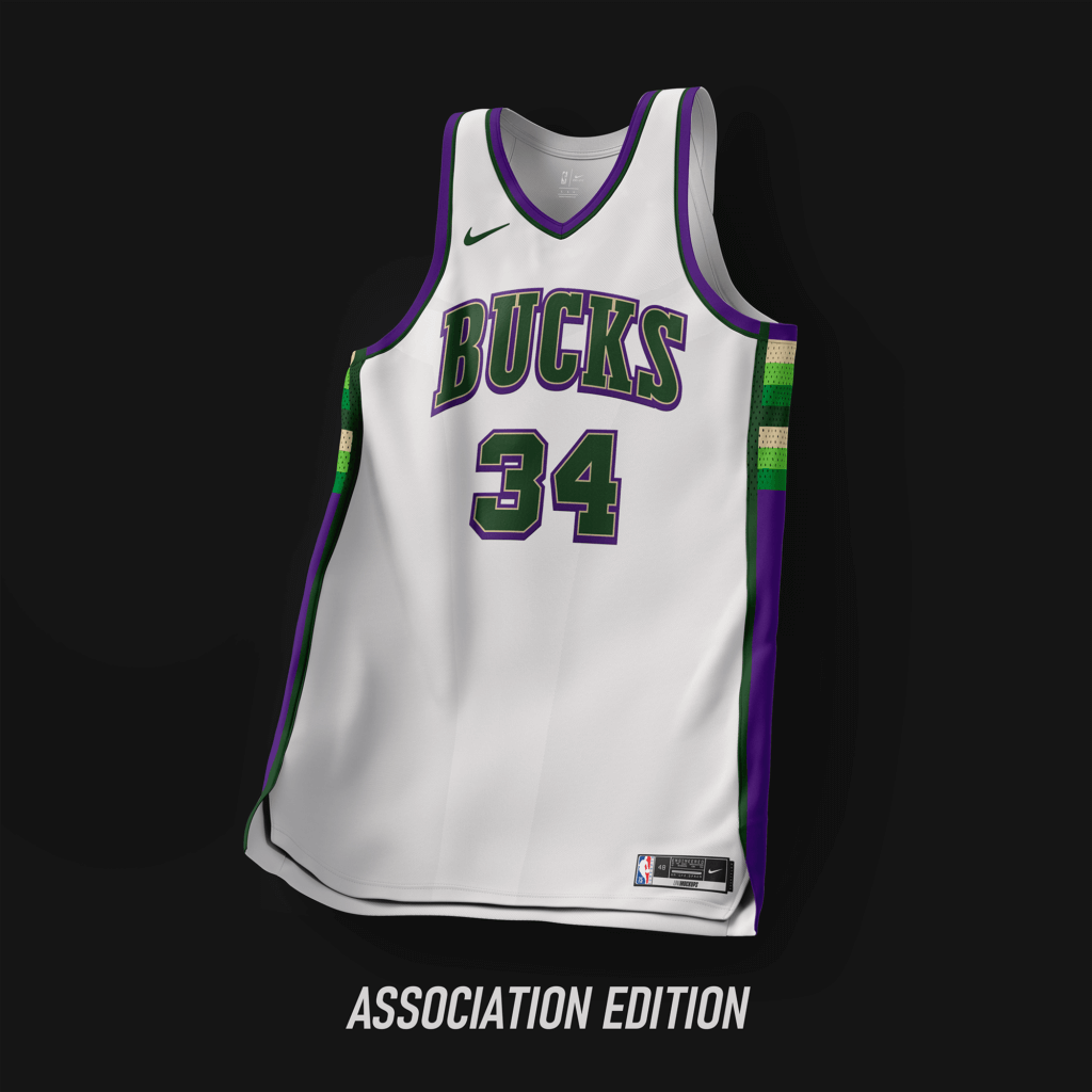
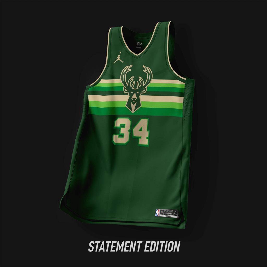
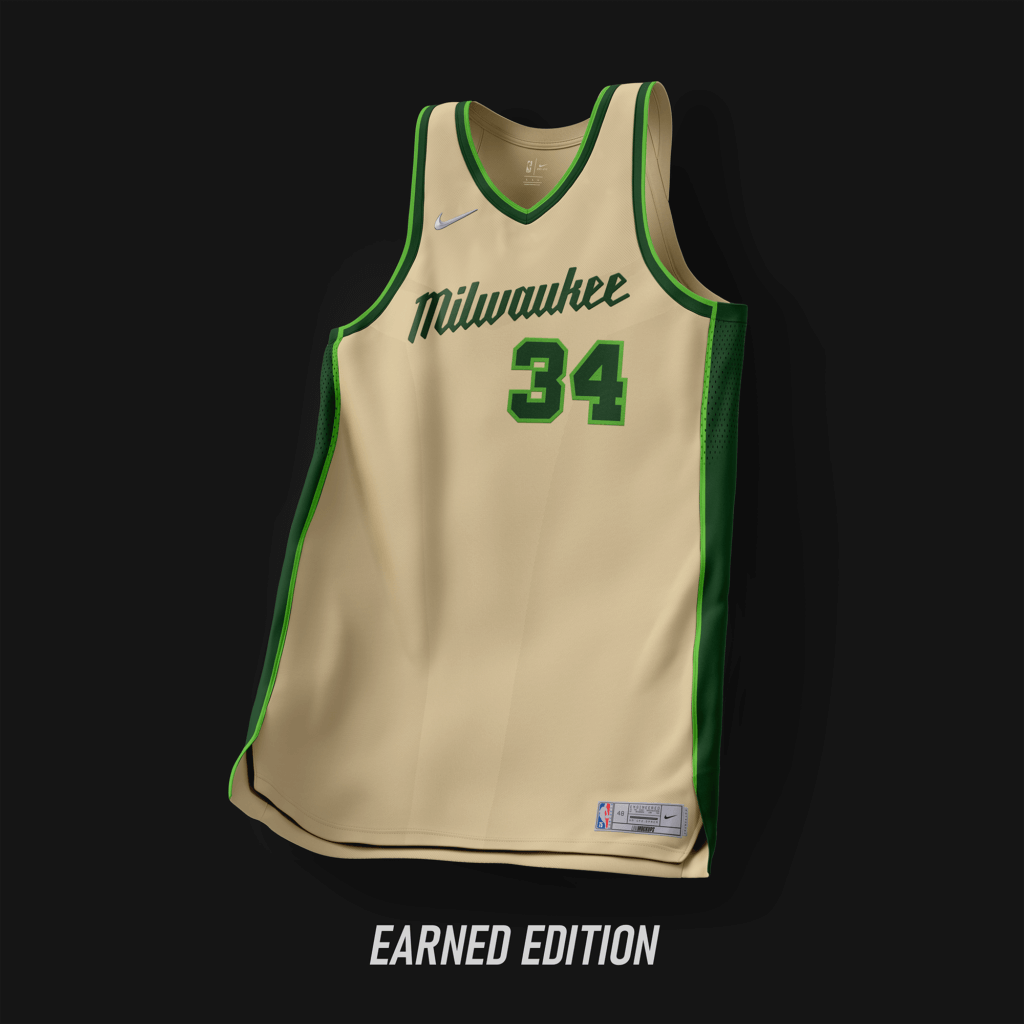
A mashup of Bucks history. Designs matches the current team, with a custom wordmark.
Minnesota Timberwolves
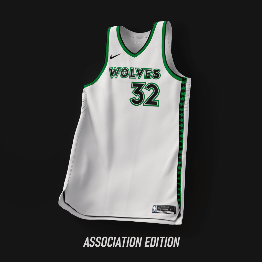
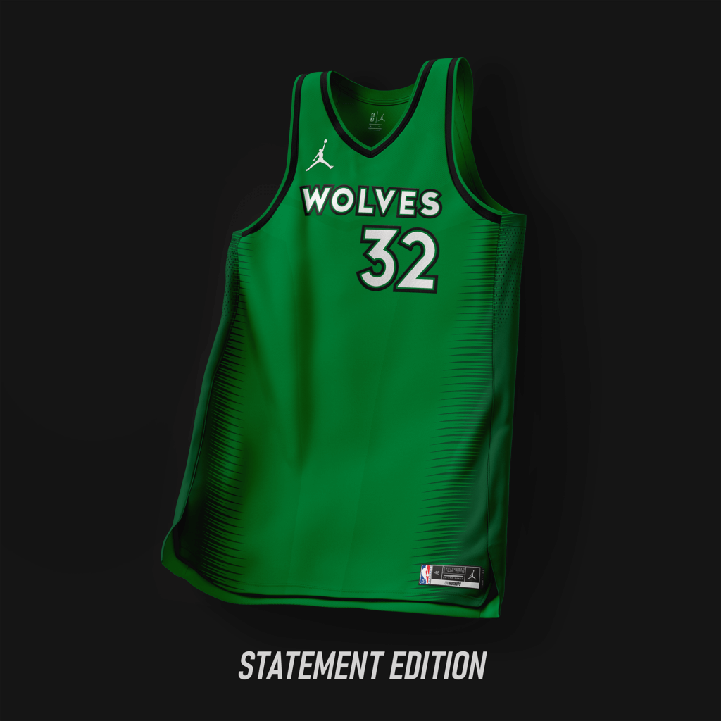
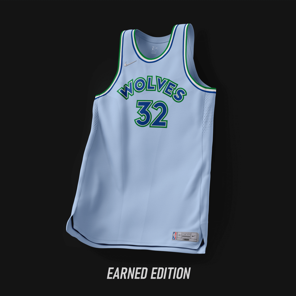
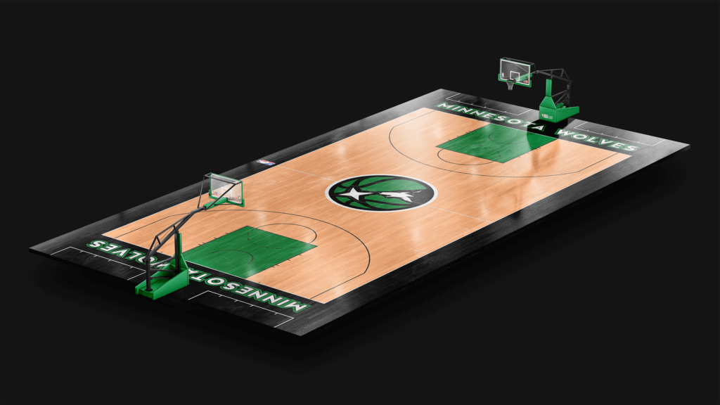
Current wordmark with the colors returning to the scheme used from ’96-’08. The Earned Edition uses the color scheme used from ’89-’96 with an added light blue as the base.
New Orleans Pelicans
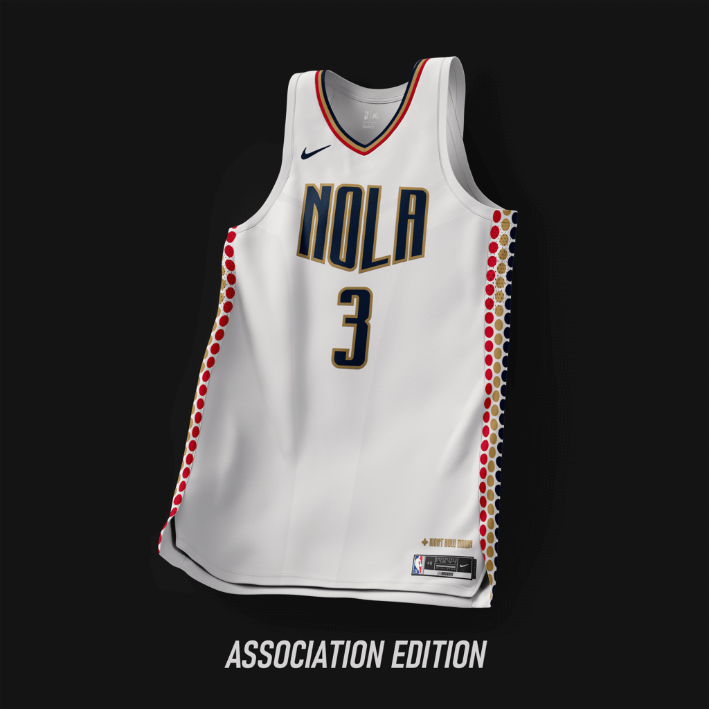
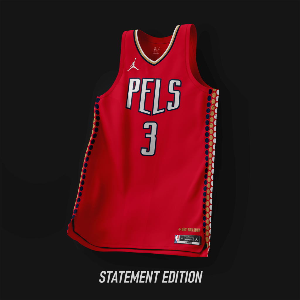
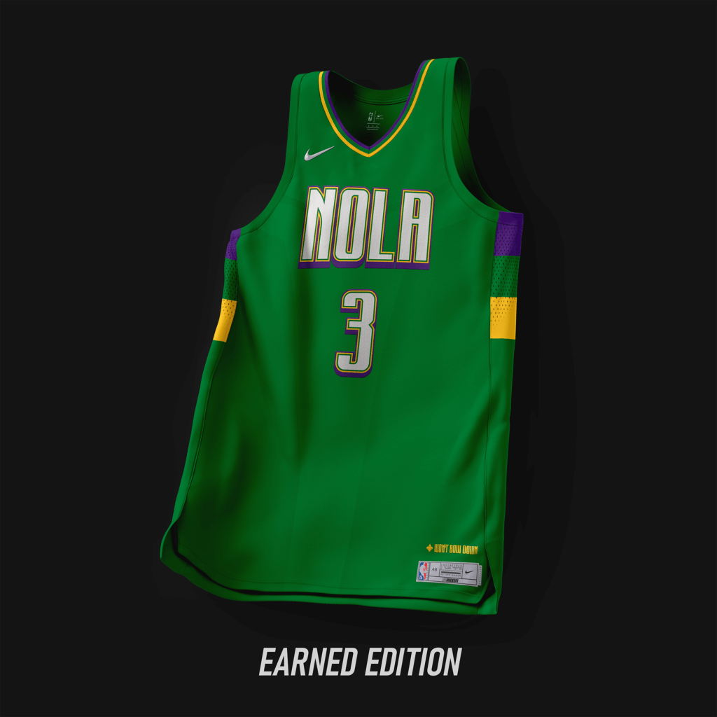
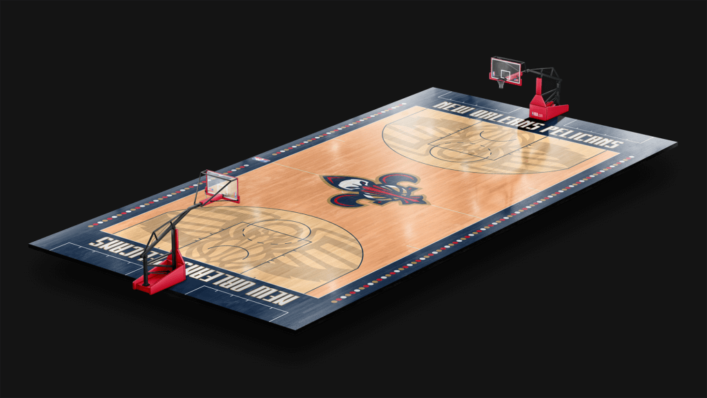
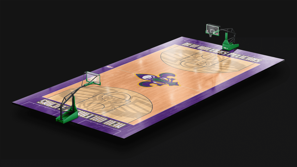
Design based off the ’21-’22 city edition, but switched the sides to a circle pattern. Wordmark based off the font used for the teams’ moniker, “Won’t Bow Down”.
New York Knicks
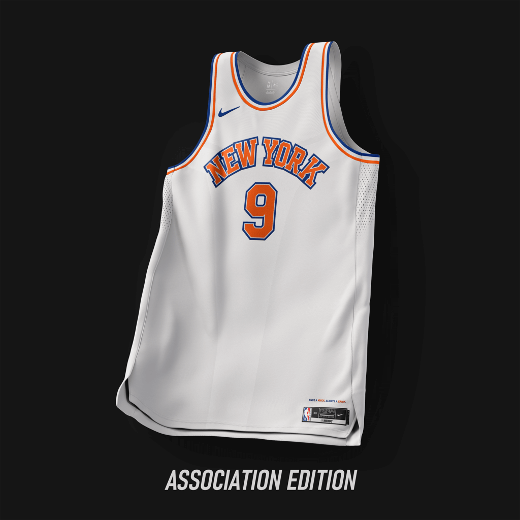
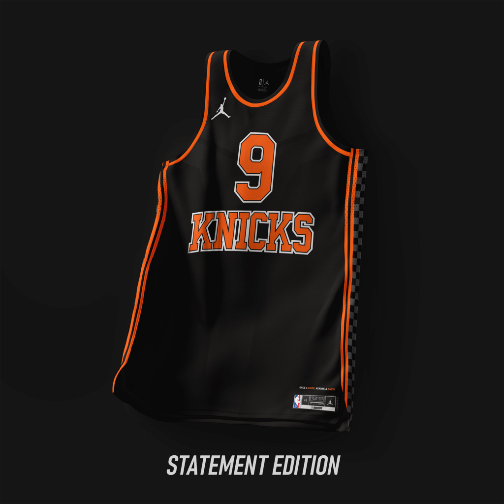
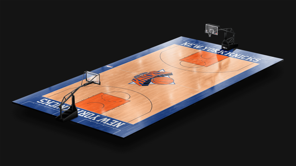
Limited changes, with the current team wordmark arched. The Statement Edition is a combo of the ’21-’22 city edition and the uniforms used from ’79-’83.
Oklahoma City Thunder
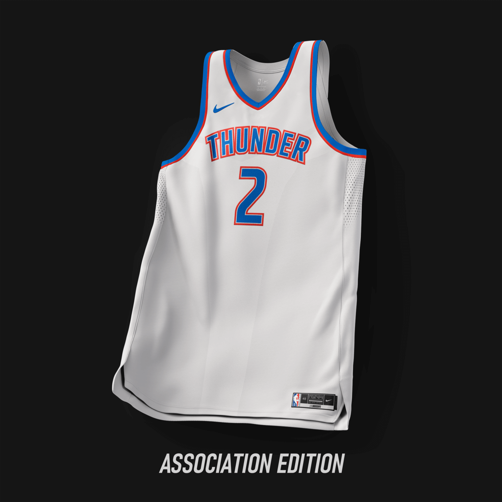
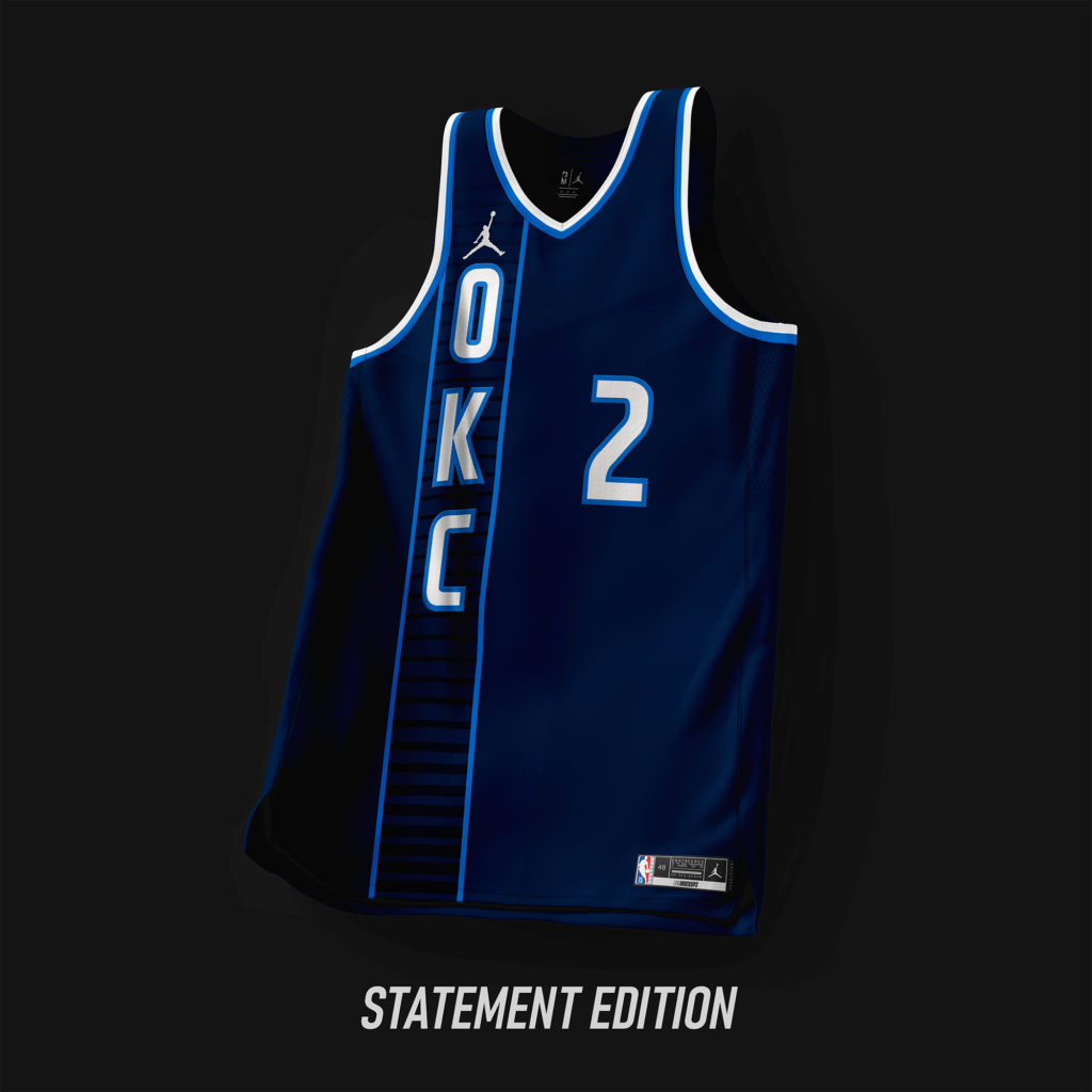
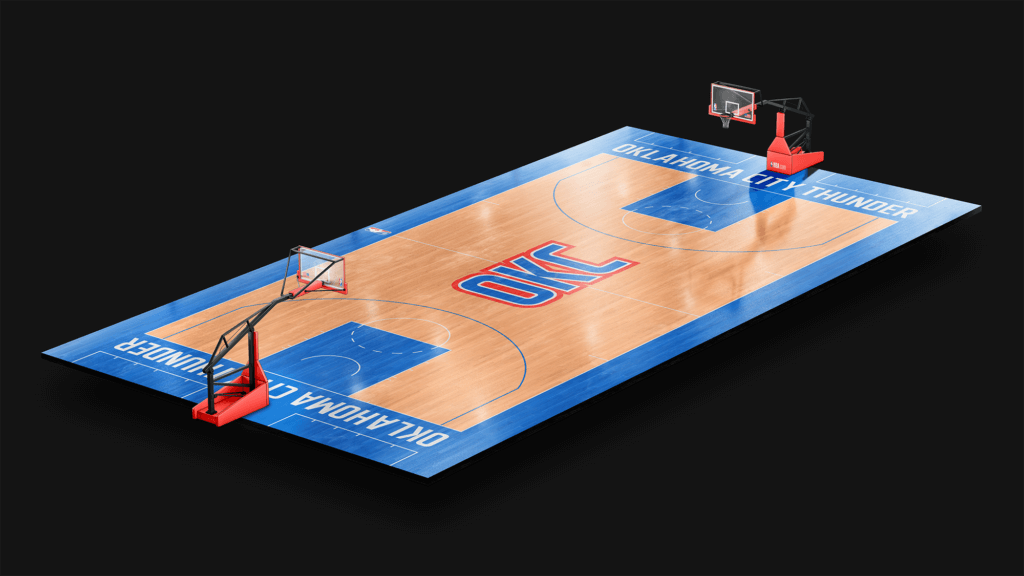
A simpler look from the current set with the font matching that from the ’20-’21 City Edition.
Orlando Magic
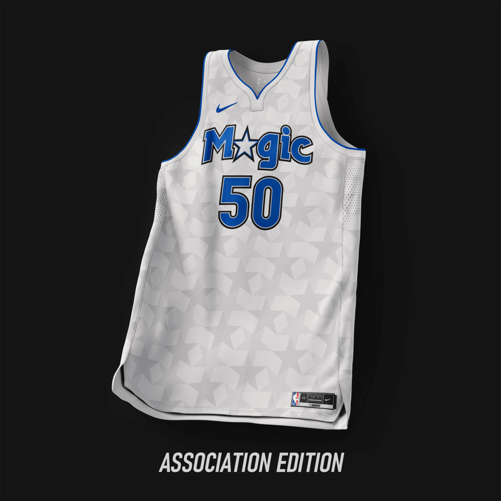
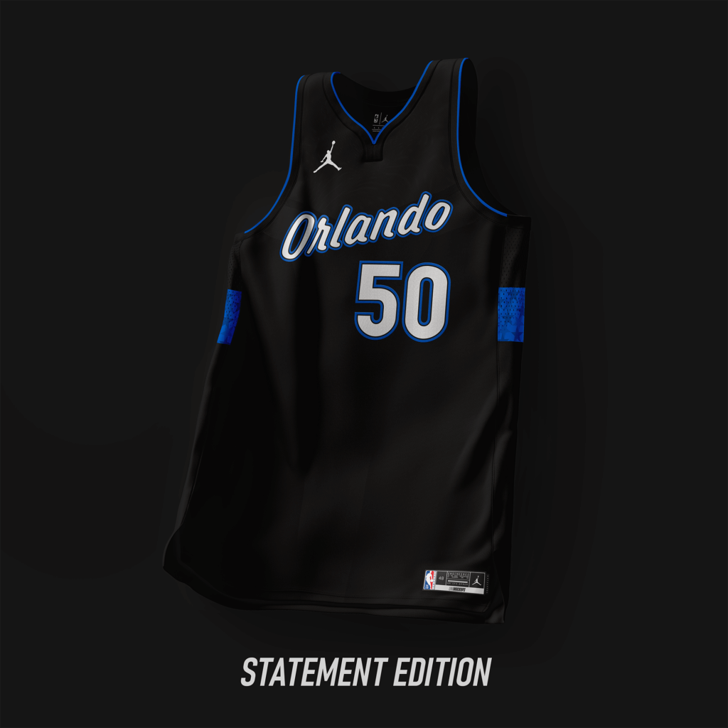
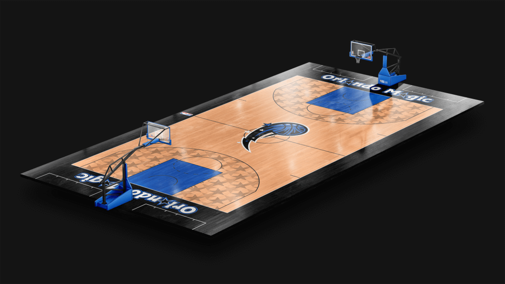
Designs based off of the design used from ’98-’03. The wordmark is an updated version of wordmarks used from ’89-’03.
Philadelphia 76ers
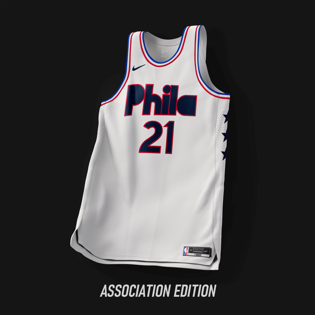
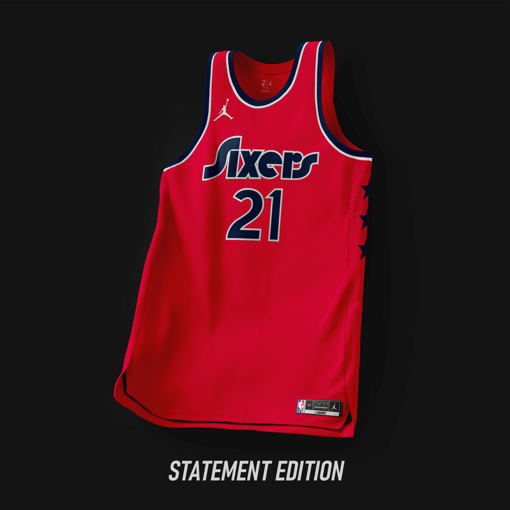
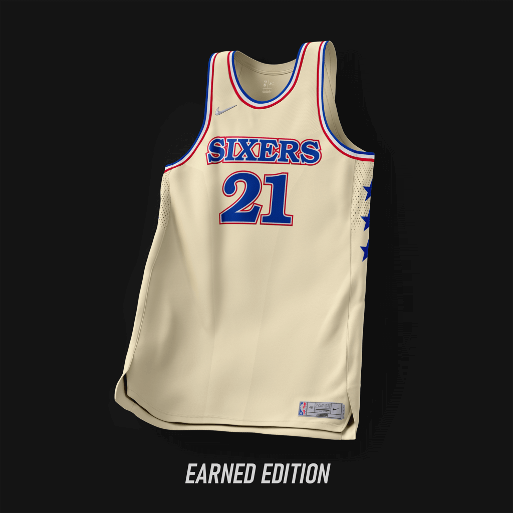
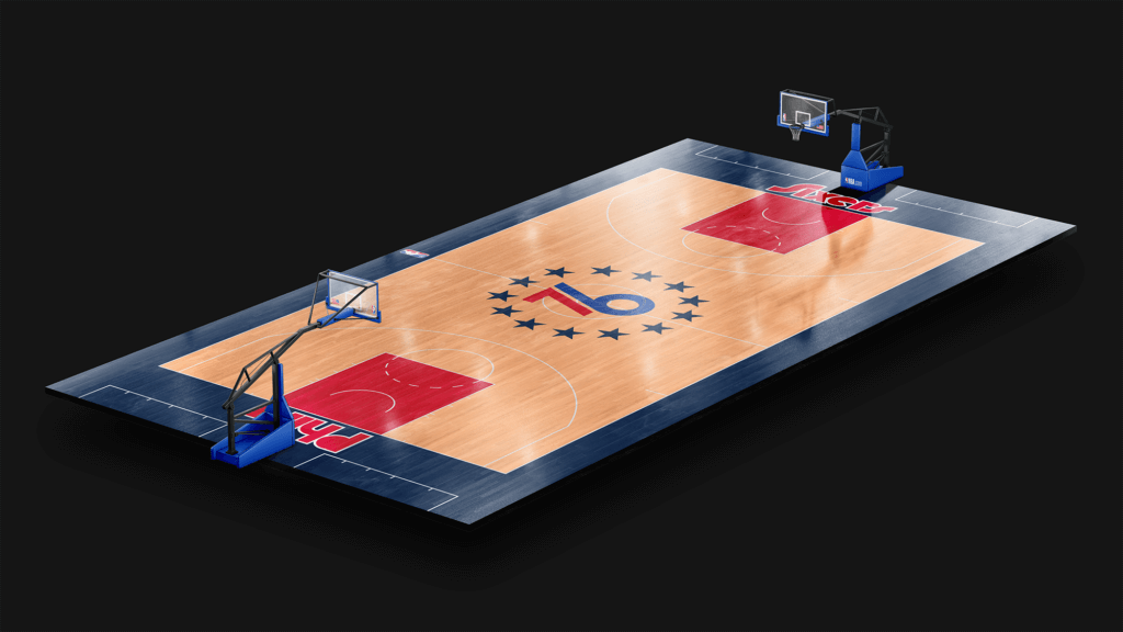
Extension of the ’21-’22 City Edition, with a simple star design for the side panels.
Phoenix Suns

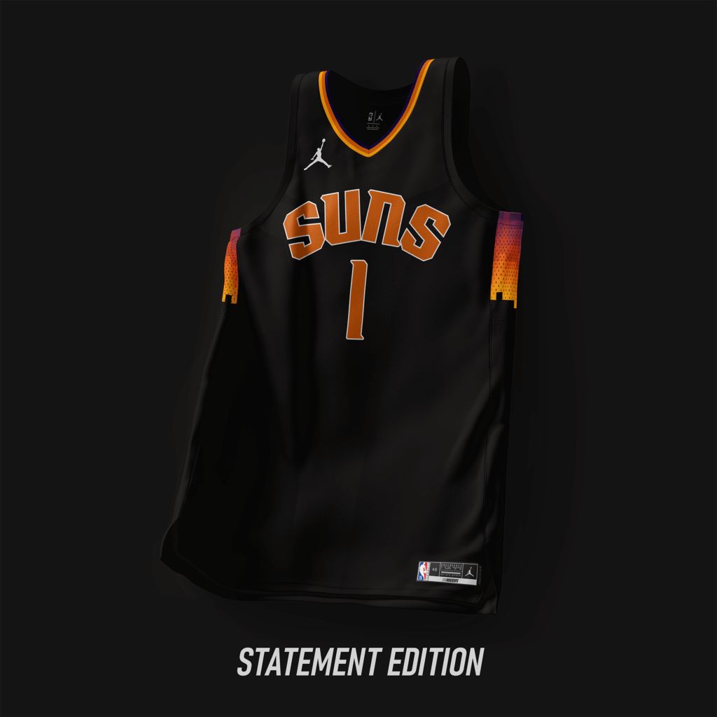
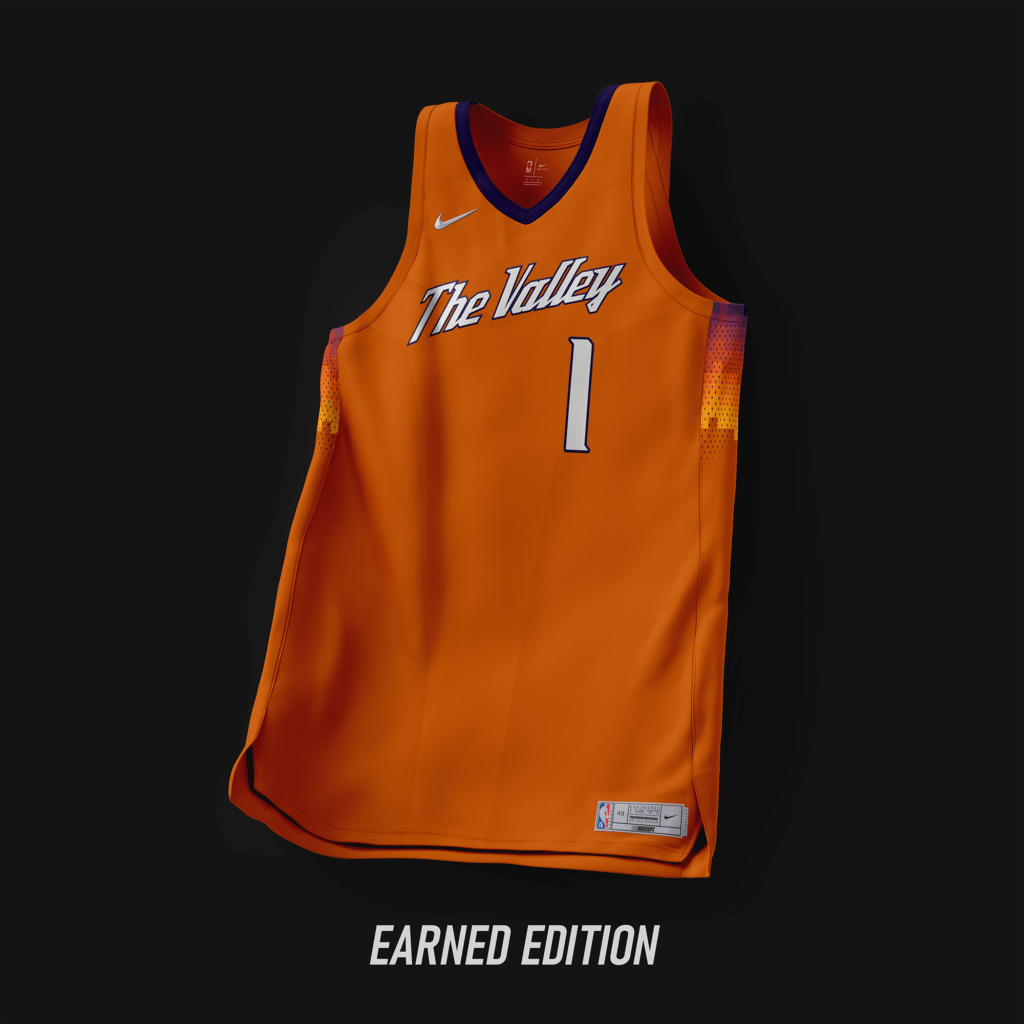
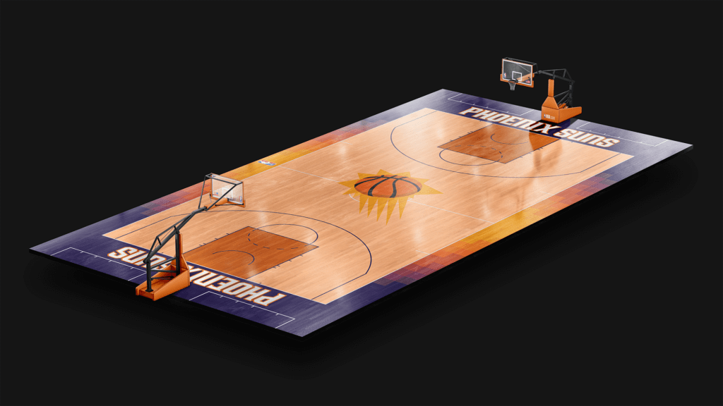
Current wordmark arched with the valley gradient on the side panels.
Portland Trailblazers
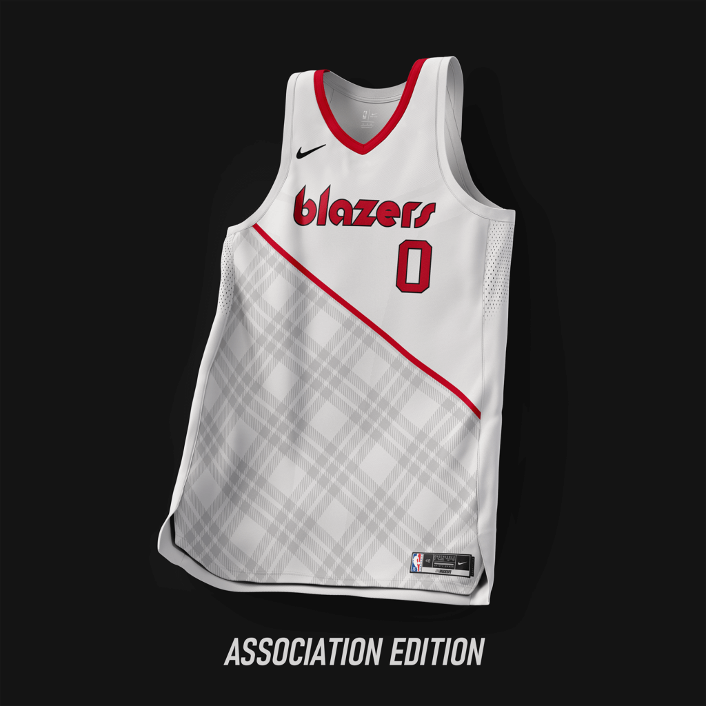
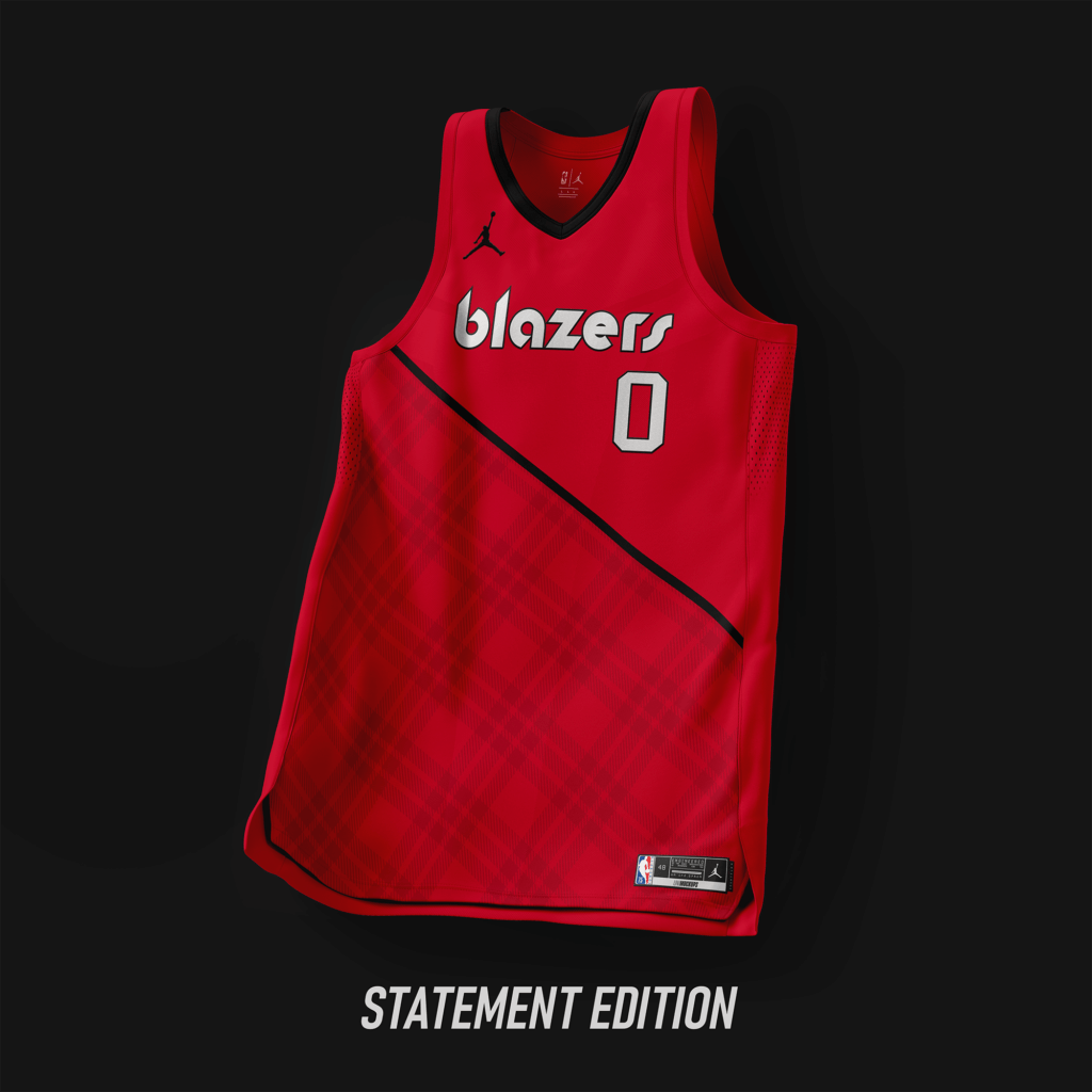
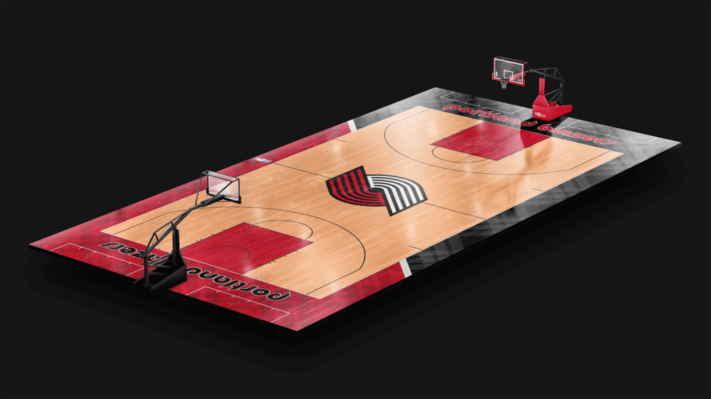
Using the classic wordmark from ’77-’02, with a subliminal plaid pattern added underneath the minimal sash.
Sacramento Kings
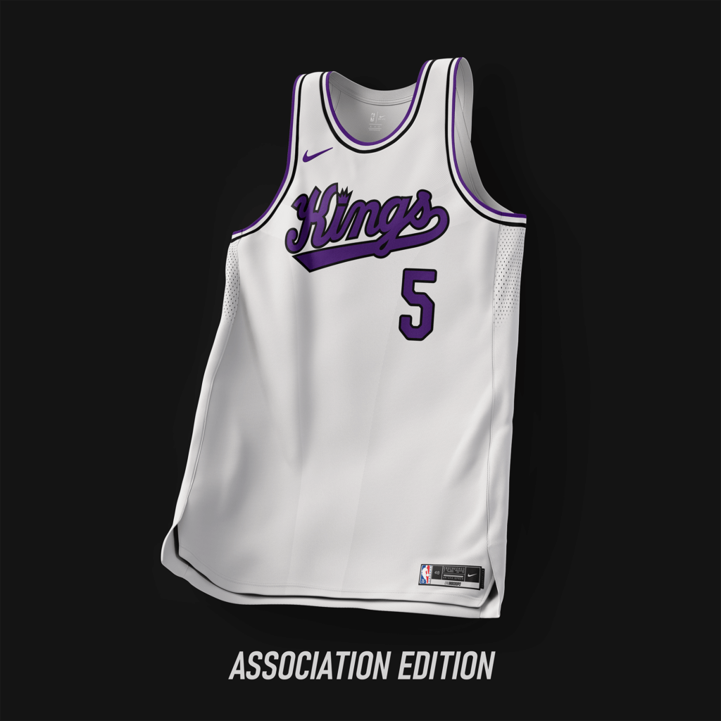
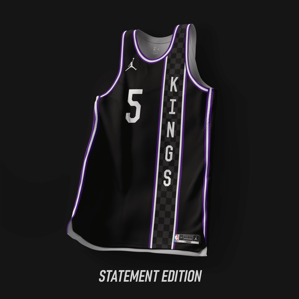
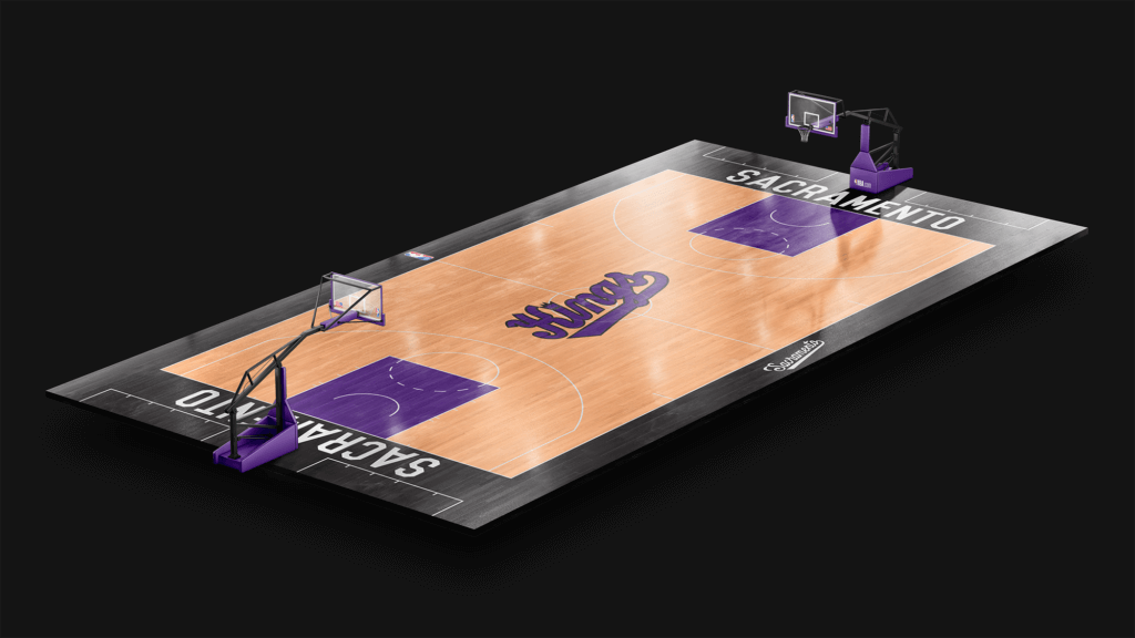
Simple design based off the ’21-’22 City Edition. Statement edition based of the Cincinnati Royals design used from ’67-’71.
San Antonio Spurs
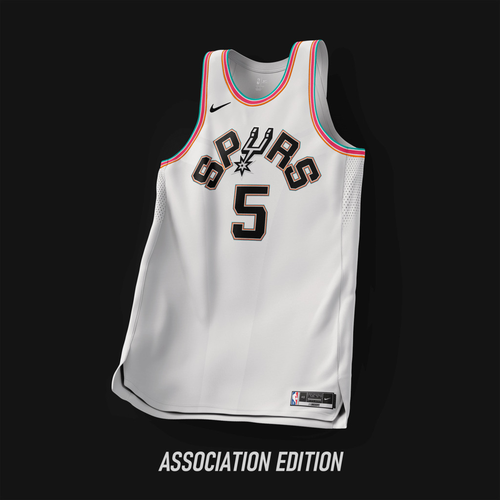
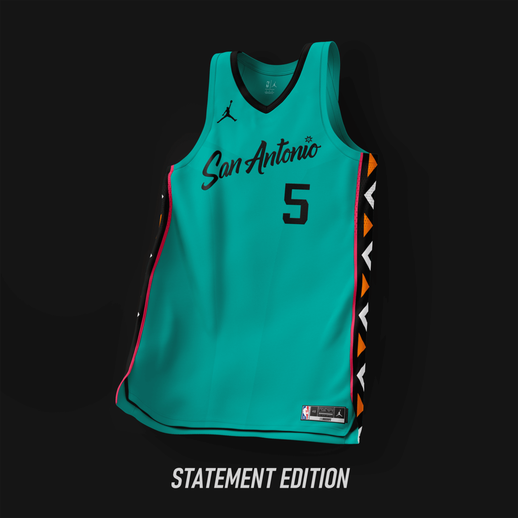
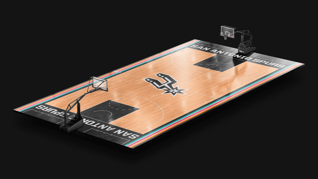
The design uses the Fiesta color scheme, with an arched wordmark using the current font. The Statement Edition resembles the design from the All-Star jersey used in ’96.
San Francisco Warriors
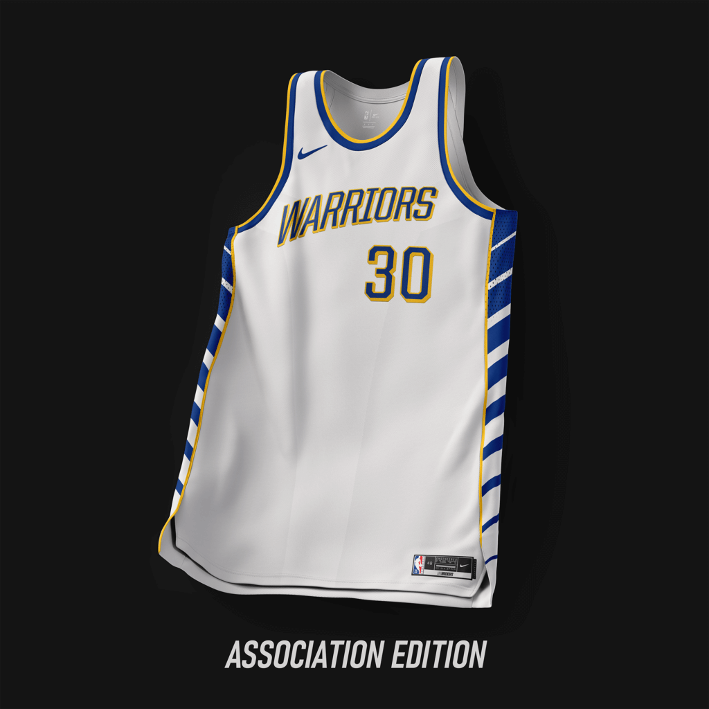
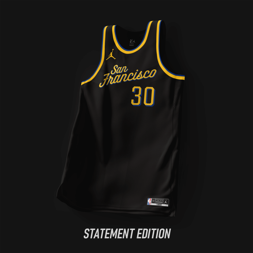
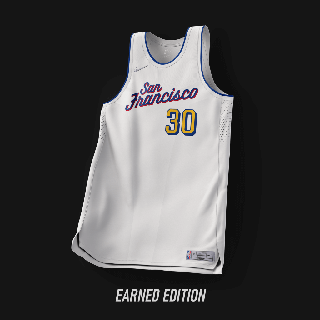
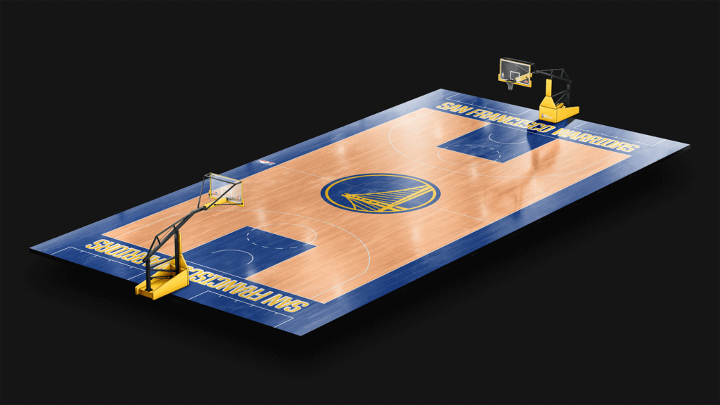
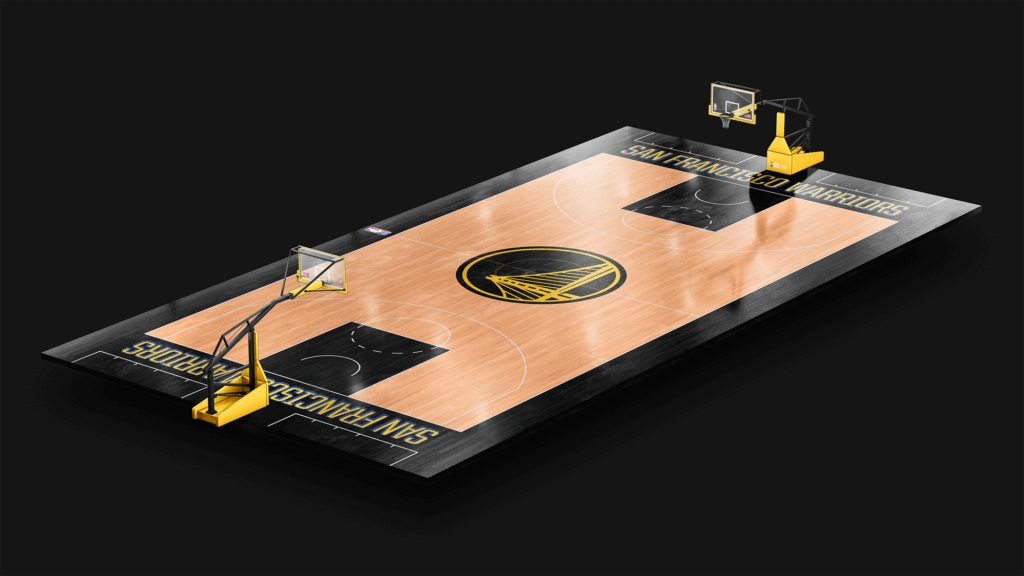
Wordmark are using the same font from the original version of “The Town” used from ’17-’19. Side panels was designed based on the logo used for “The Bay”.
Toronto Raptors
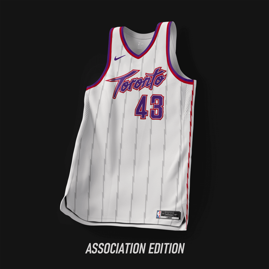
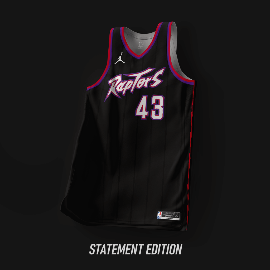
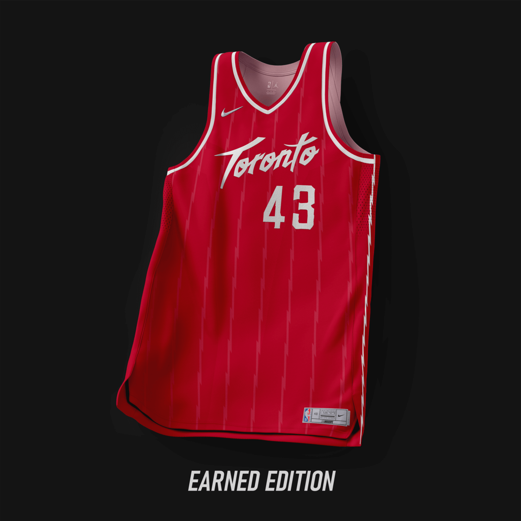
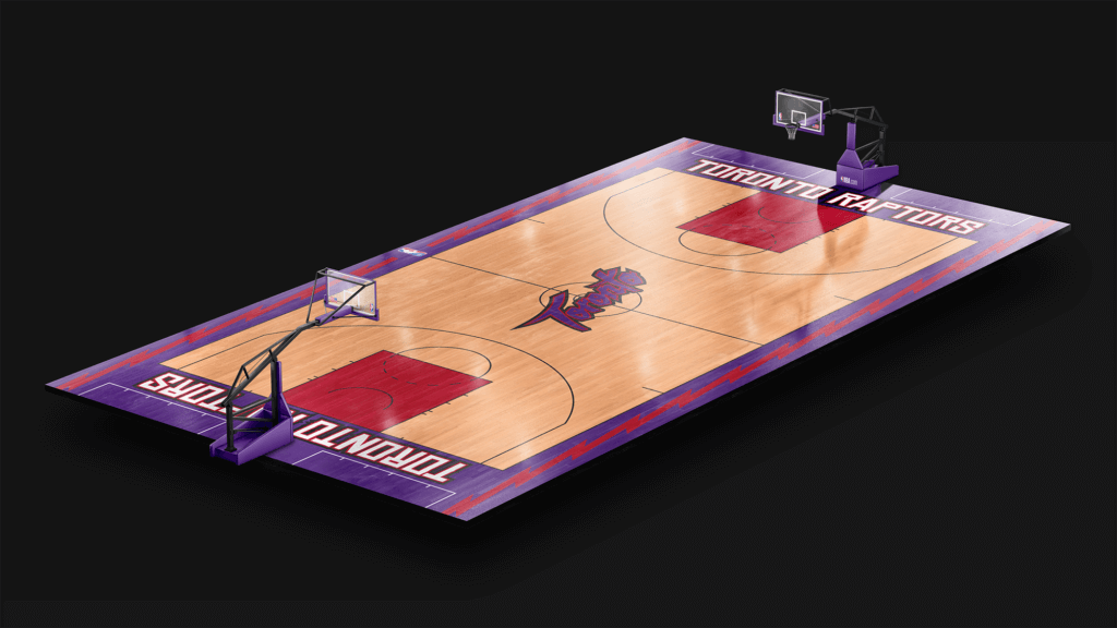
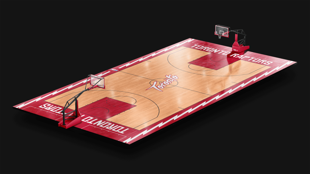
A simple redsign from the original set used from ’95-’99, minus the Dino Logo.
Utah Jazz
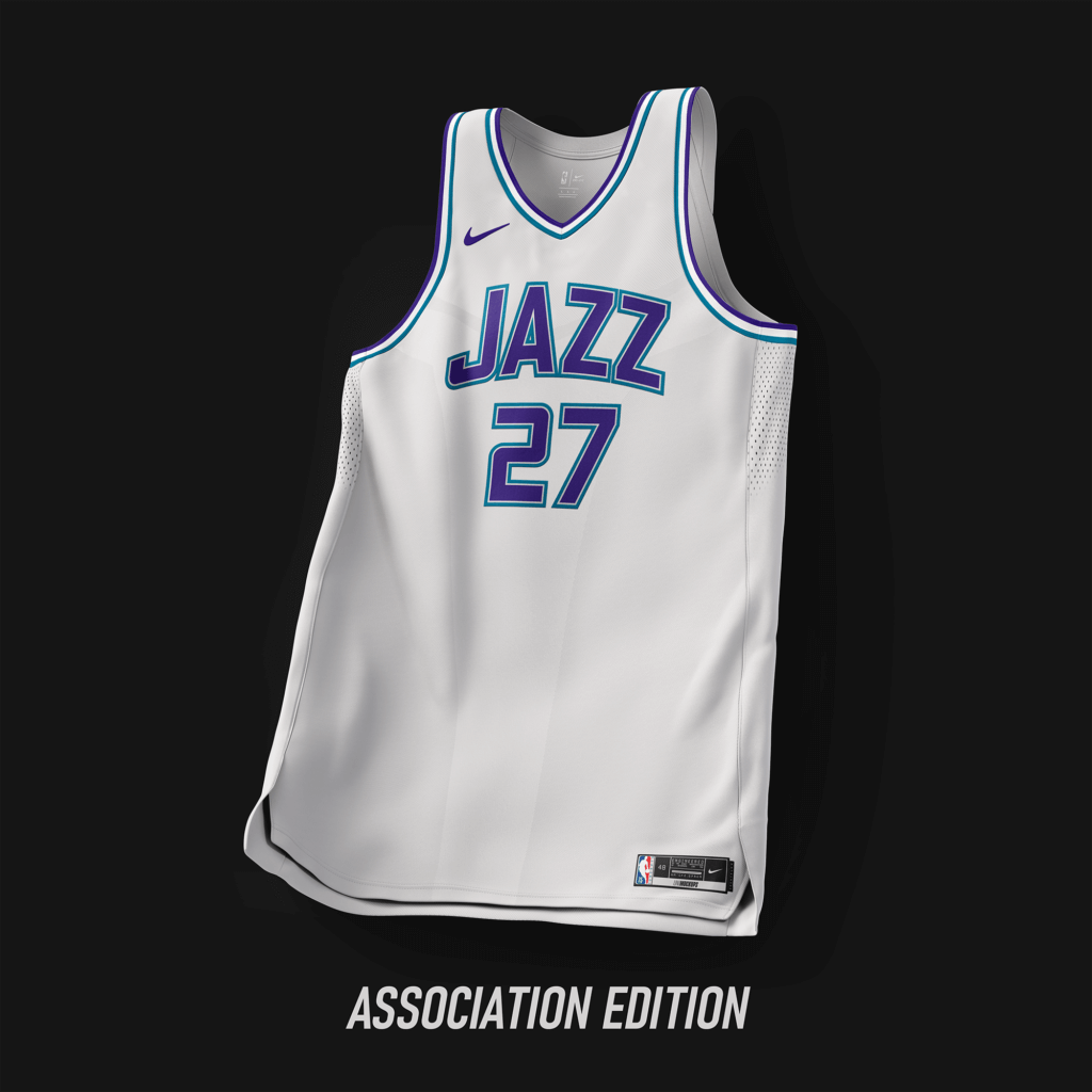
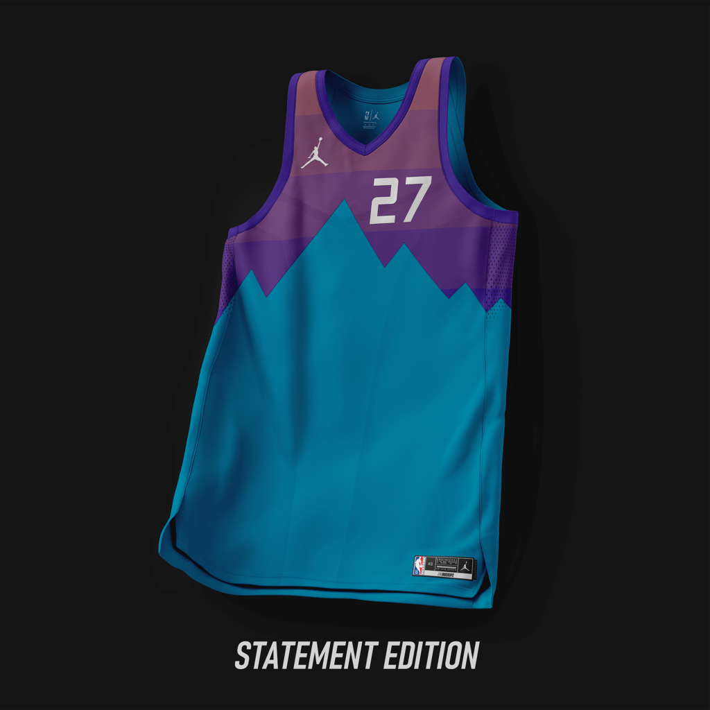
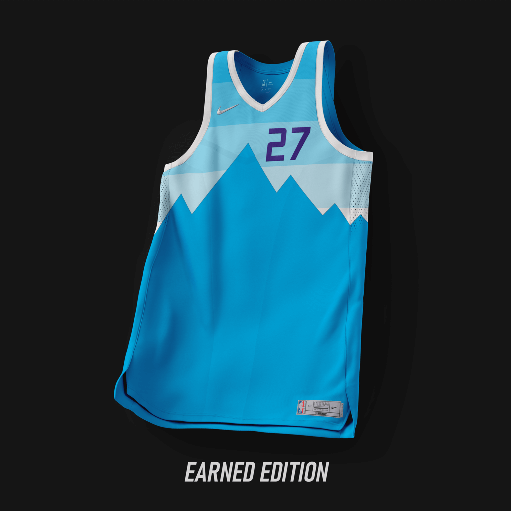
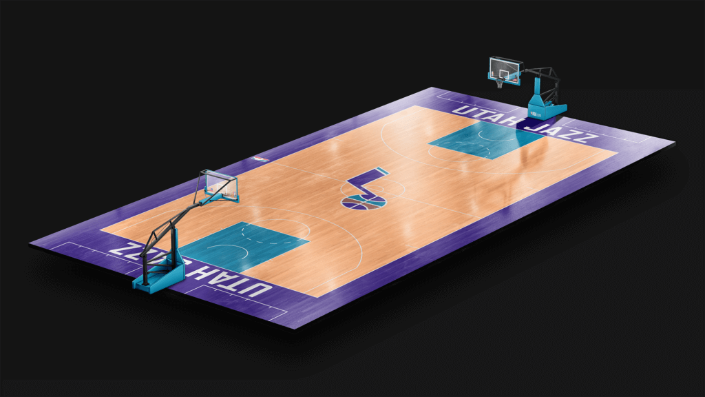
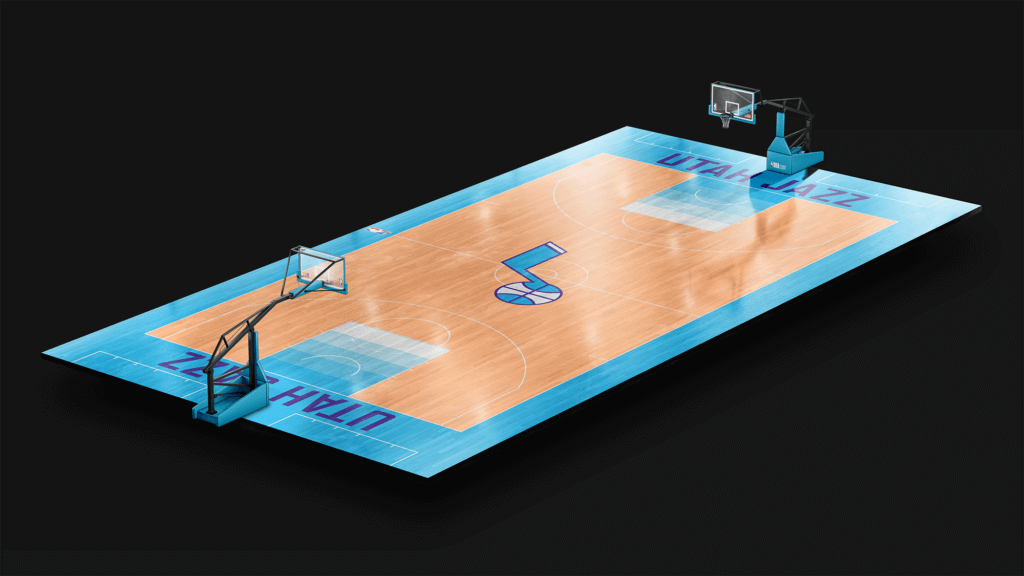
A simple design using the current wordmarks and the purple and teal that the team used from ’96-’04.
Washington Wizards
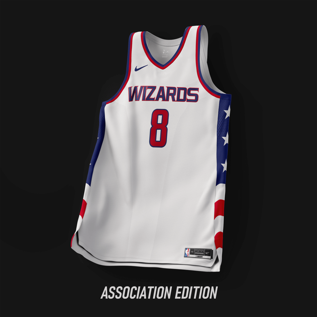
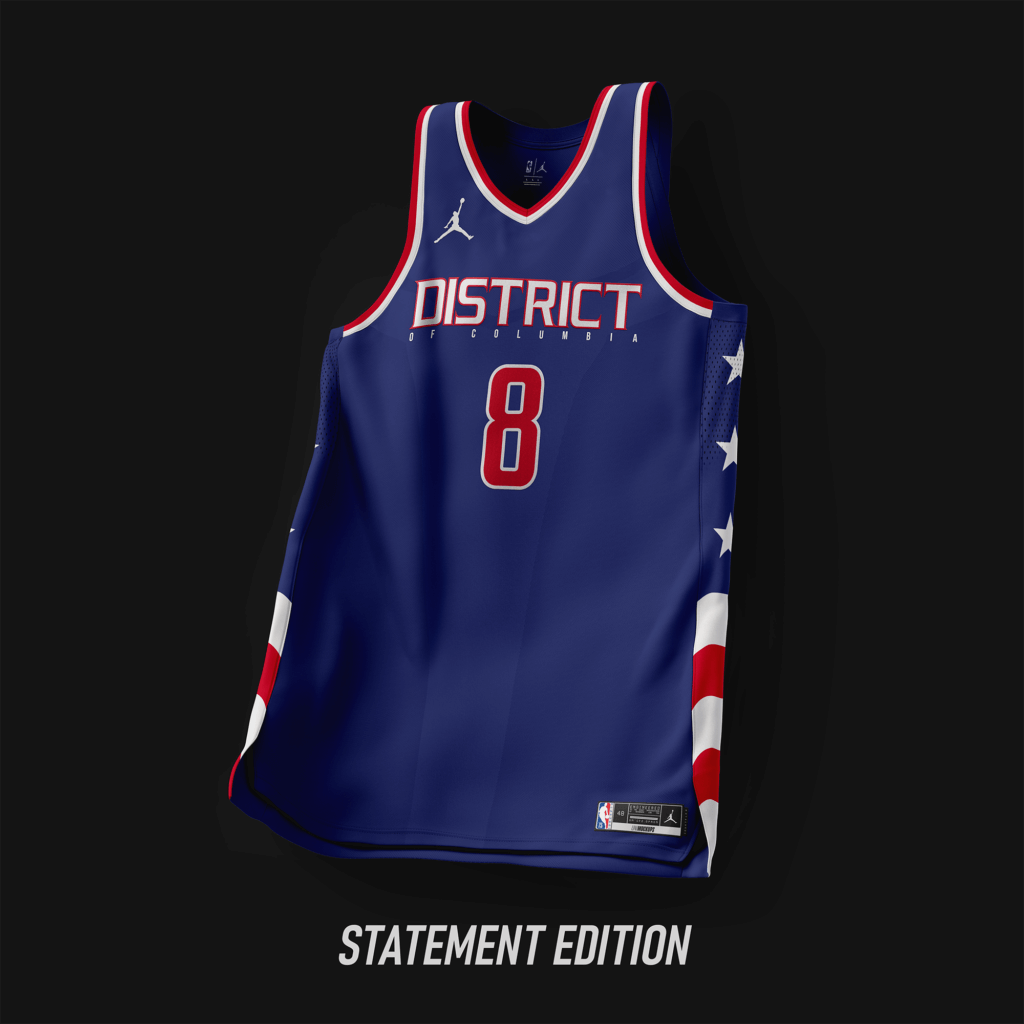
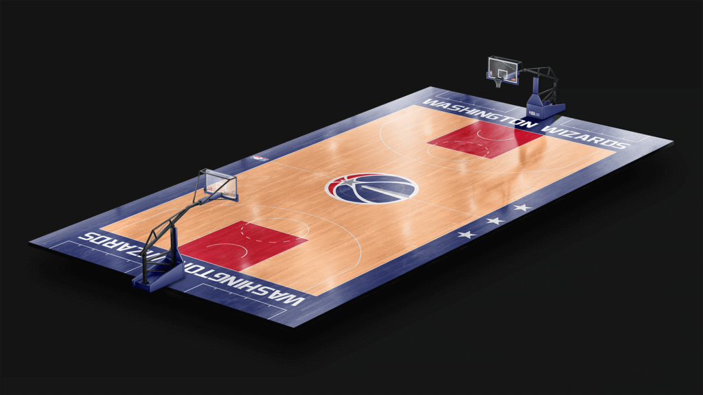
Design based off the Stars and Stripes design used multiple stints. The navy blue was swapped for the deep blue used in the cherry blossom jersey.
All-Star
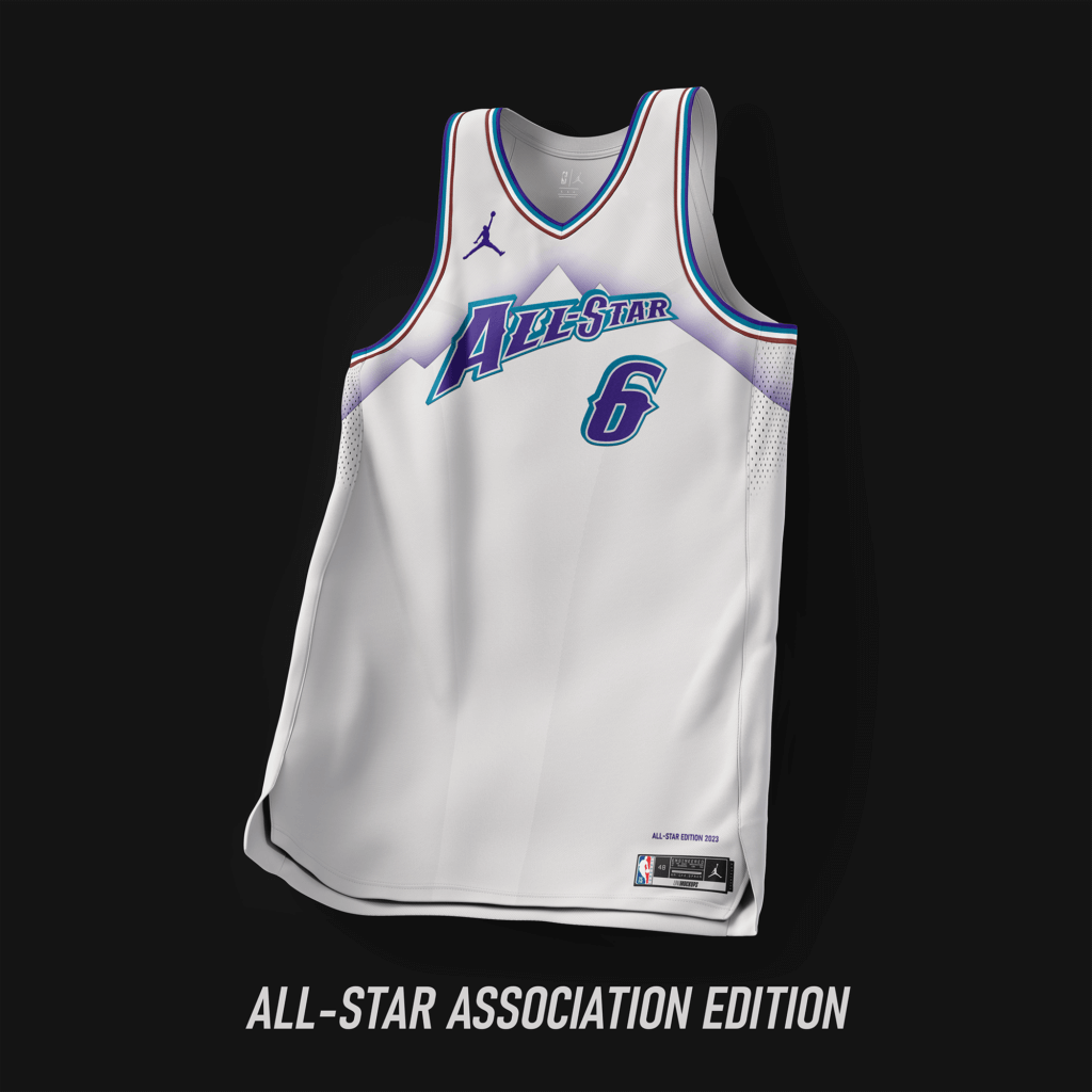
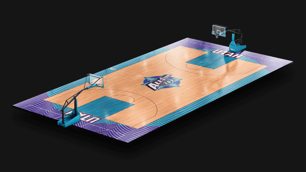
Based off the famous Utah Jazz mountain design used from ’96-’04.
Thanks, Casey! Lots of interesting concepts (and courts!). I enjoyed this one as much as Part I.
Readers? What do you think?


Guess The Game…
from the scoreboard
Today’s scoreboard comes from Tom Watchkin.
The premise of the game (GTGFTS) is simple: I’ll post a scoreboard and you guys simply identify the game depicted. In the past, I don’t know if I’ve ever completely stumped you (some are easier than others).
Here’s the Scoreboard. In the comments below, try to identify the game (date & location, as well as final score). If anything noteworthy occurred during the game, please add that in (and if you were AT the game, well bonus points for you!):
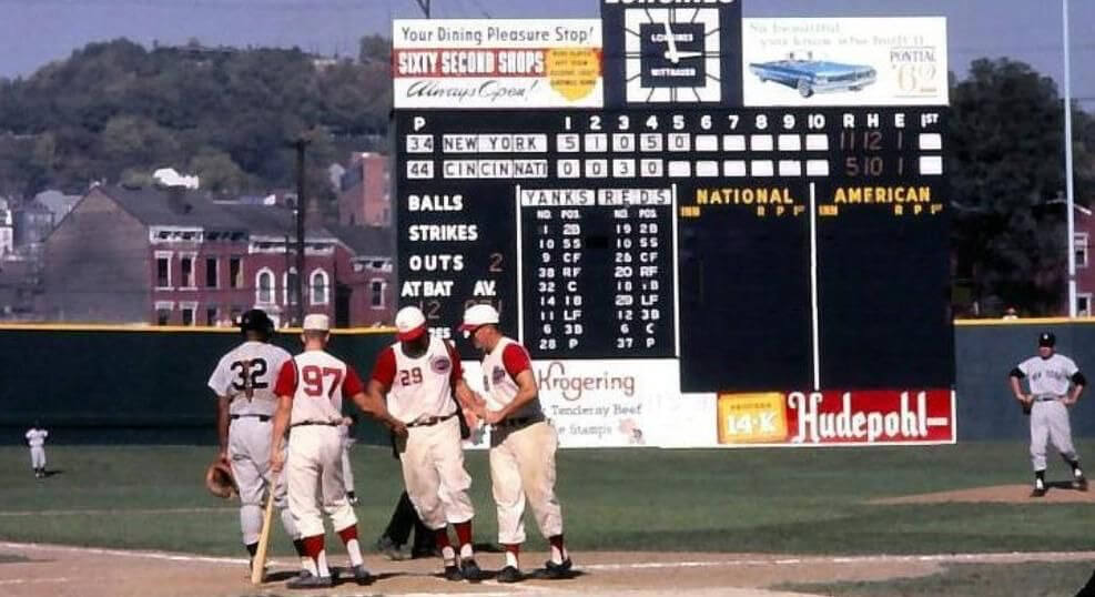
Please continue sending these in! You’re welcome to send me any scoreboard photos (with answers please), and I’ll keep running them.


Click to enlarge
Bulletin reminder: Paul here. In case you missed it on Friday, my latest Bulletin column features really fun interview with MLB pitcher Chris Paddack about his stirrups (some of which are shown above), including info on the high-cuffed role model from his childhood, how he obtains his stirrups, his plans for this year’s designs, and even a stirrups-based charity initiative. He definitely Gets It™!
My premium subscribers can read the article here. If you haven’t yet subscribed, you can do that here (you’ll need a Facebook account in order to pay). Don’t have or want a Facebook account? Email me for workaround info.
Now back to Phil with the rest of today’s content.


Too Good for the Ticker (Part Deux)
In yesterday’s article, Samuel Barrett shared with us a United Airlines ad featuring 20 MLB caps worn during the 1969 season. He followed up with that…with this:
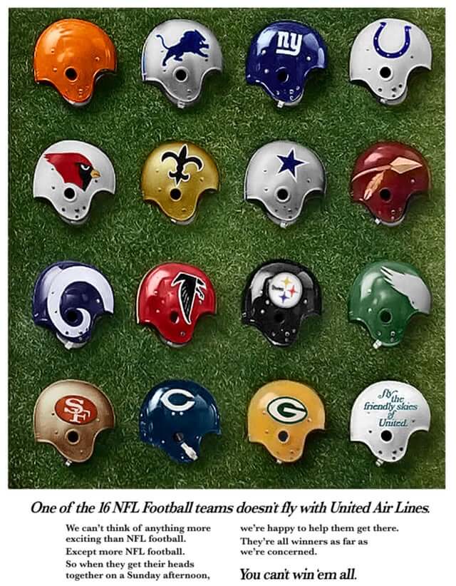
He adds, “I really liked the 1969 Sports Illustrated ad for United Airlines with the MLB caps that was shown in today’s Uni Watch post. I was searching for it online when I came across something similar on Reddit-an NFL equivalent.”
Obviously, this ad was pre-NFL/AFL merger, and one team is missing. WITHOUT cheating, what’s the missing team (in other words, don’t google “NFL teams 1968” or similar to figure out the missing team). It took me a minute…and the answer will make PL happy. Also note that three of the teams pictured above “moved” to the AFC following the merger.


Uni Watch News Ticker
By Phil

Baseball News: Some good news out of Colorado for people who have eyeballs: the Rockies have mothballed the black sleeveless jersey for the foreseeable future, a decision, at least in part, caused by the addition of the soon-to-be-revealed “City Connect” uniforms. … The Tennessee Volunteers debuted a new alternate uniform featuring a BFBS jersey with a huge “VOLS” as their wordmark. … Here’s what looks to be a team-issued Twins Mortal-Kombat-inspired workout shirt (from Caleb Pardick). … Not only do the Oregon Ducks wear the same style numbers on their baseball jerseys as they do in football, they’re just as huge (from anonymous hippopotamus). … The Miami Marlins have created a 25th Anniversary Logo of their 1997 World Series win (of course, they were known as the Florida Marlins then). From Kendrick. It looks like the logo will be worn cap patch on May 15. … Remember the Padres (potentially) leaked City Connect socks? Is it possible Manny Machado is test-running special cleats to be worn with those socks? (from Padres Uni Tracker). … Blue Jays Coach John Schneider’s cap was missing the NE logo yesterday (good spot by Jeff Peters). … Here’s even more on that Orioles Home Run chain (from Marcus Hall). … Have you seen the new “GOATbusters” commercial from DirecTV, featuring HOFers Randy Johnson, Kid Griffey and Big Papi (plus A-rod)? Here. Submitter Robert Brashear adds, “love Mr. Reds as the Pillsbury doughboy….and A-Rod, Griffey, Ortiz and Johnson as GOATbusters.” I caught it quickly yesterday. Interesting uniforms they give the GOATbusters. … Boston College did the camo thing yesterday (from Timmy Donahue). … This Pirates frankenshrisey has elements from four different decades (from Matthew Toy). … This is great! The Tampa Tarpons have released the Official Rachel Balkovec collection (from Lee Wilds).

Football News: Montreal Alouettes QB Vernon Adams Jr. is trading in his jersey number 8 for number 3, a number he wore in college and during the start of his pro career (from Wade Heidt). … The Tennessee Titans have revealed uni numbers for their draft class. … Same for Kansas City. … The NY Giants have given numbers to their entire rookie class, except Kayvon Thibodeaus. … The Atlanta Falcons have also done the rookie number thing. … And here’s the rookie numbers for da Bears. … NY Jets have issued numbers for rooks and more. … Draft class #s for the Seahawks. … The Maize and Blue Review has ranked the logos of the B1G. … NEW YORK Giants first pick Evan Neal didn’t know the team plays in New Jersey. I know this is a “funny” point for some commenters, but the team is NOT named for the state, but for New York City (which is about 13 miles to the east). Nearly a third of the NFL’s teams don’t play in a town that’s in the city they’re named after, so I hope he’s not too disappointed when the learns the Chargers and Rams play in Inglewood, the Commanders play in Landover, Maryland, and the 49ers play in Santa Clara, which is forty-five miles away. … The Washington Commanders have gotten rid of their “cheerleaders”, replacing them with a new gender-neutral dance team. Needless to say, this has pissed off lots of people. … The Denver Broncos are lighting up their stadium in burgundy and blue in support of the Colorado Avalanche’s Stanley Cup playoff campaign (from Kary Klismet). Also posted in Hockey. … U Sports East-West Bowl is a spring all-star game for top Canadian university prospects for next year’s CFL draft. Players wear their school’s helmet but litter it with multiple logos of other schools that are their rivals (from Wade Heidt). … Here’s a neat thread of Buffalo Bills AFL programs through the years (from BillsVHS). … Yes, kids, there was a time when the NY Giants, Cleveland Browns, St. Louis Cardinals and Pittsburgh Steelers were in the same division in the NFL. And for one year, the Capitol Division featured the Cowboys, Eagles, Washington and the New Orleans Saints, but not the New York Football Giants (both from Michael MPH).

Hockey News: The Denver Broncos are lighting up their stadium in burgundy and blue in support of the Colorado Avalanche’s Stanley Cup playoff campaign (from Kary Klismet). Also posted in Football.

Soccer News: NWSL expansion side San Diego Wave FC have revealed the first look of their primary jersey for the rest of the 2022 campaign. … Lots of Claret in this Burnley v. Aston Villa match (from Jay Es). … Parish Athletic Club, a new team in USL2 based in Baton Rouge, will play their first match Sunday on the road. Submitter Mark Jones adds, “Yesterday they released the first look at their primary away kit. Primary logo here.”

Grab Bag: Peter Moore, a “force” in the 1980’s sneaker revolution, has died NYT link. From Tom Turner. … Reader Tim McKay writes, “My buddy used the Oilers logo for a select lacrosse team his son plays in here in Texas. Thought it turned out pretty neat.” … Lucknow Super Giants, one of the two new franchises in IPL 2022, wore special jerseys on Saturday against Kolkata Knight Riders, featuring their mother’s names as NOB.


Uni Tweet of the Day
See Eagles and Commanders? Not all alternate helmets need to be black…
What do you guys prefer If the 49ers eventually go with alternate throwback uniforms?
1960's (Kittle) or 1950's (Deebo) pic.twitter.com/I83f0kjwRh
— …. …. (@JayKnight9383) May 7, 2022


And finally… that’ll do it for today, and for me for this weekend. Big thanks (again) to Casey for sharing his NBA Refresh concepts.
Everyone have a wonderful Mother’s Day (enjoy all the gray caps in MLB today!) and a better week, and I’ll catch you here again next weekend. Till then,
Peace,
PH
The missing team on the United ad is the Vikings.
No wonder I couldn’t guess it. I was thinking about a current NFC team.
The scoreboard is from Crosley Field, Game 5 of the 1961 World Series, October 9, 1961. Yankees won the game 13-5 to take the Series 4-1.
I’m fascinated by that number 97 in the photo. Is he a bat boy? Was it normal to put “real” (but weirdly high) numbers on bat boys’ backs in those days? I had always imagined them wearing blank-backed jerseys.
Yeah, definitely a bat boy. Some teams assigned them in the upper 50’s, 60’s or just “BB.” But in this photo it’s hard to say whether it’s a bat BOY or an adult assistant filling in. Remember, bat boys had school! We’d assume they got to take the day off for the World Series, but who knows?
I really like that sky-blue Jazz jersey from Casey, with no team or city name on it. So clean. I hope it has only a number (no NOB; no silly patches) on the back too.
It is a gorgeous jersey. I would’ve preferred it with a team name myself. The baby blue Jazz court is gorgeous.
It says a lot that even with someone as talented as Casey coming up with concepts, OKC is beyond help. They are seriously more in need of a total rehash of colors/logo/wordmark than any professional franchise in history.
Marlins need to go back to the 90’s black and teal look and scrap the eyesores they have now
Heck, I’d settle for these:
link
There are two World Championships in those uniforms. That’s enough pixie dust for me!
I love the Sixers jerseys I would pay to get those but especially the red one, as far as the eagles go with the alternate black helmets I would say it’s a welcome addition but also can’t wait for the Kelly green jerseys
The “Pillsbury doughboy?” Mr. Brashear, please go re-watch the movie.
Thank you. I was coming in hot ready to go; “Do I really have to be the first one to say this?”
A twist for the 49ers throwback tweet: which would you choose IF YOU SWAPPED THE TWO HELMETS?
I believe the photo with the NFL helmets has come up before and the Vikings were missing because they flew with another airline. I feel like it was Pan Am or TWA.
Kris correctly identified the game, when the Yankees broke my 8-year-old heart. Even more significant, for me, is that all of the scoreboard adverts? Painted by my sign painter father, who redid all the Crosley signs for the World Series.
The scoreboard, at least, must be a nice memory.
My guess would be what was then known as Northwest Orient, which had its hub in Minneapolis
Great stuff, Casey. I think I’d rather see all of these teams go with your designs than what they have now.
Not sure if this was intentional, but the circle patterns on the Pels’ jerseys remind me of Mardi Gras beads. A nice touch.
I remember seeing that United Airlines ad as a kid and figuring out back then that the missing team was the Vikings. The memory is so vivid that as soon as I saw this image and before I even noticed the text that points out that a team is missing I was confirming my memory that the Vikes had been left out of the ad.
Pels? Does anybody call them the Pels?
In doing jersey concepts, I always look to give teams a personality or a character – something unique to them. I don’t think the Orlando Magic’s uniforms have ever had a personality since getting rid of their original pinstripes. They’ve always just been “there.” These wordmarks with the stars are a step in the right direction.
The Court designs were fantastic. The jerseys had some really beautiful elements, but were a little minimalistic for my liking.
Nearly a third of the NFL’s teams don’t play in a town that’s in the city they’re named after(.)
The rules are simple: A team is named after the nearest metropolitan area. This boosts the team’s cachet and gives them leverage when charging for ads, etc. It also encourages fans from said metro area to wear the team’s apparel. The first teams to break this rule were the Vikings and Twins because Minneapolis/St. Paul has always come as a package deal, and for economy’s sake the teams chose the state name, learning at the same time they could broaden their appeal to a statewide base.
This has led to some ticklish situations, such as the Dallas Cowboys now playing in Arlington, Texas; a city more apt to associate with Fort Worth than Dallas.
Yes, kids, there was a time when the NY Giants, Cleveland Browns, St. Louis Cardinals and Pittsburgh Steelers were in the same division in the NFL.
Who among us hasn’t doodled football divisions *strictly* determined by geography? There are three teams in Florida playing in three different divisions. I know why Dallas is in the same division as the Giants, Commanders, and Eagles: the four owners want it that way. The governing principle ought to be placing teams that share a metropolitan area in opposite conferences.
Giants–Browns and Browns–Cardinals were rivalry games; Steelers–Giants rivalry and family ties. Steelers–Browns Turnpike Rivalry of course.
Awesome job on the NBA uniform designs. Love the Milwaukee Earned, Milwaukee Statement, Kings set, and the San Francisco script on the Warriors concept. Great work.
A site that has long railed against jersey ads shouldn’t post concepts that feature jersey ads.
A lot of hit and miss in the NBA concepts, but that is a matter of personal taste. What I really like are the sets for Milwaukee, New Orleans and Phoenix, what I really do not like are Portland, Utah, Sacramento and Golden State. Too bad shorts are not included for a total look. The courts all look allright, except for Minnesota (too much green, not enough blue). The execution of these concepts is flawless. Great job!