Click to enlarge
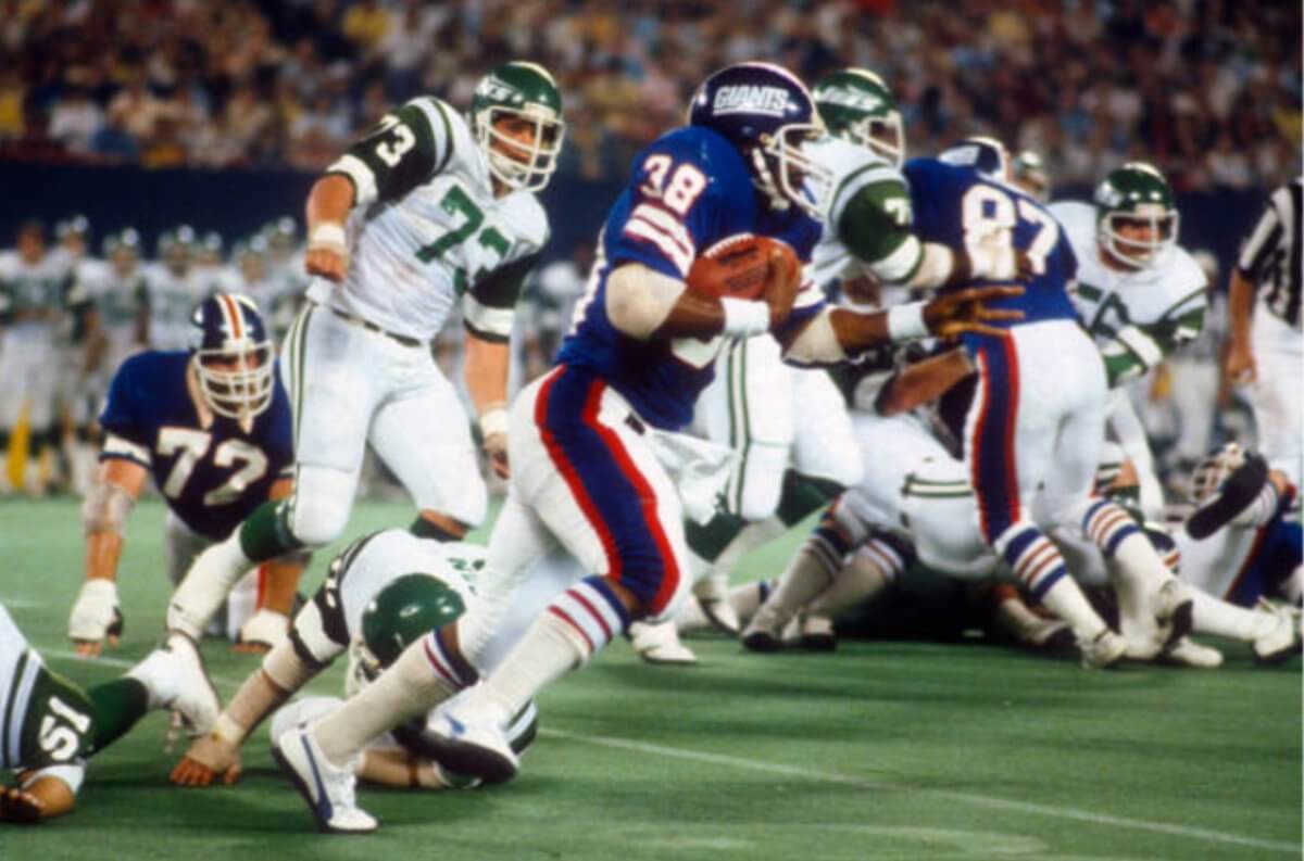
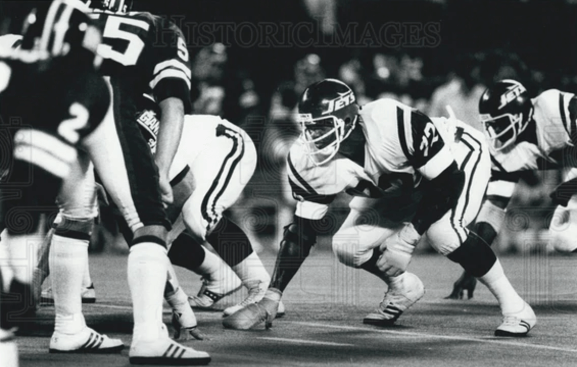
1978 was the year that the Jets changed from their Namath-era uniforms to the New York Sack Exchange design. But during the ’78 preseason, they wore a strange hybrid uni combo featuring the new helmet with the old jersey and pants. The mighty Gridiron Uniform Database shows this combo (one of the many great things about the GUD is that it shows preseason-only unis like this one), but I don’t recall seeing a photo of it until reader Adam Kanter pointed me toward the photo shown above. You can see more pics from this game — all black-and-white, unfortunately — here.
I went looking for pics from other ’78 preseason games and found these:
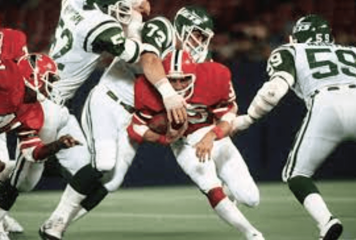
An interesting look!
Click to enlarge
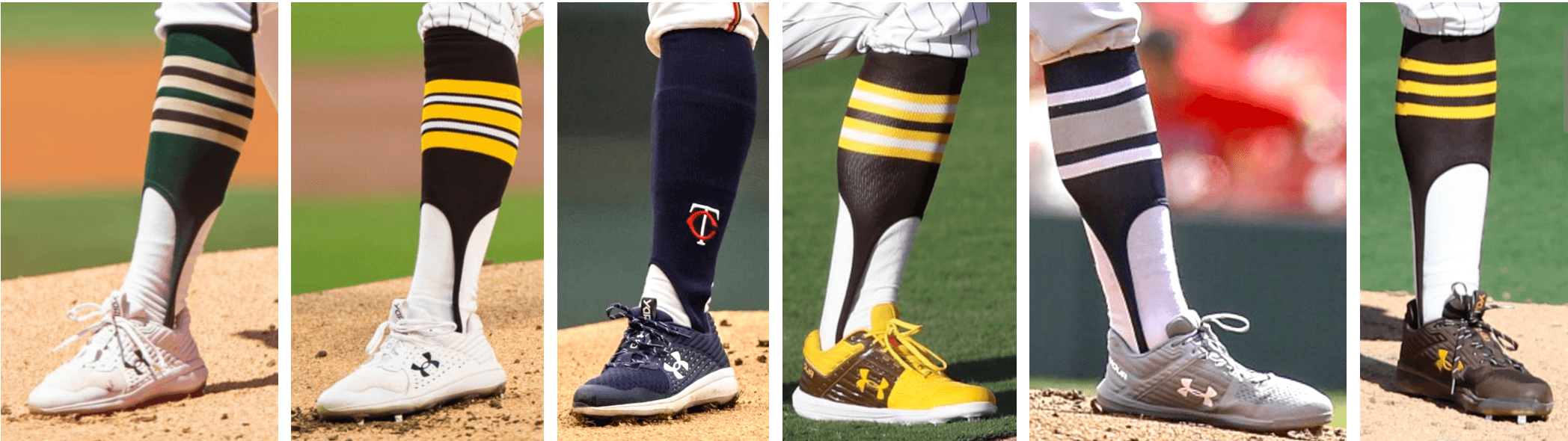
ITEM! New Bulletin column: What you see above is a small sampling of the stirrup designs that pitcher Chris Paddack has worn during his short MLB career. For my latest Bulletin column, I have a really fun interview with him about his hosiery habits, including info on the high-cuffed role model from his childhood, how he obtains his stirrups, his plans for this year’s designs, and even a stirrups-based charity initiative. He definitely Gets It™!
My premium subscribers can read the article here. If you haven’t yet subscribed, you can do that here (you’ll need a Facebook account in order to pay). Don’t have or want a Facebook account? Email me for workaround info. Thanks!
That’s a mouthful: If you watch closely in the first few seconds of the video embedded above, you can see that something popped out of Mets reliever Edwin Díaz’s mouth as he celebrated getting the final out against the Phils last night.
That was Díaz’s gum. Here’s a closer look:
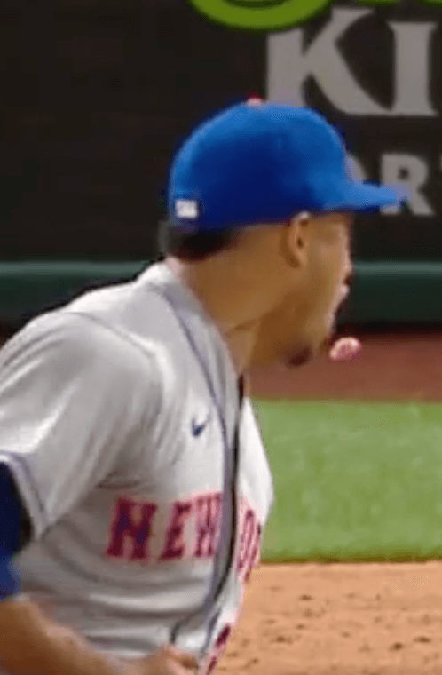
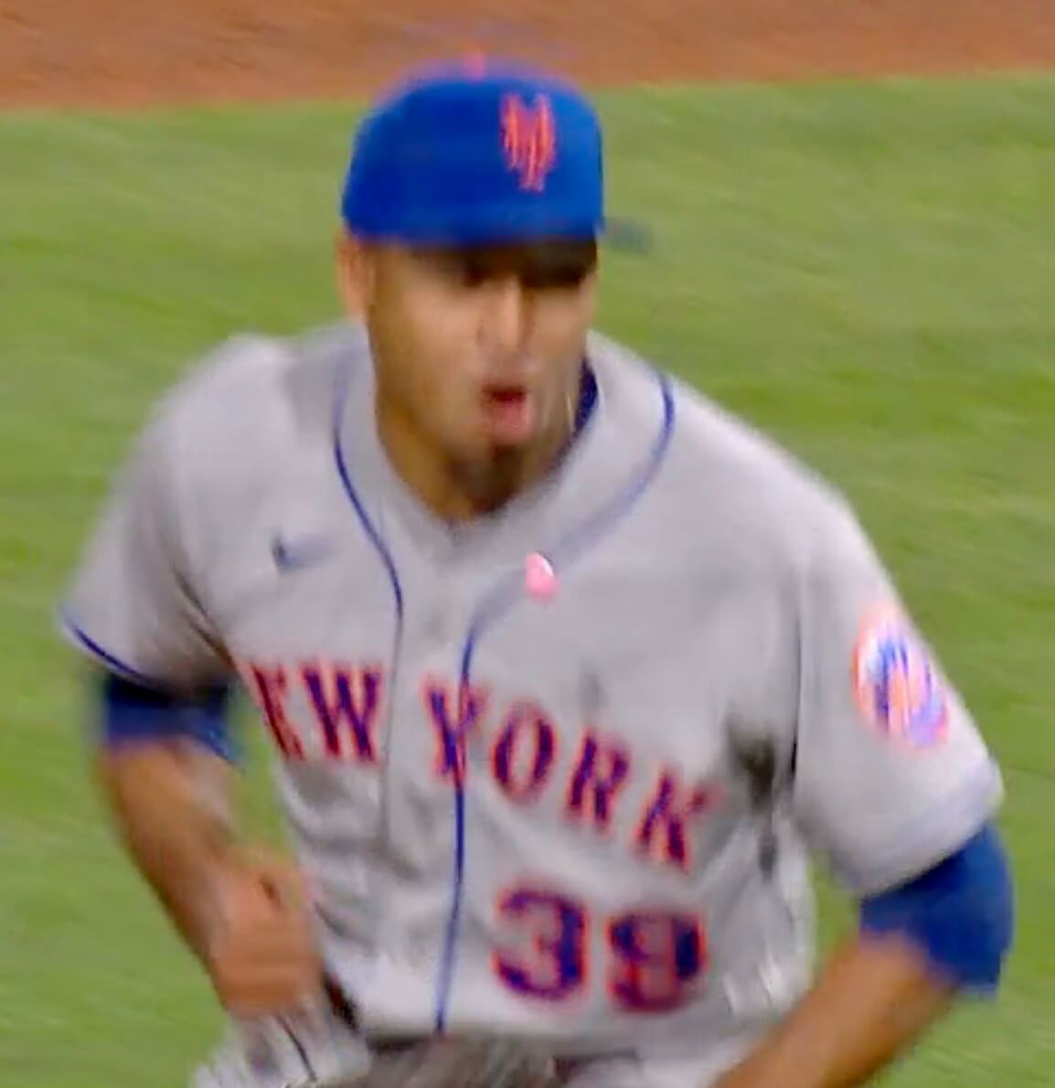
I don’t recall ever seeing anything quite like that before!

Culinary Corner: Tomorrow is the first Saturday of May, which means it’s time for the Kentucky Derby. And that means I’ll be making the dish I always make for the Derby: a derby pie, which is a lot like a pecan pie but made with walnuts and chocolate chips.
Derby pie is super-delicious and easy to make. Here’s how to do it:
1. If you know how to make pie crust, make some dough and position it in a 9-inch pie pan; if you don’t know how or just can’t be bothered, get yourself a frozen 9-inch pie shell.
2. Set your oven to 350º. While it’s heating up, get a big mixing bowl and beat together four eggs, a cup of light corn syrup, 3/4 cup of light brown sugar, and 1/3 cup of melted butter. Then add 3 tablespoons of bourbon (or maybe a smidge more than that, if you’re so inclined), a tablespoon of vanilla extract, a tablespoon of flour, 6 ounces of chocolate chips, and a cup of chopped walnuts.
3. Mix all of that together, pour it into the pie dough or frozen shell, and pop it into the oven for an hour. It’ll puff up high like a soufflé, but it’ll settle back down while it cools, which you should allow it to do for an hour or so. This up/down motion usually results in some cracks in the top of the pie, which used to annoy me, but now I’ve grown to like it:
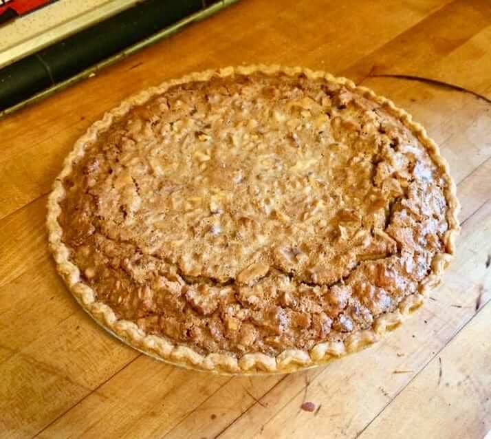
For reasons that aren’t entirely clear to me, the chocolate chips always sink to the bottom (I guess they’re less buoyant than the walnuts), resulting in a nice two-tone effect:
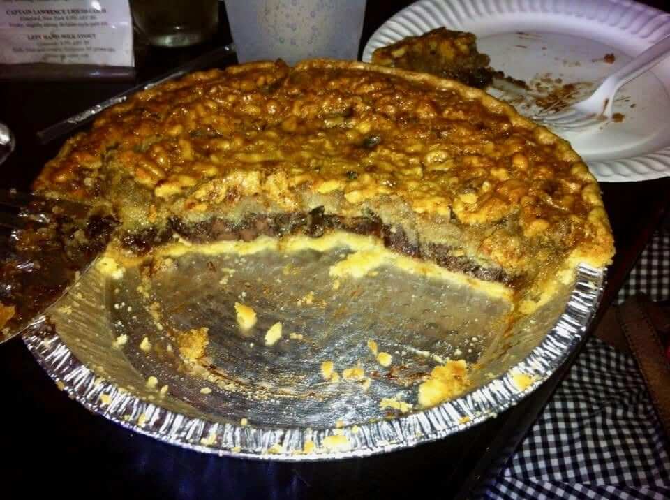
It’s traditional to serve each slice with a dollop of whipped cream, although I don’t bother with that — the pie is rich enough on its own. Less traditional and even less necessary, but nonetheless delicious, is this bourbon sauce, which is pretty much the bomb.
Trust me, there won’t be any leftovers.
Uni Watch News Ticker
By Anthony Emerson

Baseball News: The Giants wore their “Gigantes” jersey last night for Cinco de Mayo (thanks, Brinke). … During yesterday afternoon’s Angels/Red Sox game at Fenway, Shohei Ohtani lined a base hit off of the Green Monster’s scoreboard, causing his own uni number slab to fall down (from @TJMtoWit). … The Pensacola Blue Wahoos, Double-A affiliates of the Marlins, are offering fans a chance to design a jersey, provided they drop $200 on an official entry form. Each Blue Wahoos player will wear a different, fan-designed jersey for the game on Aug. 13 (thanks, Phil). … It’s fairly common to see teams in amateur and semi-pro levels poaching logos from pro teams. But the Alaska-based North Pole Patriots baseball team combined the Columbus Blue Jackets logo and New England Patriots logo into their mark!

NBA News: Next season marks the Spurs’ 50th anniversary, and rumor has it that throwbacks and a one-off game at the Alamodome are in the works (thanks, Phil).

Soccer News: In 1986, Argentina had to scramble to come up with a new alternate kit after the ones they brought to Mexico for the World Cup were inadequate (from @texastrevor). … USL League 2 side Springfield ASC have unveiled their new, fan-designed alternate kit (from @sportsball_420).

Grab Bag: McLaren F1 driver Lando Norris is going with a really cool basketball-themed helmet for this weekend’s Miami Grand Prix (from multiple readers). … Alpine F1 driver Fernando Alonso is also going with a one-off helmet design that’s much more Miami Vice than Miami Heat.
That’ll do it for this week. Stay well, enjoy Phil’s weekend content, and I’ll see you back here on Monday. Peace — Paul
The North Pole Patriots link is not working properly
Fixed.
Small but substantive correction — the North Pole Patriots are actually a high school in Alaska, not an amateur/semi-pro baseball team. The logo linked to in today’s ticker is for the hockey team (the Blue Jackets connection makes more sense):
link
The football team has a rich history of ripping off the Pats, note the use of Pat Patriot here:
link
The North Pole baseball team actually deserves credit for trying to be original:
link
Looks like Jets va. Falcons isn’t at Shea or AFC stadium – maybe Giants Stadium?
I looked it up on the GUD and they do list this game as being at Giants Stadium. Also it’s a matchup of both teams wearing uniforms they would no wear in the regular season as 1978 was also the year that Atlanta changed to the silver pants uniform- the silver pants uniform debuted in their 3rd preseason game (the first one on Atlanta that year).
The GUD does make the note that the Jets-Falcons preseason game was played in East Rutherford. Amusingly, they played the Giants there the next week.
What’s interesting is that the preseason game was not moved because of a same-day conflict with the Mets – that was an off-day between stops in St. Louis and Montreal. And the schedule was worked so the Jets’ first few home games at Shea would be when the Mets were on the road.
But then I look at the 1977 Jets page on the GUD, and find that in their seven(!!)-game preseason schedule (which included the Hall of Fame Game in Canton to start), they played two “home” games at Giants Stadium, and the other four were on the road. Then, they played their first regular-season “home” game on September 25th at Giants Stadium. In this case, there was a schedule conflict with the Mets, though it was apparently a rainy weekend, as their Saturday and Sunday games with the Cardinals were made up as part of a pair of doubleheaders at their season-ending series at Busch Stadium.
Further looking into the GUD, it seems the Jets played all their “home” preseason games from 1977-1983 (with the exception of the aforementioned 1977 HoF Game) at Giants Stadium: two in 1977, and one each year afterward through 1983. Before that, they played three “home” games at Yankee Stadium in 1976 (the Giants only played one game there that year, as the road team against the Jets!), one “home” game at the Yale Bowl in 1975 (against the Patriots – oddly enough, it’s the only game that preseason that the GUD doesn’t have uni data for), and six games as the road team against the Giants at Yale between 1969 and 1975. Otherwise, they were the road team at their opponent’s stadium, or playing in neutral site games. A *lot* of neutral site games, especially in the AFL years.
That data reveals that the Jets never played a single preseason game at either the Polo Grounds or Shea Stadium. Their first home preseason game in their actual home stadium was in their first year where Giants Stadium was their home, and they’d already been playing their preseason home games there for the previous eight years!
That Jets/Pats game was cancelled due to the Patriots players going on strike.
Ah, so then they only played two games that year. Thanks for the info.
It’s crazy, given a slow day today, I’ve been going down a rabbit hole, as I’ve ended up looking up info on the Polo Grounds for the last bit!
The Mets didn’t use to allow the Jets to play at Shea while the baseball season was on.
From 1978: link
“The Jets will be playing home games in Shea Stadium this season before all the leaves fall in nearby Flushing Meadow Park or before ice forms on Flushing Bay. The National Football League’s schedule, officially announced yesterday, has the Jets playing three home games at Shea in September and October. This will be the first time the Jets will play at home before baseball’s regular season ends. A fourth game will be.played at Shea before the World Series begins.”
I kind of figured it was something like that.
Today’s Uni activity is totally scratching my itch. First, thanks so much for the Jets info. Like you, I’d never seen photos of this combo. I wish they had adopted that look permanently. I’ve said it many times, that jersey was really unique (those sleeves with a stretched out Northwestern stripe with the numbers in it) and should never have been changed (either time). I know the loss of sleeves in general makes it hard to pull off today though. I like the green helmet look, but both the Sack Exchange logo and the current logo are so f’ing boring, given all the opportunities you have with a team called the Jets. That Sack Exchange era was successful for a few years, but the uniforms they adopted were a snooze fest, and when you only have green and white to work with, well, a little extra design creativity would have been nice. For a long time I hated living in an area where the two teams couldn’t come up with helmet logos any better than “Jets” and “Giants” spelled out. Didn’t help that for most of that time, they both sucked.
That Bulletin article totally rocks as well. Loving all the stirrup details. Chris Paddack sounds like a really funny guy from the text. Glad he was willing to chat with you. Also, kudos to him for the raffle idea. Like, how many stirrups does a guy need? Wonderful idea.
Thanks Paul!!!!!
Thank YOU for that, Tim — feels good to know Uni Watch is giving you a good start to your Friday!!
It actually wasn’t a bad look for the Jets.
I’d go so far as to say it might be their BEST look
I believe I brought this Jets thing to someone’s attention a link, link ;)
It’s actually not a bad look. Certainly better than what they have now.
I certainly remember seeing a Ticker item or 2 mentioning that combo, but can’t say I’ve ever seen a color photo.
As an aside, the derby pie is the real McCoy. It completely slipped my mind that the race is tomorrow…thank you Paul for the reminder and the recipe!
I have a favorite “new Twin” now! Loved the interview with Chris Paddack and the connection to Comrade Robert Marshall’s Uni Watch stirrup club with TCK! Very pleased to be a member of that community as well as the over all Uni Watch comm-uni-ty!
In my scorebook (an Eephus League book, dontcha know), my lineups always include an HS designation for high socks or HS/S for high sock/stirrups. There can’t be too much detail in a baseball scorecard, right? Thanks Paul!
Mike, fellow Eephus League scorer here (I bought what should be a lifetime supply of books years ago) and I don’t mark high socks. But I will going forward. Thanks for the suggestion! My scorekeeping quirk is that I use $ or rarely multiple $ or $! to mark particularly good plays. Usually defensive, sometimes baserunning. Basically, anytime my dad would have nodded and muttered, “That’s good baseball” when we would watch a game together on TV, I mark the dollar sign.
Dollar signs are a great idea. My wife usually has no rooting interest, but wants to see good plays. “Why are you making so much money?” she’ll ask. I’ll use !, too, but I may also underline who made a great play. Third baseman makes a great stop to throw someone out, 5 gets underlined in the 5-3 notation. Ditto if the first baseman digs it out, he gets the 3 underlined.
I’d like the Pensacola Blue Wahoos to look like this:
link
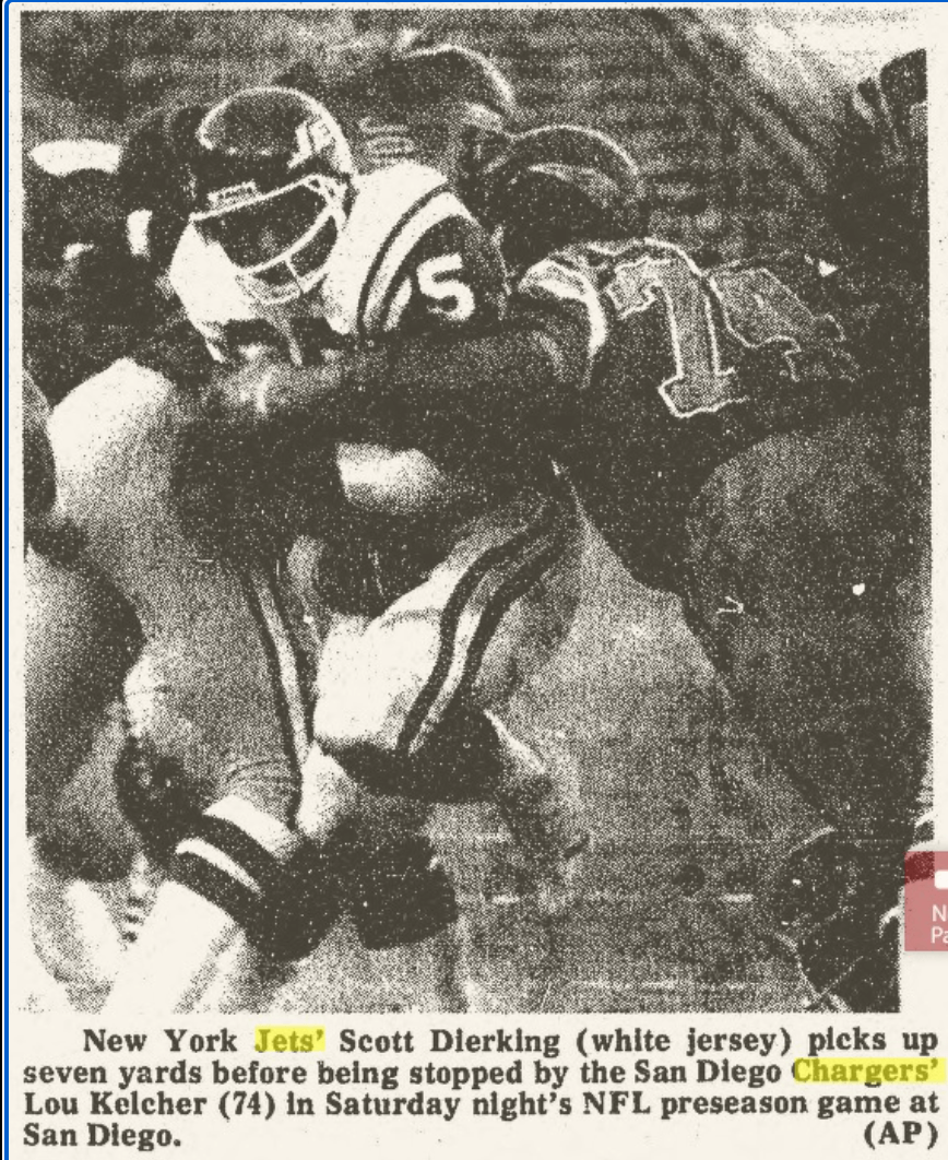
Maybe “supply chain issues” for why the Jets wore those jerseys?
Fun fact: when Metlife stadium was being built, the Jets threw a MASSIVE hissy fit about the color of the seats, I mean big enough that they threatened to pull out of the deal to play there, until the Giants patted them on the head and said, “Fine you can have your dopey seat color,” and as a result instead of the stadium having blue and red seats like Giants Stadium, they have the gray-black ones
Back then teams would sometimes wait to debut new uniforms until the regular season. I’m sure that’s why the Jets went with this look- but with the color change to the helmets they wound up with this hybrid look.
That Jet look is flawless.
Also the only time you’ll see “Jet(s)” and “flawless” in the same sentence.
Re: the floating gum.
A couple of weeks ago, a CBS soccer pundit named Micah Richards was caught cheering whilst eating pencil points. One of them flew out of his mouth and he caught it again.
link
As to the Spurs 50th Anniversary uniforms…Gervin era, diamond sided shorts…YES, YES, YES!!!
Both the Jets and Giants look AMAZING in that photo. I wouldn’t complain if they both adopted that look full-time, but perfection would be white-with-red-outlined “NY” on the Jints’ helmet, and the 1998 Jets logo floating on the sparkly 2019 helmet. Good luck getting the sleeves big enough for the numbers to fit on the green field, though.
Ditto for the Falcons/Jets photo.
Red helmets, jerseys and sock tops, white facemasks, sleeve numbers, no silver…arguably their best look.
I hope the Jets do throwback to the Sack Exchange someday.
Sure, the sleeve stripes will probably have to be sacrificed/truncated but there’s lots of real estate for accurately-sized shoulder numbers.
Boththe Jetsand Giantslook AMAZING in that photo.Fixed.
That is probably the Giants’ worst ever look. You and Jimmer Vilk may disagree, but you’d be wrong ;)
Yeah… those Giants uni’s are awful. It looks like they forgot their pants and replaced them with old Winnipeg Jets jerseys.
That first 1978 preseason game vs the Jets is also the last time the Falcons wore that uniform. They wore the old all white for the second game against Washington and then debuted the new red uniform with silver numbers and gray pants on preseason game three vs the Eagles. And promptly lost 24-7. Man, the clutter in my brain!