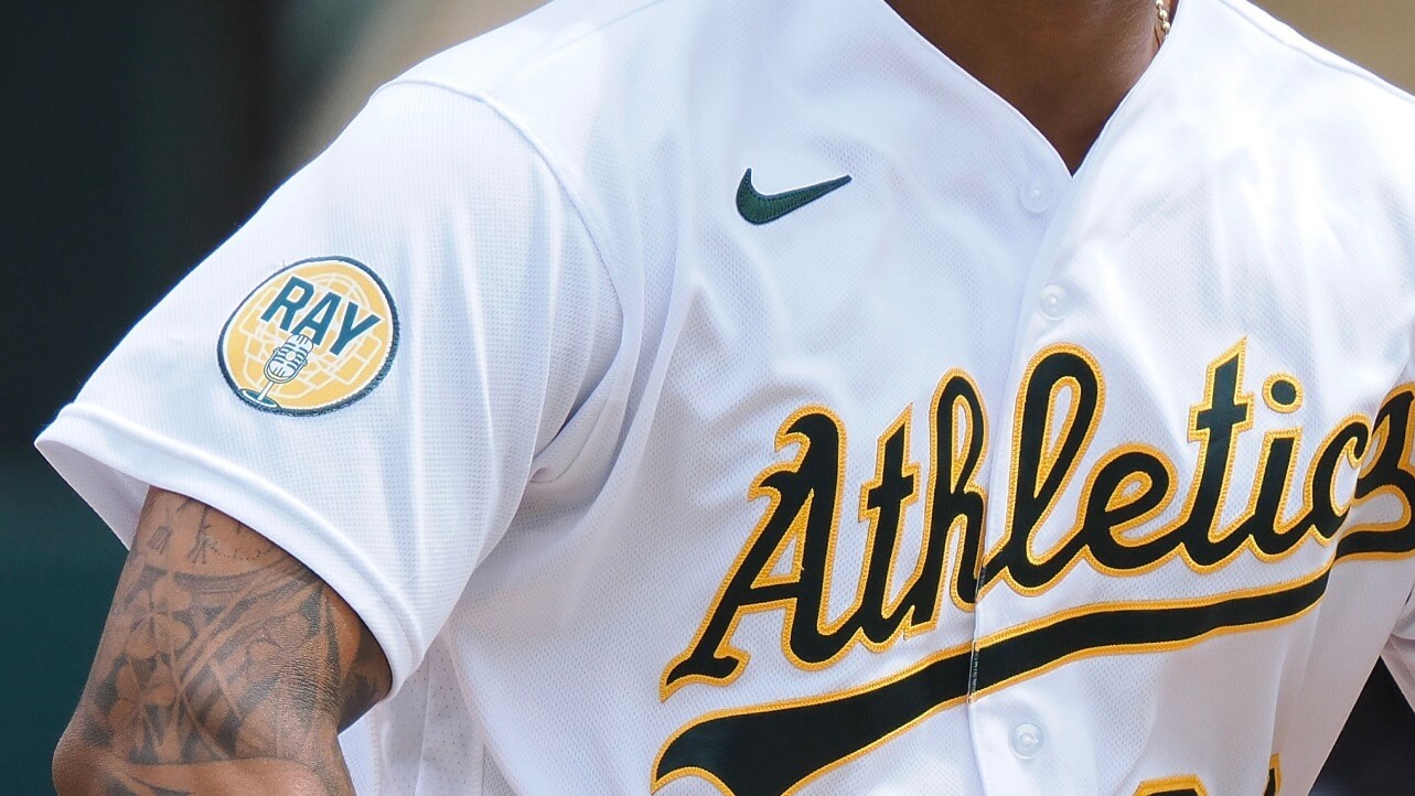
Photo by Kelley L. Cox, USA Today Sports; click to enlarge
Last Friday I wrote about the old-timey microphone on the A’s memorial patch for Ray Fosse. One of the responses I received on social media came from a guy named Clint Schultz, who identified himself as the patch’s designer.
I went to Schultz’s website and discovered that he mostly does design work for big-budget Hollywood movies. How did he end up doing the Fosse patch? I was intrigued, so I asked if I could interview him. We spoke this past Sunday via Zoom, where, like any good A’s fan, he greeted me with the Oakland Coliseum represented on his head and as his backdrop:
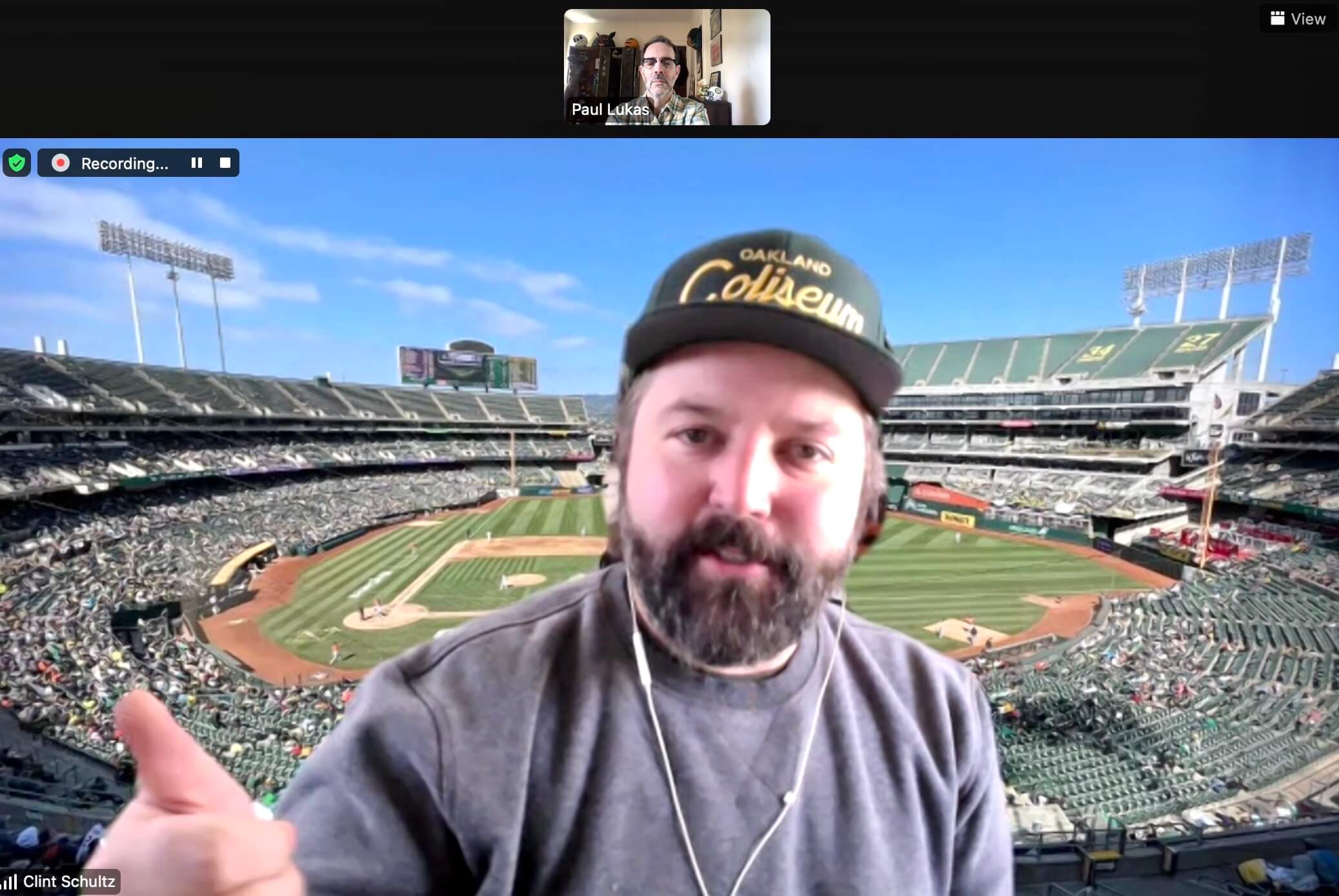
(If you look closely, you can see that I was wearing a green/yellow plaid shirt — A’s colors — but I didn’t do that intentionally. I just have a lot of green plaid shirts.)
We talked about a bunch of really interesting stuff before I got around to asking about the microphone. Here’s a transcript of our chat, edited for length and clarity.
Uni Watch: You’re a graphic designer for movies, right?
Clint Schultz: Yes, since 2001.
UW: Have you ever designed sports uniforms for a movie?
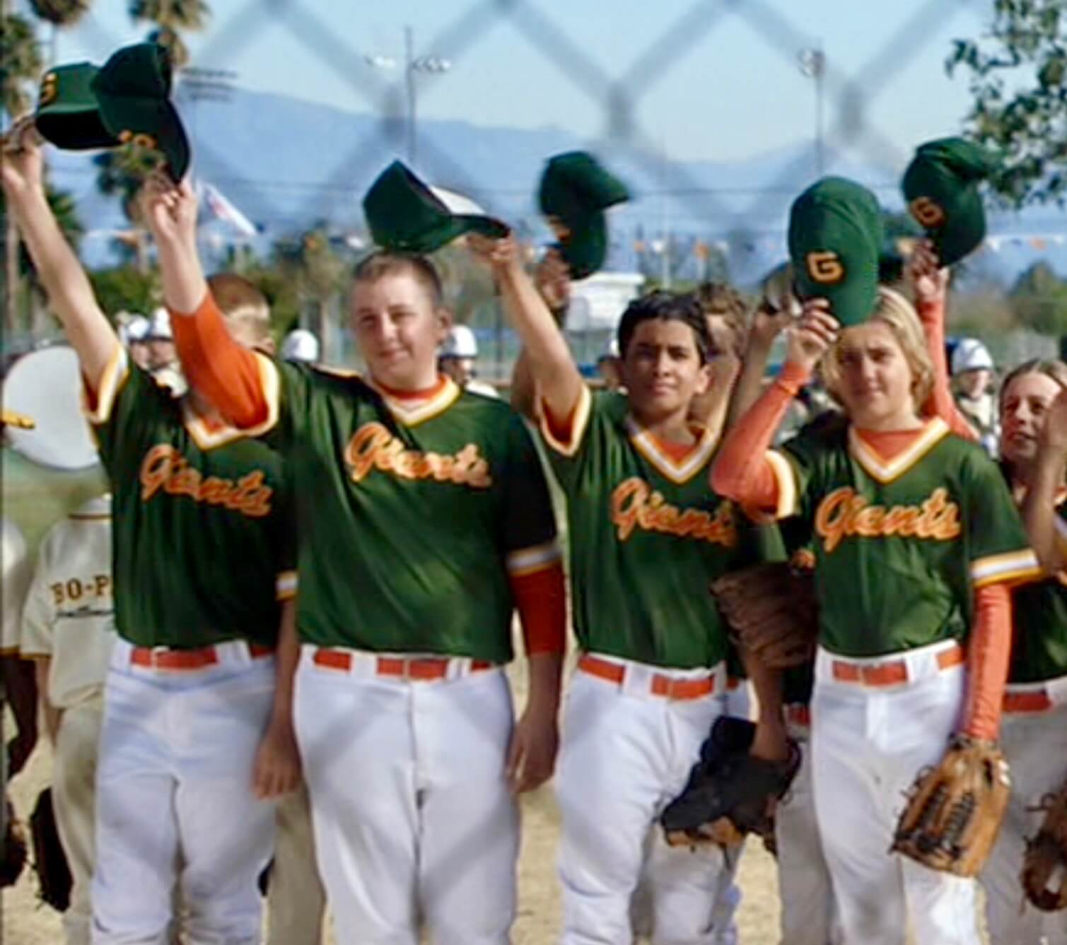
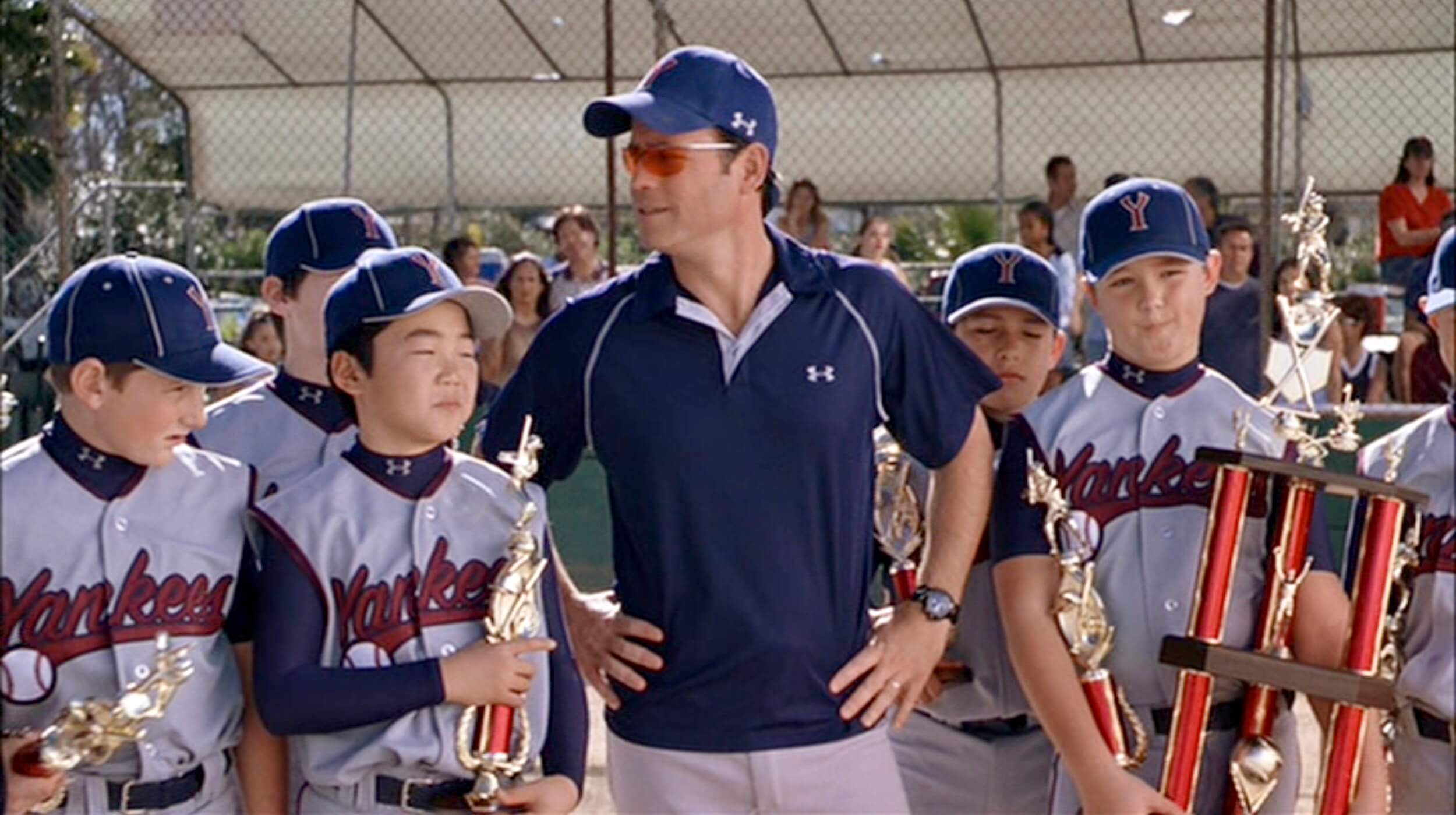
CS: For the 2005 Bad News Bears movie, the Richard Linklater version, I did all the uniforms for that. Except for the Bears — for them, they decided to just rip off whatever was on the DVD case from the old movie. But I did all the other teams. And that was awful, because it’s like, “This team is called the Giants, but you can’t use the Giants’ logo. And they need to wear green. And they can’t look anything like the major league team.” So it was a tough assignment.
UW: Any other experience with sports uniforms?
CS: No. I actually turned down a chance to work on Moneyball, but that’s a long story. I did do a lot of uniforms and badges for the 2009 Star Trek movie, though, and again for Star Trek Into Darkness. I also did all the helmets for the new Top Gun movie, which comes out in May. That’s not sports, but it’s a different kind of uniform. And my best-known design is probably the pin from Tomorrowland. [Schultz wrote an excellent article about that pin and his other design work for that movie, which you can read by going to page 21 of this PDF. — Paul]
UW: You live in L.A., but you’re obviously a big A’s fan. Did you grow up in Oakland?
CS: No, I grew up in Texas, but I have an uncle who was on vacation one time and met Frank Ciensczyk, who was the A’s equipment manager who came over with them from Kansas City. They became friends and my uncle introduced us to him, and basically we were in. Over the years I got to meet a lot of players, get autographed balls, things like that. I’ve stayed close with the team and with Vuc ever since. [“Vuc,” of course, is Steve Vucinich, who was Ciensczyk’s assistant and took over for him when he retired in 1993. — Paul]
UW: Had you ever done any design work for the A’s before the Fosse patch?
CS: Nothing serious. I’ve done some comps and things for Vuc that were mainly for fun, like “What would the A’s look like in pinstripes?,” which were a way for him to show ideas and get people talking about them internally.
UW: So you didn’t design any of their other patches?
CS: No. This is my first foray into patch design — not just for the A’s, but for any team. I’ve never worked with any other Major League Baseball team. I’m a rookie!
UW: How did you end up getting to design the Fosse patch?
CS: After the lockout was settled and spring training got started, Vuc called me up and said, “Hey, what do you have for Ray Fosse ideas?” So I threw some ideas on a piece of paper — you know, the basic “10” patch [for Fosse’s old uni number in Oakland], an “RF” patch — the standard options. It was Vuc who had the idea of working a catcher’s mask into the design, and then he said, “Maybe something with a microphone.” And I said, “Yeah, let’s try that.”

UW: Was there a particular catcher’s mask you used?
CS: I found a Johnny Bench catcher’s mask, something from Ray’s era, that he would have worn.
UW: Did you look at the memorial patch designs that other teams have done for broadcasters?
CS: I didn’t, actually. I mean, I knew about the A’s patch for Bill King [which the team wore in 2006], and I have a big bag filled with various patches, but I didn’t specifically research broadcaster patches.
UW: Did you know Fosse?
CS: I met Ray a couple times, yeah, mainly through Vuc. He was always kind of excited, like he knew it was going to be a good day to be at the ballpark. He was that guy.
UW: Did you communicate with his family at all during the design process? Like, to discuss what he would have wanted or anything like that?
CS: I communicated with them afterward. I just met them [at the team’s home opener on April 18, when the patch was worn for the first time]. They were all super-nice and super-thankful. And they — Paul, I must have signed 10 autographs for them. It was one of those things where they were really touched by it, and that was very moving.
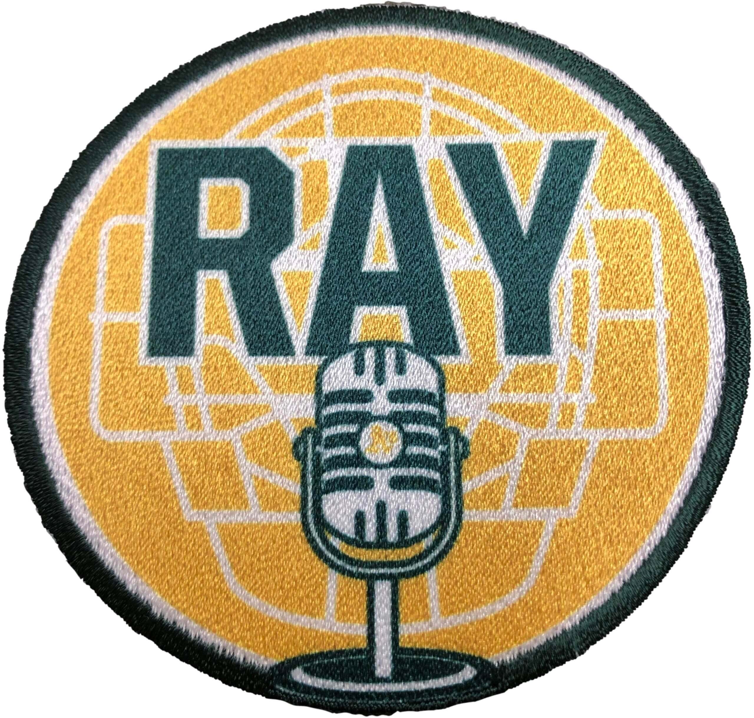
UW: Why is the patch printed, instead of embroidered?
CS: I think there were some time constraints there. It would probably look better embroidered, but I think it looks great, all things considered.
UW: What do you charge for a job like this?
CS: That’s a good question. I haven’t billed them yet. So you tell me: What should I charge for a job like this? [Laughs.] I’m going to bill them something for my work. And you know, I’m a pretty blessed guy to get to do this for a team that I love.
UW: Are you saying they might get the “friends and family” rate?
CS: Yeah. And maybe I can throw out a first pitch someday, you know?
UW: Okay, but if it were a more conventional client, what would you charge for something like this?
CS: If it was a film job, I would typically charge at least $1,200 a day. I don’t know that this is more than two or three days’ worth of work. The approval process went really smoothly and there weren’t a lot of revisions. So two or three days would probably be a ballpark figure.
UW: Okay, now let’s talk about the microphone. As you know, on Friday I wrote that memorial patches for broadcasters always seem to show the same kind of old-fashioned microphone, even if the broadcaster in question never used that kind of mic. But I can also see how an old-fashioned mic can basically be an all-purpose symbol for broadcasting that ties together the history of broadcasting and sort of puts Ray, or whomever, in that lineage of broadcasters. So I can see that argument as well. Tell me what that kind of microphone symbolizes to you, and why you chose that particular style.
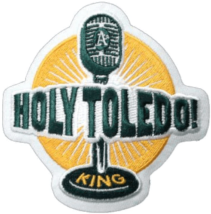
CS: I may have been influenced, even if just subconsciously, by the microphone from the Bill King patch, especially since I think the A’s were the first team to use that kind of mic on a patch. And when you say microphone, I think just from a graphic standpoint, that’s where my mind goes, just because it’s an easy read. And I think on a patch like this, it has to be an easy read.
I think there may be some other ways to do it. But once the catcher’s mask came into it, I thought that kind of mic was the only way I could do it on a three-inch patch. A modern mic doesn’t have the same pop. So for me, it just made sense from a design-aesthetic standpoint.
UW: Did you realize that so many other teams had used that type of mic on memorial patches for their broadcasters?
CS: No. I wasn’t aware that there were so many of them. I think there are some good and bad examples there, quite honestly. And I think that other people could have gotten away with a more modern type of mic if they weren’t trying to mix in a catcher’s mask. But in my case, I don’t think I could have done much of anything different.
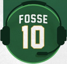
UW: I saw that NBC [Fosse’s broadcast employer] did something on social media with a headset mic.
CS: Yeah, I didn’t see that one until after mine was already done and approved. I don’t dislike it — I thought they did a good job — but I never even thought about doing it that way. Once I saw it, I thought about it, and putting the earphones over the catcher’s mask would have been a freaking nightmare. I don’t even need to try it to know that.
UW: I didn’t know this until you tweeted something about it, but you also used the old-fashioned mic to include a little Easter egg regarding Fosse’s signature “Wow!” phrase, right?
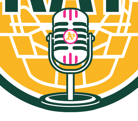
CS: Yeah, I wanted to sneak it in there without saying it. So I was like, “How do I get ‘Wow!’ in there without being so obvious about it?” So I used the three vents at the top and bottom of the old-timey mic to be Ws — it was originally four vents, but I changed it to three for the W shape. And then the circle around the A’s logo in the center was the O, so you have W-O-W. That was something that his daughters and wife were just blown away by.
UW: Were they even aware of that? Like, had they picked up on it?
CS: No, no, no, nobody noticed until I pointed it out. Which is exactly what I wanted — I wanted it to be subtle.
UW: It must be such a thrill for you that this is the team you grew up rooting for, and now something you designed is appearing on their uniform.
CS: Yeah, there have been tears of joy at times during this process. If you could tell the 12-year-old me or even the 40-year-old me that this was going to happen, I wouldn’t have believed you. I get choked up a little talking about it. It’s a really cool thing to see. But Vuc really deserves a lot of the credit — he opened this door for me to walk into. He literally called me up and said, “Do you have any ideas for a Ray Fosse patch? I’m thinking of something with a catcher’s mask and a microphone.” It was really that simple.
———
Good stuff, right? Big thanks to Clint for sharing his story with us.
A few footnotes: First, the A’s are doing a giveaway of this patch on Aug. 6. I don’t recall a team doing that before with a memorial patch, although maybe I just haven’t been aware of it. Anyone..?
Second, this interview took place just a day after Steve Vucinich suffered his heart attack, which I mentioned on the site on Monday. Vuc was on both of our minds as we talked, but Clint is tight with Vuc’s family and assured me that Steve would be okay. Vuc’s daughter, Kayla (who has the best Twitter handle ever), confirmed that yesterday:
Vuc update:@stevevuc is out of his surgery today and everything went well! He will need some time before his heart function is back to 100%. @ValVucinich and I want to thank you all for the hundreds of prayers and well wishes. We know they helped! 🙏 #WeLoveVucy
— Kayla Vucinich (@ilovevucy) April 26, 2022
Such good news! If you’re reading this, Vuc, the Uni Watch comm-uni-ty wishes you a speedy recovery and many years of good health to come.
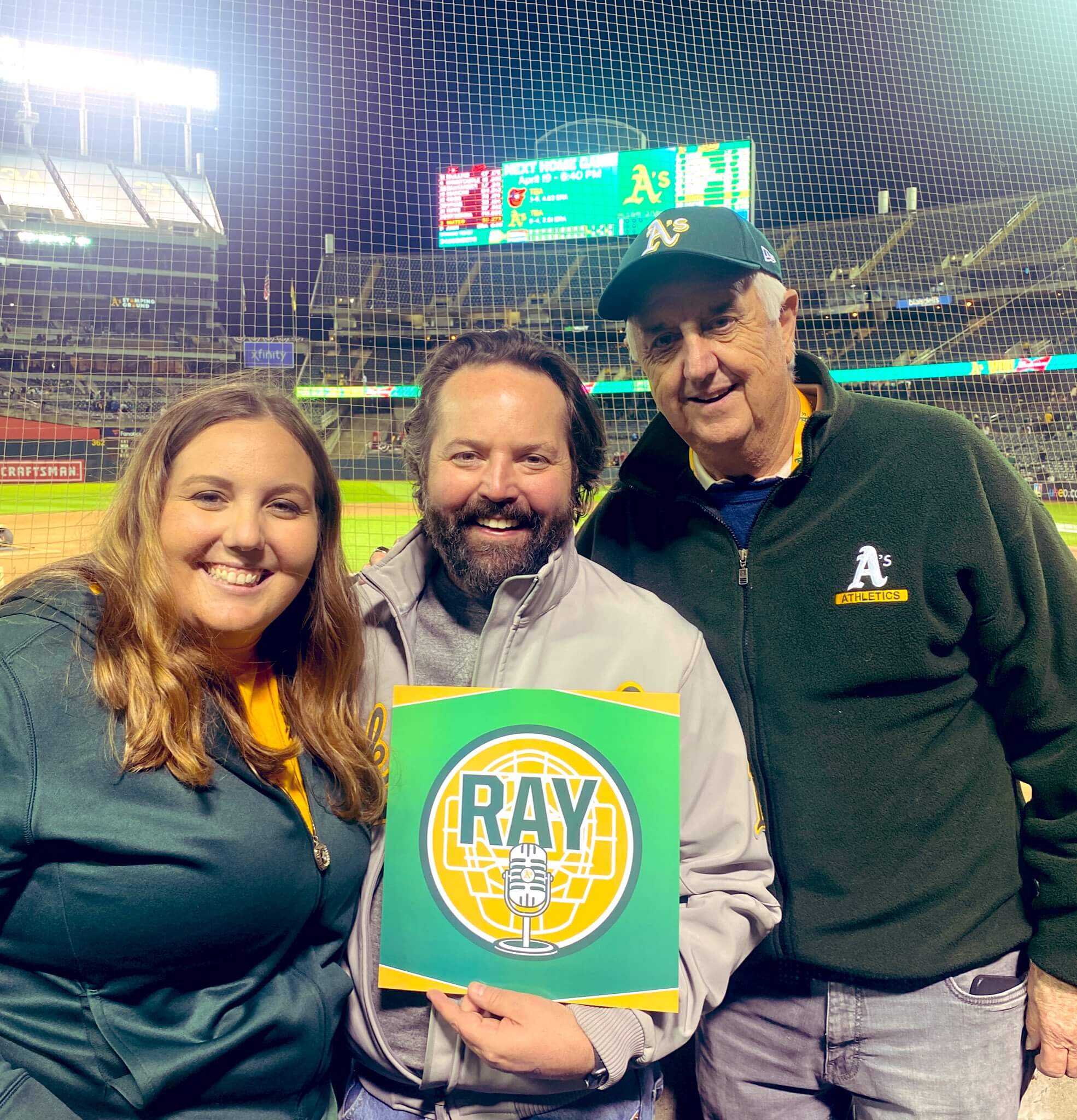
Let’s tie all these threads together with a photo of Kayla, Clint, and Vuc posing with the Fosse patch design at the A’s home opener last week:
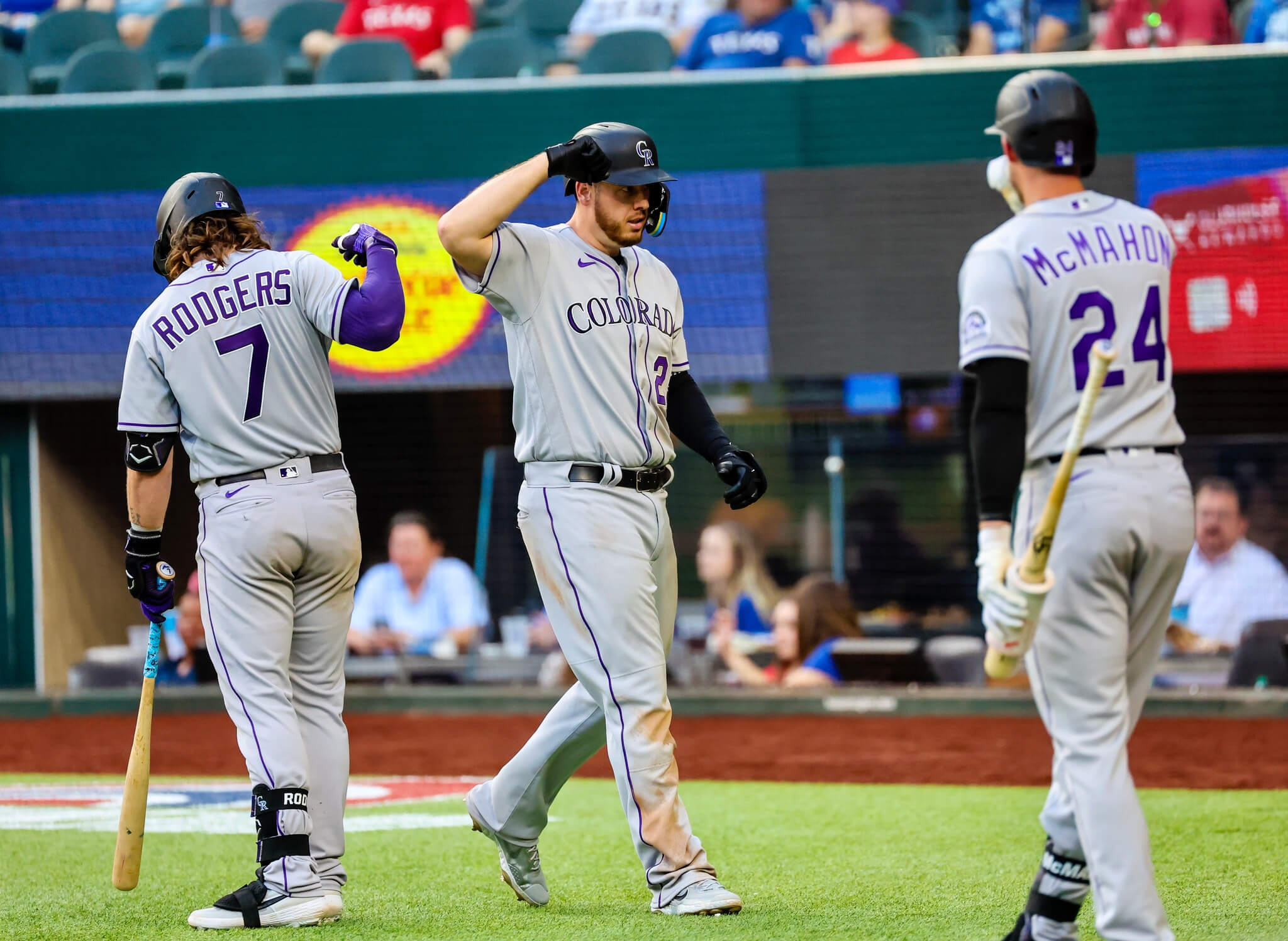
Bulletin preview: Due to the delayed delivery of MLB alternate uniforms, we’re seeing a lot more home whites and road greys so far this season. Road uniforms usually don’t get a lot of attention, so I’ve decided to give them the Uni Watch Power Rankings treatment for this week’s Bulletin article — a worst-to-first assessment of MLB greys (or, in San Diego’s case, tans). Spoiler alert: The team pictured above did not win.
This article will arrive in my Premium Subscribers’ in-boxes tomorrow morning. If you haven’t already subscribed, you can do that here (Facebook account required). Don’t have Facebook? Email me for a workaround. Thanks!
Click to enlarge
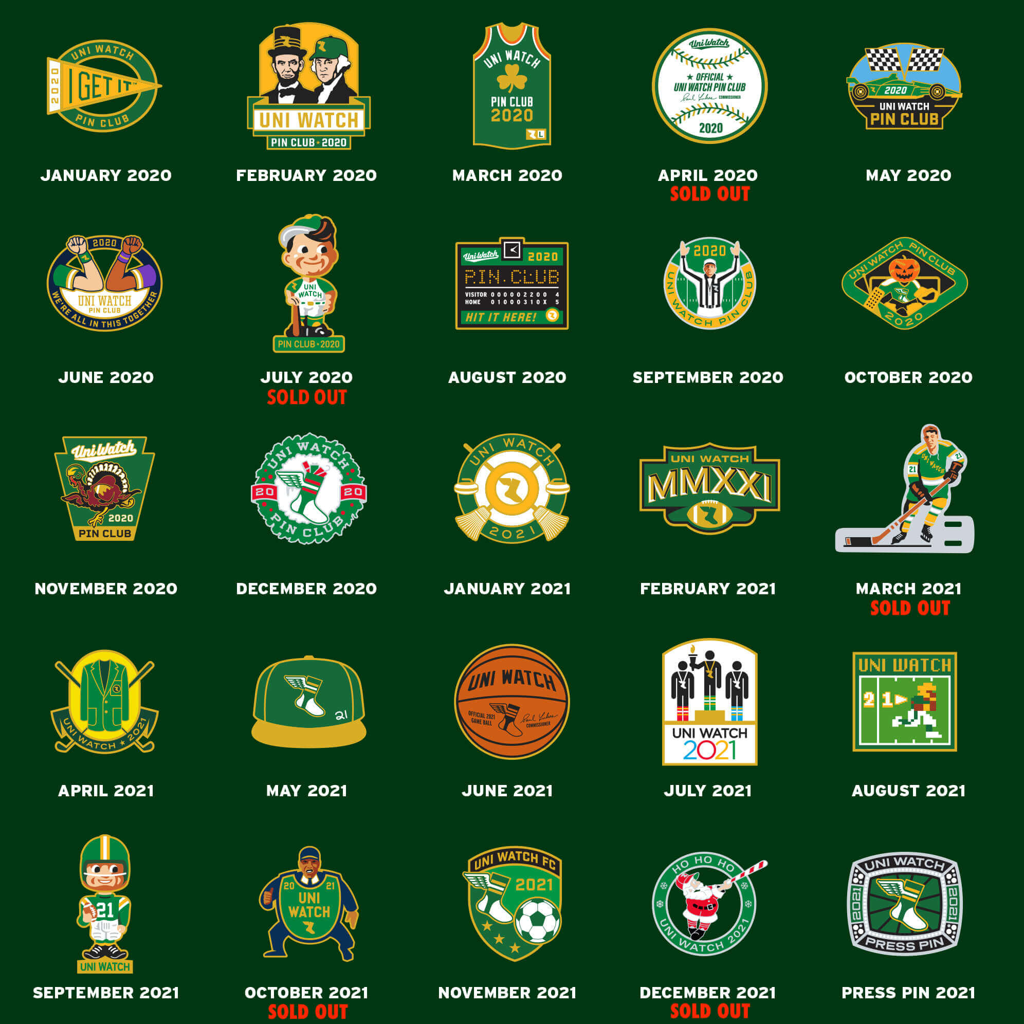
Pin sale reminder: In case you missed it, I’m running a sale on Uni Watch pins for the rest of this week, as follows:
- • One pin
• Any two
• Any three
• Any five
• Any 10 for $30
If you want more than 10, email me and I’ll give you a price.
Full ordering details here. Thanks to everyone who ordered pins yesterday!
Click to enlarge
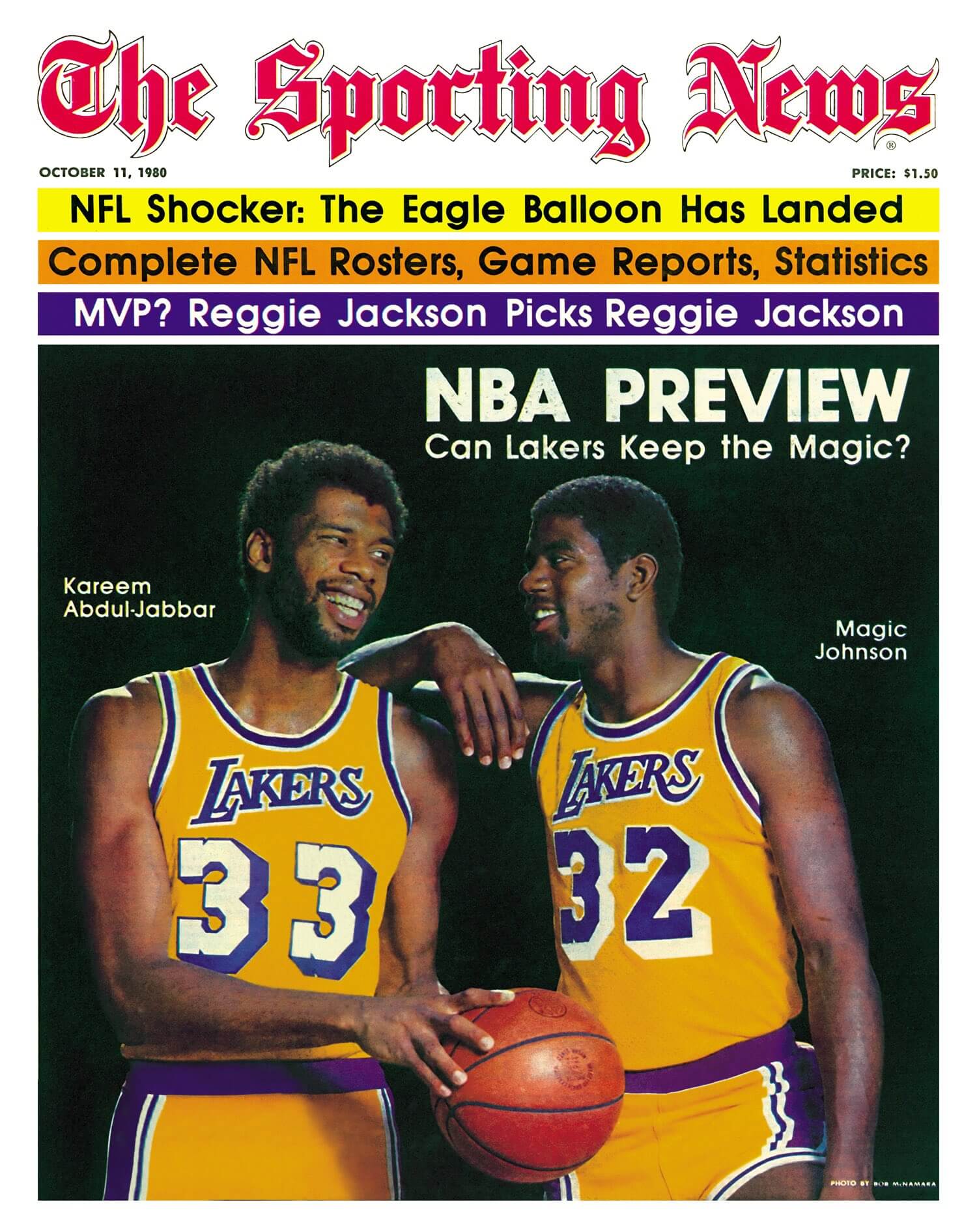
Too good for the Ticker: Notice anything odd about this 1980 Sporting News cover shot from 1980? Kareem’s uni number is white, while Magic’s is purple! “The team changed from white numbers to purple at the start of the 1978 season, so Kareem’s jersey is at least two years old,” notes reader Sean Walsh. Weird!
Click to see more photos

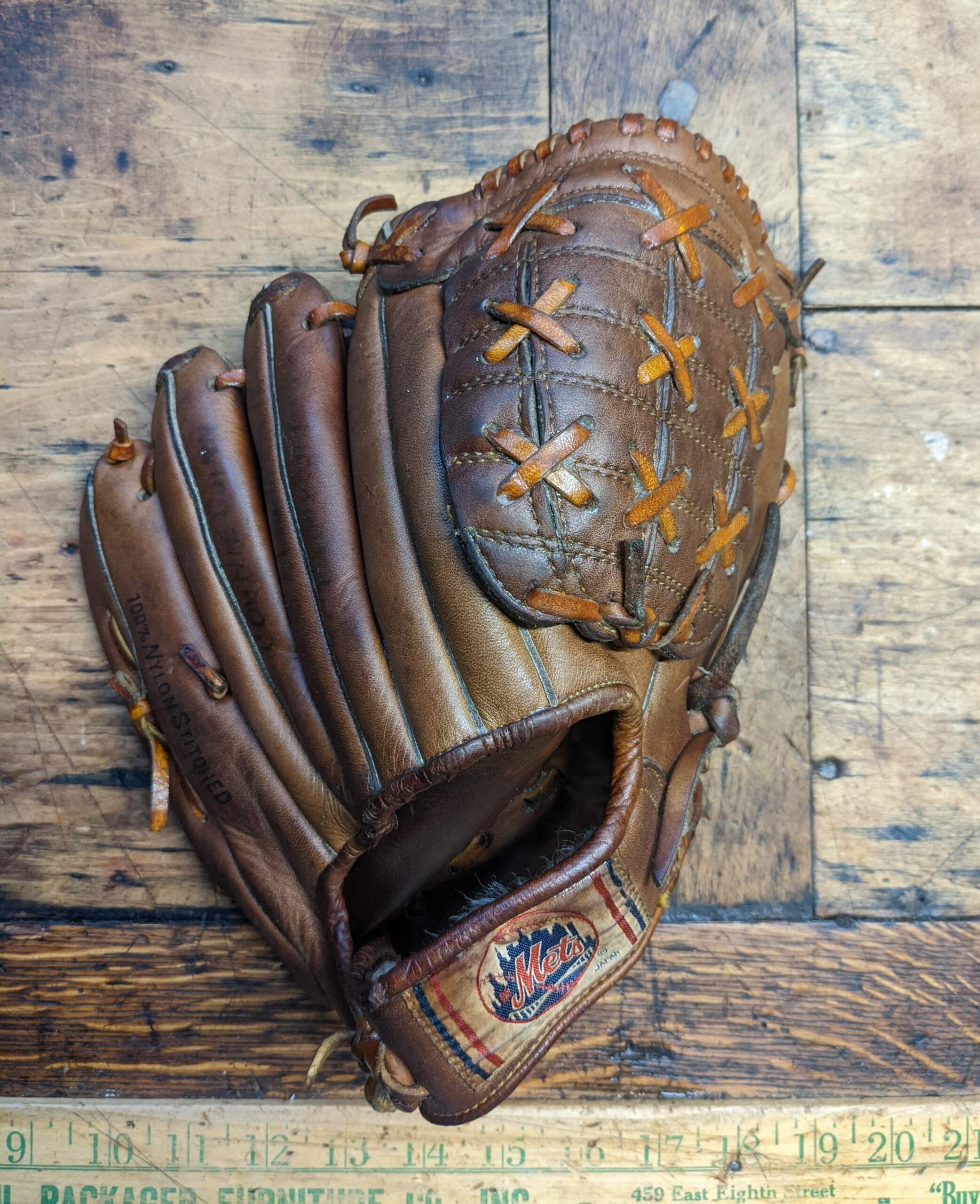
ITEM! Mets glove raffle: Longtime reader and all-around good guy Jimmy Lonetti, head of D&J Glove Repair, recently came across this old Mets-branded glove and has generously offered to let me raffle it off to a lucky Uni Watch reader. You can click on the photo above to see more pics of it.
This will be a one-day raffle. USA mailing addresses only. To enter, send an email with your mailing address to the raffle in-box by 8pm Eastern tonight. One entry per person. I’ll announce the winner tomorrow. Big thanks to Jimmy for doing this!
Click to enlarge
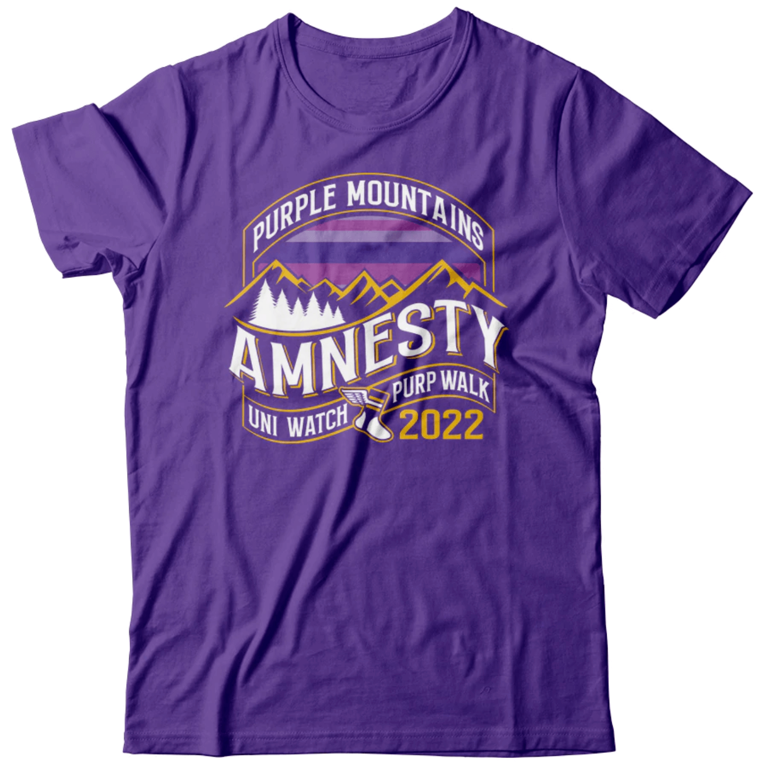
IMPORTANT Purp Walk reminder: If you plan to attend the Purp Walk party in Denver on May 17, today is the next-to-last day to pre-order the shirt with the bonus logo on the back. So if you want in on that, order your shirt now.
We’ll be giving out these shirts at the party, so don’t pre-order unless you’re going to be there. If you’re not going to be there, don’t worry — you can still order the shirt on Purple Amnesty Day, but it won’t have the bonus logo on the back.
The Ticker
By Lloyd Alaban

Baseball News: Blue vs. blue last night for the Mariners and Rays (from Mike Lefko). … The Mets have hired an entertainment company to oversee a uniform ad deal for the club. … Marlins 2B Joey Wendle bats bare-handed with a wedding ring (from John Muir). … Rangers IF/OF Brad Miller showed up to batting practice last night in jeans, the result of losing a bet (thanks to all who shared). … Here’s a great 2000 video tour of Bernie’s Chalet, the German-style home of Brewers mascot Bernie Brewer at County Stadium (from Don Schauf).

Football News: The CFL’s BC Lions posted behind-the-scenes pics of a photo shoot where it looks like the team’s helmet stripe is missing. No confirmation yet on whether or not they’ll be doing away with the stripe this season (from Wade Heidt). … New helmets for the Montreal Alouettes, also of the CFL (from Moe Khan).

Hockey News: The Sabres will wear white at home on Friday (from @Dante_X). … The Islanders are still trying to adjust to their new arena (from Kary Klismet). … Canucks G Spencer Martin wore his minor league mask and pads last night (from Wade Heidt).

Basketball News: Monday’s Ticker showed a partial view of the makeshift NBA referee uniform worn by a protester who stormed the court during Saturday’s Timberwolves/Grizzlies game. This story shows a full view of it (from Kary Klismet). … The Coaches Versus Cancer organization is auctioning off pairs of shoes signed by various college head coaches (from James Gilbert).

Soccer News: New second shirt for the NWSL’s Kansas City Current (from our own Jamie Rathjen). … Also from Jamie: Staying in the NWSL, the Orlando Pride and Racing Louisville are holding a match at Daytona International Speedway July 3. … New away kits for Brazilian side Corinthians (from multiple readers). … Red Star FC of France’s men’s third-tier Championnat National is holding a contest to design its 125th-anniversary kit (from Kary Klismet. … Also from Kary: New shirts for Chinese clubs Shanghai Port, Beijing Guoan and Guangzhou FC. … Actor Larry Mitchell’s character Scott Kilpatrick wears a Baltimore Blast T-shirt in an episode of HBO’s We Own This City (from @27inchZenith).

Ukraine News: New logo for the UEFA Champions League Final, which was pulled out of St. Petersburg, Russia, after Russia invaded Ukraine. The match is now being played just north of Paris (from Kary Klismet).

Grab Bag: The new National League Lacrosse team in Las Vegas will be called the Desert Dogs (from multiple readers). … At last Sunday’s Geico 500, former driver Clint Bowyer took a Davey Allison car for a parade lap while wearing a Harry Gant racing helmet. Allison died in a helicopter crash in 1993 en route to Talladega Speedway, where the Geico 500 is held (from Christopher Hickey). … New logo coming for the Ohio High School Athletic Association. Here’s a brief history of all its logos (from multiple readers). … Ryerson University in Toronto will now be called Toronto Metropolitan University. The school’s former namesake, Egerton Ryerson, instituted the country’s Indigenous residential school system, which forcibly separated Indigenous children from their families (from @PhillyPartTwo).
Regarding E. Ryerson, forcible family separation is not a matter of dispute that “critics say” happened. That’s just what happened. It was the policy. What “critics say” is that the policy of forcible family separation was a bad thing and ought not be repeated or celebrated.
What a terrific interview! I love hearing about creative and production processes from folks who design and implement stuff like this. Thanks to Paul for the keen interview and to Clint for his openness. I’m left with a follow-up question, wondering whether the circle shape was Clint’s idea or a direction he received. As he talked about his design process, it occurred to me that shaping the overall patch as a catcher’s mask might achieve what he was trying to do even more effectively, so I wonder whether that approach was possible and/or whether he tried it and found it not to work as well in practice as in theory.
Point well taken. Ryerson wording now adjusted.
Quote: “A few footnotes: First, the A’s are doing a giveaway of this patch on Aug. 6. I don’t recall a team doing that before with a memorial patch, although maybe I just haven’t been aware of it. Anyone..?”
I believe that the Red Sox did a similar giveaway just last week for recently deceased announcer Jerry Remy.
Correct – on April 20th – they had a Remy Memorial night, and di a giveaway with the patch.
Regarding the memorial patch giveaway– I don’t know if it was regarded as a “giveaway” per se, but on Opening Day 2017, the Detroit Tigers gave away small buttons that said “Mr. I”, modeled after the patches the team would wear all season, in memory of Mr. Mike Ilitch Sr.
The other odd thing about the Kareem / Magic picture is that they must have put Magic on a box or something? There was a 5 inch height difference between the two so I would love to know what was going on here.
I think Kareem’s jersey was airbrushed in because look at Magic’s right arm by Kareem’s shoulder, it looks painted on right there. Plus, Kareem’s number seems way off center. Look at the second 3 on Kareem’s jersey compared to Magic’s 2 on his.
I don’t know what going with Kareem’s left arm.
I thought it looked airbrushed too, said so when I sent it in
Re the Lakers photo, perhaps it’s the lighting, or fabric vs screen printing, but it has that strange issue where the purple on the tops looks almost blue vs the really purple hue on the bottoms. I remember their solid purple combo having this issue, where the hues looked really different to the eye, tops vs bottoms.
The Rockies adjusted their purple hue a few years ago so it actually looks purple on TV instead of an ugly dark blue. The Vikings had similar mismatched issues for years, but their matte finish helmets fixed that.
Hi Paul,
Typo in the Grab Bag section about the Las Vegas Desert Dogs. They are in National Lacrosse League.
Major League Lacrosse is the outdoor pro league. National Lacrosse League is pro box lacrosse.
Fixed.
“Canucks G Spencer Martin wore his minor league mask and pads last night”.
Martin’s mask does have the Orca logo on it. He would be all matched perfectly if the Canucks were wearing their usual uniforms.
What is unusual? The regular goalies always have a separate set of matching gear and mask ready when the Canucks break out the black Flying Skate throwbacks. Neither Demko or Halak played last night so farmhand Martin was in net. Martin does not have another mask/set for Flying Skate uniforms so it was the usual blue/green gear for him.
Sorry to say next month you will be seeing my significant other wearing a certain hated road grey jersey at the Purp Walk events.
The microphone issue is similar to something I dealt with a couple of months ago for a film commission logo… they wanted a movie camera, but what do those even look like today? Either a smart device or a monstrosity mounted on a huge contraption. Not instantly recognizable. Either way, an old-timey 2-reel device just works.
Also, the idea of a patch giveaway is surprising as such an item can be used to “fake” an authentic jersey. Source… Well, next month you will see me in a vintage jersey that you will also hate with an added patch for a certain All-Star Game that fits the other design elements chronologically.
And we have come full circus.
Blue vs. Blue: Man City and Real Madrid in the Champions League Semi-final. Thought it looked great!
link
For me, it was like a rerun of the 2021 City vs Chelsea final. Hated it then, hated it yesterday. Sky blue and royal just don’t offer enough contrast for me. And Real Madrid in particular has such a sharp home and third kit this season that it’s a shame we didn’t get to see them. City have worn their home sky blues against both white and mint teams recently, and in both cases the visual contrast has been better than against royal blue.
Mariners rolled out the Road “Seattle” Blue tops last night for the first time against the Rays’ home Powder Blue. I guess the supply chain issues are beginning to mitigate?
link
Dammit. Missed that this was shown in the notes. Sorry
I was happy to see the Dodgers going with the script LA roads so far this season but now I know why. (alt delays) I thought the Dodgers finally made script LA (my fav) the main road jersey.