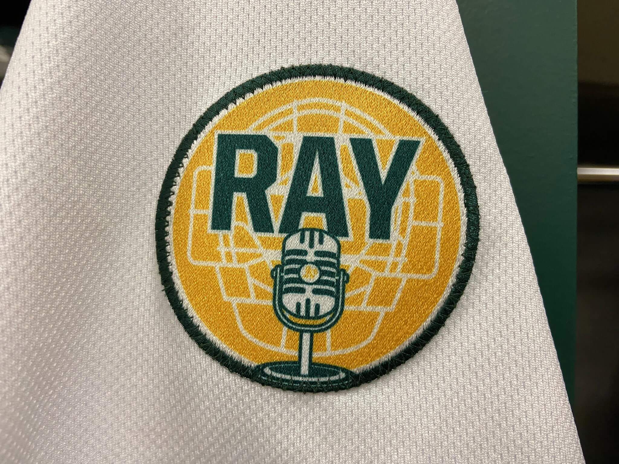
Click to enlarge
As noted in the Ticker earlier this week, the A’s started wearing their Ray Fosse memorial patch on Monday (it’s only on their home jersey, so it didn’t debut until their home opener). Since Fosse was both a catcher and a broadcaster for the A’s, the patch design shows a catcher’s mask and a microphone — nice.
It’s the microphone that I want to talk about today. It’s one of those old-timey mics, like the one Elvis is cradling on this postage stamp:
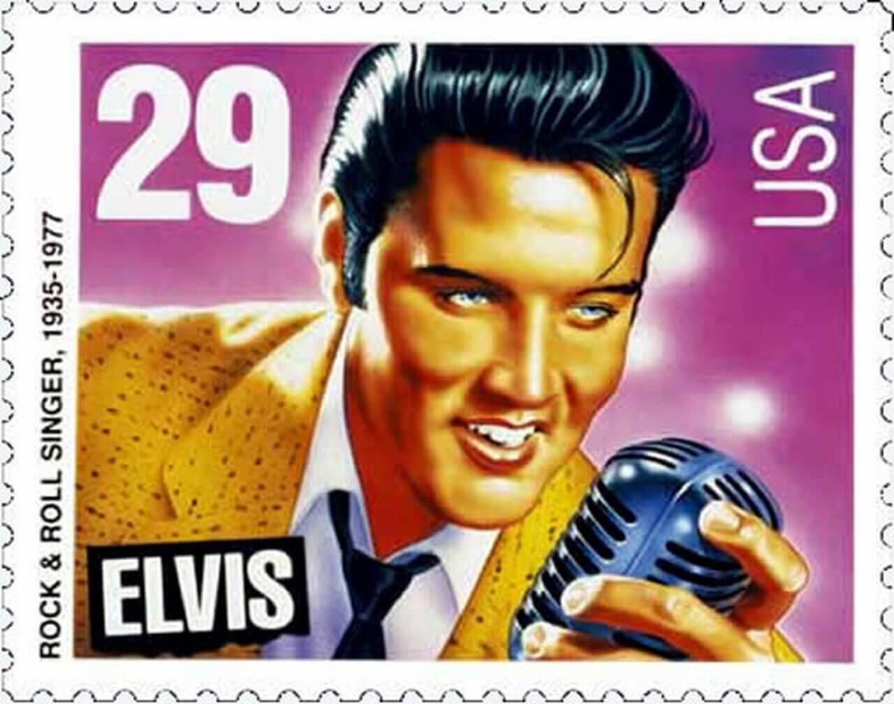
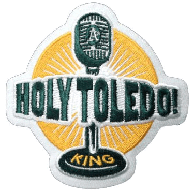
That stamp was issued in 1993 — nearly 30 years ago — and that type of mic was already a retro relic by then. More recently, that type of mic has become a standard visual element when teams salute or memorialize broadcasters. In fact, I’m pretty sure the A’s were the ones who started this trend with their Bill King memorial patch in 2006:
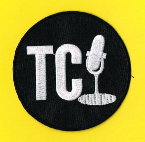
2006 was also the year that the Blue Jays added this Tom Cheek memorial patch:
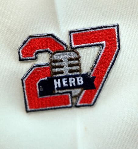
The following year, the Twins added this Herb Carneal patch:

Two years after that, in 2009, Cleveland wore this patch for Herb Score:
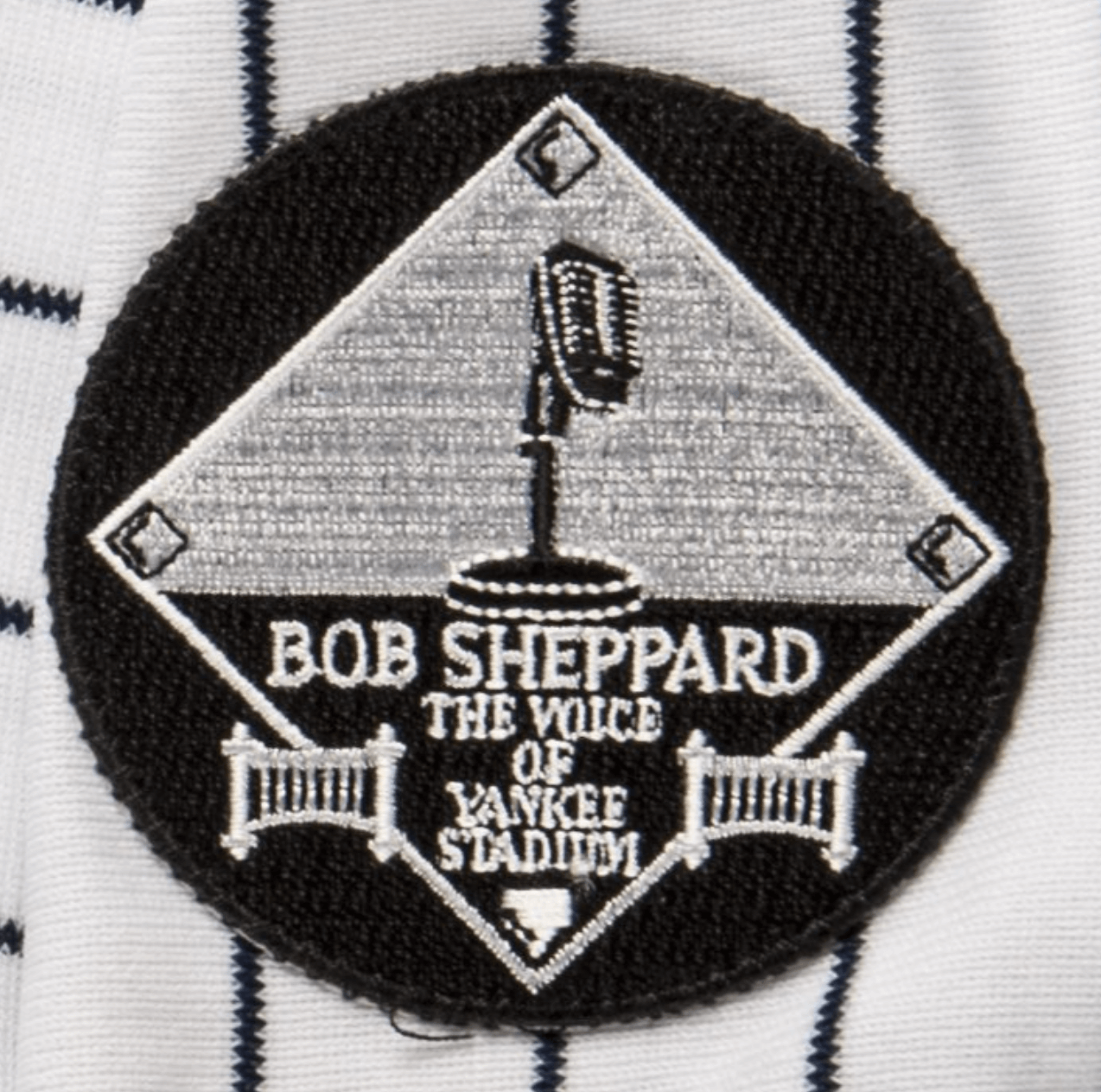
The following year, the Yankees wore this patch for P.A. announcer Bob Sheppard:
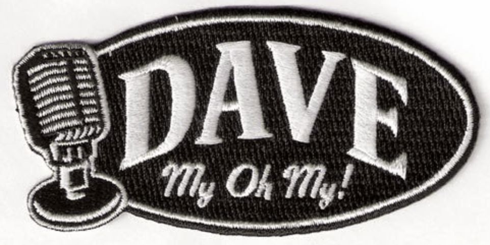
The next year, 2011, the Mariners wore this patch for Dave Niehaus:
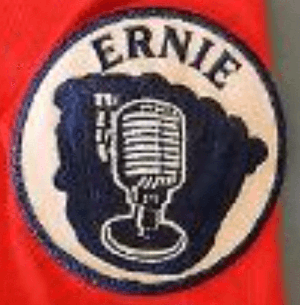
That was also the year that Atlanta wore this patch for Ernie Johnson Sr.:
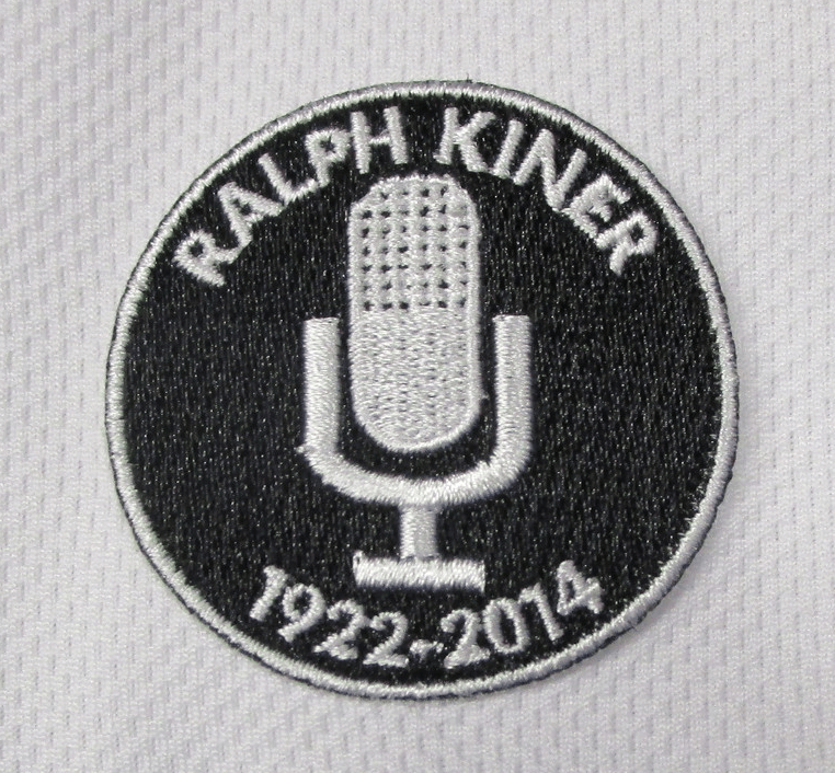
Jumping ahead three years to 2014, the Mets wore this patch for Ralph Kiner, with a slightly less old-timey microphone:
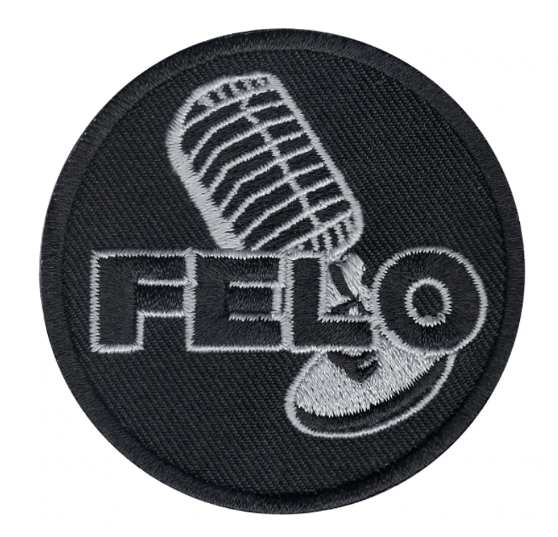
And in 2017, the Marlins added this patch for Rafael “Felo” Ramírez:
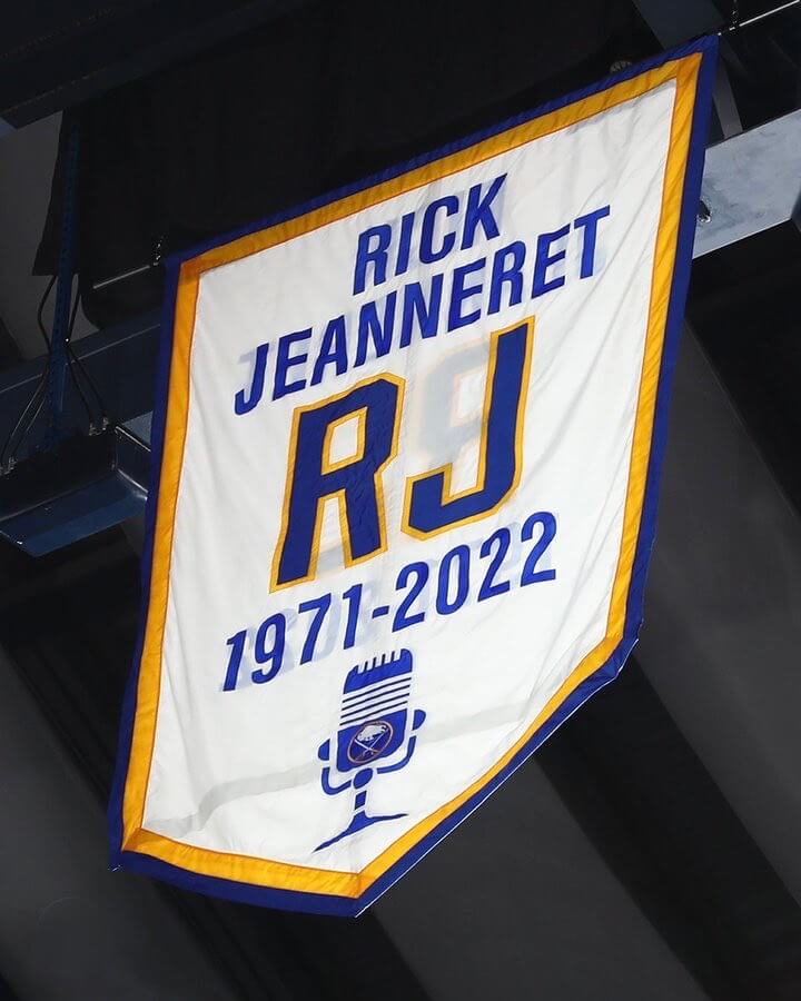
This phenomenon is not limited to baseball. Just last week, for example, I wrote a Bulletin article on the making of the Sabres’ “retired name” banner for broadcaster Rick Jeanneret, which looks like this:
———
I don’t dislike old-timey microphones. On the contrary, I think they look great! My friends Susquehanna Industrial Tool & Die Co. routinely use them, to excellent visual effect.
But SIT&DieCo is a retro act, so it makes sense that they’d use retro mics. It might also make sense for someone like Bob Sheppard, who began handling P.A. duties at Yankee Stadium way back in 1951 and was the aural personification of old-school. But the old-fashioned mic doesn’t make nearly as much sense for someone like Ray Fosse, whose broadcasting career began in 1986 and, I’m willing to bet, never used a mic anything like the one shown on his memorial patch. Same goes for many if not most of the other broadcasters I just mentioned. Is there a sell-by date on the use of this type of mic on a patch design, or will teams still be cranking out this same type of broadcaster memorial patch 20 years from now, when the design will be even more dated than it already is?
On strictly aesthetic terms, I like the old-timey miconography (see what I did there?). It certainly packs more of a visual punch than a modern handheld mic, to say nothing of a clip-on. But I’m a 58-year-old who likes old stuff. At a time when baseball is supposedly struggling to connect with younger fans, does it really make sense to keep copy/pasting the same boilerplate mic design that most kids have never seen in real life, especially if the broadcaster being honored never used that type of mic to begin with? Seems creatively lazy, unimaginative, historically inaccurate, and a bad way to connect with the next generation of fans.
I know, I know — it’s just a little patch, and the real way to appeal to young fans is to sell them jillions of godawful jerseys and caps speed up the game and promote the game’s stars more effectively. But sometimes it’s the little things that can reveal more about how an industry’s mindset is stuck in the mud, and I think the outdated mic image is a good example of that. Anyway, it’s good food for thought.
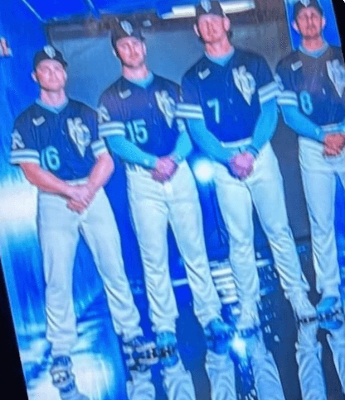
Photo from Twitter user @NotARightFieldr; click to enlarge
New Royals CC leak: The photo shown above was tweeted yesterday by Twitter-er @NotARightFieldr, who said it shows the Royals’ new City Connect uniform. (As you may recall, the cap leaked earlier this week.) When I asked how he obtained it, he said, “I have a friend who works behind the scenes in the organization. They sent it to me, and I believe they tried to hide taking the photo, which is why it is blurry.”
I can’t confirm that backstory, of course, but two things suggest that the photo is probably legitimate. First, a few hours after it was tweeted, the Royals had it taken down (but not before I had made a screen shot of it). And second, a retail T-shirt appears to show the same stylized “R” that’s shown on the sleeves of the jerseys in the newly leaked photo:
@UniWatch @UNISWAG Just caught this apparent Royals City Connect leak on Dicks Sporting Goods site. Looks like light blue will be the predominant uni color. pic.twitter.com/oqlhPV2va0
— T. Brooke Shannon (@sbtenney) April 20, 2022
So it’s probably legit. But I’m hoping it isn’t, because boy do those uniforms look like shit. We’ll find out soon enough, because the KC CC uni is due to make its on-field debut on April 30, so the unveiling has to happen soon.
Batter up: As I’ve mentioned several times this week, Uni Watch bats are now available from the Pillbox Bat Co. By coincidence, the Midco Sports Network just did a really nice story on Pillbox — great info on the two founders (who grew up playing Little League together), some footage of the bats being made at the Pillbox factory, and a lot more. If you were thinking about ordering one of our bats, this story will definitely make you feel good about who you’re buying it from. And even if you’re not interested in ordering, it’s a great video clip. Highly recommended!
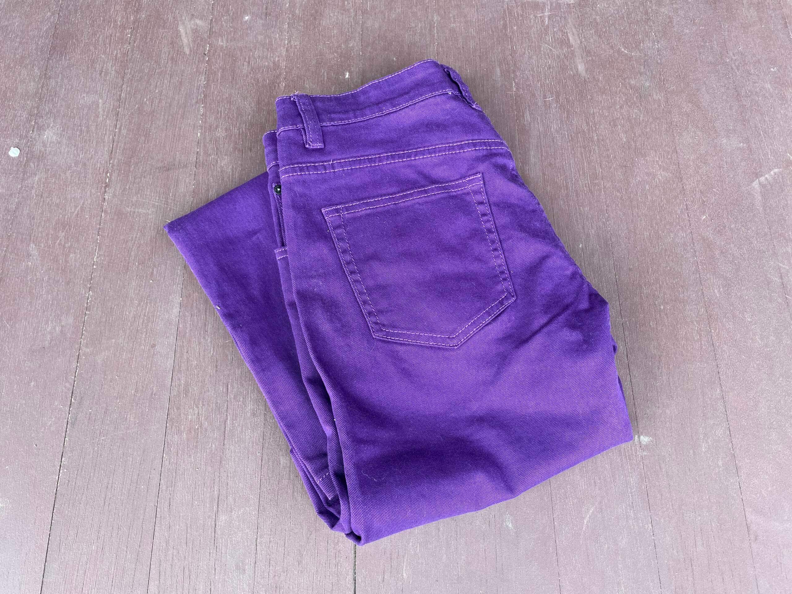
Click for the full horrific effect

And so it begins: Yesterday I procured my first piece of purple clothing for the upcoming Purp Walk party in Denver. Mary still hasn’t stopped laughing about how I looked when I tried them on.
If you need to get caught up on the Purp Walk plans, everything’s spelled out here. Two important things to remember:
1. If you’ll be attending the party at Blake Street Tavern and want to enter the raffle for the free Rockies/Giants tickets, you must send an email to the raffle in-box by 8pm Eastern tonight. One email per person, and indicate in your email if you want one ticket or two tickets. (Sorry, no more than two.) Please do not enter this raffle unless you will be attending the party! I’ll notify the winners this weekend, and I’ll also notify the non-winners so they can buy tickets if they want.
2. If you’ll be attending the party and want to pre-order the shirt with the bonus logo on the back, you can do that here. Again, please don’t do that unless you plan to attend the party, because that’s where you’ll receive the shirt. We will not be mailing them or holding them for later pickup. Thanks!
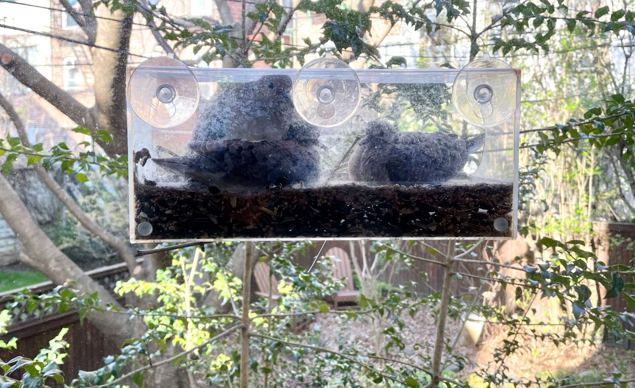
Click to enlarge
(Final?) Dove update: Based on what we’ve read, the baby doves should be ready to leave the nest this weekend. They certainly seem big and feathery enough to do so! We’ll be keeping a close eye on things over the next couple of days.
The Ticker
By Anthony Emerson

Baseball News: Longtime Guardians skipper Terry Francona wore an old Indians-era pullover during a press conference yesterday (from Don Delco). … The Atlantic League’s York Revolution have unveiled their 15th-season logo. … Karbach Brewery’s Crawford Bock beer has the best uni-based can design I’ve ever seen. All proceeds from purchases go to the Astros Foundation (from Mic Foley). … Here’s a rarity: a (mildly) pro-uni-ad piece from Washington Post columnist Candace Buckner, who goes on to make a bigger point that baseball’s entire culture is stuck in the past (thanks, Phil). … With the Quad City River Bandits hosting the Cedar Rapids Kernels at the Field of Dreams later this year, MiLB has revealed the throwback identities that the two teams will assume for the game: the Davenport Blue Sox and the Cedar Rapids Bunnies (from @HawkeyeWeirdAl).

Football News: UGA is reverting to block numbers on their unis, something I’m sure is welcome news to Bulldogs fans (from multiple readers). … With New England’s Pat Patriot throwbacks coming back next season, Pats S Jalen Mills posted a welcome sight on his Instagram account yesterday: a close-up of his throwback helmet (from multiple readers). … USFL punters and kickers will no longer use chip-embedded footballs, after concerns were expressed that the chips might be affecting the kicking game. Key quote: “All of our specialists will be kicking their own balls” (from our own Jerry Wolper).

Hockey News: The Penguins wore white at home against the Bruins last night (from multiple readers). … The Kraken wore green pregame jerseys on Wednesday night in support of the One Roof Foundation (from Wade Heidt).

Basketball News: Here’s a rendering of what the home court for Montreal’s team in the Canadian Elite Basketball League will look like (from Kary Klismet).

Soccer News: New second shirt for the NWSL’s Orlando Pride (thanks, Jamie). … Sticking in the NWSL, new kit and shirt ad for the Chicago Red Stars. Additional info on the shirt ad here (from Charlie Whiteman). … The following are all from Kary Klismet: Spanish side Real Betis has unveiled the kits they’ll wear for this Saturday’s Copa del Rey final (also from James Welham). … New kits for Inter de Madrid of Spain’s third-tier Primera División RFEF. … New away kits for G.D. Chaves of Portugal’s Segunda Liga.

Grab Bag: Teams in Australia’s National Rugby League will wear Anzac Day jerseys this weekend. Here are the designs for the Cronulla Sharks, Manly Sea Eagles, Canterbury Bulldogs, North Queensland Cowboys, Melbourne Storm, Canberra Raiders, South Sydney Rabbitohs, Sydney Roosters, Newcastle Knights, Penrith Panthers, Parramatta Eels, and St. George Dragons (from Allan Jennings).

Click to enlarge

What Paul did last night: A few weeks ago I was looking at the calendar page for a Brooklyn music venue and saw the photo shown above, which was promoting an upcoming show by a local band. I hadn’t heard of the band, but I was totally into the guy’s shirt, which looked like it would be a good addition to my collection of green plaid shirts. So I listened to some of the band’s music and found that I really liked it.
And that’s how I ended up spending last night with the Pre-War Ponies, a band that specializes in playing non-famous songs by famous 1920s, ’30s, and ’40s composers like Cole Porter, George Gershwin, and Irving Berlin. They’ve been playing around town for about 15 years, and it turns out that we have a lot of friends in common, but for some reason I totally missed the boat on them until now. Thank god for that green plaid shirt!
One of their best tunes last night was their rendition of “Give Me the Moon Over Brooklyn” (originally recorded by Guy Lombardo and His Royal Canadians):
Although Walter — the guy closest to the camera in my video — didn’t wear the green shirt, it was still a really swell way to spend a Thursday night (and since the Mets had already played in the afternoon, I didn’t even miss anything of consequence). The Ponies have a monthly residency at the club where I saw them, and I’ll definitely be back.
That’s it for me for this week. Enjoy Phil’s weekend content, stay well, and I’ll see you back here on Monday. Peace. — Paul
The last time I saw one of those types of microphones being used, it was a metal band called Lesser Key and the singer used it as a second mic with a reverb effect on. I think it compressed the sound on its own so that’s why he was using it.
The microphones remind me of modern “save” buttons that still use a floppy disk icon.
This is exactly what I thought when I saw this. No one uses it, but everyone knows what it means.
Also, it’s used in the logo for the show Brockmire: link
As well as in the show itself: link
This is kinda what I was thinking.
1. It’s just kinda the universal symbol for microphone.
2. Modern mics used by announcers typically just aren’t as aesthetically pleasing, especially shown in silhouette. Most broadcasters use a headset, and that alone probably doesn’t scream “announcer” to fans. If you want to go with just a mic, modern ones either just kind of a rod on a stick (the Electro-Voice RE20 is one of the most common) or a ball on a rod on a stick (the Shure SM58), which, frankly, in silhouette, can look a little phallic.
3. For certain venues, I use the Shure 55SHII, still a very popular mic in the Shure catalog because it looks, feels and acts like a retro mic. So it’s not like that mic has totally gone away.
I thought it was funny that Purdue honored Joe Tiller with a sticker that you could use for an announcer (in fact, I went looking for it as an announcer patch and finally realized it was Cowboy Joe with a headset that I was thinking of: link
“Susquehanna Industrial Took & Die Co.“…Typo?
Yes. Fixed.
1. The old-timey mic works on memorial patches, even if the announcer never used it. Consider the alternative – how gauche would it be if they used a modern Burger World headset on a memorial patch? The old mic conveys a greater degree of gravitas and nostalgia. Same reason that the emoji for “camera” is a picture of what is now an outdated relic.
2. I love typography and I am all for unique fonts, but it is good to see the bespoke font trend cresting. Arkansas went back to Block Varsity for football, and now the defending national champs. It seemed like at one point, Nike wanted every school to have a bespoke font. But there are only so many ways you can design a numeral that is both unique and (more importantly) legible in a stadium of 100,000 people or on TV.
3. With each new iteration of football helmet, it seems that the maker wants to stamp their brand on the design when it comes to ventilation holes. Problem is, their designs can clash with the logos and striping elements on a team’s helmets. Since the vents can be placed almost anywhere on the design, shouldn’t there be some consideration for the logos that teams are going to apply when making the helmet?
The old mic conveys a greater degree of gravitas and nostalgia.
Why is nostalgia necessarily a desirable thing, especially for an era that had nothing to do with the deceased?
I’m not saying nostalgia is bad; I’m just asking you to explain why it’s good.
Nostalgia is inherently neither good nor bad, and such a duality misses the point. Nostalgia reinforces a sense of tradition. I root for a baseball team that was founded in 1883, and I wasn’t alive to see Richie Ashburn play but I heard about it from my dad from his childhood. My kids hear me talk about Mike Schmidt and Steve Carlton. They’ll tell their kids about Chase Utley, Jimmy Rollins and Ryan Howard. And we go to games and see all the retired numbers. So it goes with the memorial to Harry Kalas and the Rich Ashburn Broadcast Booth at Citizens Bank Park. It’s a thing that isn’t corporate. There is a sense of belonging and tradition with historic names and numbers; whether that is good or bad is irrelevant. If the old-timey mic is a pictograph representing “announcer”, it is better than a blank space where a number should be on a banner, and a new-age mic would be subject to misinterpretation.
The old style mics are more aesthetically pleasing and easily recognizable as mics. A modern mic, when drawn in line art is not very pleasing to the eye, and could be mistaken for a sex toy among other things.
As for younger generations not knowing what a vintage mic looks like, or not relating to one, I seriously doubt that. Many podcasters used modern mics that are styled to look retro. The look is ubiquitous enough that everyone can relate to it.
It’s the same reason why fountain pens are still common in stock photos and icons representing “writer”. Even at low resolution, a fountain pen nib says “pen”, even to people who’ve never used one. A ballpoint just looks like a stick.
Modern microphones are all either stick shaped (which is ambiguous in a logo) or headset shaped (which is recognizable, but asymmetric and clunky to build a logo around). Even if it’s anachronistic, the old microphone is a good shape to have in a logo and is clearly a microphone, even when rendered in embroidery.
I had the same thought about trying to turn a modern non-headset microphone into a logo. I suspect they could end up looking phallic. And nobody wants that.
Ditto.
Google image search for podcast logos:
link
The 76ers had a banner at the old Spectrum for announcer Dave Zinkoff who died in the 80s, and that banner featured a similar microphone style.
The Zinkoff banner went up in the Spectrum in 1986, and there is a Zinkoff banner in the current arena. He’s listed as having had his “microphone retired” on the team’s retired-numbers page: link
I agree with everyone above that the older style mic is better for a patch than the current headset style mics that most, if not all MLB broadcasters use.
But that mic style hasn’t gone away completely. James Hetfield of Metallica prefers them and that style is what he’s been using for live shows for a long time now.
I live in TX, about halfway between Houston and Dallas, so Crawford Bock is readily available here. Not only is the can/label appealing, but it’s a tasty beer and I always have it in my fridge.
link
I completely disagree with Paul. There is nothing wrong with an old school microphone used in that context. It’s like a universal symbol of broadcasting. No young person is going to be turned away from the game of baseball b/c of that rendition of the microphone on a patch. It’s a nice little tribute to the past and nothing wrong with a young child or person learning that little facet.
In my opinion, MLB needs to stop ripping up what makes the game special by trying to eliminate the things that make the game special. There was never an issue of attracting the younger generation to baseball over the years. The issue isn’t the younger generation, but the fact that the game has changed to the point where it’s a slog to watch the game and it’s not fun with the 3 true outcomes. Focus on returning baseball to its roots…starting pitching duels, hitting into the gaps, base stealing, and faster pace and that excitement will bring people in. It serves no one to piss off the established fans by demolishing what they hold dear for the possibility it *may* attract younger fans.
Anyways, I love the old time microphone on the patches and hope that trend continues.
What does an old timey microphone image have to do with what makes the game special?
Glad to see the Pat Patriot helmet with the white facemask, that’s a better look than the red in my opinion. And I know it’s been stated that they’ll be using the red jerseys but I’d like to see them (and other teams) use their white throwbacks sometimes, too. Would be nice to see a Patriots-Dolphins game with both teams wearing their classic throwbacks instead of their current clownsuits.
And I’m looking forward to complaining about the stupid truncated shoulder stripes on the Pats red jerseys, it will feel like things are getting back closer to normal.
Here, Here!
I’d have been OK with gray, but the white works.
But please, Patriots, leave those red pants in the dustbin of history.
While I don’t agree with your view of the Dolphins current uniforms, that would be a great looking game (I hope to someday see a Jets Sack-Exchange matchup with the New England Pat Patriots).
Does Bruce Banner know you borrowed his pants?
Obviously, all taste is subjective, but I don’t get what looks shitty about the Royals purported leak, besides maybe the fountain logo itself?
This is probably my personal taste, but I like the tri-stripe sleeve cuffs, which hearken back to the ’70s. It’s not a mono uniform, which is a step up from most of the CC looks. The powder blue numbers and accessories pop nicely. I don’t know…they seem to look a lot cleaner than the Astros’ CC did upon unveil.
I agree, Brian. Other than their being softball tops, and nothing unusual being different than what the picture appears to show, those Royals CCs look outstanding. The different “R” fonts are a bit unnecessary, but the blue color combo with the white pants is really nice. They certainly aren’t anywhere near “shite”.
I’m sure you’ve covered the jersey patch the Red Sox have been wearing for Jerry Remy, which does not include a microphone. However, I have seen NESN use a logo with his number 2 and a old-timey microphone during broadcasts (not sure if it has been every game). You can see it in the video of the ceremony they had the other night: link
It has been mentioned above, but the older microphone now represents something larger than it’s original function. Broadcasting, recording, voice to text, microphone volume, and more can be conveyed. Similar to how the symbol of a now obsolete 3.5 inch floppy disk now is universally representative as “saving” something.
I noticed this morning, that the dictation symbol in PowerPoint and also on my iPhone both use an older version microphone.
Its an interesting transition, and you may have found one of the earliest examples (2006)
Paul, do you have a special set of tongs or lotion you put on before you handle purple items? ;D
Quote of the year:
“All of our specialists will be kicking their own balls”
I might watch a USFL game to see that!
Some condenser microphones still look like what you consider old-timey, take a look at the Shure 55SH for example.
It’s purely for aesthetic purposes at this point, though. I think by the 1930’s with the advent of ribbon mics and commercialization of mics in general, the exposed brass mesh models were just cheaper to produce.
Re: the Elvis stamp. There were two different versions of the stamp considered, the one pictured which was referred to as “Young Elvis,” and one of an older Elvis in his familiar white jumpsuit which was referred to as “Fat Elvis.”
IIRC the USPS actually allowed the public to vote on which stamp would be used and there was a HUGE, for the time fooforah about the “Fat Elvis”, how it was “sullying the image of a sacred figure in the history of popular music,” and “disgusting,: as well as the usual comments from people declaring they were never going to use the USPS again, which is a actually a REALLY neat and nearly impossible trick when you think about it.
Paul where did you find those purple jeans?
Amazon.
Bravo!
Thank you Paul for giving us something else to consider in the visual sphere.
I would offer that the most iconic modern microphone that could be easily designed into any graphic would be the Shure SM58. Everyone knows it’s a microphone, and the shape is unmistakable. link
Wouldn’t the more accurate depiction need to be a headset then? That’s been the usual setup for most broadcasters since at least the 80s if not before unless I’m mistaken.
The Royals CC unis could be much worse, thank god they don’t have navy blue/ matching color pants like the: Dodgers, Astros, Cubs and White Sox those look like beer league unis.
I was afraid the Royals CC jerseys would be bbq themed with matching tops and bottoms, I like the fountain theme.
Totally agree, after what had been released I was more worried they’d look worse.
I do like the T-shirt though.
Perhaps find the designer(s) and ask them why.
It’s an old-time look, but that doesn’t mean that style of microphone is antiquated or obsolete. Shure still makes this microphone style in various models, one of which, the Super 55, uses a modified Beta-58 capsule (the Beta-58 comes in what you would consider a “modern” form factor, but the capsule inside is what is doing the work). I use this particular mic on stage in a metal band. It sounds fantastic. Excellent frequency response. And it just looks cooler than a simple SM58-style mic that everyone else uses. To me, anyway.
It’s an iconic look. Instantly recognizable. And I get why it gets used in the context of broadcasting iconography.
Even though I’m a Gator fan. It’s nice to see Georgia going back to classic block numbers (wish the Steelers would). I also pray that the Gators will as well. That font they are using now is, as Sir Charles would say, is turrr’ible. And, their record isn’t that good since the change either.
I was a fiend… before I became a teen
I melted microphones instead of cones of ice cream
Sorry, Paul.
I can’t resist referencing my favorite mic blesser, Rakim.
I was hoping you could find pants that were a little more eggplant-y in color. Those are gonna be tough.
Actually, I was hoping for some jeans with purple suede attached, ala Oak Tree.
+1 to any and all Rakim references!!!!
Metallica has been using old-school microphones in their shows for a while now – been going to Metallica shows for 25 years and it’s been interesting to see them change to those in recent years.
link
Yeah they made that transition in 2007 or so. Custom red grill cloth too.
When my dad, a career radio man, died in 2005, we added exactly that microphone symbol to his memorial marker. It was just the available stock symbol from the cemetery’s marker maker. Dad started in radio in the early sixties, and to the best of my knowledge he never used that particular type of microphone. But on the grave marker, as on the memorial patches and banners, it’s not a representational depiction of a particular microphone, it’s a symbol for the concept of a microphone or broadcasting. Like, look at your nearest TV remote control or audio player or app. The back and forward buttons will have arrows pointing left or right, which originated as representational depictions of the literal direction that literal tape moved in reel-to-reel devices. Now there’s no tape, and nothing moves left or right when you press either the left-pointing or right-pointing button. The arrows are now abstract symbols for the concept of moving “forward” or “backward” when listening to or watching media. Same deal here. The old-times microphone as it’s used on these memorial patches and banners isn’t a picture of a microphone, it’s a 27th letter in the alphabet. If a team used a representational image of the actual microphone a broadcaster used, very few would even recognize it as a microphone, much less as a symbol for broadcasting.
And before I would even consider any connection between the use of this abstract microphone symbol and anything to do with baseball as a sport relative to other sports, I would need to see evidence that other sports depict broadcasting with other symbols. The only thing these microphone examples tell me about baseball as a sport is that teams seem to believe that fans make emotional connections with baseball broadcasters. Which, anecdotally, seems obviously true, but could perhaps bear interrogation. Do they? If so, why?
All of which may sound like I intend harsh criticism of Paul or today’s lead, which is not the case. This is one of my favorite UW leads of all time! Thanks for this! I just have a difference of opinion with a couple of bits of Paul’s analysis.
Thanks for the thoughtful feedback, Scott, and condolences on the loss of your father.
Just saw this on Twitter — a patch with a more modern microphone. Works fine, signifies fine, and more era-appropriate:
link
My initial reaction to today’s post was that the old-timey microphones were necessary to show that the thing was actually a microphone and not an indistinct cylinder (like a bunch of posters have said). This tweet convinced me otherwise.
The old-school microphone imagery is so dated, they were normally referred to as “mikes”. So 20th century!
As a broadcaster, I know several friends / colleagues (especially in Minor League ball) who ditched the headset & went to the old-school stand-up microphone. They largely claim that it sounds a bit better & they enjoy the traditional, old-timey feel of it.
Personally, I’m still a headset guy (I like having the microphone right there if I’m moving around or trying to look something up between pitches), but I will say that the old-school mics have a pretty nice visual appeal.
I know it’s fiction, but the mics the announcers use calling soccer matches onn”Ted Lasso” are very cool. They call them “lip mics”. Here’s an explanation by an announcer.
link
It seems like it would get tiring holding these mics for an entire match.
The announcer in Ted Lasso is Arlo White. He uses that lip mic when calling actual Premier League games for NBC, as well.
Too bad lip mics aren’t used as much on this side of the Atlantic. Crisp sound … play-by-play guys used to wearing headset mics these days. I remember a great BBC Radio 5 Live tv ad which just used images of the Coles 4104B lip mic while great calls played on audio.link
Some podcasting mics, the ones you put on a table between the people speaking, I guess, have that old timey look.
Maybe it’ll come round and be new-timey again because the Young People ™ are all podcasting and not watching TV.
I remember the days of the old Boston Garden, the Celtics retired a physical microphone in honor of radio broadcaster Johnny Most. I can’t find any pictures online. Anyone else remember this?
Yes 100%.
They definitely had an old school tabletop stand & mic mounted in a little shadow box type of frame on the outside of the balcony press box.
Surprised there are no photos of it out there, but I remember it, and they showed in on TV a lot. Feel like I’ve seen it recently (either on Bird highlight videos, the Celtics/Lakers rivalry documentary, or maybe the Tommy Heinsohn memorial special)
Yeah, I think the old school microphones do a better job of…you know…unambiguously looking like a microphone. Same reason why we still use landline headsets as the phone symbol and why we still draw rabbit ears on TVs…otherwise everything would look like a rectangle!
I don’t see a prior comment about this (which totally surprises me): USFL punters and kickers will no longer use chip-embedded footballs… Key quote: “All of our specialists will be kicking their own balls”.
You have to be somewhat agile to kick your own balls… not that I would want to if I could. Yuk, yuk, yuk (or is it, ouch, ouch, ouch?).
It’s true that there aren’t many alternatives to a microphone by as an icon for broadcasting by itself, but the logo for the All Madden documentary is an example of how a headset could be used as part of an icon for a specific individual. link
Lots of great comments from the readership on today’s lede. Many of them say something similar to what I was going to bring up about how the old-timey microphones, as a symbol, are more useful from an iconography standpoint to convey the object’s meaning than modern mics. I agree with that.
I find it interesting how the progression of technology has created modern designs for objects that has robbed them of much of their unique look and appearance of the past (the ubiquity of the utilitarian rectangle, as Mike Engle noted). It’s the ultimate example of function over form. However, those original forms actually had an important function of letting us know what those object were and what they were used for.
Even though those forms have been largely lost, we still revert to them when trying to convey meaning with symbols. In that sense, I think the look of the old-timey microphone still serves a valuable function, even for younger generations who may only know it as a symbol.
The Reds use the old-timey mic for Hoyt, Nuxy, and Marty and it’s interesting to me that they do that while a new-age mic is clearly what Marty was using at that very instant.
link
Its definitely the most fine detail I’ve seen on a memorial patch – with the mask and the microphone.
Its the only one linked today that seems to be printed (as opposed to embroidered). I guess this level of detail wouldn’t be possible with an embroidered patch? I don’t know.
Is this the first printed memorial patch we’ve seen? I can’t say for sure that there hasn’t been one before but I can’t find an example of a printed patch.
Always liked old-time mics.
The one most copied is the Shure 55SH mic, aka the “Elvis” mic.
As a former Radio Corp. of America employee, I liked the RCA 77DX, the “salt shaker” mic that was used by many, including Steve Allen, Johnny Carson and most recently David Letterman.
Then the true classic, the RCA 44BX, as modeled by one Betty White:link
I believe that since Busch Stadium III opened in 2006, there’s been some representation of a old-style microphone along with “Buck” in memory/honor of longtime Cardinals announcer Jack Buck.
link
I don’t think it’s lazy to use an old school microphone for a memorial patch. It’s become visual shorthand that gets the message across. The more universal the shorthand, the clearer the message to the viewer and in this case everyone understands the meaning.
On another note, Felo Ramirez of the Marlins is one of the few that would have used that type of microphone. Not with the Marlins but when his career started in Cuba in the late 1940s!
As a commenter above said, I do like the white pants for the Royals’ city connect uni. That said, as I was scrolling down the page and saw that blurry photo, I assumed it was a college or high school team.
I’ve yet to see a city connect uniform that has a redeeming quality in design or intent to connect.
1. Damn, had I known you were in the market from some purple jeans I would have tried to find my purple Guess from high school (although they were a deeper shade). Man, those mid-90s, colored denim days…. hahaha
2. “boy do those uniforms look like shit” Come on, it’s a blurry, crooked photo, let’s wait till we actually see them on the field!
3. I have zero problem using the “old timey” mic (I use quotes because as some have eluded to, this style of mic has actually come back in style). This blog uses the stirrup as a logo element when probably less than 5% of current MLB players actually wear them.
This blog uses the stirrup as a logo element when probably less than 5% of current MLB players actually wear them.
Yes, but this blog has never suggested that stirrups are common on the field of play. Rather, this blog *advocates* for stirrups being common on the field of play. Big difference.
Thanks for the jeans offer!
Shure has made the 55SH mic as long as I’ve been playing music (40 years) and it’s still a popular item. Pretty much every singer ends up with one of those. An SM58 or 57 or one of the popular new podcast type mics would look terrible on a uniform. That old styled mic shares the same aesthetic as classic baseball uniforms. There literally is no other choice.
Man, I can’t wait to see Paul in those purple jeans! In fact, I really want a pair for myself now.
With regards to the old-timey mic, it’s not really out of place when it comes to iconography. Few people’s phones are still shaped like the phone on the phone app, the icons of various Google services are not physically what they represent, and the save icon is still a floppy disc despite those not having been used in the past ten or twenty years. WHile in a vacuum it may not make sense, the use of the old-timey microphone to represent ALL microphones makes perfect sense in this context.
The pants look great. Can’t wait for Purp day.