For most photos, you can click to enlarge
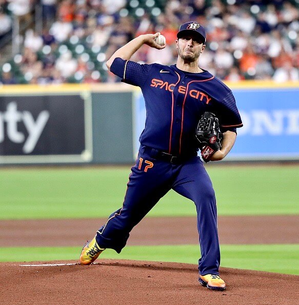
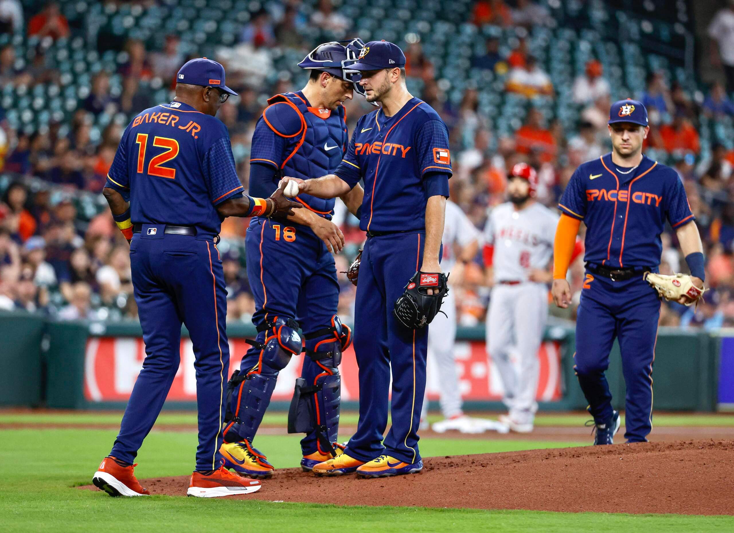
After an uniform unveiling, I often qualify my reaction to the new design by saying, “But let’s see how they look on the field,” because sometimes a uniform looks different in a game than it does in the carefully controlled environment of a photo shoot. And that turns out to be the case with the Astros’ “Space City” uniforms, which made their on-field debut last night.
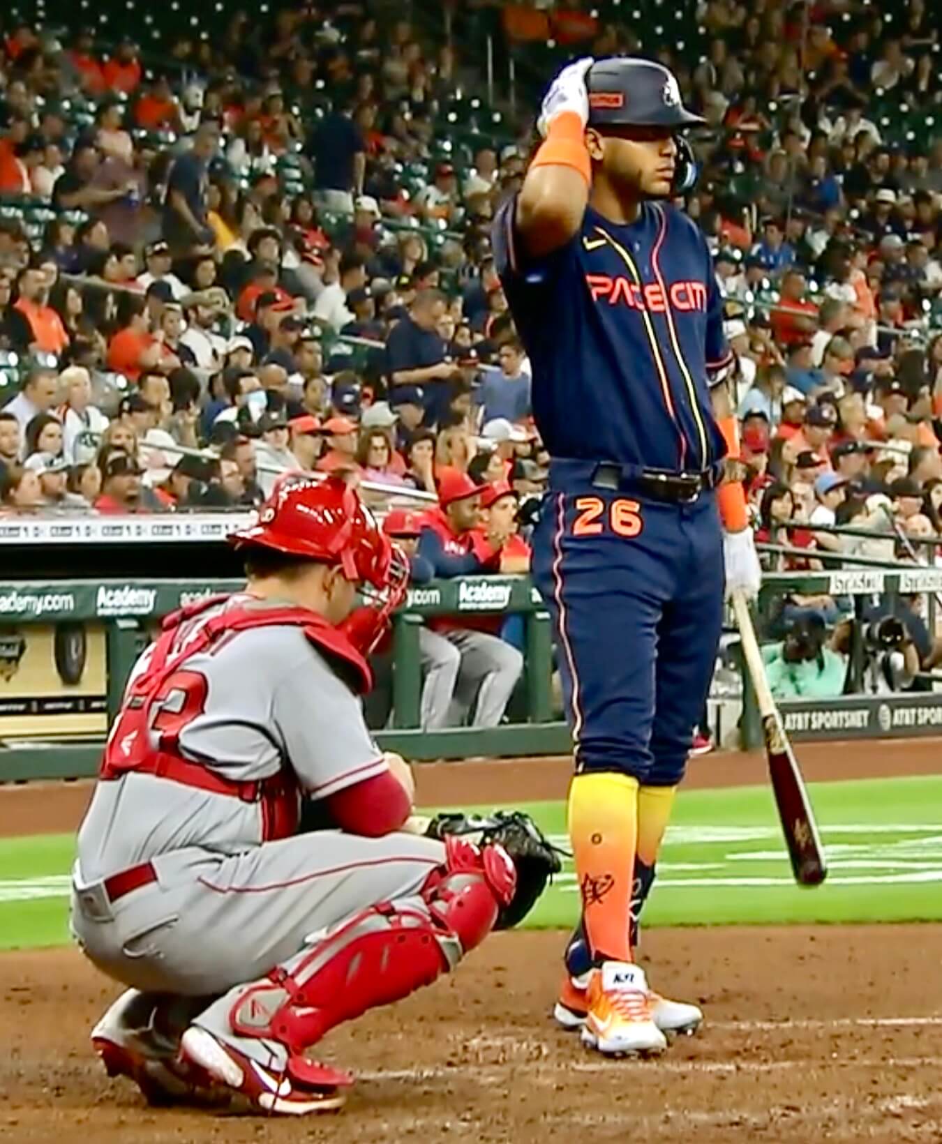
The unveiling photos for this uniform mostly featured dark backgrounds. But on the field last night, in good lighting and with lighter, contrasting backgrounds, the uniform looked really bad, at least to me. The mono-navy design looked super-pajama-y, and the straight-line chest lettering looked plain and isolated instead of space-age and snazzy:
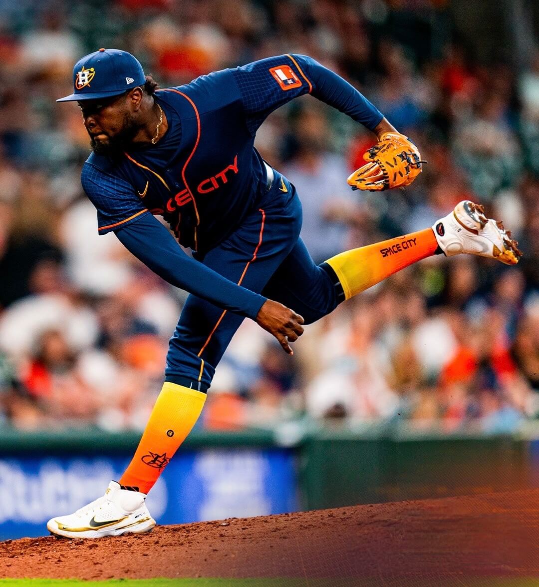
Players who went high-cuffed looked better, because the contrasting socks broke up mono-navy tedium. But I noticed only two players went high-cuffed — outfielder Jose Siri and reliever Cristian Javier:
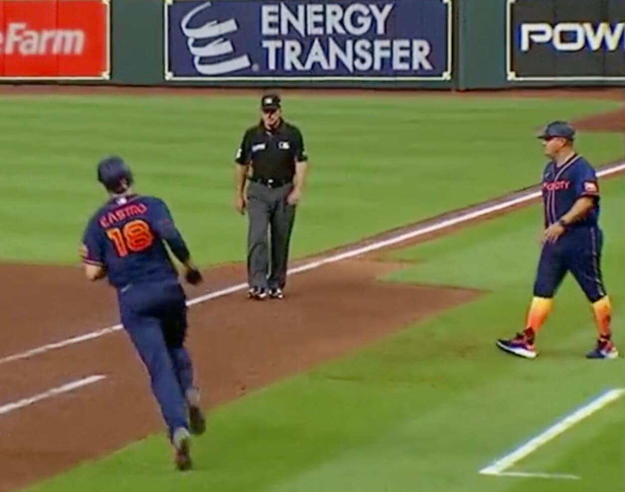
As an aside, I noticed that first base coach Omar Lopez also went high-cuffed — a rarity for a coach! He doesn’t normally do that, but maybe he likes the Space City socks:
Anyway: Not a good uniform overall, although I still love the cap.
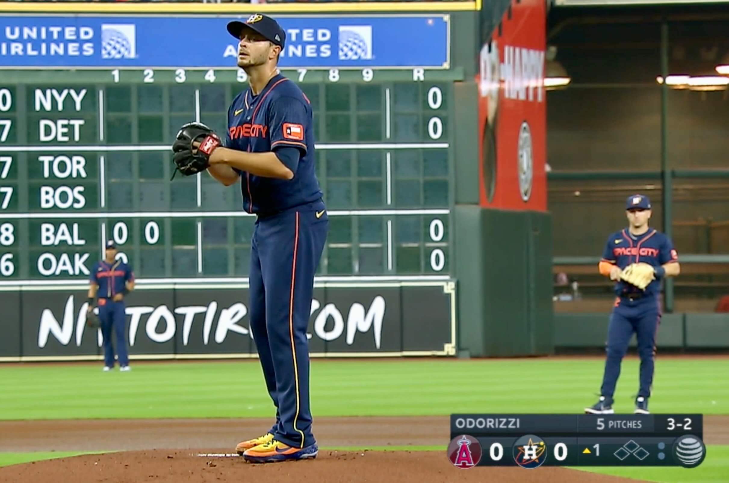
One final note: It’s ironic, and also pathetic, that the Astros celebrated Houston’s heritage of space travel while plastering the mound with an ad for a much more Earthbound mode of transportation:
Click to enlarge
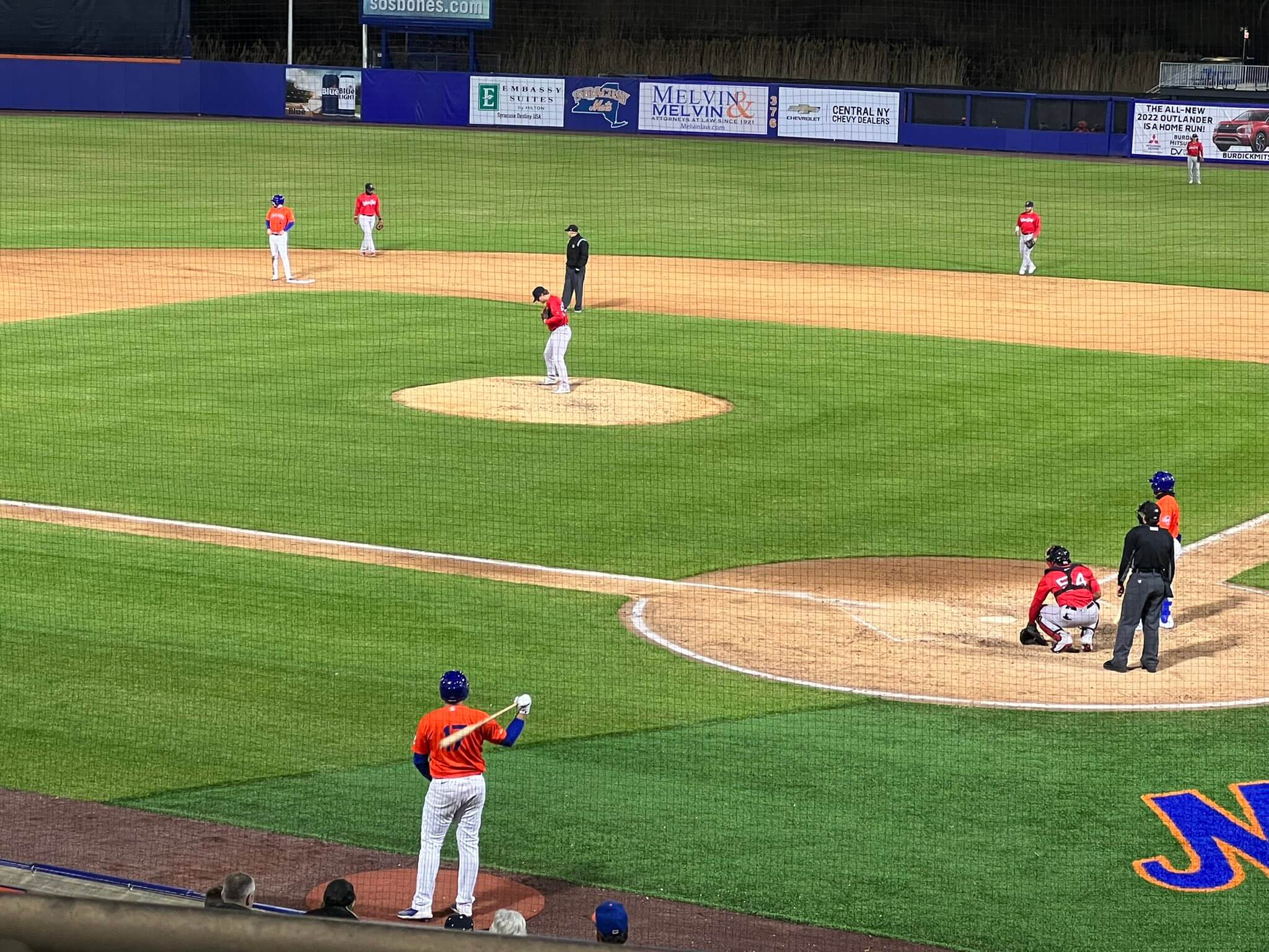
Where’s that Spider-Man gif? Rough game last night in Syracuse, as the Worcester Red Sox and Syracuse Mets went red vs. orange in the second game of a doubleheader (after going navy vs. white in the first game).
Here’s how it looked in action:
Nick Meyer's double brings home an insurance run!
4-2 US pic.twitter.com/1LqCJWkLP8— Syracuse Mets (@SyracuseMets) April 21, 2022
Purp Walk update: In case you missed Wednesday’s and/or Tuesday’s posts, big plans are afoot for this year’s Purple Amnesty Day. I’ve consolidated all of the info onto this page, so start there if you need to get up to speed.
Remember, if you’ll be attending the party at Blake Street Tavern and want to enter the raffle for the free Rockies/Giants tickets, send an email to the raffle in-box by 8pm Eastern tomorrow. One email per person, and indicate in your email if you want one ticket or two tickets. (Sorry, no more than two.) Please do not enter this raffle unless you will be attending the party! I’ll notify the winners this weekend, and I’ll also notify the non-winners so they can buy tickets if they want.
Also, if you’ll be attending the party and want to pre-order the shirt with the bonus logo on the back, you can do that here. Again, don’t do that unless you plan to attend the party, because that’s where you’ll receive the shirt. We will not be mailing them or holding them for later pickup.
Yesterday I booked my flight for this trip. Excited for what’s sure to be the best Purp Walk ever!
Click to enlarge
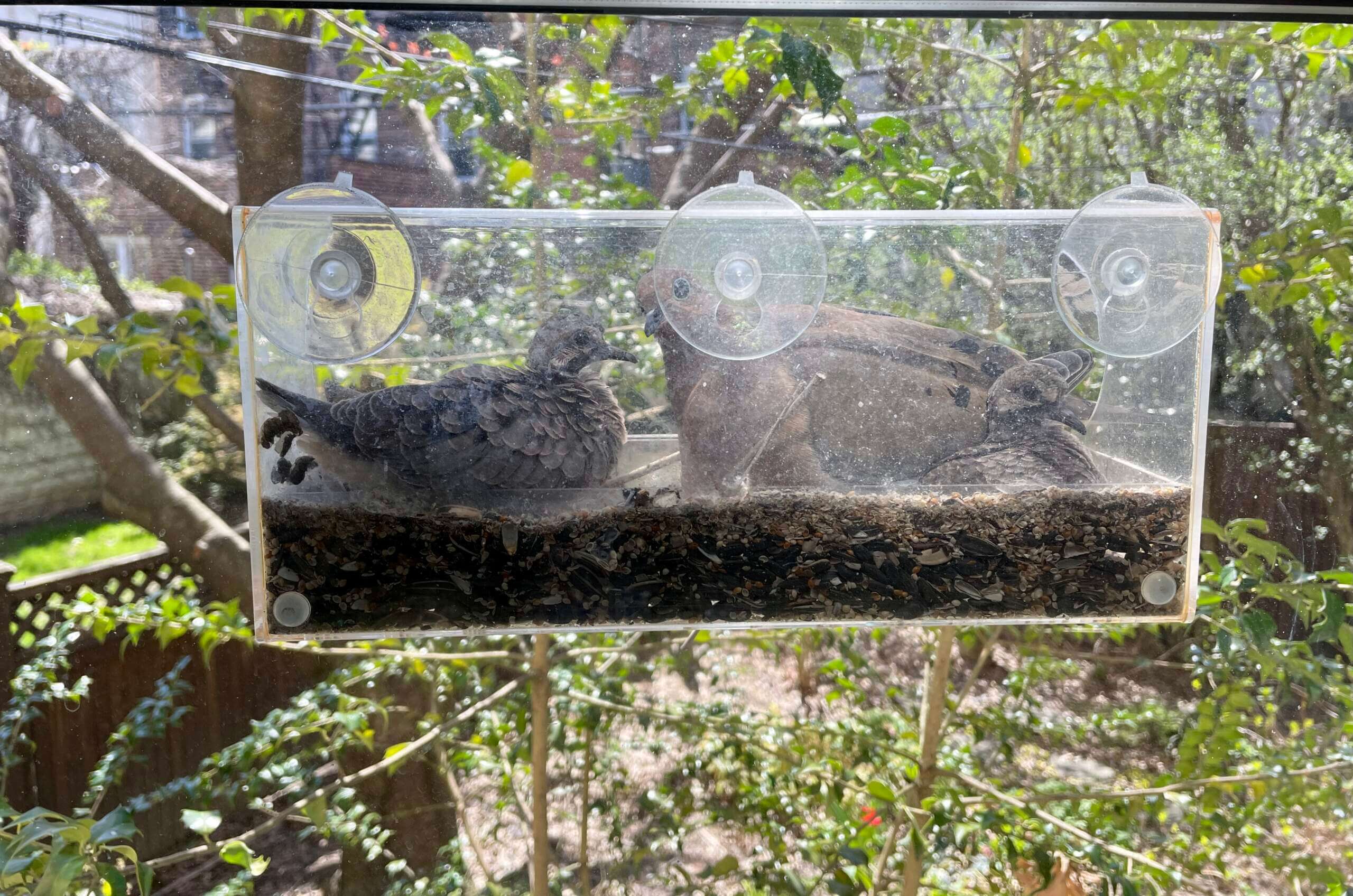
Dove update: The babies are now so big that the family no longer fits in the left-side compartment of the feeder and has spilled out into the adjacent compartment. The babies should be ready to leave the nest in another day or three!
The Ticker
By Paul
Indigenous Appropriation News: All of these are from Kary Klismet: The American Indian Community Center, an indigenous advocacy organization in Spokane, Wash., has donated $35,000 to the city’s North Central High School for new sports team uniforms after the school dropped its Native-themed team name. … A Colorado state commission has added “Thunderbirds” to the list of team names that schools can no longer use because of its ties to Native American culture. … Sandusky High School in Michigan will no longer call its teams the Redskins (also from Scott Crocker). … After two high schools in West Hartford, Conn., voted to drop their Native American team names earlier this year, some parents in the school district have filed a petition to reconsider that move, citing support for the names from the chief of the local Schaghticoke Tribal Nation.

Baseball News: New tequila sunrise-style jerseys for the Single-A Fayetteville Woodpeckers (from Ignacio Salazar). … Former Twins 1B Kent Hrbek’s autobio has some fun uni-related anecdotes (from Trevor Williams). … Among all his other distinctions, Angels P Shohei Ohtani is the rare pitcher with a dirty uniform. … Oops: A pregame parachute promotion at Nats Park prompted an evacuation of the U.S. Capitol. … I’m not 100% sure, but I’m guessing that a pitcher tackling a guy who’s circling the bases after hitting a home run probably violates one of those “unwritten rules” we’re always hearing about. … I love to see a manager going high-cuffed and a pitcher wearing stirrups, but I’d love them both a lot more if their stripes matched. … Hmmm, this is concerning: Hosiery hero Chris Paddack always wore stirrups for the Padres and also wore them last week for his first start with the Twins, but last night he just wore socks, not stirrups.

Football News: The NFL is keeping an eye on the USFL’s use of technology for things like ball spotting and first down measurements. … Here’s a shot of Joe Namath and Mr. T in uniform while shooting an episode of The A-Team (from Brad Eenhuis). … Some new uni number assignments for the Ravens (from Marcus Hall and Andrew Cosentino).

Hockey News: I’m quoted in this article about the brave new world of NHL jersey ads.

Basketball News: Here’s a cool video of the Colorado State floor being repainted (from Chris Ruebel). … New court for the WNBA’s Connecticut Sun (from Trevor Williams).

Soccer News: New “hypno-themed” pre-match shirt for USL League One’s Forward Madison FC. … Here’s a look at the ball that will be used in England’s FA Cup Final on May 14 (from Kary Klismet). … Here’s a video showing some of the best men’s World Cup kits through the years (thanks, Phil). … The charity United to Prevent Suicide has secured the naming rights for Scotland’s men’s fifth-tier Lowland League Cup (thanks, Jamie). … Also from Jamie: “The Afghanistan women’s team is about to restart playing post-Taliban in Australia in one of Victoria’s state leagues, Women’s State League 4 West, with the support of Melbourne Victory. They have red shirts with Victory’s crest. On the back, they’re using an “AWT” NOB, for ‘Afghan Women’s Team,’ with an Afghan flag above that.”

Grab Bag: This is pretty cool: classic rock album covers rendered in Lego (from Jason Hillyer). … Ace Frehley’s original hand-drawn logo design for the band Kiss is being auctioned off. … The rest of these are from the indefatigable Kary Klismet: After an online poll, Valencia College in Florida has chosen the puma as its new mascot. … Western Connecticut State University has chosen “Wolves” as its new team name. … Organizers of the Rugby League World Cup 2021 (postponed until October of this year due to the pandemic) are holding a contest to create a mascot for the event. … New BFBS uniforms for Harvard lacrosse.
If the Astros would just use that font and logo on their regular uni sets, that would be an enormous improvement.
Those Astros uniforms would have benefitted *greatly* from white pants. Would have made the dark blue stand out more and brought more focus on the logo and sleeve patterns. I still really like the jersey and love the cap, but the blue pants just hurt the whole look.
I too love the cap, but orange hats (and helmets) would be my suggested tweak…keep the H white but switch the ‘orbit oval’ to navy.
It’s less hideous if the players showed some sock. The guys who wear the cuffs low look like they’re wearing dark jeans, not a baseball uniform. Monochrome isn’t a great look in baseball, and this should be a cautionary tale to Nike and any teams who want to do this. Just don’t do it.
The designer mush have been a fan of last year’s All Star uniforms worn by the American League and said “yeah, blue pants are ok now”
Agreed. I hate the mono-look, but I think the jersey would be pretty solid with white pants. I have a feeling that most City Connect sets are going to mono unfortunately.
100% true. The mono look that many teams are going with is so “beer league softball” looking that it’s not helping them stand out as much as they think.
Overall, the space theme isn’t really a step away from the normal branding of the team. Would have liked to have seen them step out just as the Marlins or DBacks did.
Thunderbirds? Does that mean Ford is racist?
Yep. So is the Air Force. And Jeep.
Just exhausting.
-C.
Actually, nobody said anything about anyone being racist. The question is whether using “Thunderbirds” is misappropriation.
Let’s please stick to reality and not use inaccurate and inflammatory terms. Thanks.
Paul, what are your thoughts about the ‘Thunderbird’ moniker? And, no I don’t have an opinion on it one way or another, and would actually like to hear more perspectives on it.
Paul,
The new wrinkle here in all of the debates about indigenous team name usage is the appropriation of things and imagery that are not directly referencing (or stereotyping, if you feel that way) certain human beings. It leads to wondering what other team names are up for further debate or elimination. We can go on and on about this (and we do, here on U-W), about what is or is not acceptable. But that’s not the issue for me in this case.
The thing that strikes me about this story shared by Kary is that by eliminating such a team name or mascot as thunderbirds (which most, I would venture, do not find obviously offensive or racist), I believe the opportunity to help educate students — particularly impressionable elementary school kids — about the these mythical creatures and the pride they are held by tribal cultures, is lost.
Imagine if the schools would work with the native tribes in the area to present the stories behind their importance. And the progress that could be made by educating kids through a greater understanding. In this context, I can’t imagine why anyone would argue against that, nor find offense by utilizing a mythical animal as a mascot and source of school (and community) pride.
Instead, by mandating this specific name be removed, it only causes further anger and division. And that does nothing to further dialogue among people who otherwise disagree.
My two cents.
-C.
That’s fine. But the original comment specifically asked if the name was “racist,” when nobody had even made that claim. So I asked that we dial back the inflammatory rhetoric. That’s all.
The sticky wicket in this discussion is whether the archetypical “thunderbird” has purchase outside its use in Indian cultures. Some would argue it does, others would argue it doesn’t.
Maybe a better choice would be “Firebirds”, since that mythical beast occurs in many cultures, not exclusively Indian ones.
On this topic: the University of British Columbia uses the Thunderbirds name for their sports teams. They were given permission to use it in a ceremony in 1948.
Oh, my color blindness!!! Worcester and Syracuse!
I believe the Namath Mr. T photo is from a “A Team” episode.
Nice catch! link
“I pity the fool who doesn’t like ginormous pants stripes”
Comment of the day!
Have to agree, those Houston unis are awful, just not a fan of mono coloring, unless its grey, powder blue, and white. I am so worried about my Royals connect uniforms.
IIRC, the Mr. T/Joe Namath photo is from the set of “The A-Team” in 1986 for an episode called link
IIARC, the link in that episode wore #14 on the front and back of his jersey and #12 on the shoulders.
#14 is actor Alan Autry, maybe best known for his role on TV’s “In The Heat Of The Night”.
Interesting note…Autry (then known as Carlos Brown) was a QB in college, a 12th round pick of the Packers in ’75 and started a few times in ’76.
And here’s a shot of him in character (Mike “The Hammer” Horn) from that A-Team episode(a bit hard to see but jersey seems to have NickNOB):
link
I’ve read that since the HBO series “1st and 10” also made use of the USFL’s LA Express footage, all their QB’s wore #14 to match the game action.
This made me curious if Mr. T played football. His Wikipedia page (link) says he briefly attended Prairie View A&M University on a football scholarship, but an extremely quick search didn’t turn up any photos.
There was a picture of him in uniform for Dunbar Vocational High School (link)
I remember that episode, and the script had them playing a Warsaw Pact (East German?–works with the NJ Generals’ colors) team, in front of a purposefully empty stadium.
Clever way to work in USFL game footage.
Perhaps I’m hair-splitting here, but from the looks of it, those navy pants look a bit better when they’re more tapered at the bottom, as opposed to the boot-cut look that most player seem to prefer. The baggy, floor dragging cut of pants really never looked good in the first place (on baseball players and out in the world) and thankfully, that look seems to mostly be gone…except on a baseball field.
Agree that the on field the look for the Astros uniform is brutal. Also I’d add that in action the E isolated in the head spoon looks even worse.
As with most of these Nike Alts there are some nice features but as a whole they just don’t work. Sort of a testament that in fact Nike does have some good ideas, but their overall ethos seems to be more is always better, and they can’t get out of their own way to just implement the good stuff without overdoing things.
The alternate hats are by and large more successful than the uniforms in general–I think it’s because the hat designs have shown a bit more restraint than the uniforms.
Agreed, there is only so much you can do with the hat… though I am sure Nike will prove us wrong on that also.
If the NBA is any indication on where this is heading in other sports, the uni-ads are almost an afterthought. When uniforms that create a recognizable identity for teams give way to an ever changing array of what is essentially merchandise promotion, the ads aren’t nearly as much sacrilege, because the teams have already burned their identities.
Agreed–I think these alternate unis seem like a last gasp attempt to boost baseball jersey sales. I would guess that people don’t tend to buy a lot of baseball jerseys, if any. Maybe the City Connect jerseys being so different from the home/away looks are an attempt to get someone to buy a second or third jersey, but the real barrier is almost certainly the outrageous price points. (God, I sound so old!)
A Canadian anchor on a highlight show last night mentioned something about the Astros uniform and I think he was on to something. It looks like the type of uniform that should be worn during a beer-chuggin’ Sunday afternoon slow pitch game. But it was worn in the Big Leagues.
Not sure about those numbers on the pants. Didn’t we learn from the White Sox uniforms from years ago?
Well, the Sox took the idea from the ’Stros.
The Houston unis look like something that Cintas is in charge of and they will pick them up after the game to launder them.
Hey Paul! That’s actually Sandusky High in Michigan changing it’s name. Sandusky High in Ohio has always been the Blue Streaks.
Thanks. Fixed!
Sandusky High is the Blue Streaks? I love it when a school’s nickname references something local, like a roller coaster.
Not sure if the sweater on CC Sabathia has been mentioned – He’s at the Yogi Berra Museum Awards.
link
Those Lego album covers look amazing! Paul, I know you’re a fan of music, have you dipped your toes into the vinyl revival or are you someone who never stopped collecting? If you’d like to dive into this deeper, I’ll make a note to submit for the next reader submission post.
Never stopped.
What I found most fascinating about the “Space City” uniforms were the head spoons were different on the players. Possibly the pants stripe too, but if it is, it was not as noticeable to me as the head spoon was.
It’s absurd that the NFL is STILL using the antiquated chain and refs eyes to properly place the football, especially when there is a qb sneak or really ANY short yardage play. Just stick a chip in the damn ball and *gestures vaguely* GPS every field in every NFL stadium and hire some nerd from MIT to figure it all out.
Oh wait, that might cost the NFL a couple million dollars so they’ll never do it.
And of course what happens to the schmucks who hold the stupid yard marker poles if the chip thing does happen? Will the NFL keep them on as some sort of ‘old school’ garbage like Nascar refusing to switch to automatic transmissions? Or will they fire all of them?
Again, what am i saying, of COURSE the NFL will fire all of them.
Also REALLY looking forward to the chip being sponsored by whoever makes it and the announcers being forced to say the chip companies name every time.
Given the “old school”, “Bat flipping disrespects the game and anyone who flips their bat should be beaned and suspended for the year” attitude towards the idiot ‘unwritten rules’ of baseball by posters here, I’m really surprised not to see any comments supporting that jackass pitcher for assaulting the batter who hit the home run.
Also, unless there was a LOT more that happened after the video clip in the story ended, there was NO brawl. The benches didn’t empty nor did the bullpens.
Why are you complaining about things that haven’t even happened yet? It’s almost like you’re disappointed that bad things haven’t taken place because then you’d get to be more cranky about them.
Let’s please stick to commenting on things that *have* happened. Thanks.
Wow.
And I thought I had a cranky streak.
-C.
Ha, ditto. My first thought in response to this was, “Tell me you aren’t open to an honest discussion about ideas and opinions without actually telling me.”
How does the chip in the ball know when the knee (or other body part) is down?
“…some sort of ‘old school’ garbage like Nascar refusing to switch to automatic transmissions”
While not “automatic”, NASCAR’s NextGen cars scrapped the H-pattern 4-speed manuals used forever with a new 5-speed sequential-shift transmission. Yes, it still has a clutch but drivers only use it to shift into 1 or R (for years they have been shifting without using the clutch anyway, matching gear shifts to RPM). A lot of money was spent with the hope of saving teams money by reducing breakdowns and adding flexibilty/adjustibility for different track layouts, which leads to better racing(?).
Now if they would just get rid of the ‘new-school’/ad friendly number placements!
Chris —
Some of those forward number designs are jarring to the eye. No doubt about it!
-C.
I wonder how many readers will bolt when there’s no more dove news!
The Astros unis are horribly bad. The socks are so ridiculous that I think it is a better look for the ones that went full-blown pajama bottoms.
Another quick note about the Astros is that they *technically* had CC-specific batting helmets already too. Matte navy last night instead of their usual gloss.
My misgivings about the Astros’ uniforms are 1.) the straight-across lettering, which never looks good; doubly so because it was stitched to a plate, and 2.) the number on the pants needs to be four inches lower.
What an un-alloyed disaster of a baseball uniform!
The game pics caused me to say, out loud to an empty room: “Who the f**k is designing uniforms these days? Just anyone?”
If this is the New, the Cutting-Edge, the Fun-With-It, the Finally-Something-Different…count me out. You can’t feed me dogshit and tell me its filet mignon…
Thunderbirds – does that force the group that organizes the PGA Phoenix Waste Management Open to find a new handle?
Re: Syracuse Mets- I commented this on Sunday but during their game they played on Sunday vs the Columbus Clippers, they were also wearing orange while the Clippers wore red. It was a day game and it was awful (the unis, not the game).
Fayetteville Woodpeckers jersey:
That’s actually the second Fayetteville Rainbow Guts jersey the team has trotted out. The original had the wordmark FAYETTEVILLE on it.
My blog did our own take on the jersey:
link
It’s too bad my 1978 print on the blacktop from the pounded erasers at school has no photographic record…it would have fetched more than Frehley’s
Why did it take so long? The “Kiss” logo is so enduring and omnipresent, it has taken on a life of its own, divorced from whatever feelings you might have about the band. Like the Golden Arches and Chevrolet’s bowtie, you expect to see it on all seven continents. I certainly have worn my share, and I don’t particularly like their music. I just like well-designed insignias, and I defy anyone to tell me it isn’t.
The Space City uniform suffers from the mono look (like both Chicago teams do) and the straight plate with the wordmark looking awkward. Arch stitching with no plate and wearing the jersey with regular white or grey pants should fix it. The hat is the star of this set.
Astro’s softball team just took the field. I know it’s all about selling merchandise for Nike. But, damn. Just like the NBA, I don’t like turning on a game and not recognizing the teams by the uniforms or the court. Shit is getting old.
Well the hitter is more likely to have violated an “unwritten rule” than the pitcher. The pitcher violated a written rule, namely a Texas statute on assault.
I can’t believe I’ve been a CFL fan for decades and haven’t stumbled across 13th Man.
Tangent: We all know that LA’s Wrigley Field was the diamond for many baseball scenes on the big and little screen. But is there a database of sport scene filming locations for (especially) baseball and football?