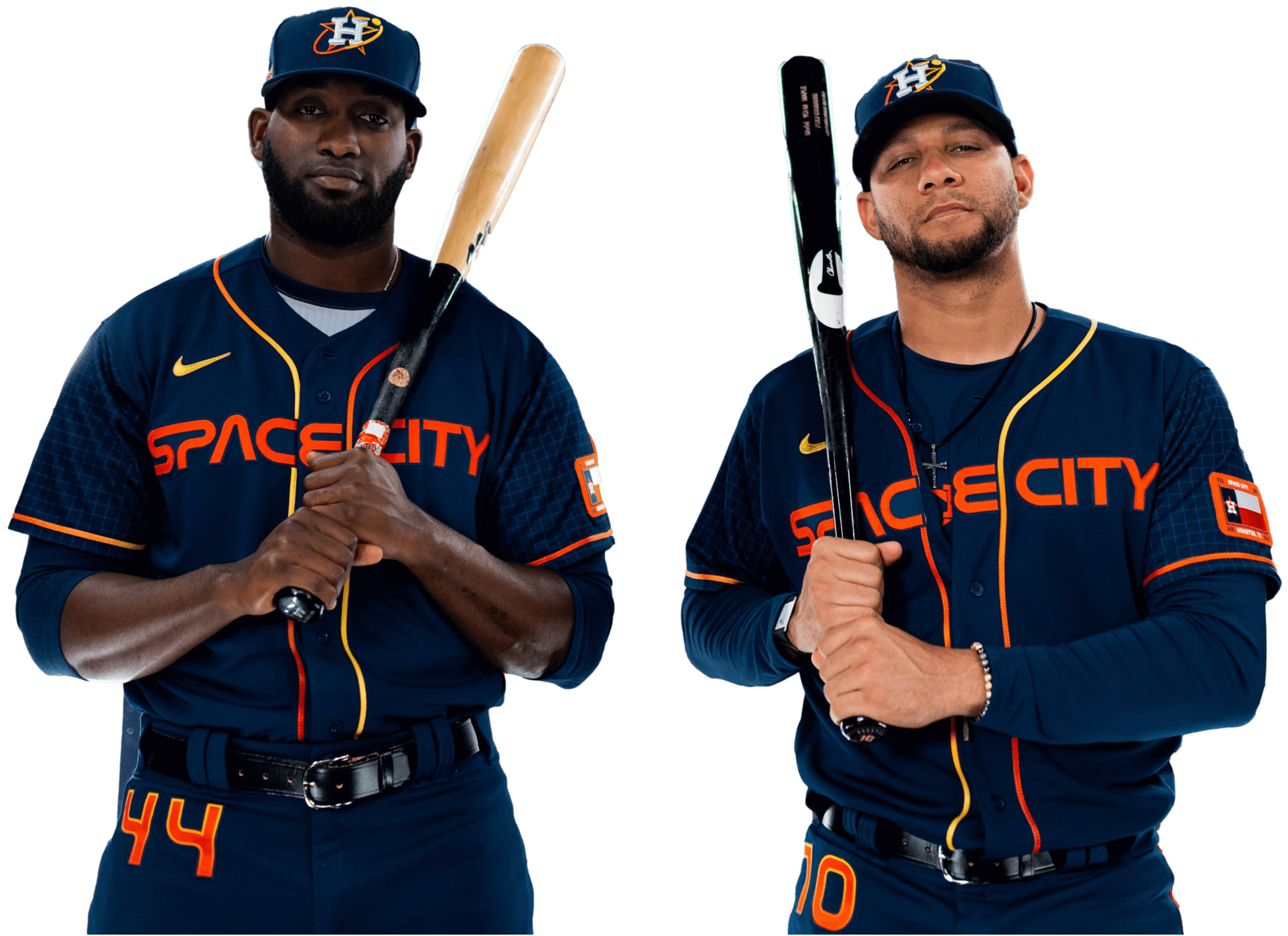
For all photos, click to enlarge
The Astros yesterday became the second MLB team this season to unveil a City Connect uniform, as they released a NASA/space-themed design. There’s a lot going on here, so let’s go one element at a time:
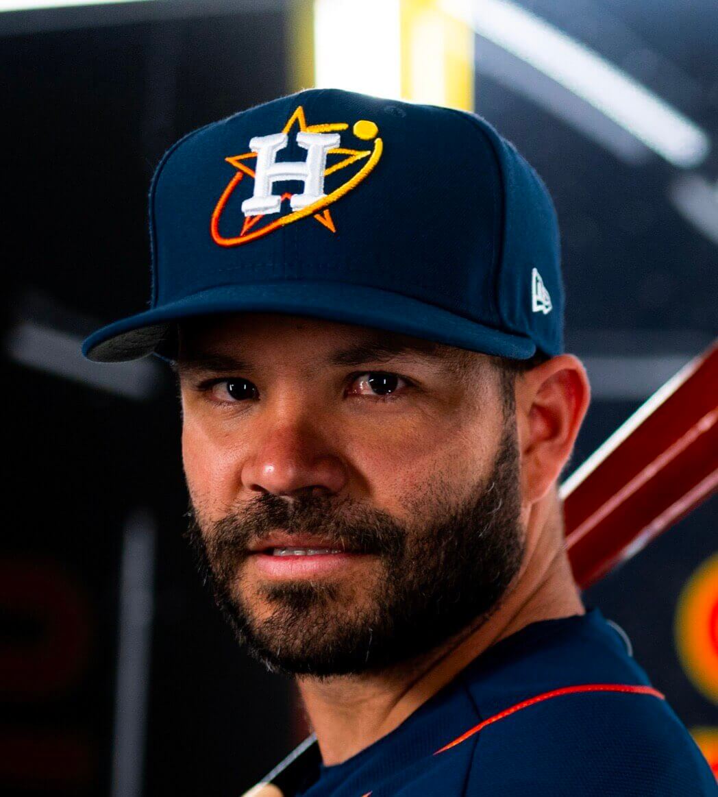
The Cap
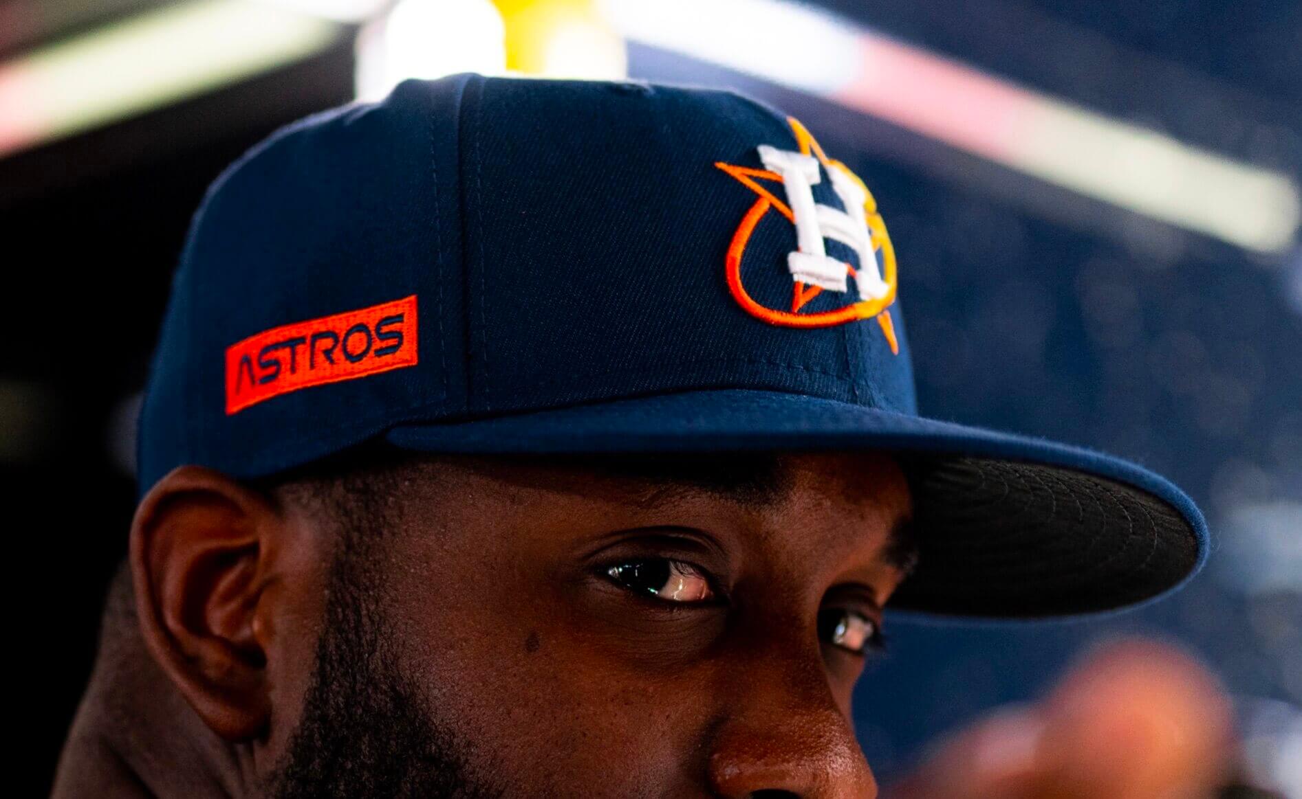
I love this and would be happy to see them make it their primary. Well, except for the silly wordmark on the side, which is an unnecessary gewgaw:
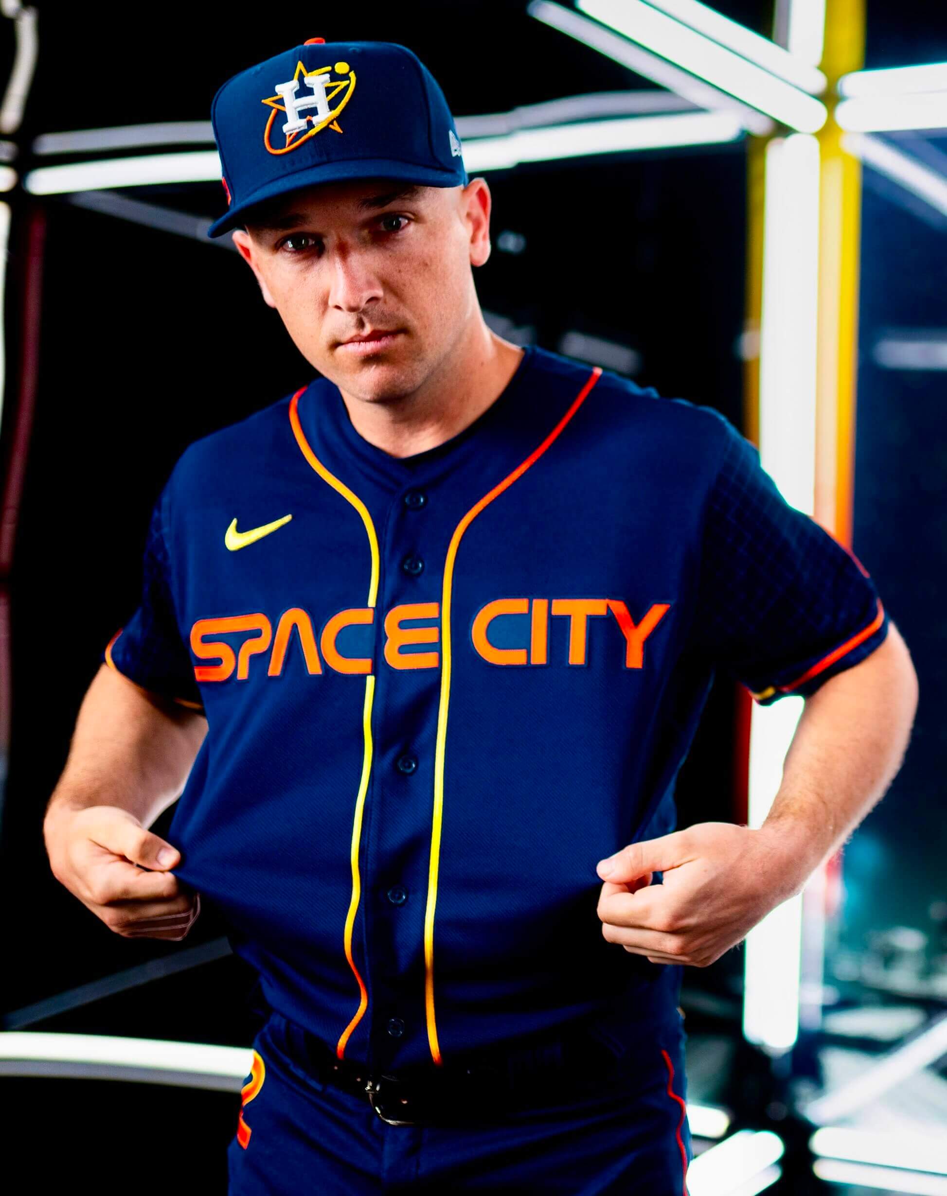
The Jersey
Do Houstonians really refer to their town as “Space City”? Whatever — the team name is based on the city’s connection to space exploration, and the use of the familiar NASA font is a clever move that works, especially with the “SP” ligature at the start of the chest lettering.
Other notes about the jersey:
• I also like the tequila sunrise-style headspoon.
• I’m not so fond of the area code-laden sleeve patch:
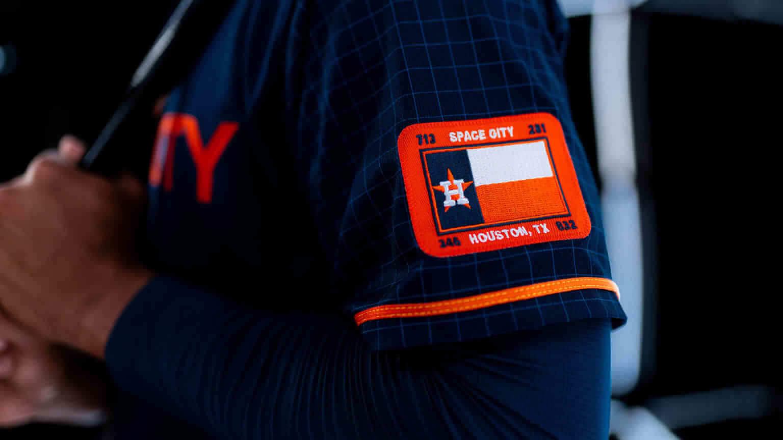
• As you can see in that last photo, the sleeves have a graph-paper pattern, which is rooted in a typically absurd bit of “storytelling” that I won’t dignify by spelling out here. But the pattern is pretty much invisible except in close-up views, so whatever.
• They’re also using the NASA font for the NOBs:
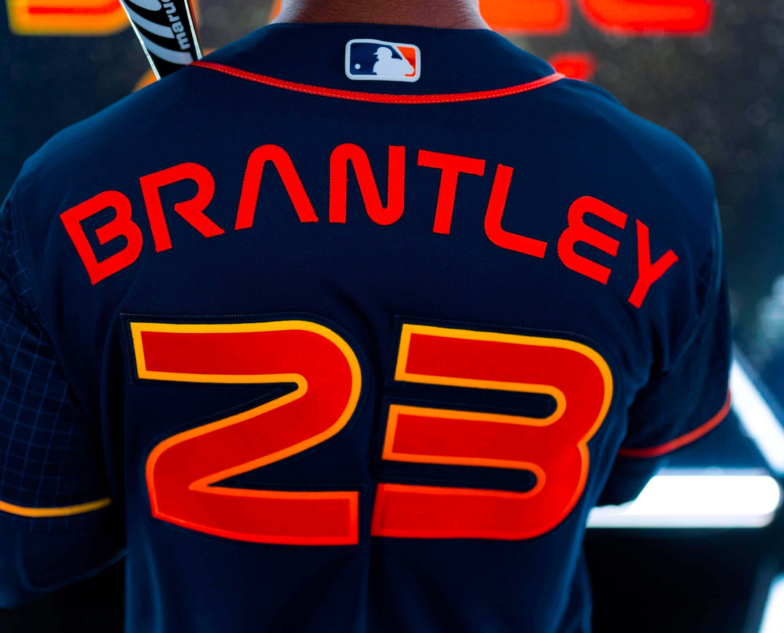
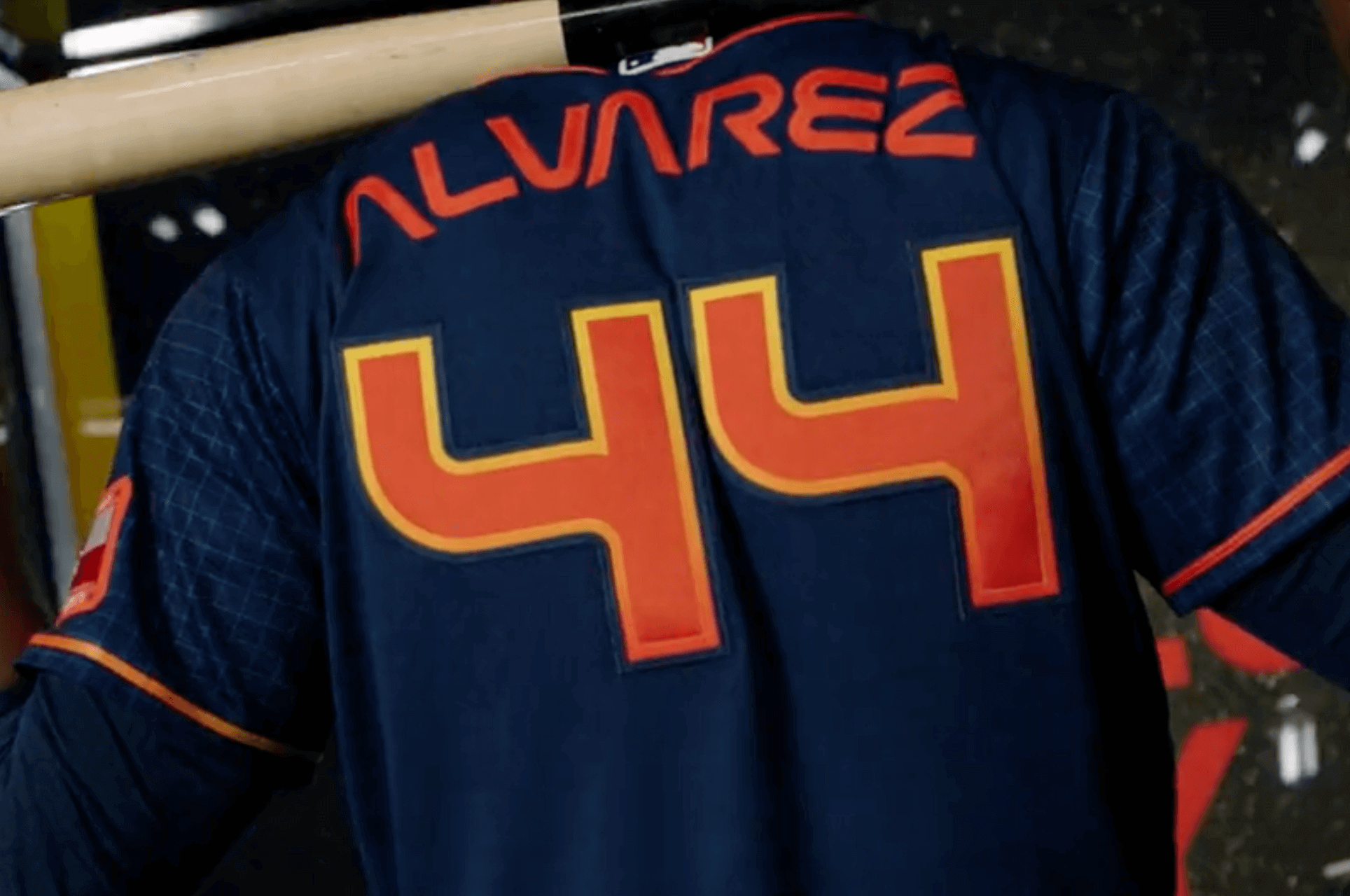
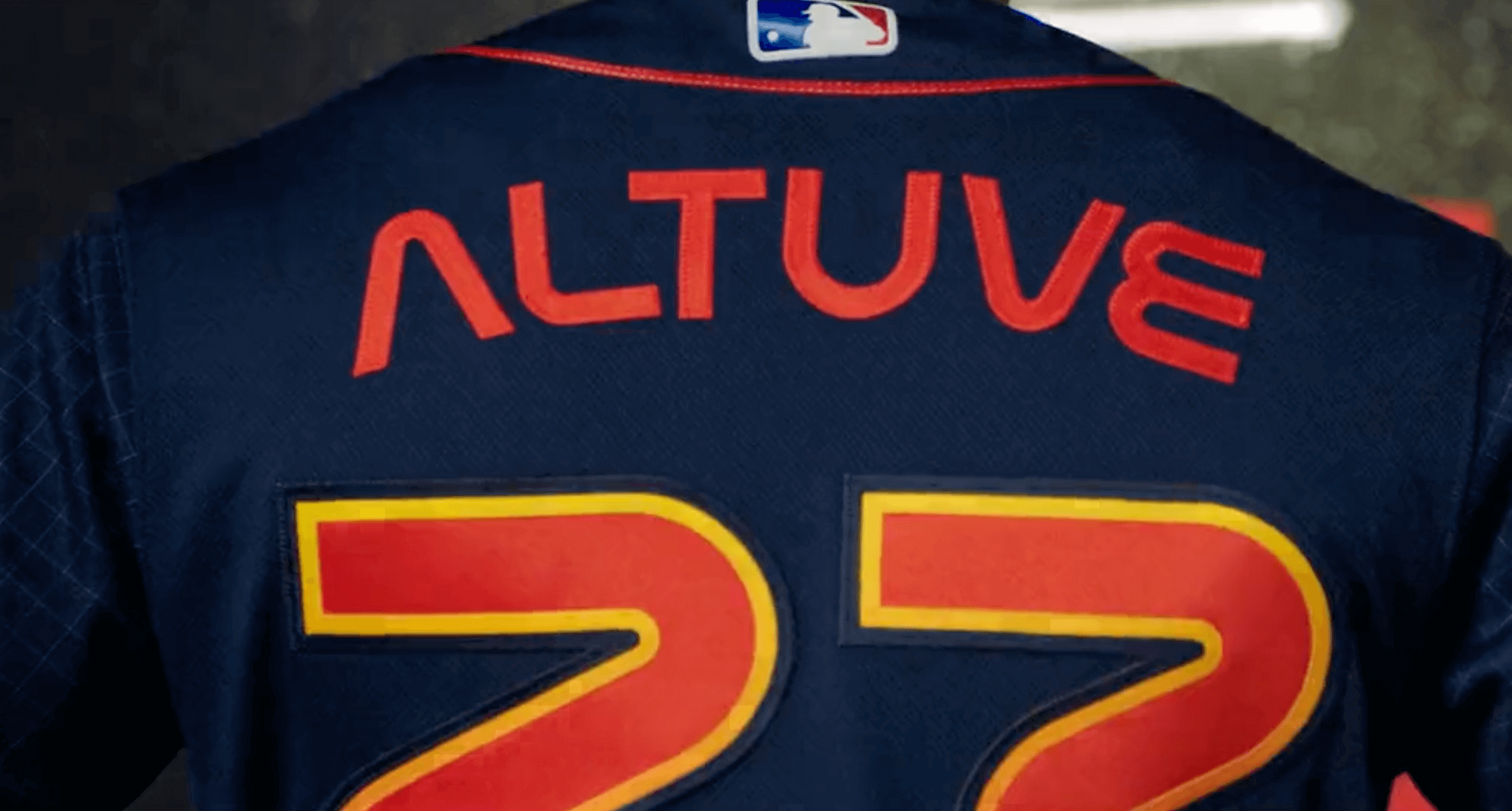
Those look pretty nifty. But I don’t think it’s a coincidence that the Astros chose to showcase three NOBs that include the letter “A,” which is obviously the coolest letter in the font. I have a feeling the visual effect won’t be as strong with a surname like, say, Tucker. (On the other hand, of the 28 players currently on the Astros’ active roster, 18 of them have at least one “A” in their surname, so there you go.)
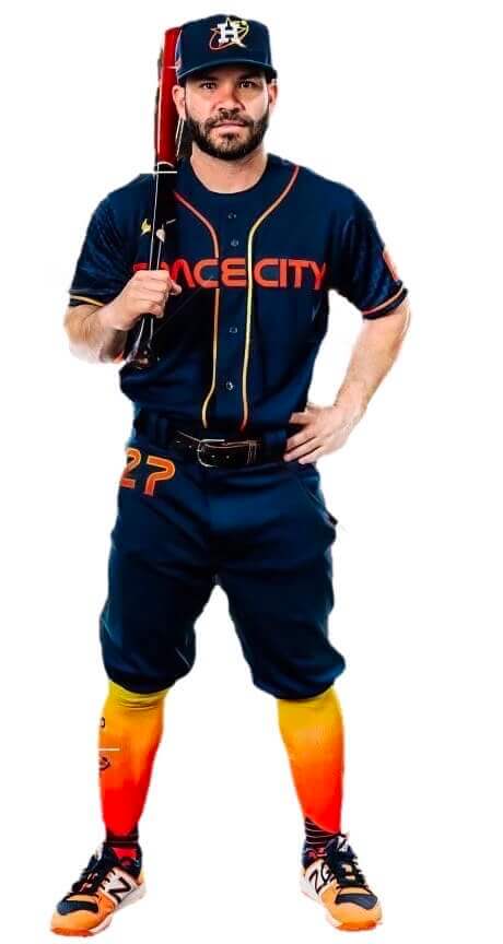
Below the Belt:
The number on the hip is a nice tequila sunrise echo, but I hate that they’re going mono with the navy pants instead of just wearing white.
As for the socks: Would’ve been fun if paired with white pants, but the contrast with the navy pants is too much. Most players, of course, will go low-cuffed anyway, so we’ll just see navy pajamas out there. Woof!
Overall: A very good cap, and some good elements sprinkled elsewhere in the design, but not a fully successful uniform, mainly because of the mono look.
This uniform will make its on-field debut on April 20. The next team to unveil a CC design will be the Royals, sometime later this month.
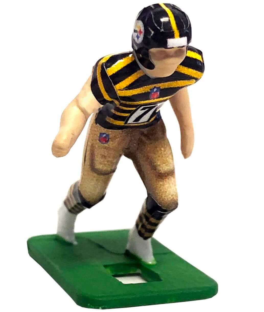
Electric Football update: Last summer I wrote a piece about a new uniform format for Electric Football. Instead of buying pre-painted players or having blank players custom-painted, fans would be able to apply decals to the blank figurines.
Tudor Games prexy Doug Strohm tells me that the new format, called Uni-Forms, has been a big success and is expanding to include more uni designs (like the Steelers bumblebee throwback shown above), including more college teams. You can see the full range of current offerings here.
As someone who grew up playing Electric Football (and who cares about uniforms, obviously), I’m really happy to hear that the game is continuing to thrive and evolve.
Photos by Mary; click to enlarge
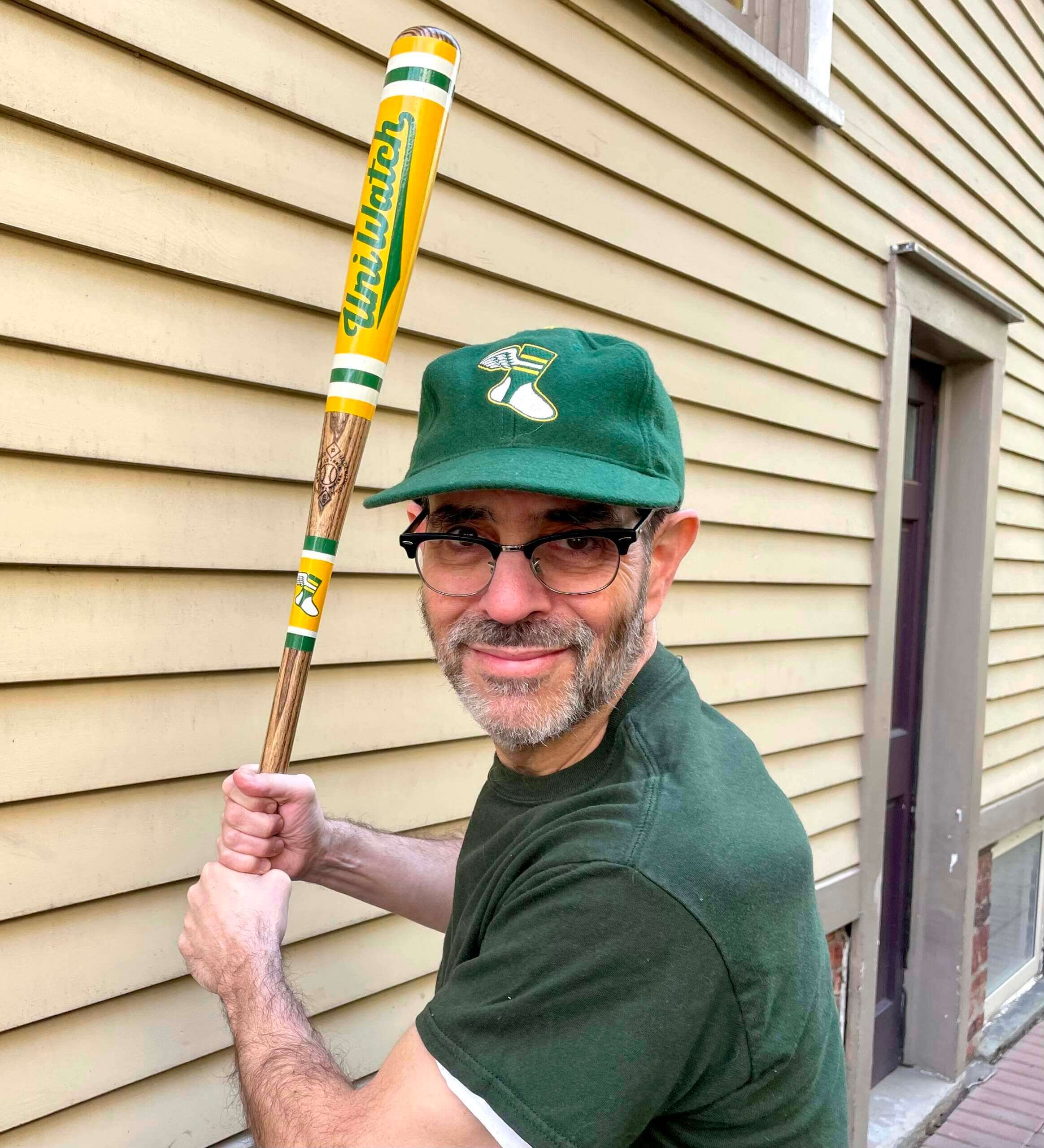
Bat update: I recently mentioned that we’d soon be partnering with the great Pillbox Bat Co. on a line of Uni Watch bats. I’ve now received one of the prototypes, and I can honestly say it looks and feels superb! A really nice object. Here are some additional pics:
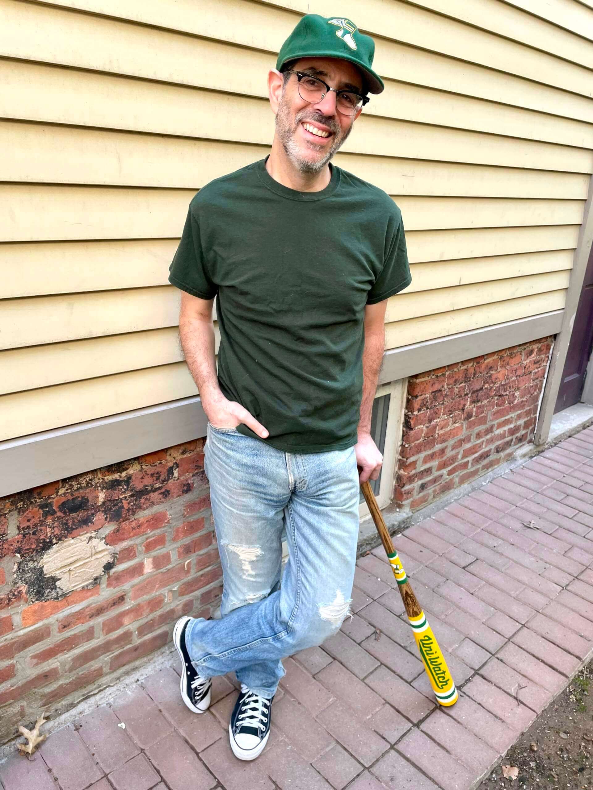
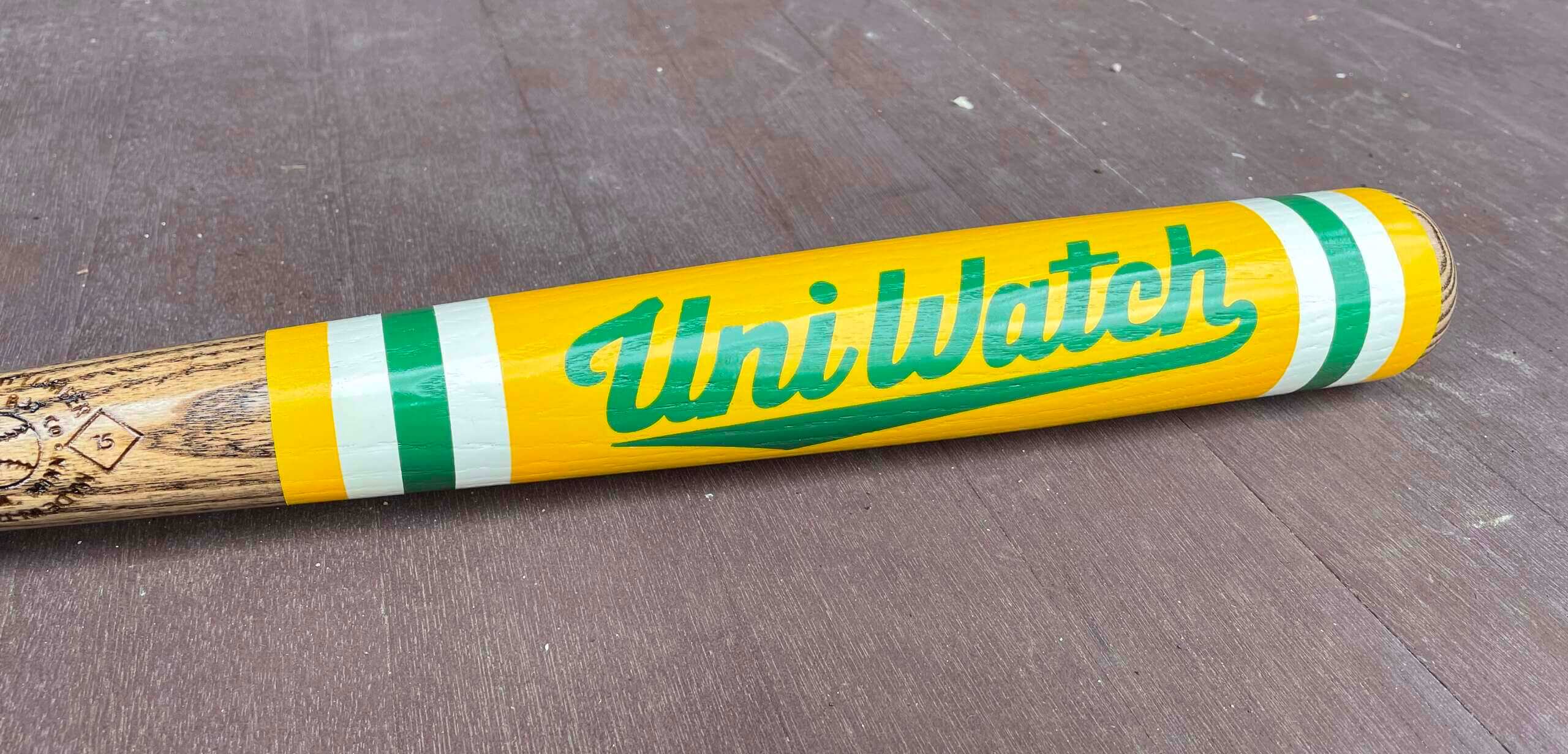
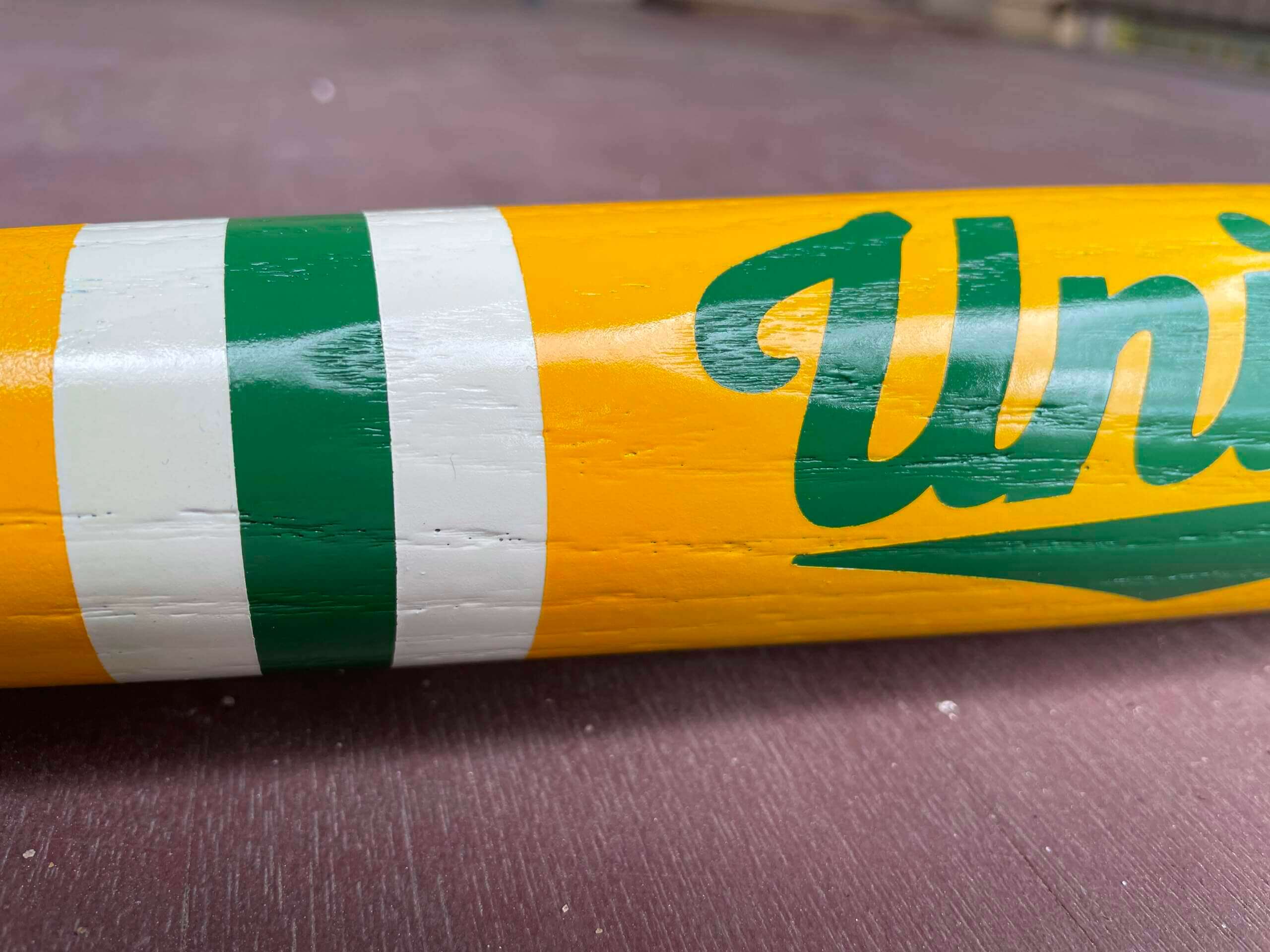
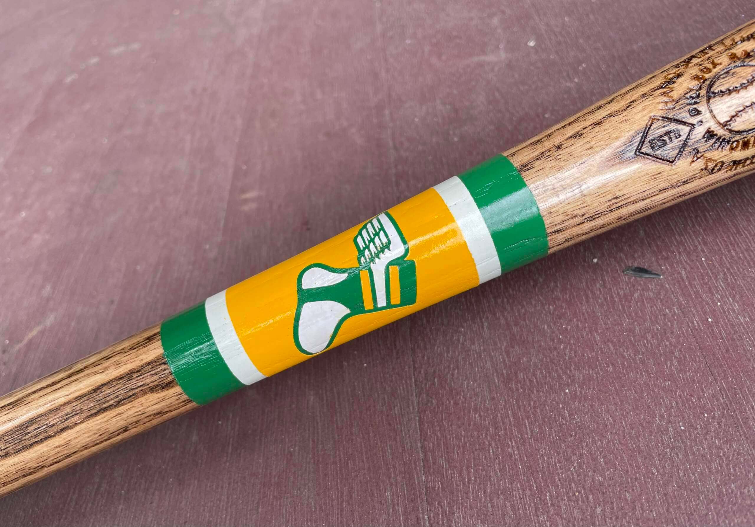
I also received a sample of a mini-bat (17″), and it looks mighty fine as well:
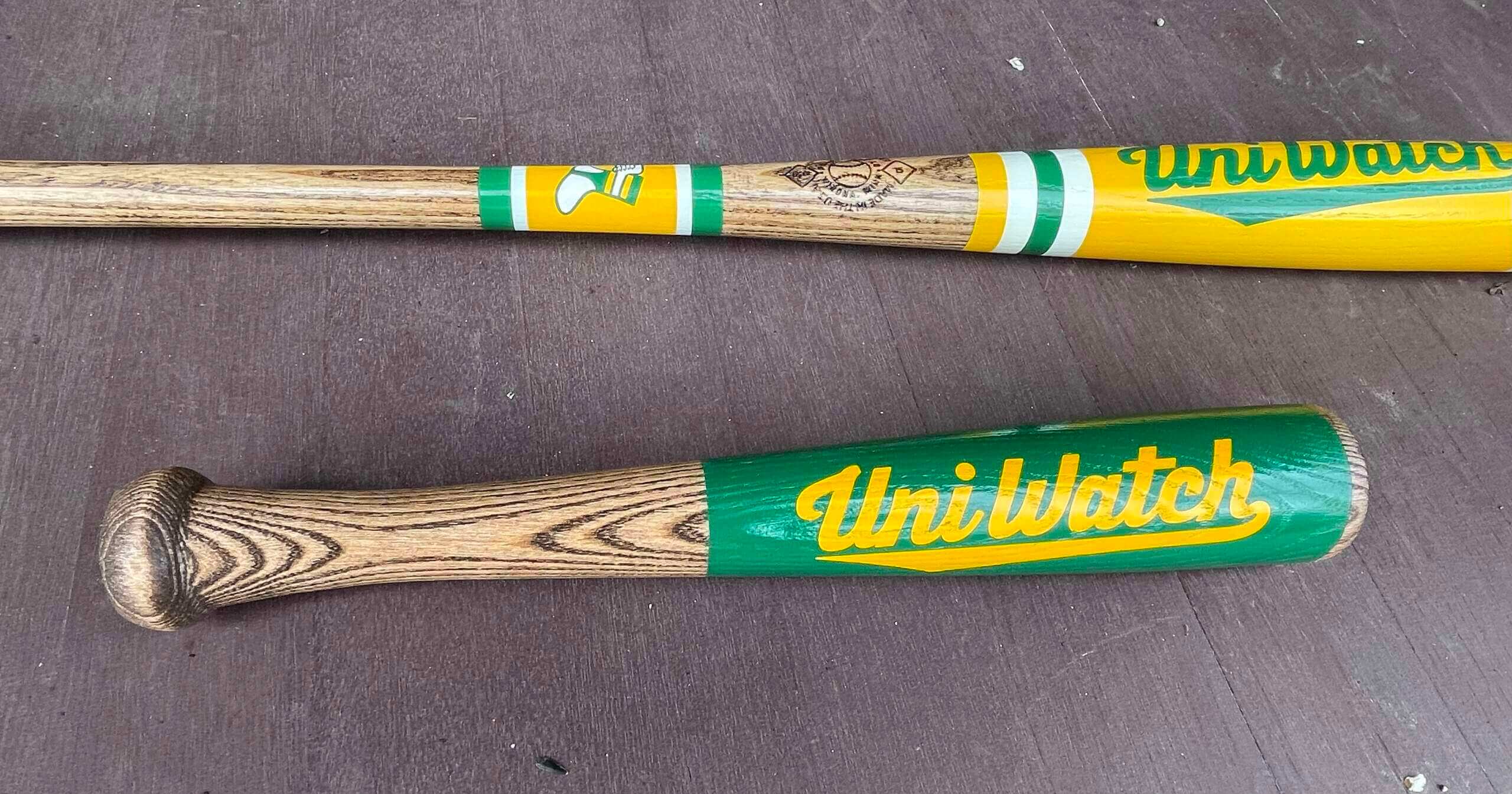
As you may recall from my earlier post about these, we will also have green and BFBS versions:
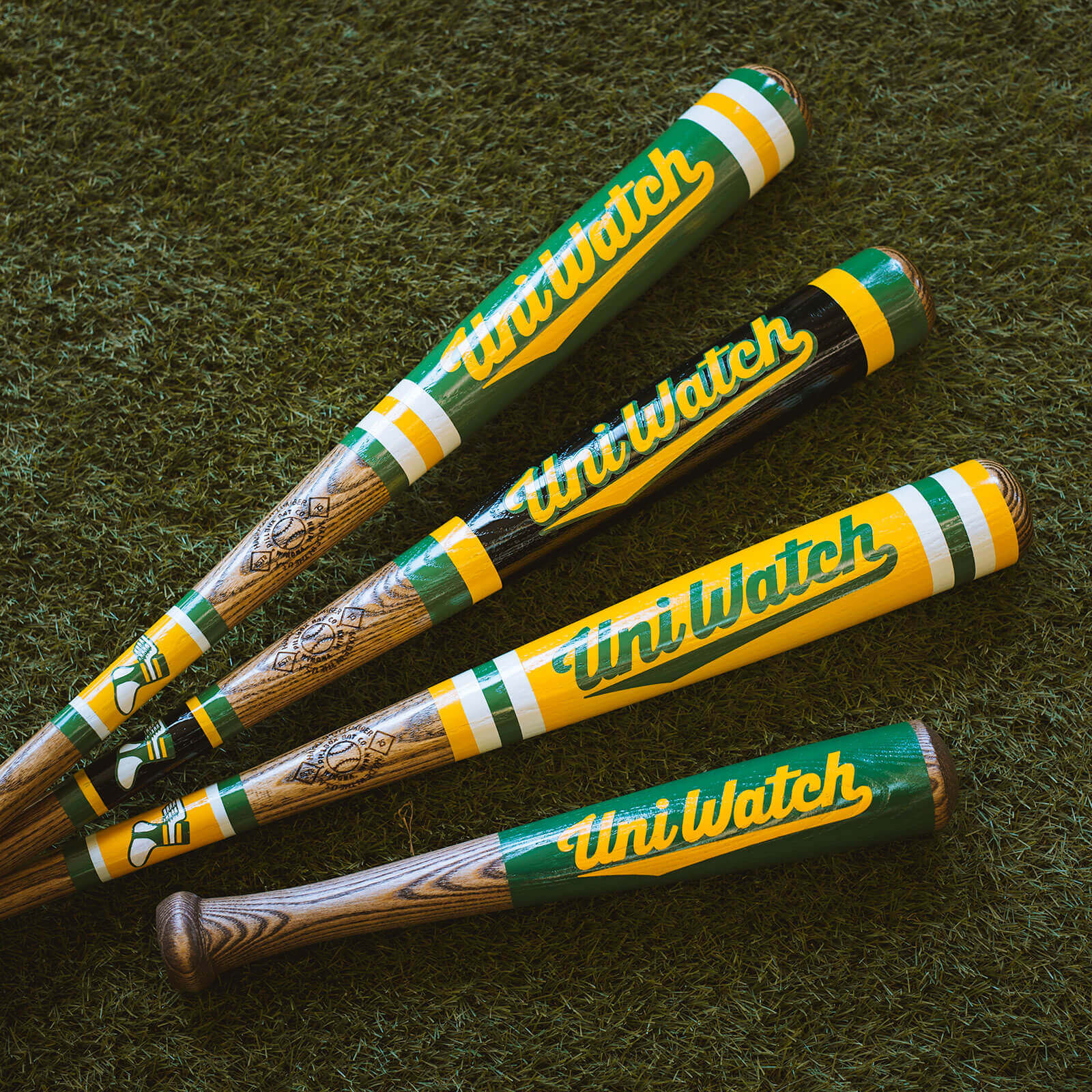
The bats will be available for purchase soon — I hope later this week. Stay tuned.
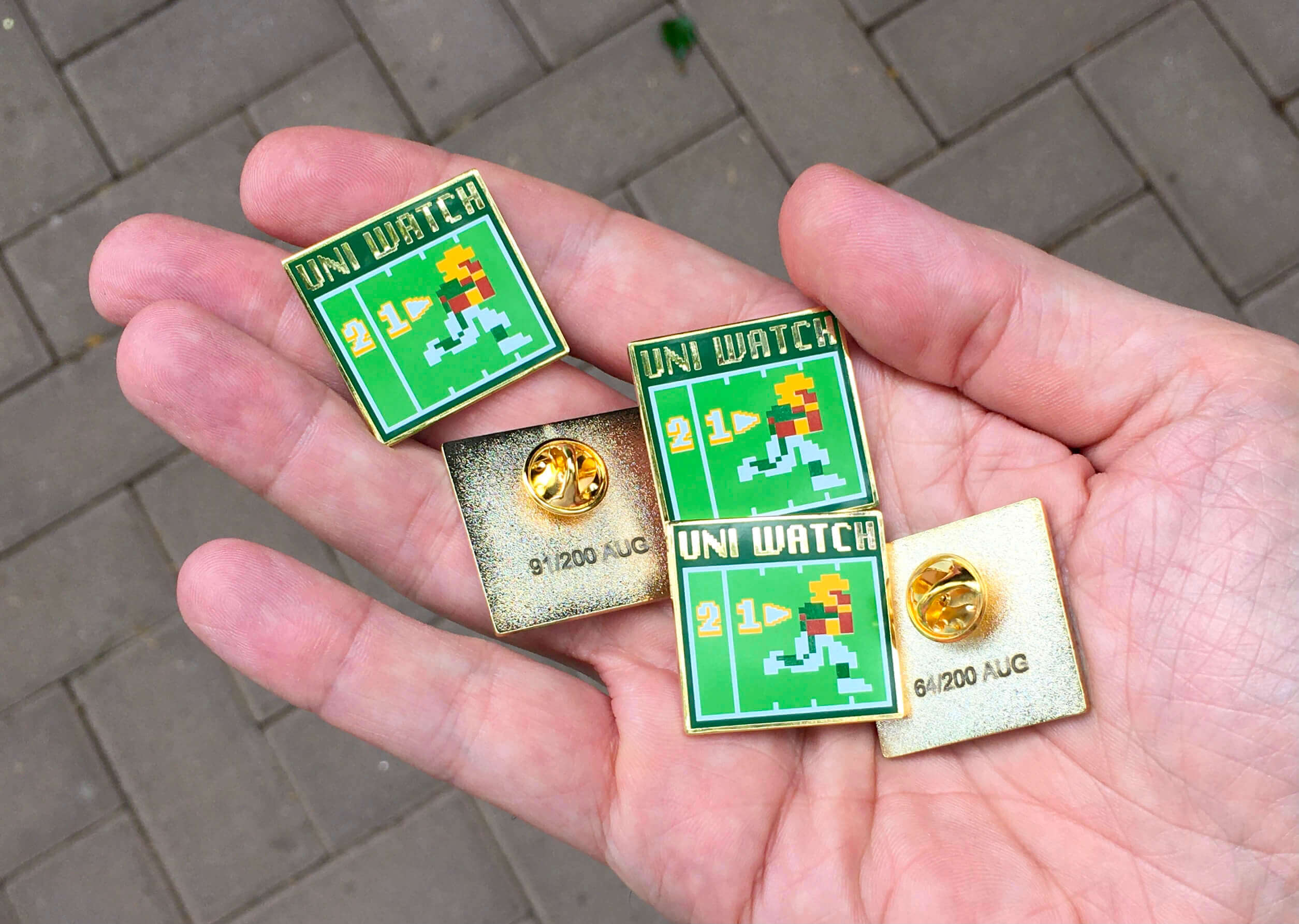

ITEM! Pin raffle: Reader Bill Fenbers has an extra August 2021 Uni Watch pin — the Tecmo Bowl-themed design — and has generously offered to let me raffle it off, so that’s what we’re going to do today.
This will be a one-day raffle. USA mailing addresses only. To enter, send an email with your mailing address to the raffle in-box by 8pm Eastern tonight. One entry per person. I’ll announce the winner tomorrow. Big thanks to Bill for doing this!
Click to enlarge
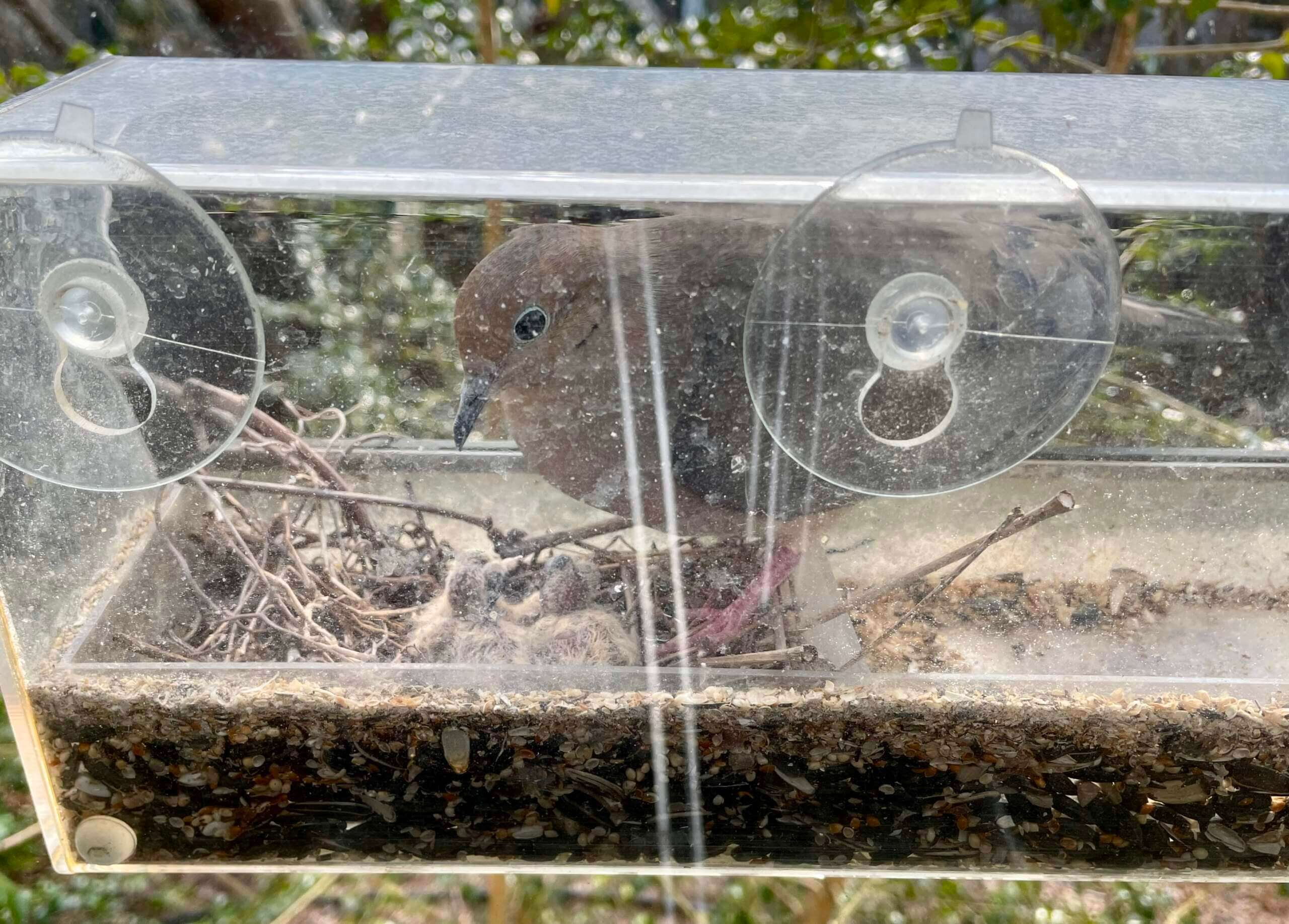
Nest update: I’m very happy to report that the baby doves arrived on Saturday! We’ve only gotten very brief glimpses of them, because the adults spend most of their time sitting on them to keep them warm (just like they sat on the eggs), but they’re definitely there.
Here’s a very short video clip of Mama Dove feeding one of the babies:
Awww — the miracle of life and all that. I’ll continue to provide periodic updates as events warrant.
Click to enlarge
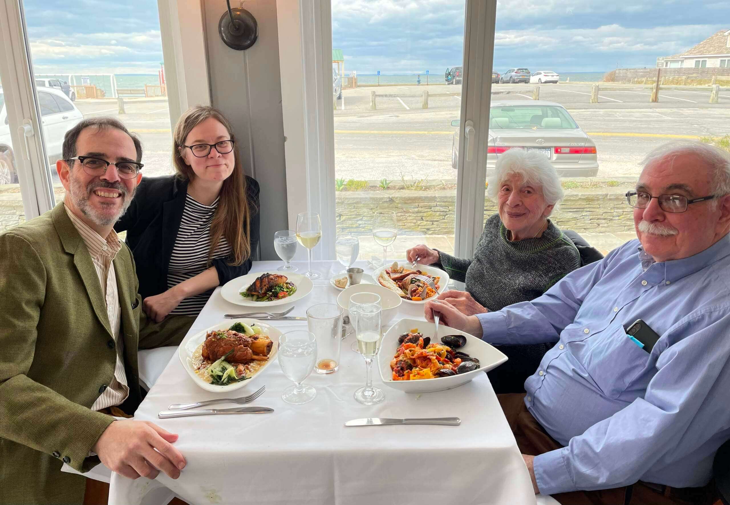
Speaking of the miracle of life: The baby doves aren’t the only ones with a birthday on April 9. My indestructible mom turned ninety-fucking-eight years old over the weekend, so Mary, my brother, and I took her out to lunch.
In the interests of honesty, I should say that these family outings aren’t all rainbows and sunshine. Families are complicated, and ours is no exception, mainly because there’s a lot of friction between me and my brother. But we all love Mom, who’s looking like she’ll make it to 100, and then some. Amazing.
The Ticker
By Jamie Rathjen

Baseball News: The Phillies’ cream alternates and blue Thursday throwbacks are currently unavailable due to supply chain issues. Similar problems have afflicted the Cardinals and A’s. … Rays 1B Choi Ji-man’s helmet logo was peeling off yesterday (fom multiple readers). … Reader Steve Mathonnet-VanderWell visited the Negro Southern League Museum in Birmingham and sent us some pictures. He’s actually not the first Uni Watch reader to do that, as there are more in this entry from 2016. … The rest of these are from Kary Klismet: Atlanta got their World Series rings on Saturday. … New Denver Broncos QB Russell Wilson threw the first pitch at the Rockies’ home opener on Friday wearing a jersey with his NOB and No. 3, which was also missing a front number, and a cap in Broncos colors but with his personal logo on the front. … A fan vote on the name for the mascot of the Atlantic League’s Charleston Dirty Birds returned “Dusty” as the winner. The High-A Beloit Sky Carp are also asking fans for a mascot name. … “This story about Babe Ruth and Lou Gehrig bringing their barnstorming teams to play in Santa Barbara in 1927 includes several great vintage uniform and stadium photos,” Kary says.

Hockey News: Wild G Marc-André Fleury has a new mask design (from John Muir). … The Lightning are giving away replica championship rings next weekend (from Kary Klismet). … The OHL’s Peterborough Petes and the WHL’s Winnipeg Ice both did Pink in the Rink promotions this weekend (from Wade Heidt). … President Aleksandr Lukashenko of Belarus suited up for a hockey game and took a stick to the face on Saturday (from L.J. Sparvero).

Basketball News: Warriors PG Jordan Poole had an adventure with his arm sleeve on Saturday. “Poole gets his arm sleeve loose, throws it on the ground, then slips on it. Draymond Green attempts to throw it to the sideline and fails,” says Mike Chamernik.

Soccer News: New shirts for Brazil’s Fluminense. … The Canadian Premier League’s Pacific FC has a new second kit (from @jayappletree). … Meanwhile, Footy Headlines did a CPL overview, without that Pacific FC release (from Kary Klismet). … Also from Kary: Greenland’s unofficial men’s team has new shirts.

Ukraine News: The Ukrainian men’s soccer team Shakhtar Donetsk started a series of friendlies for charity by playing Greece’s Olympiacos on Saturday. A “Stop War” flag patch was where Shakhtar’s ad would be, and Olympiacos wore a similar patch in their colors of red and white. Shakhtar’s NOBs were also cities that are heavily affected by the war (also from Phil). … Germany’s women’s soccer team’s World Cup qualifier against Portugal on Saturday featured corner flags using a peace sign based on the German Football Association’s logo. Both teams also posed with a “Peace” banner. … Meanwhile, Denmark’s women’s soccer team wore “Together for Ukraine” warm-up shirts before their World Cup qualifier on Saturday. Their shirts for the match also featured the Ukrainian flag beside the match info and some are to be auctioned off for charity. … The Japanese men’s soccer team Shonan Bellmare annually wears a third shirt for some summer home games, and this year the design is yellow and blue to raise money for the team’s charities’ efforts in Ukraine (from Jeremy Brahm).

Grab Bag: Australian Football League club Fremantle’s men’s team wore yellow accents and stars on Saturday as part of an annual promotion for the Starlight Children’s Foundation. … The next two are also from Australia: Super Netball’s Adelaide Thunderbirds (in silver) and New South Wales Swifts both celebrated 25th anniversaries this weekend by wearing throwbacks to their original color schemes. … A New South Wales rugby league club, the Moree Boars, has new shirts. The men’s team plays in the Group 4 Rugby League regional league and the women’s team plays league tag, which is the sport’s equivalent of flag football (from Kary Klismet). … Jaguar Formula E driver Sam Bird’s helmet for this season is very creative: the top shows the view you’d see from one of the car’s onboard cameras, which is above the driver’s head. So when it’s viewed from that camera it creates but doesn’t take an opportunity for infinite regression. … Athletes Unlimited volleyball players wore themed warm-up shirts for the third weekend in a row, this time for the charity Starlings Volleyball USA.
For the Astros socks, are those supposed to mimic the flames coming out of a rocket as it launches?
All of the “storytelling” silliness is explained right there in the article linked in the first graf, Dave.
At least the socks are pretty literal, and on top of that they didn’t decide to add any storytelling to it, just “this is the rocket thrusters.”
The Pacific FC new alternate kit deserves more than just a mention in the ticker.
(A) it’s absolutely beautiful,
(B) it’s a statement in the reconciliation movement here in Canada.
WOW! That kit is amazing! It’s too bad American teams can’t garner enough goodwill to earn uniforms with indigenous artwork of their own.
I concur. I’ll have to make an effort to see it on the pitch.
space is the place with the helpful hardware folks
I hate earworm ads sometimes.
Happy Birthday Paul’s Mom!
Re Astros: My major gripe is “Space City”. It’s tiresome how teams are trying to “make fetch happen” with these nicknames. The jersey would look so much cooler if it said “Astros” or “Houston”.
Or a more literal “Mission Control.” The (ubiquitous if informal) name of the actual thing that’s the core of the space connection for Houston. Heck, the NASA worm-style ASTROS as seen on the cap would carry the same community-ID message on the chest.
The thing about the Astros City Connect uniform is that almost every element and feature breaks my personal rules and preferences for good design. Like, if you showed me a uniform design that featured any one or two of these elements, I’d burn the paper. But all together, it works very nicely for me. Though I’d still rather not have the thigh number or the “Space City” text.
Or even just the hat logo on the chest! Space City makes it look like a uniform in a video game that doesn’t have the rights to team names.
Speaking as a Houstonian of 21 years, “Space City” is used regularly. In fact, it’s part of HPD’s shoulder patch. “Bayou City” is also a regular, but that would probably get us in trouble with our neighboring state to the East. Plus, “SC” gives ample “story telling” and branding opportunities. Last night’s local news was sure to report that the retail jerseys cost $145. All aboard the new merch train!
Here is patch referenced:
link
Very cool. Thanks!
I don’t hate the navy pants. Some of the design choices here are a lot, but an all navy baseball uniform harkens back to the early, early days. Other than a powder blue, I think it’s the only color that works for baseball pants other than white/gray/cream.
In my opinion, this uniform looks better with matching jersey and pants than it would with contrasting blue top, white pants, and orange socks.
98 years, that’s amazing. Quite a blessing, hope you had a great time celebrating with her.
Each time I see these city connect uniforms it seems like there is always one or two pretty great elements, but they get swallowed up by designs that have too much going on, and intentionally are overly innovative to buck against the traditional style of baseball uniforms.
Those Astros uniforms look like they should have been part of baseball’s original Turn Ahead The Clock release.
Editing, and maybe pedantry, the line “The Astros yesterday became the second MLB team to unveil a City Connect uniform” should possibly have a “this season” tagged onto it.
Right you are — not pedantic at all! Now fixed.
Pretty sure pedantry is what we’re all here for anyway!
Can a Brooklyn Branches rebrand/City Connect edition as The New York Doves be far off? Happy Birthday Mrs. Lukas!
I’m surprised that you didn’t comment about the negative space on the letter “C” covering that stripe. It’s kind of freaking me out, but I can’t think of a better solution.
I can’t understand why the C’s and E have negative space as part of the patch letter and the A, T and Y don’t. It just make the whole front wording look inconsistent.
Maybe it has already been discussed and I’m late to the party, but, when can we expect a Brooklyn Dove’s uniform design contest a la the Brooklyn Branches? Or, due to recent additions, the Brooklyn Squabs?
I second this!
Proofreading: Shouldn’t it be “between my brother and me”?
On a different note…
Like a lot of people, I find doves beautiful, but not until they’re full-grown. Baby doves are some of the ugliest birds you’ll ever see IMO – almost comically so.
Happy birthday to your mom, Paul! How wonderful that she’s so healthy at such an age!
Where’d you all get lunch with your mom? Looks delicious!
link
Very good restaurant.
I had to laugh. On the Astros’ illustration of the uniforms, the Mission Patch description points to the piping, while the Rainbow Piping section points to the sleeve patch. And the Jock Tag description points to the belt, since the jersey is tucked in.
That side patch on the Astros hats looks like someone in MLB is trying to visually condition fans for advertisers next season. Call me cynical. -C.
Couldn’t you say the same about any sleeve patch?
Sometimes a patch is just a patch.
You could. Again, call me cynical. I just have a feeling this is coming when the advertisers are unleashed upon us. Hats are prime real estate … as are sleeves. -C.
Just to be clear: There are no plans to advertise on MLB caps. The plan is for batting helmets this October and sleeves next season.
What I truly appreciate about the SPACE CITY designs for the Astros is there’s NO mistaking what team the new City Connect uniform is “connected” to. While it’s a total deviation from their current very staid and conservative branding, the new uniforms immediately say Astros… which not all of the other eight teams can say.
Clear connection to current team brand:
1- White Sox
2- Dodgers
3- Giants (it’s a push)
Do not immediately connect to team identity:
1- Red Sox
2- DBacks
3- Cubs
4- Red Sox
5- Nationals.
While I’m not sure it “important” they connect to their teams identities, when they do, the designs just resonate as an extension of their core brand.
You left out the Marlins.
Presumably one of the Red Sox was supposed to have been the Marlins…
Space City is one of Houston’s nicknames. Its used like “Big Apple”, its on the Police Badge and such. Its pretty common and everyone here knows it. So for locals, Space City makes perfect sense
Space city rolls off the tongue better than “Cheat Town” #Asterisks
I actually do not mind the mono navy at all as it provides some visual interest that the softball tops do not. Obviously the mono look is better with high socks, but I’ve enjoyed what the city connect program has done in that regard.
First/foremost/most importantly: Happy 98th Birthday to the Uni-Mom!!! Re the brotherly friction, we have our share in my family too. Goes with the territory sometimes, I’m afraid. Like you said, the most important thing is to agree you all love your mom, so making the best of it for her is key.
Re the ‘Stros uniforms. I agree, that hat logo rocks. Dare I say, if you are going to do this, perhaps orange pants would have been interesting? The socks would have to change though. I really like the lettering font.
Here’s an extremely pedantic complaint:
According to the press release “The grid pattern displayed on the sleeves of the jersey resemble the star charts used by astronomers to identify and locate stars, constellations and galaxies.”
The grid patten on the sleeves of the jersey looks like regular “rectangular” graph paper. If I’m not mistaken, star charts should be plotted on polar charts, not rectangular.
link
Re: Russell Wilson in a Rockies jersey, a lot of people know this, but what the hell: Wilson actually was a 4th-round draft pick of the Rockies in 2010 and played two years in their system before committing to football, which seems to have worked out for him.
Paul, do you bat right-handed? Thought you were a lefty.
Yes. When I was very little and started playing stickball in the street, all the other kids batted right-handed, so I did too. I thought that was just how you do it. By the time I learned there was another way, it was too late — batting right-handed felt natural and normal to me. (I use a right-handed grip on a golf club, too.)
Same thing happened to me. Everyone in my neighborhood batted righty so I followed suit. It wasn’t until I was about 10 or 11 and my hitting was struggling that one of my coaches said to try going lefty and instantly I had some much-needed pop that was missing when I batted Righty.
Same as me! Then when I was 9 or 10 my dad suggested trying lefty and hey, what do you know, much better! (Not that I could really ever hit much either way.) And like you, I golf righty too — when I was learning to swing a club there were no lefty clubs available. Feels perfectly natural, though.
I golf lefty but still putt righty as when I was little we’d go miniature golfing all the time and it’s always felt more comfortable.
I appreciate the Sun Ra reference!
Happy birthday to your mom, Paul! She looks great! And it looks like a fabulous spot for lunch. My mouth is watering over here.
I really like the effect of the Tequila Sunrise headspoon on the Astros’ City Connect uniforms. However, the fact that the gradient pattern isn’t consistent from one jersey to the next will take some getting used to. The inconsistency is readily apparent in the lede photo featuring Yordan Alvarez and Yuli Gurriel, with the yellows and the oranges of the gradient showing up in very different spots along the piping of their jerseys.
I never thought of myself as having OCD, but this is triggering something akin to OCD in me. It makes me very aware at how these uniforms aren’t as uniform as it feels like they should be.
Happy Birthday, Paul’s mom! Ninety eight and looking (and hopefully feeling) great!
Cheers to your mom’s 98 years, Paul!
My family’s no stranger to friction these days for a variety of reasons, but we try to set that and put on our best faces when it comes to our mom (she’s the other side of 90 as well).
Looking forward to the eventual return of the Phils’ cream alts (just make them the home standard already!). The Thursday blues…not so much.
“‘They weren’t able to deliver the uniforms in time,’ Phillies executive vice president Dave Buck said Sunday morning. ‘It’s a shame because our fans really like them. But the supplier [Fanatics] is backed up and doing the best they can.’ ”
So this yet another confirmation of the tail wagging the dog? Fanatics only makes merchandise, right? They don’t make the actual on field product, do they?
Assuming they are only making merch, so the Phils are coming right out and saying they didn’t wearing their alternate uniforms because they don’t have any in stock to sell to fans?
That said, as a Phillies fan, someone who likes their standard home and road, and prefers teams don’t have alternate uniforms, I am quite happy this limits the Phillies uniform options.
Note that the Phils exec didn’t say Fanatics; the author just assumed that’s what he was referring to.
Given how clueless many sportswriters are about the inner workings of the uni-verse, I wouldn’t be so sure that his assumption is accurate.
Thanks for the clarification Paul. That makes much more sense.
Given the Phils’ cream or baby blue uniforms aren’t new it didn’t fit the same situation as NFL teams bringing back classic designs and thus not having retail stock available for the rollout.
I like everything about the Astros set except for the wordmark on the cap. Despite that I might actually buy one! This is probably one of the best CC unis we’ve seen.
I can’t wait for the Brooklyn Doves t-shirt. It’ll go well with my Branches tee;-)
Congrats to 98 Mrs. Lukas! Preparations are underway for the “Mom 100” patch.
Happy birthday to your mom Paul! What an achievement!
I think I would appreciate the effort put into City Connect uniforms across all leagues if they weren’t shoving so many down our throats. I liked it when teams kept a certain alternate jersey for a few years, but now it’s all about sales pushing them putting so many out so we don’t get time to enjoy and grow any sort of attachment to them. But they can do what they like; I won’t support this nonsense by buying any City Connect merchandise.
In my first chance to get to Comerica Park in 932 days since the onset of COVID border restrictions, I was greeted with an ugly display of the Stance all-in-one fake stirrups by White Sox Right Fielders.
The White Sox had AJ Pollock starting in RF.
link
He got injured early and came out, replaced by Andrew Vaughn.
link
Vaughn was taken out later in the game and was replaced by Adam Engel.
link
The only other player I noticed on the team wearing them was Josh Harrison. I wish the guys who cared enough to wear fake stirrups instead of plain socks, cared enough to actually try on some real ones…
Having had a chance to look at hi-res photos, I have two minor but strong quibbles with the Space City uniforms:
1) On the chest lettering, the filled-in negative space in the Cs makes it look like the whole name is a nameplate rather than individual letters. Sort of has the look of having had a different lettering covered over with duct tape or something.
2) The H on the cap logo retains the drop shadow, but renders it in white, so it just makes the H look a bit wider, like it’s been oddly boldfaced.
April 11 1962: Mr. Met is born….or created. Either way: Happy Birthday!
Actually, Mr. Met debuted on the cover of the 1963 yearbook.
Happy 98th to you mom…that’s just awesome.
Not an Astros fan, but it boggles my mind that they have a friggin train in their stadium as a mascot ( or whatever). Years back, they had a space shuttle logo on their sleeves and I thought that was perfect.
-I don’t mind the Astros uniforms, surprisingly. They serve the “City” gimmick pretty well, and using the NASA worm letters is an interesting choice.
-Congrats on your mother’s birthday. You’re truly blessed to still have her with you, and healthy and happy!
-What do you call the doves? Surely you’ve given them names by now, lol. And did either of you witness the hatching?
No names yet.
We did not witness the hatching.
I like the Astros’ uniforms but I’m not a fan of the open “4”. I wish they had used the Eurostile font instead: it’s famous for being on the space shuttles in the Space Odyssey movies but was also, in a more condensed variety, on the Astros’ uniforms during the gold-and-navy era, which I miss.