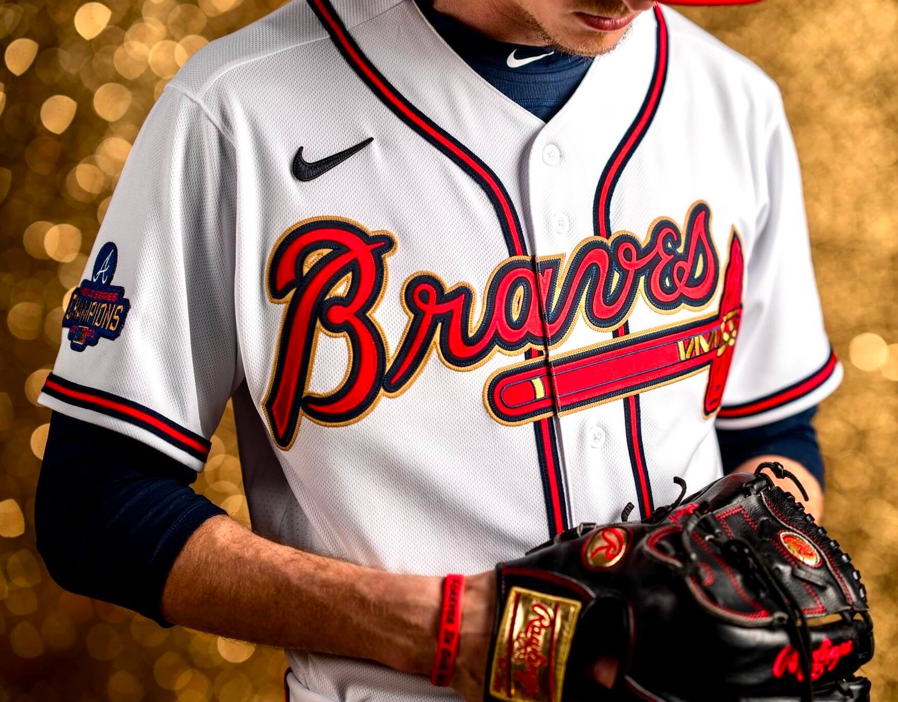
For all photos, click to enlarge
As expected, Atlanta unveiled its gold-trimmed championship uniform yesterday. From a strictly aesthetic standpoint, leaving aside the club’s questionable team name and iconography, it’s one of the better gold-trimmed designs, since the gold tones mesh well with the team’s colors, plus the tomahawk already has gold trim.
Here’s a closer look at that championship sleeve patch:
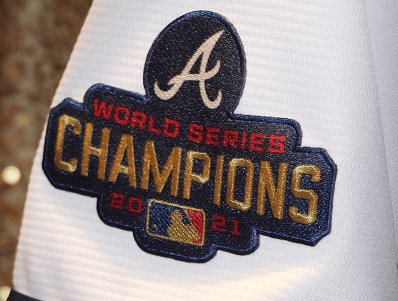
I was wondering if they might be planning to put that patch on all of their jerseys this season, but a team rep tells me that it will appear only on the gold-trimmed jersey.
The other sleeve has a star and the Roman number IV, indicating the four championships that the franchise has won throughout its history in Boston (1914), Milwaukee (1957), and Atlanta (1995 and 2021):
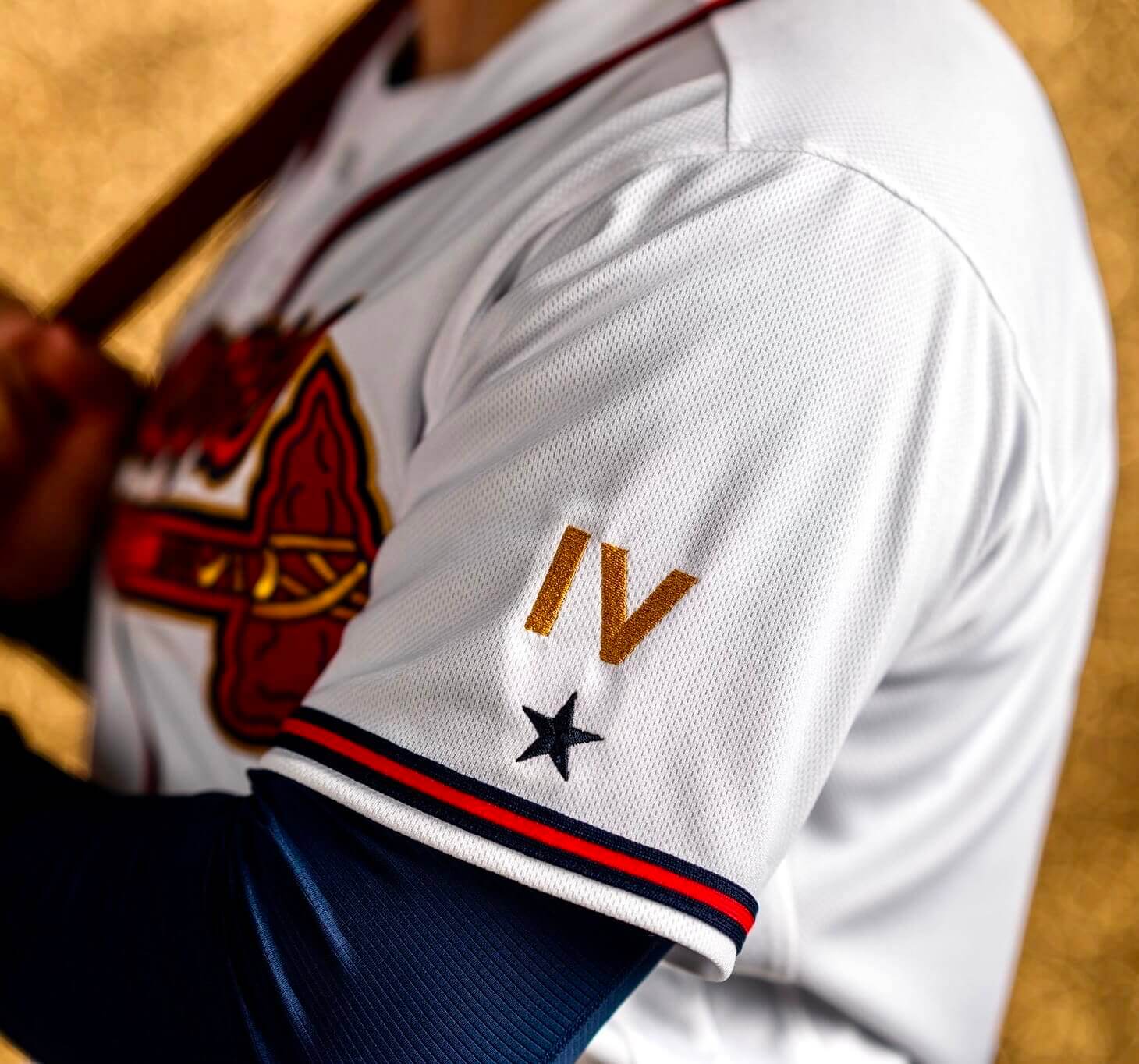
As you may recall, the Dodgers had the same Roman numeral element on their gold design last year, so I guess that’s now officially a thing. I’m not a big fan of this approach — feels a bit hubristic, plus Roman numerals are too closely associated with the Super Bowl and don’t feel right for MLB — but whaddaya gonna do.
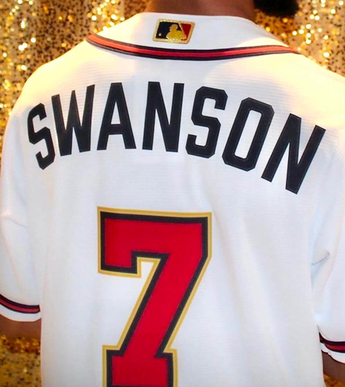
The gold trim has also been applied to the rear uni numbers and the MLB logo on the rear collar:
And as you’d expect, there’s also a gold-trimmed cap:
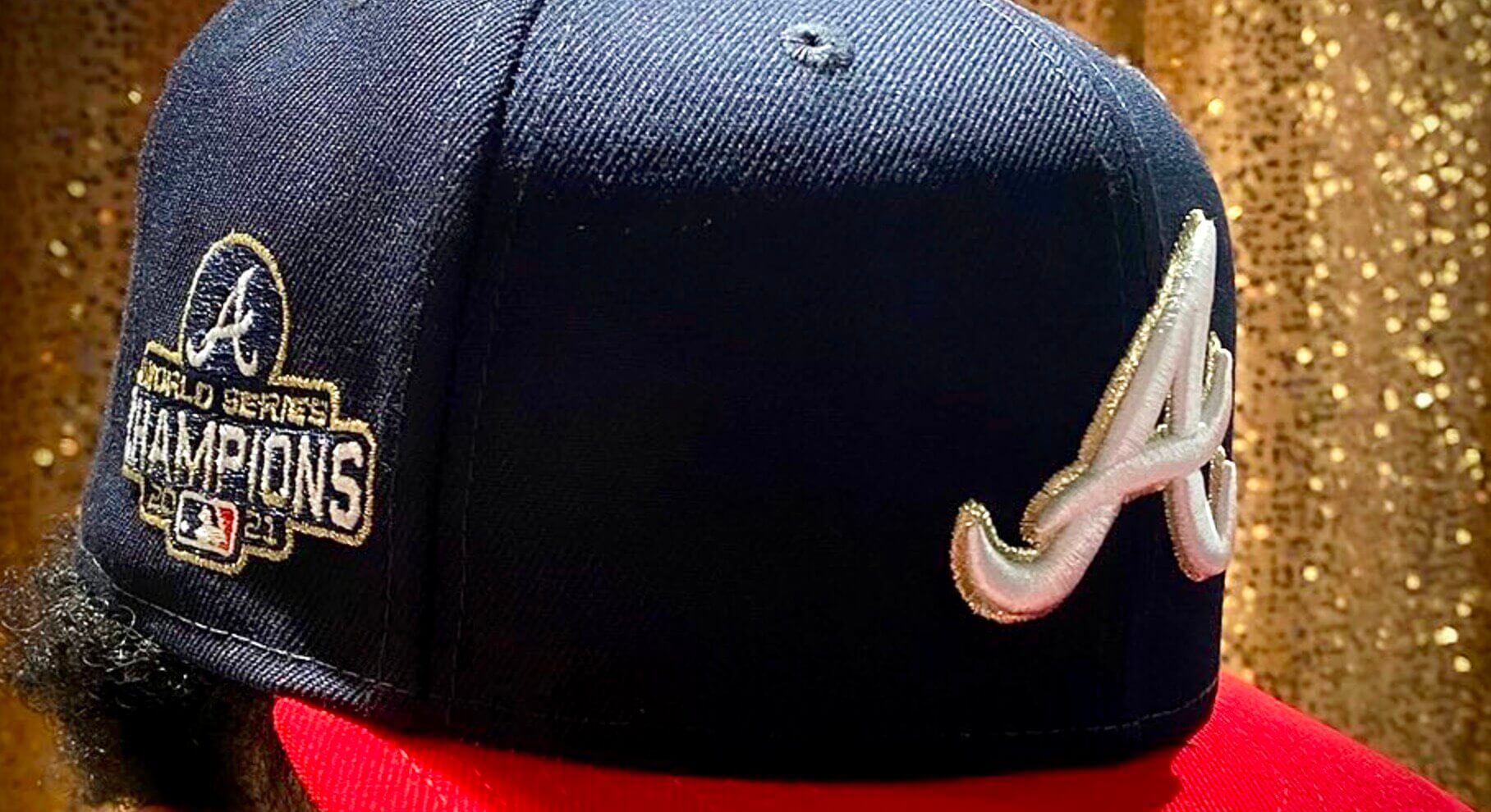
This uniform will be worn for Atlanta’s first homestand of the season (April 7-13). A team rep tells me it will likely appear “a couple of other times” later in the year, but no details yet on that.
MLB Preview reminder: In case you missed it yesterday, the 24th annual Uni Watch MLB Season Preview is the biggest and arguably best article in Uni Watch history! Overflowing with tons of uni-related info ranging from the straightforward to the super-obscure, it’s an epic compendium that’s by far the most obsessively completist document I’ve ever produced — really!
The MLB Preview is available to my Premium Subscribers here. If you’ve been waiting for the “right time” to subscribe, believe me when I say the time is now (Facebook account required). Don’t have or want a Facebook account? Email me for workaround info. Thanks!
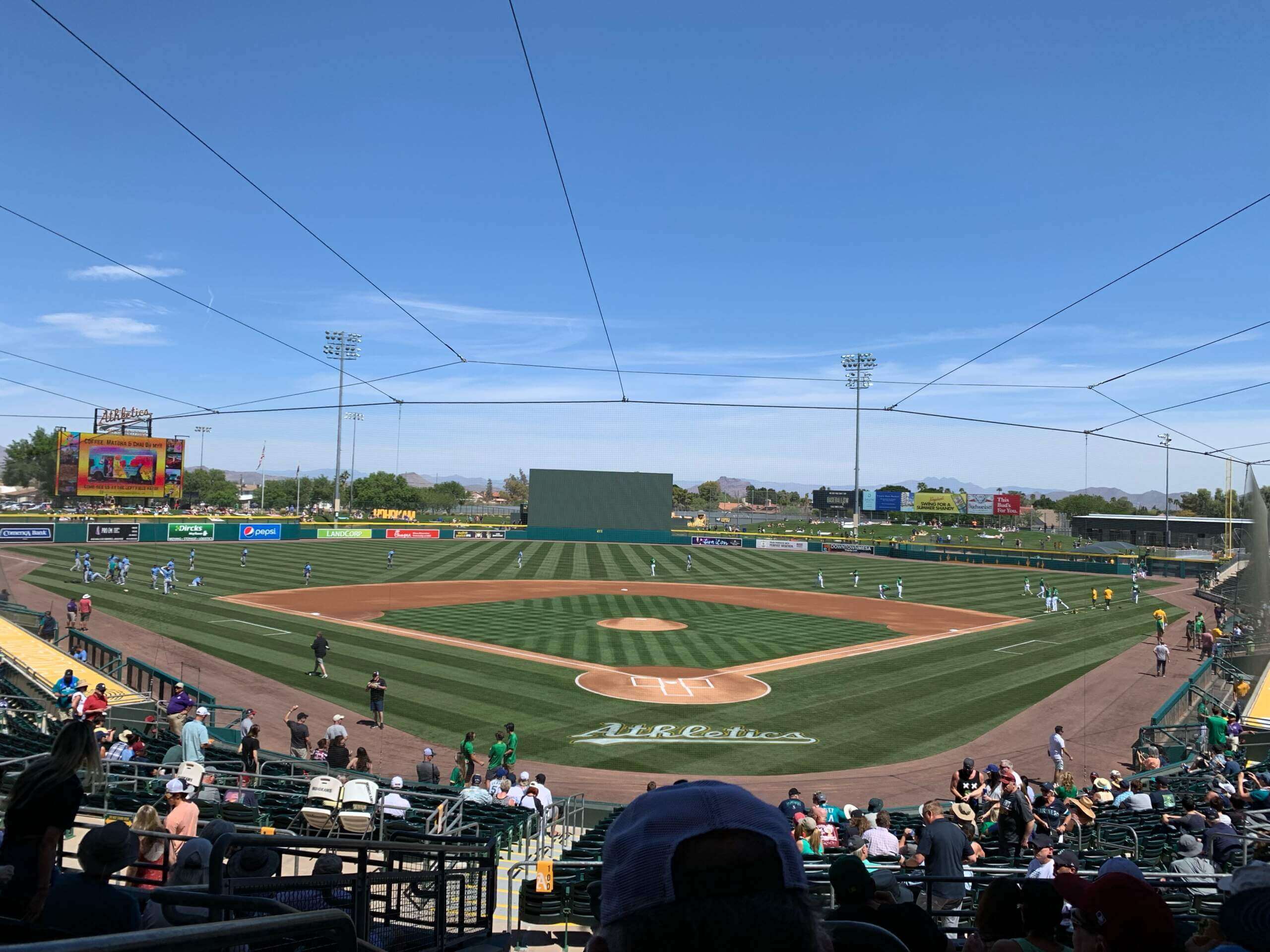
Click to enlarge
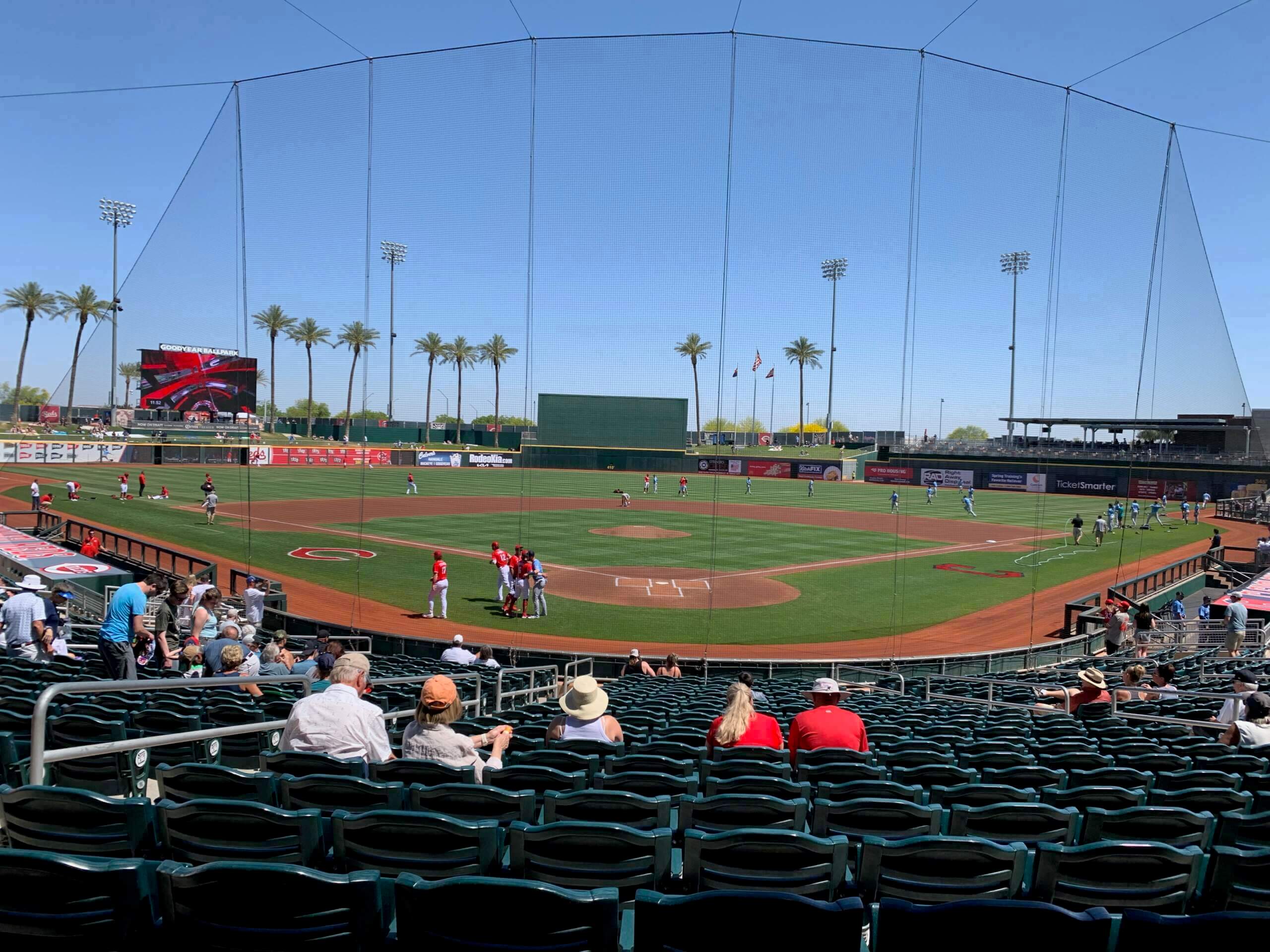
What’s wrong with this picture?: Reader Joel Horn recently attended a Cactus League game at the A’s spring ballpark and took this photo. Notice anything amiss?
Answer: There are no on-deck circles! No dirt cutouts, no chalk circles, no circular synthetic mats — nothing.
Joel found that the same was true at the Angels’ spring ballpark:
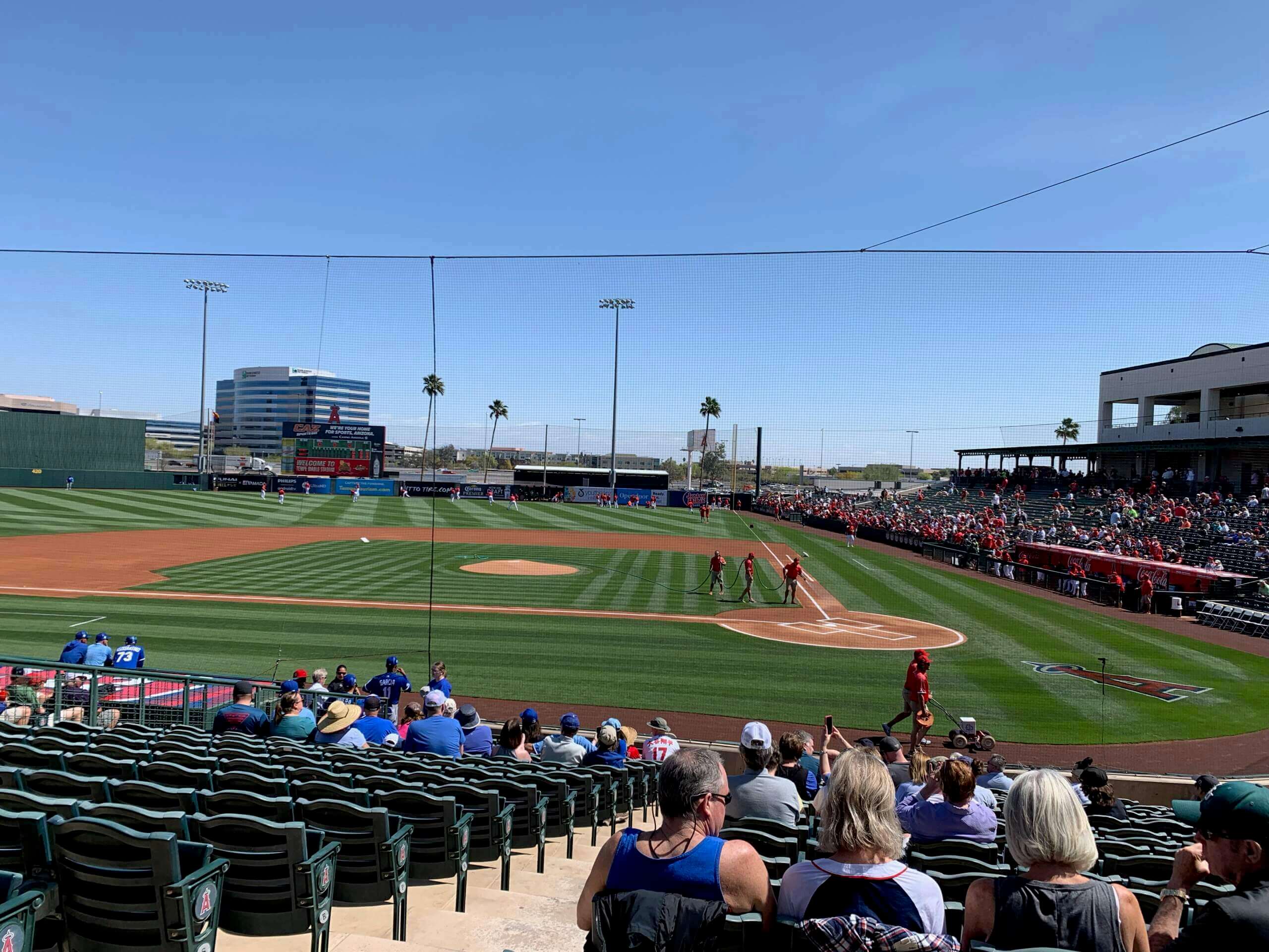
And at the Reds’ spring ballpark:
And at Arizona State:
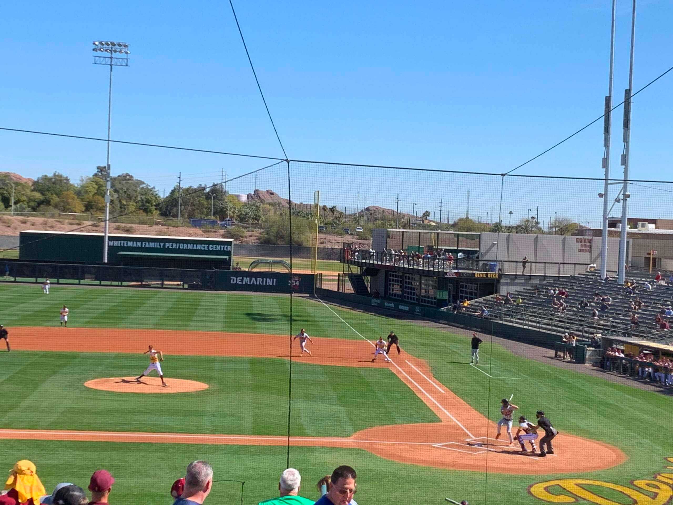
I realize most players awaiting their turn at bat rarely stay within the confines of the on-deck circle anyway, but it’s strange to see so many fields without even the semblance of a specified on-deck area. Is this a thing now?

Click to enlarge
The friendly skies: I never knew how badly I wanted to fly in a green candy-striped jet until the other day, when I learned that the German airliner Condor had unveiled this design as one of their new liveries. They have other colors as well. Additional info here.
(Big thanks to Christian M. Zummer for this one.)
The Ticker
By Lloyd Alaban

Baseball News: MLB has approved the use of catchers’ electronic signal-calling devices for the regular season. … Mets 1B Pete Alonso somehow didn’t have his cleats for a recent spring training game, so he had to make an emergency run to Dick’s Sporting Goods. … New jersey color for the Jacksonville Jumbo Shrimp, affiliate of the Marlins (from our own Phil Hecken). … Here’s a good look at the baseball uniforms in the new Broadway revival of Take Me Out (from Kenneth Traisman). … Both Air Force and Abilene Christian wore military-themed uniforms when they played each other last night. Air Force’s uniforms were C-17-themed, while ACU’s honored nearby Dyess Air Force Base (from Brandon McAuliffe). … Here’s a ranking of minor league team names (from John Vieira).

Football News: Some new uni number assignments for the Cowboys and Bears. … Texas LB DeMarvion Overshown is wearing a ridiculous number of sweatbands in this photo (from @joshuaexline). … Here’s a ranking of the 18 uniforms BYU has worn since becoming an independent. … New logo for the XFL.

Hockey News: The Hurricanes wore black pants and gloves on the road last night, instead of their usual red (from multiple readers). … Green warm-ups tonight for the Capitals in support of an environmentalist campaign (from our own Jamie Rathjen). … The Canadiens wore warm-ups with a childlike version of their crest last night to honor the Canadiens Children Foundation (from Wade Heidt). … Here’s an article about the evolution of hockey equipment (from our own Phil Hecken).

Basketball News: Black vs. black last night for the New York Police and Fire Departments in their annual basketball game (from @Brevity_Wit).

Soccer News: New shirts for the Sweden women’s national team. The shirts include a guide on “How to Stop Sweden.” … The Vancouver Whitecaps have released a logo to celebrate Vaisakhi, the Sikh New Year celebration (from Wade Heidt and John Flory). … Also from Wade: New ball for the Canadian Premier League. The design is inspired by the Northern Lights. … Here are all the J3 League’s second shirts (from Jeremy Brahm).

Grab Bag: A radio commentator says she was fired for comparing Vice President Kamala Harris’s brown suit to a UPS uniform and quipping, “What can brown do for you?”
The Texas player with the sweatbands is not sanders. It is DeMarvion overshown he is known for wearing them
Fixed.
Still need to capitalize Mr. Overshown’s last name.
D’oh! Fixed.
I didn’t remember the Dodgers doing the Roman numeral thing. I am for it. Setting aside any association with the NFL, and having a Roman numeral suffix myself (which I have never, and would never, wear with my NOB on a jersey because it is not my last name, FYI), I like the look. It makes a statement with a single glyph. The only problems come at the extremes: a team celebrating its first WS win would have a single sans-serif “I” with a star, which would look more like a weird gold mustard stain. And when the Yankees win another, “XXVIII” would almost wrap around the sleeve hem. That said, I am hoping to live long enough to see a simple “III” intermingled within the red pinstripes on the Phillies’ home unis.
The Roman numeral looks nice, especially embroidered like that. Better than if they put a “4” on there, which would make me think it’s a memorial. Maybe a better idea would be to arrange 4 stars without a numeral.
Maybe, and the Roman numeral does avoid confusion with a memorial – but then the Yankees would have 28 stars the next time they win, unless you went the soccer route and made a silver star for every 10 championships or something.
I would use the following system:
Circle = 1 Championship
5 point Star = 5 Championships
10 point star = 10 Championships
So the Braves would have 4 circles in some arrangement, while the next Yankees championship would have 2 ten point stars, 1 5 point star and 3 circles in some arrangement.
The simple answer is this sort of stuff really isn’t needed. And if you are going to do the special gold championship uniform for opening day, with an indicator of championships won, I don’t know that indicator needs to be a standard template.
Perhaps the answer if a template is needed is having a patch with the commissioner’s trophy, and the number of championships represented by stars in/around the patch. This accommodates a good visual design for teams with only a few, and also teams like the Yankees, Cardinals, or Athletics who could arrange the stars in the roundel encircling the trophy.
MJ, as a fellow Phillies fan I don’t anticipate us having to worry about championship uniforms any time soon. Curse of Bryce.
XFL 3.0?
Wasn’t there talk of a merger with the CFL or something?
Will they will be re-branding/relocating teams too?
To quote original XFL owner Vince McMahon’s entrance music and speaking as a CFL fan.
No chance in hell of merging with the XFL!
Those are probably the best-looking gold-trimmed World Series champ unis I’ve seen…
In Champions League and Europa League, teams with more than 5 wins or 3 consecutive titles are allowed to use a “badge of honor” that shows how many titles they’ve won.
Real Madrid, Bayern, Barcelona, Milan, Liverpool and Ajax are the clubs allowed to wear it in UCL. Sevilla in UEL and Olympique Lyon in women’s UCL.
Source: link
The article is from 2019, but I remember seeing Raul use it long ago. Here’s a picture of him in 2002.
link
Went to Spring Training in Goodyear AZ back in 2015 and looked at some photos when I saw this article – sure enough, no on deck circles at Goodyear Ballpark (CLE/CIN) even back then, so this has been going on for a while!
Hurricanes now looking even more similar to the 1990s WHL Moose Jaw Warriors with the black pants and gloves on road.
link
If you’re talking about the circles close to home plate, while everybody (including me) has always called them on-deck circles, I’ve never actually seen a hitter stand there, for obvious safety reasons. Those were, I believe, traditionally where coaches stood to hit balls to fielders between pitches during batting practice; the dirt circle came into use so they didn’t wear out the grass in that spot. Since teams major league teams almost never take full batting practice on the field before games like they used to any more there’s no need for those circles.
In the before times we called them fungo circles. A lost art but the late great Jimmy Reese of the Angels was worth coming early to big “A” to see him hit lob shots so Fred Lynn could practice picking balls a foot off the top of the wall.
I agree that the Roman numerals on the Braves (and Dodgers) jersey looks bad, but I think it’s a good idea in theory. Maybe it would be cool to take a page out of soccer’s book and use multiple stars to represents champions – although this could get messy with a team like the Yankees, or even the Cardinals, should either team ever win another World Series.
Off the top of my head, were the Braves the first team to win a championship in 3 different cities?
As an aside, whenever a link to a Twitter post is in the ticker I will only read the original post and skip all the comments. What a horrific cesspool of Debbie Downer assholes! For reference, it was the Washington Capitals green warmup sweaters link.
That’s a good question. And, yes, they are.
The Braves are one of only three teams that have even played in three different cities. The A’s, Philly/KC/Oakland, are one of the others. The third team is surprising and is a great trivia question. The Orioles were once the St Louis Browns and the Browns were originally the Milwaukee Brewers, who played a single season in the AL.
The dirt circles are called fungo circles. They would make terrible on-deck circles.
I did a quick look over MLB and found only two stadiums that still have them – Fenway and Comiskey.
link
link
The on-deck circle is a completely different matter. Way closer to the dugout. Some teams have mats, some have chalk circles, they’re in all different places, sometimes players try to move them. Its a whole complicated thing for another day
link
Is the team name Braves questionable or is this just your mets bias showing, Paul?
The former.
Describing someone as “brave” is questionable? Lets be real, it’s the latter.
Actually, it’s the former. I try not to use team names with Native American connections. Been that way for years, as anyone even vaguely familiar with my work can attest. Please stop making silly mind-reading insinuations. Thanks.