Click to enlarge
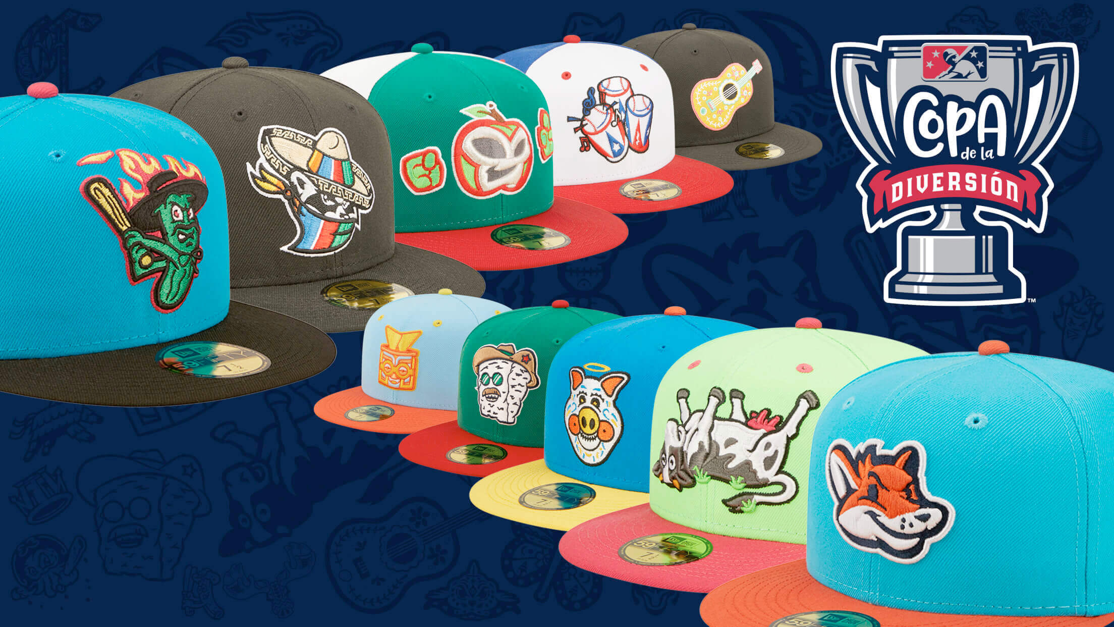
Minor League Baseball will once again feature its popular Copa de la Diversión (Fun Cup) promotion this year, with 85 MiLB teams rebranding with Hispanic/Latino identities for a few games apiece. Eight of the participating teams are Copa first-timers, while two more are previous Copa teams with new alternate identities.
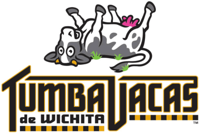
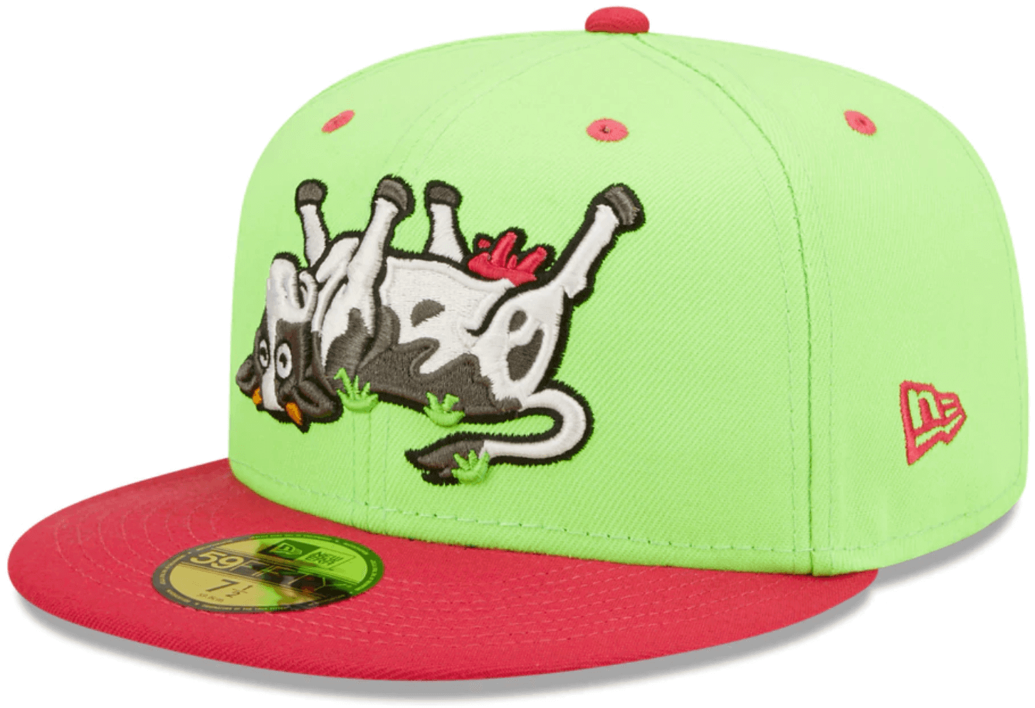
Of those 10 new Copa concepts, the one that will probably get the most attention comes out of Kansas, where the Double-A Wichita Wind Surge will be playing as the Tumba Vacas de Wichita (“Cow Tippers”), complete with an upside-down cow logo:
The Double-A Frisco Roughriders becoming the Quesos (“Cheese”), with a Teddy Roosevelt-ized wedge of dairy product:
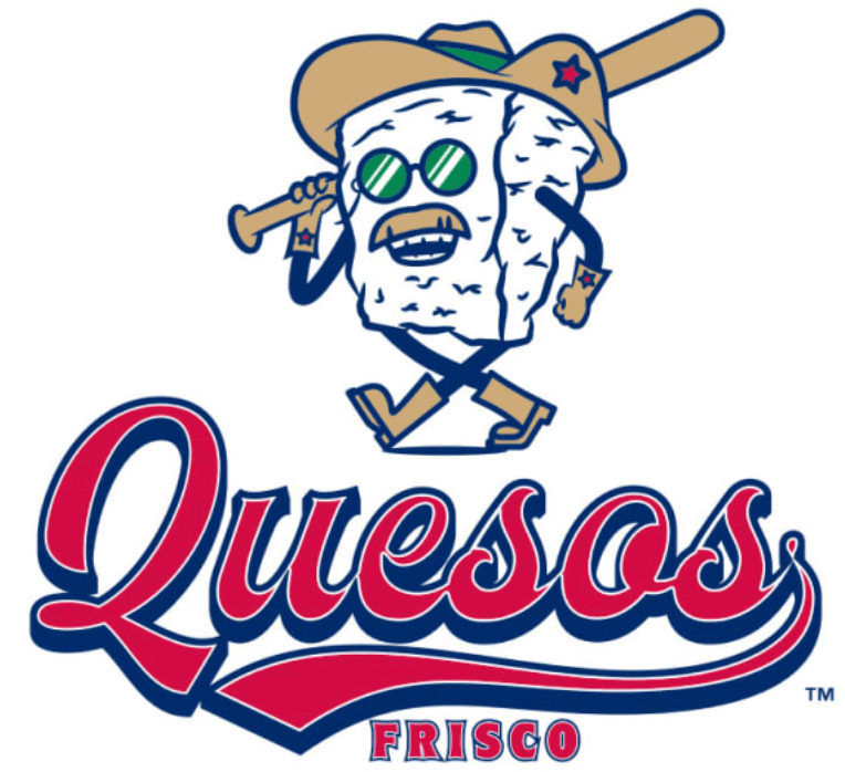
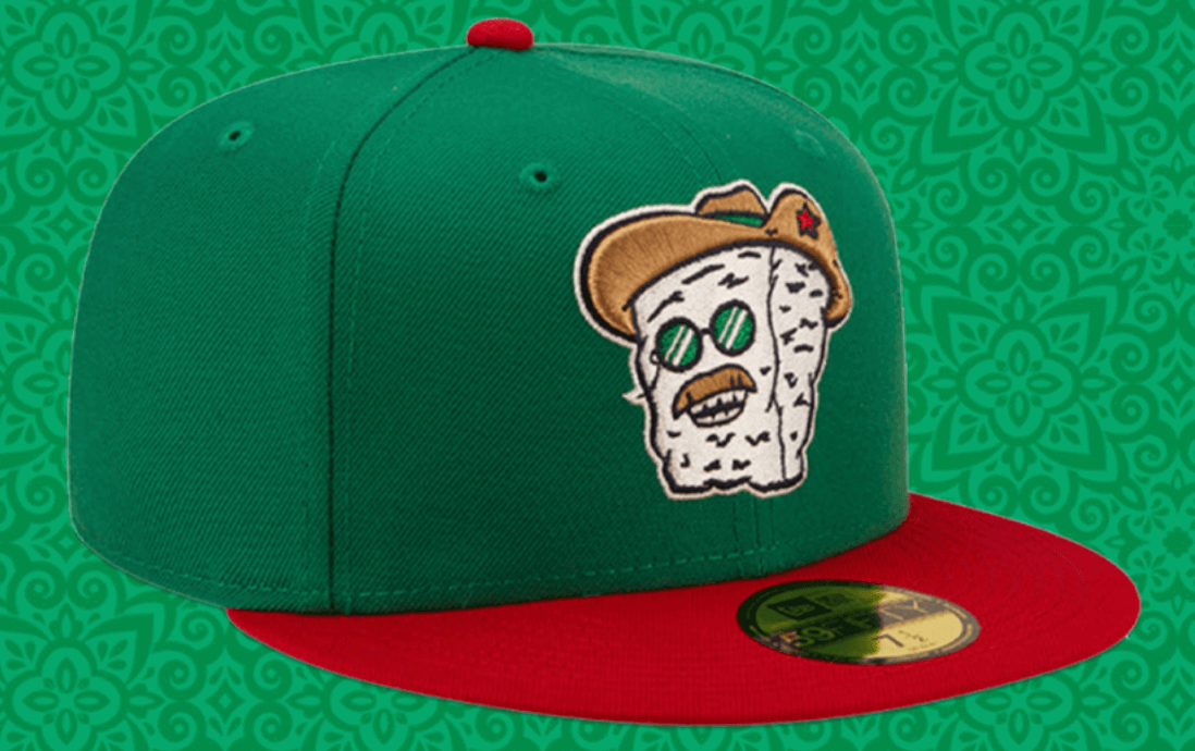
Fun stuff all around — nicely done.
You can see more info on all 85 of this season’s Copa teams here, and you can see more photos and unveiling videos here.
My favorite TikTok account is this dude who identifies obscure sporting events in movies and TV shows. pic.twitter.com/Ok1D2PUTeZ
— Scott Sandalow (@ScottSandalow) March 17, 2022
ITEM! New Bulletin article: A bunch of readers recently forwarded me the video clip shown above, which is by a guy who pinpoints the exact game — and often the exact play — from sporting events that briefly appear in movies, TV shows, and even video games. It’s really fun stuff (watch the video for yourself, you’ll see), so I interviewed the guy for my latest Bulletin piece.
My premium subscribers can read the article here. If you haven’t yet subscribed, you can do that here (you’ll need a Facebook account in order to pay). Don’t have or want a Facebook account? Email me for info on workarounds. Thanks!
Also: I’ve been hard at work on the 24th annual Uni Watch MLB Season Preview, which will be published on Bulletin next Tuesday morning, and I don’t mind saying it’s a doozy. Hope you’ll subscribe so you can check it out!
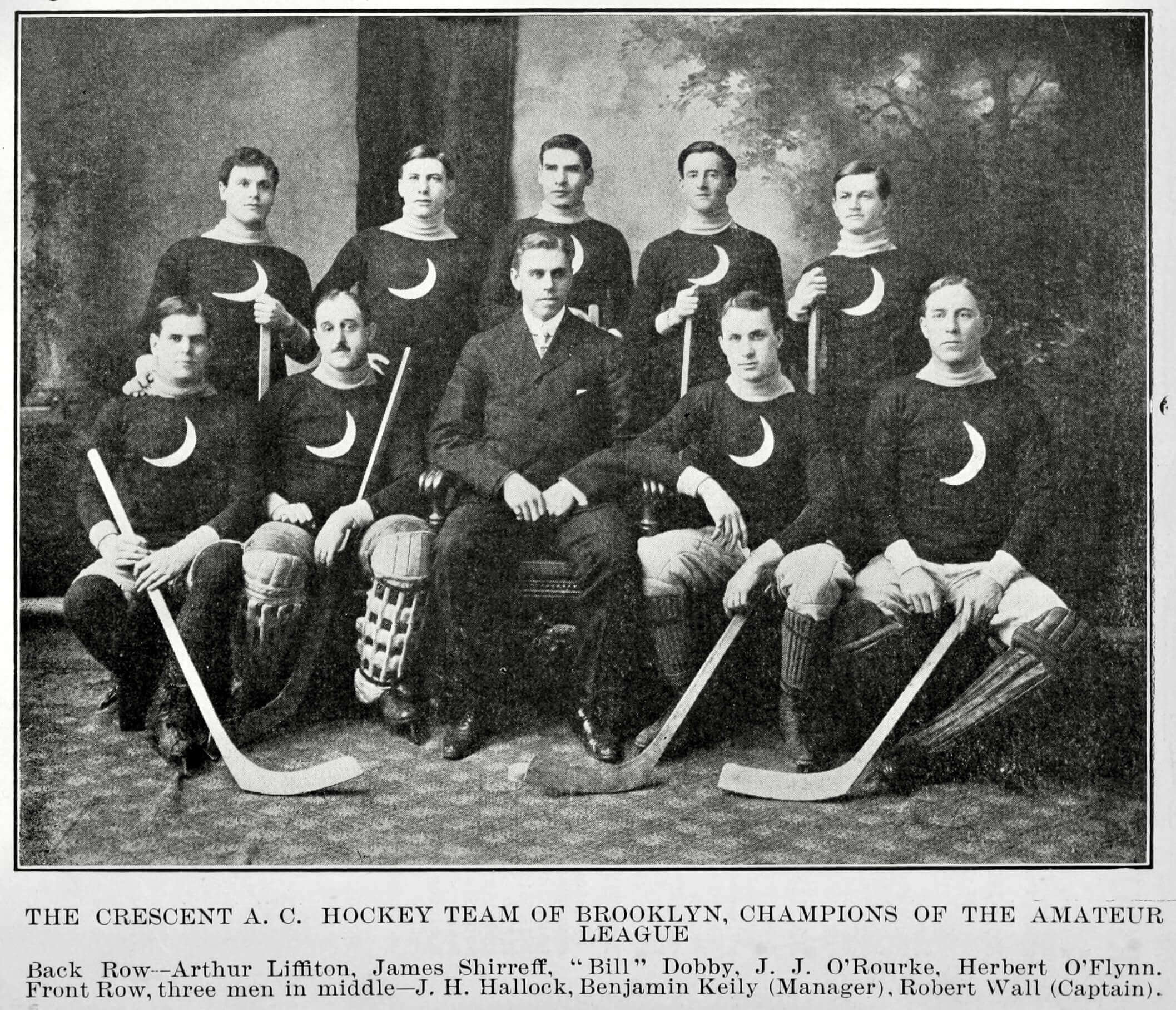
Click to enlarge
Brooklyn pride: Check out this team portrait of the 1903 Crescent Athletic Club hockey team — great uniform, right? And as a longtime Brooklynite, I’m pleased to see that they hailed from hereabouts. Go Crescents!
(My thanks to Twitter-er @VikingGiraffe for this one.)
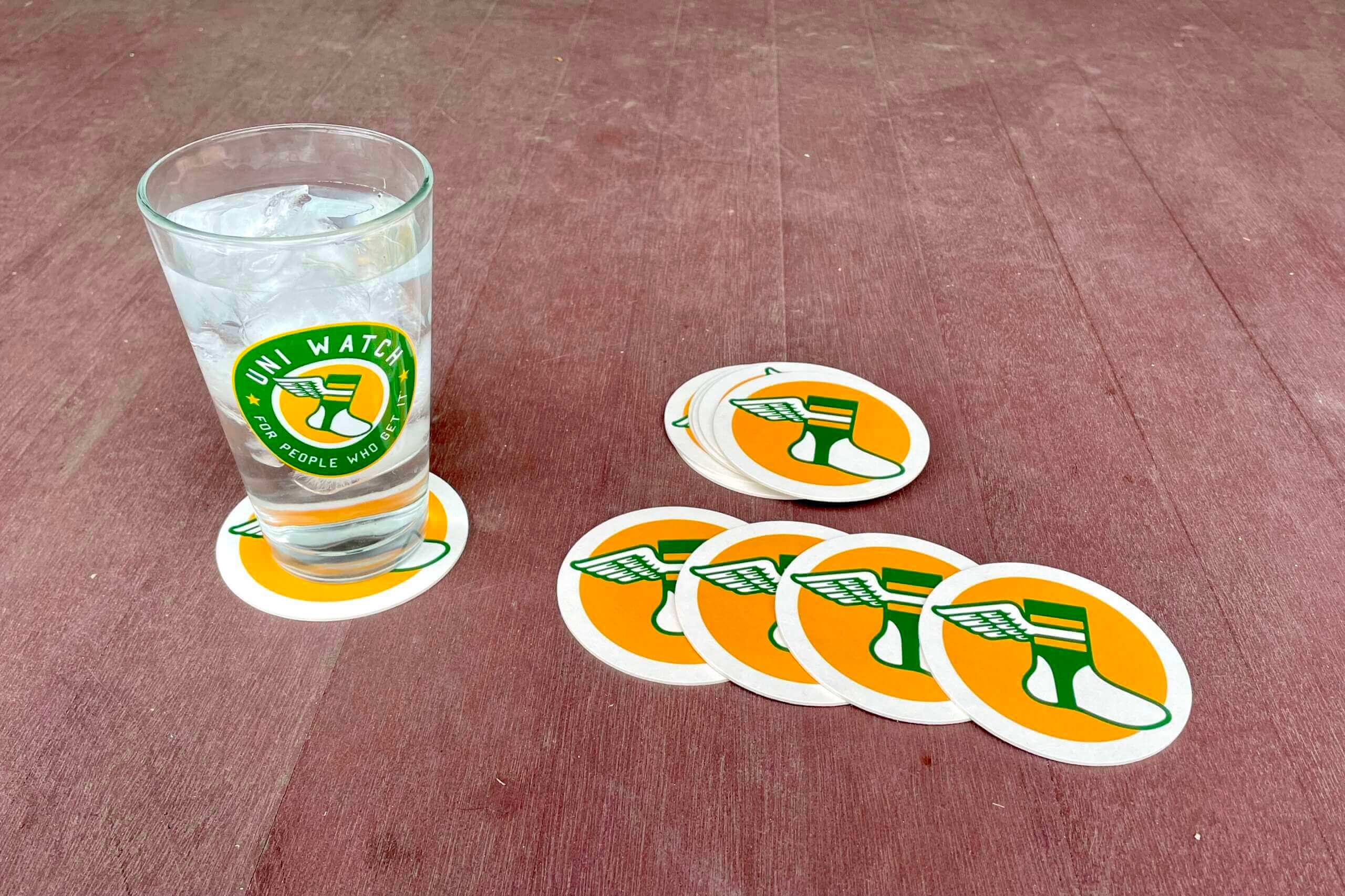
Click to enlarge
Almost gone: I’m now down to just three two sets of these great Uni Watch coasters. If you want a set of three for $9, move fast! Full details here.
Meanwhile, the winner of yesterday’s coaster/magnet raffle is Dan Pepper. Congrats to him, and thanks again to Chris Hickey for sponsoring this one.
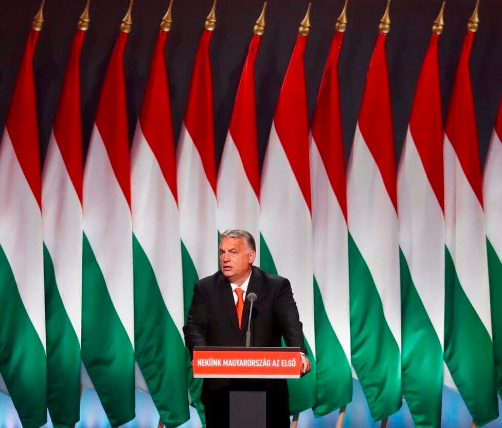
Design matters: It’s not unusual for a big display of flags to be positioned behind a world leader making a speech. But the flag design can make a big difference in the resulting visual effect. For this shot of Hungarian president Viktor Orbán, for example, the design of Hungary’s flag makes for a near-hypnotic repeating effect.
Compare that to the American flag:
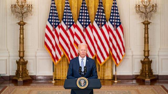
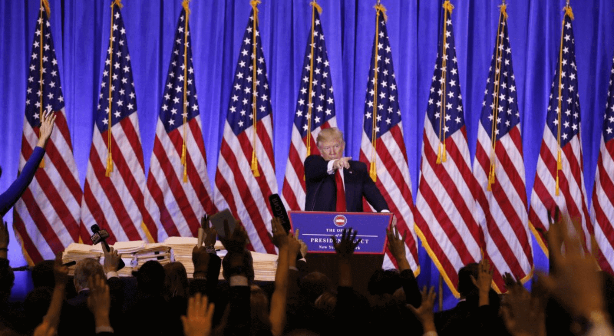
I’m not saying Hungary’s flag design is better than America’s; I’m just saying it’s better suited for this specific type of multi-flag display. It’s really mesmerizing, and I’d never seen anything like it until I encountered that photo of Orbán yesterday.
The Ticker
By Anthony Emerson

Baseball News: When you replace “Indians” with “Guardians,” you only have to buy four new letters for your spring training complex sign (from Jimmy Lonetti). … The Dodgers had a player wearing jersey No. 87 during a recent game against the Guardians, with the 8 applied upside down (from Zac Neubauer). … The Athletic has a great piece on the Tigers’ statue of Ty Cobb in their spring training stadium — which, as it turns out, isn’t actually a statue of Ty Cobb (from multiple readers). … The cover of the Phillies’ 2022 media guide is a homage to the 1987 cover (from Jason Criss). … Here’s a really fun thread on notable MLBers who wore numbers other than the ones they’re usually associated with in their rookie seasons.

Football News: Longtime Denver sports columnist Woody Paige took shots at the new NFL draft caps in his latest column (from @ada_m_d). … New USC football coach Lincoln Riley is introducing “gold plate” helmet decals that players can earn for demonstrating hard work (from multiple readers).

Hockey News: Chicago came out with a logo celebrating Jonathan Toews’s 1,000th NHL game (from @The_Big_GB). … Reader Kevin Rice was attending last night’s Bruins/Devils game in Boston, when the scoreboard clock malfunctioned in the first period. While rebooting the scoreboard, the Devils’ logo was replaced by the Capitals’ logo, and later just the words “Maple Leafs” typed out.

Hoops News: The New York Times has a great piece on the different shades of blue each men’s Final Four team uses as its primary color (from @DeadstockDan).

Soccer News: All three of Arsenal’s 2022-23 jerseys were leaked yesterday (thanks, Phil). … A couple of Canadian Premier League teams, York United FC and Calgary Cavalry FC, have unveiled alternate kits (from Wade Heidt). … The new USL’s W League has unveiled its ball (thanks, Jamie). … Also from Jamie, this article mentions that Washington Spirit winger Tinaya Alexander started celebrating goals last season at LSU by lifting up her shirt to reveal another shirt that said “Stop police brutality” — her father was killed by police — and plans to continue doing that in the NWSL. … One Knoxville SC of USL League 1 has unveiled a new alternate kit. $10 of each sale of the jersey will go to the United Way of Greater Knoxville (from multiple readers). … Another USL League 1 team, Tormenta FC, has unveiled an alternate kit (from Ed Zelaski). … The rest of these are all from Kary Klismet: Here’s a graphic showing the evolution of the official balls of the World Cup. … Here’s an overview of the shirts the clubs participating in this year’s Copa Libertadores in South America will wear. … New home kits for FC Tucson of USL League One. … Borussia Dortmund will wear a new one-off kit this weekend. … New kits for Bolivia’s Club Bolívar.

Grab Bag: The Mille Lacs Raiders, the combined sports teams representing Minnesota’s Isle and Onamia High Schools, have unveiled new logos (from Kary Klismet). … The Wabanaki Alliance, the political advocacy group for Indigenous rights in Maine, has a new logo.
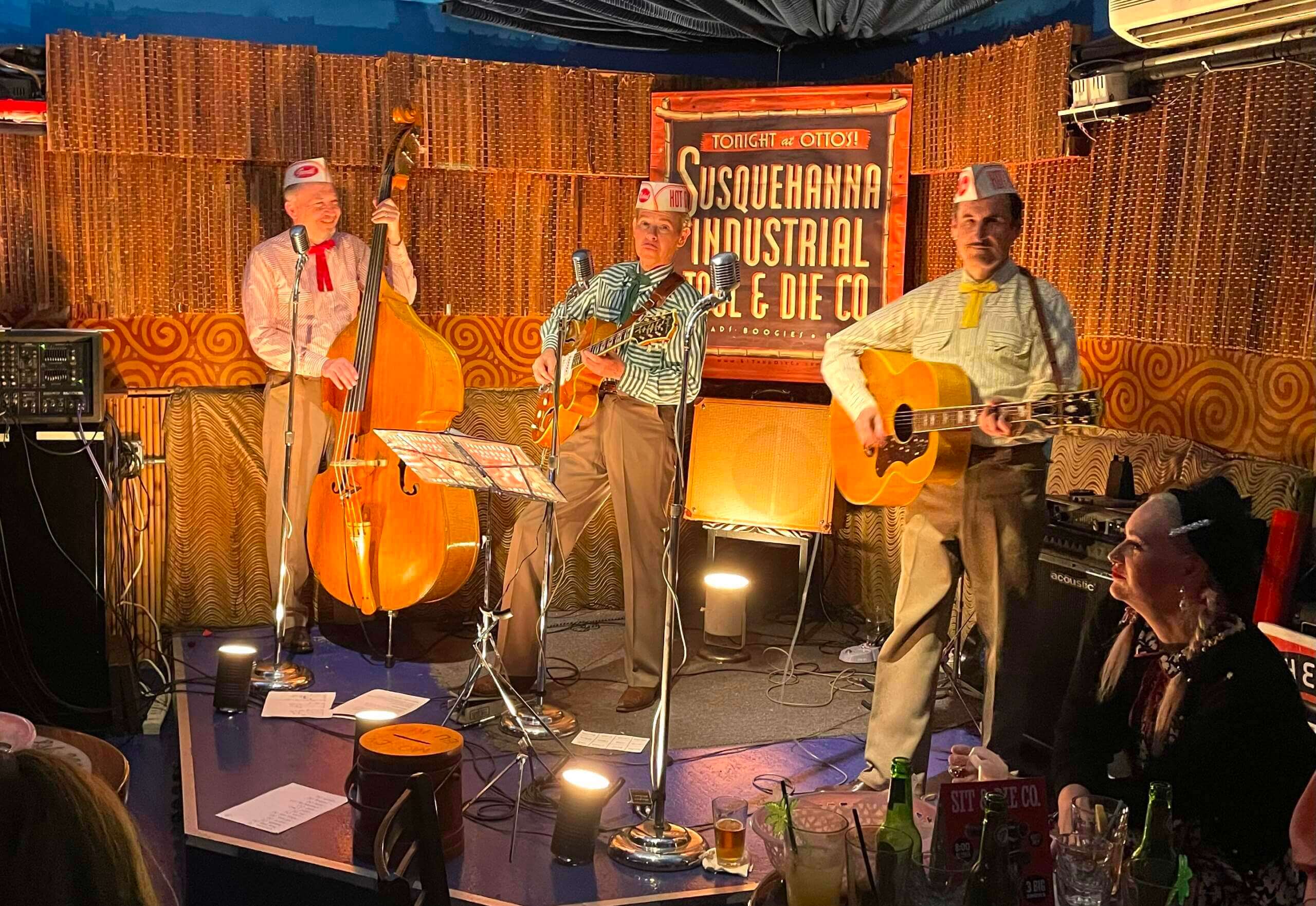
Click to enlarge

What Paul did last night: From late 2007 through early 2020, you could usually find me on the last Thursday night of every month at Otto’s Shrunken Head in Manhattan, where my friends Susquehanna Industrial Tool & Die Co. had a longstanding monthly residency. There were friends I’d see there who I wouldn’t see anywhere else, and the whole scene was a big part of the culture of my life.
The pandemic put an end to that, but last night SIT&DieCo were back, and so was I. It was great to catch up with so many old friends who I hadn’t seen in over two years, and ditto for the Otto’s staff (I don’t think I’ve ever hugged the bouncer before). Otto’s on the last Thursday of the month: It’s like riding a bike.
Today is April Fool’s Day. So if you see some outrageous-seeming uniform news, take a second think about the calendar before getting all excited and/or riled up about it. And then, if you think it’s a prank, send it to Phil, who’s compiling today’s bogus uni news for tomorrow’s post.
Speaking of which, that’s a wrap for me. Enjoy Phil’s weekend content, stay well, and I’ll see you back here on Monday. Peace. — Paul
The Quesos Frisco means the Friso Cheeses. Fresh Cheeses would be Quesos Frescos.
Got it.
Although, the mascot is clearly meant to be a wedge of Queso Fresco, thereby setting the wordplay of them being the Frisco Queso Frescos.
Actual question: Where is the line between “pandering” and “promotion?” To be specific, isn’t rebranding in Spanish as much of a shallow “Buy our merch, Latinos” ploy as dressing everyone up in camo and saying “Buy our merch, Vets?”
“Pandering” usually refers to a cheap appeal to a majoritarian emotional impulse, like patriotism. Outreach to a marginalized community doesn’t really fit the category. Is it marketing? Yes. Is it capitalism? Obviously. Is it pandering? I’d say no.
You’re right, its pandering.
Actually none of this pandering; be it patriotism, social justice or minority outreaching. It can be a very vile word that can be very insulting if falsely used.
pandering – noun
1) the act of catering to or profiting from the weaknesses, vices, or unreasonable desires of others:
Pandering and fear-mongering are the main ingredients of his appeal to anxious voters.
2) the act or practice of furnishing clients for a prostitute or supplying persons for illicit sex acts:
Human trafficking violates many other laws as well, including those against kidnapping, slavery, false imprisonment, and pandering.
Pandering -adjective
catering to or profiting from the weaknesses, vices, or unreasonable desires of others:
He’s the epitome of the pandering politician, ready to say yes to everyone.
Definitely in the neighborhood of pandering. But I am not Latin/Hispanic, so I wouldn’t know. I’d think the targeted community would know if they are being pandered to or not.
That said, the TR cheese cracks me up. As a big TR fan I love the Rough Riders branding.
To be clear, I am not saying the Copa jerseys *are* or *are not*, just genuinely curious where the FFS eyrolling starts.
There’s a huge difference in pandering and celebrating different cultures. If MiLB didn’t already have a long tradition of wacky names and mascots, then I could see the argument for pandering.
Still seems like the “merch dump” that most alternate uniform programs are. It’s not a uniform unveiling but mostly just links to buy new hats/shirts/etc. I’m just a little surprised that this wasn’t noted in Paul’s comments in the article like most of these types of programs.
That being said, I have to agree these are really fun designs and hopefully respectful of the culture from which they are based on, unlike many team names that play off cultures (e.g. previous Washington Football & Cleveland Baseball). As a white man, I can’t say whether that’s the case here or not.
As much as some of the logos and hats are funny and really nice, what bothers me is that Mexican cultural cliches are taken as symbols for the entire Hispanic community. If I were from any other Latin or South American country outside of Mexico I would not really relate to all these Mexican symbols. I am Dutch but I would really be annoyed if MiLB would announce an European Cultural Identity program for its teams and every single team would feature French food, clothing or musical themes. Also, if every single team would feature Dutch windmills, cheese, tulips, clogs, dikes, weed and cheese in its team name and logos I would be pretty annoyed and embarassed as well. One country is not an entire community, not even if they share the same language. My point is: include all Hispanic societies graphically in the Copa program or just call it Mexican Heritage Week or something (preferably in Spanish).
I agree with comments that this is essentially “merch dump.” In a number of cases, I assume that the expected audience is “hipsters,” rather than Spanish-speakers. In other cases, the communities that are played in may have large Spanish-speaking fanbases (think some of the more rural minor league areas).
Of course, some of these are just random: I’ve never been to Asheville, but I somehow doubt that there are a lot of Kechwa speakers there (indigenous language of the Andes, and the language of the name “Yacumama”). But maybe I’m wrong!
Personal favorite is Eugene Monarcas.
Brandiose treatment or not, so many of those Copa logos are just beautiful!
Those flags behind Orban might also be special flags that are used only for that purpose with different ratios. France does this with their tricolor as mentioned in the below articles(both in French).
link
link
Bills pulled a nice April Fools Joke today…
link
The logo is SO good!
It may be a joke, but it is soooo much better than the mess they wore from 2002-10.
Regarding World Cup balls, I like the 78-98 designs (of course it aligns with my own life being born in 80 and playing high school soccer in the 90’s), 70-74 are my least favorite, even though that’s kind of everyone’s idea of a generic soccer ball. I don’t mind the current designs, but the 78-98 era just speaks to that part of my life.
The Canadian flag is perfect for this kind of podium display. The maple leaf ends up being perfectly displayed.
link
The Canadian style of two colours, vertical stripes, one big symbol in the centre is ideal for this kind of display.
link
That New York Times piece on school colors conflated the academic “Duke Navy Blue” with “Duke Royal Blue” for athletics. link
Here’s a history of Duke’s blue colors. Unfortunately, many of the pics no longer pop up. link
Whether pandering or not, I do question just how “popular” this promotion is. Do teams really move any more of this merchandise than they do when they rename themselves as food items or trot out any of hundreds of other identities? Do they really draw bigger crowds on Copa nights?
When I described it as “popular,” I meant people seem to like it, an admittedly speculative assessment that I based on (a) the responses to it that I’ve seen on social media, which have been overwhelmingly positive, and (b) the fact that MiLB keeps rolling it over for each new season and is even expanding the number of participating teams this year.
Maybe the sales figure are good too, or maybe not. But sales figures are not the only gauge of popularity.