Good morning! I want to go off-uni today and talk about a piece of confoundingly bad design that I recently encountered. Bear with me while I explain.
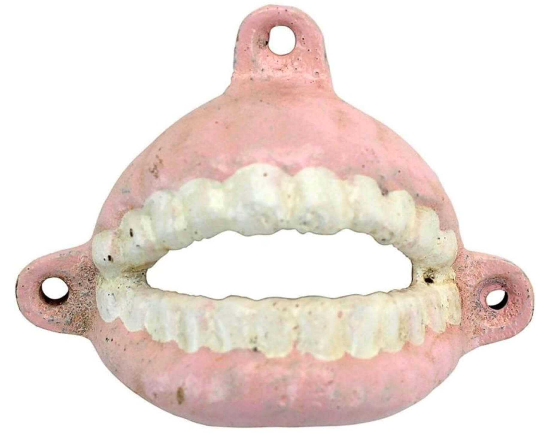
So: The Tugboat Captain and I were recently at a vintage shop where we encountered a cast iron bottle opener — the kind you mount on the wall — shaped and painted like an open mouth. So to use it, you’d stick the neck of the bottle “in the mouth,” apply a bit of leverage, and ka-chunk — the “teeth” would remove the bottle cap.
I realize the mere idea of this might make some people itchy, but we found it hilarious and thought it would look great in our kitchen. It was more money than we wanted to spend, however — something like $40, I think — so we didn’t buy it.
Our next stop after the vintage shop was a restaurant where we had lunch. But I couldn’t stop thinking about the bottle opener — maybe the same thing was available on eBay for a more reasonable price? While we were waiting for our food to arrive, I poked around on my phone and quickly discovered that the mouth/teeth opener isn’t even a vintage item — it’s available online for $12.95. Walmart even sells them!
And then our food came and I forgot all about the bottle opener. It just vanished from my mind. But not from Mary’s — she ordered one and gave it to me as one of my birthday presents. It was a really fun surprise. And that’s when things got weird.
I should stop here and note that we already have a wall-mounted bottle opener in our home. It’s an old Coke opener that I’ve had since around 1990 (it has moved with me from apartment to apartment). I love using it — the ka-chunk is very satisfying — and I’ve long noted the simple genius of its design, which is this: In order to remove the cap, you insert the bottle into the opener diagonally and then push down on the lower end of the bottle. So as the cap comes off, the bottle becomes vertical, the mouth of the bottle becomes level, and no liquid spills out of the bottle as the cap falls away, all of which you can see here (I usually catch the cap but didn’t do so in this video):
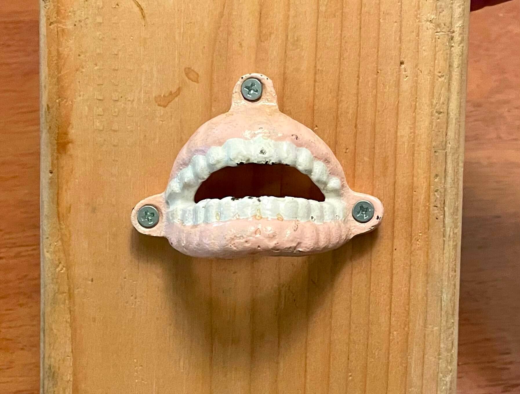
There’s nothing revolutionary about that — any bartender could tell you that’s just how wall-mounted openers work. Or at least it’s how they’re supposed to work. But when I got a bottle from the fridge and tried to simulate how it would work with my new birthday present, it seemed to me that it wasn’t going to work. The alignment of the ridges wasn’t right.
I didn’t want to put new screw holes in the wall of our kitchen unless I was sure that the mouth/teeth opener would actually work. So I got a piece of scrap wood from the basement and screwed the opener into that, like so:
And sure enough, the only way it would work was if I inserted the bottle diagonally and then pulled up, instead of down, like this:
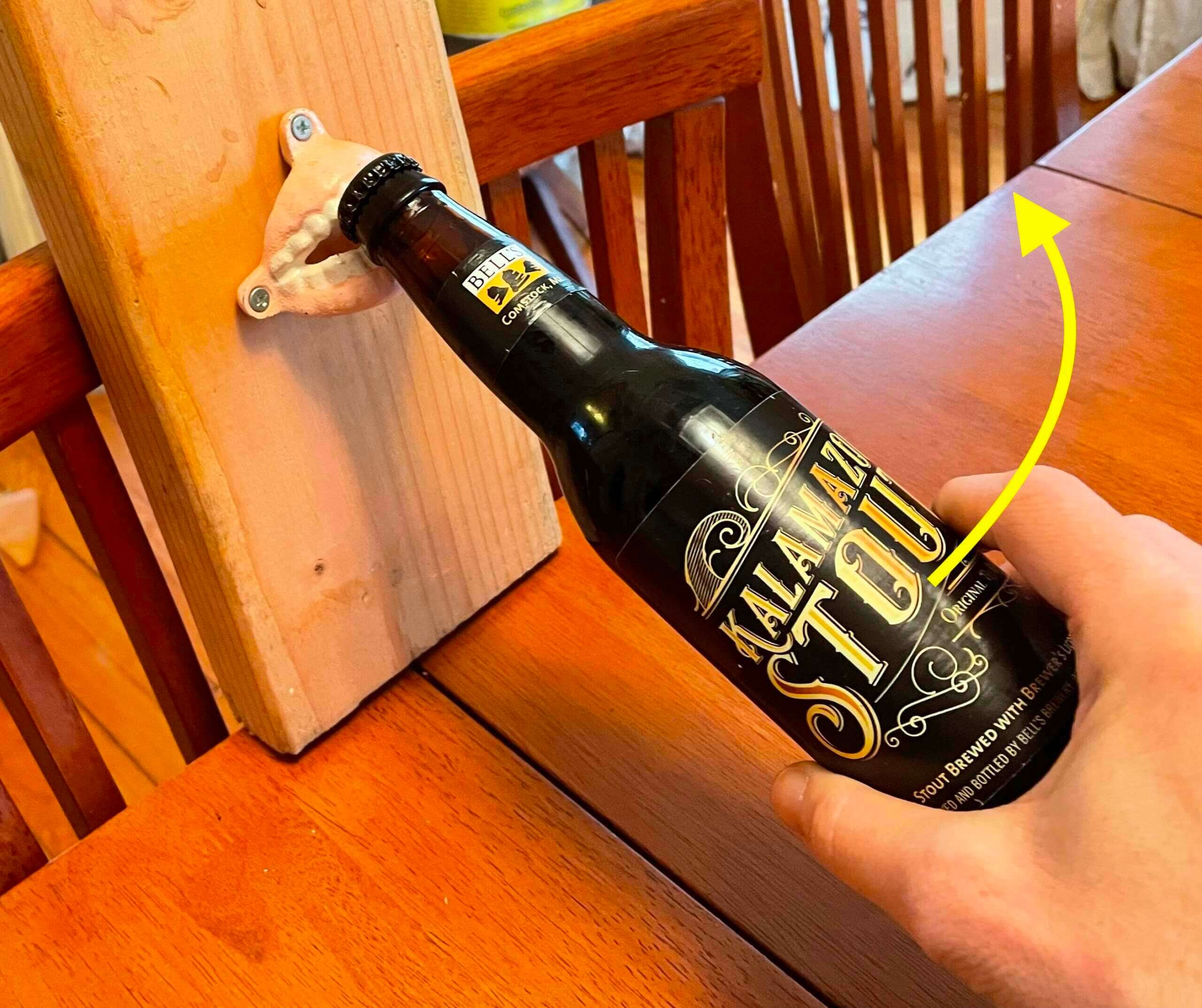
But if you use it that way, you end up with lots of spilled beer as soon as the cap pops off. “Hmmm,” said Mary, “maybe it’s meant to be used upside-down.” So I turned the piece of wood the other way, like this:
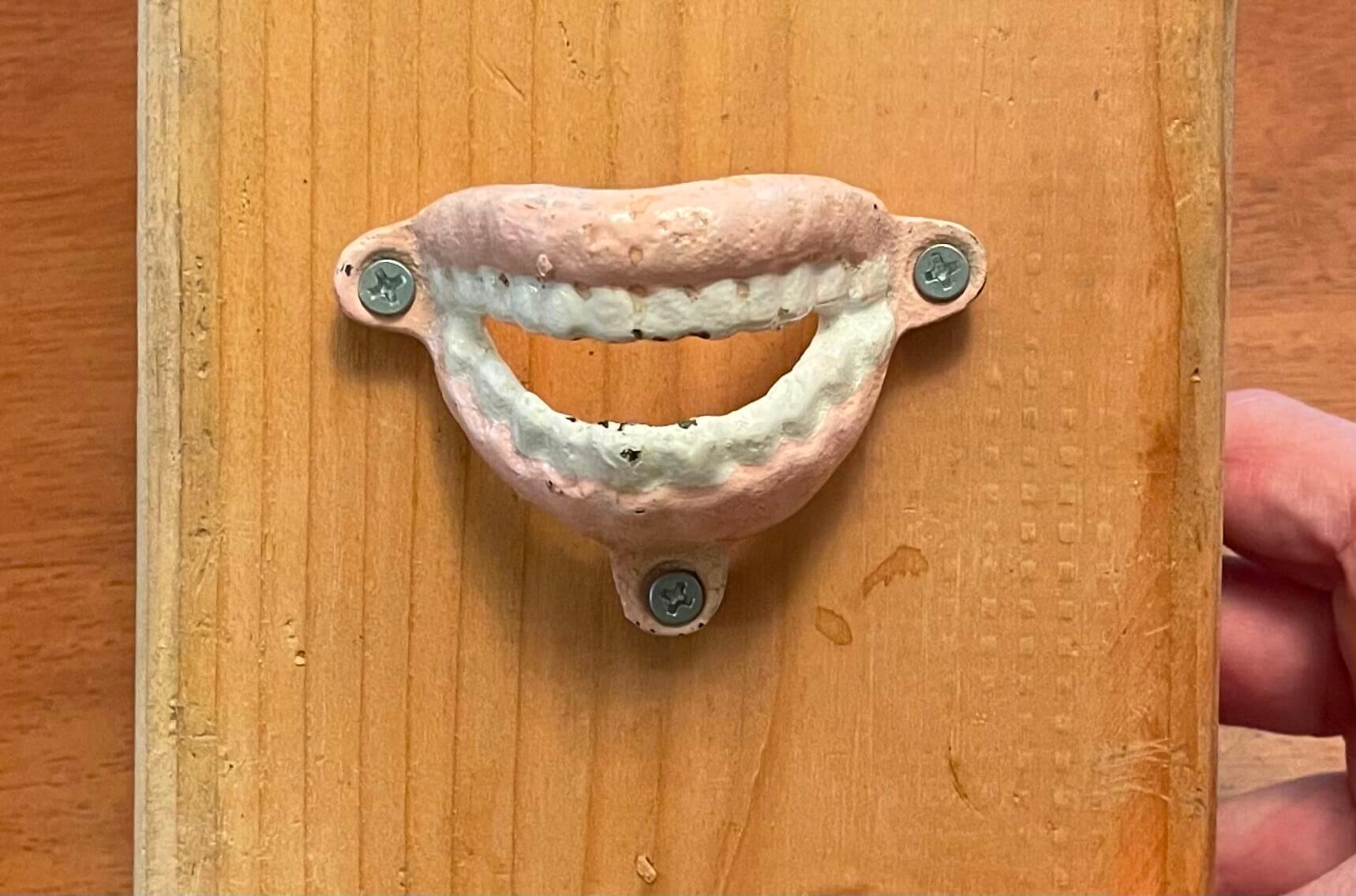
That didn’t look as good as the proper orientation — and, as it turned out, it didn’t solve the larger problem either. Once again, the only way to open the bottle was to pull up, resulting in spilled liquid:
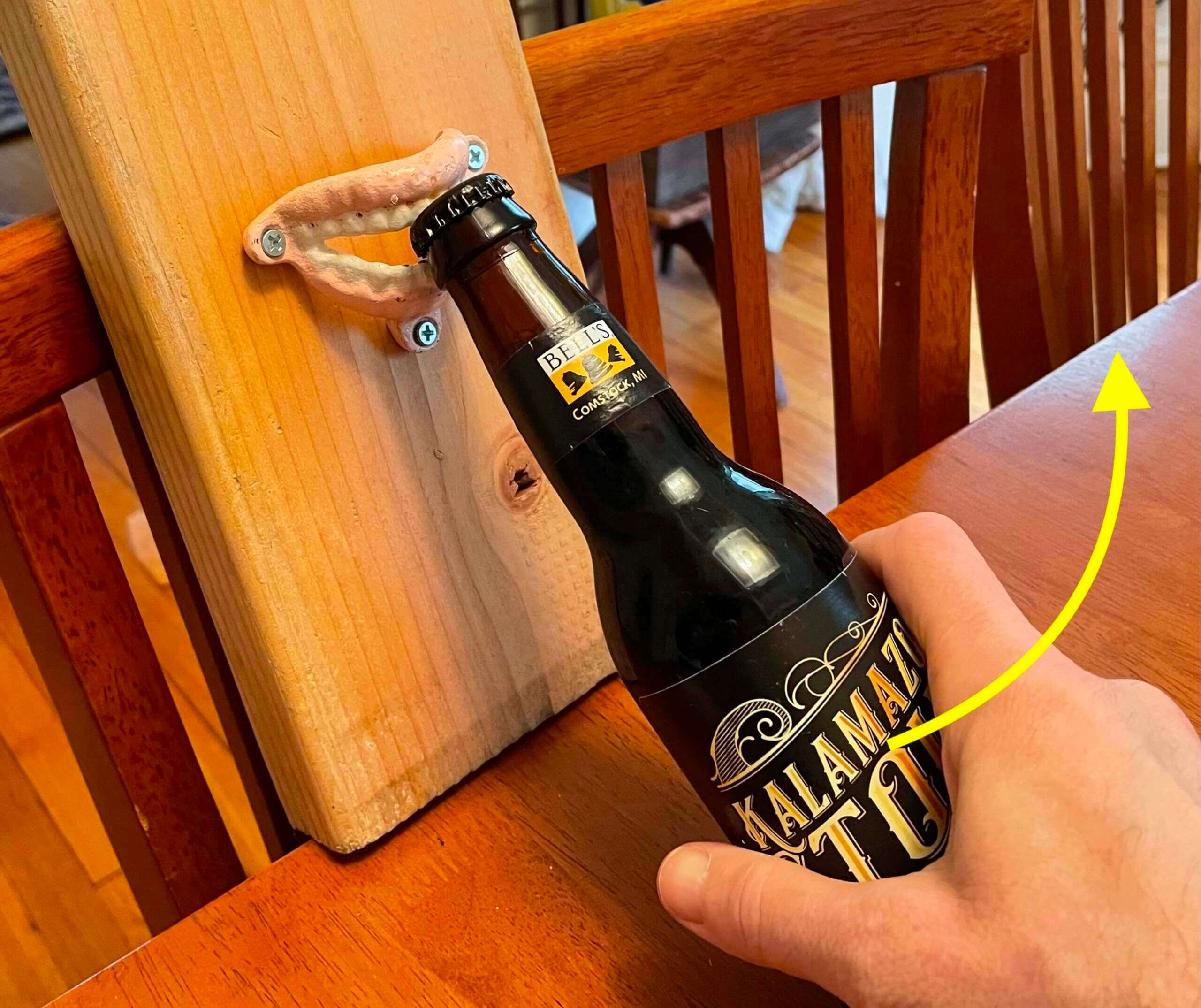
At that point I unscrewed the opener from the piece of wood and tried to use it as a hand-held opener. The good news is that it worked; the bad news is that it looks and feels ridiculous to use a hand-held opener that includes wall-mounting holes, plus the whole operation isn’t as much fun:
In short: This is an astonishingly poor piece of design. How could they have created it this way? Bizarre! On the plus side, at least it makes for an interesting story. And the rest of my birthday presents were much better.
Click to enlarge
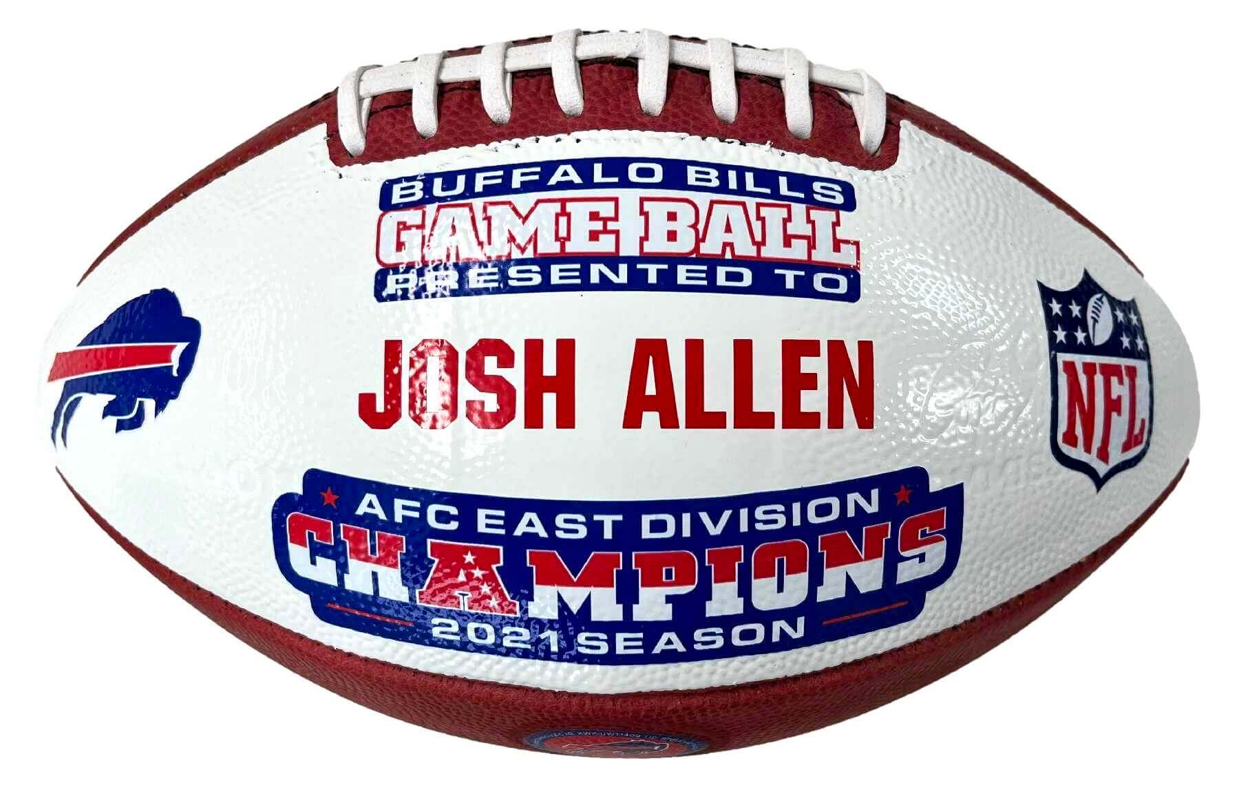
ITEM! New Bulletin article: My latest article for Bulletin is an interview with a guy whose company makes NFL commemorative game balls like the one shown above. It’s an interesting peek behind the curtain of something we all know about but rarely think about. Good stuff!
My premium subscribers can read the article here. If you haven’t yet subscribed, you can do that here (you’ll need a Facebook account in order to pay). Don’t have or want a Facebook account? Email me for info on workarounds. Thanks!

Click to enlarge
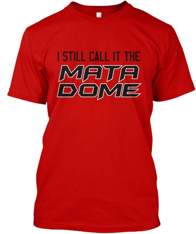
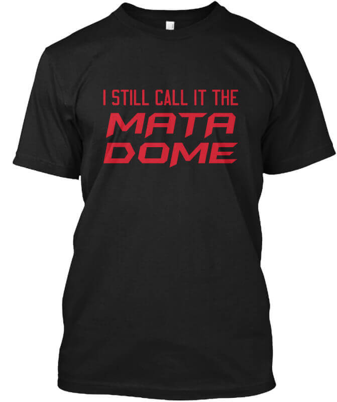
ITEM! Naming Wrongs update: As noted in yesterday’s Ticker, Cal State Northridge’s basketball arena is getting an annoying new advertised name, so we have new Naming Wrongs shirts for that. Here’s where you can get the red, black, and grey versions. And if you want to get reacquainted with the full Naming Wrongs product line, you can do that here.
Speaking of Naming Wrongs: New York mayor Eric Adams yesterday lifted the vaccination requirement for home-team athletes playing in the city. He made the announcement at the Mets’ ballpark, and if you go to the 9:40 mark of this video, you can see that he made a point of still calling it Shea:
Join us at CitiField for a major announcement. https://t.co/DnXcmz8J4G
— Mayor Eric Adams (@NYCMayor) March 24, 2022
The Ticker
By Anthony Emerson

Baseball News: The Brewers have evidently removed the thin royal blue circle on their barley-ball logo. … Giants OFs Austin Slater and Steven Duggar placed last in the team’s fantasy football league last year, so as punishment they were forced to serve as batboys during Wednesday’s Spring Training game, and wore blank jerseys with “L” taped to the back (from Brice Wallace). … The Nationals will unveil their City Connect uniforms next Tuesday. Judging by the teaser, they will indeed be cherry blossom-inspired, as has been speculated (from multiple readers). … It appears Marlins IF Jazz Chisholm wore tights with a giant Nike logo on them yesterday (from @KCNep95). … Whoa, check out the unis for Phillips Andover Academy in Massachusetts. Looks like they looked at every retro design trend and decide to adopt all of them (from Kurt Blumenau).

Football News: New uni ad for the CFL’s Ottawa RedBlacks (from Mike Chamernik). … Brandon Weir sends along this graphic showing the evolution of the Michigan Stadium scoreboard. … New logo for the German Football League, which plays American football (from @acquijpayya). … With the signing of WR Marquez Valdes-Scantling yesterday, KC is building an impressive collection of players with hyphenated NOBs.

Soccer News: Italian Serie C side SSC Bari has released a new one-off kit, for use this Sunday, as well as new pre-match kits (from Ed Zelaski). … More images of Manchester United’s 2022-23 kit have leaked (from Charles George). … Swedish ST Alexander Isak’s jersey number was peeling off during the World Cup qualifying match against the Czech Republic (from Micah Burk).
Ukraine News: The ECHL’s Reading Royals will be selling and auctioning — but not wearing — these Ukraine-inspired sweaters to raise funds for the Ukraine War Refugee Aid Fund (from Mike Givler).

Grab Bag: YWCA Canada has launched a campaign (warning: autoplaying video) to “add the M” to men’s major league sports logos, and includes downloadable versions of updated logos for the “MNHL, MNBA, MMLS and MPGA Tour” (thanks, Jamie). … Here’s a piece on artist Ilya Stallone, who reimagines brand logos as medieval illustrations (from Adam Herbst). … Nebraska is apparently working on creating more “consistent” uniforms across different sports (from Nick Benes).
Our latest raffle winner is Ron Gordon, who’s won himself a complimentary Uni Watch membership card. Congrats to him, and thanks again to James Lutz for sponsoring this one.
That’ll do it for this week. Phil has this weekend off, so we’ll be closed for the next two days. Enjoy your weekend and I’ll see you back here on Monday. Peace. — Paul
Only way the mouth bottle opener would work on the wall is with a significant overbite.
Good call on the Bells, surprised to see that given your usually a macro-brew guy.
I thought I was the only one with a defective bottle opener. I have a wall mounted Coca Cola bottle opener that I got some time in the 80’s that has broken the necks of some glass bottles during cap removal. Needless to say, I don’t use it much any more.
I suppose it would work if it were mounted on the underside of an overhead cabinet… but then, what would be the point of the teeth design? Just a bad bit of tat.
Way to think outside the box! I was thinking that maybe it could be used for opening aluminum cans of soda or beer, i.e., use the teeth to pull the tab to save the nail.
Seems counterintuitive, but could you successfully open a bottle from the bottom of the opener, below the teeth?
I tried that too. Didn’t work!
What were the results with the teeth opener when you tried prying against the upper teeth instead of the lowers? That’s how the Coke opener works. Is the teeth angle so bad that you can’t get the bottle in there and press down without spilling?
The only way to get that to work would be to position the bottle almost upside-down (which, obviously, would result in an even bigger spill when the cap came off).
Maybe anchor it on the edge of the lowers and pull down? I do that on the edges of metal tables from time to time.
The ticker item about adding an M to major league sports leagues to designate them as “men’s” is incorrect. Well, the ticker item isn’t incorrect but what its referring to is. The NBA at least – but I’m assuming the MLB and NHL as well – has no rule anywhere that women are prohibited from playing. It is in fact a coed league that just happens to only have men playing at the moment. The WNBA and NBA aren’t just men’s and women’s version of the same thing. The NBA allows anyone to play whereas the WNBA prohibits men from playing.
I had a similar thought. *M*NHL? Manon Rhéaume would like a word with you.
OMG, that bottle opener story is hysterical. I think I would mount it anyway, just for the story-telling potential. Plus, anytime a friend asked, you get to say, “it’s a bottle opener, but doesn’t work for shit!” LOL
In hindsight, could you mount it and store a wooden spoon or other kitchen implement sort of in the jaws? Might look cool.
Haven’t been on the blog in a few days, so I’m playing catch-up a bit. I wanted to address the issue posited about the Leafs potentially being the first NHL team to wear five different unis in consecutive games.
A commenter mentioned that no team has worn five different unis in a single season since the 2003-04 season, and that isn’t exactly true. As far as I can find, the other times that teams that have worn five unis in a season are as follows:
Anaheim (2013-14): Home primary, road primary, alternate, throwback, Stadium Series.
Los Angeles (2019-20): Home primary, road primary, alternate, throwback, Stadium Series.
Los Angeles (2020-21): Home primary, road primary, alternate, throwback, Reverse Retro.
Montreal (2008-09): Home primary, road primary, three different throwbacks.
Montreal (2009-10): Home primary, road primary, three different throwbacks (only one of which overlapped with the previous season).
St. Louis (2020-21): Home primary, road primary, alternate, throwback, Reverse Retro.
St. Louis (2021-22): Home primary, road primary, alternate, Winter Classic, throwback.
Unfortunately I don’t have the time to verify whether or not any of those teams ever wore all five consecutively. (I suspect they didn’t.) But that’s at least a starting point if anyone else wants to do the research.
One last fun fact: The Columbus Blue Jackets also wore five different unis in 2003-04, even though they weren’t part of the NHL’s Vintage program that season. I don’t know what the story is behind it, but they played their first two games (one home and one on the road) wearing their old Stinger shoulder patch instead of the new Ohio flag logo.
The manufacturer of Paul’s Coca Cola opener is called Starr. They also make magnetic cap catchers …
link
… which adds an extra beat to the satisfying “ka-chunk.”
I’ve found with a bit of practice, they’ll catch about 99%.
Whoops. Wrong thread.
Wall opener tip: I mount a strong magnet about 4-5 inches below, and it catches maybe 90% of the caps.
The manufacturer of Paul’s Coca Cola opener is called Starr. They also make magnetic cap catchers …
link
… which adds an extra beat to the satisfying “ka-chunk.”
I’ve found with a bit of practice, they’ll catch about 99%.
As a former employee of NFL Europe I smile when I see the GFL team name and logo of the Frankfurt Universe. Clever continuation of the NFLE’s Frankfurt Galaxy. The moment I saw the lede picture of the mouth opener I knew it would never function properly. Bad design but a hilarious story.
Yeah, but have you ever tried opening a bottle with your real teeth? Way worse design.
I tried to find video, or even a photo, of Joe Charboneau opening one with his eye socket but, surprisingly, came up empty. I was sure there’d be at least a photo of that somewhere!
Re: Phillips Andover jersey
I kind of like this fauxback. Also, biggest font ever!
I like it too.
For Naming Wrongs. I still call it the Agridome. Junior hockey-loving Saskies will know what I’m talking about.
The worst thing about CSUN is its had its own Credit Union since 1963, and then they go out and get a regional/national credit union to sponsor the gym.
Today’s piece is Uni Watch at its best. Absolutely great stuff!
Aw — thanks, man!
Seems these kitchy faux-vintage bottle openers are common at vintage stores. About 10 years ago I bought one that also looked vintage (I knew it wasn’t because they had several other designs) and was neat, which I attached to my wooden post outside by the patio. The design of that one was also was terrible and it didn’t even work at all! Not even upside down causing spillage. I ended up having to file a small groove in it to give the bottle cap teeth something to catch on.
Love the sound effects of opening a bottle of beer also love the barbicide jar in the background on the one video, need to fill’er up though.
I wrote an article about Barbicide (which at the time was manufactured in Brooklyn) around 1995. After it ran, they gave me a Barbicide jar. I’ve been using it for pretzel rods ever since.
I hope you cleaned it out thoroughly.
Bell’s K-zoo Stout – good choice!
Bells Kalamazoo Stout is so good!