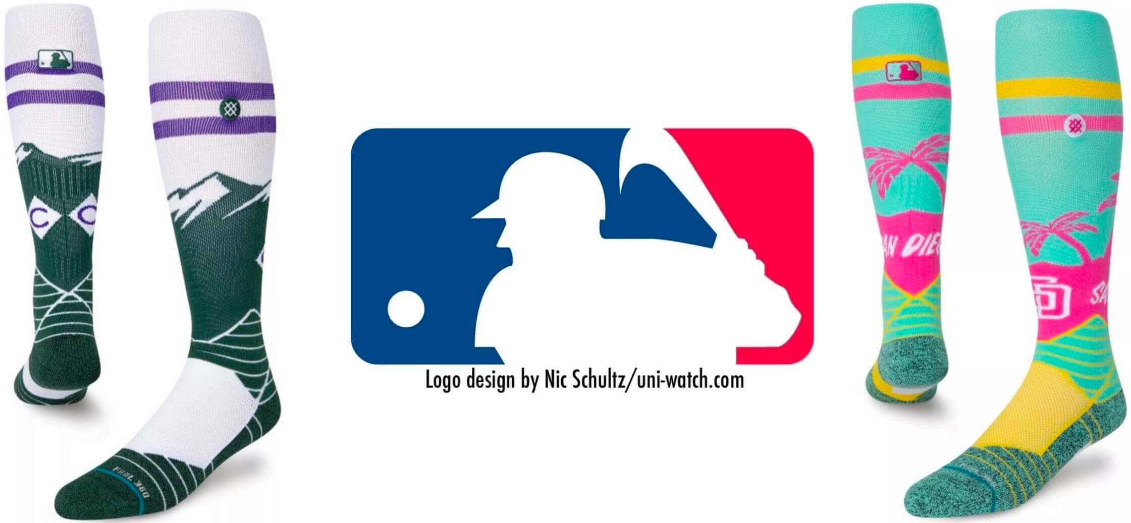
Good morning! Today I want to expand upon an item that Phil had in yesterday’s Ticker: the apparent leak of the Rockies’ and Padres’ City Connect socks.
A quick refresher course, just to bring everyone up to speed: MLB’s City Connect program launched last season. Seven teams participated — the Red Sox, Marlins, Giants, Cubs, White Sox, Diamondbacks, and Dodgers. The plan is for another batch of teams to get the CC treatment this season (assuming there is a season) and for the remainder of MLB teams to get on board in 2023.
No official announcement has yet been made regarding which teams are getting CC alternates this year. As recently as last Thursday, I asked a clued-in source if they knew which teams would be joining the program in 2022 and was told, “Nope — they’re keeping that info under wraps.”
But on Saturday, several Twitter-ers began sharing images that they said were leaks of the Rockies’ and Padres’ CC socks. I asked one of these Twitter-ers, @elibroz, what his source was. He replied, “Stance put them on their website as the ‘2022 City Connect OTC Socks’ but quickly took them down.” I haven’t been able to confirm that, but for now let’s believe it’s truthful. (Full disclosure: I admit that I want to believe in this leak because I’m pretty sure it would be our first-ever case of leaked socks. The absurdity of a potential leak coming from a uni element that won’t even be visible on most of the players, because they’ll be going low-cuffed, seems suitably ridiculous for the merch-driven uni-verse in which we now find ourselves. That said, we should all maintain a healthy skepticism until the leak is confirmed.)
Let’s start with the Rockies. Naturally, I’m intrigued by the use of green (my favorite color alongside my least-favorite color!). What might that be signifying? Longtime Ticker-submisson Kary Klismet lives in Denver and is a big Rockies fan, so I asked him if he any insights about what the Rockies might be up to with this design. Here’s his characteristically thorough response:
I have two initial thoughts on what could be driving the Rockies’ use of green. First, Colorado’s license plates have historically featured a green/white color palette with a mountain skyline in the background:
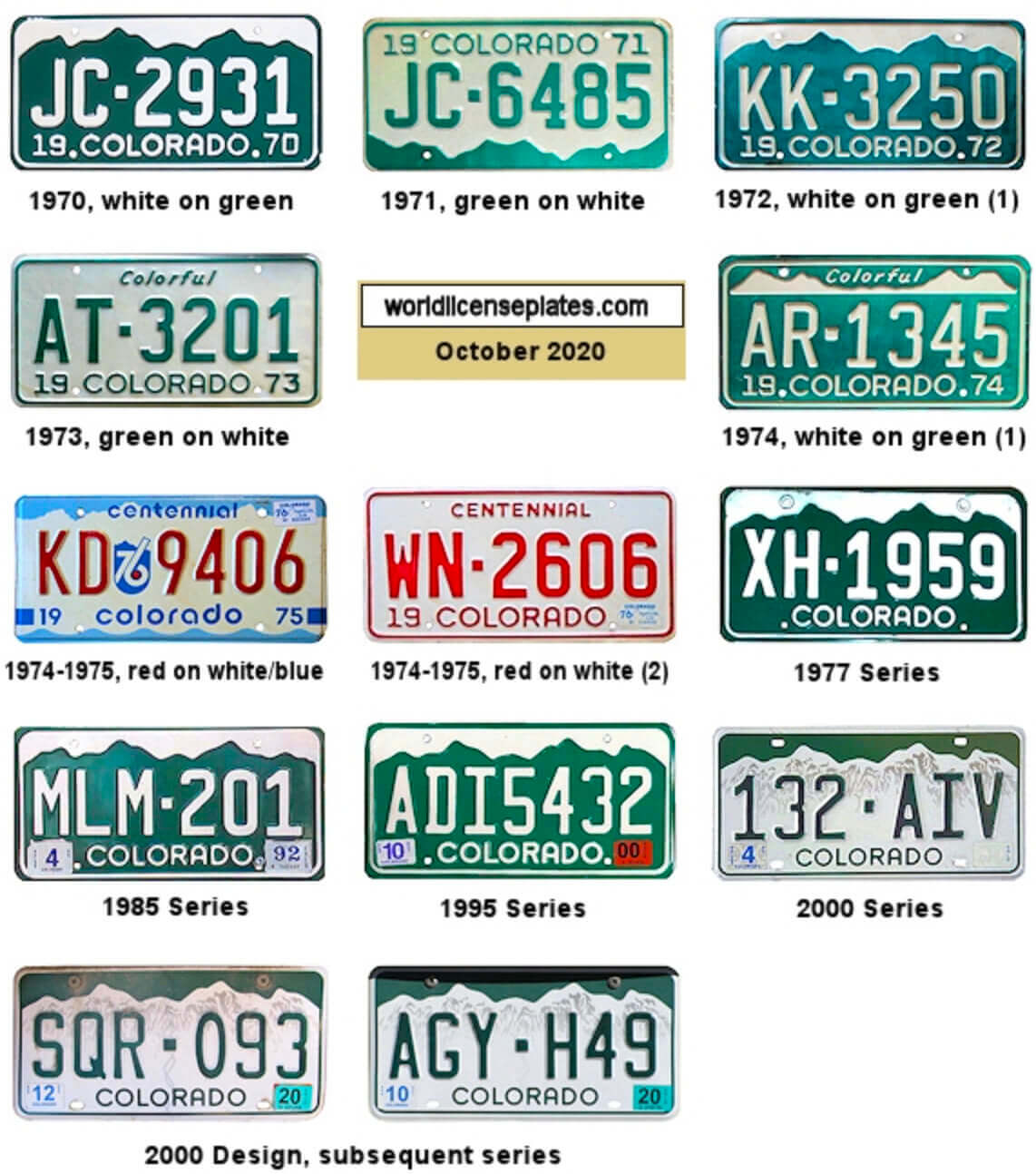
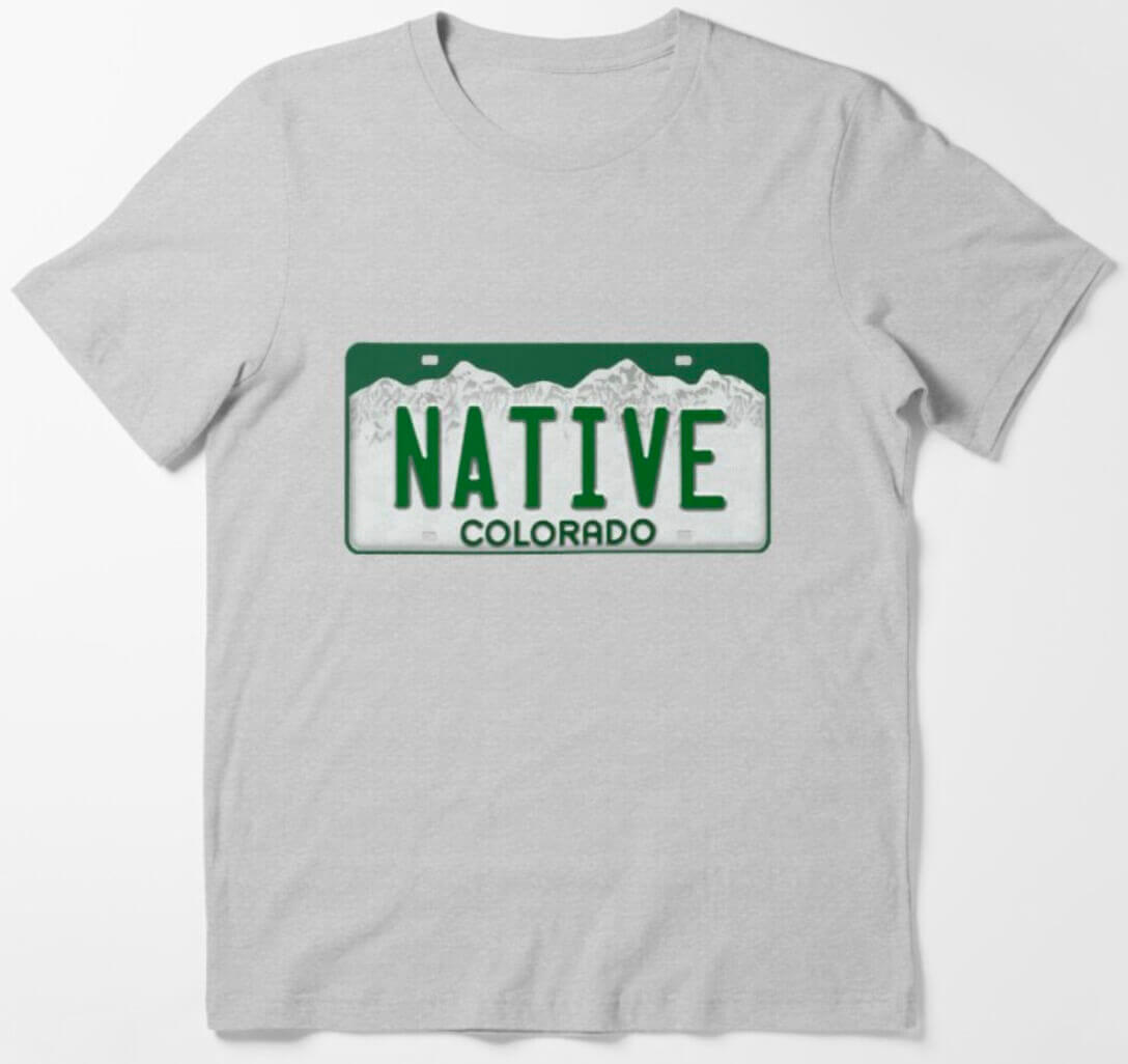
The license plate design is well-incorporated into the state’s culture. It’s often seen on merchandise, especially T-shirts and bumper stickers featuring the word “Native,” to signify one’s Colorado bona fides:
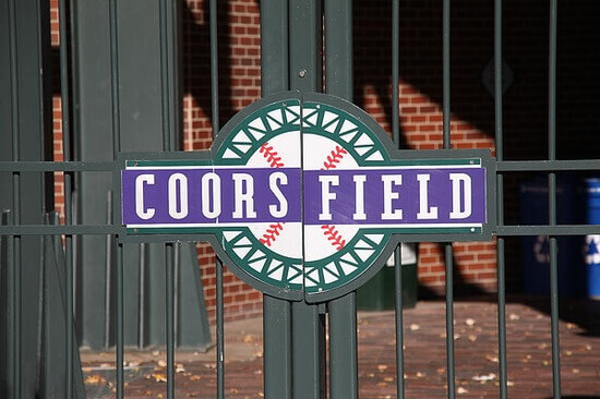
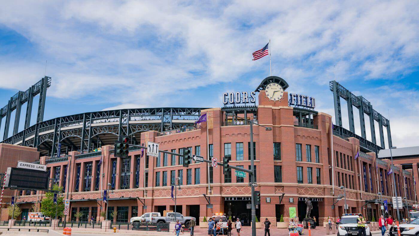
Second, Coors Field prominently features green in its color scheme. For starters, the ballpark’s logos include green:
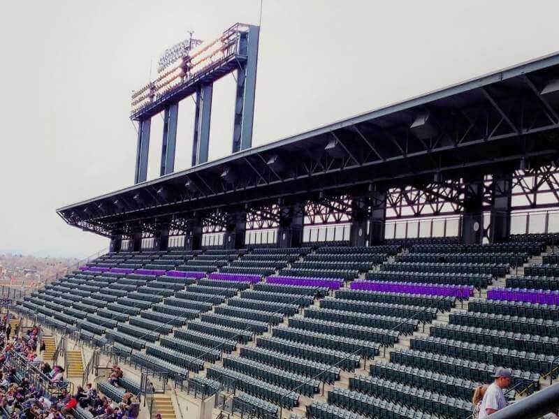
In addition, the painted metal scaffolding/girders are green, and so are the seats (except for the row of seats at the 5,280′ elevation mark, which are famously purple):
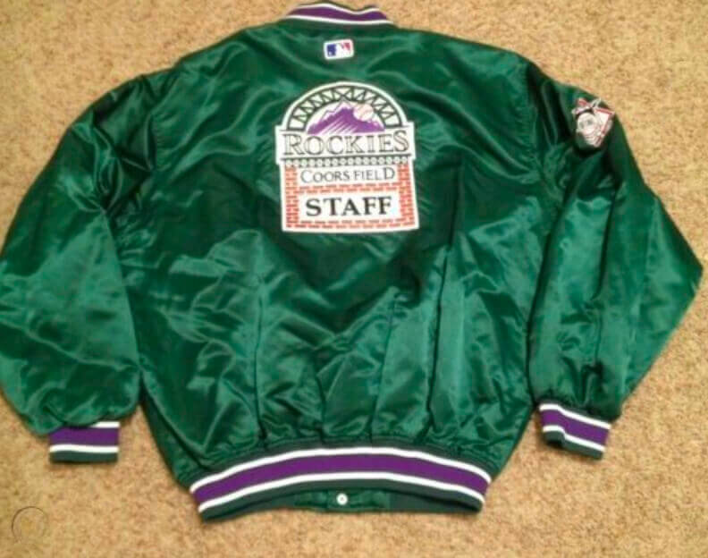
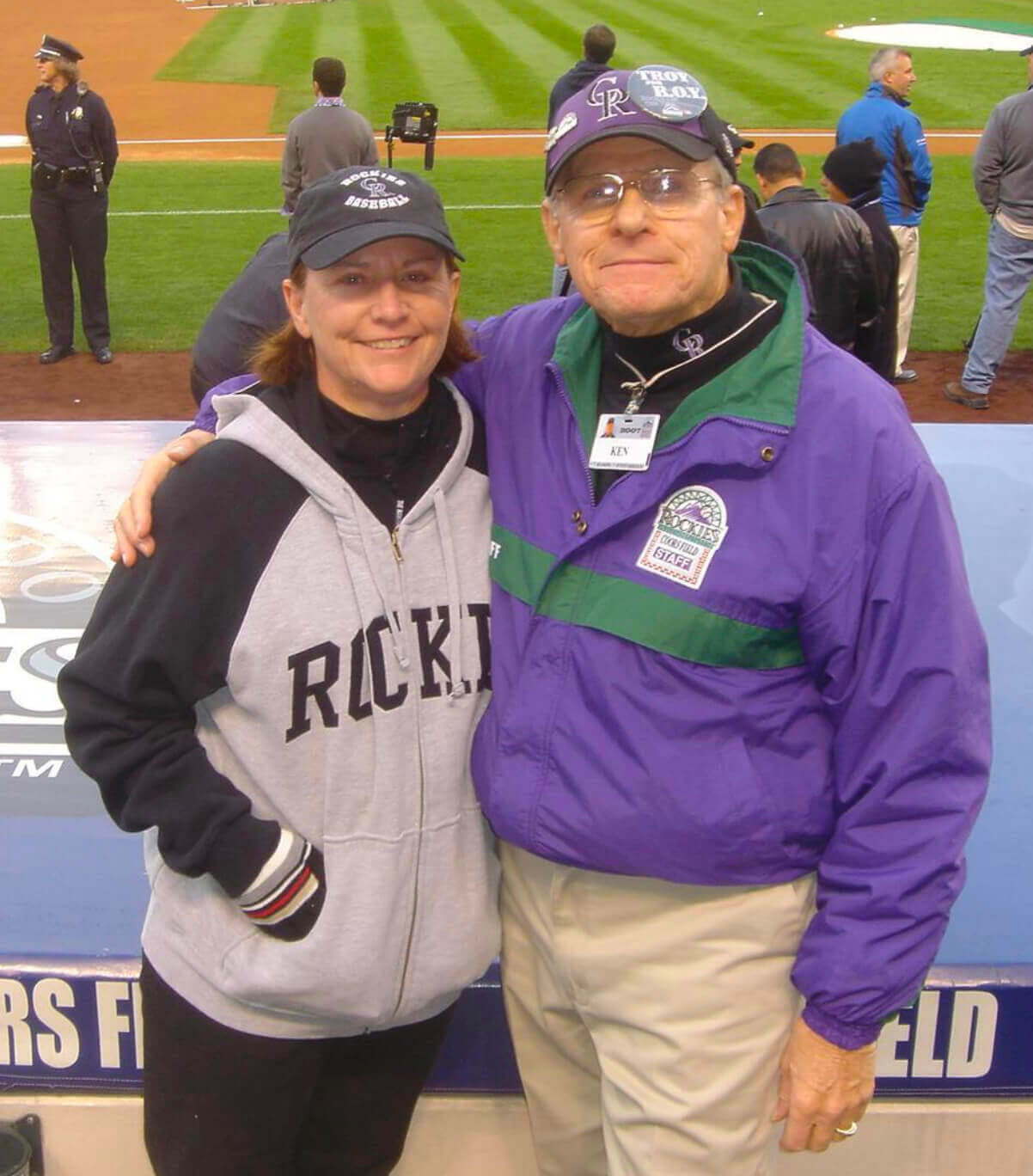
Green has also been used for Coors Field staff apparel:
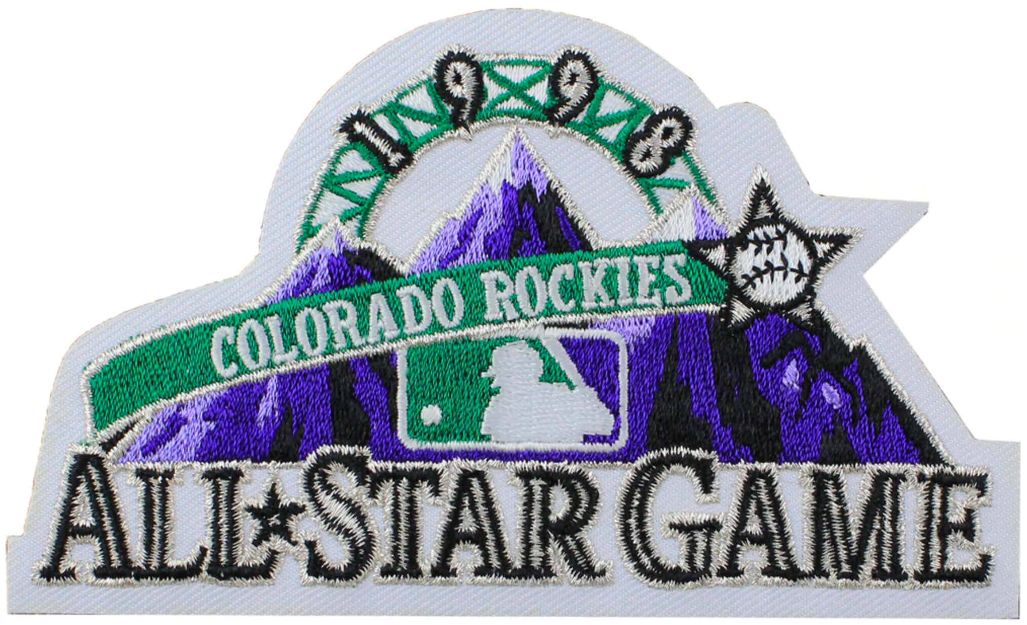
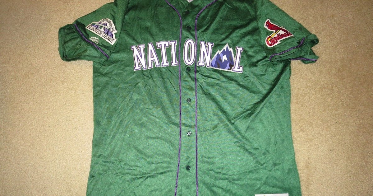
And when the All-Star Game first came to Coors Field in 1998, green was prominently featured in the logo and also on the jerseys worn by National League players for the Home Run Derby that year:
So green clearly has an established place in the visual identify of the state, the team, and the ballpark.
Wow — fantastic info there from Kary! Please join me in thanking him for his insights.
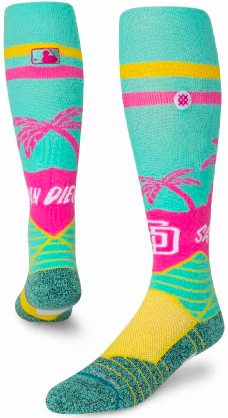
As for the Padres design, I emailed a few San Diego folks yesterday to see if they could read the tea leaves for us, but I didn’t hear back from them in time for today’s blog post. (Apparently some people have better things to do on the weekend than deciphering uni leaks of questionable legitimacy for a baseball season that might not even take place, go figure.)
In any case, the colors obviously bear no resemblance to the Padres’ color scheme — if anything, they look very Miami, right? On the other hand, the sock colors are at least somewhat similar to the colors of the NWSL’s San Diego Wave, and I also saw someone speculating that the sock hues might be meant to evoke the kaleidoscope of colors found at Del Mar Racetrack, which is just north of San Diego. But whatever the colors represent, I think it’s fair to say that they don’t bode well for the full uniform. Or to put it another way: Yikes!
Click to enlarge
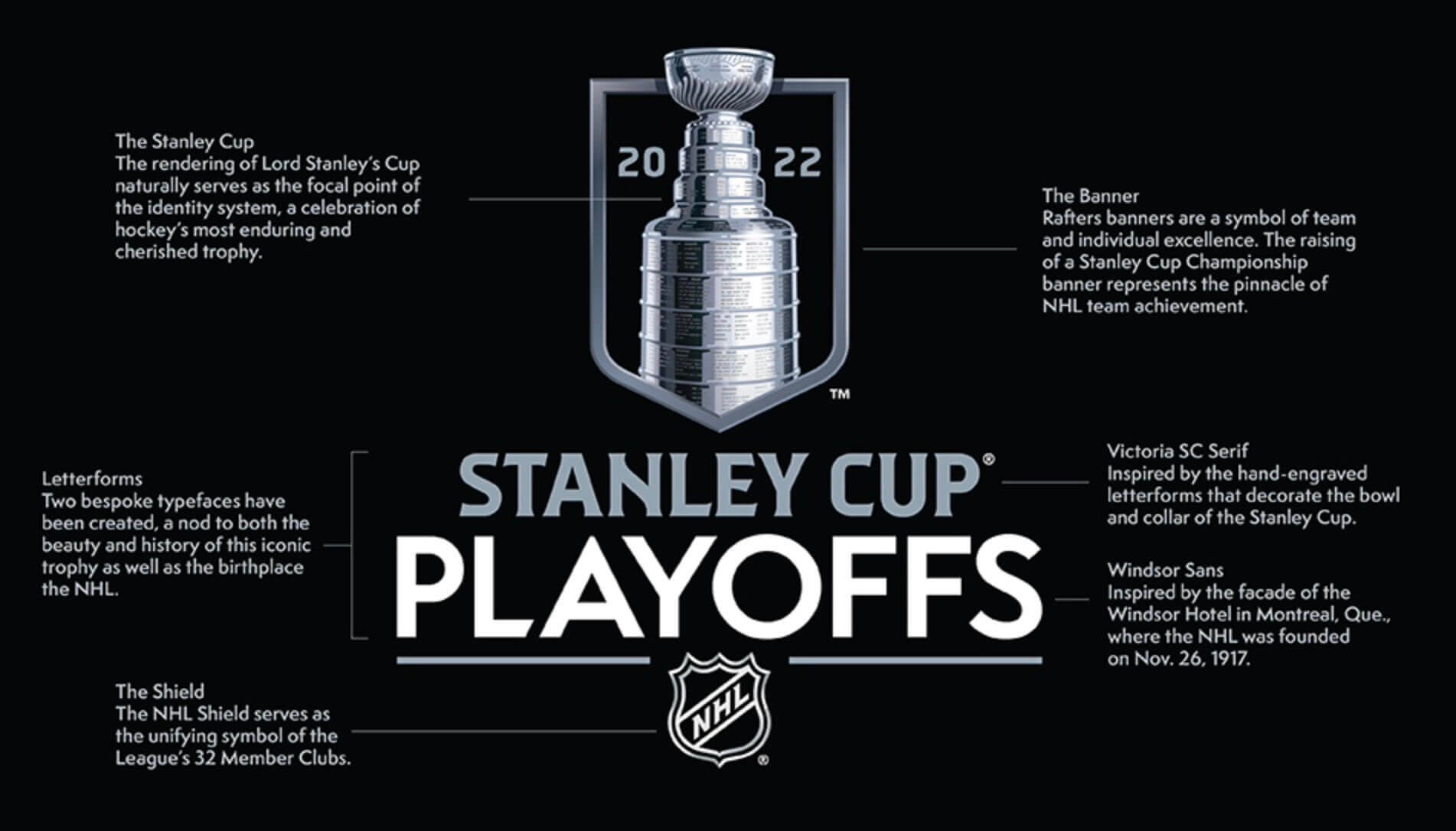
New NHL postseason logo: The NHL this morning released the new design you see above for the Stanley Cup playoffs. As usual, the “storytelling” is absurd, but the design itself isn’t bad. Additional info here and here.

My country, right or wrong: We’re continuing to see the uni-verse present lots of protests of the Russian invasion of Ukraine (there’s a fresh batch in today’s Ticker), but Russian gymnast Ivan Kuliak turned the tables yesterday by wearing a “Z” on his chest — a symbol in support of the invasion — during the medal ceremony at the Apparatus World Cup in Doha, Qatar. As explained in this article (which has lots of additional background info — recommended):
The “Z,” a letter that does not exist in the Cyrillic Russian alphabet, is regarded as particularly incendiary given [that] it has been seen daubed on Russian tanks and vehicles in Ukraine and has come to symbolize support for president Vladimir Putin and the invasion.
For Kuliak, who won the bronze in the parallel bars event, the gesture wasn’t just an expression of Russian nationalism — it also appeared to be a way of trolling the gold medalist, Illia Kovtun of Ukraine. Kuliak is now facing disciplinary action from the sport’s governing body.
(Big thanks to Paul Friedmann for this one.)
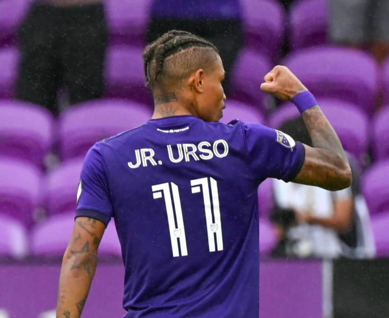
Odd NOB: The player shown above is Orlando City midfielder Ocimar de Almeida Júnior, but he goes by Júnior Urso — hence the strange situation of having “Jr.” at the front of his NOB!
(My thanks to Tom Donnelly for this one.)
Click to enlarge
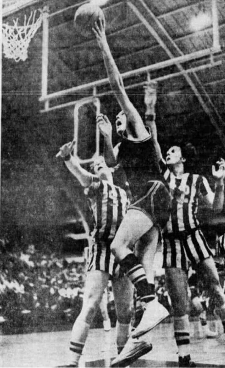
Too good for the Ticker: Phil linked to this photo in yesterday’s Ticker, but it deserves a better showcase. The year is 1972, and the team in stripes is Albert Gallatin High School in Pennsylvania. The stripes would be uni-notable enough on their own, but note that the jerseys also have sleeves! An Pittsburgh Press article from March 5, 1972 (that’s 50 years ago, almost to the day) referred to the uniforms as “blue and white striped uniforms with white numbers that looked like prison garb with short sleeves and short pants” — indeed!
(Big thanks to our own Jerry Wolper for this one.)
The Ticker
By Jamie Rathjen

Baseball and Softball News: Florida State softball wore throwbacks yesterday. “The 1973 team seems to be the inspiration. Minus the shorts, obviously,” says @VictoryCB. … One of Wichita’s TV stations teased what Trent Guyer tells us is this year’s Copa de la Diversión logo for the Double-A Wichita Wind Surge. While he says the hat was released last year, the team name that goes with it hasn’t been yet. … Also posted in the hockey section: The ECHL’s Worcester Railers wore uniforms based on MiLB’s Worcester Red Sox on Saturday, including socks with “stirrups” (from Brian Alexander). … The Blue Jays are updating the video board at their ballpark. … Baylor P Will Rigney used some shoulder liniment that discolored his vest jersey and undershirt during last night’s game, so the umps made him change into fresh gear (from James Gilbert).

Hockey News: A fan at Saturday’s Avalanche game was wearing a Nordiques jersey from the team’s 1995 redesign, which was aborted by the move to Colorado (from @caseytweetguy). … The organist from the movie Slap Shot is now the Kraken’s organist and apparently wears a helmet and a jersey with No. 88 and his NOB (from Greg Franklin). … A reader who prefers to be known as Teddy tells us that Devils D Dougie Hamilton is currently wearing a full-face shield. … My brother and I watch the German TV series Tatort, so imagine our surprise when this week’s episode had one of the characters wearing a Penguins T-shirt, of all things. … The PHF revealed the logo last week for this season’s playoffs in Tampa. … The ECHL’s Worcester Railers wore uniforms based on baseball’s Worcester Red Sox on Saturday, including socks with “stirrups” (from Brian Alexander). … The Junior A British Columbia Hockey League’s West Kelowna Warriors wore peach on Saturday. “They were celebrating the nearby community of Peachland,” says Wade Heidt. … Also from Wade: The same league’s Wenatchee Wild wore pink accents on Saturday. … “My nephew plays goalie in a youth floor hockey league and my brother-in-law did an Eddie Van Halen Frankenstrat-inspired paint job on the helmet,” says John Kimmerlein. … Now that this season’s NHL All-Star Game is over, the Golden Knights have removed their ASG jersey patches, but you can still see ghosted patches on some of their jerseys (from Brayden Teeter). … Here are some of the high school jerseys that will be represented at the New Jersey state championship tourney, which begins today (from Scott Fasano).

Soccer News: With International Women’s Day approaching, a number of English men’s teams below the Premier League wore warm-up shirts supporting the anti-sexism charity Her Game Too. … Arsenal’s men’s team broke out the rare red shorts yesterday (from Timmy the Cop). … Elsewhere in England, Reading goalie Grace Moloney received a No. 200 shirt for making 200 Reading appearances. … Players on several U.S. teams wrote “KM” on their wrist tape in memory of Stanford goalie and captain Katie Meyer, who died by suicide last week, including the U.S. under-20 women’s team and the NWSL’s Orlando Pride.

Grab Bag: Reader Greg Mays proudly sends along two items from his daughters who Get It™: The Iowa/Nebraska women’s basketball game on Saturday was color-vs.-color, and also that since 2020 the combined girls’ ice hockey program for Fargo North and South HS in North Dakota is called the “Spruins” and has a combination bear/Spartan logo, which I will say we did mention here at the time. … Teams that wore black armbands for Australian cricketer Shane Warne, who passed away on Friday, included Australia’s men’s Test cricket team, Australia and England’s women’s Cricket World Cup teams, and AFL club St. Kilda’s teams, as Warne briefly played there as a teenager before sticking to cricket. Australia’s women’s team wore doubled black armbands, adding one for Rod Marsh, another cricketer who passed away on Friday.
Ukraine News: Before a game in Germany’s Frauen-Bundesliga between Eintracht Frankfurt and Hoffenheim, the scoreboard simply said “Stop it, Putin!” … In addition to wearing a peace sign, both of VfL Wolfsburg’s teams turned the center circle into another peace sign. That’s technically a violation of soccer’s Laws of the Game, which don’t allow any markings other than ones required for play. … Also in Germany, Schalke 04 already replaced their previous Russian shirt ad with a new one and added a message saying “Gemeinsam für Frieden” (“together for peace”). Why the first two letters of “Gemeinsam” were capitalized was not explicitly stated but may be a reference to Schalke’s city of Gelsenkirchen. … You can see a roundup of gestures of support in English soccer, including in the Premier League and women’s League Cup final, here. … Meanwhile, this weekend’s Premier League games weren’t broadcast in China because of the league’s Ukraine tributes.

For all photos click to enlarge

What Paul did last night: As many of you know, I have a thing for green plaid shirts. So I was completely distracted last night while watching the Oscar-nominated Japanese movie Drive My Car, because the female lead spends most of the movie wearing a spectacular shirt that I am now officially coveting. Kudos to the wardrobe/costume department!
As for the movie: We liked it but didn’t love it. Definitely interesting and visually gorgeous (great light, some spectacular scenery and camera angles), but maybe not worth the full three-hour run time. Well, except for that shirt.
While trying to find out why Arsenal wore all red, I noticed the reaction was either in favor of it or totally against it. Some likened the look to pajamas or compared it to a lower-division club. One person said that it looked like what Americans would call “color rush” (paraphrasing). But those who were in favor seemed to like the mostly monochromatic red look.
I’m not sure why Arsenal chose the red socks and shorts as there was no significant color clash with Watford.
I hate the red shorts, because it’s just not Arsenal.
There was no clash, and shorts are not a big retail item so the change really doesn’t make sense.
But this is a good time to mention (again) BRING BACK THE HOOPED SOCKS!
Saw the history behind the two fonts, but am I the only one who sees the new Stanley Cup Playoffs logo and says “Why did you mix a serif font with a sans-serif font?!?!”
That was my reaction as well. And why two fonts for two lines on a logo? What a reach!
That’s gonna be a pretty big patch with all those wordy explanations on it.
The few Stanley Cup articles that have been linked on here the past few days have all talked about how the Cup itself was updated to look more realistic within the logo. The SCF patch that the two teams wear in the Final has been one of the last actual embroidered championship patches left in North American professional sports.
Given that the league themselves is touting the new realism, I can only guess that they’ve switched to the plastic patches in order to show off that new realism a little better than embroidery would, which we’ll see this coming Final.
Also, and maybe I’m wrong about this, but the ESPN article today talked about how Gary Bettman said some of the older renderings were missing the ‘etchings’. Aren’t the names on the Cup hammered on/embossed, rather than etched/scraped on? And if so, shouldn’t the commissioner of the NHL know that?
Always interesting that, in Germany, at a German soccer game, in front of a German audience, reported in a Tweet written in German, a sign is written in English, instead of saying, ”Hor Auf” or even just “Halt es”
Somewhat related to today’s lede… Here’s a deep dive on Colorado’s iconic license plates from a few years ago. link
Great stuff on Colorado’s license plates, Ron! Thanks for sharing! I had to admit, I never realized that the mountain range graphic was flipped horizontally when the state switched from green mountains on a white background to white mountains on a green background. Great attention to detail!
I see the visual look of the padres socks and am hopeful that it will be something cool. to me it’s simply evocative of a warm weather beach town, but also reminds me very much of a sort of generic (or at least I thought so at the time) tshirt I owned while living in San Diego. The base color was that “electric seafoam” of the socks with a sort of pink and yellow based tequila sunrise style strip across the chest that was overlayed with palm trees, a sailboat, and a setting sun. Above the strip was a small font “San Diego” word mark. Maybe they will be doing something like that?
However, given that San Diego had a long road to returning to the brown and yellow, and that they actually showed great restraint in what they ultimately presented, particularly by only having one hat because they didn’t want to water down the identity, I can see this as nothing else but watering down the identity.
This CC program, and any of Nikes uni gimmicks across the leagues mostly claim to strengthen either the fans’/locale’s/players’ connection to the team, or strengthen the team’s connection to its own history, yet it hasn’t produced many jerseys that do anything other than muddle up or water down the identity.
Good thoughts. I’m a long-time San Diegan and am a bit bewildered by the socks, if those do indeed reflect the upcoming jersey design. I can see turquiose blue as a reasonable cultural fit (the obvious sea color and even a light nod to southwestern/Balboa Park design sensibilities, i guess) but the hot pink doesn’t strike me as a meaningful color for the region at all – that’s Miami Vice, not SD. Then again if this is an attempt to show brand similarity to the Wave FC then that’s fine (meanwhile the Loyal soccer club is orange and Torrey-green, BTW).
having no trust in nike’s ability to “stay on task” with these promotions, i wonder if, after doing something new with the marlins (aka “not miami vice”), they didn’t want to miss an opportunity to have a pink and teal team (as it is a very hot selling basketball promotion). so they went with the next warm weather beach town on the list regardless of the fit.
If they are trying to make some sort of brand association with a soccer team that just started play this year then I’m baffled. It would be such a blatant promotion for the soccer team at the expense of confusing the padres fans.
Del Mar Racetrack… maybe. Opening Day is colorful for sure but that’s still not a strong visual association in my book.
While I like those socks stand alone, I shudder to think of the corresponding uniforms!
Interesting about Albert Gallatin… because I always thought their color scheme was silver/gray and black?
Did you pay for concessions at the movie or did you sneak in a few beers like you did for Jackass?
Streamed it at home.
Colorado has the best license plates in the country.
New Mexico has entered the chat.
The two diamonds on the back of the Rockies’ sock make me think they’ll do something ski-related as well. Either that or it’s just a pointless design piece.
As I commented late yesterday, Stance socks make me thankful for pajama pants, and I hate pajama pants.
Stance actually made navy blue socks for the Red Sox. The Red Sox. Their contract should have been terminated for breach, and they should have been disqualified from ever making baseball socks again.
I haven’t seen Drive My Car, but I’m always happy to see a classic Saab 900.
“The absurdity of a potential leak coming from a uni element that won’t even be visible on most of the players, because they’ll be going low-cuffed, seems suitably ridiculous for the merch-driven uni-verse in which we now find ourselves.”
This is an interesting take, as FootyHeadlines (a site often referenced in the Ticker) regularly gets its uni leaks from things like pre-match jerseys and tracksuits, but also from even more obscure items like backpacks, t-shirts, balls, and other fan merch.
Great job Kary on your feedback with Colorado’s green & white license plates and how it ties in with the Rockies and Coors Field.
Thanks, John! I appreciate your kind words!
Paul,
Not sure if anyone else is experiencing the same, but for the last week using Chrome on desktop the photos/images haven’t loaded. Just the little “photo” icon but not the actual photos for any posts. Works on Firefox however. Anyone else experiencing this??
Nobody else has mentioned this to me, Nicholas. Can you please email me some screen shots? link
Email sent! Thanks Paul!
Paul,
This page has a couple of close ups of the Albert Gallatin High School striped uniform: link
The IIHF website seems to have leaked new uniforms for the 14 teams competing in the upcoming World Championships.
The teams include both the USA and Canada, and, for both teams, they are, predictably, wearing the same jersey template that they did in the Olympics except:
1. The teams’ familiar federation logos on the chest;
2. No third or “alternate” jersey.
This is the USA jersey (toggle for road): link
And, Canada:
link