Click to enlarge
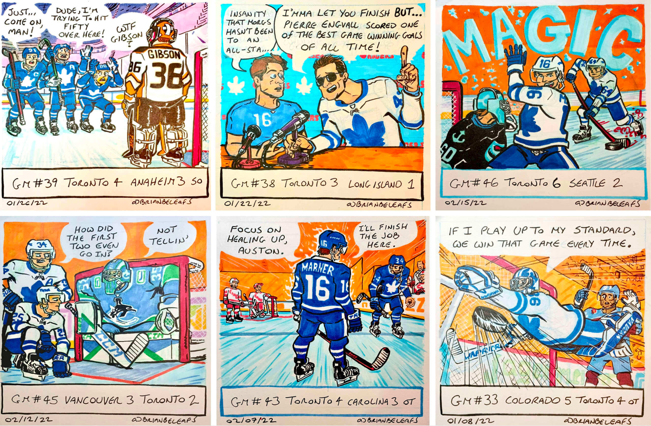
I’m not sure how I didn’t know this until now, but there’s a cartoonist up in Toronto who calls himself Brian BeLeafs. He’s apparently a rabid Maple Leafs fan, and after each Leafs game he posts a one-panel cartoon summary of the game on his Twitter feed. As you can see above, he’s really good! His style and his hockey obsession both remind me of longtime Uni Watch pal Rob Ullman, which I definitely mean as a compliment.
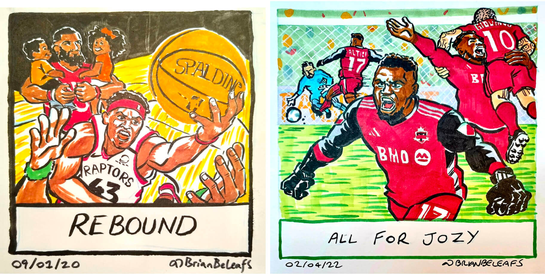
Brian BeLeafs sometimes does cartoons for other Toronto sports teams:
Brian has compiled his comics into books and trading cards, all of which looks pretty good. I only learned about him yesterday, so I’m still kinda scratching the surface here, but I hope to have an interview with him soon — stay tuned.
(Big thanks to reader Ted Arnold for bringing Brian BeLeafs to my attention.)
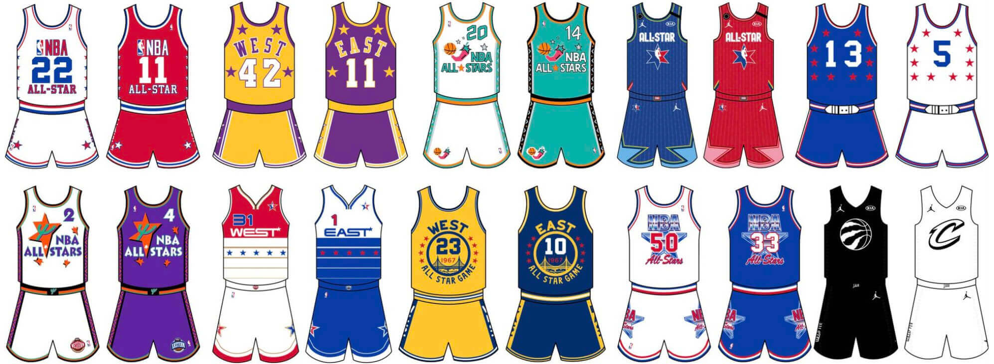
ITEM! New Bulletin column: The NBA All-Star Game is this Sunday, so my Bulletin article this week is a ranking of the 10 best and 10 worst uniforms in NBA All-Star history.
My premium subscribers can read the article here. If you haven’t yet subscribed, you can do that here (you’ll need a Facebook account in order to pay). If you want more info on what you’ll get for your money, you can find that here. And if the Facebook requirement is a dealbreaker, email me and I’ll keep you posted regarding non-Facebook payment options and possible workarounds. Thanks!
Blast from the Cowboys’ past: Uniform unveilings back in the day were very different than the ones we’re used to seeing now. Case in point: In 1981, a local TV news report in Dallas gave very low-key coverage to the Cowboys’ then-new blue jerseys and silver pants (which was the start of the team having different pants for the white and blue jerseys). The segment was just uploaded yesterday by YouTuber Martin Caidin.
Interestingly, the shot at the end of the segment shows defensive lineman John Dutton without an NOB:
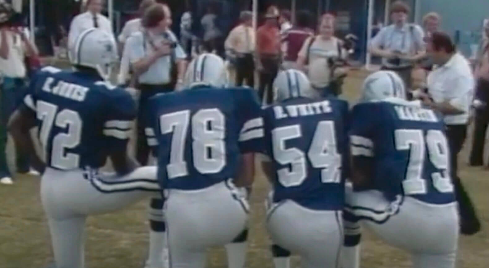
(My thanks to Steve in DC, who declined to give his last name, for this one.)
The Ticker
By Paul
Indigenous Appropriation News: A Pennsylvania school district that last year voted to discontinue its Native American-themed sports iconography is now rethinking that decision. … Back in 1930, MLB’s Boston Braves used an Indian-head coin as a season-ticket pass (from Jim Brunetti). … A non-binding referendum on the ballot this spring in Dartmouth, Mass., will allow residents to weigh in on the local high school’s “Indians” team name and associated iconography. … The rest of these are all from Kary Klismet: La Conner (Wash.) High School has selected a new logo by a local Swinomish artist to accompany its “Braves” identity and replace its previous stereotypical and culturally incorrect logos. … The Washington Commanders’ new name has provided closure for some Native Americans affected by the team’s previous name. … Wildwood (N.J.) High School has decided to keep Warriors as its team name and associated Native imagery after reaching an agreement with the Native American Guardian’s Association, a group that advocates for preserving Native American-themed team names as an educational tool. … Several sports teams in Europe have joined their North American counterparts in dropping Native American team names and logos. … Lyme Central High School in upstate New York will no longer call its teams the Indians. … Mason City (Iowa) High School is asking local residents for suggestions to replace its “Mohawks” team name. … In a mildly subversive act that might qualify as “reverse cultural appropriation,” an Indigenous artist has highlighted his people’s plight and continued survival by painting a mural in Tucson that puts a Tohono O’odham spin on University of Arizona logos.

Baseball News: From the indefatigable Kary Klismet: “I recently connected with a guy named Jeff Schamel, who shared these great 1991 photos of the Reds playing a charity basketball game against faculty and coaches at Eaton High School in Ohio. He also pointed me to this excellent 1971 color footage of Johnny Bench, Pete Rose, and several of their Reds teammates playing charity hoops against members of the 1961 and ’62 Cincinnati Bearcats national championship teams at old Armory Fieldhouse in 1971.” … Atlanta has become the first MLB team to join the metaverse by creating a digital version of their ballpark. … We all know Earl Weaver had a cigarette pocket in his Orioles jersey, but he also had one when managing the Gold Coast Suns of the Senior Professional Baseball League (from Douglas Ford).

Football News: Here’s something I hadn’t been aware of: While covering the Dolphins’ training camp in 1973, ABC broadcaster Howard Cossell dressed up in a full Dolphins uniform (from Brad Eenhuis). … Here’s an article on the evolution of the Cowboys’ uniforms (from Kary Klismet). … The Washington Post is asking readers how they’d like “Commanders” to be shortened in headlines. Sadly, “Commies” isn’t on the list (from Jeff Sak). … USFL 2.0 uniforms will be unveiled today. I’ll have light coverage tomorrow and then Phil will have a more in-depth treatment on Saturday. … Here’s an article about a particularly avid Penn State jersey collector.

Hockey News: The Pittsburgh Tribune-Review created a fun infographic using era-appropriate jerseys to show all the players who assisted on Sidney Crosby’s 500 career goals (thanks, Jerry). … The ECHL’s Norfolk Admirals will play as the Virginia [pizza] Slices this Saturday (from @Kurzy17). … The Sabres’ Heritage Classic jersey, which the team will wear when facing the Maple Leafs outdoors on March 13, has leaked.

NBA News: DeAndre’ Bembry is poised to become the first No. 95 in Bucks history. He’s worn that number throughout his NBA career. … The D League’s Motor City Cruise wore uniforms designed by a local fashion designer two nights ago (from Wayne Jones).

College and High School Hoops News: Cross-listed from the baseball section: The indefatigable Kary Klismet writes: “I recently connected with a guy named Jeff Schamel, who shared these great 1991 photos of MLB’s Cincinnati Reds playing a charity basketball game against faculty and coaches at Eaton High School in Ohio. He also pointed me to this excellent 1971 color footage of Reds players playing charity hoops against members of the 1961 and ’62 Cincinnati Bearcats national championship teams at old Armory Fieldhouse in 1971.” … Throwbacks last night for UConn men’s (from Geno Green). … Northwestern men’s wore purple at home last night against GFGS-clad Purdue. It was ’90s Night, so the scoreboard used a retro Purdue logo (thanks to all who shared).

Soccer News: New “City of Bayous” kit for the Houston Dynamo (from Ignacio Salazar). … Manchester City has issued a cease-and-desist order to a third-tier Chilean men’s club over the latter’s crest, which is very similar to City’s (from Mark Coale).

Olympics News: American snowboarder Julia Marino withdrew from the big air competition after a dispute with the IOC over an advertisement on her board (from Kary Klismet).

Grab Bag: New logo for NYC Pride. … Here’s a list of five unusual military uniforms from around the world (from Kary Klismet). … Also from Kary: New helmet for driver George Russell of the Mercedes Formula One team. … M&M’s is rolling out a line of package designs based on classic pop music album art (from Max Weintraub).

What Paul did last night: There’s a movie theater right around the corner from Uni Watch HQ, and all tickets on Wednesdays are just $6. We rarely go there because they mostly just show blockbusters and kids’ movies, but every now and then we can’t resist the Wednesday deal. That was the case yesterday, as we tucked a few beers in our bags and headed around the corner to catch Jackass Forever.
Honestly, I’ve never been a huge Jackass fan (Mary is a big devotee). But all joyous mayhem and kicks in the nuts definitely resonated differently after two years of pandemic-ing — I’m pretty sure this was the hardest I’ve laughed in that time, and boy did I need it. Recommended!
Our latest raffle winner is Jim Lutz, who’s won himself a Uni Watch membership card and a pair of magnets. Congrats to him, and thanks again to Chris Hickey for sponsoring this one. — Paul
It always trips me out when I hear the Minutemen (“Corona” – Jackass theme) on my TV.
Had the pleasure of hanging with Dimitry Elyashkevich (producer/camera) at his house in Hollywood a few years back. My daughter (5 at the time) threw limes at him as he chopped them with a machete midair. Very Jackass-y.
This new Ridell seriously impacts the aesthetic of the face mask.
Marty, I think of you every time Jackass comes up because I know you’re such a big Minutemen fan (as I am!). T-shirts for the Minutemen, Black Flag, the Ramones, and several other punk/indie bands appear in the new movie.
There’s a pretty good doc about Big Brother skateboarding magazine. That was the onset of Jackass. I think I saw it on Hulu.
Punk rock saves lives.
“Jackass” was my introduction to Minutemen. I’d been into US Punk/Hardcore for a while but they’d completely passed me by. Saw the first episode on MTV UK one night, thought the theme tune rocked and saw it was Minutemen in the credits. A few days later I was on an art college field trip and found a second-hand copy of “Double Nickels” and it quickly became one of my favourite albums of all-time.
I was lucky enough to get the chance to hang out with Mike Watt after a gig a few years ago, he was one of the nicest and humblest celebrities I’ve ever met – and he’s still making great music!
I’ve had the pleasure of touring San Pedro in his van. It was gnarly. I lived We Jam Econo (If you haven’t seen it, see it.). He’s also stayed at my house on a few tours (since ’04). Amazing guy. He’s gotten a little surlier over the years. Who doesn’t? Still love him.
A lot of the “punks” back in the day didn’t think the Minutemen were punk enough. I believe Agent Orange went through that as well.
That Maple Leafs cartoon reminds me of Joe Petruccio who use to do a cartoon after every Mets game. Paul interviewed him back in 2010. link
The commanders would be shortened to “coms” or “cmdrs”? What a joke. Maybe in print that works, but out loud coms does not have a nice mouthfeel and cmdrs is commanders. Nice try dummies. You’re the commies.
Was thinking the same thing, the polls is essentially asking how people want the named shorted for newspaper headlines. If they went with Cmdrs, it would still be said as Commanders. So that option is pointless when it comes for how fans will actually shorten the name when talking about the team.
Coms or Commies, and Coms is shorthand for Communications, or at least it is frequently depicted that way in Hollywood when you need to get Coms back online after an attack.
Even if you remove definitional context from the words/abbreviations, commies sounds comfortable and correct: “going to the commies game this weekend?” “The niners are at home against the commies on Sunday”. Coms still sounds like industry jargon for a mundane thing (and not in a cool way). So the options are full commanders, which is fine but not a particularly effective handle if you ask me, the commies which – political implications aside – does have that casual affectionate sports fan feel, like niners, buccos, ‘boys, iggles, vikes, the pack, etc. Coms feels rote and awkward. It would fit well into the sentence “step one: connect hvac temp sensor to ac port outlet neg/pos”
So it’s commanders which is a real mouthful and kind of has a sad “kid with no friends reinventing himself in college” feel to it,
Or it’s commies, which has a nice ring to it but also indicates that they are communists.
Somewhat related, but professionally I occasionally deal with editing and publishing to academic standards using the Chicago Manual of Style with authors who are active-duty military officers. Prior to the 15th edition of CMS, 15.15 required Commander to be abbreviated Cdr., whereas the US military uses all-caps CDR. Not a rank that comes up much in my work – flag ranks are more common – but my goodness active-duty officers can be pretty darn insistent on using the all-caps version instead of the academic-style version.
Also, obviously the acceptable forms of the Commanders’ name are:
Washington
Commanders
WAS
WSH
Commies
That’s it, that’s the fully list. Eventually fans will organically develop some variation on Manders/Mandos/Commandos/Salamanders/etc, and who knows where that will go, but eventually the list will grow. Folks need to stop trying to make Coms/Cmdrs happen.
Pretty simple. Until the whole communism thing dies down, their shortened name can be Red Legs. ;)
Trying to show strength by using a name associated with the American military, that gets shortened to a name that represents anti-American values. It is such a funny flop for the flailing ownership group there. Going with a generic and pandering name completely backfired, and I love it.
It gets even more head scratching knowing they kept the team colors, and created completely generic logos. They could have called this team anything else, and still used the same logos and uniforms (minus the GI Joe cosplay). If they were the Federals nothing would be different other than they’d be called the Feds instead the Commies.
Love the pics of Howard Cosell in the Dolphins uni. Dude was TALL!
I am enjoying the way that the USFL is unveiling their team’s uniforms with one released per hour. Are they the first league to employ this type of approach?
So far (after two unis) they’re not great but also not bad. Both are at least WAY better than the pile of puke that is the Commanders uniforms!
It’s a novel approach!
Based on what I’ve seen so far, I’m preparing to be thoroughly disappointed at 3:00:01 this afternoon (already mildly saddened that Jeff Fisher isn’t the Stars’ coach), and I was also very let down when I saw the Breakers’ nouveau-logo…a signal to me that a straight-up throwback to their original helmet design was not going to happen.
I am curios why the Cowboys switched the white outline on those blue jerseys midway through they season.
Those were beautiful uniforms though, looked perfect in RFK games.
The Sabres have revealed their Heritage Classic uniforms in full. Paul, you’re going to LOVE the socks.
link
This very well may be the Sabres’ best looking jersey ever… combines all of the best elements form their recent 3rd jerseys while still maintaining a classic look.
The socks are definitely cool. Two things stand out from that link:
1) When did hockey socks change material so drastically? I (naively) assumed that they were still like the knit style in years past, but those appears to be almost pure polyester.
2) That Sabres logo with just the Buffalo and “Sabres” written within it is awesome.
Been quite a long while since the socks changed from knit (a decade? more?). Knit ones are even the more uncommon ones now at retail. May have started happening when the jock shorts (with velcro tabs) came out and the newer style polyester ‘performance’ socks with velcro tabs.
Even I, who am usually a very late adopter, have changed over to the jock shorts (very rarely use the separate jock and garter belt). Other than a couple pair, all my socks are knit. I even still have some older knit ones with stirrups that I still use.
Socks in NHL changed from the knit style in 2007-08 with the introduction of Reebok Edge uniforms.
Thanks Wade for digging that up. Makes sense.
As a Houstonian member of the Uni-Watch faithful, let me say:
1) The Gamblers uniforms are okay (love the classic logo!), except the side panel on the white jerseys is the same color as the pants that go with the black jerseys, not the lighter silver pants that are pictured with the white jerseys. Big oof there.
2) I really don’t care for the new Dynamo away jerseys. That splotchy/camo pattern doesn’t do anything for the shirt, despite what they claim (echoes moonlight reflecting off a bayou? What?)
Better luck next time, Houston teams.
The hypocrisy is just too much
Your thoughts on ambiguity and/or vagueness?
Hi Paul. The story about the Cowboys uniform reveal reminded me of a story in the Ticker on this day – link
The story says that Jerry Jones once modelled a new uniform on the sidelines. Did you ever find photos of this? Every once in awhile I’ll remember the story and search for photos/videos, but have never found anything.
Nope. Still hoping!
One would think that the Washington Commanders Marketing/design teams would have considered what the shortened version of Commanders would be in print or by fans/competitors/news.
This is yet another typical Dan Snider f-up.
The 1997-2002 era of players wearing their own uniform in the All-Star game. I believe this also deserves credit to the Lakers white uniforms which were developed specifically for this game since the Lakers were the only team that didn’t have a white uniform at the time. That then led to the Lakers wearing the whites for Sunday home games. Which also seems like it led to the NBA putting the Lakers at home on Sunday more than any other team.
I’d just like to point out that this might be the first time in a long time that the football team from Washington appeared in the ticker but not in Indigenous Appropriation News. How refreshing.
Actually, they’ve appeared in the Ticker countless times in recent years simply as “Washington” or “WFT.”
Whelp, they had to do it. They had to ruin the Gamblers uniforms with side panels and zero effort. It’s so fucking predictable these days it’s exhausting. Who are these goddamn people designing sports uniforms?????
Leafs ‘toons: Reminds this UW long-timer a bit of “Benchies”.
’81 Cowboys: Innovators of the hip number/patch placement(Colts & Packers followed suit with numbers, Raiders with the AFL@25 emblem)?
IA News: South Jersey has no shortage of school districts/teams with Native-American-based names…wonder if there’ll be more engagement/outreach to keep those around.
Excellent Weaver pocket pic find by Douglas Ford, and cheers to raffle winner Jim Lutz…enjoy!
Armory Fieldhouse still exists.
Nothing in the Ticker says otherwise!
By “old,” I meant just that – it’s an old facility! It’s been around a while! Also, it’s no longer the Bearcats’ home basketball arena, so “old” seemed appropriate in that context. My understanding is that it’s primarily used as a rec center now and for indoor track meets:
link
It’s still a good-looking facility, in my opinion. I love the design of old fieldhouses and arenas like that.
Please just stop your cultural appropriation bits.
Sorry, Dave, but I see no reason to do that. Those bits appear just once per week, it’s obviously related to athletics aesthetics, and some people care about the subject matter.
I’m sorry you don’t like that section, but it’s easy for you to scroll past that it if you don’t care about it (just like some people scroll past the soccer section). Problem solved!
I don’t know about anyone else, but IMHO, apart from the Maulers’ shoulder yokes and the Stars’ side- and helmet striping, the USFL 2.0 uniforms are fantastic.
Overall, I like the USFL unis. Although it’s weird that the Stallions show a tan set of pants in the video, but the one showing home and away only shows the white pants (unless I’m not seeing the hue, etc.). Also, why, oh why, did the Breakers change the helmet design??? Yes, it looks more like a breaking wave now, but that flowing sea like logo on the former helmets was one of the league’s best. Also, love the Panthers’ color combo, did then, still do!
My vote goes to Tampa for the best looking uni. I can’t believe a great color combo like Red and Silver isn’t in the NFL.
Is Howard Cosell the most unathletic man to ever wear a uniform?
George Plimpton.
It was pretty interesting that you had a video of the new Cowboys uniforms for 1981 and, later in the blog, had a link to a piece claiming to be the evolution of the Cowboys uniforms that didn’t mention the 1981 change at all.
Are you aware of the Mets cartoonist who does the same? Seems right up your alley. link
I’ve written about him!
link