
For all images, click to enlarge
The lockout has put a serious damper on MLB uni news, but the Astros got things cooking yesterday by unveiling a 60th-anniversary logo. As you can see in the photo above (a horribly backlit shot that I can’t believe they used for their official announcement), the commemorative mark will be worn as a cap patch, and the press release says it will also appear on jersey sleeves. There’s no photo yet of the sleeve treatment, at least that I’m aware of, but you can get the general idea from this retail mock-up:
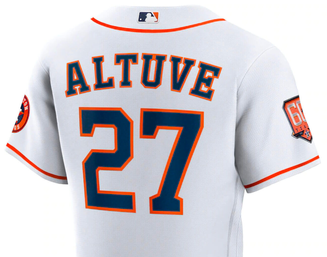
So it appears that the cap and sleeve patches will be the same design (instead of having a simplified version on the cap, which is how it often works).
Here’s a closer look at the patch design, along with the digital version (click to enlarge):
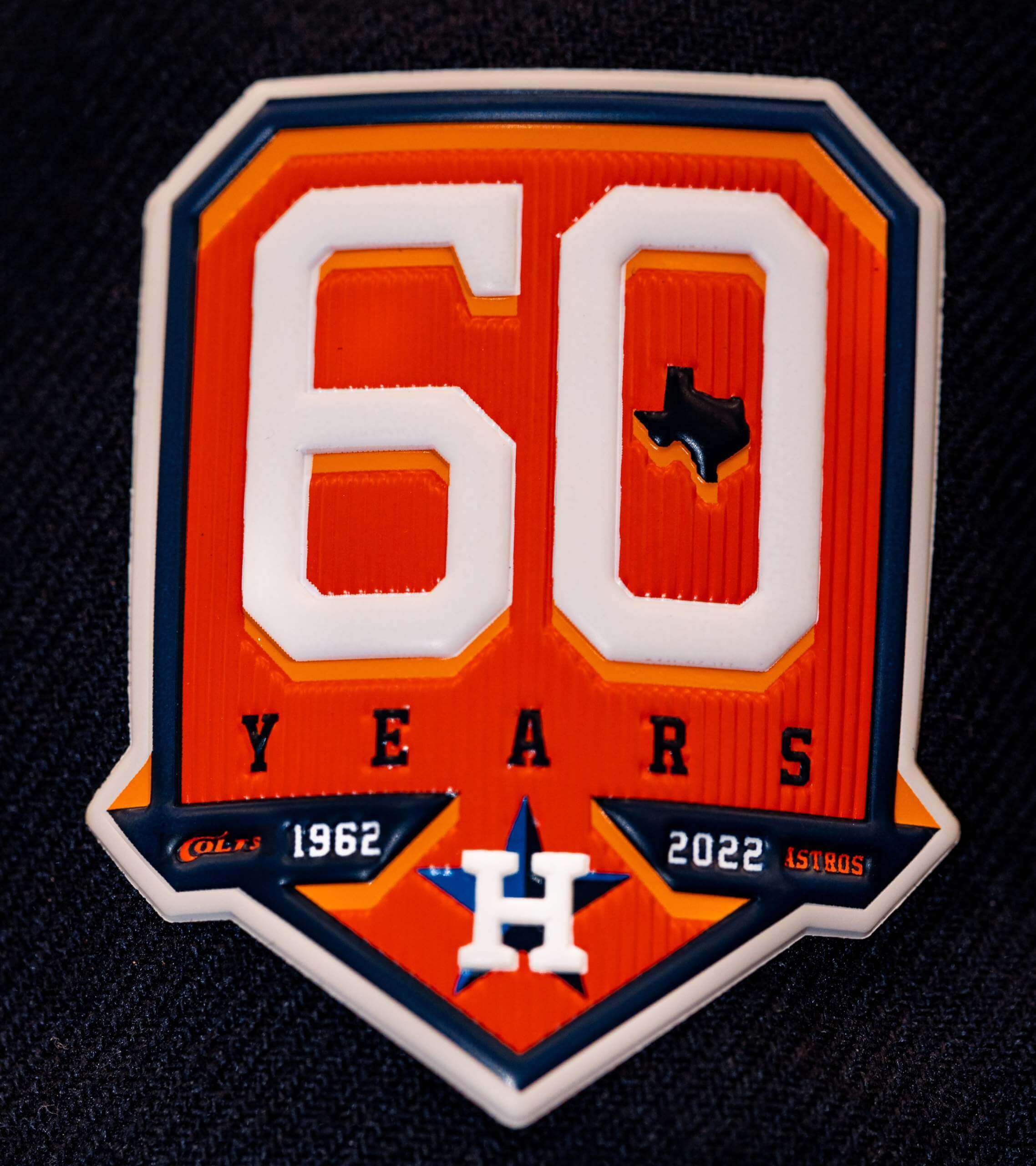
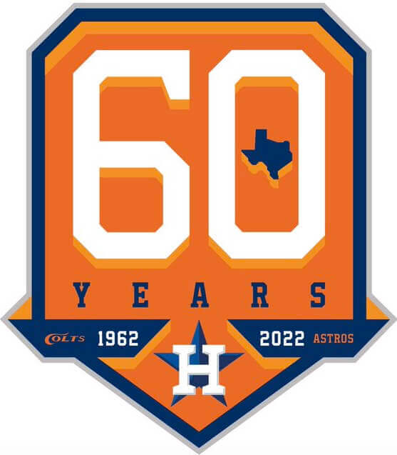
As we’ve discussed many times before, teams usually celebrate either a milestone season (which I generally don’t care for) or an anniversary (which I prefer, because there’s usually a better symmetry to the date range). For the Astros, the 60th season would have been last year, and the 60th anniversary is this year, but they’ve taken a third route with wording of this patch: “60 Years.” Personally, I find this a bit unsatisfying, like they’re trying to have it both ways but are ending up with neither.
The Astros have a long, muddled history with milestone logos. They’ve sometimes used the word “Anniversary” (both accurately and inaccurately), sometimes used “Years,” sometimes skipped using any word at all, and never used “Season.” All this is complicated by the fact that the franchise spent its first three seasons as the Colt .45s, so they’re sometimes celebrating a franchise milestone (as in the case of the “60 Years” patch) and sometimes just an Astros milestone. Here’s their full collection of milestone logos, some of which have been worn as patches while others have been used just for marketing purposes:
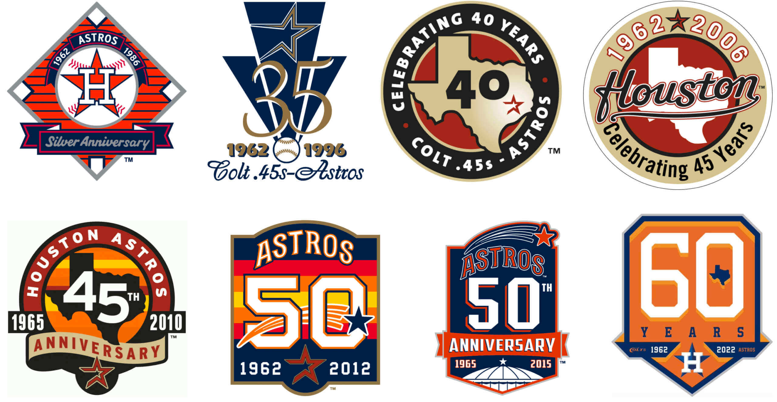
What a mishmash!
According to the press release, the ’Stros will also mark the anniversary with “Flashback Friday games” throughout the season, so we’ll likely see some fun throwbacks — something to look forward to.
(And yes, we know, the Astros are cheaters and the patch design should include a garbage can. Now that that’s out of the way, let’s please stick to uni-related talk. Thanks!)
Click to enlarge
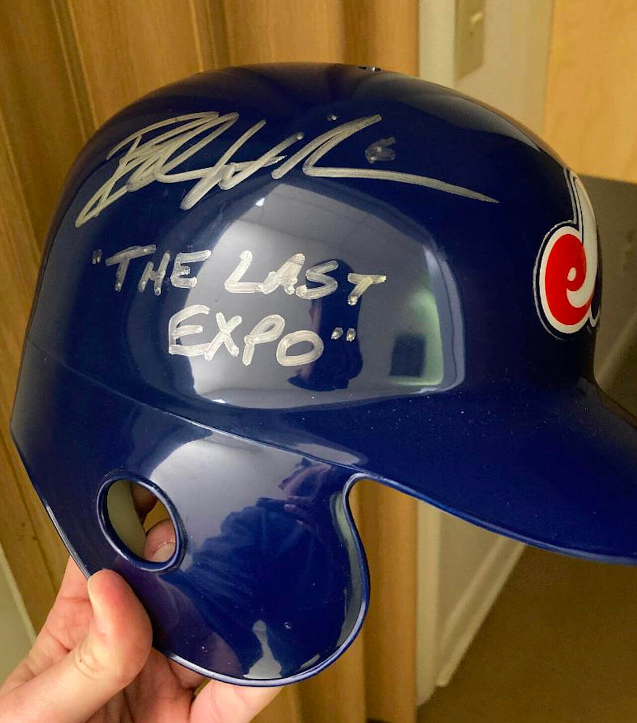
Follow-up: Yesterday’s entry about Jonathan Allen being the last NFL player to wear a Washington Football Team helmet prompted a note from reader Chris Edwards, as follows:
I was teammates with future MLB player Brad Wilkerson in high school. Gotta admit it was pretty cool having a friend in the majors, getting travel to stadiums and getting comp seats!
Anyway, he was the last player to wear an Expos uni, during the Japan All-Star series in 2004. Once he retired, I got him to sign an Expos batting helmet as “The Last Expo.”
Very cool — thanks for sharing, Chris!
Click to enlarge
Collector’s Corner
By Brinke Guthrie
Follow @brinkeguthrie
Well, this didn’t take long: The Washington Commanders have existed for less than a week, and we’ve already got some DIY gumball helmet kits, like this burgundy kit and this black version. Stick one of those on this 1967 NFL gumball helmet goal post kit, and you’re all set!
Now for the rest of this week’s picks:
• How to Knock Home Runs and Other Tips to Batters is the title of this 1934 booklet by Babe Ruth. Sponsored by Quaker Oats, who get their plug in toward the back: “If you want lots of ‘steam’ and ‘muscle,’ eat Puffed Wheat and Puffed Rice.” (And here I always thought the Bambino lived on hot dogs and beer.)
• Never seen this before — a 1971 Cincinnati Reds season ticket ordering booklet, featuring the timely and hip slogan “Right On Reds.” It talks about how great the 1970 championship season was, and promotes “one of the finest new stadiums in the world” with its “computerized scoreboard.” (Here’s that fine stadium being blown up 31 years later. Ahem.)
• NHL goalie Jacques Plante authored this 1971 title, Hockey Tips for the Goaltender,. Plante was with the Toronto Maple Leafs at the time, hence his generic blue/white uniform on the book’s cover.
• With the big game coming up this Sunday, here’s a 1980 History of the Super Bowl record album (from Fleetwood, of course), narrated by Curt Gowdy.
• Speaking of Sunday’s game, Rams fans are probably hoping they’ll play better than they likely sang on this 1970 Christmas album, The Rams Sing Holiday Halftime. It includes Merlin Olson soloing on “All I Want for Christmas Is My Two Front Teeth,” which probably wasn’t far off the mark.
• One more SoCal record album for you: This one is called Dodgers ’59, with KMPC play-by-play highlights of the team’s second season on the West Coast. Brought to you by Vin Scully, of course.
• In keeping with the Collector’s Corner Equal Time Rule for Super Bowl teams, here’s a late-1960s Chase & Sanborn promo coffee mug for your Cincinnati Bengals. Never seen this one before! For once, the lettering on the helmet depiction closely matches the real-life version, as opposed to those GIANT CAPITAL LETTERS more commonly used during that era.
• Here’s a T-shirt commemorating the 1983 Philadelphia Phillies’ World Series appearance.
• This mid-1970s bar glass set features all then-current NHL team logos.
• With the Olympics currently underway, here’s a Labatt’s promo hockey puck from the 1988 Calgary Games.
Click to enlarge
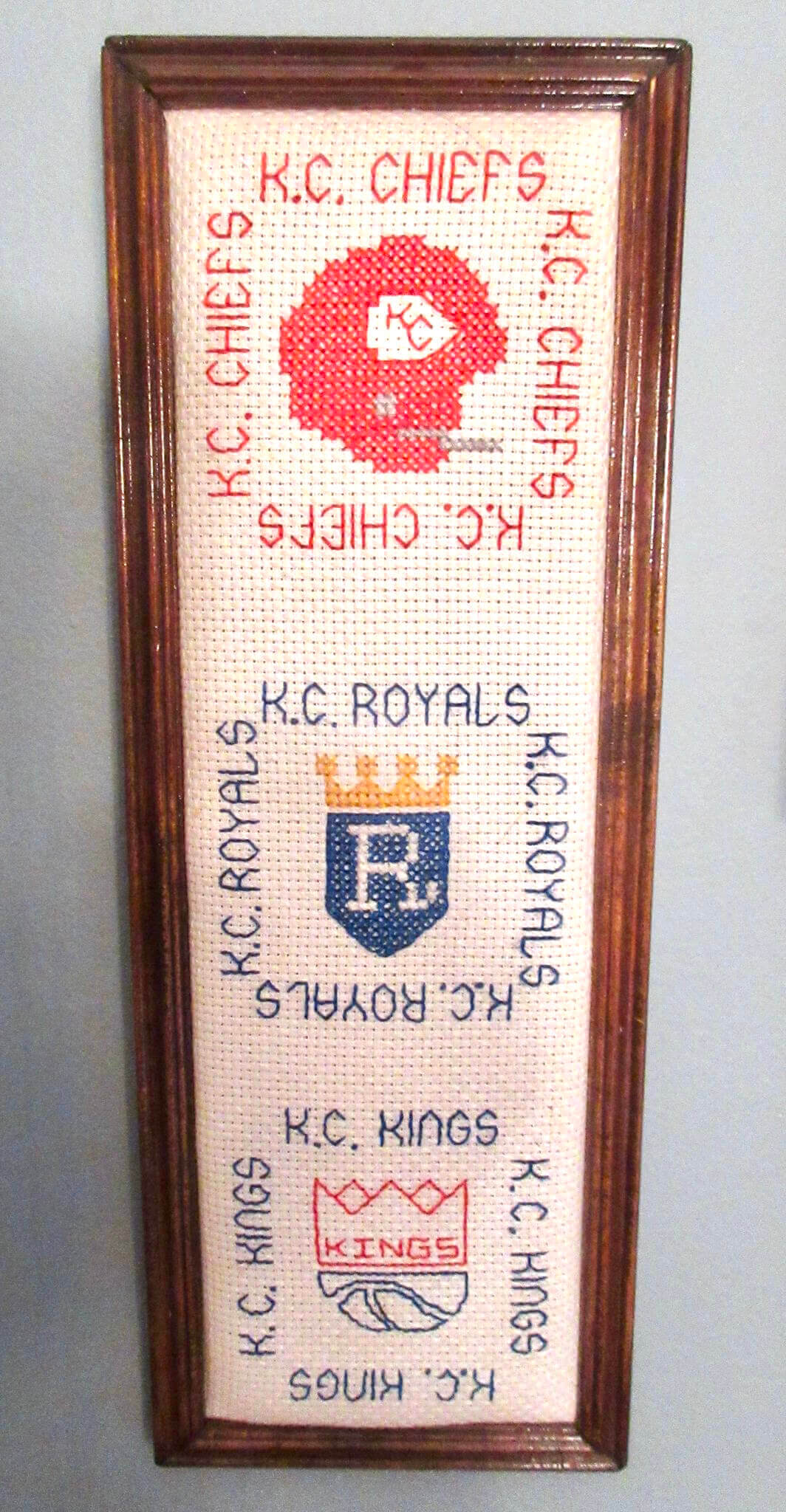
Too good for the Ticker: Oh man, how awesome is this old cross-stitch piece featuring all of the Kansas City pro sports teams! Yes, I know, the football facemask is the wrong color (by the time the KC Kings existed, the football team had switched to white masks, which I guess would’ve been tricky to depict on a white background), but it’s still pretty amazing.
The photo was posted on Twitter by Ethan Bryan, who says, “My grandma and grandpa made this for me 40 years ago. It hangs on the wall right next to my writing desk.” An excellent family heirloom!
(Big thanks to Jimmy Lonetti for pointing me toward this one.)
The Ticker
By Paul (swapping days this week with Alex Hider)
Indigenous Appropriation News: Four Iowa lawmakers have introduced a bill to phase out Native American-based mascots in the state’s schools by 2024 (from Eric Patterson). … While the NFL no longer has a team called the Redskins, many high schools still do. … Two more Connecticut high schools have dropped their Native-themed team names (thanks to all who shared). … Jamestown (N.Y.) High School, whose teams are known as the Red Raiders, has dropped its logo featuring a Native American-style feather in favor of a red cougar-like cat head (from Kary Klismet).

Baseball/Softball News: The Hanshin (Osaka) Tigers will wear 1936 road throwbacks for a game against the Tokyo Giants this season. Look at that overhanging “A” at the center of the jersey — never seen anything quite like that before! (Big thanks to Sean Kane.) … Clemson’s softball team received its 2021 ACC championship rings (from Kary Klismet). … Always fun to see a photo of the Happy Days softball team at Wrigley Field (from Alan Kreit). … Latest fun sports item to appear on Antiques Roadshow: a scorecard from the famous 1951 Dodgers/Giants “Shot Heard ’Round the World” game (from James Gilbert).

Football News: After a full season’s worth of weekly uni/mascot-themed illustrations, here’s Jason Von Stein’s illo for the Super Bowl. … The tossed coins from the NFC and AFC championship games are up for auction (from David Firestone). … Ohio State has unveiled its new turf design. Here’s a video showing the changes that have been made. … The Kitten Bowl may be moving to a new network (from Bryan Martin Firvida). … I only watched a few snippets of it so far, but this 45-minute video presentation on the evolution of football equipment and uniforms looks promising (from James Gilbert). … The number fonts on the Super Bowl Media Day hoodies have changed this year from team-specific to generic.

Hockey News: Due to delayed processing of some Covid tests, the Canadian and Russian Olympic women’s hockey teams played while wearing N95 masks for the first two periods of their game on Sunday night. Russia removed their masks for the third period after the negative test results finally became available, but Canada retained their masks for the full game (and won). Here are additional photos and info. … With the AHL moving into the second half of its season, teams will switch from wearing white at home to color at home. … 1973 throwbacks last night for Boston University men’s (from Phil Santos). … We all know that hockey refs wear red armbands while the linespeople have no armbands. But in the women’s hockey games at the Olympics, the refs have red but the linespeople have white armbands. Is that a new thing, an international thing, or what? (From Derek May.)

Basketball News: The D League’s Iowa Wolves are partnering with a local art nonprofit to create unique uniforms for six themed-promotion games celebrating “the many diverse communities in Iowa.” The patterns at the top of that linked page are apparently what the uniforms will look like. … Truman State men’s will honor the school’s past incarnation as Northeast Missouri with these throwbacks (from Kary Klismet). … The Athletic has a (paywalled) story on how Bucks players chose their uni numbers (from Maverick Johnson).

Soccer News: Japanese side JEF United Chiba’s new shirt has two gold stars above the crest, for the team’s League Cup championships in 2005 and ’06 (from Jeremy Brahm). … From our own Jamie Rathjen: “A Sunday match in England’s Women’s Super League between Aston Villa and West Ham United saw West Ham wear a fairly unusual mashup of their dark-blue third shirts with light-blue shorts and white socks, which were the opposite of Villa’s white shorts and light blue socks. Villa midfielder Remi Allen is color-blind and said she had trouble telling the teams apart.” … New home shirt for semi-pro Welsh side Barry Town United (from Ed Zelaski).

Olympics News: Cross-listed from the hockey section: Due to delayed processing of some Covid tests, the Canadian and Russian women’s hockey teams played while wearing N95 masks for the first two periods of their game on Sunday night. Russia removed their masks for the third period after the negative test results finally became available, but Canada retained their masks for the full game (and won). Here are additional photos and info. … Also cross-listed from hockey: We all know that hockey refs wear red or armbands while the linespeople have no armbands. But in the women’s hockey games at the Olympics, the refs have red but the linespeople have white armbands. Is that a new thing, an international thing, or what? (From Derek May.) … Several competitors in the mixed team ski jumping event were disqualified for uniform violations (thanks, Phil).

Grab Bag: Here’s a really good interview with brand-design expert Debbie Millman. Recommended. … The rest of these are from Kary Klismet: Fun article about the evolution of the Rolls-Royce hood ornament. … Firefighters in Trenton, N.J., are protesting the new department director’s decision to redesign a uniform patch. … Britain’s new Royal Air Force uniforms are being mocked for resembling the unis from Star Trek: The Next Generation. … Headwear retailer Lids is partnering with several Black sports organizations — the Negro Leagues Museum, Black Fives, and the Harlem Globetrotters for a new apparel line. Uni Watch pal/ally Todd Radom tells me he’s a brand ambassador for this one (from Tom Turner). … New developments in the works for U.S. Space Force uniforms.
Our latest raffle winner is Alex Dewitt, who’s won himself a 2021 Uni Watch Press Pin. Congrats to him and thanks to Frank Seitz for sponsoring this one.
Tomorrow: The Uni Watch Super Bowl LVI Preview! — Paul
Error in “Collecter’s Corner.” The Phillies didn’t win the 1983 World Series, the O’s did. That’s a “National League Champions” t-shirt.
Fixed.
Looking at the astros patches and thinking “the math just doesn’t work out here” and getting extra frustrated that they don’t stick to one milestone metric. Like I don’t particularly care which one they choose, but don’t celebrate 45 years in 2010 and 60 years in 2022. That’s basic addition right there. And while it would mean ignoring the colt .45 years, why not take the opportunity to always have big milestones on a nice attractive multiple of 5 year?
Paul, in your bulletin article on the Commies you do discuss both the W helmet logo and the crest, but was curious about a few things you didn’t address:
1) Which logo is considered the primary? I assume it is the helmet logo, which feels pretty weak in that case. The helmet W feels more like a baseball team’s cap letter, than a full on logo.
2) While you discussed the problems with the crest, curious about your take on them using a crest in general, when that goes against the norm for NFL teams. Feels much more like a soccer logo.
Given those two points, it seems like after all that time they couldn’t come up with a good NFL style logo for the name Commanders, so they settled on a simple letter logo (I know a few of the older franchises still employ one) and a crest. It all feels very non-NFL to me.
“W” is primary.
I don’t mind the crest. Probably a nod to Maryland’s civic design style, much like the Ravens’ crest:
link
I’m also bothered by the fact that the astros current navy and orange look (with occasional nods to the tequila sunrise) didn’t happen until 2013, meaning they wore 2 patches that were designed in almost total denial of the team’s (at the time) current aesthetic. Which I understand because the red and gold look was weak and generic at best.
The Last Expo…so cool. We could do a parody of the Last of the Mohicans with it.
Don’t like the 60 years patch being on the hat for the Astros. Too much. Too busy. Keep the patches away from the hats. The patch is already on the jerseys and that is enough.
Hat patches, like corporate logos, are a pox on a baseball cap, always and everywhere. I don’t even want to see All Star or World Series logos. Caps (and helmets) are too small a canvas for them, and most jerseys are cluttered enough with unnecessary stripes and piping and ‘wordmarks’ and the like to accommodate yet more distractions.
Interesting how the Astros have renamed the Colt .45’s to now the “Colts” on this patch. I have never seen them referred to the Colts before and I wonder why they did this?
Actually, there’s nothing new about that “Colts” lettering on the patch. It’s taken right from the Colt .45s’ home jersey and was part of their branding from the outset of the franchise.
link
Yeah, my bad. I took a quick look as I could not recall them being referred to as “Colts” but there it is right on the uni! Duh. I guess I should have checked there first. I just thought it was a little odd as they did refer to Colt .45’s on a previous patch.
I believe “Colts” was a common public and press nickname for the team at the time. And the Colt Manufacturing Company maintains and enforces a trademark on Colt .45 as well as a C shape very close to the Colts chest lettering within the context of depicting firearms. And it’s not super-popular to glamorize firearms in this day and age. All three of which auger in favor of dropping the digits from the nickname and going with Colts.
Of course Potsie doens’t wear stirrups.
Astro’s patch missed opportunity, should have made the negative space in the 6 an outline of the astrodome.
Nothing too terrible about the Astros patch, but drop shadow is bad enough in a format easy to see (past 49ers and Dolphins uni numbers on some truly awful jerseys come to mind), but why bother on something so small? It’s barely noticeable, and if it were, it would just make everything look blurry.
The drop shadow in this case comes out looking more like a color registration error to me. I can’t like this. Ugh.
A couple of the links in Collector’s Corner are not coded properly – the History of the Super Bowl record and the Labatt’s puck.
Both now fixed.
Regarding that Reds season ticket order book, I think it’s hilarious that sellers are apparently now using the term “3D” to describe actual physical objects.
Olympic broadcasters would not elaborate on the disqualified ski jumping suits, but I’m guessing they were looser-fitting than the acceptable ones, offering more resistance to the wind. Like a flying squirrel.
Yeah, I was hoping for an explanation of what specifically caused them to be disqualified. Thanks for the speculation.
It’s not “wind resistance,” but increase surface area that theory increase lift. However there are other suit violation conditions that may have caused the disqualification.
Such as…?
The state of Texas in the 0 of 60 looks a lot like an asterisk…just sayin’
“Astros are cheaters” — for someone so fanatical about details, you sure missed this one. It should read “The Astros cheated” — past tense. Present tense would read “Yankees are cheaters.”
Carry on.
Hey Chris, great Brad Wilkerson helmet. I’m a fellow Apollo High School grad. Cheers!
Re: hockey ref armbands, Olympics hockey is run by the IIHF and for whatever reason they use the white. Red is actually not common in America — most leagues, including the NHL, use orange. Red is more common in Canadian leagues.
Back when the NHL changed their logo from orange to silver they planned, and then scrapped, to also change the ref stripes from orange to silver. I remember this because some guy wrote about it in 2007: link
Touché!
For what it’s worth, it looks like that “mid-1970s” NHL bar glass set in Collector’s Corner is actually from the late 1960s, since it doesn’t include the logos of the Canucks or Sabres, who joined the league in 1970-71. The 12 teams depicted correspond to the league’s lineup from 1967-68 thru 1969-70.
“Uni Watch pal/ally Todd Radom tells me he’s a brand ambassador for this one”
I have no idea what a “brand ambassador” is, but I want to be one when I grow up.
Man, the Astros really love patches. Does any other team regularly celebrate 5 year increments?
Well, at least they didn’t do 55.
I can sort of understand 45, since there’s the Colt .45s connection. Kinda wish they’d skipped 60, though — wait until 75.
The Mariners are at least one other example — they’ve been doing anniversary patches every 5 years since 1997. Speaking of which, it’ll be 45 years for them this season. I’d suspect we’ll see another patch from them soon.
Thank you for sharing Paul.
Hope everyone has a great Super Bowl Sunday.
Who Dey!
RE: Washington Commanders. Message from my Sister-In-Law…
The question is will the commandos wear their skivvies on the field? Also, why are the Chiefs still the Chiefs…
In the US and NHL, the referee wears orange armbands and the linesmen have none. Canada does red bands on the big guy.
I have been a hockey official for many many moons and this is the first I have seen white bands. If we are ranking uniform changes, this qualifies as stupid and unnecessary.