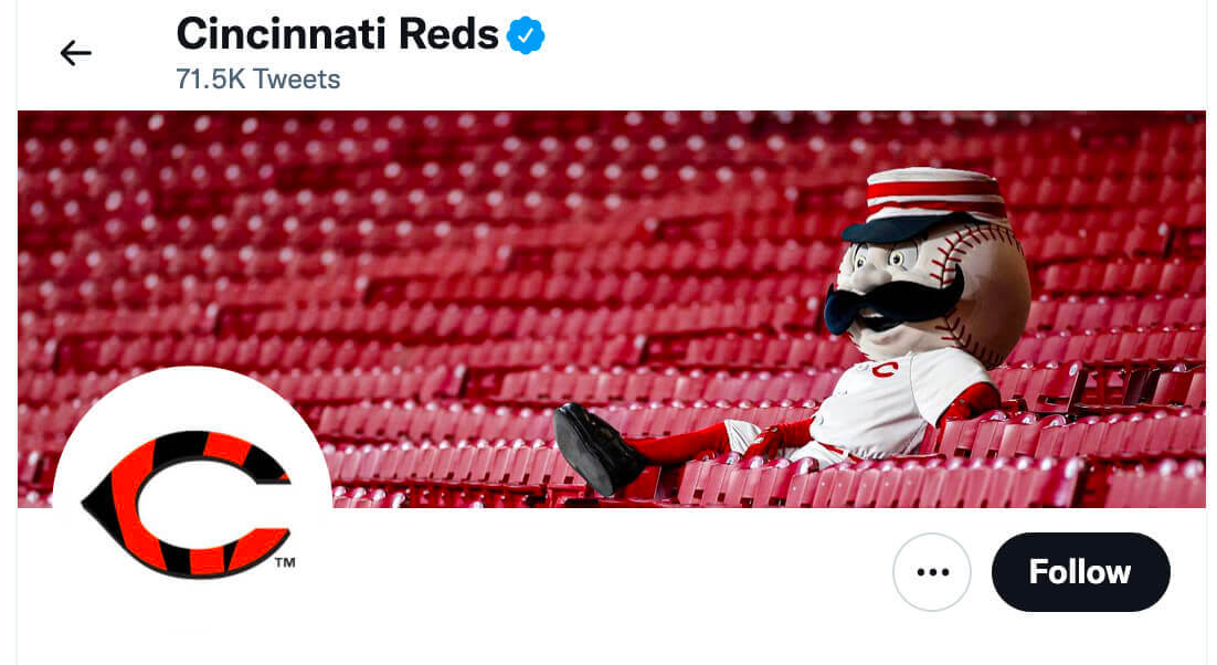
Nice move yesterday by the Reds, who supported the Bengals’ Super Bowl run by adding tiger stripes to their wishbone-C logo on social media (see above).
But as many fans quickly pointed out, that’s a little confusing because the Bears also use the wishbone-C. Fortunately, longtime Uni Watch reader Dan Pfeifer came up with a completely brilliant solution last night:
Alright, you made this #brewers fan go to his computer and do it.
Allow me to present a better alternative for the @Reds to show their @Bengals spirit.
Ladies & gentlemen: Mr. Bengal.
I'll accept an all-expenses paid trip for two to #SBLVI as payment. #MrBengal #bengals pic.twitter.com/UQhVOTwBHo
— Dan Pfeifer (@MUPfeif) February 4, 2022
Is that genius or what? So simple, so good!
And that isn’t the only great Super Bowl-related idea put forward yesterday by Uni Watch readers. Late yesterday afternoon, reader Glenn H. posted a comment on the blog that most of you probably didn’t see, so I’m going to reprint it here:
I want an ad during the Super Bowl where Matt Ryan steals the Rams’ dishwater jerseys, and then he, Stone Cold, and Ice-T throw them into an industrial washer with a five-gallon pail of Tide and they come out pristine white.
That would be the best uni-based ad ever! Here’s all the storyboarding you need:
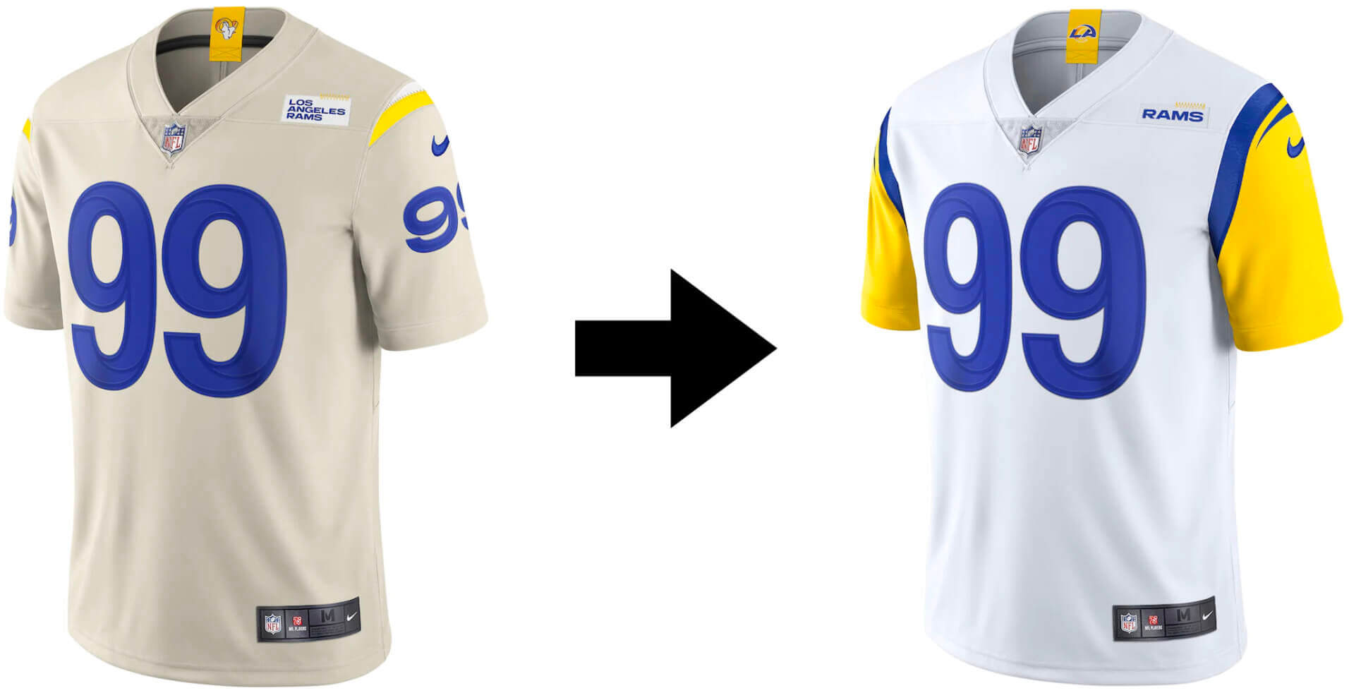
I love this. And how great would it be if the commercial ran right before the Rams came out onto the field?
All of which just goes to show that the sports world would be a lot better off if Uni Watch readers were running it. What other good Super Bowl ideas can we come up with (aside from game-specific logos, obviously) Go!
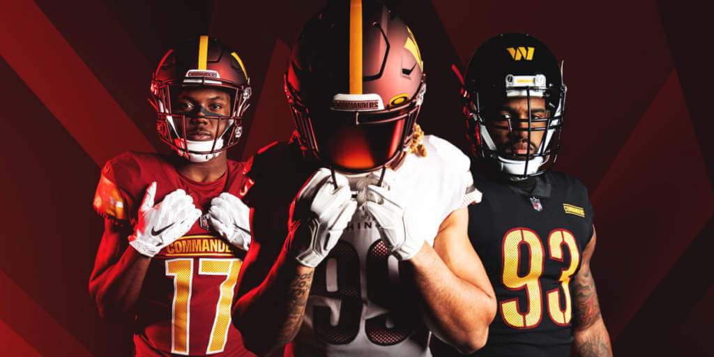
Commanders reminder: In case you missed it yesterday, I have a very detailed assessment of the Commanders’ new team name and uni set. You can read it here on Bulletin, but you’ll need a paid subscription to access the article (and you’ll need a Facebook account to pay for the subscription).
If you haven’t yet subscribed, you can do that here, or just click on the article link. If you want to subscribe but the Facebook requirement is a dealbreaker, I can let you know when a non-Facebook payment option is available — just shoot me a note and I’ll keep you in the loop.
Thank you to everyone who subscribed yesterday (and in the preceding week). I’m grateful for your support, and I’m very pleased with how this is working out so far.
Click to enlarge
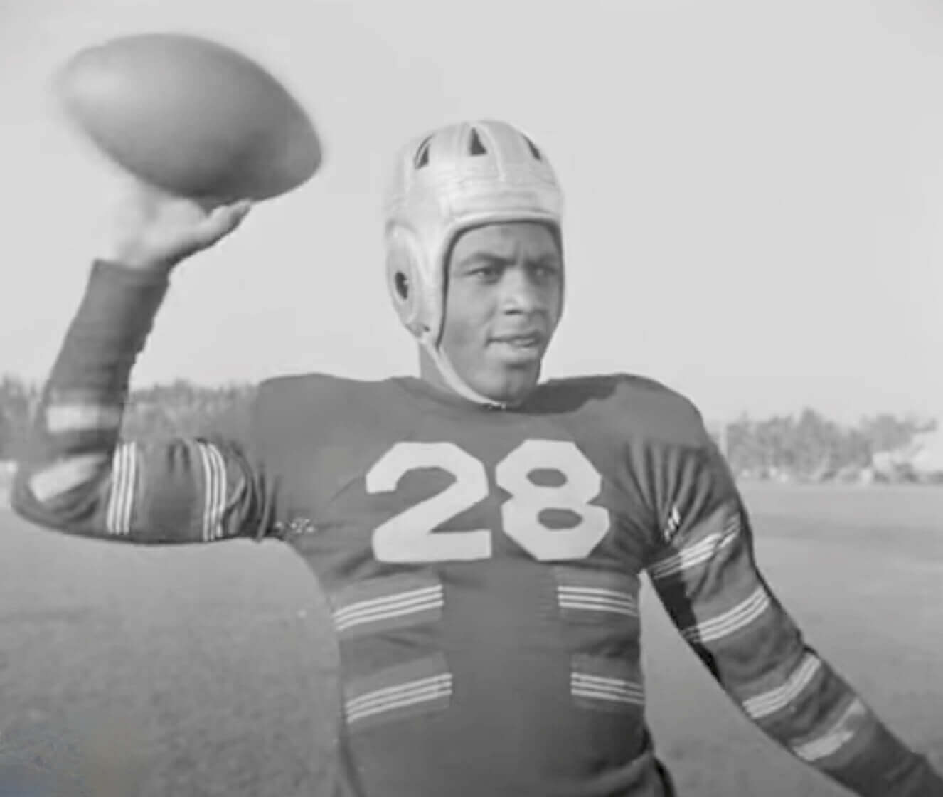
Too good for the Ticker: Who’s that tossing the football around in 1939? None other than Jack Roosevelt Robinson himself, during his UCLA days!
Is that an amazing jersey or what? It’s a “friction strip” model — the stripes were made of textured leather or canvas and were designed to reduce fumbles. They were eventually banned, but UCLA was apparently still using them for practices (not games) in ’39.
That image is a screen shot from a short but wonderful video clip turned up by Uni Watch proofreader Jerry Wolper. Enjoy:
Click to enlarge
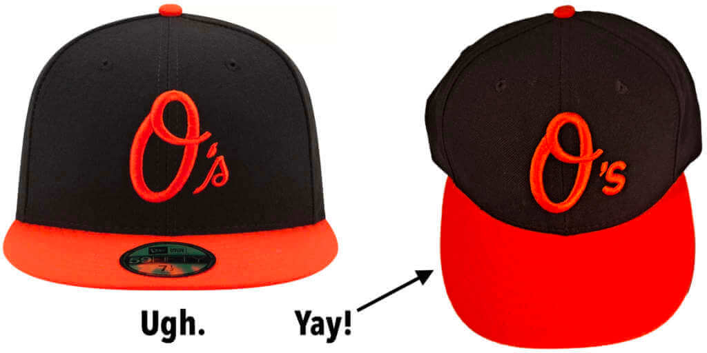
What might have been: For 17 years now, the upside-down apostrophe on the Orioles’ cap (above left) has been quietly bugging the shit out of me. It’s wrong, it makes no sense, and for some reason they refuse to change it. Grrrrrrrrrr.
But it didn’t have to be this way. A reader who prefers to remain anonymous showed me a photo of a prototype O’s cap that was recently posted on a private Facebook group (above right). The person who posted it to the group said:
The first iteration of the O’s hat had an identical apostrophe-s as the A’s hats. They were changed to their current look before they ever hit the field, but when they were unveiled in [late 2004], the apostrophe was right-side-up and the s was essentially in lowercase Arial font.
I have a vague recollection of the transition from the original apostrophe-correct unveiling to the on-field apostrophic-catastrophic version, or maybe I’m just imagining it. Either way, this new evidence indicates that they somehow botched the apostrophe when they changed to a cursive s. Gah!
If anyone connected to the Orioles wants to tell us more about this all-time uni botch, my door is always open. Discretion and anonymity assured, of course.
Click to enlarge
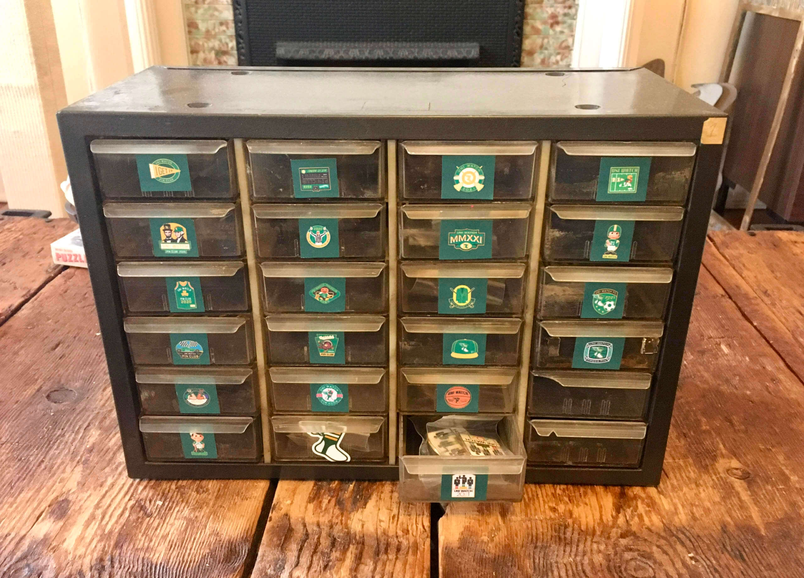
Pinventory reminder: There’s something very satisfying about my new Uni Watch Pin inventory/shipping station. A drawer for every pin and a pin for (almost) every drawer — lovely, lovely.
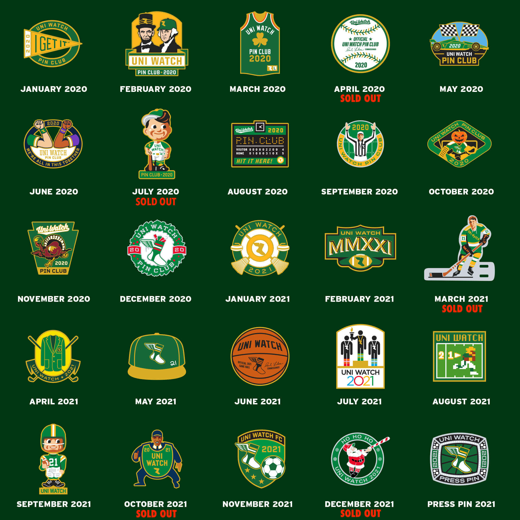
As you probably know by now (but I’ll say it again anyway), the pins are now available at deep discounts for multi-pin bundles. Full details here, or just click on the graphic below:
The Ticker
By Anthony Emerson

Baseball News: The White Sox are giving away hockey versions of their City Connect jerseys on April 30, assuming the lockout doesn’t stretch that far (from @mcianfrini).

NFL News: Here’s a bird’s-eye view of the Super Bowl LVI field. Notably, the Rams will not have a green outline in their end zone (from Bryce Bement). … Brent Kivell noticed this Bud Light poster at a grocery store in St. Thomas, Virgin Islands, featuring a generic football player, a Titans player in a five-year-old uniform, and a Vikings player in Irv Smith Jr.’s No. 84 that doesn’t appear to be him. Odd. … President Biden’s granddaughter is promoting the First Dog, Commander, to be the mascot for the newly renamed Washington Commanders (from Kary Klismet).

Hockey News: The WHL’s Calgary Hitmen have unveiled an Indigenous heritage sweater designed by two local Indigenous artists (from @TeebzHBIC). … Very hard to tell the teams apart in last night’s Olympic women’s hockey game between Denmark and China (thanks to all who shared).

Basketball News: The NBA has a new All-Star Game trophy, named after Kobe Bryant (from multiple readers). … Nebraska’s men’s and women’s teams will wear commemorative uniforms for Black History Month (from multiple readers). … Rutgers men will also have one-off unis on Sunday for Black History Month (from multiple readers). … Alabama has released renderings of its new proposed basketball arena (from Kary Klismet). … Arizona has a player, Kerr Kriisa, who goes FiNOB. Kriisa was named after fellow Wildcat Steve Kerr, and wears Kerr’s No. 25, which is presumably why the university allows him to wear his first name.

Soccer News: The Guardian has a great article about a Dutch soccer fan who has collected over 3,000 jerseys from around the world. This man is living my dream (from Bruce Adams). … New away kits for Waterford FC, a second-division Irish club (from Kary Klismet). … A blockchain company will pay over $27 million a year to advertise on Manchester United’s training kits. … Speaking of Manchester United, Middlesbrough manager Chris Wilder has banned his players from swapping shirts with United striker Cristiano Ronaldo on the field for today’s FA Cup tie between the two.
Olympics News: Forbes has ranked the most “stylish” unis at the Beijing games (from Kary Klismet). … A Taiwanese speed skater sparked outrage back home for wearing a Chinese uniform while practicing (thanks, Paul). … Cross-listed from the hockey section: Very hard to tell the teams apart in last night’s women’s hockey game between Denmark and China (thanks to all who shared).

Grab Bag: Southern Utah University dropped the colors turquoise and coral because they thought it was too difficult to source uniforms in those colors (from Josh Soelberg). … A selection of Cleveland sports memorabilia is going up for auction, covering 100 years of history (from Jason Hillyer). … The Global Cycling Network’s annual “Hot or Not” rankings of 2022 team kits is up on YouTube, starting at about two minutes in (from David Barndollar). … The champions of the U.K.’s Netball Superleague from last season, Loughborough Lightning, have gold accents and cap numbers this season (thanks, Jamie). … U.S. Army soldiers can now wear nameplates on their Army Green Service Uniforms. … A large selection of Star Trek memorabilia is going up for auction, including several uniforms.
And that’ll do it for this week. Stay safe, enjoy Phil’s weekend content, and thanks again to all the Bulletin subscribers. See you back here on Monday. — Paul
Apostrophe aside, the Orioles could easily do “addition by subtraction” by eliminating those alternate O hats. They have never looked good on-field IMO, don’t have any history with the teams uniforms, and seem unnecessary.
The B from their Baltimore chest script would make a great cap logo. Personally I’m a stickler for cap logos to the be letter of the city/state/region of the team, rather than a non-letter or a the letter of the nickname (Athletics being the exception).
If we can’t eliminate them, the Script B would be reasonable. I’d just stick with the cartoon bird head, it’s perfect as is.
Or this – link
I wouldn’t mind that whole design as their alternate.
The only cap logo the Orioles should ever wear is the curlicue B from the seating at Camden Yards:
link
I’ve never seen that before, great look. Thanks for sharing!
Why doesn’t the NFL allow the teams to replicate their home field end zones? I for one would like to see the Bengals’ tiger-striped end zone during the Big Game.
I think there’s a variety of reasons that’s not a great idea:
1. I’m guessing a the Bengals, and probably some other turf teams like the Cowboys, never have to recreate their end zone design after their turf is manufactured. It would probably be a significant challenge if they didn’t already have stencils around or whatever.
2. The only ones who probably know how to truly replicate a team’s design, including stencils and whatnot, is the team’s grounds crew, which means all the more people you need to uproot from their lives unexpectedly and ship across the country, which seems costly, inefficient and like another logistical hurdle for teams that probably have to deal with a ton of them during the two weeks leading up to the Super Bowl as well.
2a. Keep in mind how, uh, badly certain teams like the Titans, Eagles and Commanders have been known to be when it comes to taking care of their field and painting. Heck, I think the Bears actually leave all of that to the City of Chicago at Soldier Field (which, again, would probably present a challenge if the Bears would ever reach the Super Bowl again, though I’ll take this moment as a Packers fan to thoroughly laugh at that idea). You really want to put those folks in charge of the most-seen grass in all of television annually?
3. You’d want to supply each team with similar paint, which the league would then have to probably coordinate anyway, lest one end zone look brighter than another or something.
4. It’s entirely possible one end zone would “pop” much more than another. A team like the Packers generally only paints their wordmark, or in anniversary years, just uses the truly old-school white lines and the anniversary logo; the Rams, meanwhile, have bold stripes all the way through theirs. When Madden used to just use team end zones for the Super Bowl, it just looked weird, and it would also look weird to have such an imbalance.
5. Having them somewhat match only adds to the feeling of neutrality that a neutral site is supposed to have.
So yeah. I really don’t think that would be all that awesome logistically or visually. Leave it to the George Tomas of the world to get it right.
Nike was obsessed with hoop stripes for their Beijing hockey uniform template. When it goes around the back it makes numbers hard to read. Soccer has learned to not extend the stripes to the back fir number readability.
It’s funny that you say that because I love how the Canadiens do it and hate how Florida does it. I’ve always thought that the backs of the Panthers sweaters look incomplete with no wrap around stripes. In terms of the Olympic sweaters, I loved the look of the US team’s whites until I saw China’s and realized that Nike just took the cookie cutter approach for many teams in the tournament.
Nike being obsessed with the use of templates in general always causes at least minor issues at IIHF/Olympic tournaments. Templates can work if you have a broad colour spectrum to choose from, but in terms of national team colours, especially amongst nations competing at the top level in hockey, there’s going to be a whole lot of red and white, with some blue thrown in occasionally.
At these Olympics, in the hockey events, you have Canada, Denmark, Japan and Switzerland who all have flags that are just red and white, and you can add Latvia to that if you stretch ‘red’ to include burgundy. You then have China, who always predominantly use red and white for sports, the Czechs, who have always been red and white when it comes to hockey, and the Russians, who’ve pretty much eliminated the blue from their uniforms for at least as long as they’ve been playing under the ROC banner. Luckily for Nike, a few of these countries don’t mind adding black as an accent colour, blue helps with others, and there’s gold in China’s case, but no matter how you dress it up, if you’re relying on templates, it’s going to be difficult to differentiate uniforms by any kind of margin.
The Olympic tournament takes hockey into more homes globally than any other league or tournament, and the IIHF should be using it to grow the sport, especially in nations that are still developing their hockey programmes. Instead, we’re getting games like the Denmark/China game, where the game becomes difficult for a casual viewer to follow because you can’t figure out who has the puck, or you get instances in games where the USA are wearing their white jerseys, or Canada are wearing their red uniform, when you have a platform to create athletes with a global presence, particularly in the women’s game, but you can’t identify with your favourite player because the names and numbers aren’t legible on TV.
Mr Bengal is awesome, well done Dan!
Superbowl endzone design is a sad reminder how both teams use inferior logos as their primaries; the tiger (head or full body) is superior to the B, and even though it is mediocre, the ram head is superior to the LAC logo.
It could be argued that the Orioles’ hat is not an apostrophe catastrophe. It is a brushstroke font, and the weight of the stroke varies widely around the O, as it would with a calligraphy pen. Thus, the variable weight on the apostrophe may be an affectation of a handwritten mark than an upside-down apostrophe. Just a thought.
If this is the case, then it should be possible to find examples of hand calligraphy that renders apostrophes thusly. I’d love to see such examples, and I’d be especially curious to see how such calligraphy differentiates between apostrophes and single open-quote marks.
If you can forgive a bit of self-indulgent rambling regarding “other good Super Bowl ideas”… One of the greatest Super Bowl experiences of my life was five years ago. Facebook Live was relatively new, and everyone was using it for just about everything. So, I rounded up the family and we staged our own Super Bowl Halftime on FB Live, right after the “real” halftime show ended. You know, during the 10-15 minutes when they’re clearing the field and no one has anything to do anyway. Millions..er..thousands..er..maybe a hundred or so people tuned in to watch…. as I made a Peanut Butter sandwich on FB Live, complete with music and some low-level pyrotechnics. The ultimate so bad it’s good deal (as opposed to the real halftime which is usually just so bad it’s bad). My kids loved it and still recall it fondly. I think.
Five years later, with 2+ years of pandemic hell to re-shape my thinking, and with a nudge from my daughter, I’m doing it again, with a twist. While I do my show this year, I’m encouraging all in attendance to do, or commit to doing, one small act of kindness. That can be anything. Just do something during this 10-15 minute period of dead time when you won’t be doing anything else anyway. I’ve given it the very creative title of “The Super Bowl Halftime of Love and Kindness (SBHLK). The whole idea is a bit trite, but so what? Who couldn’t use more kindness and love, right?
Whatever I do this year is going to be lame again. Probably even worse than making a sandwich. I don’t play instruments, and have no real talent. But it’s silly and it’s about kindness, and way better than that other halftime show.
That Bud Light poster has Chris Johnson, Cordarrelle Patterson, and some generic player, I wonder how old it is
Patterson played at Tennessee in college, so makes sense as a regional-specific poster.
Have we talked about UCLA’s pants and the stripe up the back of the legs? We probably have and I don’t remember. Great video link for sure.
I wonder if the green border around the end zones in LA has to do with the changeover from Rams to Chargers end
zones. They can do the switch quickly and not have to worry about messing up the side and back borders.
Re: the Bud Light poster. The Vikings player appears to be Cordarrelle Patterson who last played in MN back in 2016. Definitely an older poster from the mid 2010’s.
Patterson played at Tennessee in college, so makes sense as a regional-specific poster.
A.) The Jackie Robinson footage is GOLDEN!
B.) O’s fan here for 35 years. I believe “O’s” hat is a good fit for the team. When the National anthem is
unnecessarilyperformed at an O’s home game, the crowd yells “link” at the “O say does that star spangled banner yet wave” part. Not that it’s the reason for the cap, but it’s a cool Orioles tradition. Plus, lots of folks I know call them “Dem O’s” :-) I wish they would fix the apostrophe catastrophe.C.) Maybe the bone jersey wouldn’t be so bad if it didn’t have the white elements??
(I hope I did the tags right)
How about only the “O” with no apostrophe or “s”?
I had never heard of friction strips before. I would love to see that uniform in color.
The gray jersey next to the white jersey look like home and road baseball jerseys.
Lots of friction strip photos here:
link
FRICTION STRIP JERSEYS ….
Love the Jackie Robinson film and photos. Early UCLA was pretty ambitious with their football jerseys. After Friction Strips faded from use, they were one of the few teams with sleeve logos – for UCLA the Bear/Bruin sleeve patches. IIRR, Jackie wore that jersey in games.
Love the style and detail of Friction Strip jerseys from the 1920s-early 1930s. Some catalogues from the era offered teams the choice to have the Friction Strips in a team initial – Nebraska most notably had a very stylish “N” on the chest in Friction Strip cloth.
And of course, my favorite and most well-seen are the 1933 Pittsburg Steelers jerseys replicated by the team for the NFL’s 1994 75th Season Throwback year.
Never had any idea that they were banned, and over the years I have collected a number of Football Digests and publications with photos of Friction Strip era teams and jerseys.
There was one early 1930s publication, name of it escapes me now and my collection in storage, which is in small booklet form, depicting all of the with the schedules for each week, with team pictures for almost every team, including smaller colleges and HBCUs, which show how some teams still wore Friction Strip jerseys longer than others, and with the evolution of the respective teams’ jerseys changing through the years. By early 1930s almost all of the Friction Strip jerseys were no longer depicted, but I am certain the jerseys were used in practice for years afterward. Teams were much more resourceful back then.
The NFL Films hour long film of the Champion 1972 Dallas Cowboys show the team wearing their original 1960-1963 Star Shouldered game jerseys in practice and camp in 1971, along with their 1967 three stripe jerseys.
Years after teams stopped in the early 1960s wearing the leather-covered plastic MacGregor helmets in games, the Oklahoma Sooners continued wearing them practice through the 1970s until they wore out (ostensibly to limit concussions from practice hits).
But I had not realized that Friction Strip jerseys were banned.
For YEARS I have agitated for Ebbets Field Flannels and some others to make them for retail sale – loving the unique look and believing them to be marketable – but with no luck yet.
That’s nuts. I’ve been watching football for over 50 years and I’ve seen those pics before. I had no idea that those stripes had an actual use until today. Talk about learning something new…
I think the helmet Jackie Robinson is wearing is also illegal, as the NCAA began requiring teams to paint helmet straps contrasting colors in 1930.
I did not know Orioles changed the font choice during the design process? If this is true it explains it. Someone changed the design from Arial font to a script font & the apostrophe flipped with the new font. I just tested them both & the apostrophe did change based on the 2 font styles.
It’s common for design software, or even word-processing software, to treat the ‘ mark contextually. So if you type ‘s, you’ll get a single open-quote mark, whereas if you type O’s, you’ll get an apostrophe. If you intend ‘s to be apostrophe-s instead of quote-s, you need to manually change it. Or, better yet, don’t try to type ‘s but rather create the apostrophe and the s as separate elements. So sloppy use of graphics software does seem plausible here. “They want a cursive s? Easy.” [highlights the block apostrophe and s, clicks deletes, adds a text element, types ‘s, applies skew tool, exports file.] “Done!”
That Southern Utah University piece says a lot about branding in college sports.
A team can go from turquoise and coral/orange (unique, area-representative and frankly beautiful)…
to Columbia Blue and orange (slight change in color, still pretty unique and representative, and still nice-looking)…
to red and white with some BFBS added in (trite, used up, boring, goes anywhere).
In the early ’80s, the makers of the Denver Broncos uniforms said it would no longer produce the terra cotta-colored jerseys unique to the team. They had to go to a lighter shade of orange, costing the team some exclusivity.
Hey Paul!!! – University of Arizona Alum here (B.Arch, 2002),
Fun additional fact(s) re: Kriisa and the Steve Kerr’s #25: He asked for and received permission from Kerr to wear the number. Kerr’s #25 is actually retired by the UofA MBB Program.
Additionally – #25 goes a little deeper into the ‘Cats MBB Lore as Gilbert Arenas, short-time Arizona Wildcat, long-time NBA Player and gun enthusiast (sorry, had to) wore #25 in High School in Van Nuys, CA but switched to #0 in College and then the NBA since the number was retired at UofA. He wore other numbers too during his Pro Career, but is best knows as ‘Agent Zero.’
Gil picked #0 because that is the number of minutes Scouts predicted he would get at UofA after committing to play there as a Freshman.
Happy Friday! – THX.
-B.
Thanks for the info!
Ben,
That comment about Arenas rings a bell. He graduated from my high school and I recall him making that comment to a writer in one of the local newspapers as he was beginning to make an impact with the Wildcats. Find your motivation wherever you can. Brilliant!
-C.
That Southern Utah story reminds me of when our new high school was opening in 1995. One of the reasons given for choosing grey and maroon was that it would be easier for selecting uniforms. Actually turned out to be a positive selection, since many wanted the go-to colors of the 90s, teal and purple.
Also a comment about the Bulletin subscription. I’m actually happy to give some financial support here, since I frequent this site almost daily, and I’m not one to purchase merchandise.
I would think that Mr. Red would be a better template than Mr. Redlegs but well done, nonetheless.
My idea: The Super Bowl should be color-on-color. Seeing it is the only game (London games excluded) which doesn’t have a true home team, it would make sense to allow both teams to wear their preferred uniform if it doesn’t clash. This year isn’t the best example, seeing as the Rams’ white uniforms probably is their best look, but if the 49ers for instance had won last week, I would have loved a black-on-red matchup.
I’m totally for this. If the Rams wore blue and the Bengals wore orange it would be a visual spectacle.
“Notably, the Rams will not have a green outline in their end zone”
Isn’t this actually negative space?
Quite the juxtaposition of the “End Racism” and “It takes all of us” banners in the End Zone out of bounds area and the NFL being sued by Brian Flores for systemic racism…
I’m sure the irony is completely lost on Roger Goodell and the owners.
Mr. Bengal is awesome. I would definitely wear a shirt or cap with that logo. But one question — why No. 81 on the front? Shouldn’t it be 21 (this season), 56 (the non-roman numeral for this year’s Super Bowl) or even 68 (the Benagls’ first season)?
The Reds, as currently constituted, were founded in 1881.
Mr. Bengal is still Mr. Red at the end of the day.
Also, this is starting to sound like a game of “Clue.”
The bird’s-eye photo of the SB field reminds me of just how much I think the monstrously large video boards take away from the experience of being at a live sporting event. Maybe it’s just me, but I find myself looking at the video screen because it’s just so big, it interferes with viewing the actual game.
And it’s not just football; my only experience going to a Red Wings game at the…. new barn… should have been wonderful, sitting in the gondola seats (similar to MSG, where a small section – four rows deep – is suspended above the lower bowl). It was impossible to watch the game live, because the players on the screen were so much bigger. If I’m going to watch the whole thing on the screen, why would I pay $150 for a seat, $15 for a beer, etc.?
I think it depends on the facility.
You probably have a point about the DoughJoe. I think some of the monster boards going into arenas now are a little obscene, especially in environments that are pretty intimate already. I’d rather see them go smaller but use motion elements, like they’re doing in Chicago and Philly. At some point, these boards are just too big.
However, I will make the case for bigger boards at some of the outdoor facilities, though.
I sit with my father at Lambeau Field for a game or two every year. He’s a Milwaukee-package ticket holder in a wheelchair, so his seats are at the very top of the bowl in the corner, right in front of the new, towering addition they added a few years ago. Action that happens at our end? Great to watch. But once they cross the 50 going the other direction, we’re far enough away that we lose most of the subtlety of what’s going on at speed on the field.
All of a sudden, a big videoboard and good replay is really helpful. Otherwise, given the drive and the elements one often has to fight at Lambeau, the bad view would probably be enough to keep a lot of Milwaukeeans, and even some of the regular-package holders, home for those few games a year.
There’s a lot of variables when it comes to board size, but I think the supersized boards become helpful when you get above 30-40,000 fans in terms of aiding those with bad seats.
Can’t say for sure whether or not LA’s board is right for the facility; I’ve never been in there. I’m guessing it might be OK, though.
At times, I do feel like AmFam Field’s is a bit too large for its own good. However, they use the extra real estate well to post more stats and whatnot in-game. #FirstWorldProblems, I guess.
Been looking for a Hormel chili football jersey to wear? Look no further: link
Has anyone touched on the fact neither team in this year’s Super Bowl have TV numbers on their jerseys. All prior participants, including the prior trips by this year’s participants, has TV numbers on either the sleeves or shoulders.
Yes, that’s been discussed. I mentioned it in yesterday’s lede, and several commenters have brought it up as well.
Also: Not all prior Super Bowl participants have had TV numbers. The 49ers didn’t have them in SB XXIX. But that is the only previous instance.
The apostrophe after the O shouldn’t be there anyway. It’s grammatically incorrect. This is a very common mistake, but it is still a mistake.
The upside apostrophe could be the simplest of explanations. A lower case b for Baltimore.
That’s what I think it depicts. Very clever.
I’m the one who posted the photo and comment of the prototype O’s hat in the Facebook group. I also emailed that info and a picture of the hat to you earlier last year, that may be your ‘vague recollection’ of it haha
Thanks, Bud!