Click to enlarge
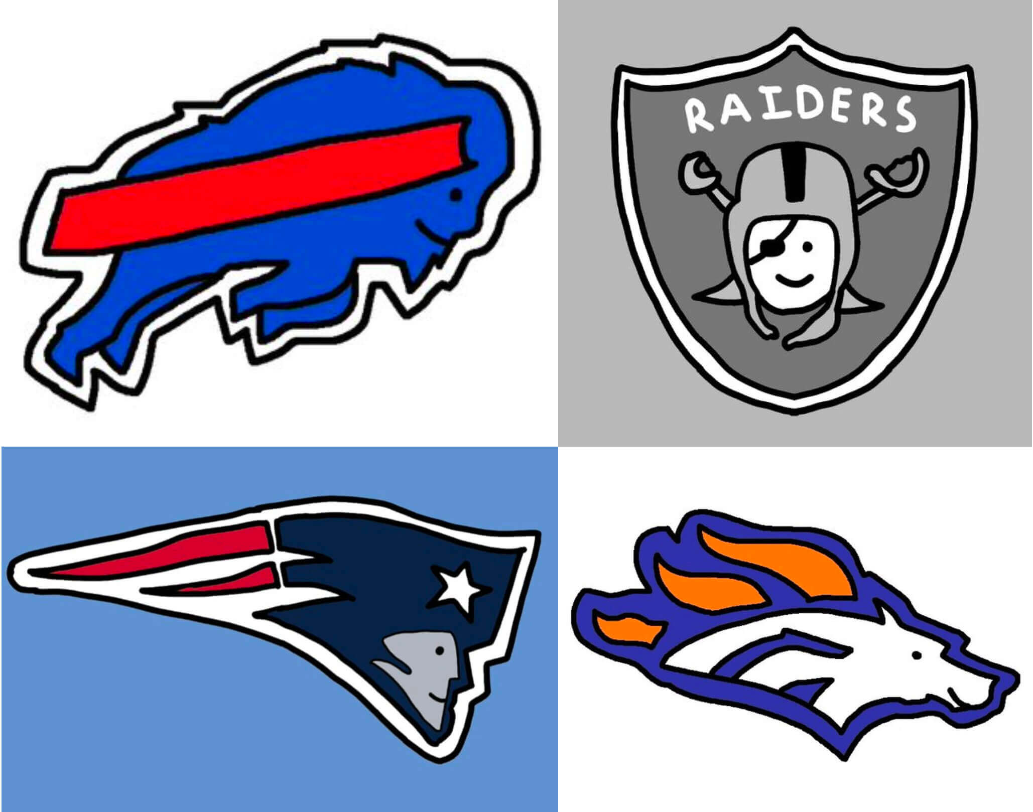
Last month I got an email from former Uni Watch Ticker-er Mike Chamernik. “Here’s an artist who draws pro and college team logos in a cool, cutesy style,” he said. “Basically the exact opposite of the ‘angry mascot’ trope we’ve grown accustomed to.”
He provided a link to a site called CornDoggy Drawings, which featured tons of MLB, NFL, NBA, and NCAA logo renderings, all executed in an endearingly simple, kiddie-style motif. The mascots depicted in these logos all had one thing in common: They were smiling. Not big, toothy grins — just happy little smiles. It was all very … pleasant.
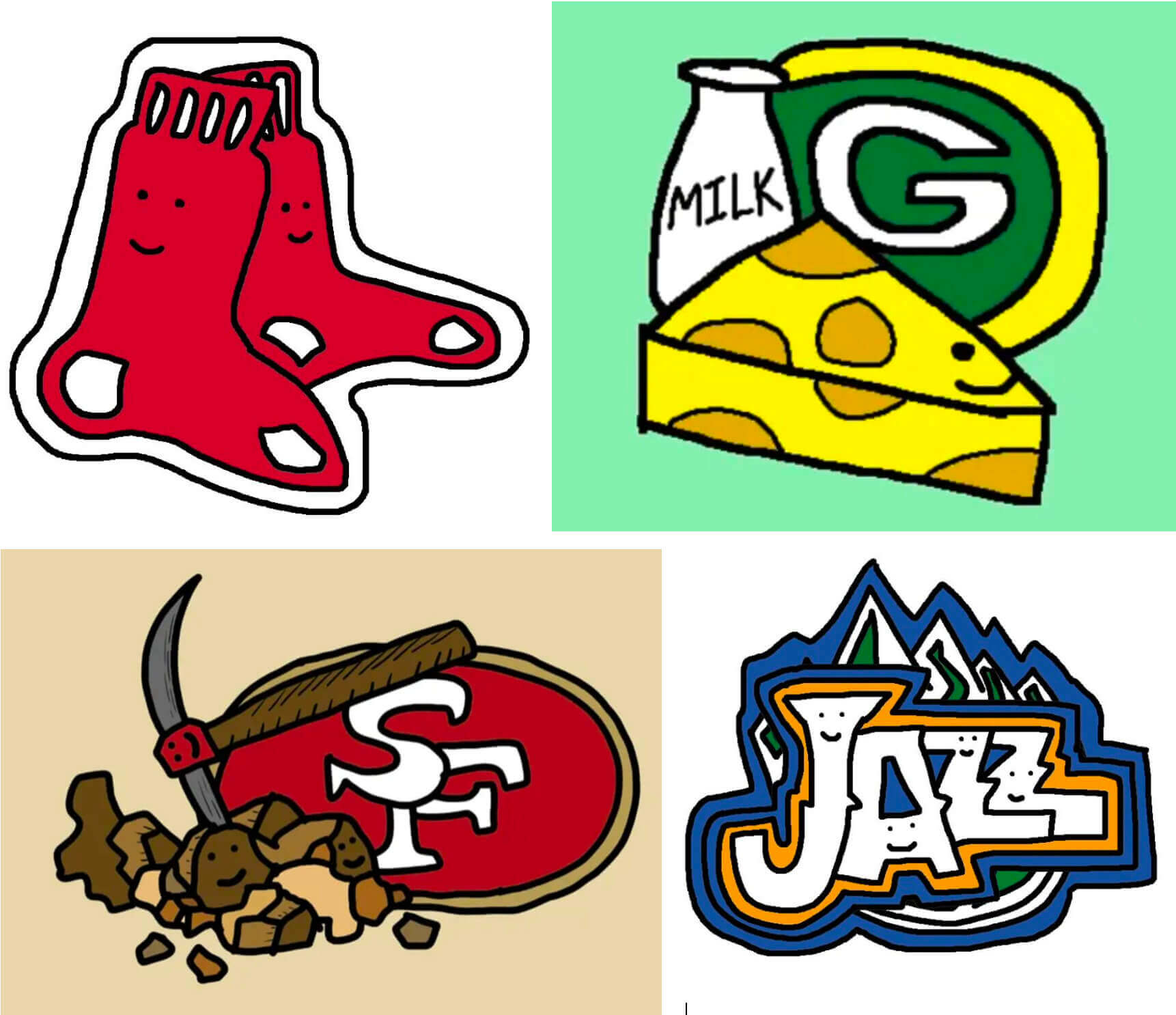
As I looked a bit deeper on the CornDoggy site, I saw that the artist also created his own “alternate” logos for many of the teams, and that the signature smile even appeared on inanimate objects and typography:
I also found this, which seems so perfect on so many levels:
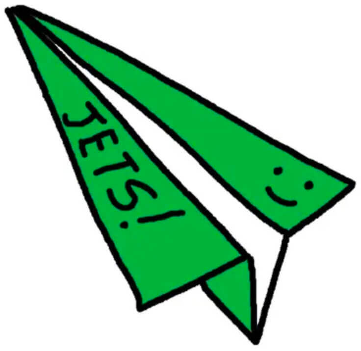
I realize some of you probably think these look wimpy and/or amateurish, but I love them. Many of my all-time favorite logos are friendly, smiling cartoon characters, like the original Milwaukee Bucks logo, or the old Dallas Chaparrals logo, or even Mr. Redlegs, Mr. Met, and the Swinging Friar. For me, those logos all communicate the idea that sports are supposed to be fun and happy, not grim and menacing.
Eager to share this new discovery, I tweeted some of CornDoggy’s illustrations and learned that I was late to the party — he already had a lot of enthusiastic fans. “This guy is a legend,” said one of them. “He draws a new set every week — dude is a machine,” said another.
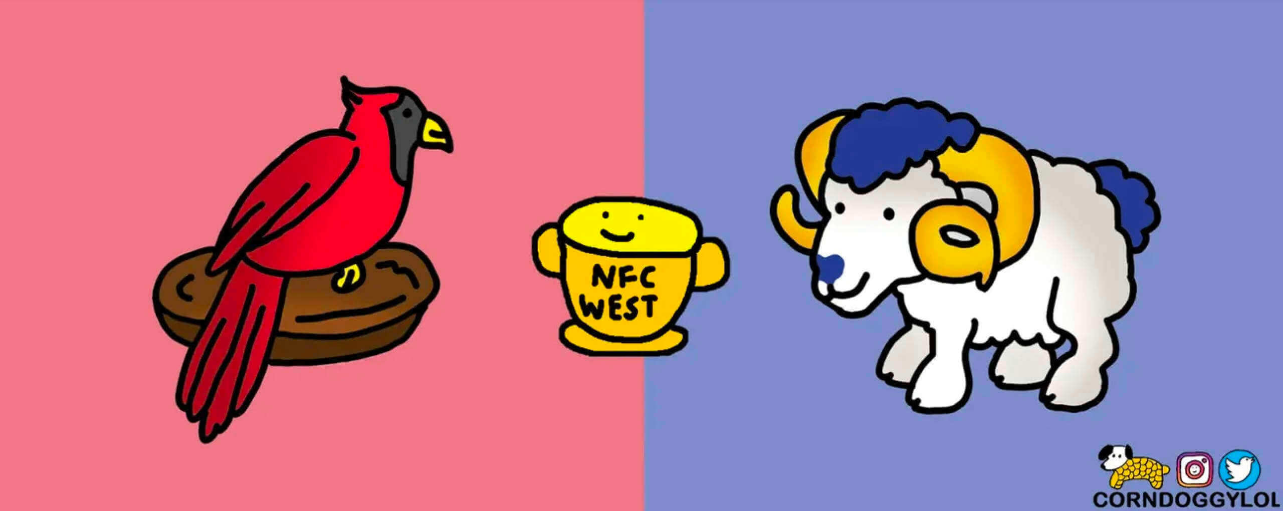
I went back to CornDoggy’s website and figured out that the “new set every week” line referred to a series of drawings he did for each week of the NFL season. Here, for example, are the drawings he did for Week Four of this season, and here are two of the matchup drawings he did for that week’s games:
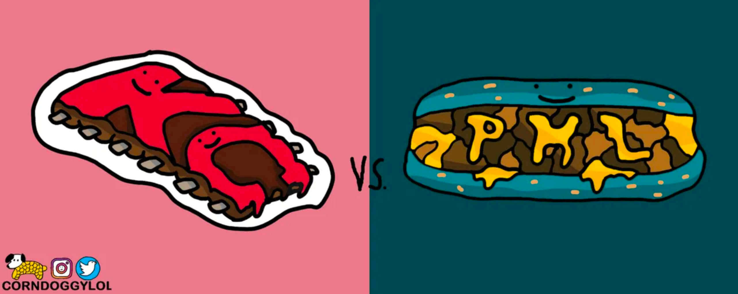
I wanted to learn more, so I got in touch with CornDoggy (he prefers not to divulge his real name). Here’s a transcript of a conversation we recently had, edited for length and clarity:
Uni Watch: Let’s start with just a little information about you. How old you are, where you live, and what you do for a living?
CornDoggy: I’m 28 and I live in Chicago. It’s actually kind of funny, because my job is the exact opposite of my CornDoggy personality. I’m a data scientist — I deal with like analytics and numbers and stuff, and then I like doing this kind of creative, artsy thing on the side.
UW: Does the pseudonym “CornDoggy” have any particular significance?
CornDoggy: No, I just thought it was kind of a funny name.
UW: How long have you been using that pseudonym for your drawings or illustrations?
CornDoggy: I used to be a pretty big video gamer, and I began using CornDoggy as my username five or six years ago.
UW: When did you start doing the logo illustrations and the things that I’ve seen on social media?

CornDoggy: I started about a year ago, for the 2020 NFL season. Some of my early drawings were pretty rough-looking — like, I remember a year ago drawing the Browns for the first time, and I think I just drew an orange square. I mean, their logo doesn’t really provide much inspiration
Anyway, I don’t know if you’re familiar with Discord — it has kind of an online chat function. And basically, you build these communities. It’s like Reddit and Slack combined. And there’s a community called NFL Chat, where they would make a breakout room for each NFL game taking place on a given Sunday. And so whichever game you wanted to watch or whatever, there was a chat going on, so you could type real-time to other people who were also watching the same game. So it was like a hangout or chat room.
So last season, I would draw these, like, a quick two-minute drawing of the team logo matchups for each game [to share as part of the chat]. That’s how I got started doing the my logo drawings.
UW: What software do you use?
CornDoggy: At first I used Microsoft Paint, but I use Photoshop now. It was funny switching over from Paint to Photoshop, because there were all these different new tools I could use, but I had no idea how to use them. So it was kind of challenging at first, but I think when when you learn to use new things, you obviously refine your craft.
UW: Had you done any drawing or illustration work prior to this?
CornDoggy: Not in any professional sense. I mean, I was that that kid in high school who’d be doodling in my notebook, but nothing more than that.
UW: And were you always interested in sports logos from an early age?
CornDoggy: No, I think I think it just worked out that way. A lot of sports logos kind of have that “evil eye,” that intimidation factor, right? So this is kind of the opposite of that, with the smiling faces. How I think about it is, you would just want all the teams — at least from a kid’s perspective — to, like, have a good time. So that’s the idea.
UW: And when you say “from a kid’s perspective,” is that what you’re trying to present or achieve? That’s like the thinking behind your aesthetic, to show it from a childlike point of view, or a sense of childlike innocence?
CornDoggy: A little bit, yeah. A lot of it is also just the limitations of my drawing ability. I mean, I’m obviously not the greatest artist out there. But it’s always fun to draw these little cartoons of the teams, and then it’s nice when people say, “Oh, I really like that, you should keep going.”
UW: So you got a lot of positive feedback.
CornDoggy: Yeah, people seem to enjoy them. So that has definitely played a role in me continuing. And I know once in a while you’ll get these people who, you know, they have the negativity, but you just try and ignore them and do what makes you happy.
UW: Has anyone ever tried to tell you that you’re basically “doing it wrong,” because your mascot depictions don’t look ferocious enough, or they look too wimpy, or too happy, or something like that?
CornDoggy: Yeah, sometimes — I think it’s kind of funny and just try to maintain a positive perspective. And you’ll occasionally get someone saying, “It looks like a five-year-old did it.” I think it’s kind of funny when people spread negativity — like, you’re making fun of someone for doing their passion. Okay.
UW: As you mentioned, we’re all used to seeing team mascot characters that are snarling or ferocious-looking or intimidating, but obviously your characters are more friendly-looking and smiling, and you even draw smiles on inanimate objects. Do you dislike the the current trend of sports mascots having that snarl of intimidation, and are you trying to push back against that by making the smile your visual signature?
CornDoggy: Not really. I mean, I kind of understand that you might want an angry mascot, at least for football. But I think the way that it kind of worked out for me is that I wasn’t very good at drawing faces. I remember watching Forrest Gump as a kid, and there was that one scene with the smiley-face T-shirt — it’s kind of like that.
UW: I noticed you haven’t done NHL team logos, at least on your website. Are you not a hockey fan?
CornDoggy: I’ve done a few hockey logos on Reddit, which people seem to like. When the football season ends, I’m going to try and do some more hockey drawings. And more NBA, too.
UW: You’ve included logos that include Native American imagery, including your own version of Chief Wahoo and a teepee for the Chiefs. Are you basically okay with teams using Native American imagery? Or were you trying to transform problematic imagery into something more benign? What was the thinking behind that?
CornDoggy: As long as you respect the culture and the meaning behind it, and if you mean it in a positive, honoring way, I have no problem with it. Some other people do, I know. Something like the Washington Redskins [team name], I think that’s over the line. And the way they depicted Chief Wahoo in the original logo probably wasn’t the greatest, right?
UW: I see that you sell stickers of your artwork on Etsy. Do you sell a lot of them?
CornDoggy: I’ve been averaging about 10 sales a week, which isn’t bad. I’m hoping one day that I’m walking around Chicago and I see my own product out there somewhere.
UW: I can tell you, having seen Uni Watch gear in the wild, it’s a nice feeling. Have you sold anything else, like T-shirts?
CornDoggy: I’ve done posters of my drawings. You know, I’m always — not scared, exactly, but there’s always that idea of getting a cease-and-desist. I know some people who made some T-shirts and then got hit with that. Which I totally understand — like, from the team’s perspective, they want people to buy their official products instead of someone else’s. But I think stickers is a very small game to them.
UW: Any plans for the future of this project?
CornDoggy: I think the plan is to keep doing this for a long while. It started as a little fun project, but it’s blown up to a scale that I didn’t think could ever happen. People seem to like the drawings, so I think I’ve found like my little foothold in the Reddit sub-communities. So as long as I can keep spreading the positivity behind each team, I’ll keep doing it.
———
Nice! You can see more of CornDoggy’s work on his website and on his Twitter feed.
(Big thanks to Mike Chamernik for bringing CornDoggy’s work to my attention.)

Bulletin reminder: In case you missed it on Thursday: Last week on Bulletin I looked at teams that moved but didn’t change their names. The week before that, I looked at teams that changed their names but didn’t move. This week, in the third and final installment of this series, I’m assigning grades to teams that changed their names as the result of a move (like the ones shown above). You can check it out here on Bulletin.
As I recently mentioned, this will be my last Bulletin article that’s publicly available to all. Starting with next week’s article, my Bulletin content will be accessible only to paying subscribers. The price is $4 a month or $35 for a full year. This revenue will also help support operations here on the blog. I want to thank everyone who signed up yesterday — the paywall doesn’t go into effect until next week, but yesterday’s response was much greater than I expected. I really appreciate your support!
If you want to order a monthly or annual subscription, you’ll need a Facebook account in order to pay for it (I know, I know). You can sign up for your paid subscription here, although it’s fine if you’d rather wait until next week. And you can learn more about what you’ll get for your money here. Thanks!
(P.S. CornDoggy did not create the “Thanks a bunch!” graphic shown in this section. But it’s perfect for today’s post, right? I stumbled upon it while looking for a “Thank you” graphic.)

Click to enlarge

Surf and turf: Since Omicron emerged, the Tugboat Captain and I have been avoiding indoor social gatherings — no restaurants, no bars, no movies, no parties, no nothin’. We had planned to break that fast, so to speak, by meeting a few friends at a local tavern on Wednesday night, but those plans got scuttled after it turned out that we might have been exposed to someone a few days earlier who has since tested positive. We have no symptoms ourselves and are testing negative so far, but it was too soon for the tests to be definitive, so we reluctantly scrapped our plans and stayed home, just to be safe.
We were really bummed about this, so we tried to cheer ourselves up by taking a nice steak out of the freezer and getting a lobster from our local fishmonger — surf and turf! Turned out great:

Incredibly, I’m not sure I’ve ever made a steak/lobster dinner before. It’s festive, but so simple — both items cook quickly and with almost no prep work. Not inexpensive, of course, but still a very easy weeknight splurge.
Whenever I post nice dinner photos like these, I realize it probably makes it seem like Mary and I have this happy, groovy domestic life. So in the interests of honestly, I should acknowledge here that we ended up having a big fight right after I took these photos. Nothing catastrophic or nasty, but it definitely put a damper on the meal. Hey, it happens. Still a fun cooking project, though.
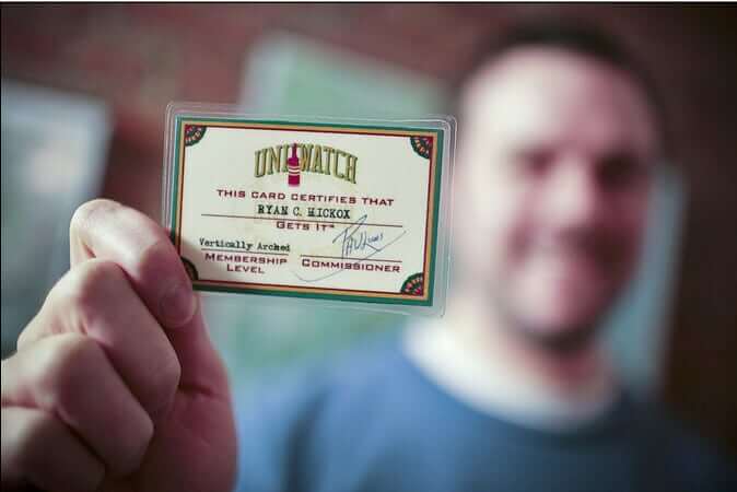

ITEM! Membership raffe: Reader John Benal won a Uni Watch pennant in one of this week’s earlier raffles and has generously decided to pay it forward by donating a Uni Watch membership for me to raffle off, so that’s what we’re going to do today.
This will be a one-day raffle. No entry restrictions. To enter, send an email to the raffle in-box by 8pm Eastern tonight. One entry per person. I’ll announce the winner on Monday. Big thanks to John for sponsoring this one!
Meanwhile, the winner of yesterday’s pin raffle is Zachary Hoover. Congrats to him and thanks again to Tim Bullis for that one.
The Ticker
By Anthony Emerson

Baseball News: The Oklahoma State Firefighters Museum shared this wonderful photo of a firefighter baseball team. The photo is undated, but Paul Deaver thinks it might be from the late 1930s. … New home unis for Dayton (from Andy Bentley).

NFL News: Yesterday we Ticker-linked a photo of 49ers DL Charles Haley’s darker grey facemask from 1990. Phillip Junis, the head equipment manager at Johns Hopkins, sheds some light on that: “The darker grey mask was manufactured by Riddell and was called a KraLite mask, as it was manufactured out of the KraLite polycarbonate material that was also utilized in manufacturing the helmet shells, Riddell’s thought was to lighten the mask weight while still providing a solid protective facemask (these did not last long on the market, not aesthetically pleasing enough and tended to break in colder weather). The photo of Jim Burt’s darker mask has a similar explanation, as his darker mask is made by Riddell and is a carbon steel version, while the other while masks are manufactured by Schutt. The manufacturers had slightly different color palettes.” Faaaascinating. Thanks, Phillip! … Sticking with the Niners theme, here’s a great story about the company behind the 49ers’ classic gold satin jacket, which was popular in the 1980s (from @WrEtcH_).

Hockey News: Ty Nelson of the OHL’s North Bay Battalion broke the puck in two with a shot during last night’s game, something I’ve never seen before (from Ted Arnold).

College Hoops News: Looks like Adidas is spreading the Reverse Retro line to other sports, as a previously unseen Kansas jersey was briefly available for purchase under that rubric. … WKU men’s went BFBS at home while UAB wore their standard dark green away unis, making for a completely unwatchable game last night (from multiple readers).

Soccer News: The new W League team based out of the Twin Cities will be called Minnesota Aurora FC and will use this badge (from multiple readers). … Olympique Lyonnais gave USWNT star Lindsey Horan a jersey with the number “2023” to announce her signing until June 2023, which is an odd move because it’s just a year-and-a-half contract. … Rumor has it that Spotify is about to become the shirt advertiser for Barcelona’s men’s team, but that the deal may also include naming rights for the Camp Nou stadium, where Barça have played since 1957. Paul, get those “Encara en dic el Camp Nou” T-shirts ready! … Hard to see in this picture, but C.D. Tapatío of Mexico’s Liga de Expansión wore jerseys with their new crest but shorts with their old crest during last night’s match (from Angel Noriega).

Grab Bag: Formula 1 champion Max Verstappen has a new helmet for the 2022 season.
And that’s another week in the books. Stay safe, enjoy Phil’s weekend content and the conference championship games (Go Niners!), and I’ll see you back here on Monday. Peace. — Paul
I really like the Aurora FC badge. Soccer badges can be hard to design because they all tend to look the same—either some sort of a shield or a circle. They designed a badge with a unique shape that has the bonus of fitting the team name.
The Aurora went to the top of my list of favorite crests because it employs the sleek, futuristic vibe of skate/snowboard graphics like Alien Workshop and Habitat.
Broken (what the) puck??? I’ve never seen that either. I saw in this case, both halves stayed out of the goal, so no score. But had one half gone in, is that a goal? Anyone have any idea what the ruling might be if that occurred?
Since the rule is that the whole puck has to go over the line to be a goal, I’m sure a half isn’t enough. I suspect that the play is instantly dead — they’re no longer playing with a regulation puck, after all — but I don’t know that for sure.
I had not see a puck break until my son did it at a pick up game. He received a pass, shot a one timer, puck hit the crossbar and split into 3 pieces.
Broken puck also happened in a WHL game really recently. In December 2021:
link
Half the puck went into the net. No goal.
I must say at first glance I was not feeling Corndoggy’s vibe, but I went on to check out the website. I started looking team by team & he has some real good stuff: some were fun, some humorous, some good mashups or borrowing from other teams/companies. I liked the license plates and a bunch of knockoff product style which could definitely see as t-shirts designs.
I was most impressed that he has designed some real good secondary or alternate logos. Titans & Warriors “spartan helmet” or the Seahawks “First Nation style bird” or the NYJ Empire state building w/ wings. Honestly there were quite a few I thought “This could be officially done & would be better than the teams actual logo!”
Some incredible outside-the-box artwork from Corndoggy. I especially liked the pair of Charlie Browns wearing pilgrim hats.
The picture of the firefighter team is great. But what does a team called the Firemen call its relief pitchers?
It’s funny you mention that, because I’ve been thinking lately about how the whole “fireman” or “putting out the fire” trope no longer works, because set-up men and closers are now brought in at the beginning of an inning, not to get out of a jam. So caricatures of relievers wearing firefighter’s hats no longer make sense, there’s no more Rolaids Relief Award trophy shaped like a firefighter’s hat, etc. I wonder if today’s young fans are even aware of the old “fireman” trope.
Is “Firemen” not a good name because it doesn’t end in “s”?
“Firemen” is a bad name because it’s sexist/patriarchal/etc. “Firefighters” solves that problem (and also the “s” problem).
Come on, Walter — you walked right into that one!
(mimes shooting pistol at own head)
Billy Wagner’s 1998 Topps card shows him in a firefighting helmet and holding a fire extinguisher while at Joe Robbie Stadium. Is that the most recent example?
Ouch… you’re right, the Jets one works.
I used a Kralite in high school one season and loved it. Never felt less safe and never cracked or anything. Sadly, our team wasn’t that good and we didn’t play long enough in the season to get into REALLY cold temperatures! I did have a helmet crack on me once though.
For 4 of the 5 years I played between jr. high and high school I had Kralite masks, and I also preferred them to the coated steel ones. I also may be one of the few who actually LIKED the aesthetic of those masks too. There were some masks out there with thick round bars (I don’t know what brand they were, but I seem to remember Jimbo Covert wearing such a mask for a while), but compared to those I thought the Kralite masks looked rather sleek!
Greg Lloyd wore the same style facemask as Charles Haley while with the Steelers; they didn’t have any issue painting it black to match everyone else though: link
You can see that not only is the material way different/thicker, but the hookups to the helmet are entirely different as well, with way less mask spilling onto the side of the helmet as we’re used to seeing.
I’m pretty sure that those Kra-Lite masks were molded in the color desired by the customer. That’s not to say that some teams didn’t paint theirs, but I played junior high/high school football from 1990-94, and had Kra-Lite masks 4 of the 5 years (for the record, I preferred them to the coated steel ones). In junior high they were gray, and in high school they were blue. I can’t ever remember scrapes or gouges revealing an underlying color, the ones we had were the same color all the way thru.
KraLites were featured in the movie “Necessary Roughness” and were also heavily used in the WLAF (where there may have also been color match issues…most photos I’ve run across are of poor quality to say for sure).
When I first played HS football in the Fall of ’84 my school was still using some of the old masks from the ’70s (like link, in gray, and even a few of link) but had a few of link, in white. My sophomore year (’85) we still had all of those those, plus some of the KraLite and carbon steel Riddell masks shown in the Haley and Burt photos. The Schutt (then Bike) masks like link started to appear, IIRC, my junior year (’86) and by my senior year (when a new coaching staff came in and changed the helmets from maroon shells with grey or white masks to white shells with maroon masks) all of the old ones were replaced with the Bike/Schutt masks that became ubiquitous over the next ~20+ years.
I see Corndoggy’s art on Reddit all the time, especially in the college basketball sub. Always puts a lil smile on my face. Fun interview Paul
Sad to see about Barcelona and Spotify. Barcelona were the longest holdouts against adding ads to their shirts among big soccer clubs; I believe it wasn’t until around 2006 that they had anything at all, long after everyone else had them.
And when they did add a logo, it wasn’t a traditional arrangement — they had a deal for a few years with UNICEF to have their logo on the shirts, but they didn’t take any money, it was just a goodwill gesture to UNICEF, which Barcelona had supported for some time. So the money actually went in the other direction, from the club to UNICEF.
That all ended with Barcelona signing a traditional sponsorship deal with Qatar Air in 2010. And now this.
This is all from memory so someone can correct me on the details.
That sounds right. Unfortunately finances are quite terrible currently at Barcelona, so now we get to see Spotify on their shirt. All ads are poor design, but will we have to see Spotify green on Barcelona blue and red?
Paul, what kind of steak did you cook? Also, what was the weight or thickness, cooking method (broiler, charcoal grill, etc.), and cooking time? I have bad luck with cooking steak, too often overcooking. Yours looks delicious.
It was a shell steak (also called a KC strip or a NY strip). I don’t recall how much it weighed — I’d guess a little over a pound. About 1.25″ thick.
For years I did the super-hot cast-iron pan method. It works, but it also smokes up the whole house. About 15 years ago I changed to a different method: I put some butter in a cast-iron pan over medium to medium-high heat. When it starts foaming, I add the steak. A few minutes per side, turn, turn again, until you have a nice crust. It takes a bit longer, but you don’t get as much smoke, the butter smells great, and the results are excellent.
Here are some pics I took while cooking:
link
link
link
Thanks Paul, the information and know-how are greatly appreciated.
Something I’ve been doing more recently with steaks is to use only 2/3 of the burners on my gas grill and cook via indirect heat. I light the center and left most burner on high, preheat until the grill is approx 500 (can be hotter too), put the steaks down on the hot side for 90 seconds, flip and cook the other side for 90 seconds, then transfer all of the steaks to the cool side and cook them to doneness (so probably about 5:30-6:30 for me and 7:30-8:30 for my wife for NY Strip steaks that are roughly 1 inch thick. I prefer extremely rare, my wife prefers medium rare).
Corndoggy is great! Pro/minor league sports teams definitely need more smiling character logos. Surprised he went with the Old English D instead of the Tiger in Circle logo – that one is ripe for updating in the happy style.
what a treat today was! I have followed Corndoggy on Reddit for a couple years, even bought some of the stickers he’s made of his drawings. So as I did my daily check of Uni-Watch, the first thing I saw were Corndoggy’s drawings! I love when two things I enjoy intersect. These drawings are posted on reddit weekly usually with team matchups for football games. They’re cute, they’re fun, they’re great drawings! Good job getting him on here Paul!
If you’re looking for something for your phone or computer to support one of the teams in the Championship games…
link
link
link
link
I especially like the Bengals’ retro logo from 1968
link
Follow-up from something Paul shared yesterday…
“I particularly like the Niners’ gold-red-gold sleeve striping…, a one-season-only (1957) element that I wish they’d bring back.”
Would those pass the litmus test to be considered “Chicago Stripes” (a term coined by Comrade Robert Marshall a while back)?
And yes, the Niners should definitely throw back to that look.
I forgot about that term — thanks for reminding me!
But: Chicago’s stripes go dark/light/dark, while the Niners’ went light/dark/light. I’d say it’s a slightly different animal, wouldn’t you?
Paul, thanks for sharing that small detail about your personal life. Nobody’s got a perfect life, so no one should feel alone in it either. Thanks for all you do.
So, the leak is that it’s the NFL Washington Commanders.
Cool, if true, Cleveland takes a name from (among others) the XFL New York Guardians, and Washington plucks AAF’s San Antonio Commanders.
There’s so much original thought out there.