Click to enlarge
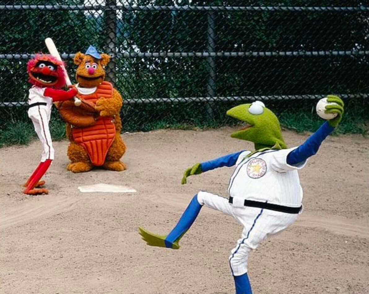
Good morning! There’s a lot of uni-related stuff to parse in this shot of the Muppets playing baseball. For example:
• Kermit does not have a fielder’s glove.
• Fozzie Bear appears to be the rare left-handed catcher.
• Kemit is wearing stirrups that loop right under his feet (no sannies, no shoes!), and it looks like Animal is as well.
• No headwear for Kermit or Animal, while Fozzie has a cap but no jersey or pants. So much for uniformity!
There are also photos floating around showing Kermit on the mound with a cap and a glove (or, if you prefer, a Ker-mitt) and a better look at Animal’s stirrups.
You want other sports? Can do: Here are the Muppets playing basketball, hockey, and football.
(Big thanks to Marc Brubaker for this one.)
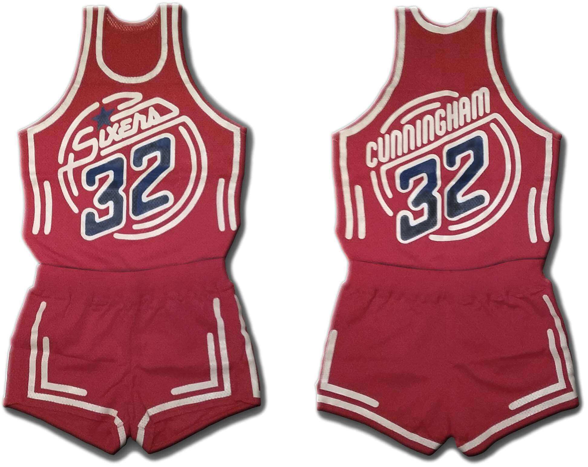
Today’s real lede is a doozy: For my latest piece on Bulletin, I have an exclusive interview with the designer who created a prototype uniform for the 76ers in the early 1980s. As you can see above, the design had a neon sign motif, but it was more involved than that — it was meant to shimmer under black light.
It’s a fascinating story, loaded with photos and original mock-up drawings. I hope you’ll check it out here.
Click to enlarge
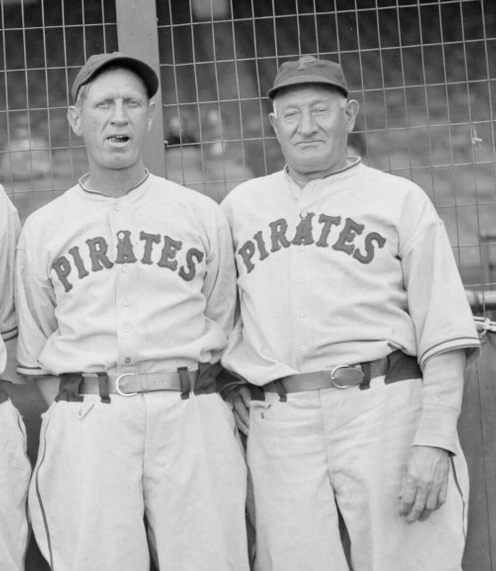
Pocket scholar: Reader Chris Hickey has emerged as our pre-eminent researcher of pants-pocketed MLB coaches and managers. His latest find, shown above, is a major one: In 1937, Pirates coaches Jewel Ens and Honus Wagner both wore flapped pockets. This is the earliest pocket example we’ve seen so far, and is also the first time we’ve seen anyone other than Casey Stengel going with the flapped variety.
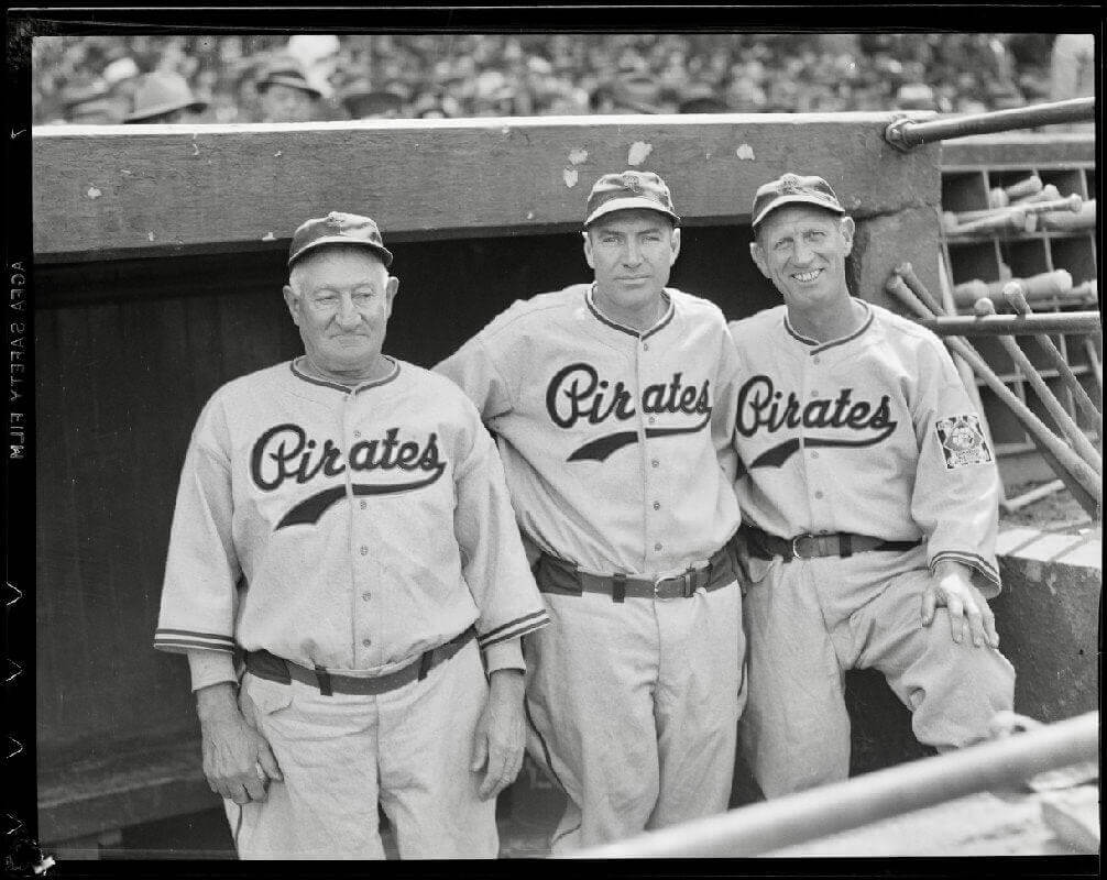
Two years later, in 1939, Wagner and Ens still had their pockets (and maybe were simply still wearing the same pairs of pants), although manager Pie Traynor did not:
I know I’ve said this before, but I’ll keep saying it: It’s kind of mind-blowing to think that I never noticed this detail before!
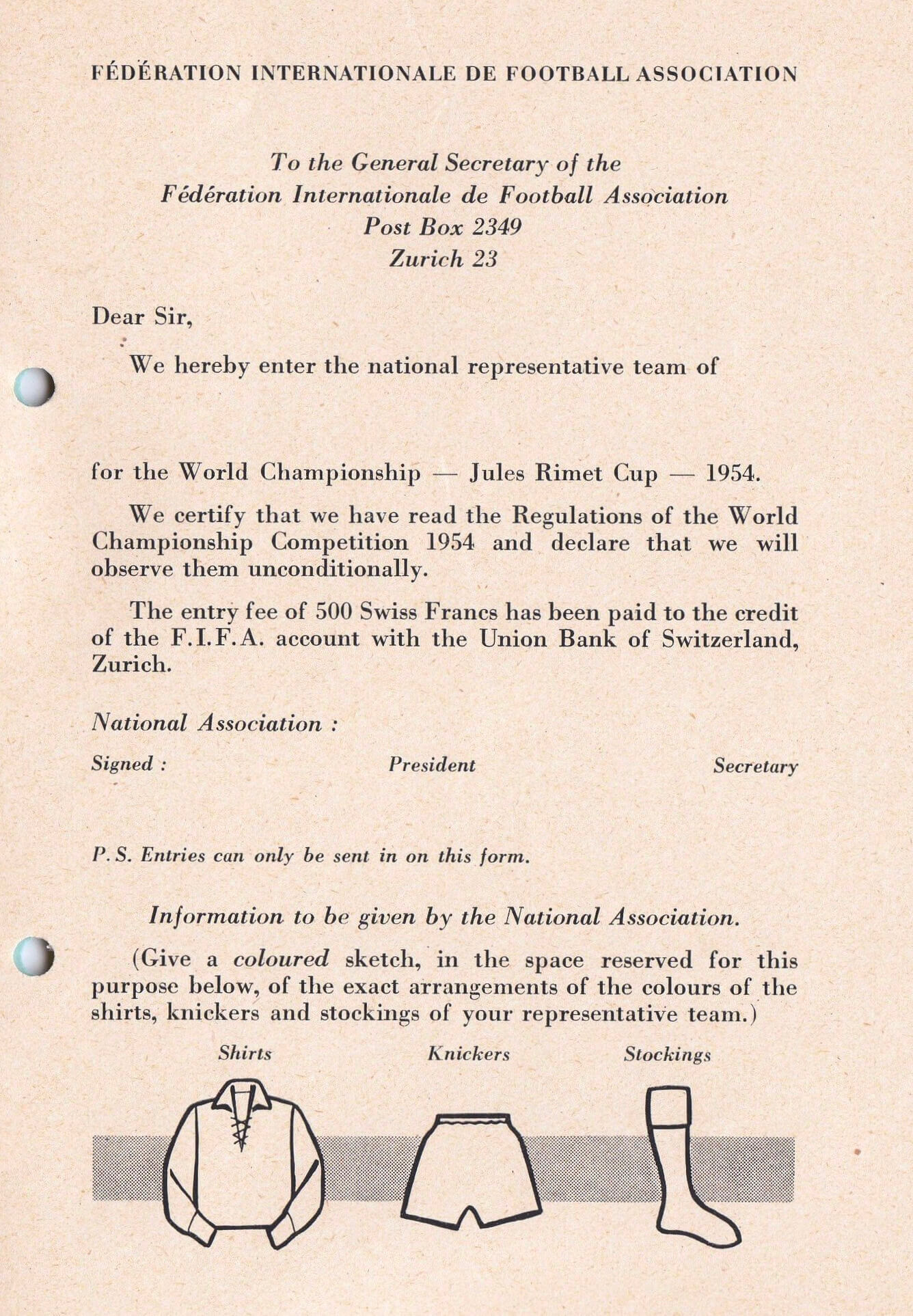
Click to enlarge
Too good for the Ticker: What you see above is the entry form that was used for countries applying to compete in the 1954 World Cup. I love love love the little bit at the bottom, where teams were supposed to sketch a mock-up showing the “exact arrangements” of their kit designs. So good!
(Big thanks to the Football Kit Podcast for uncovering the entry form, and to Jeremy Brahm for bringing it to my attention.)
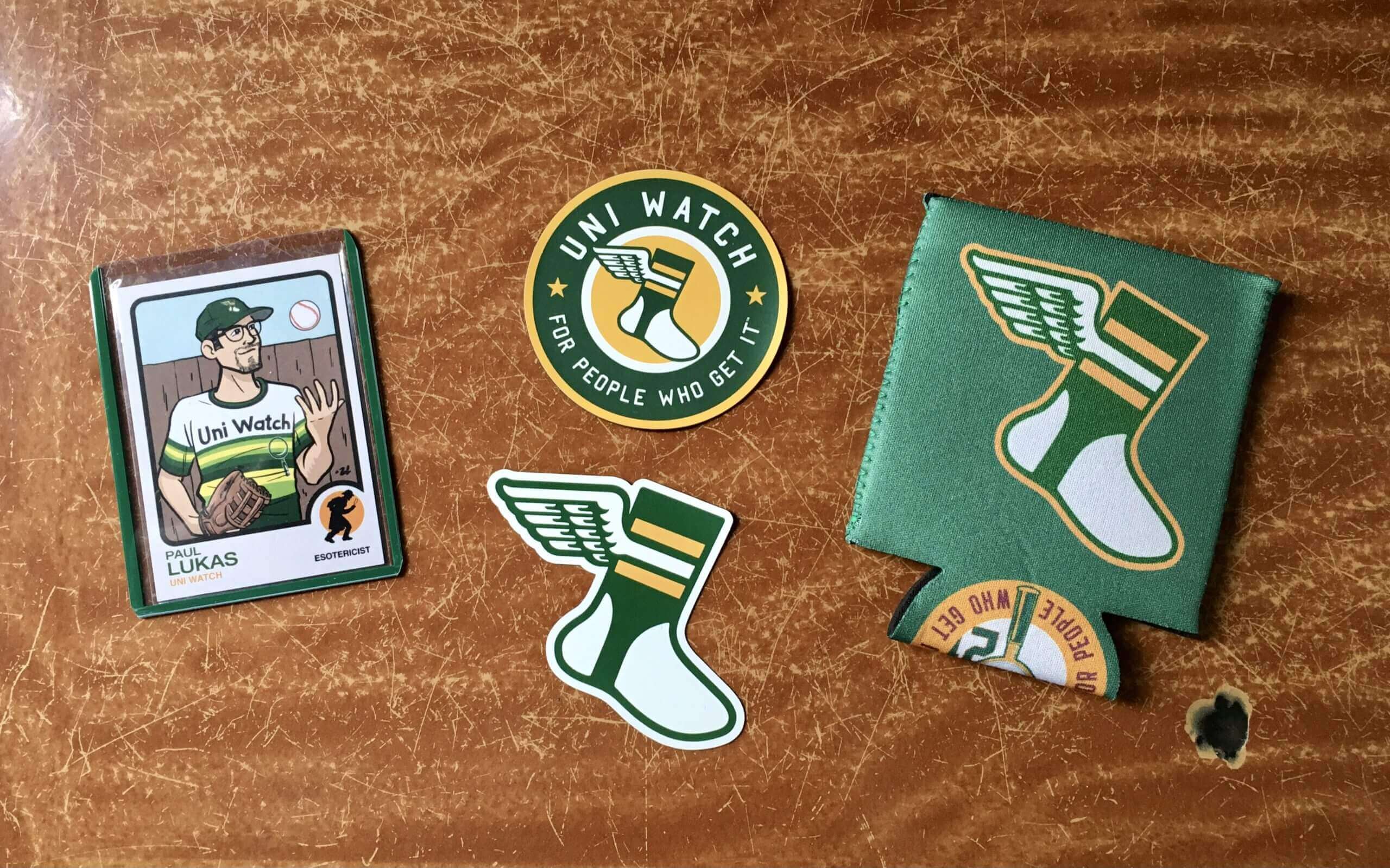

ITEM! Yet another raffle: For our fourth and final raffle of the week, I’m giving away a Uni Watch gift pack, including a koozie, two magnets, and a trading card.
This will be a one-day raffle. No entry restrictions. To enter, send an email with your mailing address to the raffle in-box by 8pm Eastern tonight. One entry per person. I’ll announce the winner on Monday. Good luck!
Meanwhile: The winner of yesterday’s raffle for the Uni Watch basketball shorts is Pete Svendsen. Congrats to him, and my repeated thanks to Matt Sanderson for making that one possible.
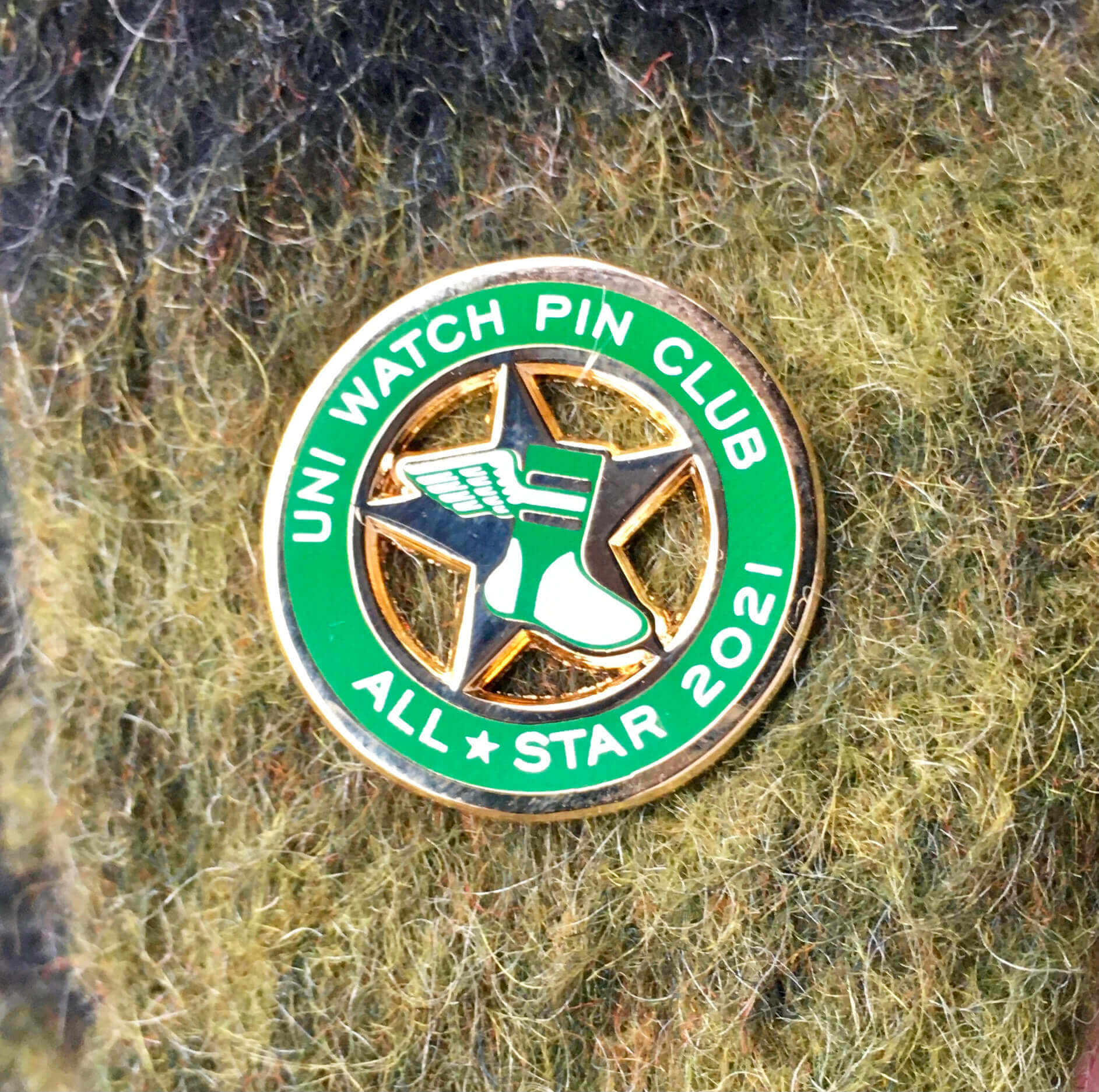
Pin Club update: All of the 2021 All-Star pins mailed out yesterday. So if you sent me proof of having collected ’em all in 2021, your bonus pin should be arriving shortly!
I have seven extra pins. So if you collected ’em all but somehow missed my earlier calls for documentation, please send me proof ASAP. Your proof can be any combination of photos of the pins themselves and your order-confirmation emails from Teespring.
While we’re at it: I’m pretty sure all shipping snafus regarding the December pin have now been resolved. But if there are any lingering issues regarding that episode, let me know. Thanks!
The Ticker
By Anthony Emerson

Baseball News: Reader Bo Baize came across this photo, which appears to show Tigers players. But those are actually the Dallas Eagles, a minor league team affiliated with the Tigers in 1946 and ’47. They continued using the Olde English D for some time afterward, as evidenced by this c. 1960 picture. … Quebec truck stops are still selling Expos merch.

Pro Football News: Someone is suing the Jets and Giants for calling themselves “New York” when they play in New Jersey (from Paul Bryant). … Check out John Elway’s lower torso in this photo — you can see his Broncos undershirt through his jersey! Ditto for the offensive lineman (great spot by Rudy Gutierrez). … The Dolphins practiced without helmet logos yesterday, strongly hinting that they’ll be going with throwbacks against the Pats on Sunday (from Bryce Starkey). … Bucs coach Bruce Arians went full G.I. Joke for his press conference yesterday. Kudos to @DSomnambulus for referring to him as “General Cosplay.” … In case you hadn’t heard, the USFL is back, and they’ve unveiled their divisional logos (from Jim Vilk).

Hockey News: The Golden Knights wore pride-themed warm-ups last night (from Wade Heidt). … Also from Wade: The WHL’s Seattle Thunderbirds will be playing the Everett Silvertips at the Kraken’s Climate Pledge Arena, and the event has its own logo.

Soccer News: Arsenal is launching No More Red, an official campaign to end knife crime in London. The campaign includes wearing an all-white kit with the crest and advertiser logos whited out as well. Also: No retail versions, to reinforce the notion that this is about values, not commerce. … The Africa Cup of Nations always has some of the best and most unique jerseys in international soccer. This blog ranks all of them for the 2022 tourney (thanks, Phil).

Grab Bag: Australia’s men’s Test cricket team are wearing pink numbers/NOBs/other accents for the ongoing fourth Ashes Test. This is a promotion they do every year for Jane McGrath day, which honors a late Australian cancer activist and wife of former cricketer Glenn McGrath (thanks, Jamie). … Sports media news: The New York Times is purchasing The Athletic.
That’ll do it for this week. Enjoy Phil’s weekend content, stay safe, and I’ll see you back here on Monday. — Paul
Rod Carew hilariously tweeted about the Muppet picture, pointing out that Kermit’s throwing a change up (because of his grip): link
Fascinating story about the blacklight Philadelphia 76ers uniforms! What a find! That’s the kind of content that keeps me coming back to Uni Watch.
A couple of quick thoughts on the uniform design:
I wonder if Ivan was influenced by the movie Tron. The striping patterns on the jerseys, shorts, and socks definitely evoked a Tron vibe for me:
link
Tron came out in 1982, so the time frame seems to line up.
Secondly, I’m curious to know how the home white uniforms would have worked with that blacklight ink. Wouldn’t it have appeared like white on white? That had the potential to be a functionally poor design.
I hadn’t thought about Tron (never saw the movie but am aware of the aesthetic) — I’ll follow up with Ivan about that!
The Hat Club has created nearly a dozen colorway versions of the Houston Astros “Rainbow Guts” cap that never saw the field after the original unveiling of the 1975 uniform.
I wonder if NBA Properties might be interested in this “What Might Have Been” moment?
The thing that stands out to me in the first Pirates pocket photo is the button coming THROUGH the top of the letter A. I don’t think I’ve ever seen that before!
It reminds me of the logo for the 1988 Tom Cruise movie “Cocktail”, too.
Your favorite muppet?
Beaker!
Or maybe the Swedish chef. Or lots of others. Depends on which day you ask me!
Given the proliferation of front pants pockets for managers, apparently between the 1930s and 1980s, is it safe to say that a “Coach’s Pant” or a “Front pocket option” was something standard in those days? A manager or coach would be offered the option to have the pocket every spring, unless/until it became known with equipment managers that they wanted/didn’t want it?
Odd that all the Muppets are leftys. Makes me wonder if the image is flipped?
Apparently not flipped, as the text on Kermit’s patch appears to read “MUPPET STARS” in correct orientation.
Most Muppets are lefties, because most “Muppeteers” are Righties. So their right hand is in the head controlling the mouth, and their left hand is controlling the Muppet’s left hand.
Oooh, that’s really interesting. Thanks for that explainer!
Kermit plays banjo lefty at the beginning of The Muppet Movie.
link
Yes and several online sources say most Muppets appear left-handed because most puppeteers are right handed, and use their dominant hand for the head and mouth, leaving the animated arms to be on the left of the Muppet.
I guess that makes for thoughtful continuity in these posed full-body photos.
Most muppets will be left handed. The puppeteers use their dominate (right in most cases) hand for their head and mouth while their other controls the hand(s).
You knew about this
With your head in your hands
All along
I was the muppet
I was the muppet
+1 for the Echo & the Bunnymen reference.
I do it clean.
I’m trying to tell if that second shot of Animal (the one with a better look at the stirrups) also has a red cap. One of those red arches above his eyes may be the brim of a cap, but it’s hard to tell.
Kermit’s waistline seems way larger than usual.
Maybe he’s been pigging out.
I’m obsessed with that Sixers “Neon Light” prototype. The black light element is of secondary importance as far as I’m concerned, that’s just an incredibly cool and unusual design. Can we somehow start a movement to get the Sixers to make them for real as a future “Statement Edition” or whatever??
It’s a lot better than last year’s City Edition, for sure!
Did anybody else notice that in Ivan’s drawing, the C in Cunningham is a custom letter that fits into and follow the curve of the circle element, like the S in Sixers does on the front? However, the actual uniform prototype uses a C in the same font as the rest of the name. The S on the front of the uniform also turned out a bit different from the drawing. I like the original design better than the way the mockup turned out. It would be interesting to see them actually do a custom initial letter for each player’s surname, but I can certainly understand why they would not want to have to do that in practice.
Yeah, we talked a bit about that, but I ended up cutting it from the interview because it was too detailed. He said basically what you said — too involved to do it for every name, and it wouldn’t work at all for some of them.
The Dallas Eagles photo is a great example of when uniforms weren’t uniform.
“Quebec truck stops are still selling Expos merch.” no surprise at all to this Canadian
Expos merchandise is everywhere in Canada. In our local stores its right up there with Blue Jays stuff. Authentic pinwheels, authentic 1990s blue caps, and a dozen fashion caps. Lots of toques.
Every level of my kids little league has one team playing as the Expos. There should be a few photos of my son (in stirrups LOL) as an Expo here on the site that I sent to Phil.
The spirit of the Expos is alive and well north of the border.
Perhaps most interesting is the revelation on the tag that Major League Baseball is “comprised of thirty teams, including the NEW YORK YANKEES and the LOS ANGELES DODGERS.” First time I’ve ever seen such an explainer on a piece of officially licensed merch. Have I just missed it, or is that something that MLB includes on merch sold in “foreign lands”…?
Huh, can that guy add the WFT to his suit on a team playing where it isn’t? I don’t want monetary damages. I just want them prevented from trying to build a new stadium in Northern Virginia using public funds.
Beautiful kits for the Africa Cup. Also, fair play on Arsenal for refusing to make retail versions of their anti-violence uniforms. The creative juice in professional sports seems to be concentrated with the footballers; I’d like to see sports on this side of the pond with that sort of ingenuity.
As far as the Jets/Giants lawsuit, my uneducated guess is that has about as much chance of success as suing ship owners using ‘flags of convenience’
I haven’t read the complaint, but can’t fathom how the putative plaintiff can establish standing, viz., an injury-in-fact directly caused by the alleged conduct. If he’s claiming that the teams are depriving New York State of tax revenue (a dubious claim in itself), that’s not sufficient; courts have consistently held that being a taxpayer doesn’t confer standing to sue over the use, appropriation or deprivation of tax revenue. From what I have read the case is so absurd on so many levels it could have been drawn by M.C. Escher.
Thanks to Paul for the kind words and continuing coverage of the front-pocket project…I enjoyed tracking down and sharing those pics!
That 76ers prototype design reminds me (in a good way) of the logo for “Dancin’ On Air”…a popular Philly-based TV dance show from the ’80s.
Dig that Sixers design…didn’t make the connection to Dancin’ On Air but that’s spot on, brings back memories.
The thing that stands out to me in the first Pirates pocket photo is the button coming THROUGH the top of the letter A. I don’t think I’ve ever seen that before!
A glove worn by Kermit the Frog = a “Ker-mitt”
This made my day, or at least validated my entering uni-watch.com into my address bar today.
Paul have you ever done an article showing the differences between the Dolphins Throwbacks and Regular Uniform ? Or a link ?
I don’t think so.
I’ll be attending the “Battle of the Sound”. I’m really hoping they go color vs color.
I couldn’t help but notice “GI Joke”, then in the very next paragraph there was a mention of another type of gimmick uniforms — pride-themed — with no snarky joke/comment. Why the double standard? Give us a “dishwater” or “BFBS” style name for pride-themed unis!
Because they aren’t the same thing.