A few months ago I wrote that I’ve always loved watching Max Scherzer pitch, so of course I was happy when the news broke yesterday about him signing with the Mets. Little did I know that his signing would also prompt an entertaining bit of internet-driven dinner theater here at Uni Watch HQ.
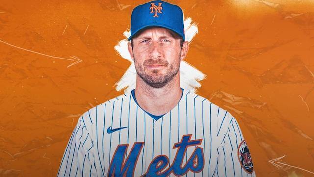
Here’s the deal: As is routine these days when a player joins a new team, Scherzer’s move to the Mets prompted lots of media outlets to Photoshop him into his new team’s uniform (like the image above, which appeared on Yahoo Sports). One of those Photoshop jobs caught my eye, and — well, here’s how things unfolded:
5:20pm – 5:34pm: I prepare dinner — marinated chicken thighs — and get it into the oven. (As an aside, why haven’t those fancy-shmancy scientists bio-engineered an all-thighs chicken already? I keep waiting for that to happen.)
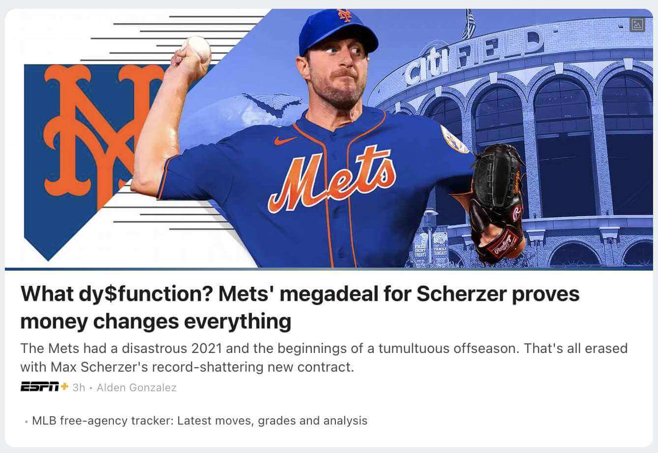
5:35pm: I get ready to do the dishes and a few other domestic chores. Before I start, I absent-mindedly go to the ESPN.com home page, where I see that the lead story is about the Scherzer signing. It looks like this:

I understand why the Photoshopper (or art director, or whomever) chose to depict Scherzer wearing No. 31 — that’s the number he’s worn for the past seven seasons. But as a Mets fan and a uniform writer, I know that Scherzer will never wear that number for the Mets, because it’s been retired for Mike Piazza. I also note that they’ve put Scherzer in the wrong cap. (The blue jersey is worn with the alternate cap with the white-outlined logo.) Ha-ha, silly ESPN!
5:36pm: I tweet about the uni number (but not about the cap logo, because that seems a bit esoteric for non-Mets fans):
ESPN home page shows Scherzer photoshopped into a No. 31 Mets jersey — which he will never wear, because that number is retired for Mike Piazza. pic.twitter.com/4QOZbtRdqt
— Paul Lukas (@UniWatch) November 29, 2021
5:37pm – 6:01pm: I do the dishes, take out the garbage, set the table for dinner, pet the cat, and so on. The chicken is making the house smell really good.
6:02pm: I see that my tweet is getting an above-average level of engagement. “Hmmm,” I think, “I wonder if anyone at ESPN has noticed?”
6:03pm: I go to the ESPN home page. Sure enough, they’re removed the Photoshopped image of Scherzer and replaced it with a game photo from last season:

I laugh out loud. The Tugboat Captain says, “What’s so funny?” I say, “Nothing, never mind.”
6:04pm – 6:49pm: We enjoy the chicken, which is very, very good, while listening to a rare Mountain Goats LP with a hand-painted jacket (a very nice gift from Mt. Goats frontman John Darnielle during my recent trip to North Carolina). It sounds great. The house feels warm and cozy. The uni-verse feels very far away.
6:50pm: After clearing the table, putting the dirty dishes in the sink, and so on, I look again at the ESPN home page. I see that they’ve restored the Photoshopped image — but this time without the number:
I laugh again, more loudly than before. The Tugboat Captain asks, “What’s so funny this time?” I start to say, “Nothing” and then think better of it and tell her the whole story.
———
Obviously, there’s no way to know whether all of ESPN’s photo switcheroos were prompted by my tweet. But I note with a raised eyebrow that they corrected the goof I tweeted about (the number) but did not correct the goof I didn’t tweet about (the cap logo). Hmmmm. If only they had a uniform specialist on the payroll, they might have avoided all this fuss, right?
(Footnote: Before wearing No. 31 for seven seasons, Scherzer wore No. 37 for five seasons. But he can’t wear that number for the Mets either, because it’s retired for Casey Stengel. For his first two seasons, with the Diamondbacks, he wore No. 39. The Mets haven’t retired that one, but it’s currently worn by reliever Edwin Díaz.)
To be fair, ESPN wasn’t the only media outlet that put Scherzer in the wrong uni combo. Sports Illustrated, for example, put him in the alternate road jersey (with last season’s Tom Seaver memorial patch, which Scherzer will never wear) and the primary cap:

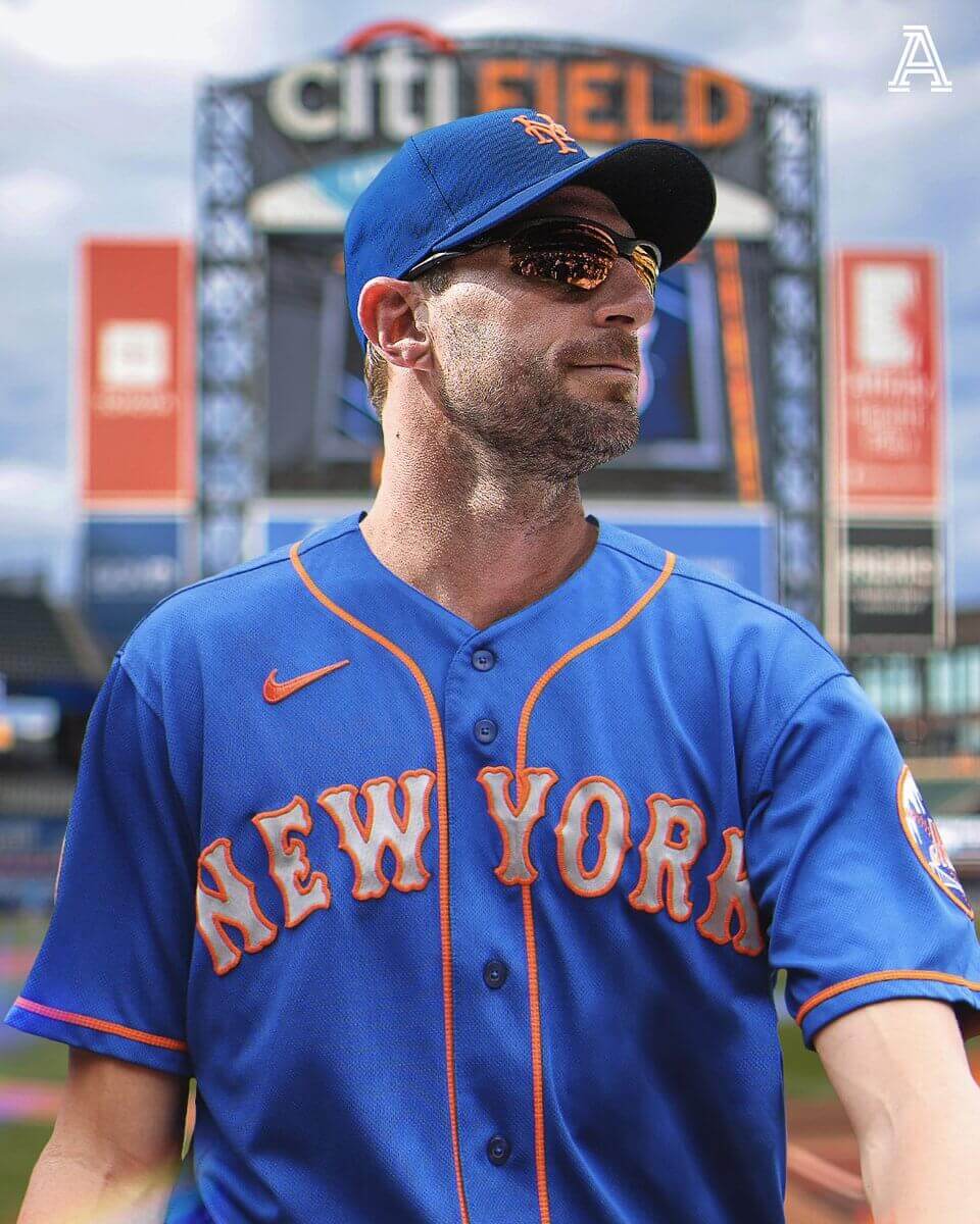
At least SI was smart enough to crop the photo in such a way that they didn’t have to choose a uni number for Scherzer. The Athletic didn’t do that, so they had to scrub the number from the jersey, plus they had the wrong cap, plus-plus they inexplicably showed Scherzer wearing a road jersey at the Mets’ home ballpark:
The Sporting News also opted to scrub the jersey number — and did a pretty sloppy job of it — but at least they got the correct jersey/cap combo:

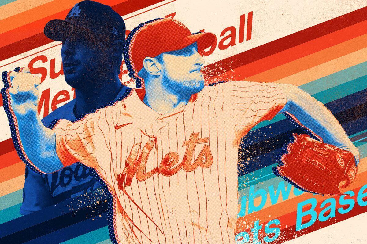
The Ringer also chose to scrub the jersey number — which was particularly glaring because they didn’t restore the pinstripes where the numerals had been:
New York radio station WFAN gave Scherzer a non-retired number and even got the right jersey/cap combo — but for some reason they rendered the number in the wrong color:

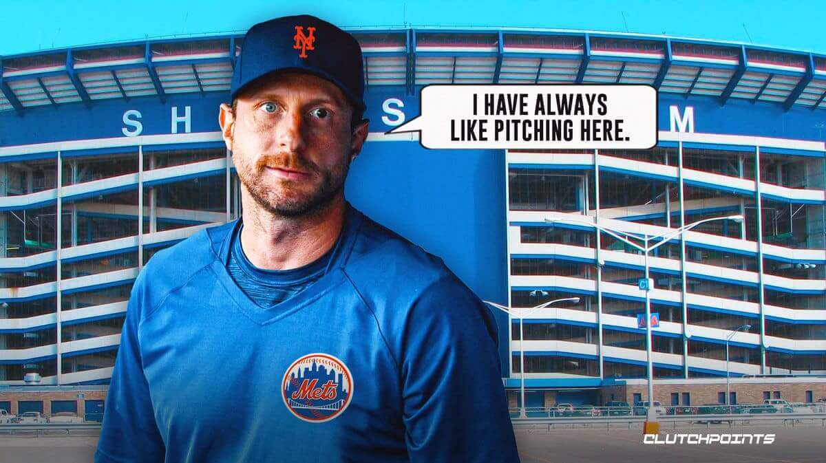
Clutch Points — a site I’d never even heard of until yesterday — took the smartest approach, showing Scherzer in pregame gear that doesn’t require a number. But they used Shea Stadium, instead of the Mets’ current ballpark, as a backdrop! Plus they (mis)quoted him with a grammatical error. Can’t make it up:
As far as I can tell, though, ESPN is the only media outlet that gave Scherzer a retired number — although the Mets’ own TV network, SNY, came close:
WELCOME TO NEW YORK, @Max_Scherzer!!!! 🗽 pic.twitter.com/MhXNNA5M1p
— SNY Mets (@SNY_Mets) November 29, 2021
In theory, that clipped-off number could be 21, or 24, or 34. But it could also be 31.
To my fellow sports media professionals: Maybe it’s better to skip the Photoshoppery and just use a game photo from last season.
Meanwhile: Scherzer famously has different-colored eyes. So as the news of the Mets signing him was breaking yesterday, the great Todd Radom created the perfect graphic for the occasion:
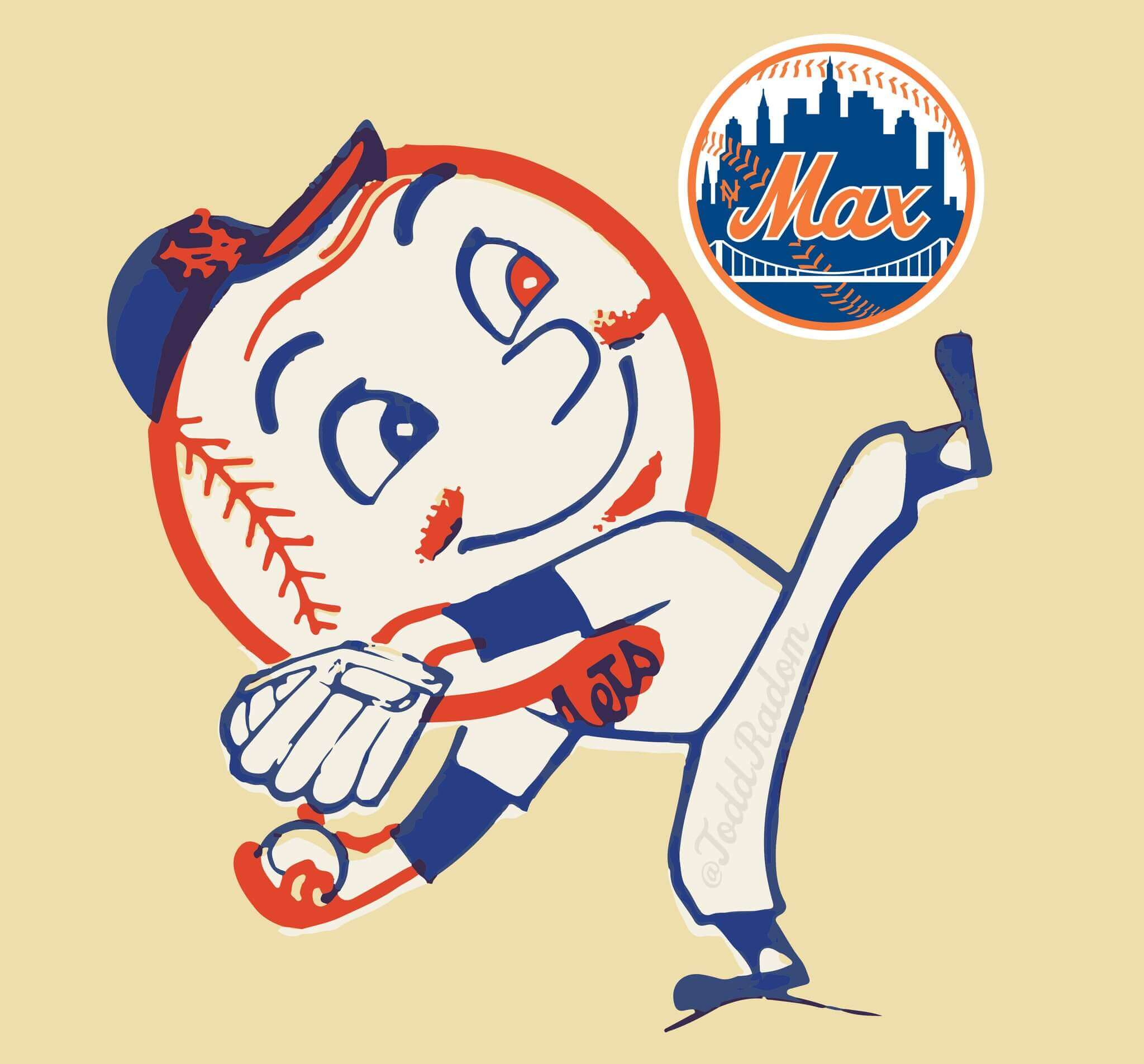
How great is that? Let’s go Max!
Click to enlarge
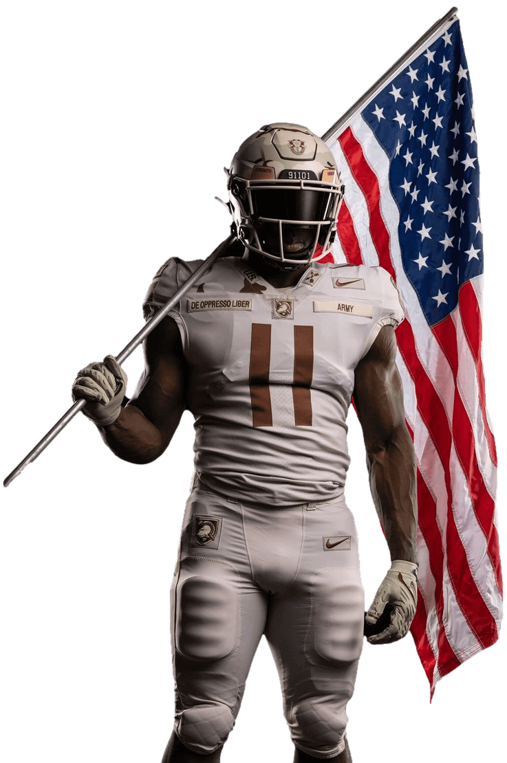
Army/Navy uni reveal: This year’s Army/Navy game is a week from this Saturday, and yesterday Army revealed its uniform for the game. This year’s design is a tribute to U.S. Army Special Forces who entered Afghanistan 20 years ago. As usual, there are lots of military-themed design details — you can learn more about them, and see lots of additional photos, on this very informative explainer page.
Click to enlarge
Collector’s Corner
By Brinke Guthrie
Follow @brinkeguthrie
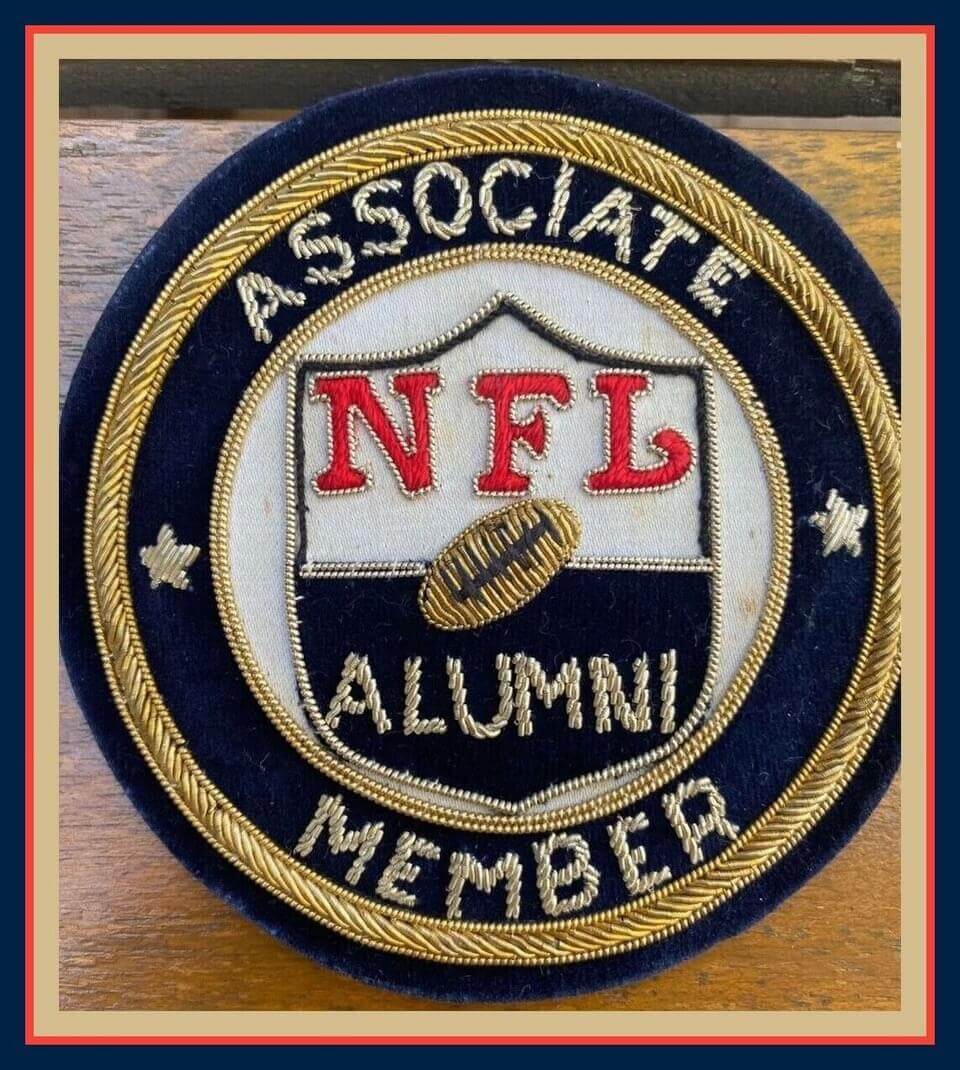
Leading off this week with a very cool-looking NFL Alumni Associate Member patch. The seller says this was from a pro coach who they used to hang out with on the golf course years ago. Great item!
Now for the rest of this week’s picks:
• This scoreboard was part of an early-1960s Munro tabletop hockey game.
• The classic Los Angeles Dodgers logo is depicted over a baseball diamond on this pair of Wincraft seat cushions.
• The ol’ rootin’-tootin’ San Francisco 49ers gold miner logo is shown along with the pinstriped NFL shield on this 1963 lighter.
• Here’s a set of four 1969 postage stamps commemorating the first 100 years of Major League Baseball.
• Speaking of the MLB centennial this button is from that season and says, “Happy Birthday!”
• This “Go 4 It!” rally towel helped New York Islanders fans cheer their side to their fourth straight Stanley Cup win.
• Back to 1967 for this St. Louis Baseball Cardinals team ruler.
• Mickey Mouse looks sharp in a Philadelphia Flyers uni on this 1980s baby blanket.
• This drink coaster is from Brett Favre’s Steakhouse, which closed back in 2018.
• Pittsburgh Pirates fans will get a nostalgic rush from this highly detailed NIB (New In Box) replica of Three Rivers Stadium.

Cyber Monday Tuesday reminder: In case you missed it yesterday, today is the second day of a two-day sale on Uni Watch merch and memberships. Through midnight tonight, you can save 20% on anything in the Uni Watch, Naming Wrongs, and Uni Rock shops by using the checkout code CYBER2021.
In addition, also though midnight tonight, the price of a Uni Watch membership card is now $20, instead of the usual $25 — a 20% discount. That goes for gift memberships as well.
My thanks, as always, for considering our products.
The Ticker
By Alex Hider

Football News: The Dan Le Batard Show polled Twitter followers yesterday on whether Oklahoma State should qualify for the College Football Playoff on the sole basis of their uniforms (from @hvhtim). … New USC coach Lincoln Riley arrived in California yesterday wearing crimson and white Jordan sneakers, likely holdovers from his time as Oklahoma’s coach (from Chris Fernandez). … With the regular season over, Chad Fields has updated Tennessee’s all-time uni tracking numbers. … Here’s a deep dive into San Diego State’s elaborately detailed helmets. … The logo for the Istanbul Rams of the European League of Football certainly seems to have been inspired by the L.A. Rams’ current “ram’s head” logo (from John Muir). … The Spring High School (Texas) Lions appear to have poached Mizzou’s tiger head logo and added a mane on its neck (from Chris Mycoskie). … The 49ers will wear their white throwbacks for this Sunday’s game in Seattle.

Hockey News: Red Wings G Alex Nedeljkovic was born in the Cleveland area and is an Ohio State fan. With the Buckeyes losing to Michigan in football over the weekend, he had to pay up on a bet with teammate and Michigan native Dylan Larkin and pose for a photo while wearing Larkin’s Wolverines football jersey (from Brandon Weir). … Throughout the season, OHL teams are participating in the “Leave Your Mark” campaign, where teams will wear uniforms designed by young fans. The Peterborough Petes and the Oshawa Generals both wore their LYM uniforms Sunday (from Wade Heidt).

Basketball News: Yesterday, Wisconsin men’s unveiled new white-on-white uniforms that were designed by players on the team. This design will be worn on Saturday against Marquette (thanks to all who shared). … Elsewhere in the Dairyland, the Wisconsin Herd, the Bucks’ D League affiliate, wore “art-themed” uniforms yesterday as part of a fundraiser for the Oshkosh Kids Foundation.

Soccer News: Did you know that the Mexican national team’s 1978 kits were made by Levi’s? That’s one of several revelations in this article about unusual kit manufacuters (from Trevor Williams). … Here’s a video report on how a bunch of the shirt advertisers in the Premier League are actually companies trying to dodge China’s anti-gambling laws (from Steve Ammidown).
Olympics News: Nearly 30,000 uniforms made for volunteers at the Tokyo Summer Olympics have gone unused (from Kenneth Traisman).

Grab Bag: Sam Bird, a driver in the electric car racing circuit Formula E, has unveiled his new helmet design for next season (from our own Jamie Rathjen). … The Air Force will be the main advertiser on the No. 43 NASCAR for three races in 2022, and they’re asking active duty Airmen to design the paint scheme (from Christopher Hickey). … This infographic breaks down the elements of the Chicago city flag (from Ty Ferrin).
All-thigh chicken.
Nice ripping off an Alton Brown bit, stupid.
Has he said that? I had no idea. I’ve been saying it myself for many years!
Great minds, etc.
The tone of that comment reads a lot like Jim Norton, the comedian. Is James Norton Jim Norton? Is Jim Norton a Uni Watch reader?
This story is the epitome of dumb in digital rendering. Every time someone gets traded or drafted graphics departments do a TERRIBLE job to show them in the new uniform.
I’ve never quite understood why they do the photoshopping when a player goes to another team. To some extent, for a baseball player, a head shot photoshopped with the new cap makes sense. But why the full uniform in supposed game action? It is obviously doctored and fake. If people don’t see them in the new uniform will they not understand or believe the words that say they are on a new team?
Is it simply because they don’t want a story about player who is on team X now, and have a photo with them on team Y? Players all get head shots for media guides, you can simply use the head shot if you don’t want them in shown explicitly in their former team’s uniform.
Just seems like a needless exercise to me, when as Paul’s keen eye detected, these fake photos can be full of errors.
Link error. In Collector’s Corner the Favre item says “which closed back in 2018.” and the link on the last few words is to this page.
Thanks. Fixed.
The WFAN job isn’t even Scherzer’s body. He is a Rawlings guy and that person has a Wilson glove. Also, the arm angle is one that he never gets in. Lastly, I don’t think I’ve ever seen him in 3/4 sleeves. It might be Stroman but a Mets fan might have a better idea.
It’s Carlos Carrasco.
link
You are absolutely correct! What a pull!
Paul, as a journalist what are your thoughts of big media outlets posting doctored pictures? We use the term “photoshop” which has a softer tone to it. I understand there is no harm in putting a photoshopped picture of a player in a new team’s uniform as you noted it’s all fun. But I’ve always questioned the ethics of a major news organization posting what is essentially a doctored photo?
Where is the line drawn? What if a photo was enhanced to make a ball look fair or foul? This is a bigger question beyond sports, but I just always had a problem with the ESPN’s, the SI’s, the Athletic’s of the industry posting an image that is essentially fake.
What’s interesting to me is that we assume photographs represent reality, whereas we don’t expect the same standard from other forms of visual art. For example, if an article included a painting (or sketch or crayon drawing or whatever) of Scherzer in a Mets uniform, nobody would cry “Fake!”
Obviously this dichotomy stems from the fact that, historically, photographs HAVE represented reality. But now, in an age when manipulating photos realistically is so easy and mainstream, maybe it’s not fair to have that mindset anymore.
I was wondering the same, specifically when they doctor in-game photos.
Certainly one thing to doctor a head shot or just upper body posed photo of the player used in media guides. In that case the edited photo only shows them in uniform for their new team. It is not referencing any actual event.
But it comes off as very strange to me when they edit them into the new uniform in-game. You are basically editing history, for what purpose?
A doctored photo is OK if it’s identified as such. The usual term is “photo illustration.”
Not only is Dylan Larkin a Michigan native, he also played at Michigan:
link
I love the WFAN graphic, which is clearly Scherzer’s face photoshopped onto Matt Harvey’s body. The arms, delivery, etc. are different and they did not bother to change the number.
It is actually Carlos Carrasco as a person pointed out above! Absolutely hilarious and raises the question is it better to photoshop the uni on the player or the player into the uni….
They all look wrong!
I can’t get that mad though, a couple of Cy Youngs, no hitters and a World Series championship later.
Now, if he doesn’t have the curly W on his plaque…
THIS. So. Much. This.
I’m with you on the chicken, Paul!
Did we know about Mexico having a Levi’s kit? Yes we did link
In all seriousness, that is a great article find by Trevor Williams. Kudos.
Steve Gelbs did the best/worst job with the Max signing. If you know Steve, you know his sense of humor. link
As a Mets fan, I love the look of jerseys with no numbers on the front.
John Darnielle being a Uni-Watcher just makes so much goddamn sense
John and I became friends back in the mid-1990s, when I was a Mt. Goats fan and he was a fan of my zine, Beer Frame: The Journal of Inconspicuous Consumption. I don’t think he actually reads Uni Watch, but he appreciates the thinking behind it.
Man, you definitely buried the lede on this one. John Darnielle! Friends with Paul Lukas! My worlds are colliding!
Also, not sure I’ve ever seen the band name rendered as “Mt. Goats.”
Apropos of today’s lede, I came across link (apparently provided by Fox).
You’d think, with the lack of alternates for Detroit, there’d be less chance of screwing up… but, nope! Aside from the use of number 23, which is retired for Willie Horton (and also associated with Kirk Gibson in my generation’s minds), the details of the road uni are a little messed up. The Tigers don’t have sleeve striping, not on their current unis anyway, and the attempt to place the Detroit script across the chest with the way the shirt is split in that particular shot just looks bad – a true failure to cross the Rubicon properly here.
Really, they should’ve just tried to do the home whites. Much less to screw up there – no number on the front, no script crossing the placket.
Interesting on the Air Force sponsoring the 43 for 3 races in NASCAR.
USAF recently pulled their full year advertising in IndyCar with Ed Carpenter Racing.
link
RE: Istanbul Rams – I always appreciate a bit of flag details hiding in a logo. Star in the eye and the horn making the crescent moon of the Turkish flag.
Paul, I’d be interested in a deep-dive into historical and current “winless” uniforms. That is, uniforms a team has never won in, despite having several appearances. I noticed that the Washington Football Team won last night in all-burgundy for the first time ever yesterday. The Lions’ Thanksgiving throwbacks are not so lucky, being an all-time 0-7. It would be interesting to find which uniform has the most losses without a win.
Did some research on the current set of Seahawks uniforms, focusing on the all white set.
There are 2 games since 2012 where Seahawks played at WFT and chose all White for both. First is the 2012 Wild Card Playoff Game (Win) and the next is a Week 5 MNF Game in 2014. So last night was the Seahawks first loss in all white at WFT.
Their overall record in the all white since 2012 is 6-7.
(Source: GUD).
EFL is full of cribbed logos. Wroclaw Panthers and Vienna Vikings are also clear NFL rip-offs. There’s a lot familiar in other logos. They got permission from the NFL to use old NFL Europe teams (eg Frankfurt Galaxy, Barcelona Dragons, Rhein Fire, etc) so maybe they have an arrangement.
re: the Chicago flag infographic – I never realized that when the flag had fewer stars, that the stars were not centered. I was able to find contemporary photos/illustrations of the Chicago flag with two stars (they are even more left-justified than the infographic), but have not seen a 3 star flag that’s off-center. Does anyone have a pic they can post a link to?
Feels similar to what the MLS did with European soccer team names ~ maybe they feel it makes the league more legit?
Just wondering how “late” into the comments Paul reads. I see he replies to some posts early in the morning… Does he read the first few while he’s tooling around on the internet? Does he read all of the comments all of the time? Some of the time? Only before dinner? What is the cutoff time?
And for that matter, should I refer to Paul directly when asking these questions, like “Paul, at what point do you stop reading the comments?” or speak directly to the readers about Paul, like “At what point does Paul stop reading the comments?”
What is the proper etiquette here?
I make a point of reading the comments in the morning because I want to be able to fix any typos or other errors that people spot.
Generally speaking, though, I continue to check the comments as long as I’m at the computer. I don’t always respond to every inquiry, but I try to respond to most of them.
Personally I think it’s just dumb to photoshop a player in full uniform. Head shot with the new team’s cap, fine; beyond that, what’s the point? Anyone who would be paying attention at all already knows that the player has never worn the uniform in question, so there’s no valid reason for going to such lengths.
Or is it just those of us who are so (for lack of a better word) picky about the uniforms? There’s a good chance that 90% of Mets fans don’t realize that they wear cap 3 with jersey A, etc., and a significant number of casual baseball fans across the country that don’t realize that 31 was retired for Piazza.
Personally as a Tiger fan, I think he never should have put on a different uniform for the rest of his career, but that’s another story altogether.
What’s worse? The photofuckery of today’s athletes going to a new team or the hilarious airbrushing of Topps cards from the 1970s?
Chicken thighs for the win! Also, do you not have a dishwasher Paul? I noticed you said you washed the dishes. My kitchen is too small for a dishwasher so ours are always done by hand.
I haven’t lived in a dishwasher-equipped apartment since 1990. It would be a nice luxury to have, but two people (and one cat) don’t produce a huge volume of dishes, so it’s not a big deal.
Can’t wait to see the drama that occurs when Kris Bryant signs with the Phillies!
And yet every single incorrect Scherzer photoshop included the Nike ad patch. Strange to see that an industry so supported by ad dollars goes to such great lengths to provide companies like Nike with free advertising.