By Phil Hecken, with Jimmer Vilk
Follow @PhilHecken
Good morning and Happy Saturday, Uni Watchers. I hope everyone had a great Thanksgiving and you’re enjoying the holiday weekend so far.
A couple weeks ago, Jimmer and I did a post on our proposals for NFC TV number “improvements,” (click here). The intro to that article explains the premise, but basically “For the purposes of this piece, we decided to review the NFC (AFC soon!) to see which teams have ‘adequate’ or good TV numbers, and which could be improved. We’ve also assumed that TV numbers must appear somewhere on the uniform. Due to shrinking sleeve lengths and the prominence of the maker’s mark on the sleeve cap, it will sometimes be necessary to suggest TV numbers in locations other than the sleeve or shoulder. In at least one instance (in the AFC), I will suggest removing the swoosh from the sleeve and moving it to the front of the jersey.” We get to that today. Last time, I had the “first” word, but today Jim’s going to go first. Here we go…
AFC EAST
JV: They’re fine as is.
PH: Yep. Throwbacks are good too.
JV: The TVs are too small and the sleeve logo is ridiculously small. Lose it and put larger TVs there.
PH: I don’t think they’re too small, but they are too hard to read. They need contrast like they have on the aqua and white throwbacks. Hell, just make those the regular unis and call it a day.
JV: Elvis on the helmet is enough. Do the same as Miami with the TVs.
PH: One of the few teams that doesn’t have TVs. So, it makes sense to add them to the sleeve (and I agree with Jimmer — ditch the sleeve logo to do so).
JV: They’re… can’t say fine… but they’re not in need of changing.
PH: There’s nothing wrong with the TVs. The same cannot be said for the rest of the uni.
AFC NORTH
JV: I don’t have a problem with what they have.
PH: Yep, we’re good here.
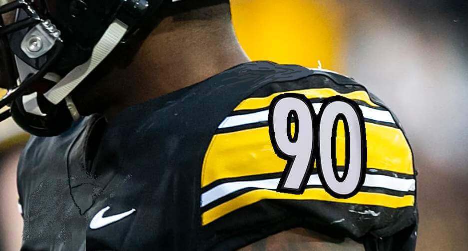
JV: Put TVs in the sleeve stripes.

PH: Another team without TVs. Unlike Jim, I wouldn’t force them on the sleeve. I don’t really think the team needs them, but if they must have them, put ’em on the shoulders, like they did with the prior CR set.
JV: Either move the TVs to the helmet or leave well enough alone. I’m fine with either.
PH: Their TVs are fine on the shoulder. As much as I like helmet numbers, they really don’t need them.
JV: Don’t mess, but feel free to keep the CR jersey for all home games. Alternatively, move the swoosh and put TVs on the sleeve stripes.
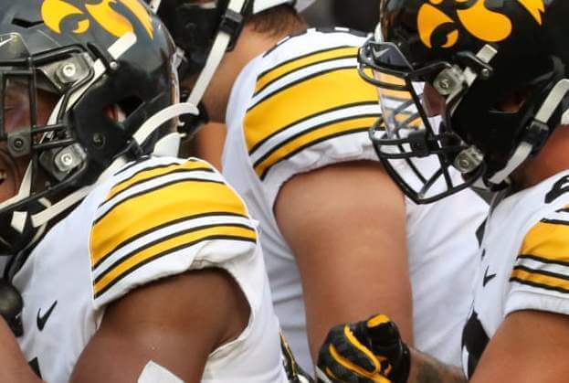
PH: Because the MOTB causes almost every player’s classic sleeve stripe design to be truncated, I’d actually advocate for moving the swoosh to the jersey and regaining full sleeve stripes (just like Iowa does). I know that has nothing to do with TVs (which are fine), but I hate the sleeve cap design. Fix that.
AFC SOUTH
JV: Houston – We don’t have a problem.
PH: They’re a little scrunched, particularly on the down linemen. There’s room on the shoulders — I’d move them up there.
JV: I wouldn’t dream of messing around with this classic.
PH: The Colts have the same problem as Houston. With the swoosh on the sleeve cap, the TVs are too small and tight. However, with the shoulder loops, you can’t move them to the top of the jersey. But…they do have some pretty big helmet numbers, so I’m ok with their setup.
JV: Just make the TVs a little bigger.
PH: These are just fine.
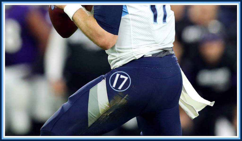
JV: The TVs need to get off the shoulder and move to the hip.
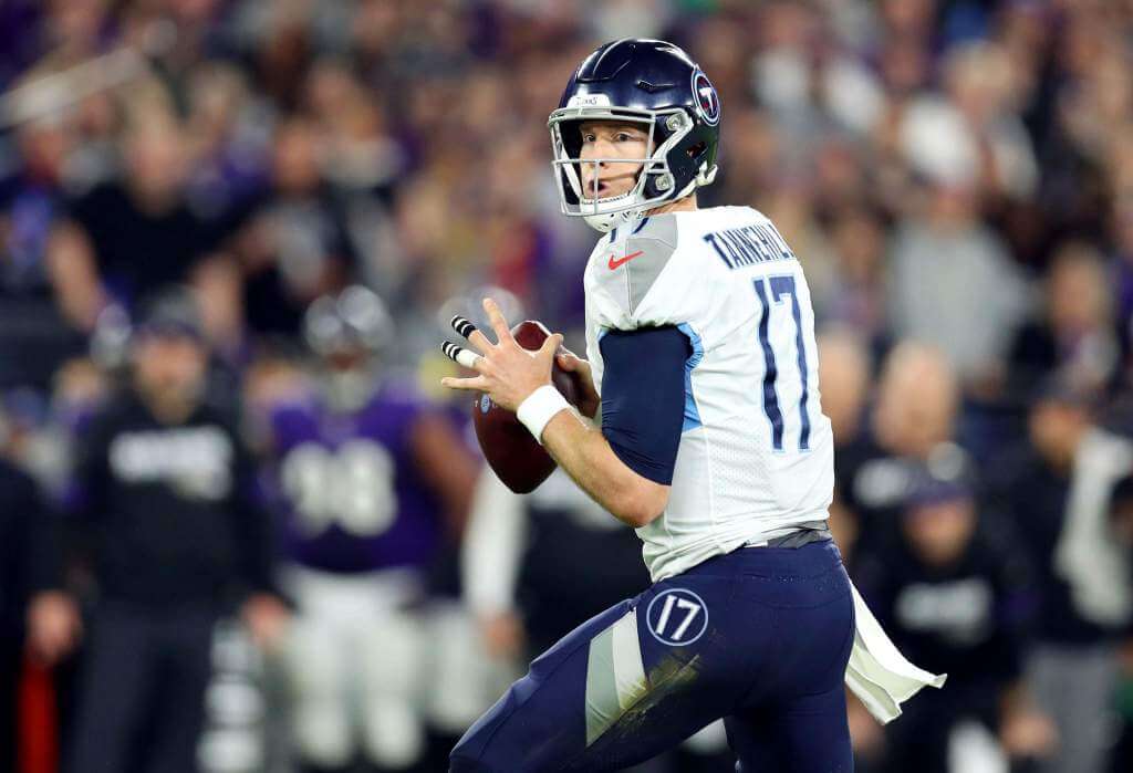
PH: Tennessee’s problem isn’t the TVs…it’s the stupid “sword” yoke. And the fonts. And a lot of other stuff too. But that’s for another day.
AFC WEST
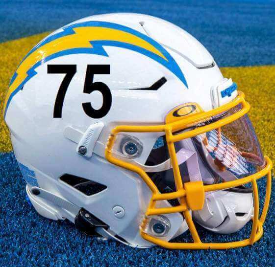
JV: Move them down to the sleeve caps.
PH: They’re fine where they are. They’re also fine on the fauxback/CR jersey.
JV: Don’t touch the best jersey in the league.
PH: Jerseys are fine (but not the best in the league), but they need to remove the Native American iconography on the hat. One could put TVs there, but I’d rather they just add the interlocking KC.


JV: Bring back black helmet #s, and add them to the hips as well.
PH: They don’t need them on the hips, but I’d like them to use black numbers on the helmets as well.
JV: Just leave them alone, baby.
PH: Agreed. They are perfect.
And there you have it — the end of the TV numbers “suggestions”. These may not be ideal solutions (in some cases, it might just be best for teams to eliminate TV numbers altogether, but that’s not an option for this exercise). What do you think? Should “hip” TV numbers come back? Should more NFL teams use helmet TV numbers? Do teams even need TV numbers at all? Love to hear your thoughts and suggestions.

Pittsburgh Steelers Logo Update
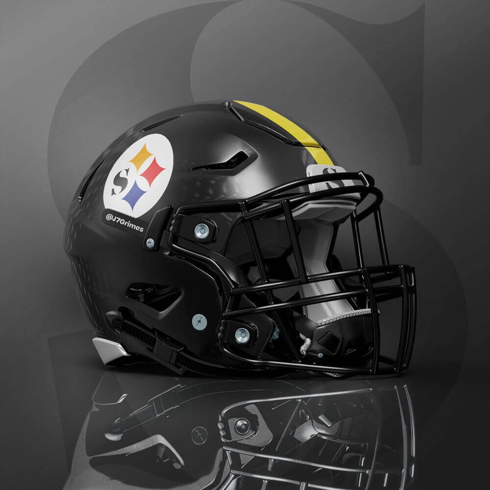
I get many concepts sent to me (keep ’em coming!), including the above “logo update” you see for the Pittsburgh Steelers. However, in what is most definitely a first, our featured artist Jordan Grimes has not only updated the logo, but he’s given a step-by-step tutorial, complete with a video, showing his thought process. I’m sure many of you are thinking “but the Steelers’ logo is perfect” — and I wouldn’t disagree — but Jordan has made a fantastic case for his proposal. Let me turn it over to him now.
Steelers Logo Update
by Jordan Grimes
Design critique never stops for me. So when I kept seeing the Pittsburgh Steelers logo used on T.V. and online it made me question why the logo has not been simplified.
An 8-letter work set in one half of a circle? We can do better.
The Pittsburgh Steelers logo is iconic, unique, and stable enough for an update for the future. Follow me on my logo update journey for the Pittsburgh Steelers.
Goal:
Simplify the Pittsburgh Steelers logo so it’s more legible.
Current logo history and examples
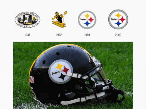
Viewing the logo in multiple sizes shows legibility in the big areas, but once it gets smaller the letterforms start to bleed together and become illegible.
Logo simplification evolution
By simplifying the color and winnowing down to just an “s” this mark is getting somewhere.
“S” Evolution & Logotype
This inspiration for this logotype were the three stars in the primary Steelers logo.

The cross bars of the “E” are actually those same stars but cut in half. With that treatment it was fitting to bring the three star colors over to the three “E”s in the logotype.
Logo at scale
Logo Set
Social Media

Uniform
Thanks, Jordan!

Guess The Game…
from the scoreboard
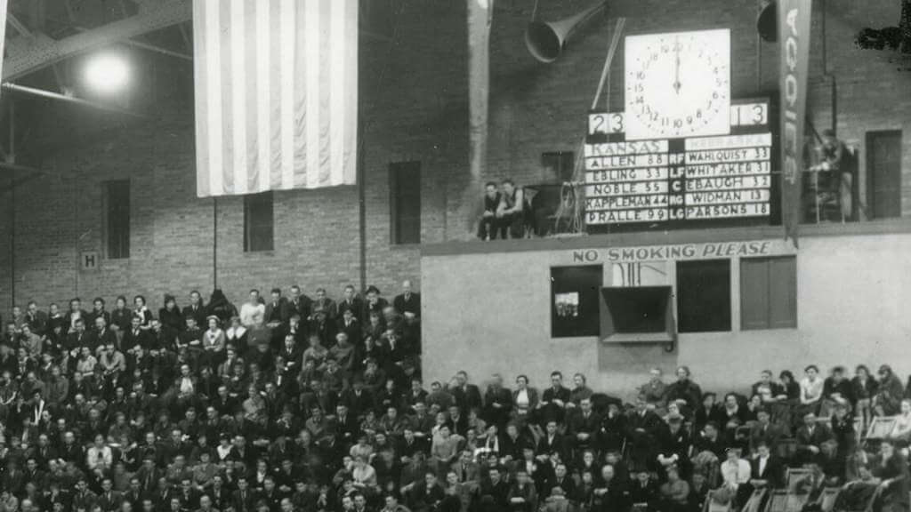
Today’s scoreboard comes from John Benal.
The premise of the game (GTGFTS) is simple: I’ll post a scoreboard and you guys simply identify the game depicted. In the past, I don’t know if I’ve ever completely stumped you (some are easier than others).
Here’s the Scoreboard. In the comments below, try to identify the game (date & location, as well as final score). If anything noteworthy occurred during the game, please add that in (and if you were AT the game, well bonus points for you!):
Please continue sending these in! You’re welcome to send me any scoreboard photos (with answers please), and I’ll keep running them.
Uni Tweet of the Day
The Splinter was always splendid!
Very very young Ted Williams wearing a San Diego uniform. Year is 1936 if I’m not mistaken pic.twitter.com/82hSAcIU4R
— BaseballHistoryNut (@nut_history) November 23, 2021
And finally… that’s going to to it for today. Sorry there was no ticker, but Anthony has the holiday weekend off. I’ll have a full ticker tomorrow.
Hope everyone had a safe and good Thanksgiving, with plenty of leftovers to tide you through! I’ll be back with the SMUW Crew tomorrow as we put a bow on the regular season for College football, with lots and lots of good (and hopefully good looking) rivalry games. Catch you then.
Peace,
PH
GTGFTS: link
Big 8? Big XII? To heck with that noise. Six big state schools in flyover country is all we need.
hypocycloids
: Bring back black helmet #s,
Black is not a Chargers color; making the number light blue is one of the several things they got right. If you must change it, make it navy blue. At least that is in their color set.
True, it’s not a team color..but neither is black as used by the Cowboys, 49ers, and KC, same with gray face masks used by the Colts, Cardinals, Giants and afore-mentioned 49ers.
All of the above look wrong to me (and you?) yet feel right somehow…well, maybe not the Niners helmet logo outline.
Black numbers on the helmet would definitely look better than the powder/yellow, would be historically accurate and easy to read, but then that could lead some to opine that the helmet would then even better with a gray facemask too, and I don’t want to those return.
The Steelers only having a S on the helmet would be the only team with an initial of the team name and not the location (city, state). Tennessee Titans have a T, which I guess could be for either.
I love this evolution of the Steelers’ uniforms. Something that is excellent can still be improved.
Perhaps the use of a “P” instead of an “S” would be more appropriate.
The team actually had to petition the American Iron and Steel Institute to change the wording from “Steel” to “Steelers”; the logo is AISI’s steelmark that’s used to identify steel products.
OMG, here we are again with the TV numbers. Anyone thinking TV numbers are still relevant probably has a land line connected to a black telephone that has a circular disk with holes around the circumference.
Don’t remove the arrowheads from the Chiefs’ helmets. Streamline them or make an isoceles triangle with a concave trailing edge.
I generally prefer TV numbers to logos… the Patriots are much improved ditching the sleeve FEs, correct?
If the Titans ‘must’ use hip numbers, they ‘need’ to take a cue from the helmet logo …number in a circle with the flame.
Chiefs helmet logo has to go? Ok, go with a Dallas Texans-inspired approach…white Missouri decal with a star where KC oughta be.
You can’t clutter the Bengals helmet, and the jerseys look so good without TV numbers. Cmon, give them a pass!
I’m one of the few ‘round here who like the Dolphins current uniforms, especially since they tweaked them after the initial roll out. Keep the throwbacks as throwbacks.
Ohio State at Michigan…
I wish Michigan would have come out in their yellow (or maize) britches.
I don’t know who’s in charge at Michigan, but at some point the alumni are going to put their foot down. One of the best uni matchups in history and Michigan looks like a rec team.
Mich looks like a HS team.
OSU Played like one.
Don’t mess with the Steelers. Need to go back to block numbers and the uniforms are perfect. Without TV Numbers interrupting the sleeve stripe.
I’d never thought of it before, but now that it’s been brought up, the whole word “Steelers” in the logo does look a little smooshed and hard to read. I can support this redesign.
My vote would be for the Steelers to stick with their current design — I think there’s a place for logos that show you something new when you get up close. Some of my favorite uniform memories as a kid involved figuring out the logos that weren’t self-explanatory and obvious from a distance (Steelers, Pat Patriot, Broncos’ “amoeba” emblem, Jets with the subtle “NY” in the background, I even had trouble seeing the “KC” on the Chiefs’ arrowhead intitially).
I think small details to logos can be especially effective in an era where the designs are being blown up to huge proportions at mid-field and in the endzones, and being given over-sized treatment on sweatshirts, etc.
That said, this is a strong design that I’d be happy to support if it had more of the kind of tradition behind it that the original has.
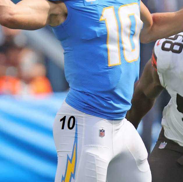
Also, I really like the sky-blue numbers on the current Chargers helmet — yes, not as readable as black or navy blue would be, but it’s a nice additional splash of the team’s great primary color. And in an era where teams are more and more going with no TV numbers at all, I don’t have a problem with marginally less readable TV numbers.
Jim Vilk says about the Colts:
“I wouldn’t dream of messing around with this classic.”
Kinda surprised by this…I thought for sure he’d suggest the hip-number-in-the-horseshoe look to return (they only appeared on the silver road pants used in the 80’s…if they won’t swap out the gray face masks, why not bring those back?)
Notice how many Michigan players were without the jumpman logo today? Then we had a bunch with only part of the logo on. Were the logos just ironed on and they came off in the dryer?
Hey Jordan – as much as I enjoyed reading your item about the Steelers logo, I respectfully disagree that you’re trying to simplify it.
The three colored “E” treatment, and adding the “S” is exactly the opposite of simplifying it -it makes it more cluttered and more complicated, almost as if you’re asking “why this?”, so someone can tell a story behind the details. …and we know how the Uni-master hates those stories!
That interlocking ‘kc’ looked fantastic.
The only thing that needs to change with respect to the Pittsburgh Steelers is that THEY NEED TO GO BACK TO VARSITY ON THEIR JERSEYS. They ruined their look in the 90’s by switching to Fuji (or whatever they’re calling that horrid font they migrated from its helmets), and if there’s any saving grace in the Rooney family’s slow release of the grip they have on that franchise, it’s that their new owner, whenever it may come, may make things right again by restoring VARSITY to the uniforms.
Scoreboard
Halftime Kansas 23 Nebraska 13 at the Nebraska Coliseum on Sunday February 23, 1936.
Kansas won the game 43-36 to move their record to 16-0 and 8-0 in the conference. The Jayhawks started the season 21-0 before losing it’s final two games of the season to Utah State in the “Olympic Playoffs”. In 1936, the Olympic basketball trials consisted of a tournament between top teams from the Amateur Athletic Union, the YMCA and the National Collegiate Athletic Association. One notably absent team from the tournament was the 1935–36 Long Island Blackbirds, who had just completed a 25–0 season behind stars Jules Bender, Ben Kramer and Art Hillhouse. The largely Jewish Blackbirds team boycotted the trials due to the games being held in Berlin.
The first guess the scoreboard is Rangers Ballpark in Arlington – game was the evening of May 30, 2012 in the last of a 3-game series against the Mariners. With the series tied at one-game a piece, the Mariners smoked the Rangers 21-8. Journeyman lefty, Derek Holland got the start for the Rangers, and while he got going quickly striking out two in the first inning, he lasted just 5 outs, giving up 8 runs on 8 hits in the top of the 2nd. Yoshinori Tateyama got them out of the inning but imploded in the very next frame, giving up 8 runs on 7 hits while only securing a single out. What you’re seeing on the scoreboard is a picture of the Stony Brook Seawolves baseball team who had just won their Conference Championship. The Seawolves home field (Joe Nathan Field) is the namesake of the Texas Rangers’ closer at the time, Joe Nathan.