For all photos, click to enlarge
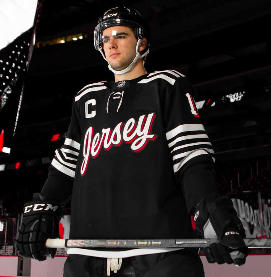
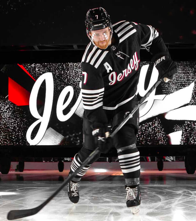
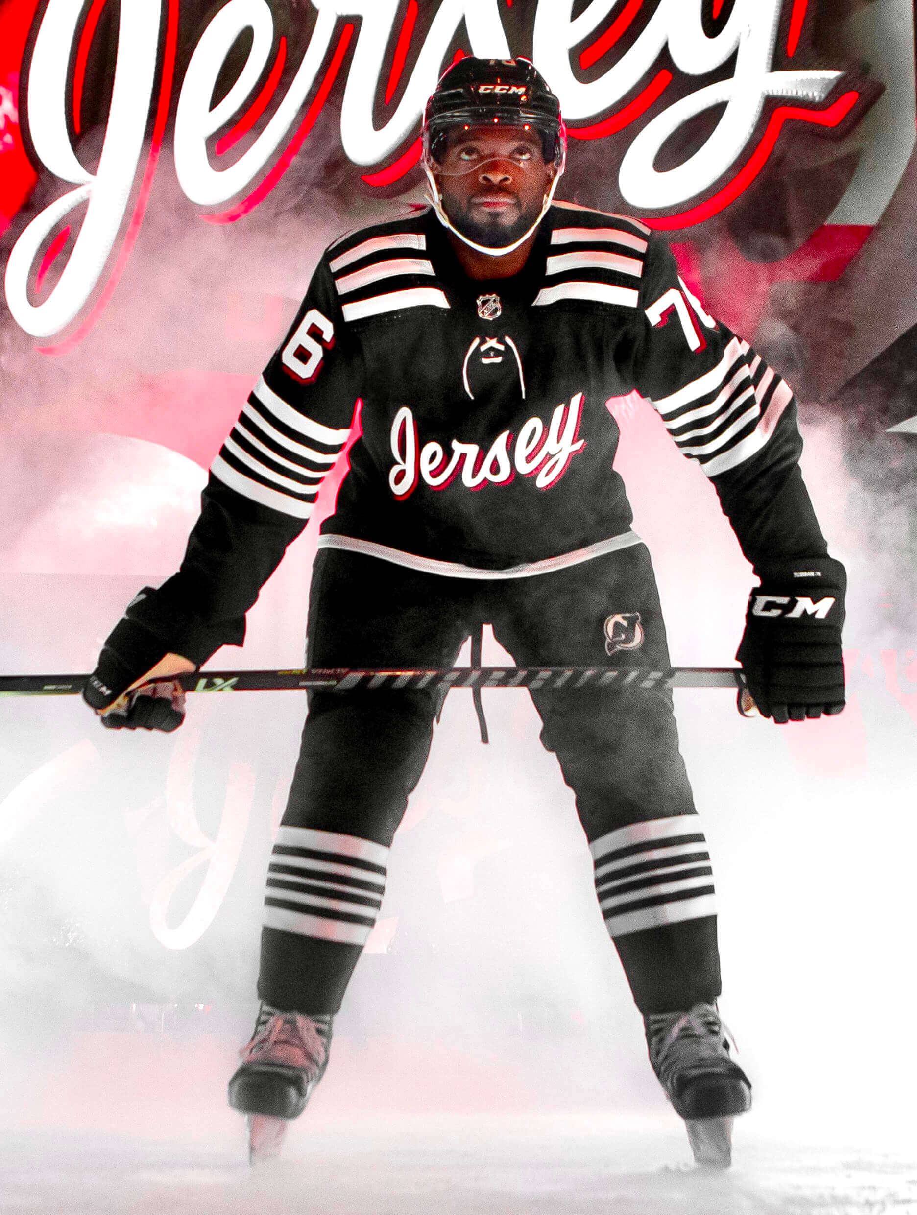
The Devils, confirming earlier leaks, made it official yesterday and unveiled their new “Jersey” uniform — the first alternate uni design in the team’s history.
Here are some additional photos:
And here are some rear views:

Some notes and observations:
• Former Devils goalie Martin Brodeur had a hand in the design. Full details on that here and here.
• The “storytelling” silliness is summarized in this handy graphic, which saves me the trouble of trying to tell you about it with a straight face:
• Back in the preseason, people noticed that the Devils had added a dark-grey version of their logo to the left pant leg. At the time, I didn’t understand why they’d remove the red from the pants logo, but it makes a lot more sense in the context of this new alternate uni.
• When New Jersey’s new “Jersey” jersey (I just like saying that) leaked over the weekend, I noticed something odd about the chest script. Take a close look here, and look particularly at the space between the s and the e (clicking to enlarge is definitely worthwhile here):
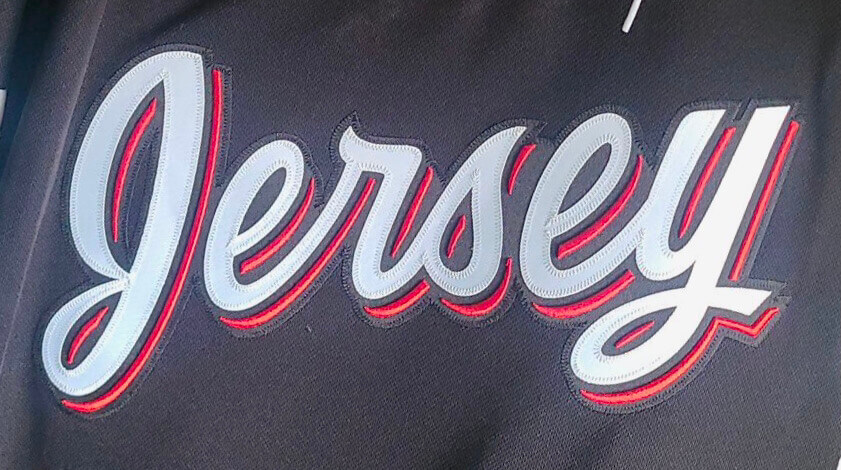
See how the black layer in between those two letters obscures part of the red layer? Ugh, that really bugs me! One of those “can’t unsee it” things. (Sorry about that.)
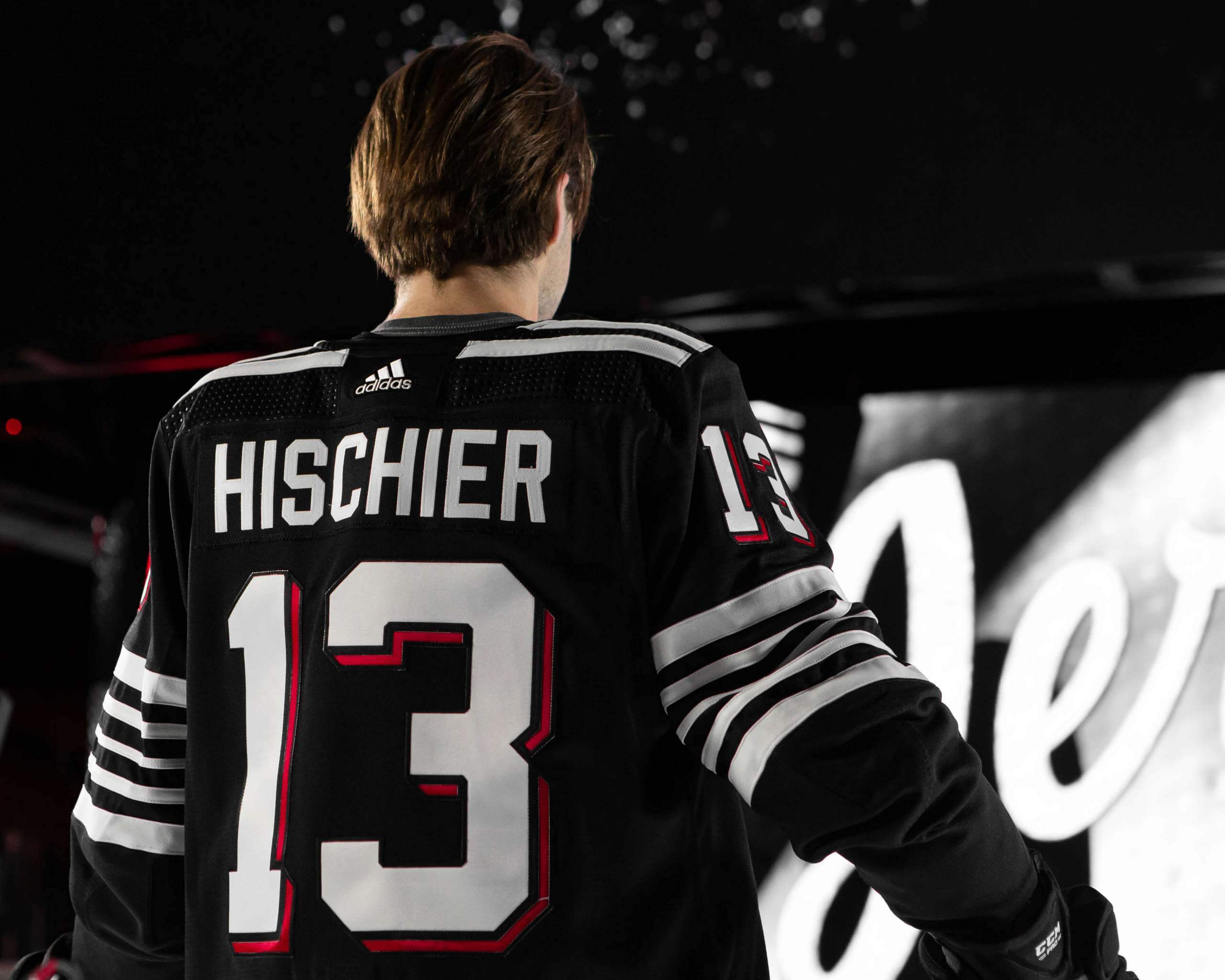
• This uniform will be worn 13 times this season. The first of those games will be Dec. 8; the other 12 games will be announced this Friday. But here’s the beauty part: They’ve actually created a bullshit “storytelling” angle for the number of games the jersey will be worn! Quoting from the press release: “New Jersey will wear the sweater 13 times — as a nod to Devils captain, 22-year old Nico Hischier, who wears jersey #13.” That transcends stupid and achieves unintentional hilarity-bordering-on-genius! It also establishes a new precedent: I fully expect — nay, demand — that all teams going forward will now tie the frequency of a uniform’s use to some meaningless factoid dreamed up by the marketing intern. New heights of inanity await! (Also: As Twtter=er @The_JerseyNerds points out, it’s a good thing P.K. Subban isn’t the Devils’ captain, since he wears No. 76.)
• Remember how the Devils previously announced that their helmet ad would feature a local Black-owned business for 13 games this season? Those 13 games will be the games when this new uniform is worn. (It’s not yet clear, at least to me, what the business will be.)
• Kudos to Twitter-er @svoktish1 for a brilliant rejoinder to one of the Devils’ silly hype slogans:
It literally says “Made in Canada” not Made In Jersey like the title of your tweet pic.twitter.com/fbvv00K5pw
— B. J. C. (@svoktish1) November 23, 2021
• As for the uni design itself, a little bit of red trim in the striping would have gone a long way. And it seems weird for the yoke, sleeves, and socks to be so stripe-centric and then not to have the usual belly stripes. Makes the lower part of the jersey feel a bit barren.
———
And there you have it. Oh, except for all the obvious “jersey”-related jokes (which we already went through a few days ago, when discussing the leak). Hell, even the Devils themselves are making them now:
Coming soon… maybe. pic.twitter.com/Aq2wUWZYS0
— New Jersey Devils (@NJDevils) November 23, 2021
Not a good uniform, but definitely a good joke — in more ways than one.
(Big thanks to Trevor Williams for bringing @svoktish1’s tweet to my attention.)
Giving thanks: With Thanksgiving taking place tomorrow, my Bulletin piece this week is an essay about things in the uni-verse that I’m thankful for. As most of you know, life has been a bit complicated here at Uni Watch HQ lately, so it was good to work on a piece where I got to count my blessings (which are numerous!).
Those of you who’ve subscribed to receive my Bulletin content via email should already be seeing this piece in your in-boxes. Everyone else can read it on my Bulletin page. Enjoy!
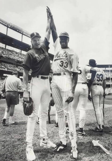
Too good for the Ticker: Who’s that in the Mets uniform at the 1993 MLB All-Star Game, looking like an even bigger unit than the Big Unit? The uni number should give you a hint — it’s none other than New York Knicks star Patrick Ewing! Looks like Tom Selleck in the background, too.
I think we’ve seen this photo before, but it came across my radar yesterday and I figured once more wouldn’t hurt, right?
The Ticker
By Lloyd Alaban

Baseball News: The Mets will keep wearing their BFBS alts on Fridays next season. … An Ohio high school accused of poaching the Tigers’ logo has reached an understanding with the team (thanks to all who shared). … Remember how the Royals hid a “Nice Try” message in their recent uni tease? Here’s how to do that (from our own Brinke Guthrie).

Football News: Mono-black for the Ravens this Sunday (from Andrew Cosentino). … UNC and the NFL are having Tar Heels players wear high-tech mouthguards to measure head trauma (from James Gilbert). … The coffee tables inside the President’s Box at the Los Angeles Coliseum are shaped like mini Coliseums (from James Gilbert).

Hockey News: New Olympic unis for Canada. Additional photos here (from multiple readers). … USA Hockey will reveal new uniforms at 10am ET today (from @Yff26).

Basketball News: New GFGS unis for Temple women’s (from @RF_30). … A surfboard featuring the autographs of all the head coaches at this year’s Maui Invitational is up for auction (from Ignacio Salazar). … The D League’s Wisconsin Herd will wear jerseys featuring a collage of art by local artists on Nov. 29 (from Brian Kerhin).

Soccer News: The first three items are from Trevor Williams: Argentina could be wearing purple as an alternate kit for the World Cup. … Swedish side Malmö wore their away kits at home yesterday to avoid a kit clash with Zenit. … New Christmas shirt for German side 1860 Munich (also from Ed Zelaski). … Italian side AS Roma is adding a sleeve patch to raise awareness of violence against women (from @Sebastian42195). … Multiple readers last night commented on how much they liked the purple-vs.-gold matchup between Nashville and Orlando City. … French club Saint-Étienne is letting fans vote on a new crest (from our own Anthony Emderson).

Olympics News: Cross-listed from the Hockey section: New hockey unis for Canada. Additional photos here (from multiple readers). … Canada has also revealed its its curling jerseys, which have an Indigenous theme (from multiple readers).

Grab Bag: New logo for Brazilian women’s volleyball club Osasco (from Jeremy Brahm). … New 100th-anniversary logo for Monza, home of the Italian Grand Prix (from Rob Altman). … New uniforms for the Royal Australian Navy (from @SVeillance). … During the recent women’s rugby union test match between Wales and Canada, Canadian player Emily Belchos De Goede wore full leggings. “She was the only player to do so,” says Graham Clayton.
Our latest raffle winner is Amy Marantino, who’s won herself a Uni Watch Alternate Cap. Congrats to her, and thanks to birthday boy Chris Hickey for sponsoring this one. — Paul
The break in the red between the ‘s’ and the ‘e’ doesn’t bother me as much as the fact that the two letters don’t connect. If they did, the break in the red would make sense.
Devils fan here. I am underwhelmed by the Devils alternates. The whole uniform set is somehow both too busy and boring at the same time.
As someone born and raised in New Jersey and a life long fan of the Devils, I can tell you the last thing this state and team need is the re-enforcement of Jersey being a joke. New Jersey gets enough of that as is, and the Devils have to fight to be taken seriously in their own market in the first place. The Jersey jersey does not help.
That ASU uniform combo was for their game last week
Right. Removed.
That ASU jersey combo was for last weekend’s game against Oregon State. As far as I can tell, the uni combo for this week’s game has yet to be revealed.
What I noticed was no red in the closed loop space for both of the ‘e’.
Another Devils fan here who is also disappointed in these unis. After the glory of last year’s Reverse Retro look, these are a letdown (I’m admittedly partial to the green and red). Perhaps they will look better on the ice. And if they win while wearing them, no Devils fan will care!
The barren waistline could represent the Pine Barrens! … ugh, just shoot me now for that one.
If they really wanted to have that historical mashup fauxback look, they should’ve used the vertical shoulder stripes of the Jersey Larks, which would make the uniform look less early-Chicago Black Hawks-ish. All in all, a pretty disappointing set.
Can’t believe we had some great Reverse Retros in the NHL last year and the uniforms were for one season only. Such a shame many were one and done. Many of them should have stayed around as regular alternates and were better than the new regular alternates being introduced this year by teams. Just sayin’ Devils.
link
There’s an unmentioned aspect here.
The New Jersey Devils weren’t named the Devils just because of some random “ooohh… scary!” notion of a hockey team named for demons from hell. The Jersey Devil is an embedded, historic, part of the state’s folklore.
link
So it makes perfect sense, to me at least, that they are at last, the Jersey Devils. Maybe, just maybe, this should have been their name all along.
One of my friends from law school is a Devils fan. We went to Rutgers-Camden, so she has the unusual fandom mix of the Devils, Phillies, Sixers, and Eagles.
I used to say things like, “What poor hockey team abandoned you that you had to pick up the Devils?” At first, she was angry at me, but we became friends over fun hockey rivalry.
So, as a Flyers fan who moved to NY and married a Rangers family and has friends like that. . . what an ugly uniform.
The Devils could have made their new sweater a little less busy by limiting their stripes to 14 since the seven South Jersey counties are in Flyers Country. But being inclusive is nice.
As a lifelong native of the Pork Roll half of the state south of I-195, you are right – this is Flyers country. I actually love this jersey and I am not a Devils fan but I would consider getting one for state pride. The 21 stripes is totally pandering but it is nice to be inclusive. And anything less than 21 would have been a giant middle finger to a portion of the state for no reason. So they lose nothing by doing it, even if it doesn’t mean more sales.
The Jersey looks like what you’d get if the Islanders Brooklyn B&W atrocity had a child with the Ottawa awful SENS third, but between the two of them they could only afford a generic font for their offspring.
Are there any Indians on the Canadian curling team?
If I had the Photoshopping skills to pull this off (and I have none), I’d have done the Devils jersey in Pathmark generic No Frills style. THAT would’ve been something … and still represented Jersey.
Nostalgia move. I miss Pathmark.
Looks like the celebrities at the home run challenge at the MLB All-Star Game in Baltimore in 1993 were Ewing, in Mets, Selleck, in Orioles, Michael Jordan, in White Sox, Bill Murray in Cubs. The other celebrities, coached by Reggie Jackson, were Ahmad Rashad, Jim Belushi and Florence Griffith Joyner. An Upper Deck patch was affixed to the right shoulder. I see YouTube has footage of an old-timers game from that week, and clips from the celebrity home run challenge are shown prior to the player introductions at the all-star game.
“… Michael Jordan, in White Sox,…”
Are you referring to the player standing behind Ewing/next to Selleck? I’m not sure that’s Michael Jordan. He wore #23 for that celebrity game, which pre-dates his #45-wearing minor league baseball career by a year…and I doubt he’d be wearing anything but Nike cleats(?). High top Reeboks…could be Frank Thomas just hanging around.
Speaking of cleats, any idea what brand Ewing is wearing?
While I really don’t like the devils new alts. They missed a built in story line for wearing it 13 times. The Jersey devil was the 13th child they could and should have went that route if they wanted story telling rather than oh our captain wears 13 so we’re going with that.
2022 US Olympic Hockey jerseys … I think they look like a christmas sweater
link
Looks to me like Tommy Hilfiger designed the USA sweaters. Ugh. USA has so many great designs in their past. These new designs, most of them since 2002, just keep going downhill. If they ever decide to keep wearing the 1960-style jerseys forever, I would be very fine with that.
Man, and I thought that Canada’s were bad
Two-parter: (1) Why doesn’t Chris Creamers/sportslogos.net have uniform tracking data for 2021? (2) What was the Mets’ record in black last year?
While I can’t say for sure why Chris stopped updating the tracking data, I know that all the data entry for that is a lot of work, so maybe he just ran out of time/energy.
Did you notice that the BFBS Mets jersey was redesigned? They removed the blue piping (but left it on the sleeve).
Is this what they’re now wearing on the field? Or is it just for the retail versions?
Good question.
Did you notice that the Mets redesigned the Black Jersey? They removed the blue piping (but left it on the sleeve). Is this intentional or is this a mistake in the promotion art?
Here’s a couple color photos of Ewing actually *playing* baseball in the Mets uniform.
link
I’m a little baffled that the Detroit Tigers would take issue with that high school’s logo. Pro sports logos are constantly poached by high school teams from coast-to-coast. Sometimes they are cleverly altered but often it’s just a straight copy. But simply having a tiger that’s facing forward? Weird fight to pick.
And in the “Once you see it, you can’t un-see it” category; the Jersey chest script now looks like two words, Jers and ey.
For the most part I like the design of the Devils jersey, but does it need to be black. Same design with green and red incorporated would be great.
I support Dwayne’s comment, as of now looks too much like that old Chicago Blackhawk uniform that gets recycled every now and then.
I’ve said this before, the only thing that could make the Lions game tomorrow remotely interesting, is if they played it at Co-America.
The Mets will keep wearing their BFBS alts on Fridays next season…
…notwithstanding that their season fell apart as soon as they started wearing them. But, they wouldn’t be the Mets if they didn’t get everything wrong…
The new Devils alternate is alright. Maybe it will grow on me. They could’ve just made a black version of what they already had
I kind of like the Devils alt – the fact the Newark Bulldogs and River vale Skeeters had similar striping is a nice connection. If they’re going to use those teams, along with the Jersey Larks as the inspiration, then two stripes at the bottom of the sweater, like Paul said, would have made more sense. But then they wouldn’t add up to 21, and taking ONE stripe off from somewhere else ruins the symmetry. Maybe 21 white stripes and one orange one symbolizing: “construction area.”
The dark space between the “s” and “e” could be about half as long and still create the effect of the red layer being below and to the right of the top white and black ones.
Re: Argentina in purple
If you own Fifa 98 (the Road to the World Cup version), Argentina is, for some unknown reason, kitted in purple for its change strip. Never figured out why.
I don’t think it’s a bad uniform
I agree, Kevin, it’s pretty good! I think the script is the weakest part, but overall it looks like a solid template!
Those Jersey unis…ugh. All that marketing gobbledygook reached it’s zenith when I read the Third Jersey Fridays would be sponsored by Heineken. Joe Piscopo must be rolling over in his grave right about now. ;-)
Looks like Canada is leaning heavy on the black Olympic unis. Do not like.
Why wouldn’t Tom Selleck be “playing” for the Tigers? Odd move.
I’ve never understood why the “storytelling” is bothersome to some people. I mean, we all appreciate symbolism, right? Is there some magic line that gets crossed where there becomes too much symbolism? I mean, your captain’s number is a fairly mundane thing to honor, but it still seems harmless enough.
Symbolism is fine, if it makes sense. The problem with “storytelling” is that it often *doesn’t* make sense. It’s usually just a box to check — “We need three ‘stories’ on this jersey, so come up with some!”
Also: It’s insipid and insulting to people’s intelligence. We all know that they didn’t choose 13 games to honor the captain’s uni number, so why pretend that that’s the case? It’s pathetic and diminishes all of us.
Also-also: It often leads to bad design. Instead of choosing 21 stripes to match the number of counties in the state, how about choosing a stripe pattern because it, you know, LOOKS GOOD, instead of worrying whether there’s any “storytelling” built into it? Instead of coming up with a number font that “honors” the design of a building on campus (or whatever), how about using a font that’s, you know, LEGIBLE? And so on.
Nobody even remembers most of the “storytelling” bullshit half an hour after the unveiling anyway. But we’re still stuck looking at the bad design that results from it.
Agreed. I think a lot of it just stems from the majority view here that anything old is awesome, anything new sucks.
For example, nobody complains that the on the US flag the stars represent the current number of states and the stripes represent the 13 original colonies. Because it’s always been that way.
Because it’s always been that way.
Correction: Because it’s actually a GOOD DESIGN that works. And duh, of course *flags* have symbolism — flags ARE symbolism. They’re not apparel, you don’t have to be able to read them (good thing, because you wouldn’t be able to count 50 stars without losing track), etc. Not a good comparison to uniforms.
The flag didn’t always have 13 stripes. From 1794 to 1818, the flag had 15 stripes reflecting the addition of KY and VT. By 1818, Congress acknowledged that moving forward with one stripe per state was impractical (there were 19 and soon to be 20 states) and chose to revert to 13. If you look at the Ft. McHenry/Star Spangled Banner flag, the 15 stripes do look squeezed.
One thing I like about the Devils’ new sweater is the red shadows on the numbers. It really pops out given the dull colors that make up the rest of the sweater. And Rutgers football had just about the same style, but with the colors swapped, around 2000 or so.