By Phil Hecken & the SMUW Crew
Follow @PhilHecken
Good Sunday Morning Uni Watchers — I hope everyone had a pleasant Saturday.
Huge game out in Utah last night, as the #3 ranked Oregon Ducks got their tails handed to them by the #24 ranked Utah Utes (although the Utes were favored to win). For those of you who are attuned to such things, this means not only will Oregon (or any Pac-XII team) miss the CFP — College Football Playoff — but if things shake out right for them, it also means that for the first time ever, a non-Power 5 team, undefeated Cincinnati, could be in the Playoff (since the CFP went to the 4-team playoff format in 2014).
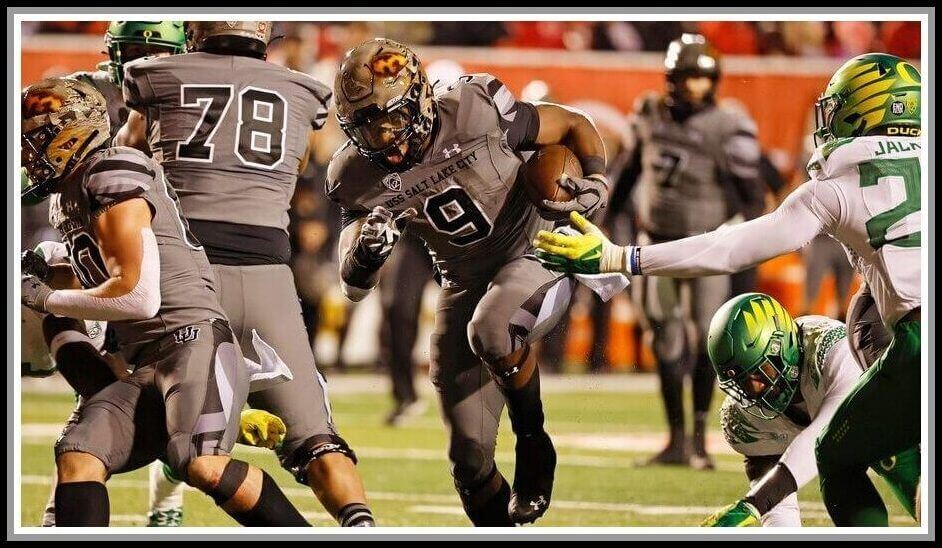
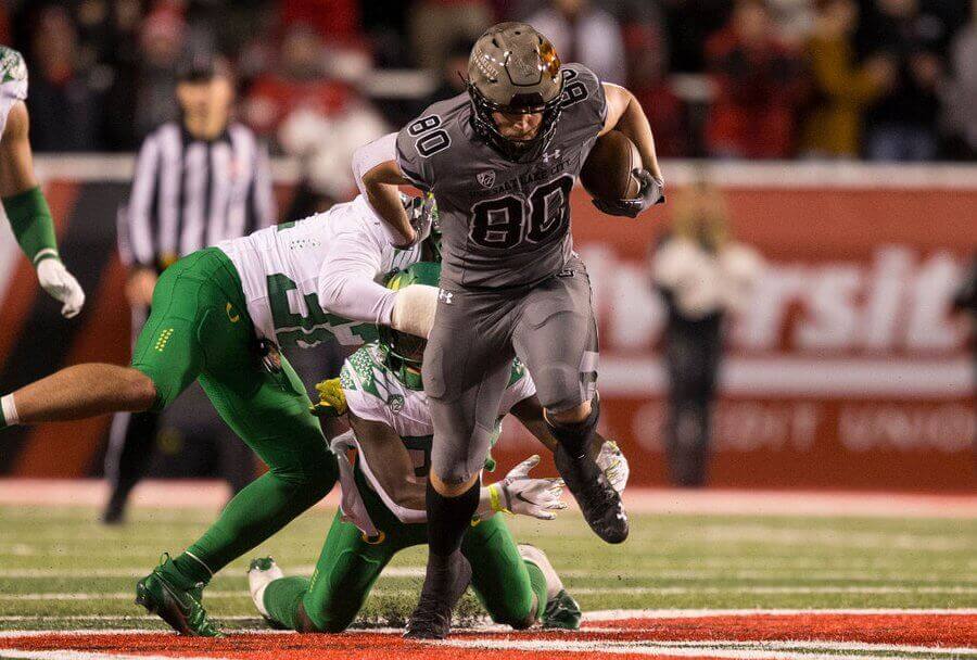
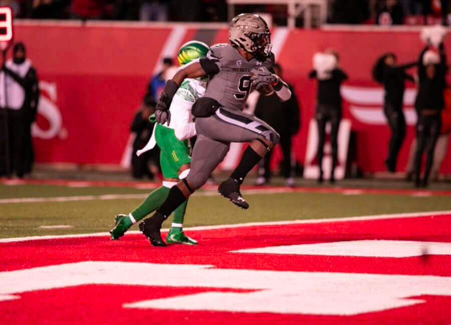
But here at Uni Watch, the even bigger story was the special one-off unis worn by Utah. As you can see, they’re mono-gray, with a very interesting helmet.
The Utah Utes unveiled this uni earlier this year (which I wrote about here — scroll down) which “pays tribute to the United States Navy ship USS Salt Lake City and its crew, which had the most combat engagements in the Pacific Fleet during World War II.”
This article has a good rundown of the uniforms:
Utah’s uniforms are dark grey — the color of the ship — with camouflage accents on the shoulders and sides of the pants that match the camouflage painted on the USS Salt Lake City.
There is also a battle star on one of the shoulders so that when the Utes are on the field, there will be 11 battle stars to represent the 11 battle stars the ship earned.
“One Ship Fleet” is on the back neckline of the jersey.
Here are some good looks at the unis described above:
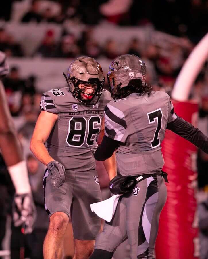
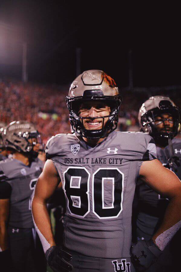
But the real star of the show was the helmet. Believe it or not, they were all handpainted (over the course of a year!) by an artist known as Armando Villarreal. Each one featured an air-brushed scene of the USS Salt Lake City in a battle from the Second World War. Check out this video of how they were created:
USS Salt Lake City helmets behind the scenes. Thank you so much to my wife @lorakatherine for all the help. @Greg144E for the video. @UtesEquipment @Schutt_RepCMac @schuttsports @Utah_Football @Tucker_Petre @SportCoatNA pic.twitter.com/ywY8MgDFAa
— Armando Villarreal (@AVStudios) November 16, 2021
I’ve said I’m not a “helmet guy,” but I’m pretty sure even the hardest core of helmet fans can appreciate this. Wow. You can read more about the artist and his creation here.
I won’t go into the symbolism and merits of whether college teams should play dress up soldier, but strictly as a uniform, I didn’t hate it. Gray is never an attractive color for a uniform, let alone one accented with grayscale camo, but they looked pretty decent on the field. It was impossible to really make out the intricacies depicted on the helmet from the stands, and the numbers were difficult, but not impossible to read, but it was easy to discern the teams. You can get an idea of how they looked in action (both close and long shots) in this video:
UTAH 78-YARD PUNT RETURN TO END THE HALF 🤯
The No. 23 Utes are dominating No. 3 Oregon 28-0
(via @pac12)
pic.twitter.com/kmGl7Phy9e— Bleacher Report (@BleacherReport) November 21, 2021
Duck fans will probably never want to see these unis ever again, but for one game, I could appreciate the effort. And how cool were those helmets?
And with that, here’s TJ with the rest of your…
Sunday Morning Uni Watch
by Terry Duroncelet, Jr.
From Wednesday:
• I don’t know what it is, but there’s something especially-cursed about the brilliantly-royal blue lids over mono-black for school name that’s as long as an Underøath song title Buffalo.
From Friday:
• You know this meme? Apparently, it manifested itself in Southern Miss’s NOBs, and in particular, Frank Gore Jr.’s name had a canyon gap for the ages.
• As with all things in life, you need to have balance, so here comes Nevada with some microscopic NOBs.
From Saturday:
• It’s that time of year again. And like every year, it never disappoints. Gotta love L.A., or should I say “__la”? (h/t to Tim Dunn)
• Michigan broke out the navy pants for (I think) the third time this season against Maryland.
• UTEP wore their Texas Western unis against Rice.
• Tulsa wore their red alts against Temple.
• Andrew Cosentino noticed how weird and warped the NOB of Miami Hurricanes RS Freshman Jared Harrison-Hunte looked. Based on the right shoulder pad, I’m guessing that this was after a play, and his pads had shifted a bit.
• L.J. Sparvero spotted a placekicker wearing #66, which I feel we don’t get to see many placekickers wear numbers in the 60s all that often.
• LSU not only wore purple at home against non-conference opponent Louisiana-Monroe, but they also wore white helmets and pants.
• Oregon State wore their sweet Fiesta Bowl throwbacks against Arizona State, and here’s a close-up of the decal they had on the back of their helmets.
• Literally Cal’s best road look, why fool with anything else?
• Built-in hand warmers –while not new in and of themselves– are new over at Tennessee, as shown in this thread.
• Sometimes, the grass isn’t always greener on the other side: sometimes, it’s wetter.
Thanks, TJ. And now on to Jimmer’s 5 & 1…


Jimmer Vilk’s 5 & 1
After more than a decade in hiatus, the original “5 & 1” decider, Jim Vilk, has returned! Jim began doing the 5 & 1 many years ago, followed Catherine Ryan, Joe Ringham, Michael “Memal” Malinowski, and several guest pickers. Once again, Jim will pick HIS 5 best looking/1 awful matchup, and occasionally have some honorable mentions (both good and bad). You may agree and you may disagree — these are, after all, just opinions and everyone has one. Feel free to let him know what you think in the comments section.
If you have a game you feel is “worthy” of consideration for the 5 & 1, please either post it in the comments below or tweet Mr. Vilk @JVfromOhio.
Here’s today’s 5 & 1:
It was a late night, so let’s just get to it, shall we?
Honorable Mentions to
Rice/UTEP
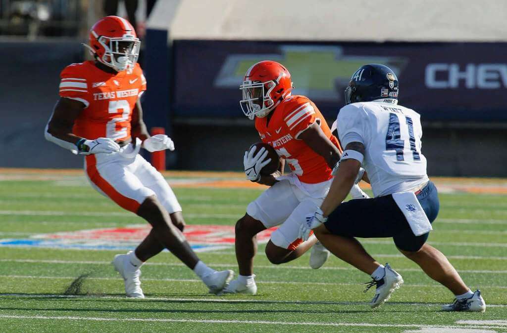
The Miners surprised me by bringing out the Texas Western throwbacks again.
Michigan/Maryland
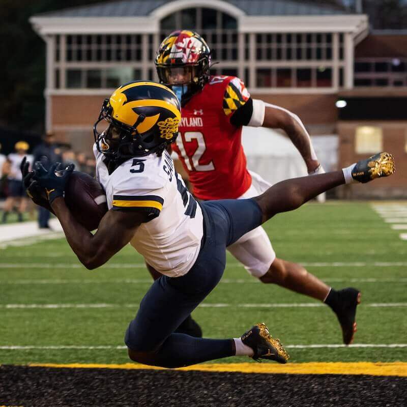
Must be the blue pants, because I wrote this game off until I saw it.
5. Western Michigan/Eastern Michigan
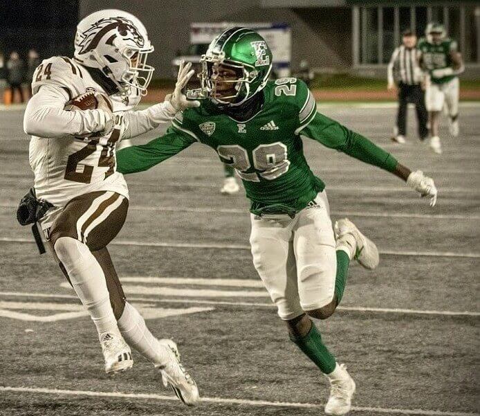
I started with this in the HM category, but each time I looked at it I liked it more.
4. Temple/Tulsa
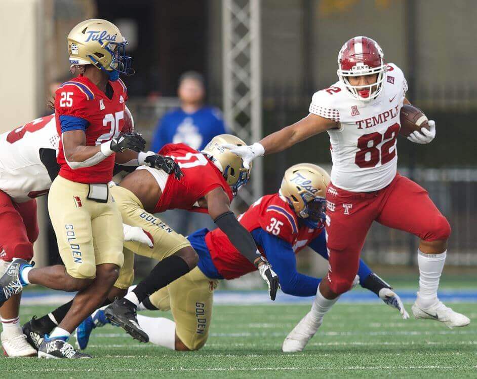
One of those “Why am I even looking up this game, it’s not gonna…WHOA!” surprises.
3. Charleston Southern/Georgia
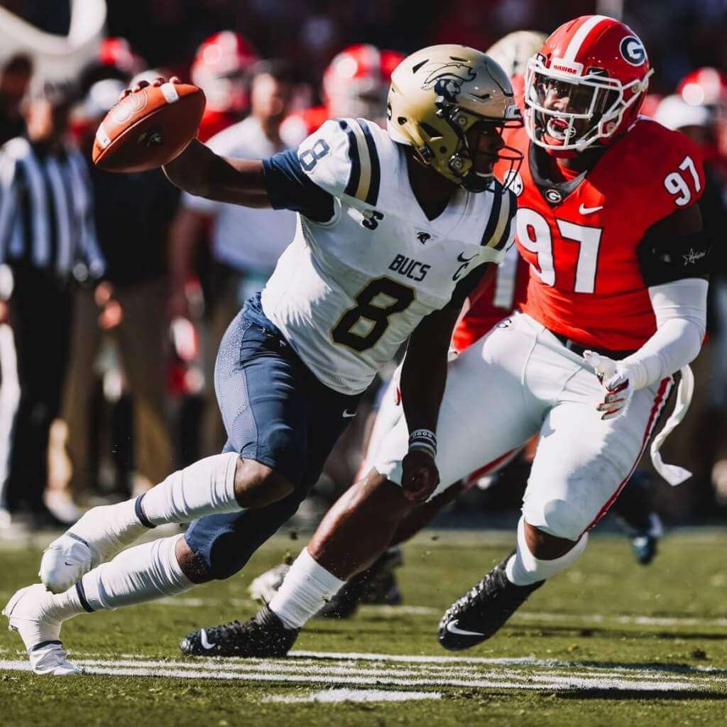
A cupcake game with a sweet matchup!
2. Cal/Stanford
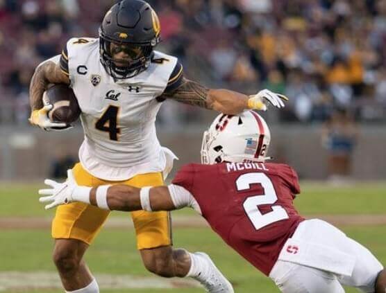
Optimal contrast, and I love the Bears’ sleeve caps.
1. UCLA/USC
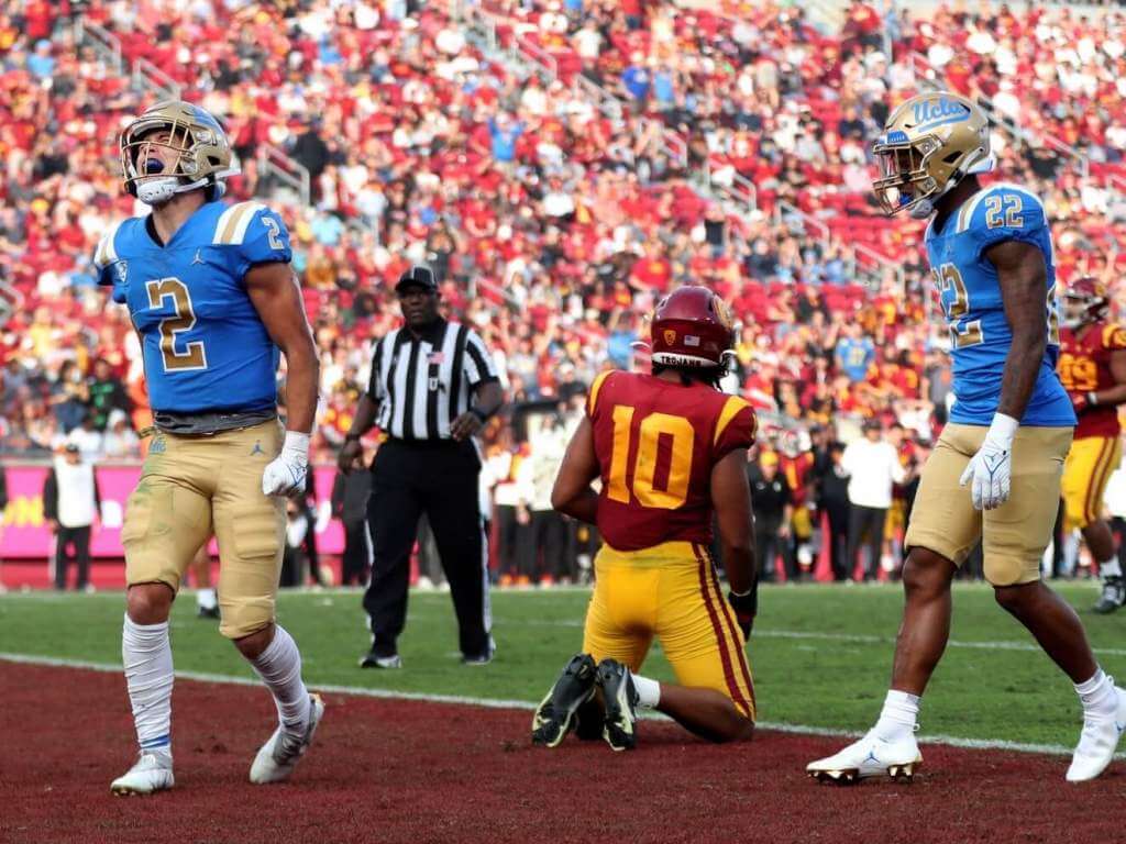
Because Phil would fire me if I didn’t…and for once I agree with him.
Dishonorable Mention to
Toledo/Ohio
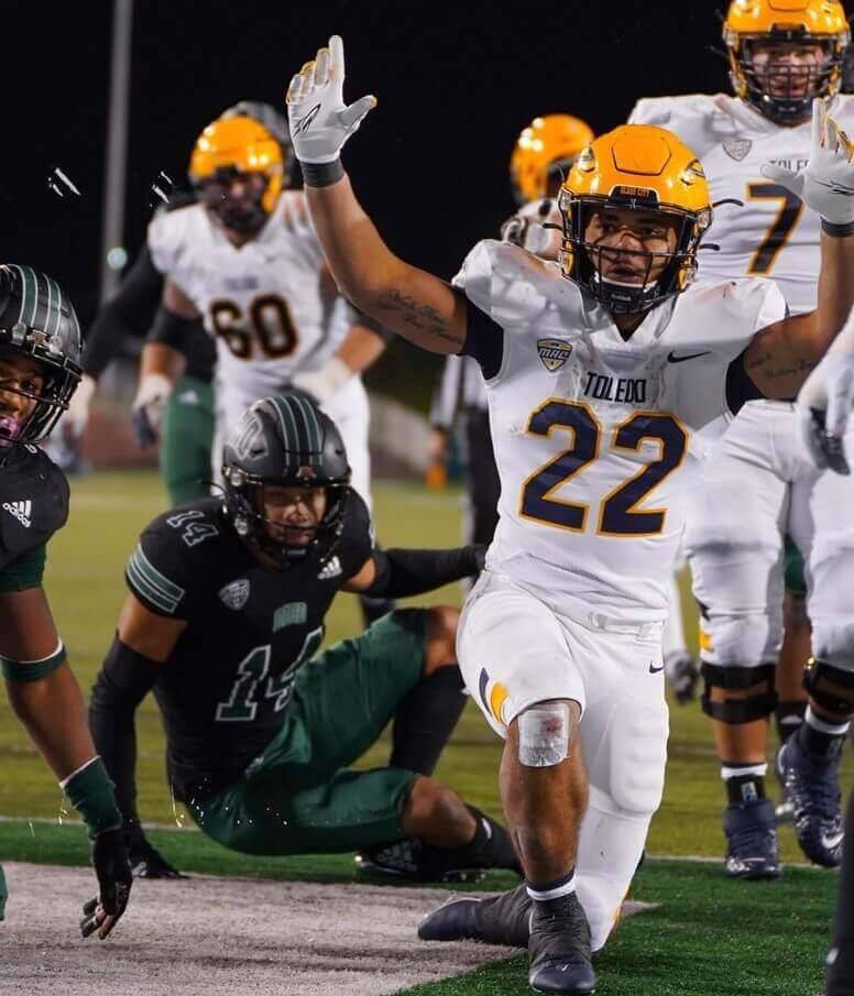
Green numbers on a black jersey is more MEHction than MACtion.
&1. South Florida/Tulane
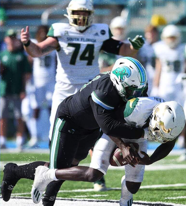
Were the Green Wave commemorating Oil Spill Awareness Week or something?
Thanks, Jim! OK readers? What say you? Agree or disagree with Jimmer’s selections? Let him know in the comments below.


NCAA Uni Tracking
Uni Watch will again track the uniform combinations worn by the “Power 5” conferences. All of the 2020 trackers are back!
We’ve got Rex Henry (tracking the ACC), Dennis Bolt (tracking the PAC-12), Kyle Acker (tracking the B1G), and Ethan Dimitroff (tracking the Big XII AND the SEC). Rex, Dennis, and Kyle and are all returning from 2015, and Ethan is back after joining the NCAA Uni Tracking a couple seasons ago. Ethan will continue to track the SEC, and has swapped the B1G for Big XII (with Kyle).
Here are the Uni Trackers for the Power 5 Conferences (along with each tracker’s info):
Rex is up first today (ACC):
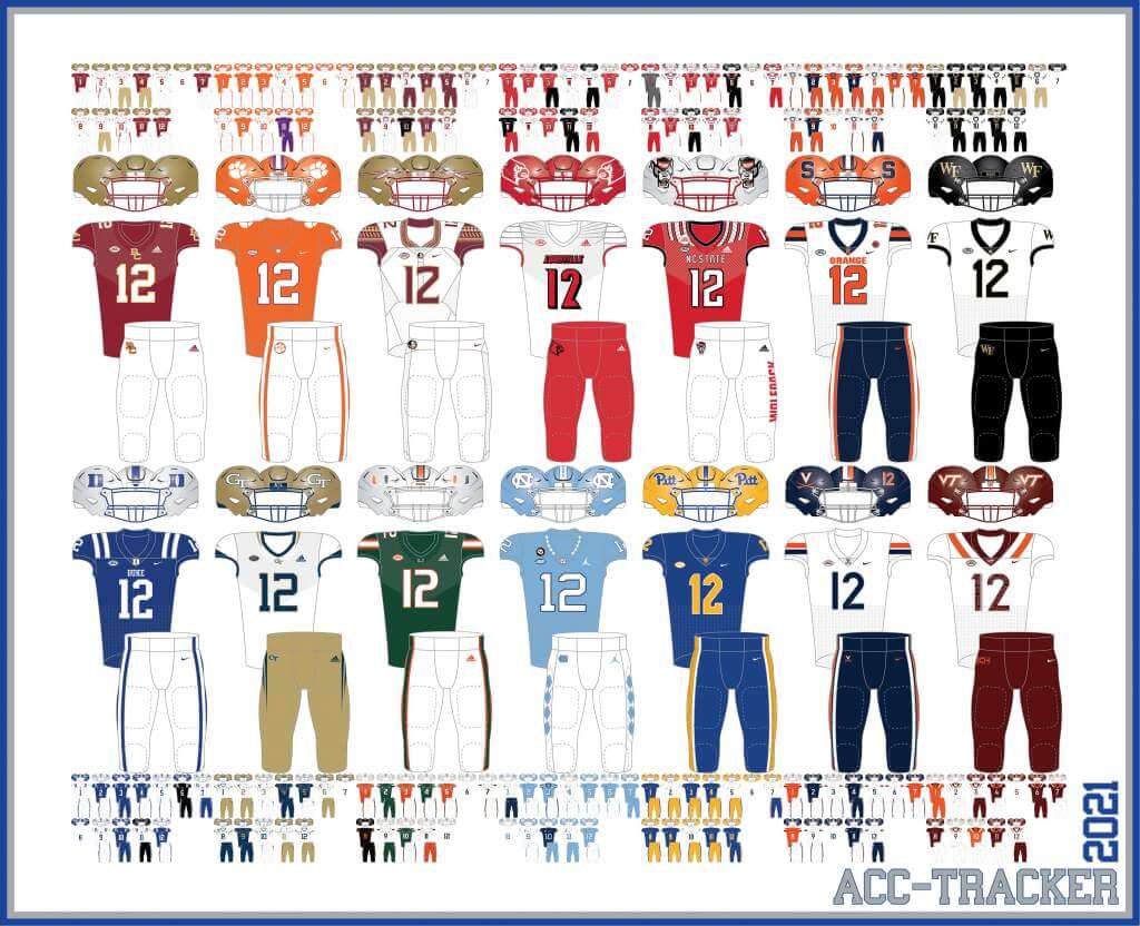
ACC
More Here.
Follow Rex on Twitter here.
And now, here’s Dennis with the PAC-12:
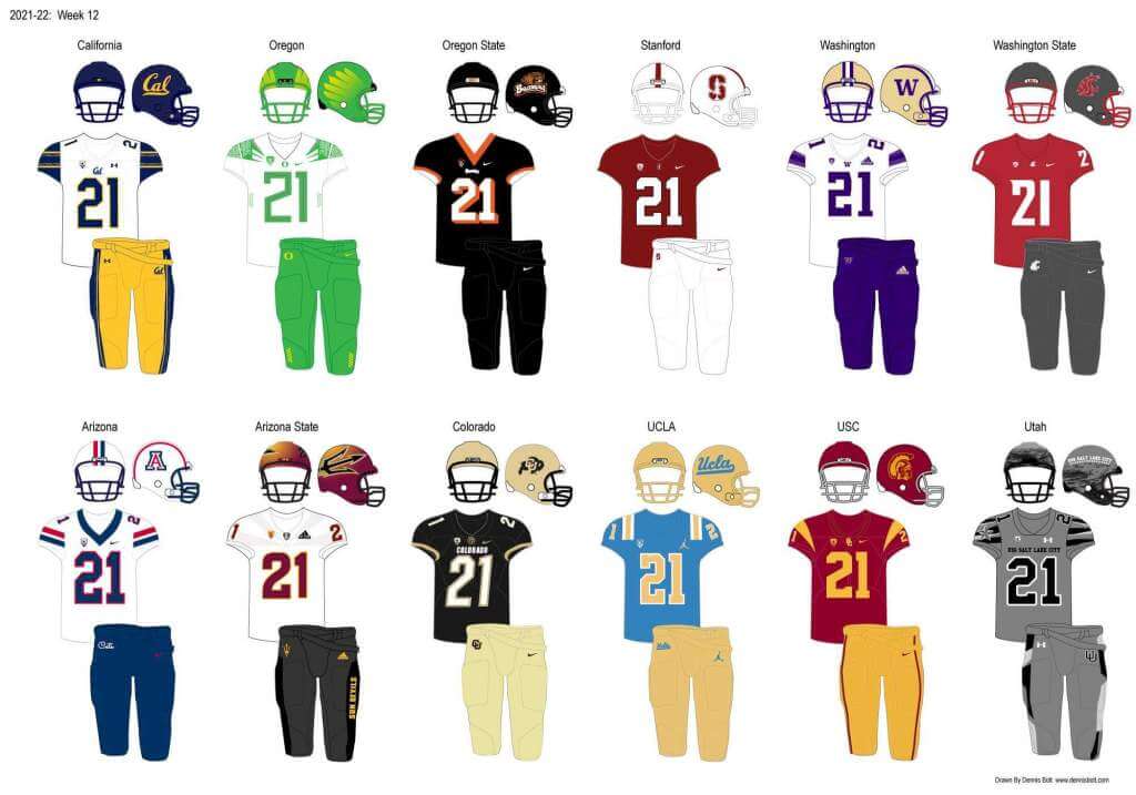
PAC-12
More here.
Follow Dennis on Twitter here.
And here is Ethan, with the SEC:
SEC
And be sure to check out Ethan’s WVU Mountaineer Tracker.
Follow Ethan on Twitter here.
And here is Kyle with the B1G:
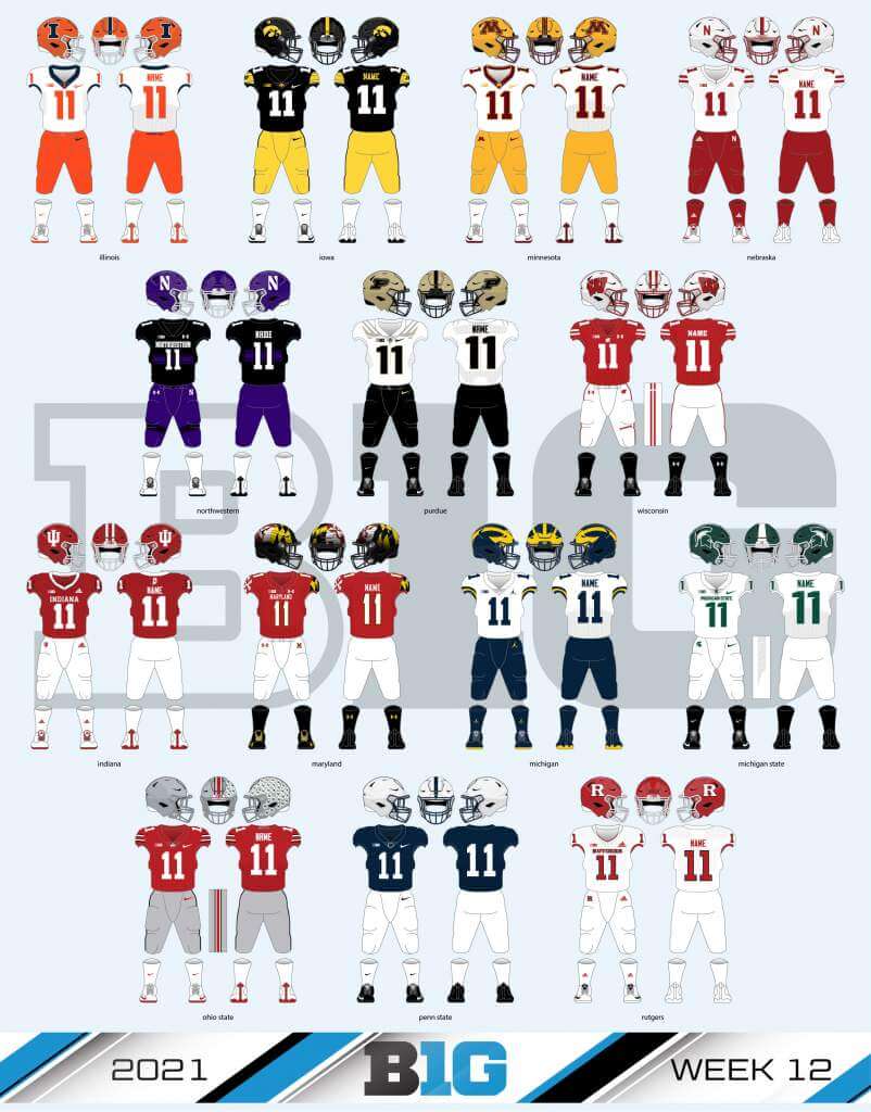
B1G
Follow Kyle on Twitter here.
And here’s Ethan with the Big XII:
Big XII


Welcome to the 2021 Oregon Ducks Uni Tracker. This little project was originally begun way back in 2008-09 by Michael Princip, who retired after several seasons, whereupon the project was continued by Tim E. O’Brien. He, too, retired from the tracking, but the project has been ably kept up by the man who also tracks the Pac12, Dennis Bolt.
Here’s this week’s Uniform Combo for the Ducks (you can click to enlarge):
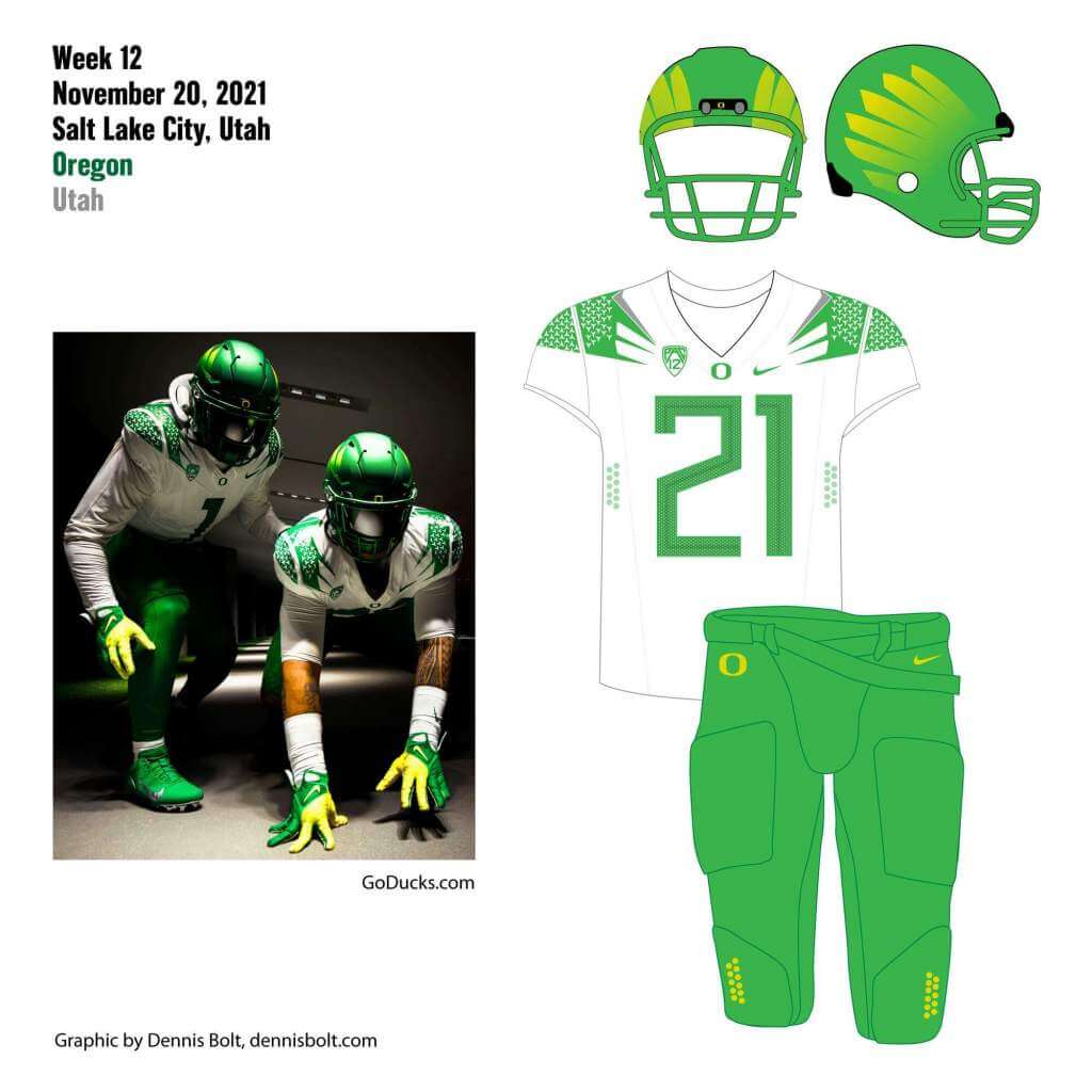
You can read about this uniform, and MUCH MORE, by checking out the Duck Tracker here and the color combo spreadsheet here!
Thanks Dennis!


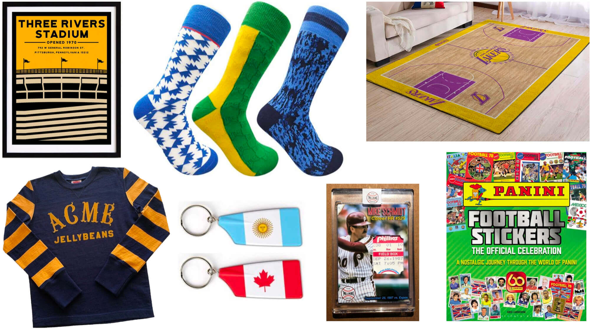
Gift Guide reminder: Paul here. In case you missed it on Friday, my annual Uni Watch Holiday Gift Guide is now available for your enjoyment.
Also, for those of you who’ve been following the Covid drama here at Uni Watch HQ, I’m happy to report that I once again tested negative on Friday, so I’m now in the clear. Unfortunately, this means Mary has to stay at the sanitarium until the day after Thanksgiving. Not quite the holiday we were hoping for, we’re grateful that our vaccinations are keeping her symptoms mild and keeping me protected.
My continued thanks to everyone who’s sent kind words of support — it really does make a difference.
Now back to Phil with the rest of today’s content.


Uni Watch News Ticker
By Phil

Baseball News: The CPBL (Taiwanese baseball) revealed the new championship trophy for the Future Series (CPBL minor league). From Jeremy Brahm. … Speaking of the CPBL, apparently the Wei Chuan Dragons have something called “Girls Night” and they wear a pink patterned jersey for the occasion. … If you’re a fan of the movie Major League, then you’re going to love this. … In a game worn collectors’ Facebook group, Mike Engle learned that then-Padres now Cardinals coach Skip Schumacher cuts the back of the sweatband out of his caps. Mike says, “Never heard of anybody doing that! But I’m sure there is a good reason for it.” … Former Met Noah Syndergaard will wear #34 for his new team, the LA Angels (it was his number on the Mets). But that number selection is generating a bit of controversy.

NFL/CFL News: If you like white hats & britches, today’s Bills/Colts tilt should make you very happy. … The still-winless Lions will wear white shirts & gray britches at Cleveland today. … Want to see a sand art version of the Denver Broncos’ old-school “D” logo? Here you go! (from Kary Klismet). … Here’s a look at the end zones yesterday at Tim Hortons Field for the Hamilton Tiger-Cats. They were in memory of Angelo Mosca who recently passed, and the special tribute included 68 seconds of celebration (from Wade Heidt).

Hockey News: Jordan Eberle, formerly of the NY Islanders and now a member of the Seattle Kraken, is still using an Islanders branded mouth piece (from Kevin Murphy). … Longtime reader Jim Wooley writes, “Not sure if you’ve seen this before but this is an amazing National Film Board doc on the beginnings of the Quebec Nordiques. There’s a quick interview with the designer of the logo/uniforms at the 13:10 mark. Quite awesome!” … The Lethbridge Hurricanes wore their CHL Leave Your Mark jersey design contest winner on Friday night, as did the Red Deer Rebels (from Wade Heidt). And speaking of the Rebels, here’s a flashback to a jersey unveil. “Back when the WHL’s Red Deer Rebels wear a new expansion team. I would be for them going back to the strictly black and silver colour scheme.” … Also from Wade: The Kingston Frontenacs wore special Hockey Fights Cancer jerseys on Friday night. … The NJ Devils recently let on they’d be introducing a new black third jersey (for the first time in their history). Brandon Weir writes, “Found this on a jersey collector hobby page. Not sure of it’s [sic] legitimacy.” He added this twitter convo. Our pal Chris Creamer seems to feel it’s possibly legit. … The Islanders finally opened their new home last night, and legendary pbp announcer Jiggs McDonald (radio & tv voice) looked dapper as the emcee for opening (from James Beattie). … Despite the caption, I think this is rather clever, even if COVID is no joking matter (from Lee Wilds). … The Islanders wore a patch on their right chest commemorating their new arena (from Art of Scorebug).

Grab Bag: Do we need to open up space in the Uni Watch Children’s Library? Well, if a book about Uni the Unicorn(!) is the subject matter, I’d say so (although a purple unicorn may be sacrilegious to some. That’s from Brandon Weir, who noted his daughter recently brought the book home from the library. … This is pretty cool: The city and village logos of Milwaukee County, ranked (via Paul).


And finally… that’s a wrap for today and this weekend. Big thanks, as always, to the Sunday Morning Uni Watch Crew: TJ, Jimmer, Rex, Dennis, Kyle and Ethan! Great work as always guys.
Everyone have a good Sunday and a better week. And of course, everyone have a safe and Happy Thanksgiving this Thursday. White meat may be for suckers, as Paul is wont to say, but I’m gonna have plenty of it.
Peace,
PH
Oh Hell Yeah! Time for some College Football Uni Tracking – Canadian Rules Style!
The march to the Vanier Cup continues. We will take a look at the 4 conference finals.
-Loney Bowl in Antigonish, NS (Atlantic conference final):
The St. Francis Xavier X-Men went navy over navy at home. The Bishop’s Gaiters wore their white over purple combo.
link
-Coupe Dunsmore Cup in Montreal (Quebec conference final):
This game was last weekend. The Montreal Carabins went with full mono-blue combo from head to toe at home. The Laval Rouge et Or wore white over red.
link
Have to include a photo of the Dunsmore Cup itself. The trophy that looks like it belongs in a 1970s rumpus room.
link
-Yates Cup in Kingston (Ontario conference final):
What else would the Queen’s Gaels wear? They basically have just 1 uniform. The classic mono-yellow was worn by the Tricolour. The Western Mustangs wore their silver/purple/purple combo on the road.
link
-Hardy Cup in Saskatoon (Canada West conference final):
Places can say they have frozen tundra. There is no doubt you are playing on frozen tundra when playing football in late Nov or early Dec in Saskatchewan.
The Saskatchewan Huskies rocked their usual home look of mono-green. The Manitoba Bisons went with their white over white road uniforms with the brown and gold trim.
link
I have to say, I love those mono-yellow Queen’s Gaels unis. Takes me back to the early 1960s Tudor electric football game where you’d get one team in all white and one team in all yellow-orange. Over the years I’ve imagined NFL uniforms based on those mono-yellow players, and have myself come up with designs for the Steelers, Chiefs and even a Cardinals uniform with that as the starting point.
Of course, Queen’s rocked the mono-yellow uniforms back in the 1960s too. This photo from 1964. Numbers on the sides of the helmet which the did for many years before putting the “Q” logo on.
link
During the utes game last night they mentioned that only 3 members of the USS Salt Lake City are still living. 2 of the surviving members spoke during breaks in the action via recorded messages, and 1 of the crew was in attendance and was given a helmet. I thought that was pretty cool.
Regarding today’s Colts-Bills matchup expected to be both white helmets and both white pants, yes, I’m someone who loves that combination. Going all the way back to the seemingly annual Patriots-Bills showdowns in the mid-60s in the AFL East, I’ve thought that was a good, classic look. And there were a few years in the early ’70s when every AFC East-vs.-AFC East game featured that combination (with the Colts, Dolphins, Jets, Patriots and Bills all going white helmets and white pants every game). Good times.
One other note about the tribute done for Angelo Mosca by the Hamilton Tiger-Cats. Angelo Jr. brought out one of Mosca’s old helmets during his days with the Ticats.
link
The tramp stamp on the Illini players butts is the best example I have ever seen of a small thing ruining a much bigger and better thing. Utah would have looked SO much better with a cleaner, simpler design.
Please Please Please, let that Devils Jersey jersey turn out to be fake!
I find the concept of the jersey just saying “Jersey” on it very funny, but, yeah, not a lot else to like there.
New Jersey’s new jersey
alternatively: new New Jersey jersey
Jersey’s jersey, “Jersey”
When I like Oregon’s uniform more than its opponents’ uniform, that’s saying something. The bright green with subtle accents is a clean, sharp look. The Utah gray was just muddled as the details were only visible up close. The helmets were as beautifully painted as the best of NHL goalie helmets, but, again, that could only be appreciated in glimpses. Side note: when I played OL in college, one of our pre-snap blocking codes was “battleship gray.”
I hate airbrushed football helmets. Football lids need to have crisp blocks of saturated color, b/c they have to communicate a maximum of information despite rapid movement and having curved and corrugated surfaces. THAT BEING SAID, I am in awe of Armando Villareal’s superhuman task, and I hope the University made him a rich man.
I found yesterday’s Oklahoma/Iowa State and Nebraska/Wisconsin games particularly eye-punishing. Too many teams with the same color scheme.
I wish Queen’s University played in the US, because those gold uniforms are inspired.
There needs to be some kind of standardization of player names in college football. Nevada’s names looked particularly terrible yesterday, and the Miami Hurricanes’ player names always look cheap and awful.