Click to enlarge
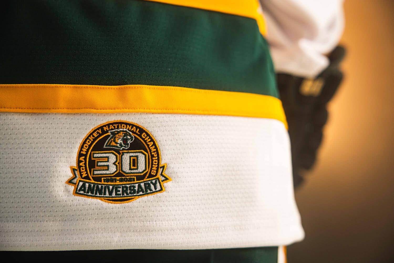
The Northern Michigan University men’s hockey team (which has my favorite color scheme, don’tcha know) won the NCAA national championship in 1991. That means the 30th anniversary of that title was this past spring (i.e., last season), but they’ve decided to celebrate the anniversary this weekend, because they’re hosting Boston University — the same team they defeated for that 1991 title — tonight and tomorrow night.
As you might expect, they’re marking this championship anniversary with a commemorative patch. As you might not expect, they’re wearing the patch in a very unusual place: on the right-rear jersey hem.
It’s not completely unprecedented for logos to appear in that spot on a hockey jersey. Back in the 1980s and ’90s, for example, it was routine for the NHL logo and/or various makers’ marks to be positioned there. (Wayne Gretzky famously had two NHL logos and maker’s marks, because he routinely tucked in one side of his jersey.) But has a team patch ever appeared in that spot before?
I admit that I couldn’t think of any. But I wondered if there might be some previous instances that I was overlooking or had forgotten about, so I put that question out on Twitter, where I learned that hem-positioned anniversary patches are rare but not unheard of. Here are some examples, in chronological order (for all photos, you can click to enlarge):
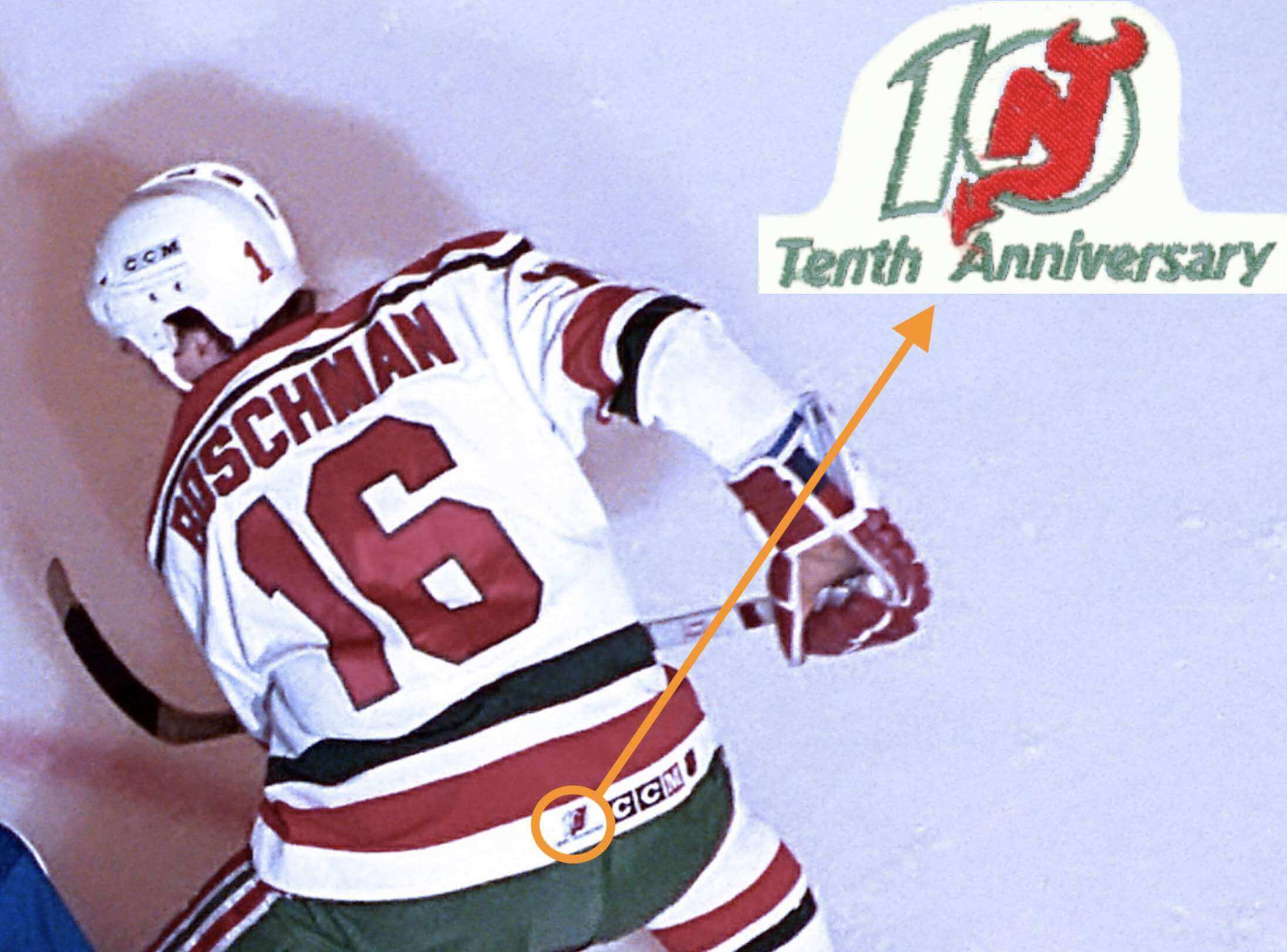
1. 1991-92 New Jersey Devils
The Colorado Rockies moved to New Jersey and became the Devils in 1982, so for the 1991-92 season they added a 10th-anniversary patch (even though it was actually their 10th season, not their 10th anniversary) and put it just about dead-center on the rear jersey hem. Such an odd placement! Did any fan even notice?
———
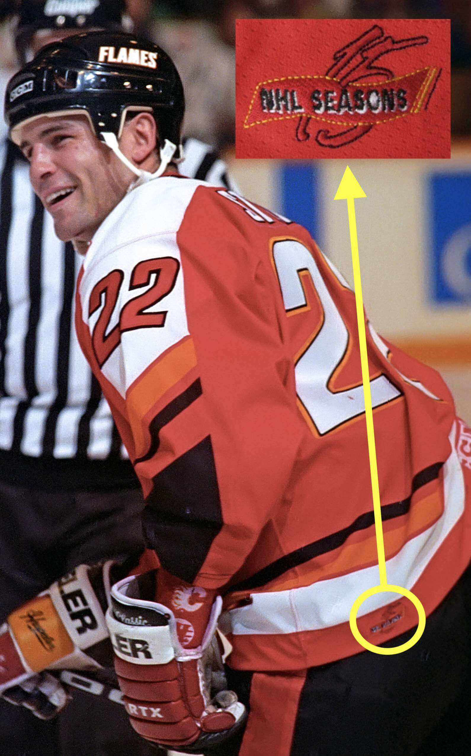
2. 1994-95 Calgary Flames
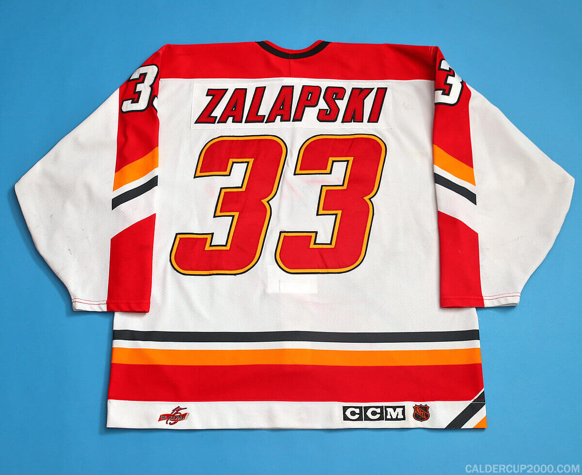
The Flames moved from Atlanta to Calgary in 1980, so they added a 15th-season logo to their left-rear jersey hem for the 1994-95 season. In addition to the odd placement, this one had odd wording (“15 NHL seasons” makes it sound like they had previously been a minor league team) and an odd color choice, because you can barely see the mark on the red jersey. It was easier to discern — but still not what you’d call prominent — on the team’s white jersey:
———
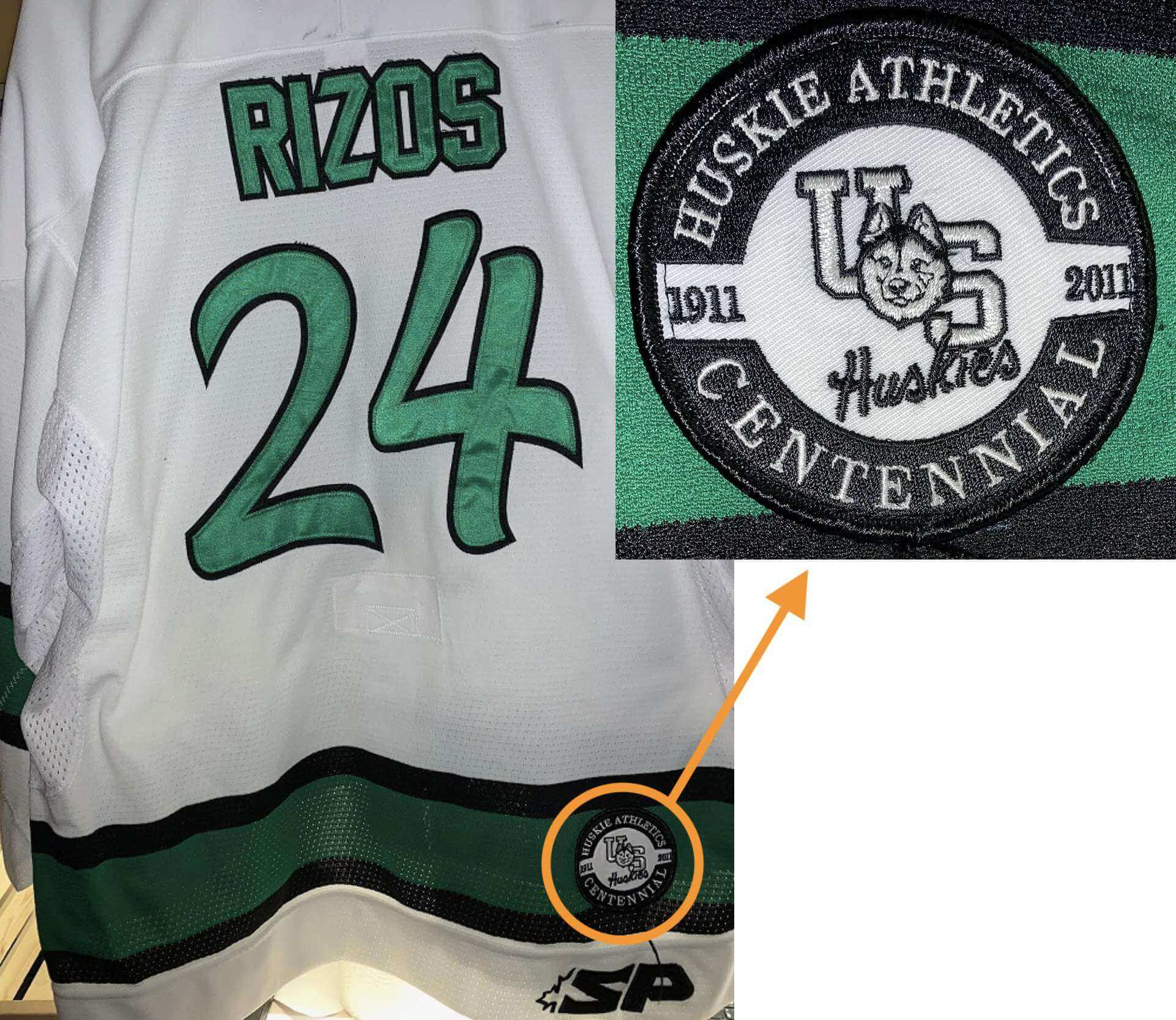
3. 2010-11 Saskatchewan Huskies Women’s
The University of Saskatchewan athletics program was celebrating its 100th anniversary in 2010-11, so the women’s hockey team (and maybe the men’s too..?) wore a patch you-know-where. Unlike the Devils and Flames examples, this one features a conventional patch that would look fine on a sleeve or chest — but for some reason they opted to put it on the rear-right hem.
———
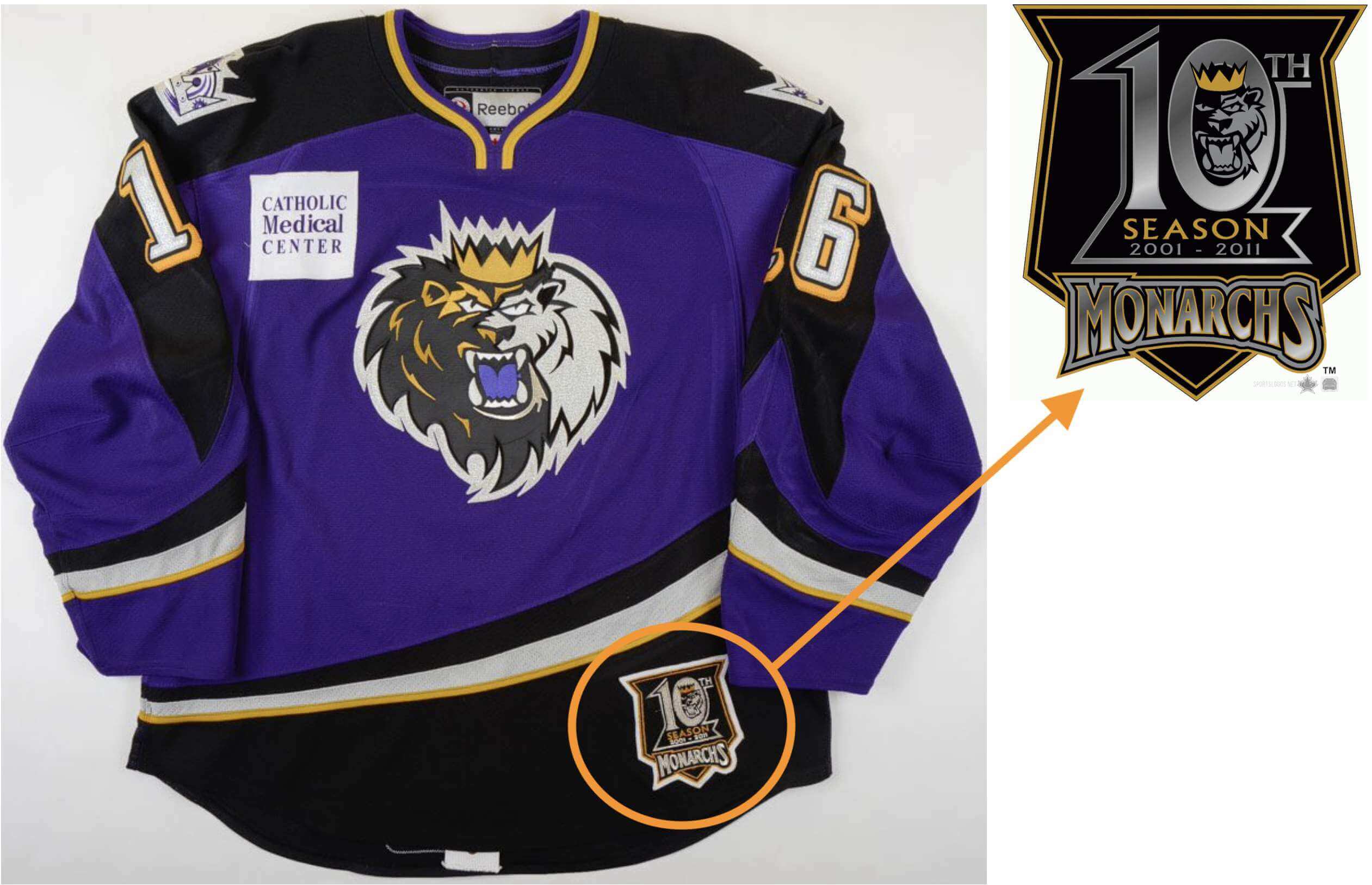
4. 2010-11 Manchester Monarchs
This one is a little bit different, because (a) it’s a minor league team, (b) it’s a much larger, more prominent patch, and (c) it involves the front hem. Still, this patch placement by a now-defunct AHL club still seems worth mentioning here.
———
I feel like there are two ways to look at all of this. On the one hand, putting a patch in such a low-profile spot seems to defeat the entire purpose of the patch. Like, you want the patch to be seen, don’t you? Why not use the chest, sleeve, or shoulder? On the other hand, hockey is the only major sport whose jerseys are designed to be worn untucked, so making use of that space at the bottom of the jersey — space that doesn’t exist in any other major sport — is nicely sport-specific.
In theory, I like that second argument. In practice, though, I think the hem is just too weird a spot for a patch. But I’m glad Norther Michigan used that spot for their championship-anniversary patch, because it sent me down this very interesting rabbit hole.
Are there any other hem/shirttail/etc. patches out there?
(My thanks to Jerry Nitzh and John Ogren for getting me started on this one, and to Trevor “Teebz” Alexander, Mike Reyes, @SDubs35, and @NCanny2 for their research assistance.)
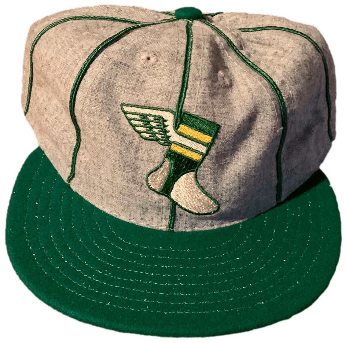
For all photos, click to enlarge
Alternate Cap reminder: In case you missed it on Thursday, I’m now taking orders on a small supply of our new Uni Watch Alternate Cap.
Just like our original Classic Cap, the Alternate Cap is an all-wool beauty made exclusively for us in the USA by our friends at Ebbets Field Flannels.
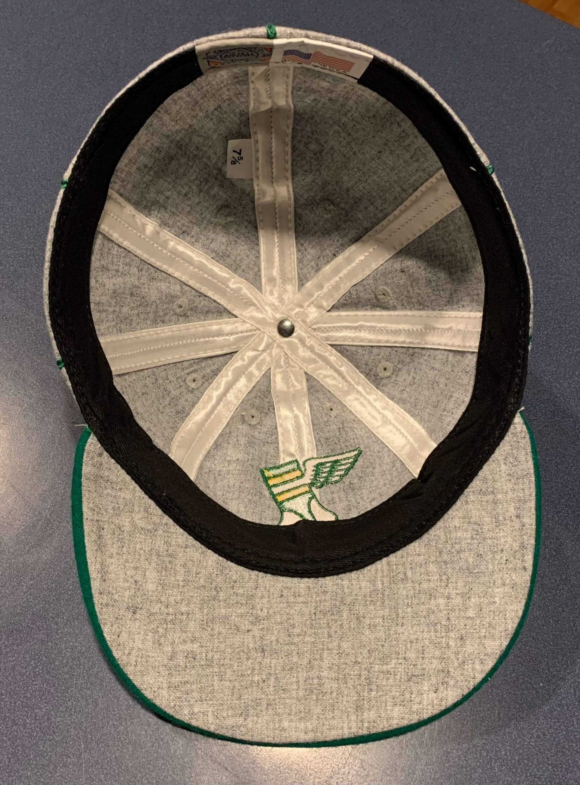
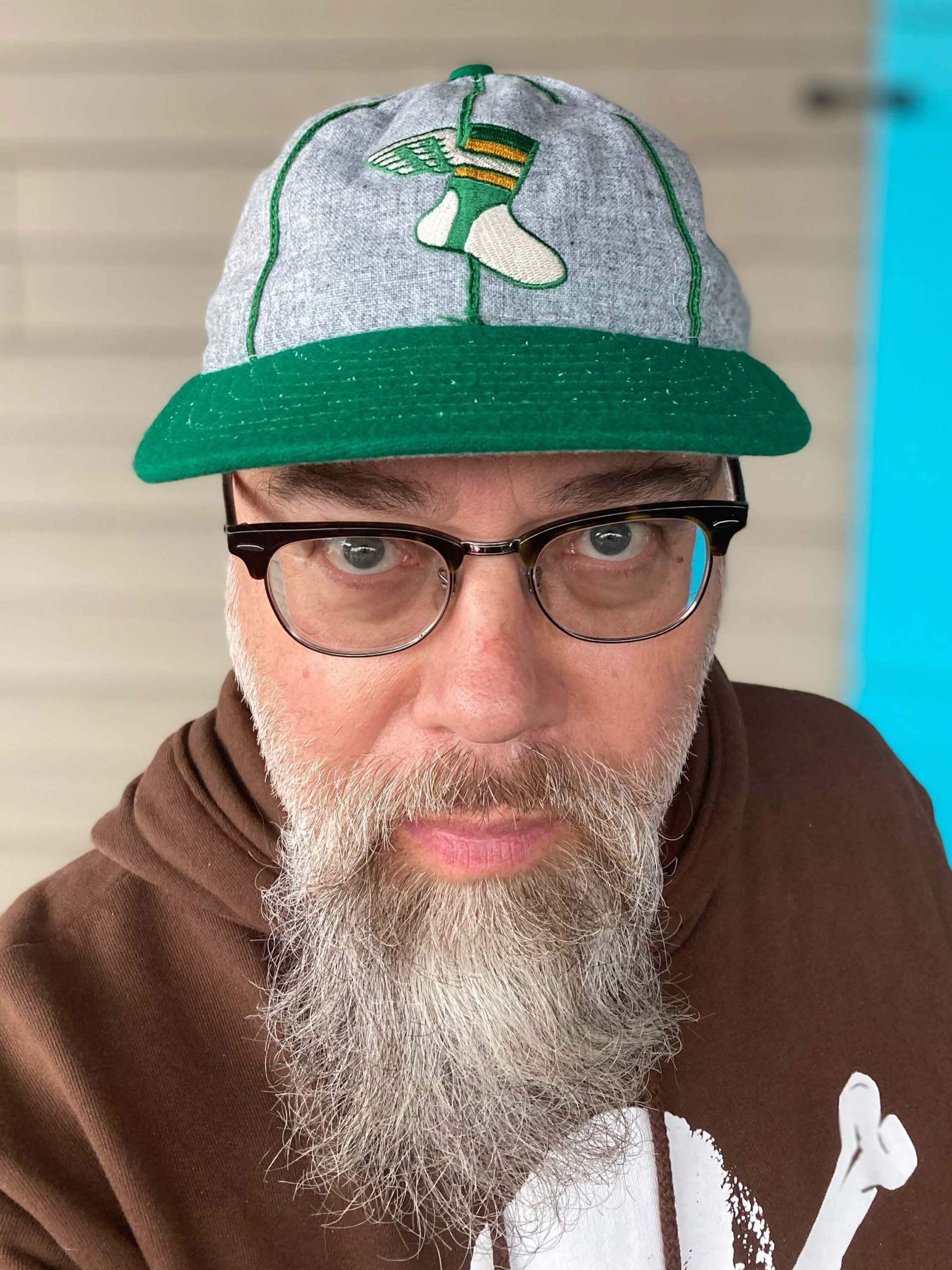
Note that this cap has an old-school eight-panel construction, instead of the more modern six-panel design. The crown is heathered grey with our classic winged stirrup logo front and center. The brim is hunter green, the seams are outlined in satin piping, and the undervisor is grey. And as is always the case with Uni Watch products, there is no annoying maker’s mark.
Here are some additional photos (including a glamour shot from membership card designer Scott M.X. Turner, who has already received his cap even though I haven’t received mine!):
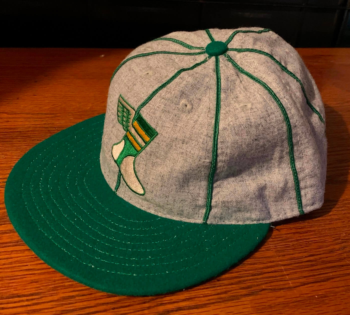
Supplies of this cap are extremely limited (for some sizes, we’re already down to just one or two remaining). If you want one, here’s how to order:
• At present, we have all fitted sizes from 7 through 8. (Sorry, no adjustables.) Not sure of your size? Here’s a handy size chart.
• The price is $42.99. Shipping in the USA is $7 for one cap and $8 for two caps. For more than two caps, or for non-USA orders, check with me to get the shipping charge.
• To order, start by sending the appropriate amount via Venmo (use @Paul-Lukas-2 as the payee) or Zelle (plukas64@gmail.com). If you’d rather use Apple Pay or a paper check, contact me and I’ll give you the info you need. Sorry, no PayPal. But if you live overseas and PayPal is the only feasible option for you, get in touch and I’ll explain how we can come up with a workaround.
Important: After sending payment, email me with your desired cap size and shipping address.
That’s it. Thanks for considering our headwear!
Click to enlarge
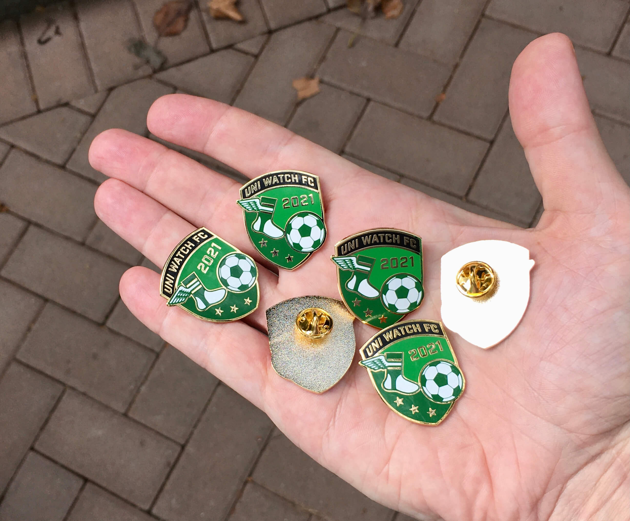
November pin reminder: In case you missed it on Monday, our latest Uni Watch Pin Club design is soccer-themed — a Pin Club first! I love how the winged stirrup is kicking the ball.
This pin was produced in a numbered edition of 150, with the number and month laser-etched onto the back. As of this morning, there were 29 remaining. You can get yours here while supplies last.
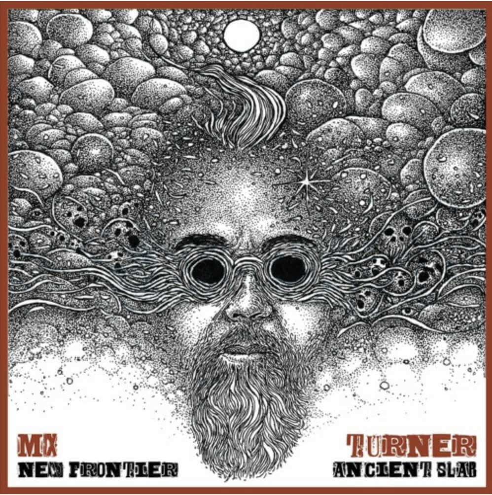
Uni Watch Hit Parade: M.X. Turner: Longtime Uni Watch pal/ally and Uni Watch Alternate Cap model Scott M.X. Turner, who has now designed over 3,000 of our membership cards and hundreds of Naming Wrongs T-shirts, is also a musician who’s been in lots of bands. He has a new solo album launching today: New Frontier/Ancient Slab. You can check it out here.
Scott describes the album as “a New Orleans album with rock, punk, reggae, Cajun, blues, EDM, disco, funk, folk, second-line rhythms, bhangra, country, jazz, and gospel fed through my 40 years of writing songs and releasing records.”
When Scott and I met nearly 20 years ago, we discovered that we both love Terence Malick’s 1978 movie, Days of Heaven. So it’s fun to see that the fourth song on the album, “Tough Little Rebel,” is an ode to Linda Manz, the then-child actor whose ad-libbed narration is a big part of what makes that movie so special. The song’s lyrics features a lot of Manz’s lines from the movie — good stuff.
Again, you can check out the album here. Congrats, Scott!
The Ticker
By Anthony Emerson

Baseball News: Reader Mike Robles hired Bill Henderson’s Dream Shop to recreate the Mets’ 9/11 20th-anniversary jersey from this season. “I took an authentic Players Weekend Cubs jersey, bought old stock Stahl’s ‘New York’ glacier twill drop shadow lettering, and had the Dream Shop do their magic. It’s on its way to Stitches [the Mets’ official stitcher] to get the 9/11 sleeve detail.” Mike later won an auction for a game-worn version of the jersey — here’s the comparison — gamer on the left, Dream Shop on the right. … Bruce Cassidy, coach of the NHL’s Boston Bruins, wore a No. 2 lapel pin in memory of longtime Red Sox player and broadcaster Jerry Remy, who passed away last week after a lengthy battle with cancer (from @Long_Tail_Foxy).

Pro Football News: As had been hinted at, the Jets wore their white jerseys with BFBS pants for the first time ever last night. Former Jets great Joe Namath suggested that the team should change pants at halftime. … XFL executive Sam Schwartzstein once had an argument with now-Jets QB Josh Johnson over the LA Wildcats’ facemask color, with the club wanting orange and Johnson wanting black (from Ted Bloss).
College/High School Football News: Here’s
a really fun, albeit paywalled, article about how Iowa assigns uni numbers (from Jay Wright). … William Tennent High School in Pennsylvania appears to have adapted Virginia Tech’s “VT” logo as “WT,” which is a bit more clever than a lot of other high school logo poaches we see (from Nathaniel Martin). … Minnesota will have a stars/stripes helmet design this weekend, though it’s a bit more low-key than most flag-desecration designs. (from Erick Kreiwaldt). … Arkansas is also going with a stars/stripes helmet for military appreciation night, plus they’ll have the seals of six different military branches on the back of the helmet along with a huge helmet number, creating a somewhat crowded look (from Taylor Crabtree). … Here are this weekend’s uni sets for NC State, UNC, Mizzou, Hawai’i, ASU (featuring a number of Pat Tillman tributes), West Virginia, and Oregon (thanks to all who shared).

Hockey News: Early in the design process, the Kraken reached out to prominent Seattle-area artist Kyler Martz for some logo concepts, and though they didn’t go with anything he came up with, they’re still a really cool look at what could’ve been (from Scott Rogers). … Cross-posted from the baseball section: Bruins coach Bruce Cassidy wore a No. 2 lapel pin in memory of longtime Boston Red Sox player and broadcaster Jerry Remy, who passed away last week after a lengthy battle with cancer (from @Long_Tail_Foxy). … The Stars’ P.A. announcer has a custom jersey with “PA” where the captain’s patch would go (from Gavin Lane). … Speaking of the Stars, C Luke Glendenning had a helmet number mishap last night. … The OHL’s Sarnia Sting will wear a jersey tonight that was designed by a kid (from Wade Heidt). … Also from Wade and staying in the OHL, the Kitchener Rangers will wear Remembrance Day sweaters tonight.

NBA News: A Washington Post columnist wants NBA coaches to drop the athleisurewear they’ve adopted since the pandemic began and go back to wearing suits (from Michael Kinney). … Thunder C Mike Muscala had a regular Nike maker’s mark, instead of this season’s diamond mark, on his jersey last night (from @OKCTracker). … The Heat debuted their ransom note City alternates last night.

Soccer News: The New England Revolution, the last original MLS team that was still using its original logo, have unveiled a major rebrand. Athletic link here, but paywalled. Notably, the Revs are not changing any aspect of their name to attempt to replicate European soccer club names, something the club is leaning into with its swag bag sent to soccer writers, declaring that they are “proudly not another FC” (from Steven Ceruolo and John Flory).
I’m sorry to report that my mom is back in the hospital (still non-Covid, thankfully), so I’ll be going out there this weekend. Hope your weekend is filled with more enjoyable pursuits! Enjoy Phil’s Saturday and Sunday content and I’ll see you back here on Monday. — Paul
NMU had originally scheduled BU for last year, but, Covid. College hockey moved to all conference only games last year, so the patch & anniversary games were postponed until this year
That’s what I thought. Its a nice patch.
Well wishes to your mom, Paul.
sending love to your mom and you
Keeping your mom in my thoughts
I found another fun one from U SPORTS. The Mount Royal Cougars used to link on their rear right hip as well after the Flames made a big donation to the school for medical research purposes. It’s not an anniversary patch, but it shows uniformity in patch locations across the conference. Neither U SPORTS nor Canada West have any rules surrounding placement of patches on their uniforms, it seems.
The Flames Foundation for Life info link.
I hit “post comment” too soon.
Best wishes and hoping your mom’s out of the hospital soon, Paul.
all the best to your mom, Pail
AHL 75th anniversary patch on the rear tail
link
And the 50th!
link
link
Williamson College of the Trades, formerly Williamson Trade, still uses the WT – Virginia Tech hybrid logo as well.
link
Best wishes to your mom, Paul.
Those kid created Sabrina Sting unis aren’t half bad!
Best wishes to your mom–may she get well soon!
Get well soon, Paul’s Mom!
Last night’s NFL game was an interesting one. The Colts looked a lot better in mono-blue than I would have thought, while the Jets looked like they forget their uniform pants and had to rush out and buy all their players tights to wear.
Yeah, I don’t hate the Colts in mono-blue. I think it’s a great color and not over-designed.
Copying over from Twitter – the Hershey Bears have done a bunch of patches on the hems/bottom stripes of their jerseys, including the Blue Cross sponsor (entitlement partner? brand activator?) patch. And in 97/98, they put the PHPA patch on the front hem, which looks really weird. link
Sorry to hear about your Mom, Paul. Best wishes to the Uni-Mom!
If you’re not aware, Northern Michigan University is also home to one of the strangest football venues: the Superior Dome. Known colloquially as the Yooper Dome, and opened as the largest wood domed structure in the world!
link
Also, I hope your mom returns to full strength soon, Paul!
I’ll echo the sentiment – hope and pray for the best for your mother, Paul.
Curious about the Kitchener Rangers’ Remembrance Day sweaters, in particular, why the image of a WWII-era tank and WWII, but nothing about “The Great War”. There’s an interesting article about this year’s sweaters on the Rangers’ website.
link
Most, if not all, of the Rangers’ Remembrance Day sweaters are related to WWI, which as we all remember from our history classes, is the very raison d’etre for Remembrance Day (and Veteran’s Day here in the States).
Best wishes to your Mom, Paul. Take care.
I opened the link to the Northern Michigan link, while I know purple is not a well liked color in these parts, what a color spectacular. St Thomas, a Minnesota school, is new to Division 1 hockey and have definitely added some color variety to the college ranks
There’s a an odd color divergence between NCAA hockey and the NHL, red and gold is prolific in college hockey (Boston College, Duluth, Denver, Minnesota all prominent programs) to name a few, barely exists in the NHL – Calgary
Best wishes to your Mom as well Paul
Yes and no on the purple adding variety. They joined a conference with Minnesota State, Mankato, which is also purple. Not many conferences can boast 25% purple membership lol
Hope and prayers for your mom, Paul, and also for you. Our parents’ health is also hard on us children.
I find that I don’t mind the small commemoration on the hem. The prominence of the hem is a distinctive characteristic of the hockey sweater. Rather, I mind the small commemoration on the rear hem. Put it on the front! If anything extra goes on the back of a sweater, I want it up around shoulder level for prominence. Whereas the entire front feels like prime real estate to me.
The Kraken’s AHL affiliate (they start playing next season) announced their name and logo:
link
Paul, hoping your mom feels better soon.
Hope your mom makes a fast and full recovery, Paul.
Wishing Paul’s mom a speedy recovery
Proofreading: But I’m glad Norther Michigan used that spot…
And best wishes to your mom, Paul.
Best wishes to your Mom, Paul