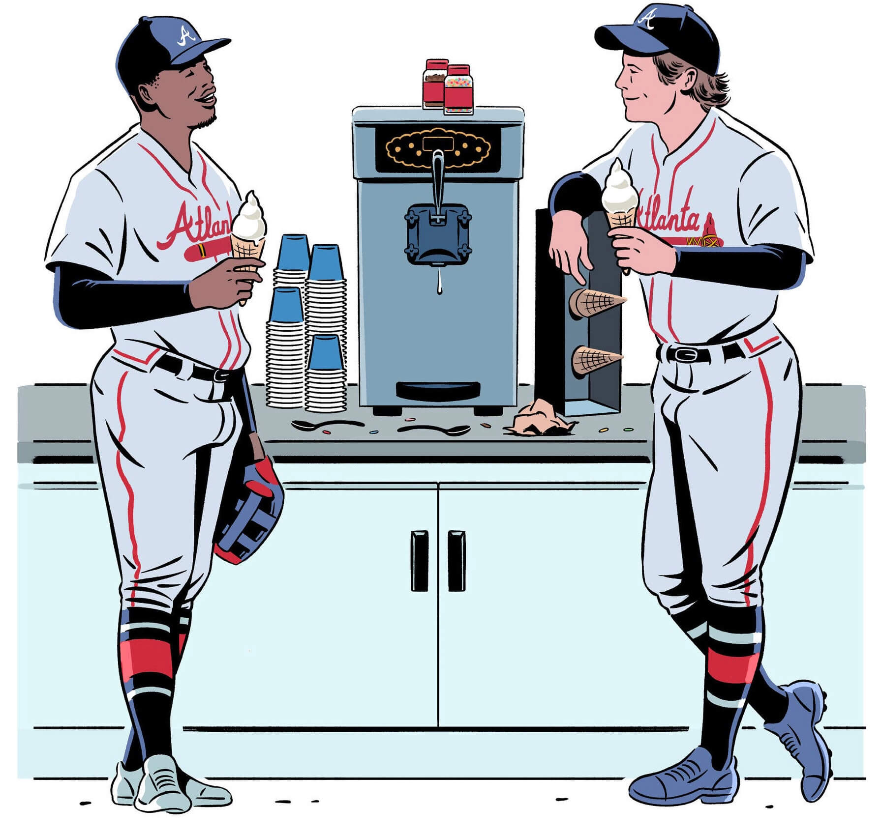
Illustration by Madison Ketcham; click to enlarge
The New York Times had a fun story yesterday about how Atlanta has a soft-serve ice cream machine in the clubhouse at their ballpark. The article was accompanied by the illustration shown above, which features some very nice uniform renderings (I particularly like the striped socks). But as you can see, the two players are depicted wearing their road greys — which they would never be wearing in their home clubhouse!
One possible explanation is that this was the illustrator’s (or maybe the art director’s) way of boycotting the team’s name, due to the Native American factor. But if that’s the case, why would they show the tomahawk on the jersey of the player on the right, especially when it would be so easy to move the player’s arm up a bit to obscure the tomahawk? So maybe this was just an arbitrary uniform choice on the illustrator’s part, and nobody thought much about the incongruity of having the road greys in the home clubhouse..?
The illustration was credited to Madison Ketcham. I’d never heard of her, but a quick check of her website reveals that she does a lot of sports-related work with lots of uniforms (including this cool design for an Ebbets Field Flannels T-shirt). Her Instagram avatar even shows her wearing a Knicks jersey. So she seems pretty uni-aware.
I emailed her last night to ask about all of this. When I woke up this morning, this reply was waiting for me:
Wow Paul! Great question.
It’s pretty simple and there are two parts to it. The first was that the Times asked me not to use “Braves” because they were referring to the team as “Atlanta” in the article, so they wanted consistency.
The second reason was that I liked the uniform! I do try and coordinate uniforms accordingly when I draw sports figures. In this piece, however, I really liked the grey uniform aesthetically and it also said “Atlanta,” which conformed to the Times‘s request. I figured if anyone challenged me I would go back to the drawing board, but everyone approved and so it went ahead.
I thanked Ketcham for her reply but also pointed out that the article does indeed include the team name several times (it’s in the very first sentence, in fact!). Her reply:
Interesting! I didn’t have a chance to read the final [version of the article] yet. When I get the prompt to start drawing, they usually only have a draft for me to read, and it tends to morph between that moment and publication. They told me they were sticking with “Atlanta” at that point and asked that I do the same.
Curiouser and curiouser! In any case, it’s a fun story and a great illo!
(My thanks to Charlie Santo for bringing this illo to my attention.)
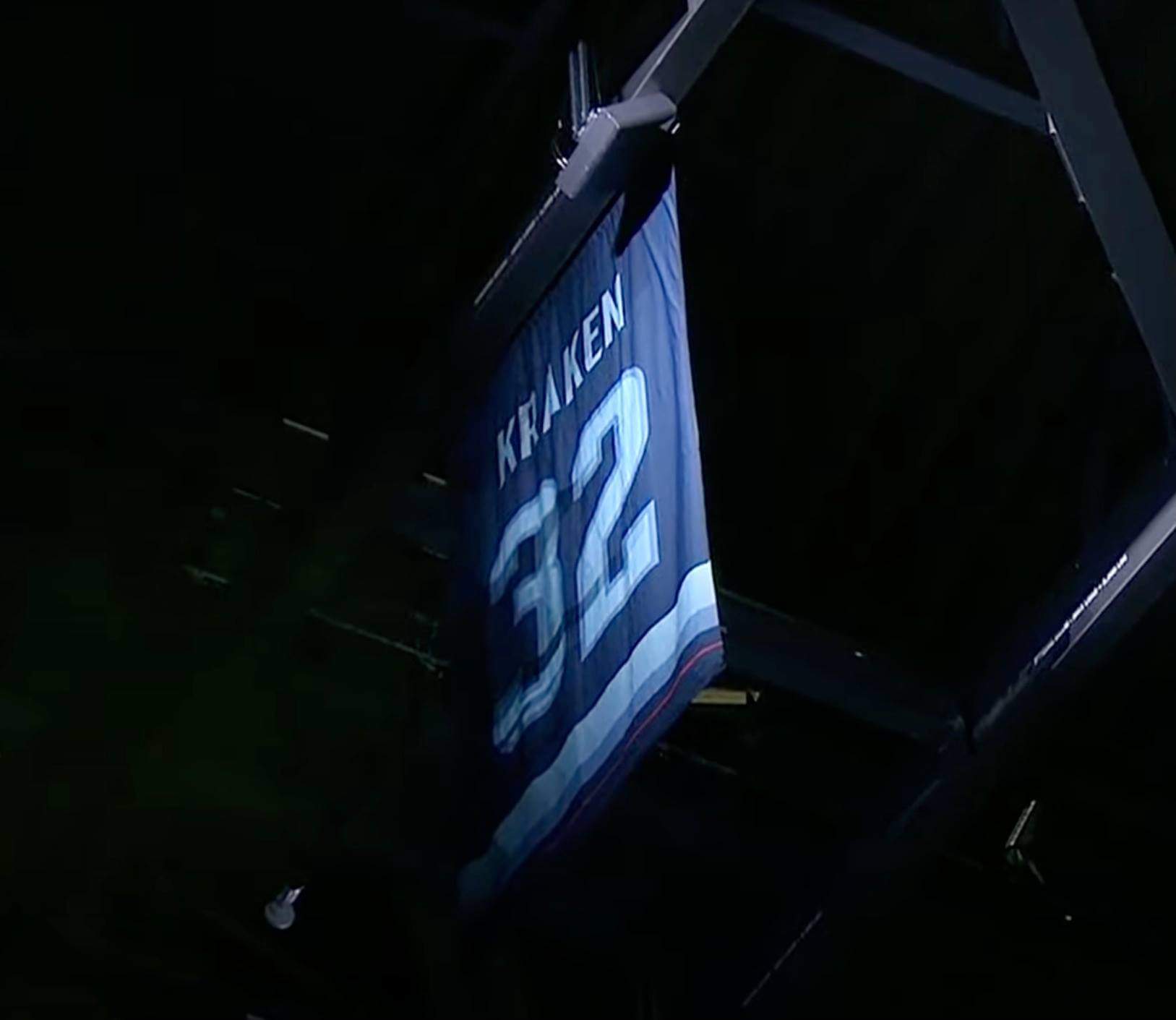
ITEM! Two new Bulletin articles: My latest article for Bulletin is a think piece about “conceptual” number retirements (like the Kraken’s recent retirement of No. 32 because they’re the 32nd NHL franchise, shown above), including a league-by-league rundown of them and what I think about them.
Those of you who’ve subscribed to receive my Bulletin content via email should already be seeing this piece in your in-boxes. Everyone else can read it on my Bulletin page. Enjoy!
But wait — there’s more! Remember last week’s Bulletin piece, in which I interviewed an ad industry veteran about the language of uni ads? A sports advertising exec sent me lots of really interesting feedback and insights in response to that piece, so I’ve created a bonus column in which the exec annotates the original interview. You can check that out here.
Click to enlarge
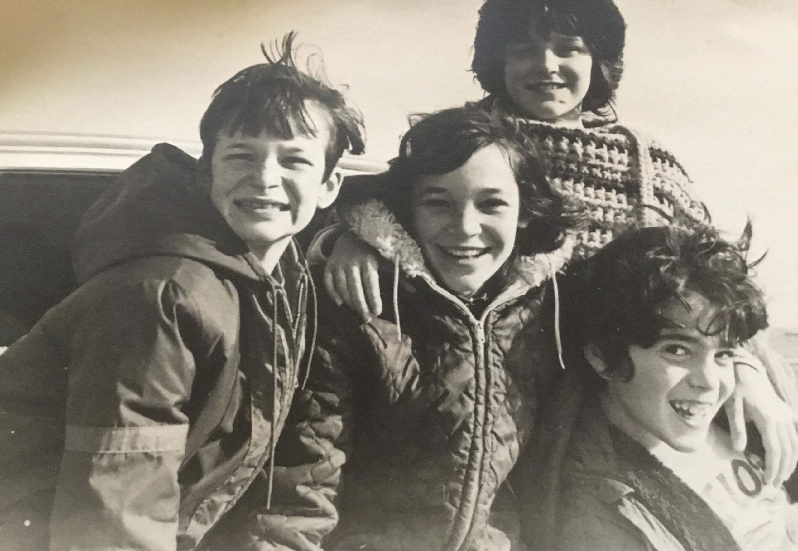
Blast from my past: I remember this day — my father took the photo, I think in 1972 or ’73, when I was eight or nine years old. That’s me at lower-right. The other kids all lived next door. Their mother, who I’m still in touch with on social media, recently found the photo (my father had given them a copy) and sent it to me.
It’s a nice memory, but I’m puzzled by what was printed on my shirt. Anyone..?
Click to enlarge
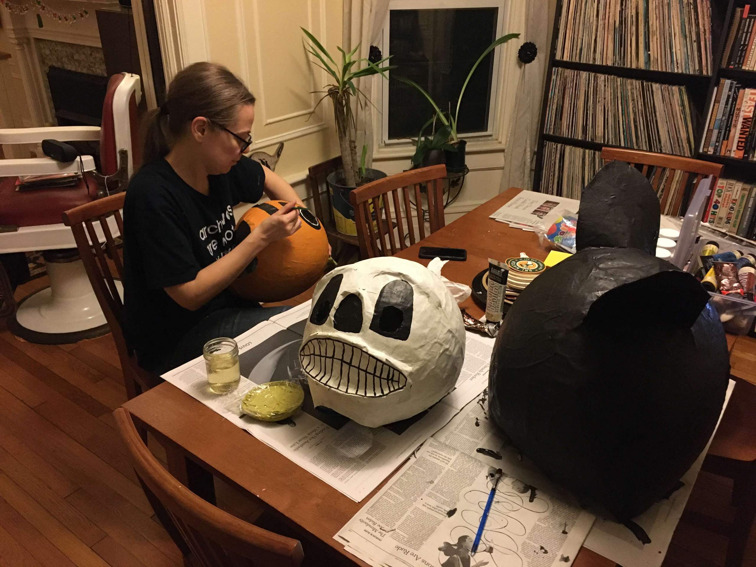
Spooooky (and crafty): For the past week or so, the Tugboat Captain’s been working on a series of papier-mâché Halloween masks. She began by blowing up big balloons, then applied the paper strips and popped the balloons after the paper had dried and hardened. Now she’s in the painting phase.
She’s much more artistic/crafty than I am. It’s so cool to watch, and very inspiring!
The Ticker
By Anthony Emerson

Baseball News: The Nationals released renderings of an upgraded club-level concourse space yesterday, but reader Neal Dorfman noticed something in the background of one of the renderings: It’s not Nationals Park. In fact, it’s Yankee Stadium. Take a look out the windows behind the bar — looks pretty Bronx-y to me! … OU is getting a new, albeit corporate-named, softball stadium (from Griffin Smith). … The justices of the Georgia Supreme Court accessorized their usual robes with pearls and Braves caps to support the home team in the World Series (from Andreas Papadopoulos).

NFL News: Reader Andrew, who didn’t share his last name, spotted a whole bunch of Reebok Colts jerseys at a TJ Maxx, and all but one are throwback-style. Guess someone found a case of old jerseys in the warehouse. … Jets owner Woody Johnson says the team will be going BFBS for Halloween (thanks Phil).
College Football News: DB Jalen Stroman will wear Frank Beamer’s No. 25 for Virginia Tech this weekend (from Andrew Cosentino). … Here are this weekend’s uni combos for UNC, TCU, Texas State, Georgia Tech, Rice, Oregon State, Oregon, ECU, Mizzou, Purdue, Villanova, UNLV, Virginia, West Virginia, Mississippi State, Syracuse, Florida, Ole Miss, FAMU, and Boise State (thanks to all who shared).

Hockey News: Statues of Guy Lafleur and Real Cloutier have been unveiled in Quebec City (link in French from Wade Heidt). … The Kraken’s “three stars of the game” postgame ritual features the three players tossing toy salmon to fans, a riff on Seattle’s famous Pike Place Market fish toss (from Geoff Poole). … Air Force will take the ice in one-off Linebacker II uniforms tonight (from Marcial Guajardo). … The Henderson Silver Knights, AHL affiliates of the Golden Knights, will wear Nevada state flag-themed jerseys today (from Dan Kober).

NBA News: Looks like the Sixers will have a Spectrum-themed floor design to go with their previously leaked Spectrum-themed City alternate (from multiple readers). … Bulls C Nikola Vučević’s jersey didn’t have the gold championship collar tag during last night’s game against the Knicks (from John Reynolds). … The Kings are the latest team to have their City Edition unis leak by way of retail merch.

Soccer News: The men and women’s teams for German side FC Carl Zeiss Jena will wear pink jerseys this weekend for breast cancer awareness (from Ed Zelaski). … Also from Ed, the Syracuse team in the National Independent Soccer Association will be called the Pulse. … The logo for the 2023 Women’s World Cup in Australia and New Zealand has been revealed (thanks, Jamie). … Oh man, check out this gorgeous tag from an unidentified Bukta kit from the middle of the 20th century — depicting a turtle to indicate that its colors won’t run! Bukta is still around as a fashion brand, but in the middle of the 20th century they provided kits for dozens of teams in the UK, as well as Ajax in the Netherlands and some clubs in the NASL (from @ACC_Tracker).

Olympic News: Ralph Lauren has revealed Team USA’s closing ceremony attire for Beijing (thanks, Phil). … The Canadian Curling Pre-Trials — the event to determine the Canadian curling teams for the 2022 Olympics — are underway in Liverpool, Nova Scotia, and here’s the logo (from Wade Heidt).

Grab Bag: The German satirical website Der Postillon just reposted this article from 2018 about a (fake) constitutional court decision requiring politicians to wear the logos of their “sponsors” — i.e., corporate donors (thanks, Jamie). … NYC Mayor Bill de Blasio, a self-proclaimed Trekkie, wore a blue Star Trek uniform during a press conference but mistakenly said it was a Captain Kirk uniform. Kirk, of course, wore yellow, not blue (from Casey, who didn’t give their last name).
Click to enlarge

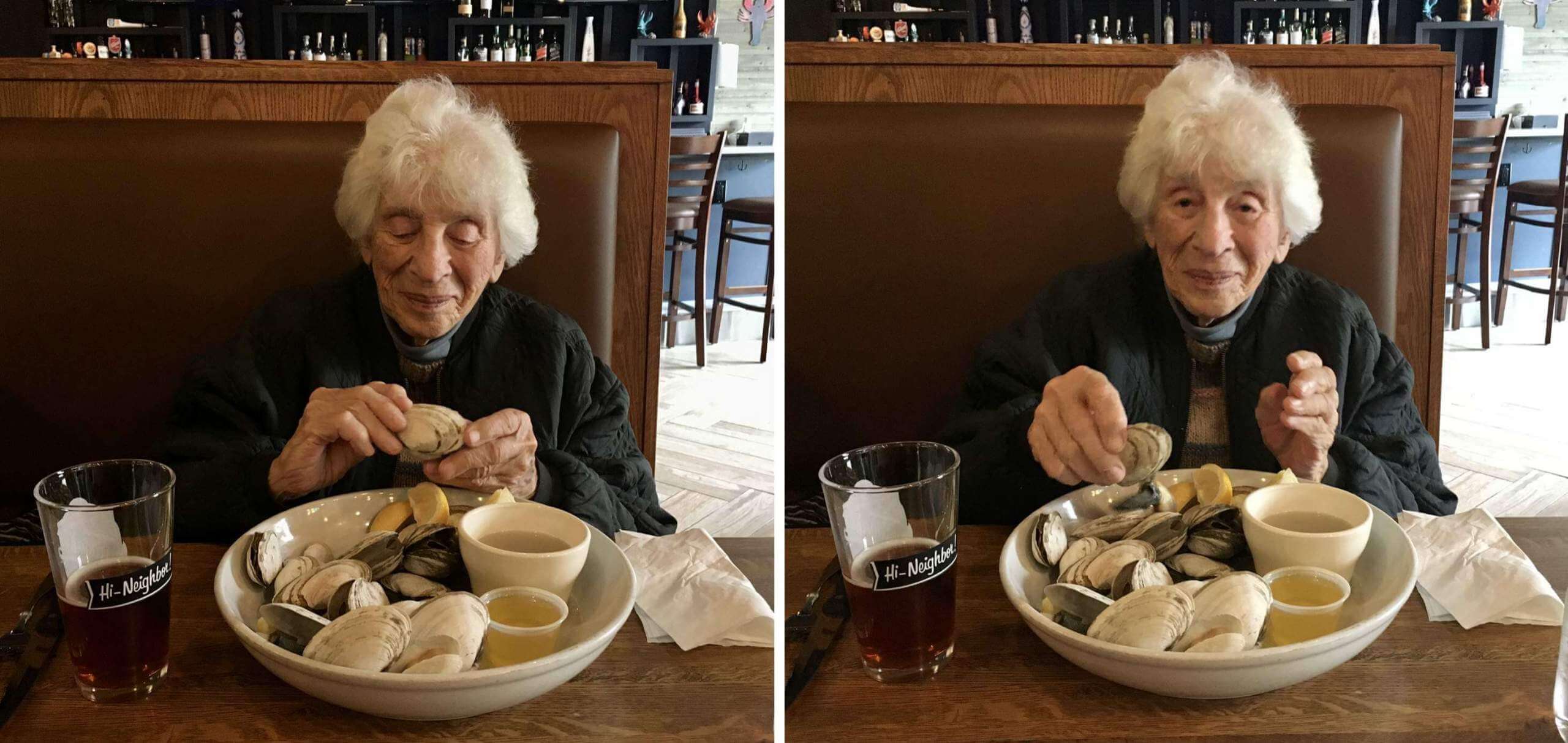
What Paul did last night yesterday: My 97-year-old mom had to spend eight days in the hospital earlier this month (non-Covid). Every time we face a situation like this, I think, “Oy, this is it — she’s finally used up the last of her nine lives.”
But then she always bounces back and it’s like nothing ever happened. She got out of the hospital last Friday, and today we had a really nice lunch at a seafood restaurant near the assisted-living facility where she lives. As she worked her way through a big plate of steamers and a pint of Blue Point Pumpkin Ale, she was as chatty and engaged as I’ve seen her in a long time.
She still has all her marbles, but she’s pretty frail now and her battery is definitely running down, so I know this can’t go on forever. But it’s still pretty amazing, and I’m enjoying it while I can.
And that’s a wrap for this week. Enjoy Phil’s weekend content, have a fun and safe Halloween, and I’ll see you back here on Monday with MMUW. Peace. — Paul
Paul,
I don’t have a facebook or meta or whatever, but the Browns have a CNR. They “retired” the number 10,363 as it is the NFL record for consecutive snaps held by Joe Thomas.
link
My understanding is that NFL teams are reluctant to retire jersey numbers due to the NFL’s limit on number to position. I’m sure you know way more about that than I do.
Thanks — I didn’t know that! But putting a number in the ring of honor isn’t quite the same thing as retiring it. The Cowboys, e.g., have lots of “honored” numbers but no retired numbers.
Those masks kind of have that House of 1000 Corpses vibe. Reminds me of the ones Otis Driftwood and company wore when they attacked the car outside their compound.
Lots of love to your mom!!
Glad to see Uni-Mom is doing well!
Regarding what’s on your shirt, I don’t know but I can parse some clues. The visible letters seem to be ELOS, but the light and shadows could be playing tricks on the eye. FEOS? EIOS? FLOS? FIOS (yuck)? And the letter to the left obscured by the jacket would need to be either A, H, M, N, maybe R or X. Does that spur any memories?
PELOSI was the first thing that came to mind. FLOSS perhaps?
Great news on your mom Paul. And while she may be getting frail, it is quite a blessing that she still has her marbles AND isn’t facing any severe physical debilitations.
One hopes we are all so blessed to see our parents live that long and well, and that we also make it that far.
Here’s hoping she makes it to triple digits! (And good beer choice on her part).
Has there been any major pieces on why Climate Pledge Arena does not currently have Sonics banners? Does it have anything to do with Chris Hansen’s still existing bid to build a new arena?
Make what you will of this:
link
All the best to your mom – that pint glass looks interesting. What was printed on the other side?
That’s a Narragansett pint glass.
Was Paul in the Cub Scouts? My guess is his shirt reads WEBELOS across the chest.
If so, I wonder if that’s a blurry/obscured Arrow of Light icon below the lettering.
I was in Cub Scouts for about five minutes but quit soon after joining. (Didn’t even get my uniform!) Don’t recall having a Webelos shirt, but I guess it’s possible!
I’ve never been a big fan of retiring numbers, for two reasons:
1. It seems counter-productive. We’re honoring someone’s number by… making sure it’s never seen again? That just seems weird to me. If anything, I feel like it should be the opposite. Want to make sure a number is remembered? Make sure there’s ALWAYS someone wearing it.
2. Logistically it can only go on for so long before you start running out of numbers. When there aren’t enough numbers left and you have to stop retiring them, that creates a situation where it looks like you’re honoring older players more than recent players for no reason other than their being old.
I’m not a Cowboys fan but I love that they hold 88 for the star wide receiver. Like it would be easy to retire, and for multiple guys, but having it pass down to each new generation is fun.
Paul,
Love that your beautiful mom is feeling better and that you get to enjoy her for as long as possible. Also, I love those Air Force unis!
“The Canadian Curling Pre-Trials — the event to determine the Canadian curling teams for the 2022 Olympics”
It is somewhat confusing. The Pre-Trials are an event on the road to determining the men’s and women’s teams. The final event to determine the winners is in late November. The Canadian Olympic Curling Trials will be held in Saskatoon, SK.
For your viewing pleasure, here is the logo for that event in late November. Of course, featuring green because it is in Saskatchewan.
link
I’d like to hear more from Mary on her crafting expertise. This is new to me and I never knew this was one of her interests. A question for her, do you have to have a release agent on the balloon to keep it from adhering to the paper mache and thus tearing it when you remove it? Thanks!
She says, “Nah.”
Glad to hear about your ma, Paul (and the great pics).
I believe a version of the politician-sponsor joke was made by either George Carlin or Bill Hicks in the ’90s.
I wonder how the Jets’ BFBS would look with green pants, or green socks.
On a separate note, this is the third year of the Jets’ “Take Flight” redesign and the team has been basically unwatchable in all three of those seasons, so the uniforms haven’t taken on any kind of identity or meaning. Although we’re stuck with them for at least two more years, and I’m in no way hoping that the team remains unwatchable for that long (although they are the Jets, so it’s within the realm of possibility), I’m thinking maybe they can bring back the classic look for 2024 and leave this unwatchable era behind.
The Jets are typically always bad regardless of how they look. But in 36 seasons they have a 46% win percentage wearing their “classic” look, including 9 playoff seasons, 9 playoff wins, and a championship. In their non classics, be it current or the green helmet look from the late 70s to the early 90s, in 23 seasons they have a 41% win percentage, with 5 playoff seasons, 5 wins, and no championships. This doesn’t account for wearing throwbacks during any season.
So they are slightly better in their classic look, by about 1 win a year, and make the playoffs about every 4 years instead of every 5 years.
They also made it to four league/conference championship games in the “classic” look, vs. one in the “non classics.”
Additionally, the Jets’ only one- and two-win seasons, and their only three-win season in the 16-game era, were in “non classics.”
Four of their five nine-win seasons, five of their seven 10-win seasons, and two of their three 11-win seasons, were in the “classic” look. Their only 12-win season was the year they brought it back.
Paul, Great to see your mom doing great. I lost my 99 year-old grandmother a little over a year ago. I know the pain of realizing that time with loved ones is running short. My wife had a project for school where she chose to basically do an interview interview with my grandmother about her life growing up in the Depression era. I still haven’t been able to bring myself to listen to it yet. She had always stated that she did not want to make it to 100, and lamented the fact that everyone she loved (my grandfather, one of her sons and her many friends that she had made throughout her many ventures in life), had all passed and left her here.
I think I may have seen something on here before, or maybe even another site about doing an interview with older loved ones, that way there is always something to be able to look back on aside from memories and photos.
I interviewed my parents when my father was still alive. Haven’t listened to that cassette in a while. Might be time to do it again.
The view from the Nationals Park club level in the mockup isn’t the only example of Yankee Stadium’s influence on the franchise. The original “Nationals” jersey logo from 2005-2010 was vertically arched, with enlarged letters anchoring the ends, and was clearly an homage to the iconic arched friezes that grace the upper deck at Yankee Stadium.
So cool about your mom!! love that she had a pumpkin ale!!!
Give your mom a big hug for all of us without one around! God bless
ELOS on your shirt. Were you an early supporter of Nancy pELOSi?
:-P
Paul, I’m curious about your thoughts on Major League Baseball commissioner Rob Manfred comments about Atlanta using the Braves name. Saw this on Chris Creamer’s site. Sounds like they are using the same reasoning as Florida State, with local Native American tribes approving of it. The cynic in me wonders if the team is making it financially beneficial to go along with this?
I think it’s apples/oranges. The “Seminoles” name belongs to the tribe — it’s their intellectual property, and they’ve essentially licensed it to FSU, as is their right.
“Braves” (and the chop, all the other nonsense) does not belong to Atlanta-area Native Americans.
As for speculative conspiracy theorizing, let’s please not go down that road. Thanks.
Delete my comment if I am wrong, but I believe its worth noting -and important to do so – that the Eastern Band of Cherokee Indians, the Native American community in that region that is “wholly supportive of the Braves program, including the chop,” according to Manfred, also runs the The Harrah’s Cherokee Resort and Casino in Cherokee, in North Carolina, and is a Braves sponsor.
Any claim by Manfred that the names Braves and the chop are okay with Native Americans applies to only one group, and that group has a business relation with the Braves.
Just FYI
Lee
This is what I thought. The commissioner is selling this as a local thing. Each market has their own local issues.
Great to hear that your mom is doing better and that you are able to spend that quality time with her. What a blessing!
I’ve never been a fan of retiring numbers. It’s cool and all but I do like seeing a player on the field and thinking of the other players who once wore it. I do have a compromise suggestion: How about adding an expiration date? Say the team honors a player and doesn’t issue the number for a 10 year period. Give sufficient time for fans to “miss” that number and then the team can reissue it. Maybe 20 years if the player is of a GOAT-like status.
The New York Islanders have two CNRs:
1500 for Al Arbour’s number of games as head coach of the Isles,
a BOWTIE for Bill Torrey, his signature wardrobe piece.
You can see the training facility versions of them in this link:
link
A bowtie is not a number!
And I would counter that the Isles didn’t ‘retire’ 1500.
My argument is based on the fact that the banner is not hanging with the retired numbers, but in a section with Torrey’s bow tie and their NHL Hall of Fame inductees.
link
I sure hope St. Louis soon has a “33” banner hanging in a metro area NFL stadium.
Or… St. Louis Chargers has a nice ring to it. KC rivalry would be the bee’s knees.
I’d even take the Jags. The regional rivalries in that division would be as geographically sound as they get.
Those masks are wonderful. The pumpkin one looks like its from “over the garden wall.”
Paul, I loved your CNR article. It is such a huge pet peeve of mine!
No number should be retired unless it’s for a player who actually played on the field/court and wore the uniform of the team. Team owners, coaches, executives, or players from other leagues should not have a number retired. It’s fine to have a banner for a coach or owner (i.e. Chicago Bulls and Phil Jackson.
One other thing that bothers me is when a number is retired for an active player who passes away. While tragic, it is not grounds for a number retirement. The only exception is if that player is actually a Hall of Famer or important player in that franchise’s history. For example, Roberto Clemente. Whether he lived past 12/31/72 or not, his number was going to be retired.
I’ll never understand why the Hornets retired #13 for Bobby Phills. He was a solid player, but he played 3 seasons for the Hornets and died doing a stupid act by drag racing with a teammate. Similarly, Malik Sealy died in a tragic car accident and his #2 was retired despite playing a grand total of 69 games for the T-Wolves over two seasons. It’s horrible that both players lost their lives, but they should not have their numbers retired.
Considering the Celtics are routinely cranking out guys wearing #37 or 46, they need to release #1 and #2 back into circulation and have numberless banners for Red and Walter Brown.
Lastly, all fan number retirements need to end. It’s beyond idiotic, insulting, and is a minor league thing to do. Just end all the 6th man or 12th fan crap. It’s fine to do it as a fan gimmick, but not at the expense of preventing the number from being worn on the field.
Again Paul, thanks for the great article and putting me into rant mode!
Retiring numbers is a bad idea, change it to a ring of honor, and put all those Celtic and Yankee numbers. Having to wear a high number is anti-motivational. Jackie’s “42” and Roberto’s “21” are still in circulation, being worn on special days.
…put all those Celtic and Yankee numbers back in circulation.
“the Kraken’s recent retirement of No. 32 because they’re the 32nd NHL franchise”
Were I a Kraken fan, I would much prefer the number 21 be retired for 2021, the year of the team’s inception. In say 30 or 50 years, will it really be that remarkable that they were the 32nd franchise? Their year of establishment seems much more noteworthy. (Of course, they may be the Oklahoma City Kraken by then.)
The NY Times Crossword today has a clue, “Name on many a sports jersey.” The answer is “SPONSOR.” Do better, NYT Crossword!
Why? There is nothing wrong with that answer.