Oh snap!!!!!! pic.twitter.com/ENvEFGqmaW
— Ref Ryan T (@refryant) October 18, 2021
More leaks of NBA City designs yesterday, beginning with the Nets retail shirsey shown above, which obviously draws from their New Jersey period. The core design is similar to last season’s tie-dye throwbacks, but without the tie-dye. Since this season’s City designs are all supposed to be historical mash-ups, there’ll presumably be other details from the franchise’s past on the side panels and shorts.
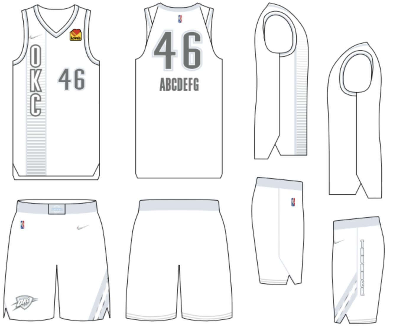
Meanwhile, a more intriguing situation — and definitely a more absurd one — unfolded around the Thunder, who apparently leaked their City uniform in their own media guide. Beat writer Joe Mussatto, who covers the team for The Oklahoman, broke the news:
Here's the full spread. Looks like the Thunder will be wearing a lot of white this season. pic.twitter.com/IpfV4xzqWX
— Joe Mussatto (@joe_mussatto) October 18, 2021
The odd context of the leak is exceeded only by the oddness of the design itself. If the media guide is to be believed, OKC’s City uniform will be white with silver/grey trim (but a full-color ad patch, of course — sigh). Let’s take a closer look (click to enlarge):

SportsLogos.net has a really good breakdown of the historical inspiration for each design element. But that almost seems beside the point compared to the larger issue here: Are they really going with grey on white? Seriously? Is there any chance that they left out the colors because it hasn’t been officially unveiled yet? Maybe a printer’s error in the media guide?
Seriously?
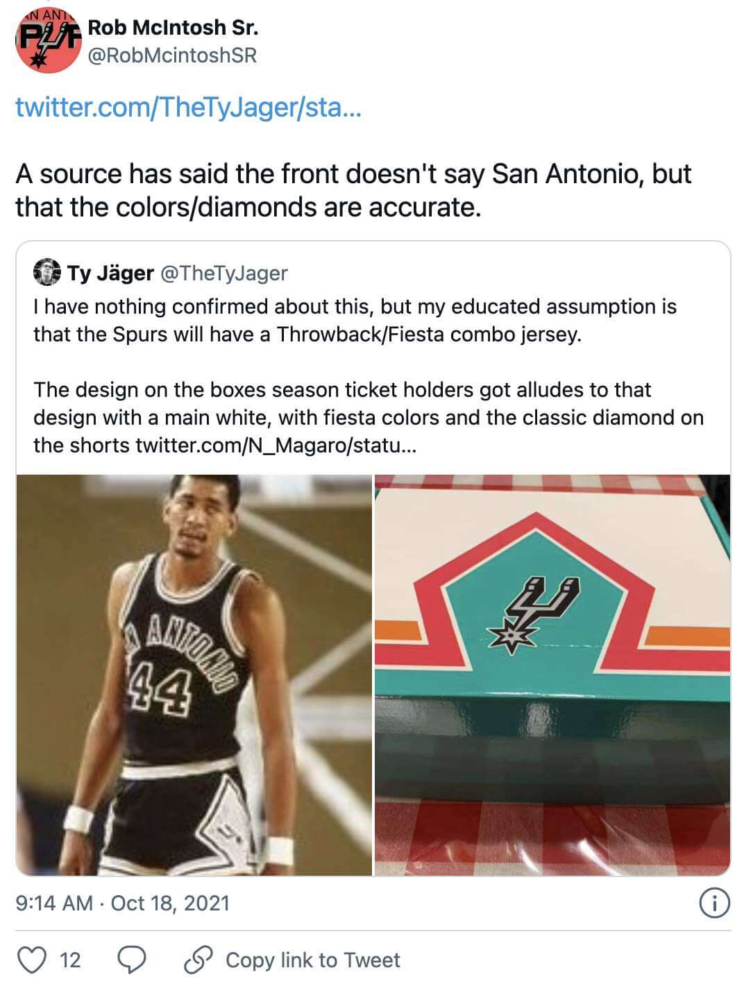
Meanwhile, the Spurs may have provided a hint about their own City design with their season ticket package:

As I explained last week, the City alternates begin showing up on this year’s uni schedule in early November, so we’ll likely keep seeing more leaks for the next couple of weeks and then a flood of official unveilings.

NBA Season Preview reminder: In case you missed it on Monday, the annual Uni Watch NBA Season Preview, which has all of the uni and logo news for the coming season, is now available for your reading pleasure over at InsideHook. Enjoy!

Click to enlarge
Collector’s Corner
By Brinke Guthrie
Follow @brinkeguthrie
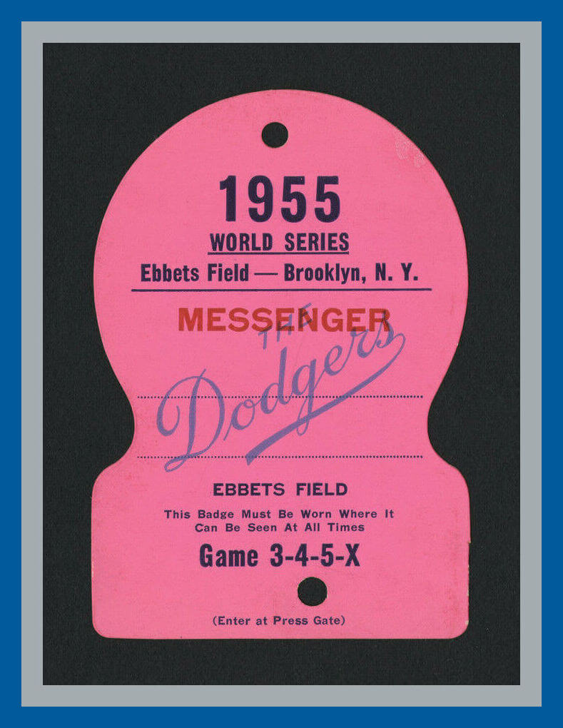
The MLB postseason continues (minus my SF Giants) with the Dodgers going for their second straight World Series win. They won it back in 1955, too; that’s the year for this rather pricey Ebbets Field “Messenger” pass. As the seller explains, “This bright pink colored ‘Messenger Press Pass’ would have been used during games 3, 4, and 5 at Ebbets Field in Brooklyn.” But what messages were they relaying?
Now for the rest of this week’s picks:
• Here’s another great item from the same seller as above; a 1947 New York Yankees press pass, with “The American League Baseball Club of N.Y., Inc.” right on the front, all official-like. “Positively not transferable,” it says on the back, so don’t get any smart ideas about getting into the wayback machine and using it yourself.
• Take a look at the perfect block-shadowed lettering on this 1971 CFL Montreal Alouettes yearbook.
• Buffalo Bills fans, keep your hands clean with this Bills soap dispenser of unknown vintage.
• New York Mets fans, keep your car smelling good with this set of Mets air fresheners. One’s a glove and the other is a helmet. (Hmmm, will your car smell like a dugout or clubhouse?)
• Nice artwork on this 1982 McDonald’s/Milwaukee Brewers promo placemat.
• Tareyton cigarettes (that’s Dual Filter, fella!) sponsored this 1962 Baseball Guide & Record Book, published by The Sporting News.
• Here’s a box of a dozen Thurman Munson Wiffle Balls from 1978. (Curve It! Bat It!) They also come with some collectible player “discs.” Munson would tragically die a year later in a plane crash.
• Dandy Don Meredith graced the cover of the NFL’s First Official Illustrated Digest for the 1967 season.
• This promotional booklet was issued two years later to commemorate the 50th anniversary of the NFL in 1969.
• This big ol’ 1970s Cleveland Browns helmet is in fact called an “NFL Helmet Picnic Flair Set.” The helmet opens up and I assume all the spoons, knives, forks, plates and cups (35 pieces!) fit inside.
The Ticker
By Alex Hider

Baseball News: Reader Jeffrey Schleicher notes that the ALCS games in Houston look a bit off because the lettering on both the Astros’ home jerseys and Boston’s road jerseys leans to one side — something that Paul first wrote about a few years ago. Luckily, we get at least two more games in Boston, where the jersey matchup is much more balanced. … Speaking of the ’Stros, Houston players wore beanies with the team’s batting practice Tequila Sunrise-inspired logo prior to last night’s Game 3 (from Ignacio Salazar). … Former Atlanta player Dale Murphy threw out the first pitch before Game 2 of the NLCS Sunday, and had several wardrobe changes on the field. He initially wore his own jersey, then removed it to reveal a Henry Aaron jersey, then removed that to reveal a jersey for 3B Austin Riley, and then put on a pearl necklace as a nod to OF Joc Pederson (from Michael Rich). … Comedian Joe Mande (who was featured in a Uni Watch post earlier this year), points out that the logos of the remaining four teams in the playoffs spell out BLAAH (thanks to all who shared). … In this interview that first aired in 2017, Rush vocalist Geddy Lee showed journalist Dan Rather his extensive baseball memorabilia collection (from Ted Arnold). … The man who designed the mascot for the Kintetsu Buffaloes of Japan’s Pacific League back in 1976 is now making Kintetsu-approved merchandise of the old mascot (from Jeremy Brahm). … The U.S. National Postal Museum in Washington, D.C. is planning an exhibition of historic baseball memorabilia next year (from Phil).

NFL News: Jackson Mahomes, the younger brother of Chiefs QB Patrick Mahomes, has apologized after he filmed a TikTok dance on Sean Taylor’s memorial logo on the day of Taylor’s number retirement. … Mark Dziak lives in Bremen, Germany. He was at the Bremen Freimarkt (“Think big fair with rides, vendors, and lots of good food,” he says) and noticed this trash can that had appropriated the NFL logo.
College Football News: The next two items are from Phil: BYU will wear mono-white against Washington State on Saturday. … As a reminder, Penn State will wear their throwback mashup jerseys against Illinois on Saturday. … @NFL_Journal found some rare color photos that show Arizona’s old “UA” helmet logo and New Mexico’s turquoise accents. … This time-lapse video shows the Arkansas Razorback logo being painted at midfield at Little Rock’s War Memorial Stadium (from Matt Snyder). … Miami will go mono-BFBS on Saturday against NC State (from Jason Lefkowitz).

Hockey News: As had been previously announced, the Coyotes wore white at home for last night’s home opener against the Blues — a way to give home fans a look at the new Kachina road throwbacks. That created some logistical challenges for the Blues’ equipment staff, since they were forced to pack all their blue gear in addition to all the standard white road gear they were bringing along for the rest of their road trip (thanks to all who shared). … This cool behind-the-scenes video shows the efforts that the Maple Leafs equipment manager goes through to make sure he has replacement sticks at the ready (from Ted Arnold). … Speaking of the Leafs, they wore black straps and ear loops with their blue home helmets during the preseason but have now switched to white in the regular season (from Andreas Papadopoulos). … In a move that may be pandemic-related, the Rangers are labeling water bottles with player numbers, rendered in the proper fonts (from Alan Kreit). … The next two items are from Wade Heidt: The Moncton Wildcats, the Blainville-Boisbriand Armada, and the Rimouski Oceanic of the QMJHL as well as the Saginaw Spirit of the OHL, wore cancer awareness uniforms on Sunday. … New mask design for G Kelton Pyne of the Regina Pat Canadians, who play in the Saskatchewan Male U18 AAA Hockey League.

Basketball News: Here’s a ranking of the top five uniforms in Hornets history (from Phil). … TNT used outdated jerseys with old ad patches in a promotional social media graphic yesterday (from Tom, who didn’t give his last name). … Lakers C Jay Huff will wear No. 30 this season (from Etienne Catalan). … George Washington officially unveiled their new men’s and women’s uniforms yesterday (from Matt Eliot)

Soccer News: Venezia FC’s new fourth jersey has leaked after the team was spotted holding a photo shoot (from @WiscoFTW). … Fans of HBO’s Succession will love this: In a Season 2 storyline, Roman Roy mistakenly buys Scottish club Heart of Midlothian FC in the hopes of pleasing his father — a fan of the club’s archrival, Hibernian FC. Hearts are now giving away jerseys with the fictional sponsorship “Waystar Royco” as a promotion for the show’s third season, which debuted Sunday (from @BestSeattle77). … Soccer blog Squad Numbers has a piece where it forms 10 center-back pairings of every combination of numbers from 2 through 6, which are the traditional numbers for defenders. But the restriction is that it’s only using defenders currently on European men’s teams (from our own Jamie Rathjen and Museum of Jerseys). … Paul noted yesterday that he had received a bottle of Kraken rum — the official rum of the NHL’s Seattle Kraken. That prompted Andrew Clarke to note that competing brand Captain Morgan released a limited-edition bottle upon Leceister City’s Premier League Championship in 2016. … Here’s what the badges for Italy’s top clubs looked like in 1984 (from Jeremy Brahm). … AFC Bournemouth’s new MF Robbie Brady will wear No. 12 (from @DorsetBengal).

Grab Bag: Former Democratic presidential candidate Andrew Yang is starting his own political party, and its new logo was roasted on social media yesterday for its similarities to both the G.I. Joe and Top Gun logos. … Longtime reader Andrew Cosentino , whose name is probably familiar to you from his many Baltimore- and Virginia Tech-related Ticker contributions over the years, was a guest on the Baltimore podcast The Truth in This Art, where he discussed Uni Watch, Turn Ahead the Clock, and City Connect uniforms. … I never noticed this before: The two chocolate bars that dot the “i” in the Twix logo double as the “pause” symbol — a nod to the candy’s previous ad slogan, “Need a moment?” … New name and logo for Nielsen, the TV ratings company (from @PhillyPartTwo).
I like the new New Jersey shirsey.
“Rush vocalist and keyboarder”
Forgot his main instrument! Slap-a da-bassssssss
“New name and logo for Nielsen, the that TV ratings company” should be “… Nielsen, the TV ratings company.” Delete “that”.
Done.
I dont follow the NBA too closely, nor do I live near Oklahoma City, could anyone tell me if there is a reason why OKC has decided to stick with the most bland, pointless logo in sports?
I can’t image they get much, if any positive feedback on it. Of all the teams that need a rebrand, it is the Thunder. Has ownership ever commented on why they stick with that, whatever it is?
They’ve had some decent alternates that are inspired from the local Native American culture, surely they could fully rebrand along those lines.
Is it really a “leak” if it’s in the media guide?
The Rangers also had individual labelled water bottles a few years back during a mumps outbreak
Some more footage of Geddy Lee and his baseballs here: link
The “messenger” pass Brinke showed was probably a pass for an assistant to a photographer for a wire service or newspaper who would take the film the photographer shot and run it back for developing.
Hey Paul is it possible that those perfect drop-shadowed letters on the Alouettes cover are actual objects that have been die-cut and then photographed? The artist in me had a little bell go off in my head. Thanks
“Speaking of the Leafs, they wore black straps and ear loops with their blue home helmets during the preseason but have now switched to white in the regular season”
This is a good move and glad the trend is reverting back to the white ear flaps and chinstraps. If the team does not have black in its colour scheme, should go with the white ear flaps and chinstraps.
I don’t know if this is a case of two people arriving at the same thought, or if one person copied the other, or if Joe Mande is the Reddit guy, but the point about the logos of the ALCS and NLCS teams spelling “BLAAH” was made in a popular Reddit post three days ago:
link
Actually, four days ago.
Based on the helmet stripe and jersey color, the Bills soap dispenser is 2002-2010 vintage.
Hi Paul. The ticker item for New Mexico is showcasing our turquoise accents. Teal is not a UNM color. Thanks sir!
Fixed!
These insidious pop up ads take up almost half of the page.
I would never have expected to see the Freimarkt Bremen on Uni Watch! I can only confirm “Think big fair with rides, vendors, and lots of good food” but lots of beer is missing!