With the NBA season set to begin next Tuesday, Oct. 19, the league took a major uni-related step yesterday by loading the full 2021-22 uniform schedule onto its LockerVision site.
LockerVision, which debuted in 2018, is the only publicly available site of its type in pro sports. It shows the uni matchups for every single regular season game, from next Tuesday’s season tip-off to the final day of the regular season on April 10. Teams v-e-r-y occasionally deviate from what’s shown on LockerVision, but not often. It’s pretty much the Bible for NBA uni tracking.
After this season’s uni schedule went live yesterday afternoon, I spent some time poking around on LockerVision. Here are some observations:
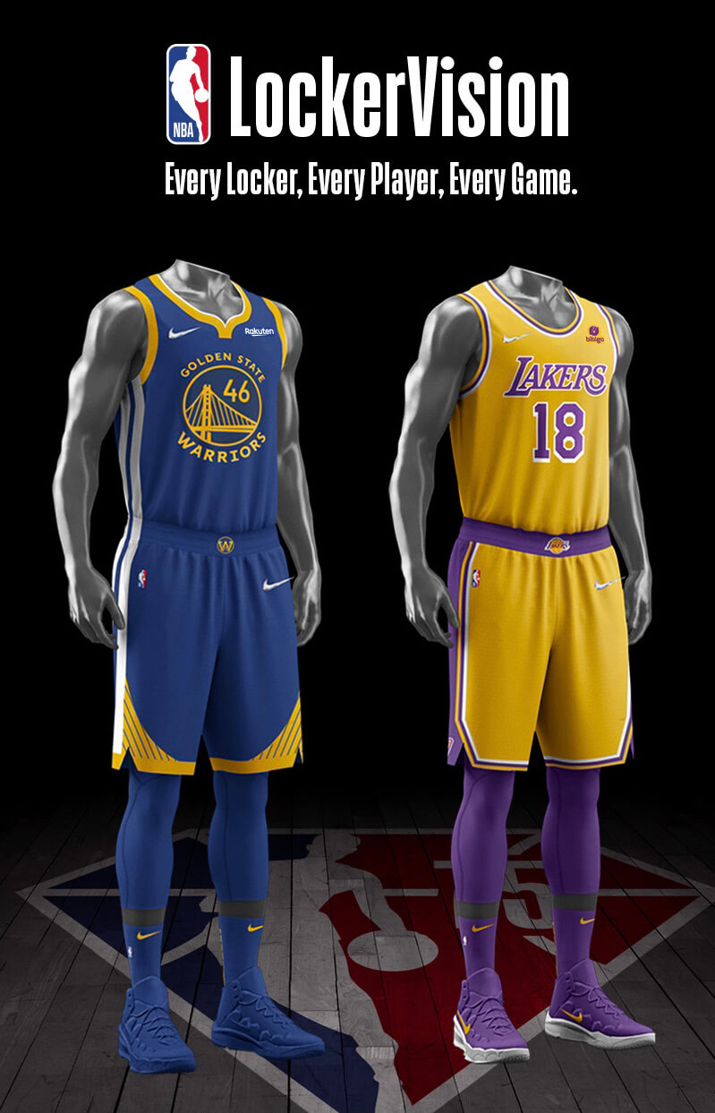
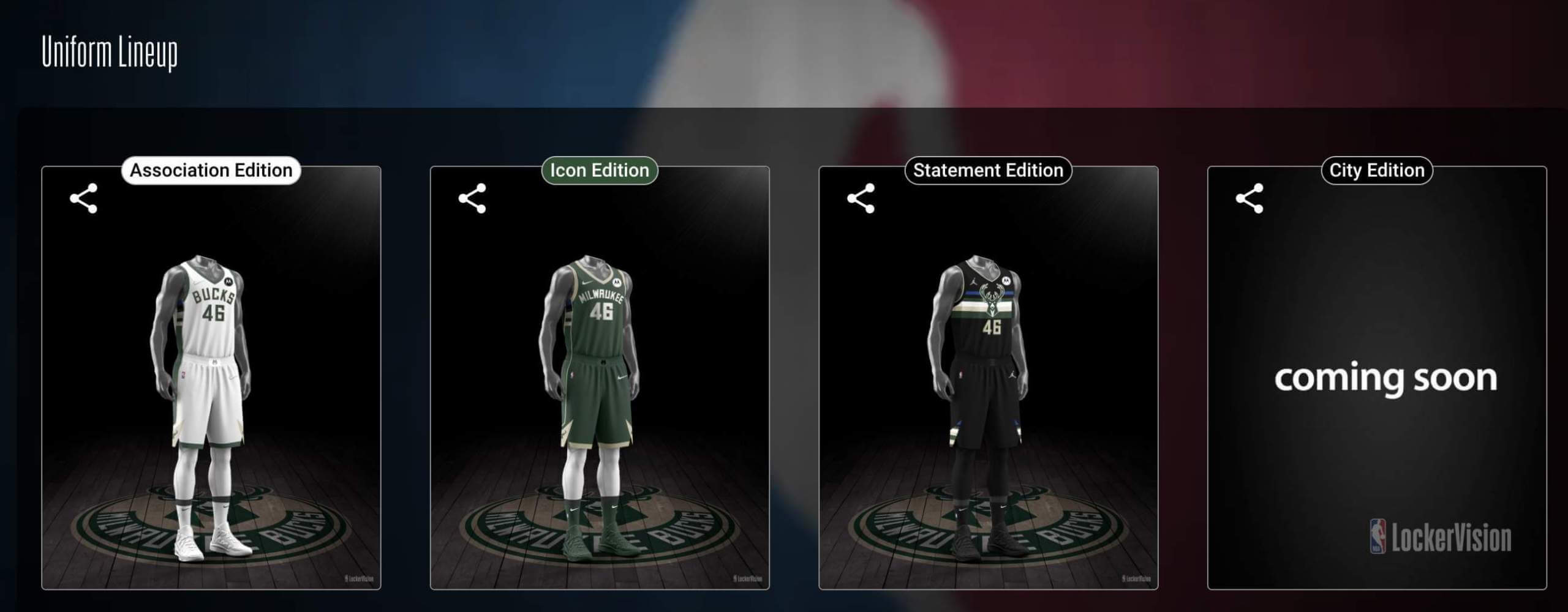
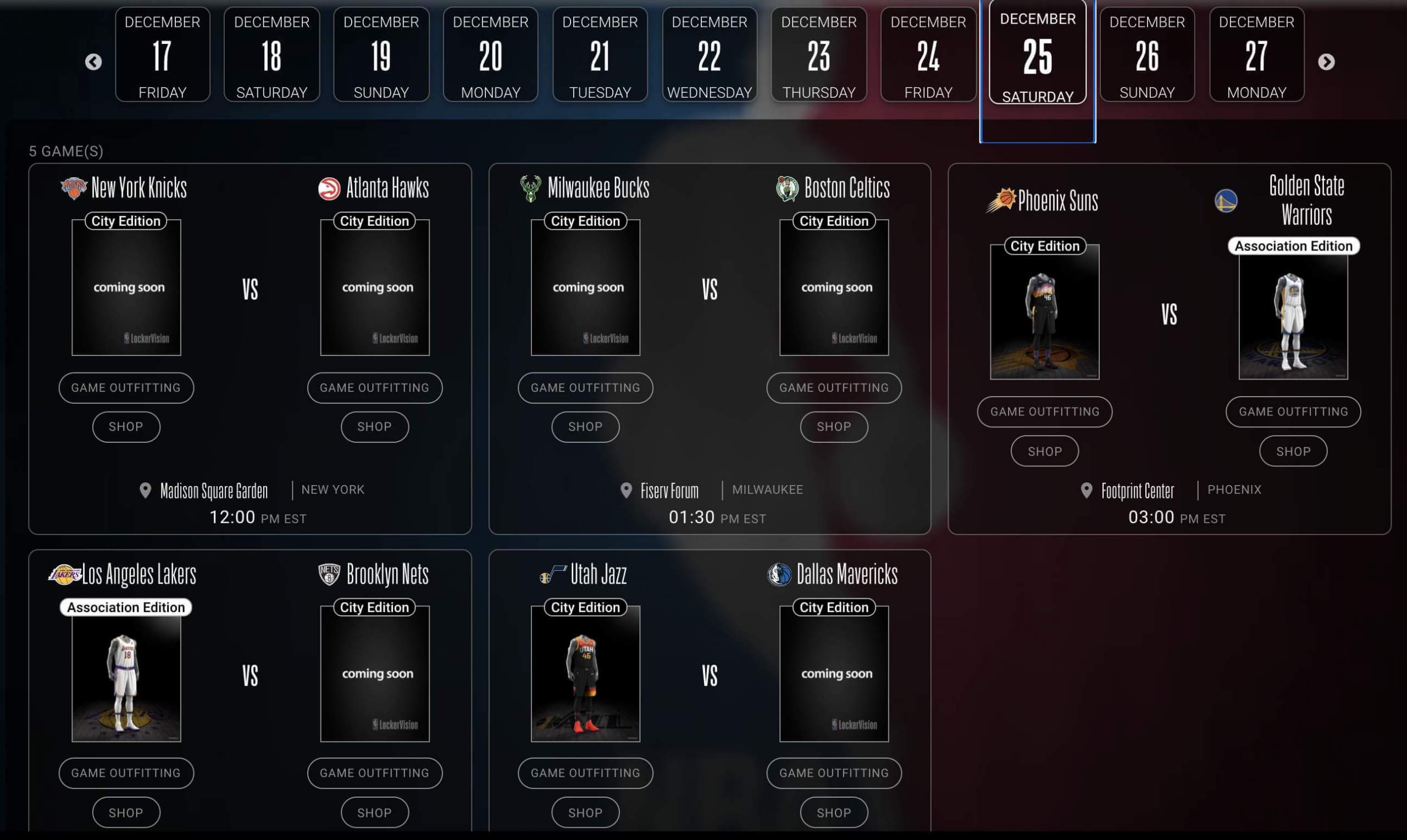
• The LockerVision site itself has been given a substantial makeover. The new interface is more handsome and dynamic than the old one, and there’s now detailed info on each uniform worn by each team (or maybe that’s not new — honestly, I don’t recall). For example, here are all of the Bucks’ uniforms. If you click on one of them — the white “Association” design, say — you get a paragraph of info on that uniform (including some marketingspeak bullshit, but whatever) and a look at the warm-up gear that goes with it. You can also see every team’s primary white uni, every team’s Statement alternate, and so on.
• As you may have noticed on that first Bucks link, all of this season’s new City uniforms — these are the “mash-up” or “mixtape” designs, some of which have already leaked, that will use graphics drawn from each team’s visual history — are listed as “Coming Soon,” both on the individual team pages and on the schedule breakdown (click to enlarge):
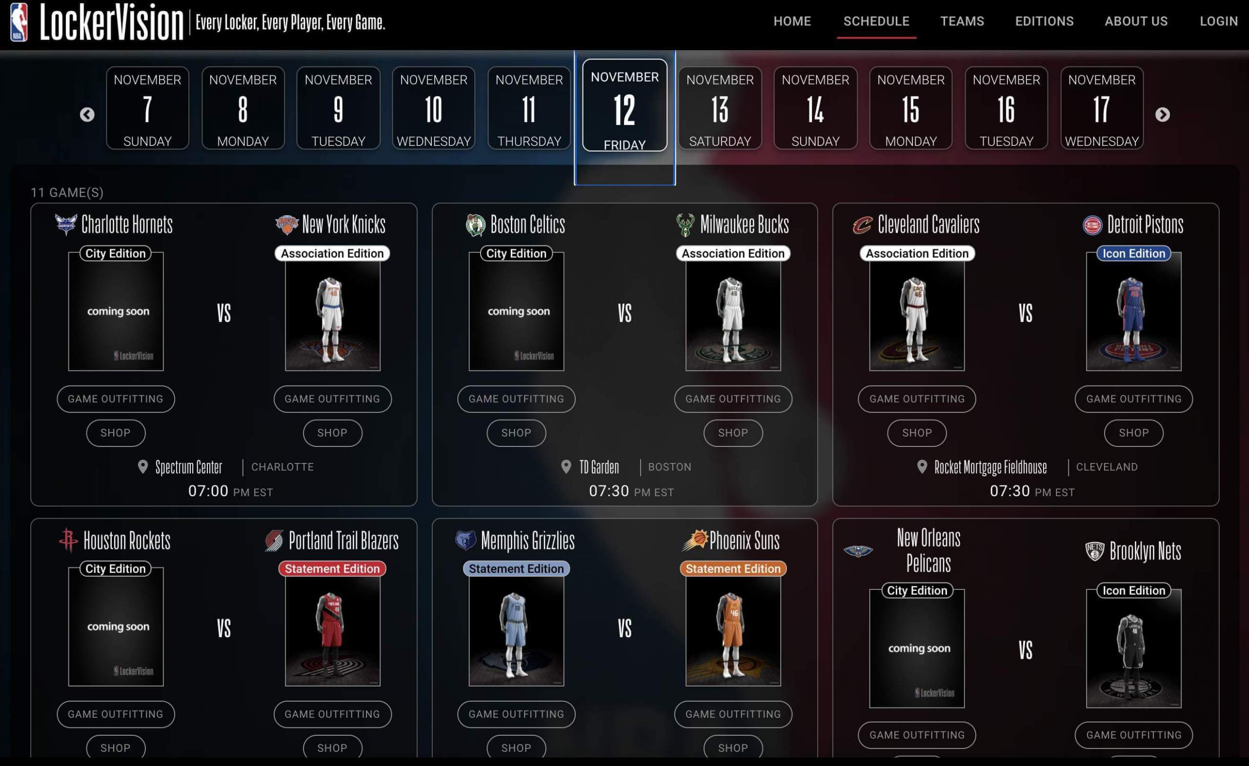
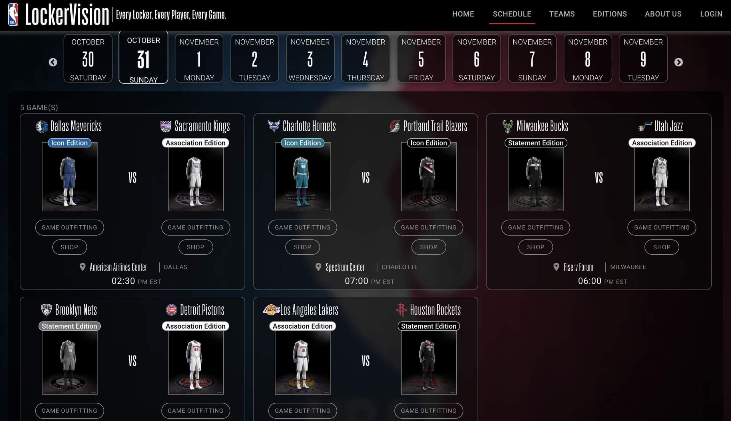
• Looking at the schedule, it appears that the new City uniforms will start being worn on-court on Nov. 3 — not for every game, but for many of them — so expect to see lots of the City designs unveiled by that date. (Of course, many more of them may leak in the interim.)
• As had been previously reported, two teams — the Suns and Jazz — are reprising their City uniforms from last season, so they will not get new City mash-up designs.
• No Earned uniforms on this year’s schedule. That aligns with what I’ve been told. (For those keeping score at home, the Earned program debuted in 2018-19, was scrapped for 2019-20, returned last season, and is gone again this season — for good, I’m hoping.)
• Not a single black-vs.-orange game on Halloween. Come on, people! Sigh:
• Eight of the 10 teams playing on Christmas Day are slated to wear their City designs (click to enlarge):
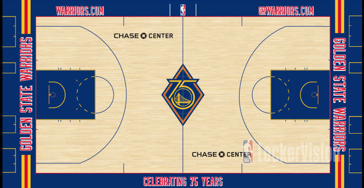
• If you look at the home team’s “Game Outfitting” for any game on the schedule and then click the right-hand arrow to scroll through the warm-up gear, you’ll eventually get to the court design being used for that game (although the ones tied to City uniforms are, like the unis themselves, “Coming Soon”). This allows us to see, for example, that the Warriors have a throwback court to go with their new throwback uniform:
Interestingly, the Knicks and Celtics also have new throwback uniforms, but LockerVision shows them using their standard court designs (the “Core” design, as LockerVision calls it) for their throwback games. Or at least that’s what it shows now — yesterday a throwback Celtics court was shown:
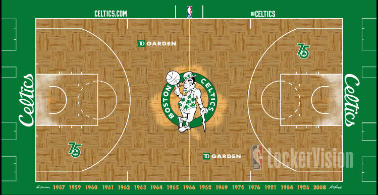
Not sure why that design was removed from LockerVision after initially appearing there. Hmmmmm.
I have not yet had time to compare every team’s Core court design to last year’s (although there’s already news about changes for the Cavs). If anyone wants to do that, to see which floors have been updated, that would be a genuine public service!
———
I’m sure there’s more info to glean on LockerVision, so feel free to post whatever insights you come up with.
Meanwhile, with the full uniform schedule now released, some enterprising uni trackers are already providing breakdowns for individual teams. Here’s one for the Jazz:
🚨BREAKING🚨 The @utahjazz schedule for the upcoming season has been released 😍#TakeNote pic.twitter.com/tckpE62lkj
— Jazz Uniform Tracker (@JazzUniTracker) October 12, 2021
(My thanks to Twitter-er @sullstice for spotting the Celtics’ throwback court.)
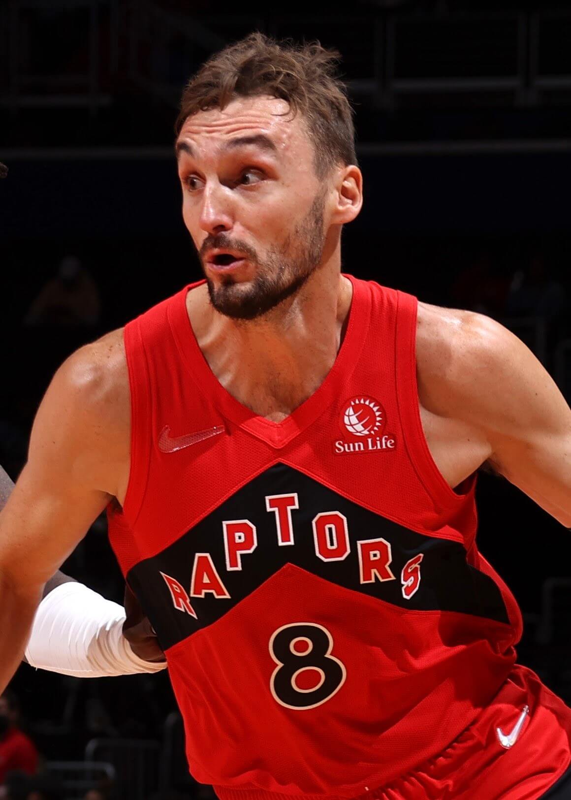
Addition by subtraction: As you probably know by now, Nike is using a diamond-crystal maker’s mark for NBA jerseys and shorts this season, to mark the league’s 75th anniversary. But if this photo of Raptors forward Sam Dekker is any indication, the diamond marks are glued on, not sewn on — and Dekker’s fell off during last night’s preseason game.
Gee, it would be a real shame if a lot of that happened this season, eh?
(My thanks to Kevin Ramchand for this one.)
• • • • •
The Ticker
By Lloyd Alaban

Baseball News: A woman caught a ball using her friend’s prosthetic leg at a recent White Sox game (from Max Weintraub). … The Phillies and the designers of the club’s Phillie Phanatic mascot have settled their lawsuit (from @PhillyPartTwo). … A fan at last night’s White Sox game wore a 1919 White Sox uniform (from our own Phil Hecken). … The Braves used the Brewers’ outdated logo on a scoreboard graphic yesterday (from Michael Rich). … Here’s a deep dive on the various rule changes MLB is considering in an attempt to make games less “boring.”

NFL News: Reprinted from yesterday’s comments: If you believe the Giants’ and Rams’ published uniform schedules, the two teams are slated to wear go white vs. dishwater this week. That can’t possibly be right — the Rams will presumably have to wear blue (also from our own Phil Hecken). … Also from Phil: Throwbacks for the Bears this week. … In the wake of the Jon Gruden scandal, the Bucs announced that they’re removing Gruden from their stadium’s Ring of Honor.
College Football News: The next four items are from our own Phil Hecken: Throwbacks for Kansas this week. … Mono-blue unis for Memphis this Thursday. … The Sailor Bear is returning to Baylor’s helmets this weekend. … UCF unveiled its “space” uniforms. … Throwbacks for Montana to celebrate the 20th anniversary of its national championship (from Bridger Deschamps).

Hockey News: The Lightning raised their championship banner prior to last night’s game. … The Blackhawks will reportedly have separate home and road alternate captains. D Connor Murphy will wear the “A” on the road and F Alex DeBrincat will wear it at home. F Patrick Kane will wear the other “A” for all games (from Jason C.). … New helmet ads for the Canucks (from multiple readers). … New logo for hockey equipment company Bauer (from @GoalieGearNerd). … ESPN’s fantasy app didn’t include the Kraken’s logo last night (from Chris Rucinski).

Soccer News: Chelsea’s goalkeeper kit for the 2022-23 Premier League season has leaked (from Kary Klismet).

Grab Bag: The McLaren team is releasing jerseys for the US Grand Prix (from @MisterPigz). … San Francisco International Airport has a museum of airline uniforms (from Skott Daltonic). … The UPC bar codes on Trader Joe’s’ baking soda and baking powder are made to look like birthday cakes (from Graham Block). … Here are the uniforms that the Blue Origin crew that includes William Shatner will wear on today’s spaceflight (from Kary Klismet). … One more from Kary: Coastline Community College in Orange County, Calif., has unveiled new athletics logos in honor of its 45th anniversary. … The New York Post ran a fun infographic showing NYC sports championships as broken down by mayoral administration (thanks to all who shared).
“Chicago baseball fan snagged a ball tossed into the stands with the help of her friend’s prosthetic leg during a recent White Sox home game.”
Not her leg, a friend’s leg.
Thanks. Fixed.
Interesting that the Buccaneers are removing Gruden from their ring of honor. If only because undoubtedly so many players and coaches from the past 100 years of football who are enshrined both by teams and by the HOF have said and done far worse than Gruden.
That is not meant to discount what Gruden said.
I suppose to the case to be made is Gruden said/did these things once our culture moved pasted tolerating such abhorrent behavior. Of course OJ Simpson remains in Canton…
Let’s please not go down a rabbit hole of whataboutism today. Thanks.
His removal had nothing to do with how our culture and society has evolved.
It had everything to do with his comments about Bryan Glazer in the emails. The Buccaneers still have Warren Sapp in the ring of honor and Antonio Brown on the payroll. They are not a beacon of high morality.
I reallyreallyreally don’t want to debate the Gruden scandal here. It is not a matter of Uni Watch concern, except that it has resulted in a change to Tampa’s stadium.
Tampa’s motivations for doing that (which nobody can fully glean unless you’re a mind-reader) are not relevant here. The “morality” of the Tampa organization is likewise not relevant here. What’s relevant is that they made a change to their stadium — full stop.
Let’s please move on. Thanks.
The LockerVision site is interesting for a couple of reasons. One, obviously, it’s neat to see what teams have planned and what matchups we might be seeing. But it also got me thinking about how far in advance teams in various sports plan their uniforms. The NBA, as we can see, is largely scripted out for the full season. NFL teams plan their jerseys for the full year before it starts, but I’m not sure if they all plan their pants at the same time or if they can make those decisions closer to the week of the game. Baseball is very different in that some dates (Jackie Robinson, players’ weekend, etc) we might know in advance what the teams are wearing, but I don’t remember seeing anything like LockerVision in advance of the baseball season. That obviously excludes teams like the Yankees, who are going to wear pinstripes at home all the time. I have no idea about the NHL. Does something like LockerVision exist for that, or do individual teams put out season-long uniform plans?
NHL teams sometimes list the dates when they’ll be wearing their alternates (and then you can assume primary home and road for the remaining games). And this year the Hurricanes released their uni schedule for the entire season — the first time I can recall an NHL team doing that.
A disappointing release that was from the Hurricanes. Too many games with the black alternate uniforms. I’m not a fan of that uniform for various reasons. Mostly the stick with flags logo is an alright secondary but does not sit well or look good as a primary crest.
The Hurricanes have an inconsistent look throughout their unis. We talk a lot about teams looking better in older or original uniforms. Throw the Hurricanes on that list for me. Bonus points for the socks on the red uniforms looking way better than they do now.
link
link
Anyone else find it odd that LockerVision lists the home team first? Just wondering
Yes, I had the same thought!
Was it perhaps originally developed for soccer?
Could be, it’s a minor thing, but I always have to flip that switch going back and forth between soccer and US sports.
The NY Rangers have had different alternate captains, home and road, for years.
Didn’t realize that. Thanks for letting us know!
I really wish St. Louis had an NFL team, but I can’t say the same for the NBA.
Re: Gruden… it will be interesting to see if there is “retail scarring” where his name has been located in the Rin of Honor. It’s a phenomenon where a sign is removed from the side of a building, but due to weather, fading, dirt, etc, you can still read what the letters used to say. I would guess the red paint on the ring is a bit faded from last time the Bucs painted it, so can they cover it up with color matched, pre-faded paint? (Sorry, I used to work for a sign company, and this was important stuff to consider.
Exactly what this site is about. It will be interesting to see. My Ravens do a Vinyl wrap for their RoH, maybe easier to remove a name.
Agreed, a very relevant point! No need to apologize, Ron!!
Fascinating! I never heard that term but I definitely know what you’re talking about. There is a bank branch less than a mile from my house and you still vaguely make out the Equibank logo. Equibank hasn’t been around since 1993!
I don’t think that will be much of an issue. The Buccaneers ring of honor is pretty low quality. The names are just printed on a panel that I assume would be pretty easy to replace with a blank panel. The Bucs are on the road this week so plenty of time to get it replaced
link
Interesting the Post infographic includes the Giants championships when they played in NJ, but not the New York Nets or Islanders … of course they play(ed) in Nassau, but if we are going to be pedantic …
Also, at 9:40 in this video (link) there is a “backwards” GBP helmet – reminded me of the recent article on helmet alignment in posters, etc.
I’m guessing because the Giants played in the Bronx and kept the New York name when they moved to Jersey. I’m also guessing that they would have included the Brooklyn Nets had they won.
I wonder if Montana went with era-appropriate jersey construction/design b/c it was less expensive, or b/c they wanted a “real” throwback jersey. Either way, they look great!
Why doesn’t UCF change their team name to the “Astronauts”? It would be more appropriate and exclusive than “Knights”.
The final line from that article about the Rams/Giants matchup – “But if they go with Bone, this game won’t be easy on the eyes.”
Sadly, that’s true for every game involving those jerseys.
While not perfect, this year’s white alt is far superior. If it isn’t promoted to a primary next year, the entire Rams front office needs a vision test.