By Phil Hecken, with Sean “Superfly” Walsh
Follow @PhilHecken
Good Saturday Morning, Uni Watchers. It’s the weekend! We made it.
A few months back, I ran the first part of Sean “Superfly” Walsh’s MLS Redesign Concepts. Today, we’re back to finish off the set. If you missed (or just want to refresh) the first part, please click on that link, as it contains an introduction/setup for Sean’s designs. There’s a lot to get to, so I’m going to turn it over to Superfly as he brings you his…
MLS Redesigns, Part II
by Sean “Superfly” Walsh
LAFC:
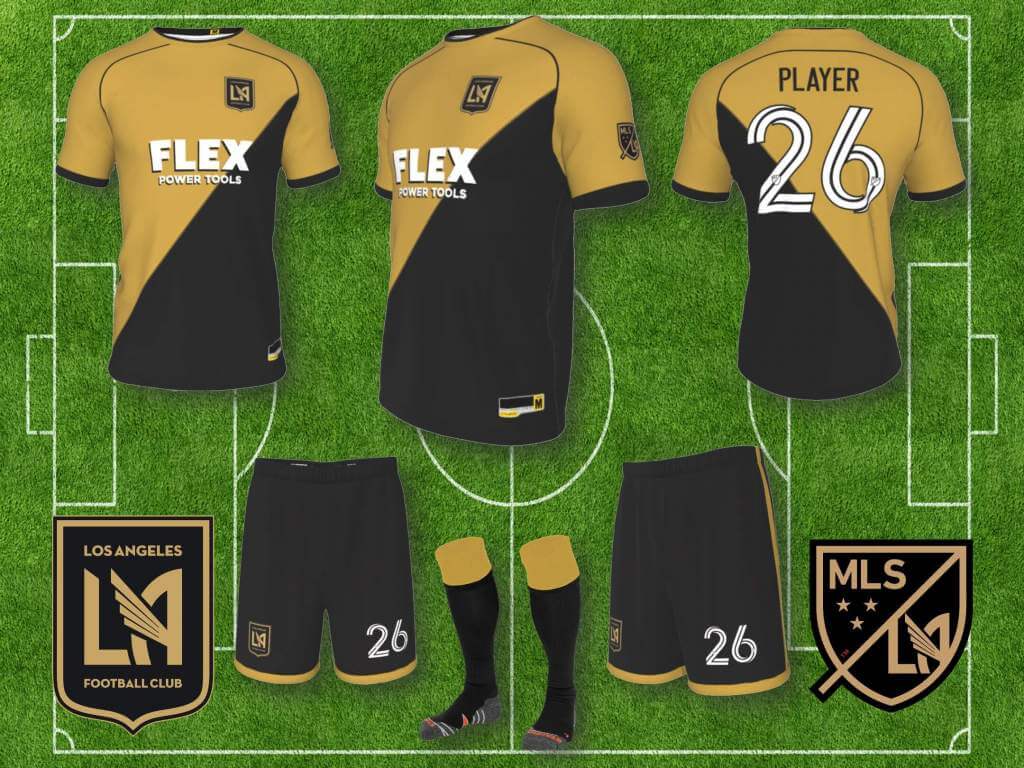
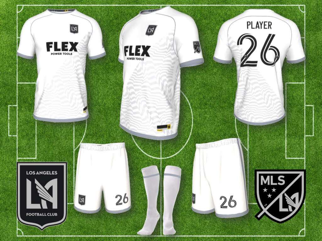
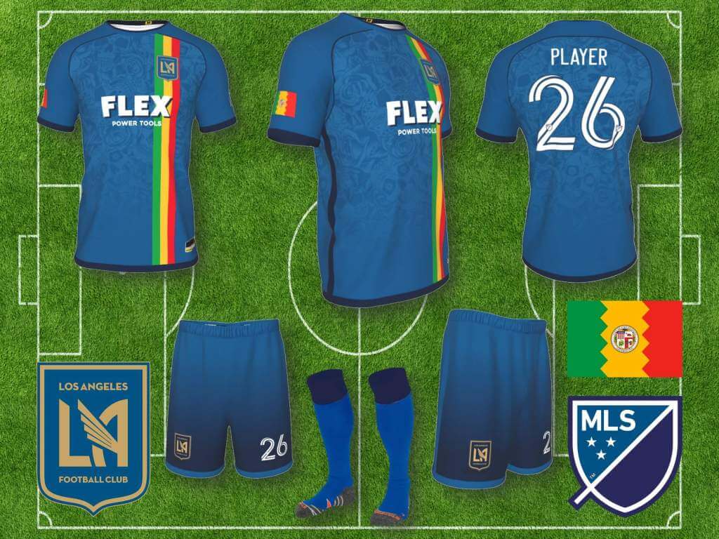
LAFC have a strong look in black and gold, and I like what they’ve done with white and gray/silver on some of their alternates, but DC United already have the mono-black look locked down, so I made a Monaco style diagonal halves jersey (blatantly ripping off my Galaxy 3rd kit design, their going to be pissed), balancing the overall set with gold. Stayed with the white and silver on the away kit, giving it a bit of a Raiders vibe with the black and silver badges. The sublimated print are waves, representing the SoCal surf. I also made a third kit, kind of a “City Edition” if you will, shades of blue representing the ocean and sky, the stripes in the colors of the LA city flag, which is also included on the right sleeve, and a sublimated “Dia de los Muertos” print.
NY Red Bull:
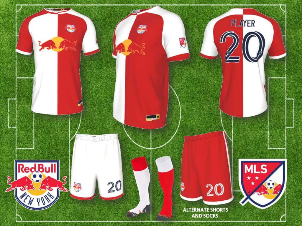
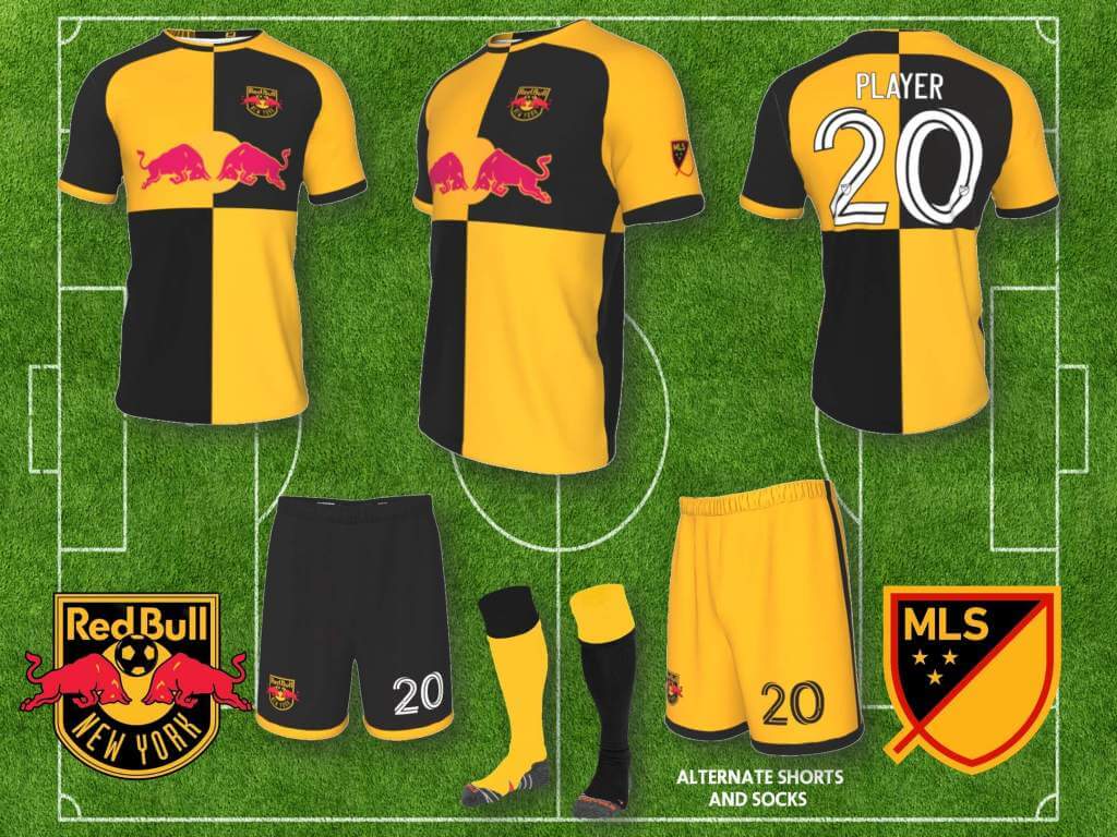
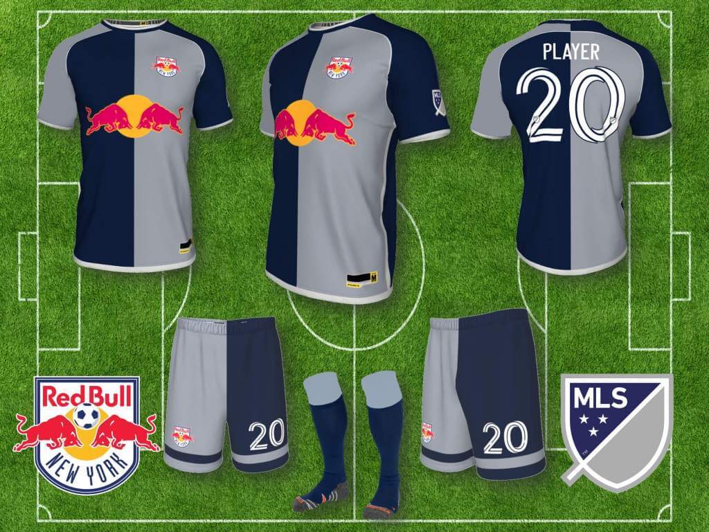
I’m surprised a company that is so obsessed with branding has never referenced their original can in their kits, which aligns nicely with traditional halved and quartered jerseys. As far as I can tell, only the Salzburg club have used this template, so my set uses various versions of halves/quarters, red and white for home, goldenrod and black away, and the 3rd alternate most closely resembling their original can, but in a bit darker shades of blue and silver/gray than the original.
Portland Timbers:
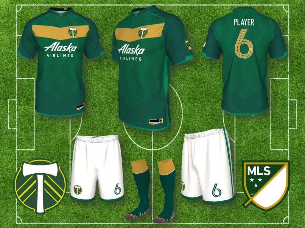
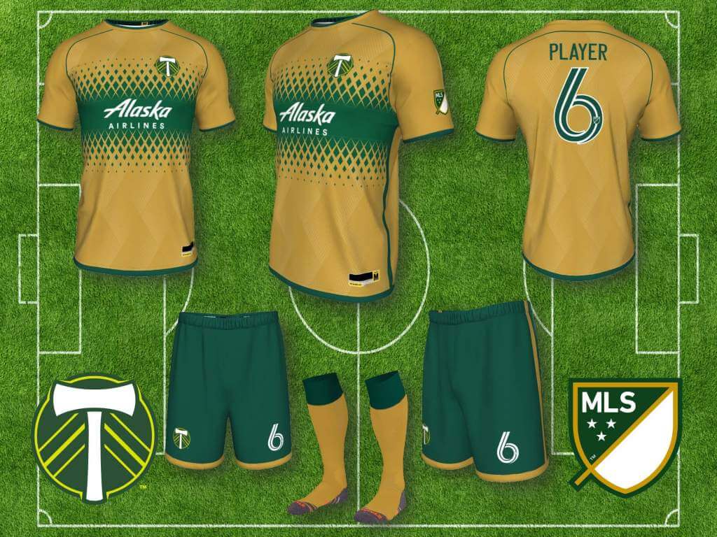
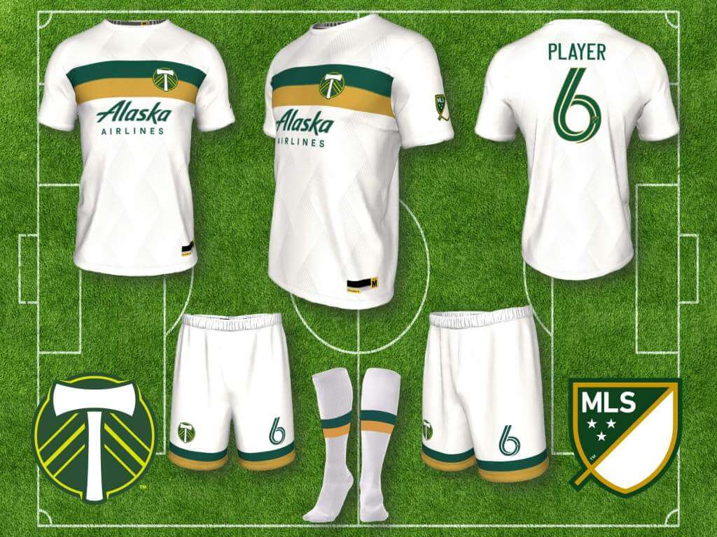
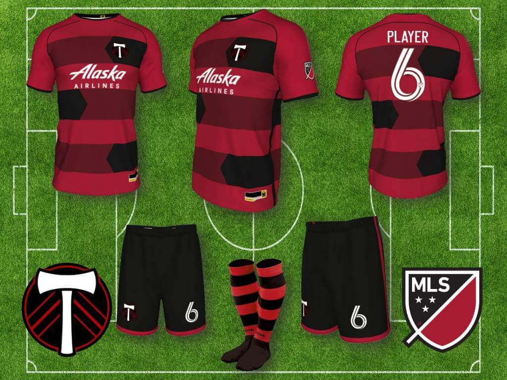
Like our proprietor, I am a fan of green and gold, though I prefer a forest green and old gold look. I generally like Portland’s kits, but because of the affinity for their colors, I wanted to create my own versions. I also created a fourth kit in red and black, colors which the Timbers have used multiple times in the past, the red, representing Portland’s nickname “Rose City,” includes a geometric rose-like sublimated pattern, the black accents reference the classic red and black lumberjack flannel, and the red and black overall paying homage to the Trail Blazers.
Real Salt Lake:
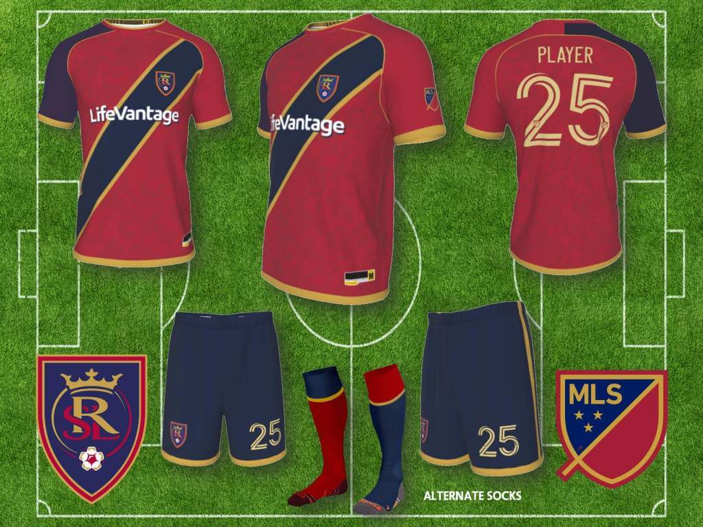
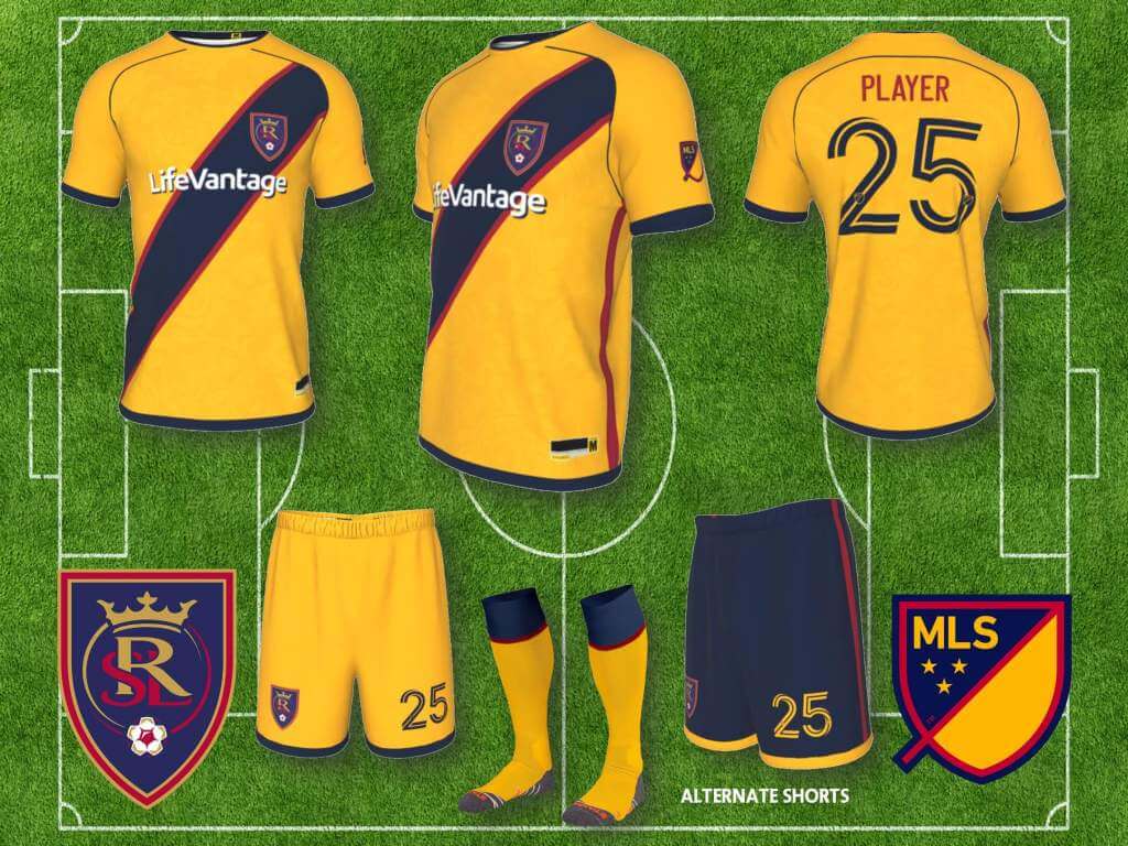
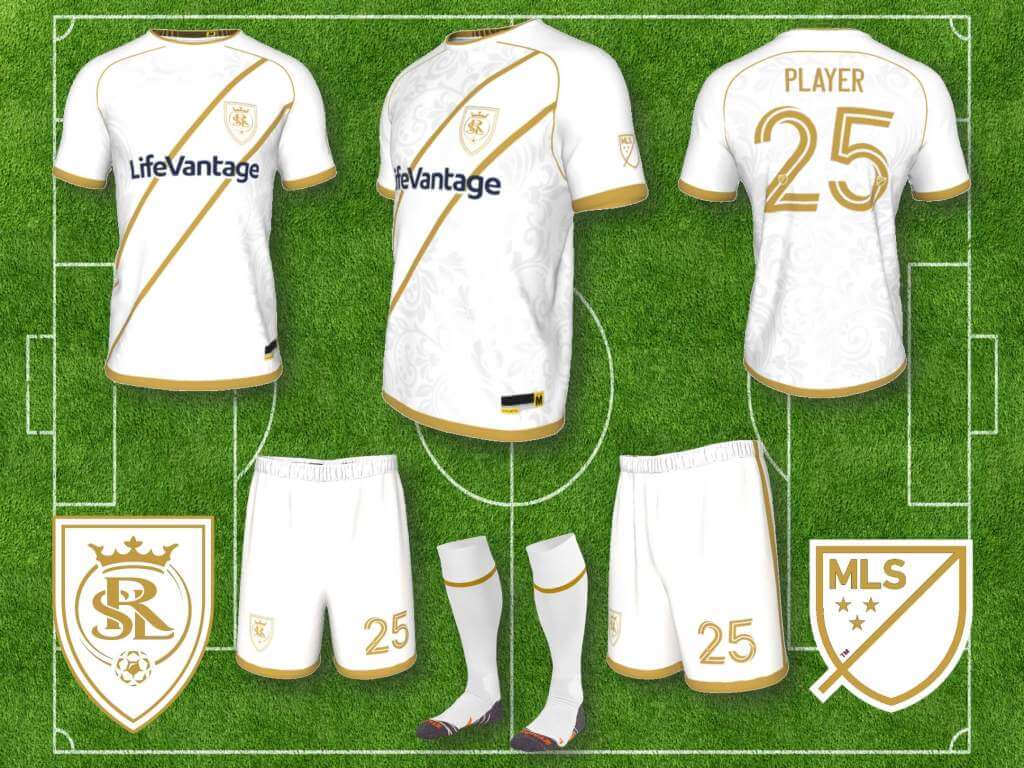
RSL are getting back to their original look, they brought back the navy/blue shorts this season, after years of red shirts and shorts, but I think they can do better. If any team should have the traditional sash design, it’s Real Salt Lake, seems very royal. I also included one blue sleeve on the home jersey, just because I like asymmetry (both RSL and Spain, the inspiration for RSL’s colors, wore a red jersey with one navy sleeve for one season/tournament cycle). I think sleeves not matching is against FIFA rules, but it’s dumb rule, so…… Also, I like Atlanta’s white uniform with gold trim, seems like a color combo for royalty, so RSL gets a version too.
San Jose Earthquakes:
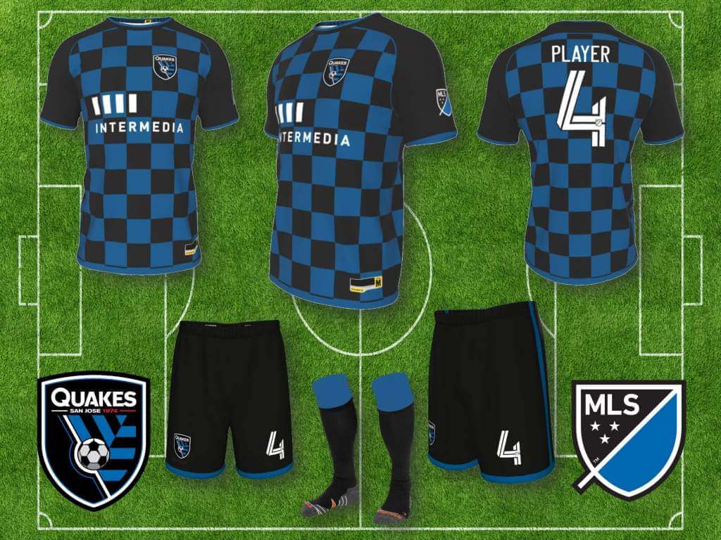
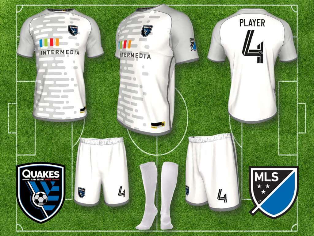
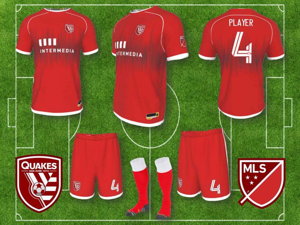
I like the blue and black of San Jose (always been a fan of Inter Milan kits), but San Jose have had some awful uniforms through the years, despite having a strong color palette to work with. They seem to have conceded Inter-like vertical stripes to Montreal (although it appears Montreal is going has gone [as I said, been doing this for awhile] in a different direction, so… ), so they need to stake their claim to some kind of trademark look, so instead of stripes or hoops, I went with neither, or kind of both, Croatia-style checkerboard. The away kit template in the is called “Dash,” apparently a reference to dots and dashes of Morse code, but I think it also evokes the digital ones and zeros of Silicon Valley. The all red, third alternate kit is an homage to the NASL Earthquakes, that literally includes a graphic that looks like the line drawn by the needle of a Richter scale, so that was easy and obvious, and sometimes obvious just works.
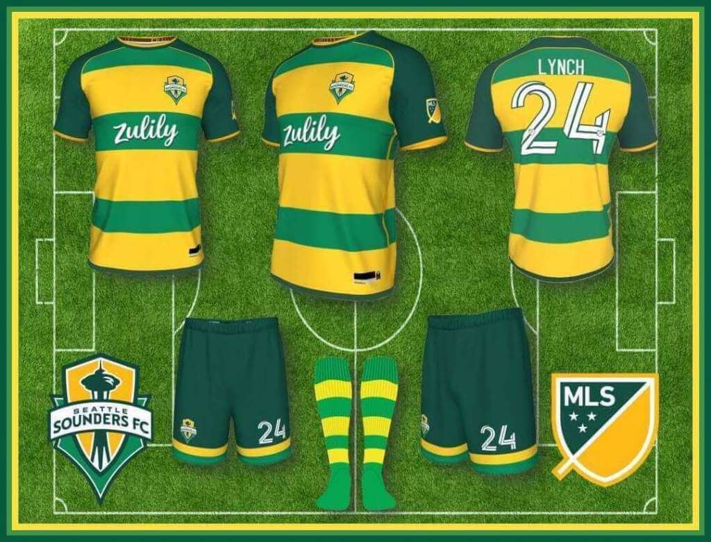
Seattle Sounders:
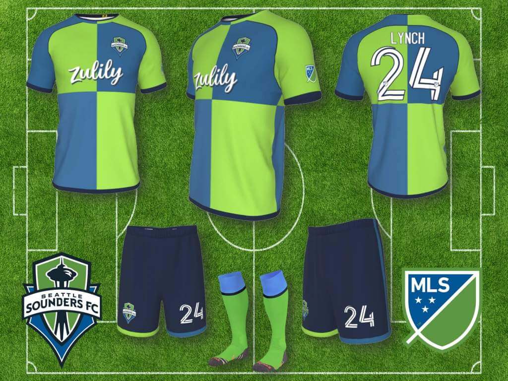
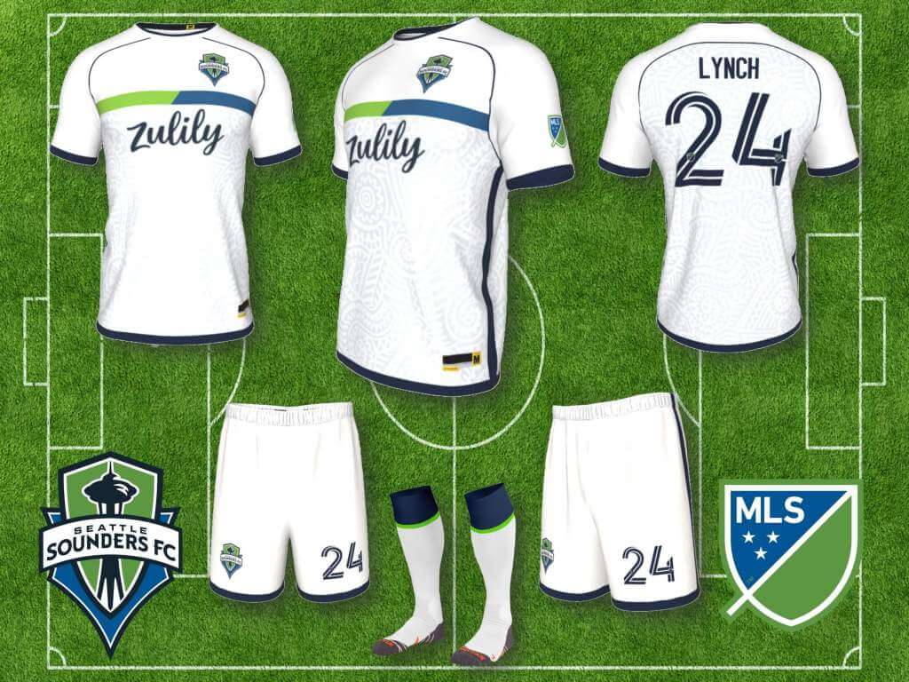
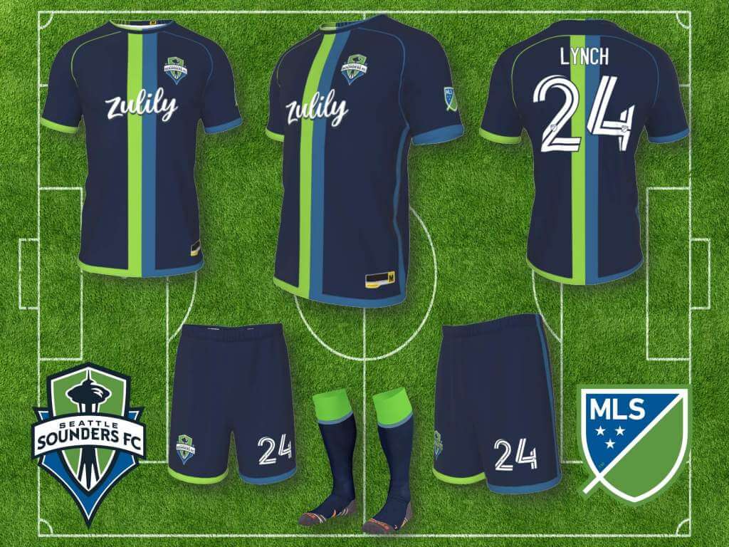
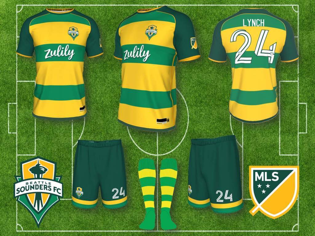
Seattle’s Rave Green and Sounder Blue are obviously distinctive, so my first instinct was to leave as is, even though I didn’t particularly like the overall look of green shirts and blue shorts, but after playing around with the colors a bit, and adding navy to the palette, the green and blue grew on me, so I designed a whole set, with interchangeable shirts, shorts and socks. I also created a Sonics homage as a fourth kit, using both the kelly green and gold of the 70s and 80s, as well as the darker green and gold of the 90s, rendered in broad hoops, evoking the band across the Sonics’ 70s-80s jerseys. I think for at least one derby a year, Portland and Seattle should wear their “basketball” kits.
Sporting Kansas City:
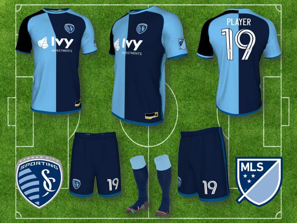
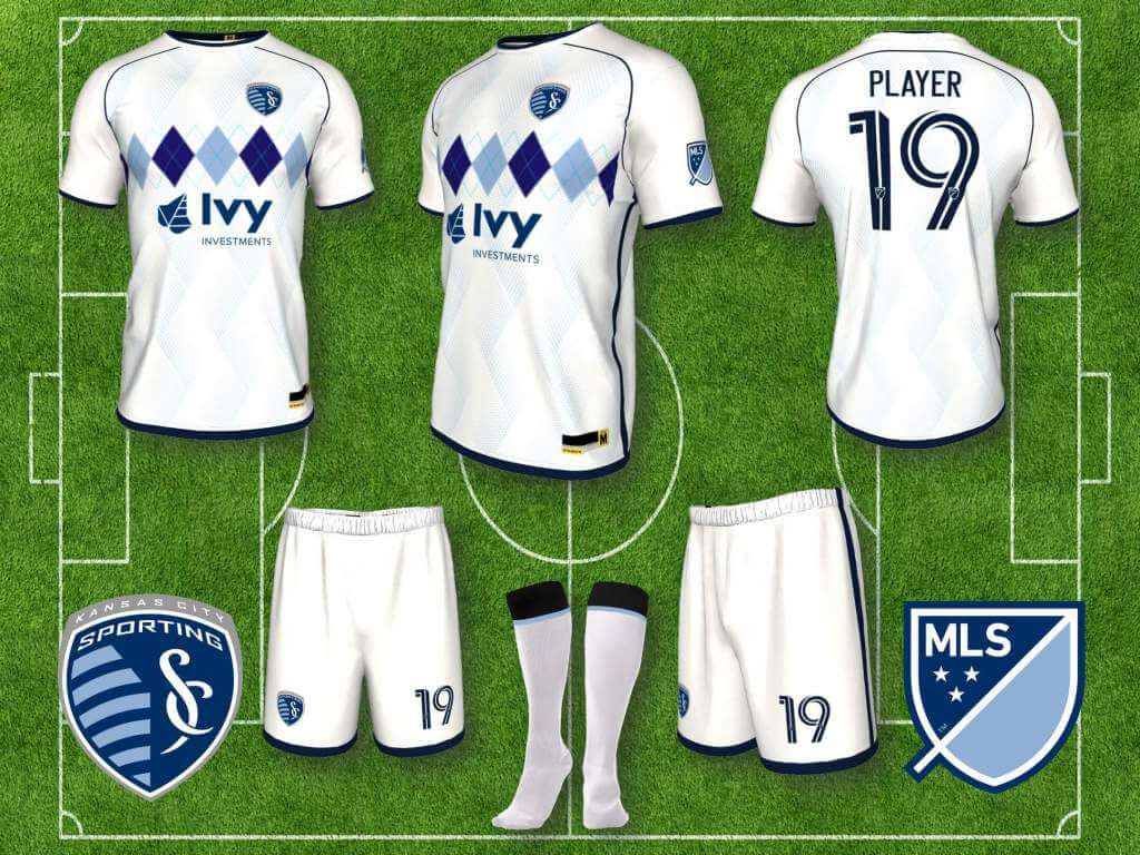
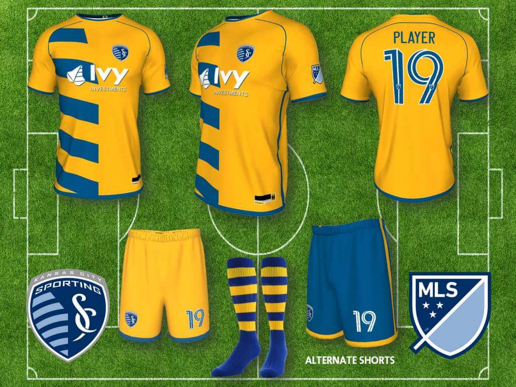
Since re-branding from the Wiz / Wizards, as Sporting Kansas City, I’ve liked several of their uniforms, and am a big fan of their light blue and navy color palette. A couple of motifs have stood out for me, first, the “state line” concept represented in their badge, that produced a modified “halves” jersey for a couple seasons, and the argyle motif that appeared in several alternate kits, so my versions of the home and away kits bring these back. A third alternate is rendered in gold and royal blue, again evoking the state line concept.
Toronto FC:
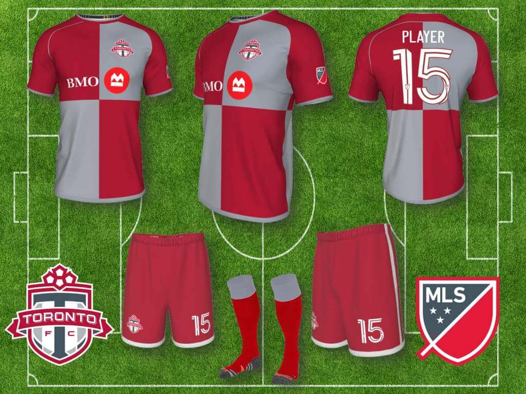
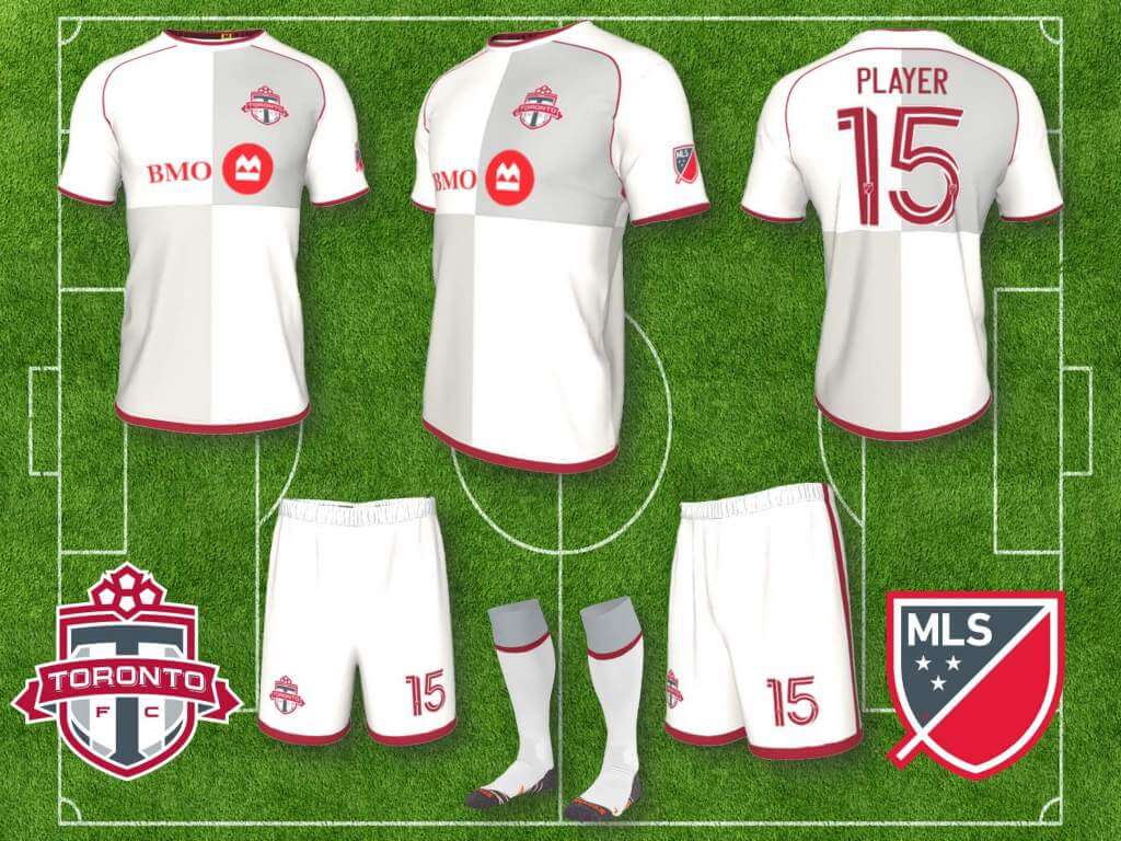
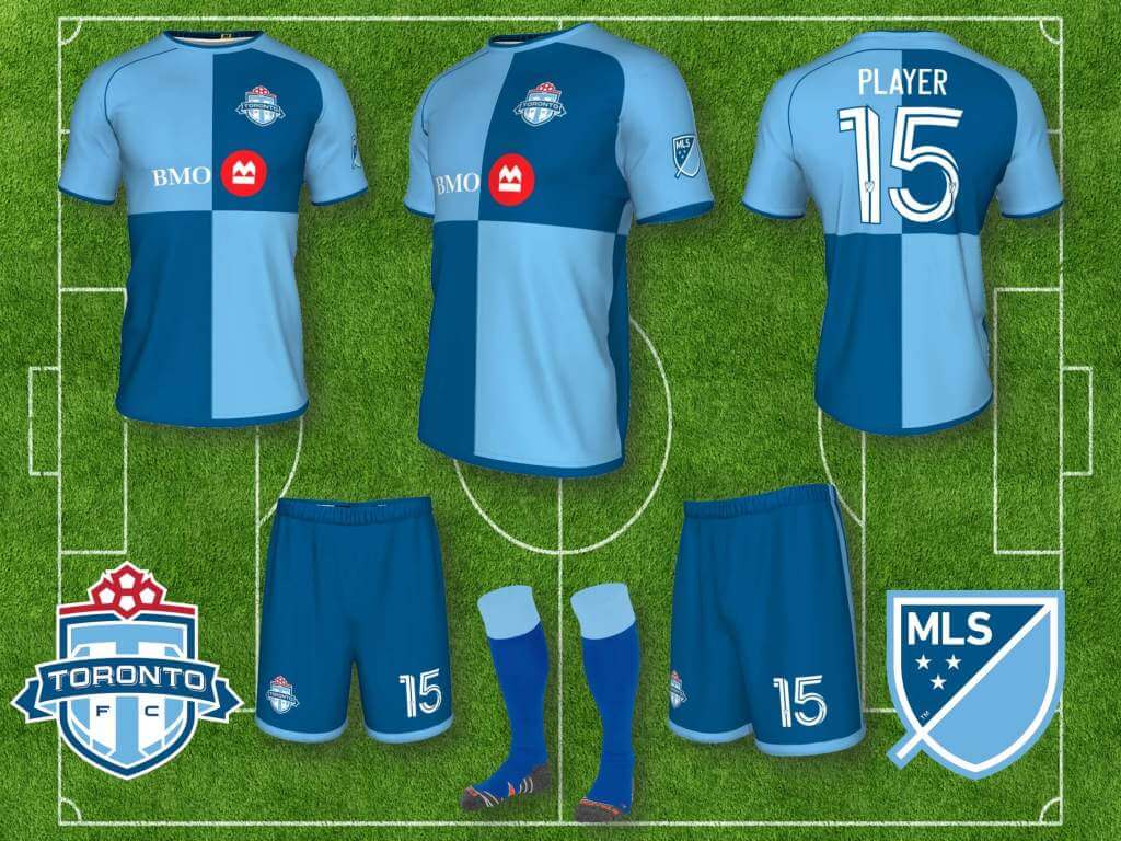
Toronto have had mostly all red kits since joining MLS, and they have often included significant gray elements, whether it be sleeves or striping, to give their kits a unique look, but they’ve never settled on gray element that would be consistently distinctive, and set them apart, so I gave them Victorian era quartered jerseys in red and gray (turns out TFC incorporated a variation of the quarters design into this year’s shirt, so I guess we were on the same wavelength). The away kit mirrors the home in white and light gray, with all red trim, and I made a third alternate, in Blue Jays colors, could rotate with Leafs and Raptors (black and purple version) colors too each year.
Atlanta United:
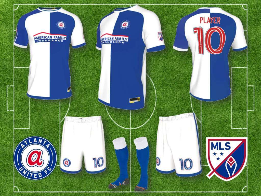
Atlanta has only been in the league a few years, I love their red and black stripes with gold trim, I love that they use peach and gold on white as alternate colors, nothing I would change, but I don’t like their 2021 kit, huge downgrade. I would add an alternate, obviously based on the uniform Hank Aaron wore when he hit number 714 and 715, one of my favorites, couldn’t decide whether to base it on the home or away jersey, so I did both.
Austin FC:
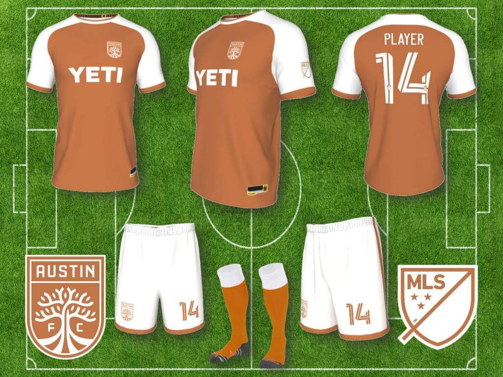
Austin FC looks great so far, green and black vertical stripes, unique and instantly recognizable. Another alternate that should be easily recognizable, based on the UT football uniforms, burnt orange and white only, no frills, just like the Longhorns. They can wear it when Houston comes to Austin, just to piss them off.
Columbus Crew:
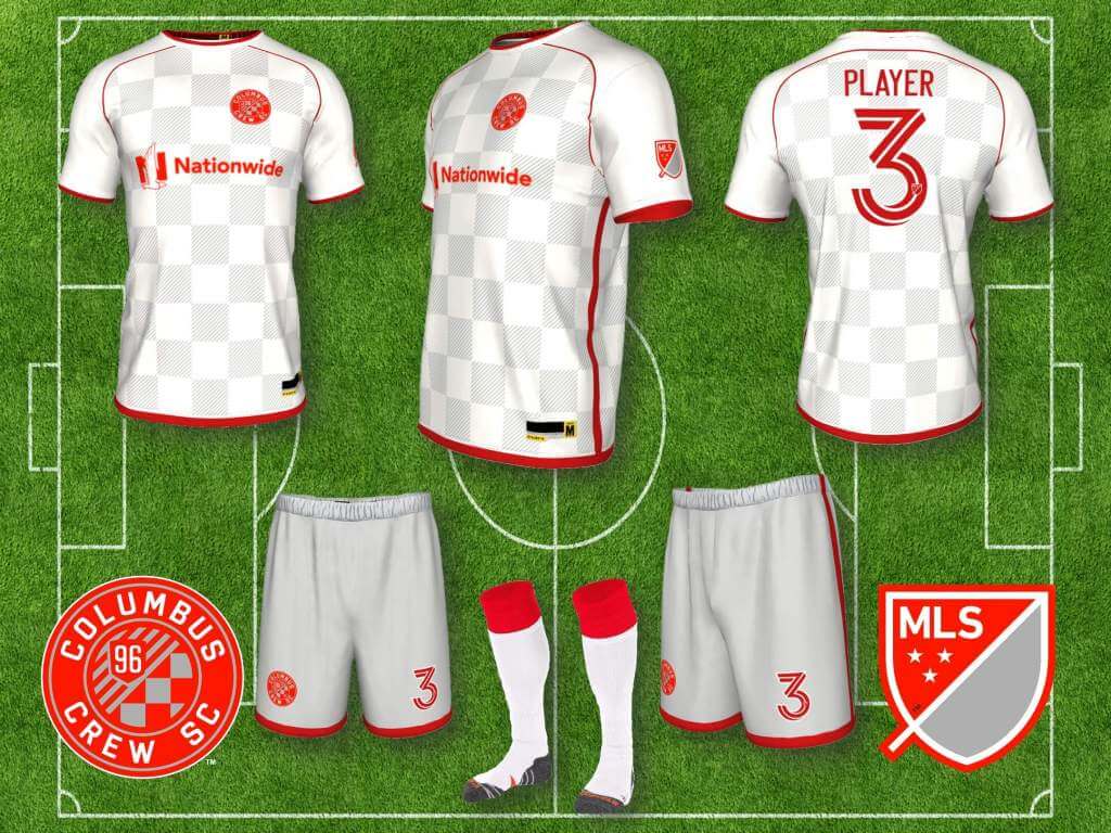
As I’ve stated earlier, Columbus established a strong identity early on, with its all yellow home kit (which they’ve dropped this year, hopefully temporarily), and all black (usually) change kits, but I did want to create a third alternate for them. I used the scarlet and gray of Ohio State, and the checkerboard and diagonal lines motif from the Crew’s “old” badge (which they are apparently keeping after another logo change disaster) to create a white and gray checkerboard jersey, with gray shorts, and all scarlet trim, numbers and badge.
LA Galaxy:
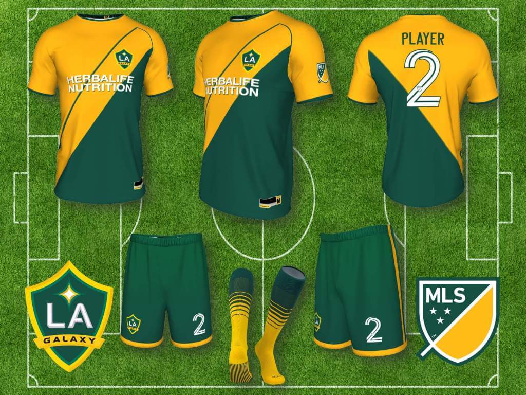
The LA Galaxy is another team that has established a strong identity, with all white home kits, and various forms/colors of the traditional sash, which I like, and didn’t feel particularly inspired to change, but again, I wanted to create an alternate that referenced a favorite kit of mine from their past, the Green and Gold kit of the 2000s. In this case, The jersey emulates Monaco’s diagonal halves, but that still outlines/carves out their sash, then transitions to the green of the bottom half, and into the shorts.
Minnesota FC:
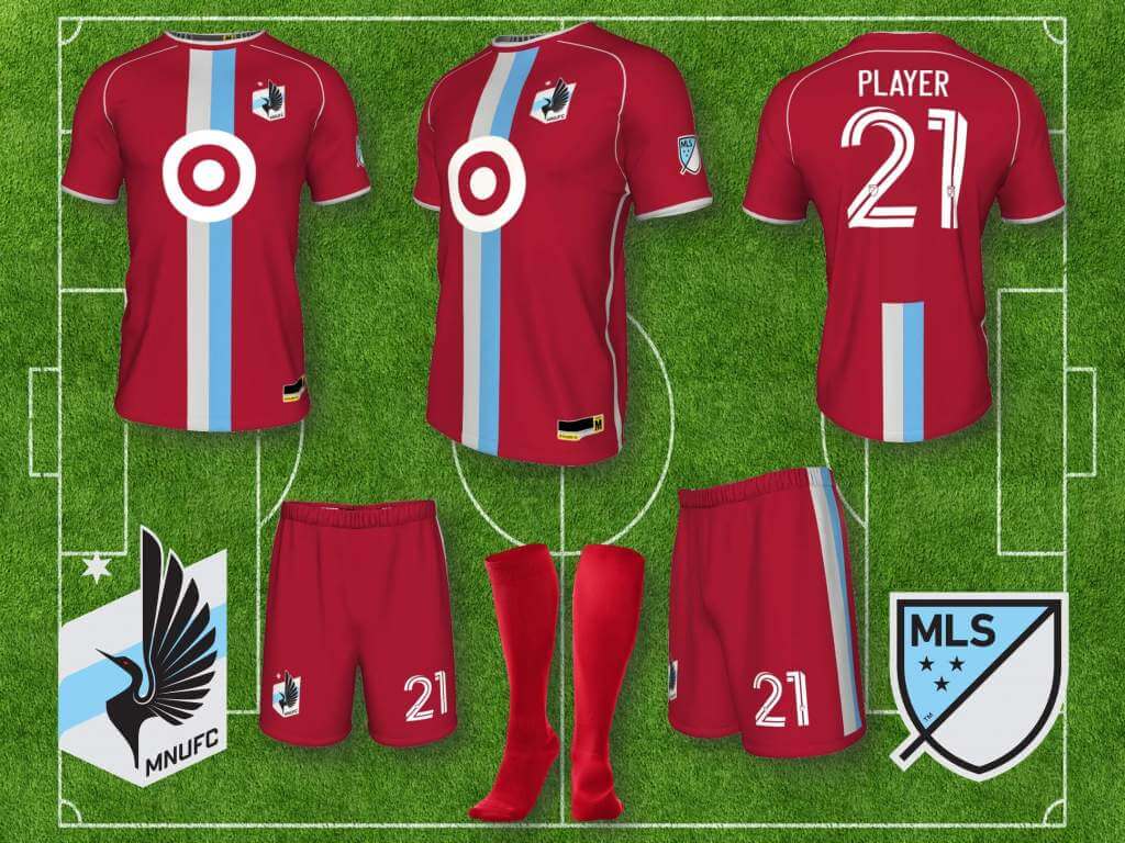
I like Minnesota’s colors, and their badge is great, but after trying various concepts for home and away, I just couldn’t come up with anything that I particularly liked, other than an alternate, maroon set, that is simple and goes well with their light gray and blue colors.
Montreal:
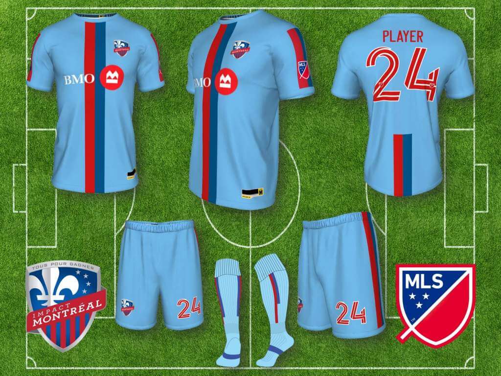
Montreal have changed their name to Club de Foot Montreal, as well as their badge and colors, so we’ll let them do their thing, but I do have a third alternate for them, the inspiration being obvious. I loved the Expos 70s-80s uniforms, still have their classic hat that I wear regularly, and those thick red and blue stripes translate nicely to a football kit. If I had the PS skills, I would have replaced the Fleur de Lis in the badge with the Expos logo.
NYC FC:
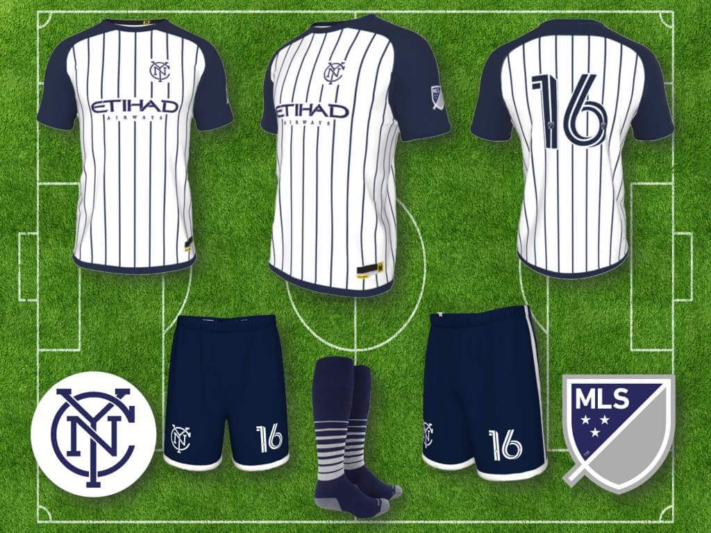
I generally like NYC FC’s uniforms, and didn’t feel the need to re-do them, but did create an alternate based on the NY Yankees, since the Yankees organization does own a part of NYC FC.
Vancouver Whitecaps:
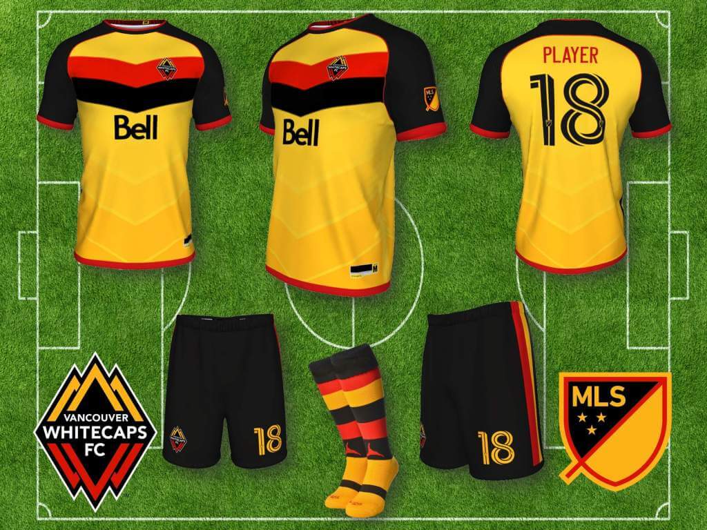
I generally like Vancouver uniforms, particularly when they use the blue band across the white jersey, so I wasn’t particularly moved to re-do, another boring color palette, but I did want to make a third alternate, and the inspiration should be obvious. I’ve rendered the Canucks’ Flying V in a more traditional chevron pattern of football kits. Gold, black and red hoops are a must, socks matter in both soccer and hockey.
San Francisco International Football Club:
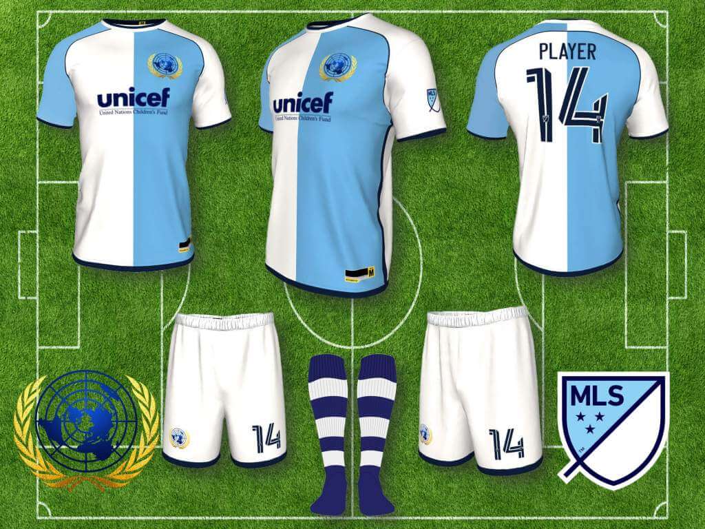
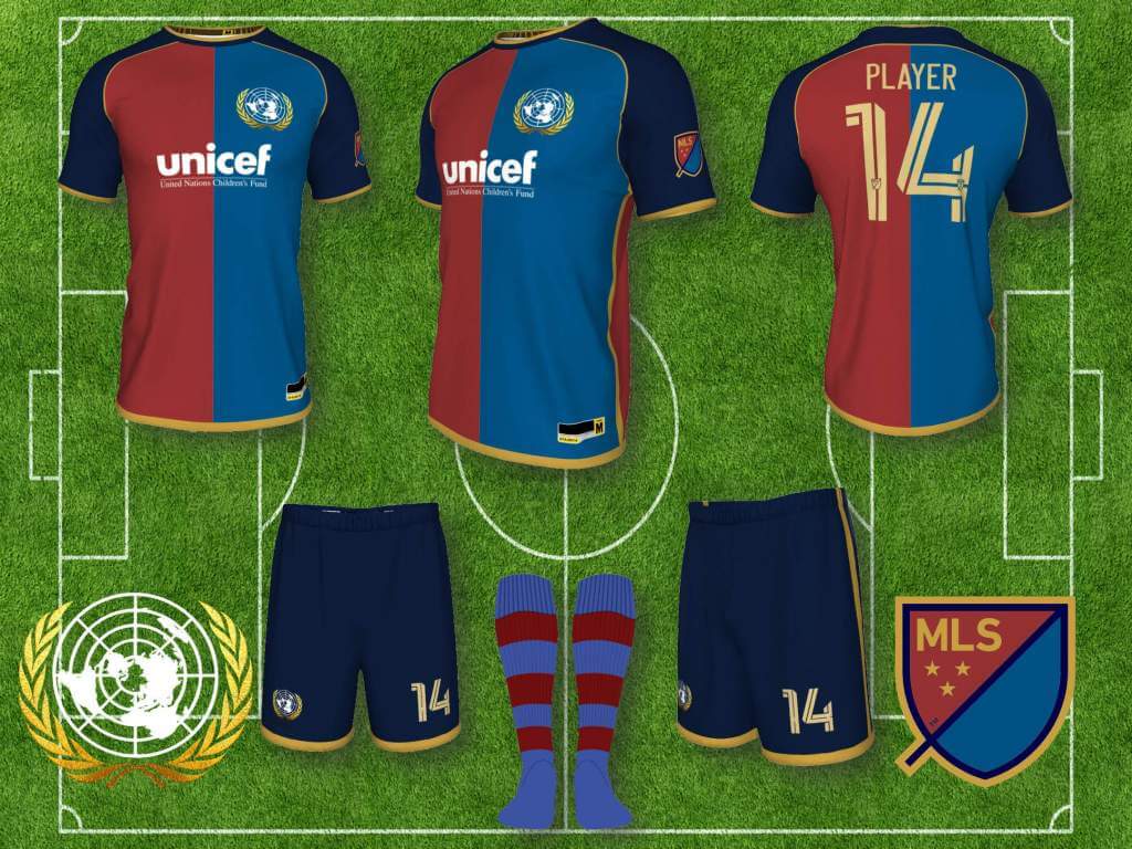
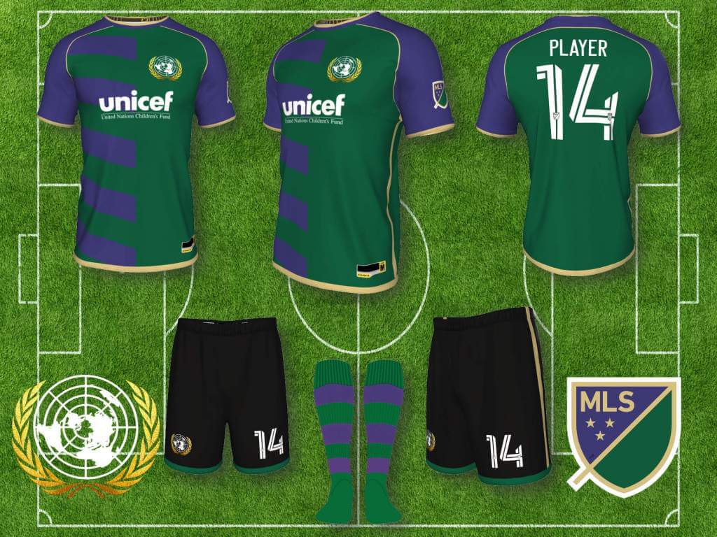
And finally, if I was granted an expansion team, it would be the San Francisco International Football Club (I stole the “International” name years ago, before Beckham did it), with the inspiration for the badge and colors being the United Nations, which was originally located in San Francisco. Away kit is a complete rip off of Barcelona’s Centenary kit, the third, is based on Wimbledon Tennis club’s colors, which I always liked.
Thanks, Superfly! Like Paul (and I’m sure many others who read this site), I’m not a soccer guy, but I try to get into it whenever possible. To my eyes, many of these redesigns are pretty sweet. In the words of Jimmer Vilk, “I’d wear (some of) that.” Well done.
Readers? What say you?

MLB Playoff Uni Tracking
It’s BAAAAACK.Alex Rocklein has been tracking the jerseys of all the teams involved in the MLB Post Season for the past several seasons. We’ve now concluded the Wild Card and Divisional Series’ and have moved on to the ALCS (last night). The first graphic depicts all games played in the WC and DS. Although he sent me this graphic before the Red Sox/Astros game was completed, the graphic is correct for the jerseys worn (see full tracker). One small change: any team that has a front number on their jersey shows the number of the starting pitcher from that game (previously it was all #21).
Here’s the full tracker (which will get filled in as we go through the NLDS/ALDS, NLCS/ALCS and World Series):
I hope you guys enjoy this annual feature and you’ll thank Alex for all his effort with a quick “Thanks” in the comments below! Look for this feature every weekend until the World Series is complete!
Bulletin reminder: Paul here. In case you missed it on Friday, my latest article on Bulletin is an interview with football uniform historian Bill Schaefer, who creates all of the uniform mock-ups that appear on the amazing Gridiron Uniform Database website. We talked about how the GUD got started, he research methods, his “white whale,” his goals for the site’s future, and a lot more. I hope you’ll check it out on my Bulletin page. Enjoy!
The Ticker
By Anthony Emerson

Baseball News: Reader John Fitzgerald sent along some shots of his 1999 MLB All Star game duffle bag and commemorative ball. John says that “A friend of our family is a former Brooklyn Dodgers pitcher, and he was given this bag filled with various trinkets when he was in town signing autographs before the game. He passed these along to me at dinner while he was in town.” The bag is a great piece of memorabilia that I had never seen before. … I think we’ve discussed this before, but just in case — a portion of the old Forbes Field outfield wall still stands on the University of Pittsburgh’s campus (from Kary Klismet). … The ABC sitcom The Wonder Years features an anachronistic Phillies pennant in the main character’s bedroom — the show is set in 1968 but the logo in question wasn’t used until 1972 (from Matthew Green).

NFL News: The WFT is wearing throwbacks this weekend (from our own Jamie Rathjen). … The Jags are going mono-black tomorrow in London (thanks, Phil). … Bucs lineman Vita Vea had a hell of a time trying to remove his jersey for a post-game jersey swap after Thursday night’s game against the Eagles (from Moe Khan).
College/High School Football News: Ohio State is calling on fans to help design their new turf (from Jason Hillyer). … Here are this weekend’s unis for Virginia Tech, UNLV, Texas Tech, and KU.

Hockey News: The Devils have added a memorial helmet decal for the late Jimmy Hayes, while Chicago wore practice jerseys reading “Haysey” (from multiple readers). … Wayne Gretzky was almost always seen on the ice in his iconic Jofa helmet. An exception was the 1996 All-Star Game in Boston, where he wore a CCM (from @tucker_1993). … The Canucks misspelled RW Alex Chiasson’s NOB. It’s pronounced like “Chaisson” but spelled “Chiasson” (from multiple readers). … The Blue Jackets remembered their late G Matiss Kivlenieks who passed away this summer during their home opener Thursday night. G Elvis Merzlikins wore a No. 80 Kivlenieks jersey in warmups. No. 80 was on ice behind the nets and a banner was put in the rafters (from Wade Heidt). … Also from Wade: The OHL’s Flint Firebirds hosted a “Pink the Rink” promotion on Thursday night.

NBA News: The Kings flashed this new wordmark up on the Jumbotron during Thursday night’s game. Perhaps a City Edition preview? (from @nbaunitracker). … Mavs F Dorian Finney-Smith was without a championship tag during last night’s preseason finale (from @MavsTracker).

College/High School Hoops News: Georgia State men have unveiled new unis (from Doug Hazard). … Sign of the apocalypse: a high school gym now has a corporate naming rights advertiser (from Andrew Griesman).

Soccer News: St. Louis City SC’s new stadium will include an art installation commemorating the historic Black neighborhood that formerly stood on the site (from Kary Klismet).
Uni Tweet of the Day
Said no Uni Watcher, ever:
“I like the swamp green uniforms” 🚩🚩🚩🚩🚩🚩🚩🚩🚩🚩🚩🚩🚩🚩🚩🚩🚩🚩🚩🚩🚩🚩🚩🚩🚩🚩🚩🚩🚩🚩🚩🚩🚩🚩 pic.twitter.com/g6qvCCvE5g
— Ryan (@Ryanmcc09) October 15, 2021
And finally… that’s all for today. Big thanks to Sean for sharing his MLS designs. For all you soccer guys (and gals), how’d he do?
Everyone have a good Saturday — enjoy the College Football and MLB Playoffs, or whatever it is you may be doing. I’ll catch you all back here with the SMUW crew tomorrow morning.
Peace,
PH
Why do we have to copy all the European clubs?
Why do we have to copy all the European cars? (I wonder this each year when I go to the auto show.)
The Devils wore link for Jimmy Hayes.
“Wayne Gretzky was almost always seen on the ice in his iconic Jofa helmet. An exception was the 1996 All-Star Game in Boston, where he wore a CCM”
I don’t know if the Jofa 235 helmet meets the definition of a helmet at all. The flimsy plastic bucket barely had any padding.
Gretzky did briefly wear a CCM helmet during his rookie pro season in the WHA:
link
Gretzky wore the unflattering Cooper SK600 in junior:
link
As a kid, I wore the SK600 my first year of minor hockey before trading that out for the Cooper SK2000. My preferred and only other hockey helmet model during my playing days.
Gretzky didn’t need any padding in his helmet. It’s not like anyone was allowed to hit him anyway ;-)
Didn’t Messier wear a Cooper SK2000? Now THAT was a helmet!
Cooper SK2000 a cool looking helmet. Preferred helmet for characters in the movie Tron in early 1980s. :)
The Canadian Hockey League teams wore whatever was given to them by the main equipment supplier, period. I remember the mid- to late 80s when they wore the XL7 helmets and Cooperalls. The XL7 almost made the Jofa buckets look indestructible.
I wore an XL7 with an HM30 (cat’s eye) cage – as a goaltender. No, I’m not insane, why do you ask?
Florida unis:
More like “Swamp Thing”
Thanks to Sean for some outstanding MLS designs. The league definitely needs more style as opposed to the all black or all white kits that have become the norm. Agree on the Atlanta United home kit, another boring adidas design. Sean’s kit would make an amazing away or 3rd kit.
Thanks John.
I’d like to reimagine those soccer unis without ads. However, I think it was a job well-done and an excellent presentation. I appreciate the work that went into this. My favorite would be the Vancouver alt! And I really like the Portland old gold treatment.
I would prefer no ads too, I assume everyone would, other than the owners, players, advertisers, etc., who benefit directly.
I made the choice to go for authenticity/accuracy (well mostly accurate, the Cafe Bustello ad on Miami was kind of a joke, and 2 or 3 advertisers either changed or were dropped between the 2020 season, when I started this, and the 2021 season when I finished). MLS held out for a fair number of years without ads, but it’s the unfortunate reality now. Hope that answers everyone commenting about ads.
Portland old gold is one of my favorites too, thanks (though I pretty much like them all).
“Turf design” is a thing now?
Whatever.
Just FYI the Blackhawks wore the same helmet decal for Vesey.
The AND FINALLY section says he did MLB designs. Should be MLS.
Good catch. Fixed.
The ABC sitcom The Wonder Years features an anachronistic Phillies pennant in the main character’s bedroom — the show is set in 1968 but the logo in question wasn’t used until 1972 (from Matthew Green).
Actually, the Phillies adopted that “P” in 1970.
I saw that pennant too, and it took me right out of it. (I could understand the Cardinals pennant.)
You’d think a Birmingham kid in 1968 would be a Braves fan–four-hour drive to Fulton County Stadium on US 78; I-20 wasn’t done yet. You had to *want* to be a Phillies fan that far South.
Fantastic job by Sean Walsh. Really appreciate the obvious time, effort, & thought that went into creating these new kits. Thanks for sharing your tremendous talents with the rest of us!
Thanks hcm
I’d have preferred if these designs had Mr. Yuck, rather than all the ads. As it stands, they basically all get a Fail grade from me just for that. (And yes, I’m aware that soccer kits around the world have ads, and they all get F’s too.)
Totally agree
We’re inundated with enough advertising on sports uniforms in the real world these days. This site should be a haven from all that. There’s no need to see ads on concepts posted here. We get the idea without them.