For all photos click to enlarge
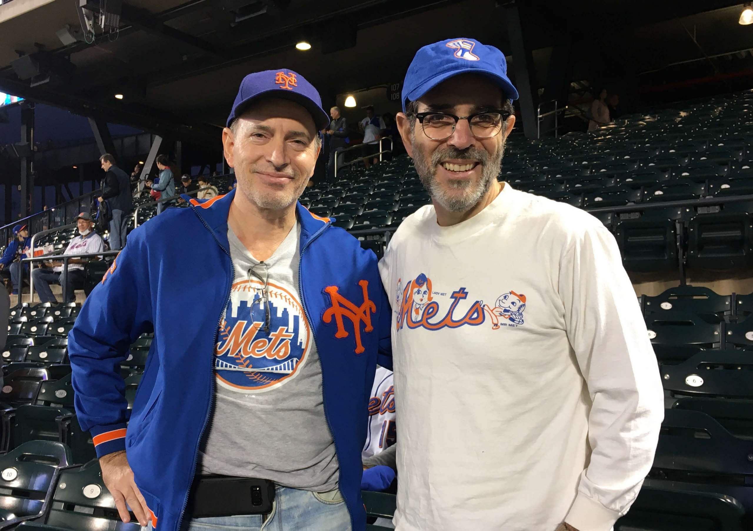
Who was that at last night’s Mets/Marlins game at Shea? None other than yours truly and longtime Uni Watch reader Steve Dodell. Steve’s had many, many Uni Watch contributions over the years, from the guestwritten story of his DIY Mets jacket (the same one he’s wearing in the photo shown above!) to his eagle-eyed spot of the true lowercase “d” that the Mets began using in their NOBs in 2014, so it was a treat to meet him in person (and even more of a treat that he treated me to last night’s ticket — thanks, Steve!).
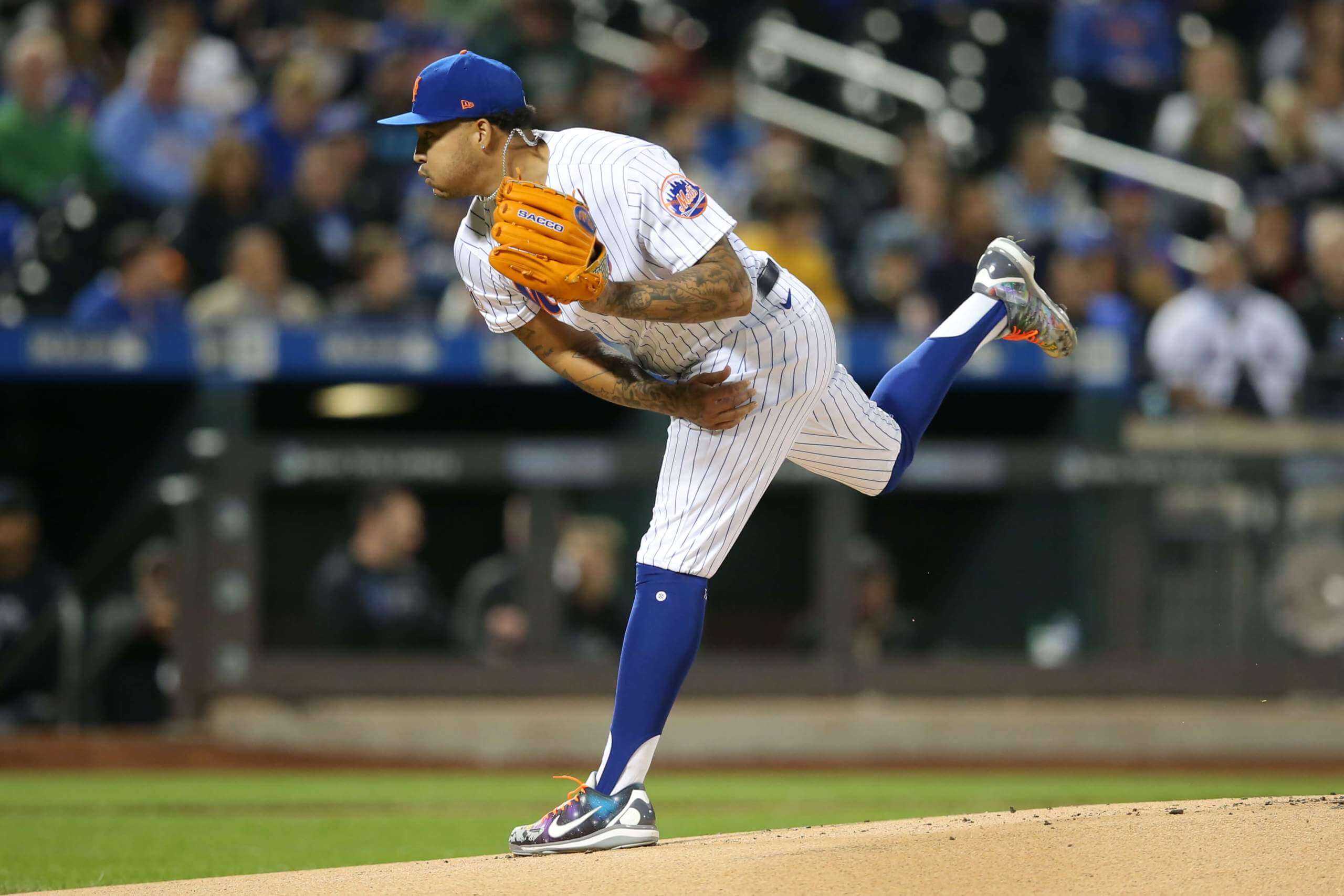
Although the game was meaningless, it turned out to be a very uni-eventful night. First and foremost, Mets starter Taijuan Walker pulled a surprise move by wearing stirrups for what I’m pretty sure was the first time this season (photo by Brad Penner, USA Today Sports):
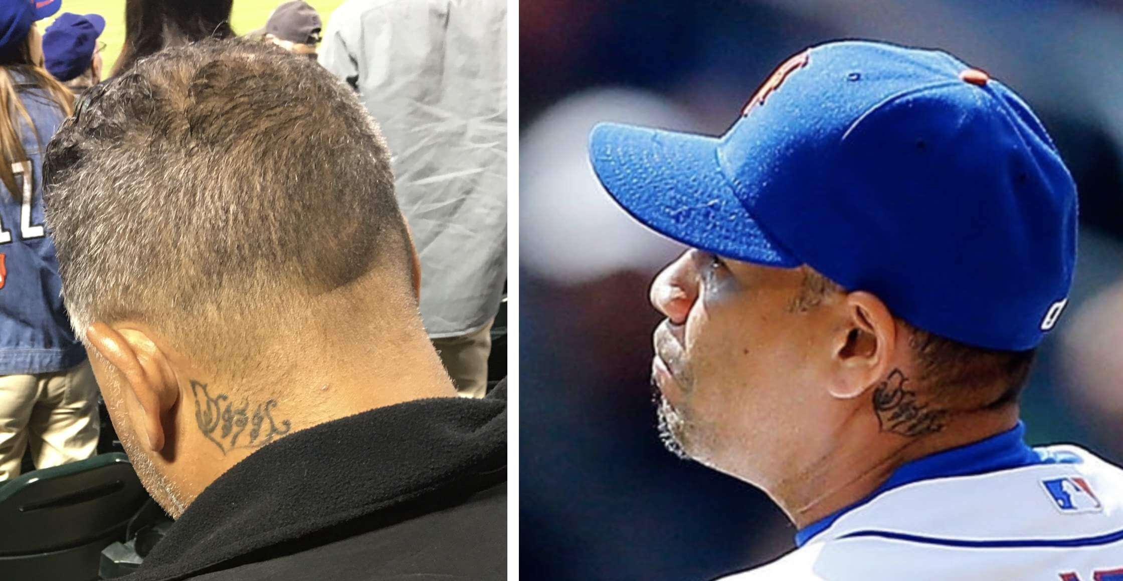
Second, I noticed a guy sitting a few rows in front of us who appeared to have the MLB logo inked into the back of his neck, just like Mets second baseman Javy Báez. I couldn’t get a good angle from where I was sitting, so I approached the guy between innings and he obligingly gave me a good view so I could photograph the logo:
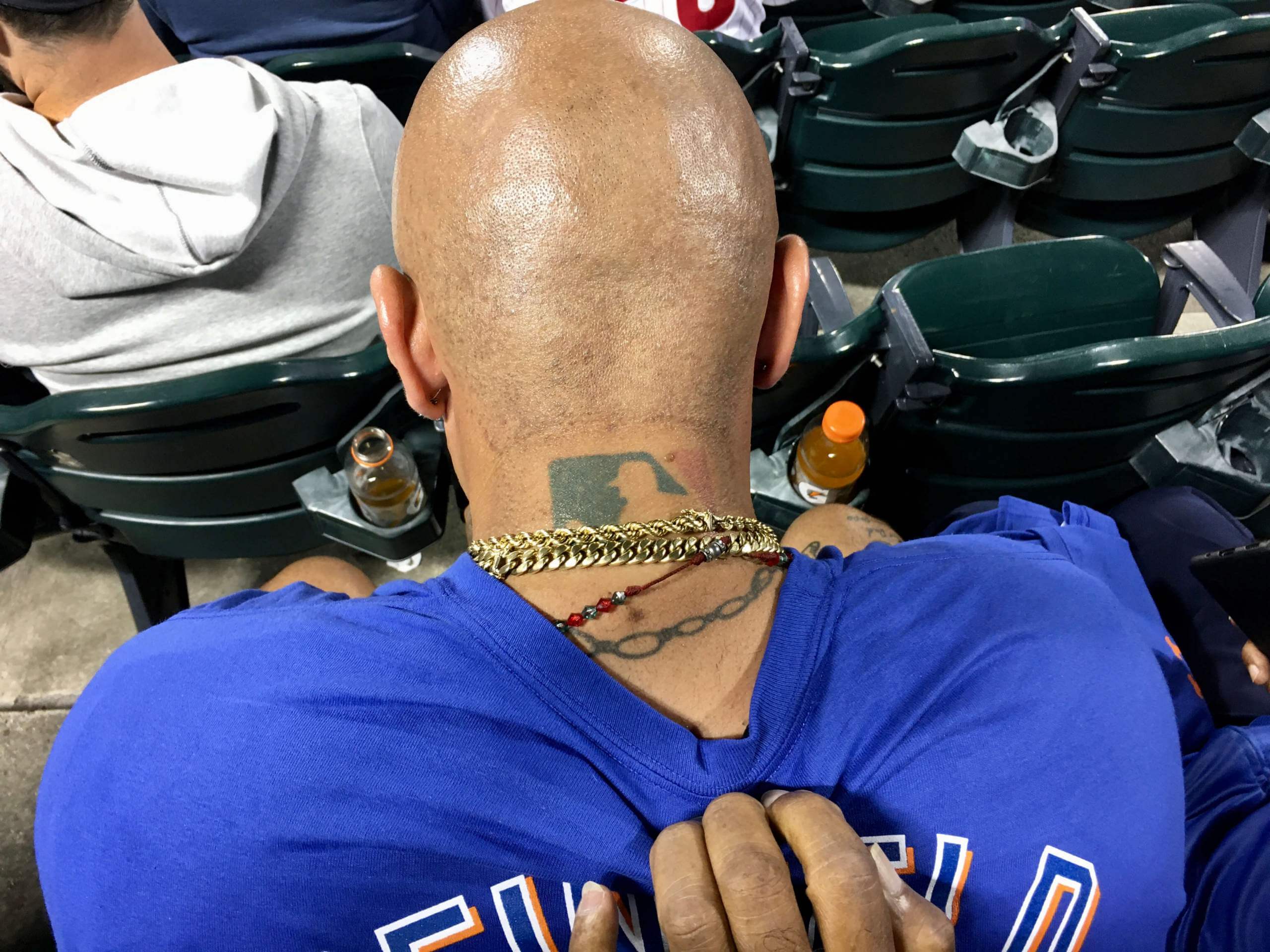
I asked the guy, whose name is Hector, if he got the tat because of Báez. “Nah,” he said, “I had it way before I’d even heard of him.”
Meanwhile, shortly after the game started, a guy arrived and sat down right in front of us. A fan sitting next to me said, “Hey, that looks like like Pedro Feliciano” — the reliever who pitched for the Mets from 2002 through 2013. I hadn’t noticed that myself, but sure enough, the guy did look like Feliciano. And it turns out it was Feliciano:
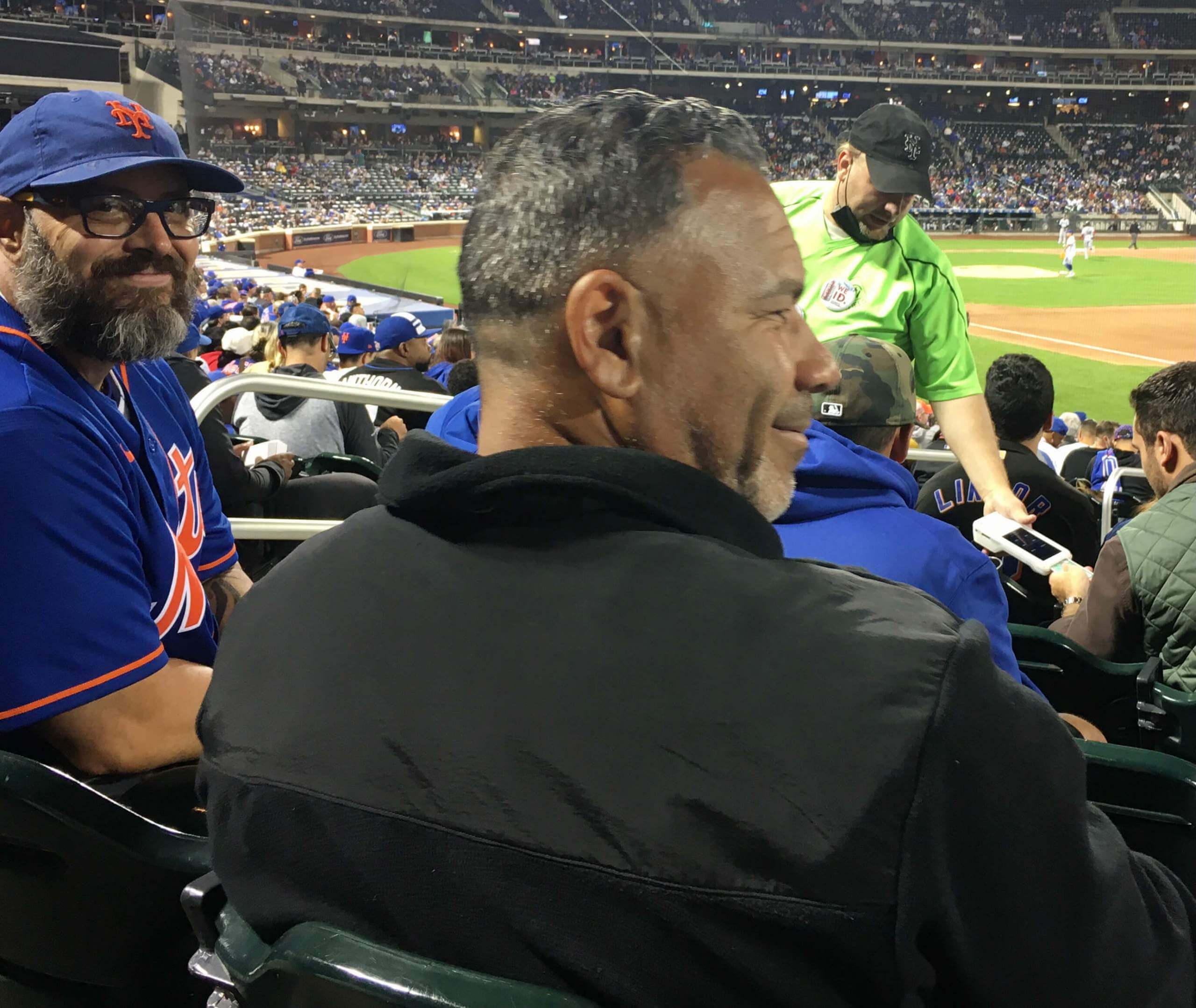
How do I know it was really him? For one thing, all the people sitting with him were calling him Pedro. But aside from that, he had a tattoo that matched the one he had during his playing days (yes, it was a big night for me photographing tattoos):
Finally, it was Seinfeld Night, complete with a T-shirt giveaway. I don’t expect much from freebie shirts, but the NOB lettering on this one was just astonishingly bad. Check this out:
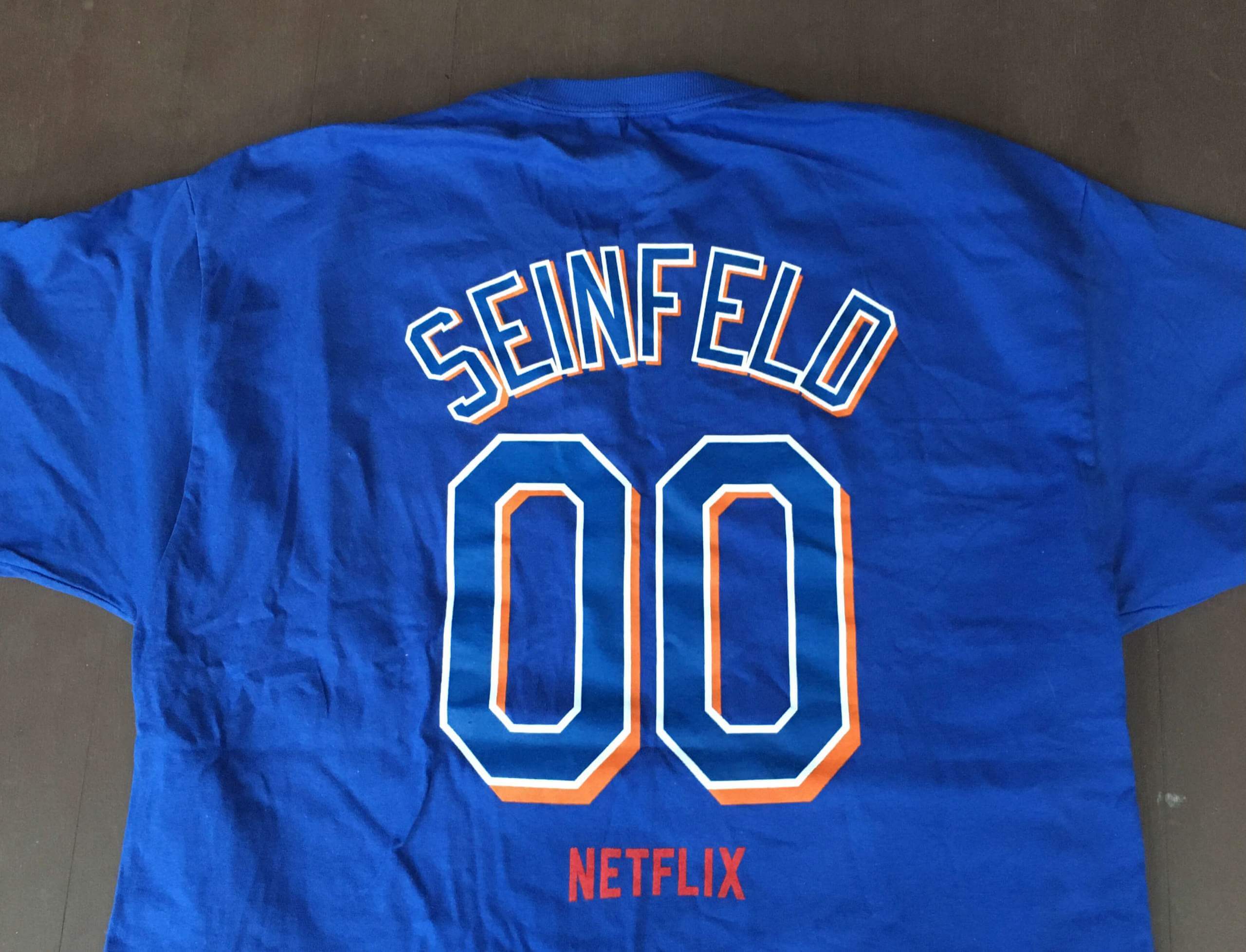
Ay yi yi — what a mess. But hey, what do you want for nothing, right?
All in all: An entertaining night at the ballpark. Thanks again, Steve!
ITEM! New Bulletin article: For years now we’ve been Tickering NBA uni number updates from the great Etienne Catalan. For my latest Bulletin article, I have an exclusive interview with him — we talked about how he got into uni numbers, how someone in France ended up as the NBA’s premier numerologist, and a lot more.
Those of you who’ve subscribed to receive my Bulletin content via email should already be seeing this piece in your in-boxes. Everyone else can read it on my Bulletin page. Enjoy!
The Ticker
By Paul
Indigenous Appropriation News: East Islip High School on Long Island, very near where I grew up, has removed its Redmen logo from the school’s exterior. … “I was watching the new show Chicago Party Aunt on Netflix and I found it interesting that they have chosen not to display the Chicago Blackhawks’ logo on a jersey or anywhere else in the show,” says Julie Streeter. “Plenty of Bears, Bulls, Sox, and Cubs logos, but not the Hawks.” … According to this article, Cleveland MLB fans “can still wear [Indians apparel] to the games in 2022. The team has no intention of becoming the clothes police. The team also will continue to sell Tribe merchandise in 2022. Team Vice President Curtis Danburg said proceeds from the sale of those Indians items will go to some Native American causes. They will have more specific details later” (from @DoogieStardust). … Football Canada and Indigenous artist Kolten Khasalus Grant have collaborated to produce a new logo to promote football in Indigenous communities across Canada. Additional info here (from Ted Arnold). … Shawnee Mission North High School in Kansas, which recently changed its team name from “Indians” to “Bison,” has released its new team logo (from Doug Donahoo).

Baseball News: You might recall that during last year’s MLB playoffs, the “Postseason” patch appeared on caps but not on jersey sleeves. I’ve confirmed via multiple sources that this year it will not appear on jerseys or caps. World Series patches will still appear on caps and sleeves, however. … The annual Congressional Baseball Game was last night. If you look at this video of the game, you’ll see that the Democrats wore a variety of uniforms representing their home districts, while Republicans all wore one consistent uniform (thanks to all who shared).

NFL/CFL News: Former Cowboys RB Emmitt Smith, who wore No. 22, has listed his house, which includes a 22-seat dining room, for $2.2 million (from @KCNep95). … The Bears are in the process of purchasing land that could be used for a new stadium. … The Giants will debut their new white pants this weekend (from @duckisgod). … Ahead of Canada’s first National Day for Truth and Reconciliation, the CFL’s Ottawa Redblacks wore orange “Every Child Matters” helmet decals two nights ago (from Wade Heidt). … Navy jersey and white pants this week for the Titans (thanks, Phil). … The jersey, pants, and socks worn by Ravens K Justin Tucker when he kicked an NFL-record 66-yard field goal last Sunday are now on display at the Hall of Fame (from Andrew Cosentino). … This is pretty cool: a jersey-based infographic of Broncos LB Von Miller’s career sacks (from @MomoNaryan). … Here’s a breakdown of the Ravens’ all-time regular season record by uni combo (from Ty Pruitt). … Looks like the Dolphins may be wearing throwbacks this Sunday. … Speaking of this Sunday, the Panthers will wear their blue alternate jerseys (thanks, Phil).
College and High School Football News: Here are this week’s uni combos for Iowa State, Cincinnati, and USF (thanks to all who shared).

Hockey News: Oilers dressing room attendant Joey Moss, who passed away in October 2020, was known for giving out high-fives as players went onto the ice. Now the team has added a high-fiving statue of him to their dressing room (from Wade Heidt). … The Flames marked Canada’s National Day for Truth and Reconciliation by wearing orange jerseys for their morning skate yesterday (thanks, Phil). … The ECHL’s Iowa Heartlanders have revealed their inaugural ice design (from Kary Klismet). … New uniforms for the Union College men’s team (from Zach Pearce). … Rangers players held a golf event yesterday and wore No. 7 on their sleeves for the late Rod Gilbert (from Alan Kreit). … Sharks president Jonathan Becher hinted on a podcast that the team might have a new white retro jersey this season (from Nathan Fry).

Pro Basketball News: NBA leakmeister Igor Coelho’s latest scoop: a new Timberwolves alternate. He also has a new website devoted to NBA jerseys (thanks, Phil). … The latest ABA team will be called the Newfoundland Rogues (from Jeff Pollock).

College and High School Hoops News: New uniforms for App State men’s (thanks, Phil). … New jerseys for NCAA women’s refs (from Wyatt Howard. … Speaking of NCAA women, they can now use the March Madness logo (thanks, Jamie). … New uniforms for Washburn University (from Kary Klismet). … New center-court logo for San Diego State (from @seb_835d).

Soccer News: The MASL has a new partnership with AccuWeather — even though it’s an indoor league! (From John Flory.) … Leyton Orient of England’s fourth-tier EFL League Two is holding a contest to name its new costumed mascot (from Kary Klismet). … Here are all 16 proposed names for the Minnesota USL W League team. “I’m not a huge fan of making team names by putting basically random words next to a location, which is what most of these are,” says our own Jamie Rathjen.

Grab Bag: The 1960s board game Password could perhaps have used a better box design (from Jeff Ash).
The Union College sweaters look similar (if not identical) to what was worn a few years ago. Around 4-5 years I believe.
Penny wise, dollar foolish of Cleveland to continue selling Indians merchandise. I felt the same way about the Brewers continuing to sell, and then wear on the field, ball-in-glove merch after retiring that part of their identity. Keeping old-identity merch in the shop undermines both immediate and long-term fan acceptance of the new identity. The team is chasing a few extra dollars now, at the likely expense of losing a lot of dollars in future years.
On top of which, the Guardians biggest obstacle in cementing local acceptance of the new identity will be local fans who adopt Indians iconography as a politicized identity-asserting weapon. The team can’t disarm them; they’re already present and well stocked with Chief Wahoo and other Indians merch. But continuing to sell Indians merch is effectively an act of arming the enemy. If the team doesn’t go cold turkey on Indians merch the moment the final 2021 game ends, it’s just sabotaging itself. So foolish.
I’m not an intellectual property rights expert by any means, but don’t they have to make at least some effort to use the old logo/name on some merch in order to retain the trademark?
The effort to retain the old trademark should be a single piece of merch buried on the website that costs about 100x as much as it should. Like a $200 pair of size small socks with a tiny Indians script and an even tinier Wahoo on the sole.
Hey, they’ve made it available!
“Sell lots of merch all the time, forever!” is not the USPTO’s standard for retaining a registered trademark. Here’s the USPTO’s guidance:
link
There’s a lot of broad, general language there that’s subject to debate and litigation about specifics, so the best advice will always come from a practicing IP attorney. But the Guardians have lots of options other than selling lots of merch as if the team had never changed names. Including transferring the Indians registrations to MLB, and MLB has to date been quite successful at maintaining trademark registrations on defunct marks that for all practical purposes it never permits manufacturers to use. The team could transfer the Indians IP to a Native American tribal or charitable organization, which could likewise keep the registrations current without doing much by way of retail with them. Or the Guardians could keep the Indians marks in the drawer until they become abandoned intellectual property and trademark registration lapses. At that point, anybody could make and sell merch with old Indians marks, but who cares? That will be years in the future, and the Guardians name should in theory be well established by then and the only significant demand for new Indians/Wahoo merch will come from a small minority of folks who are highly likely to seek out pirate merch anyway. To the extent that a market will still exist for retail Indians/Wahoo merch, it will be probably tiny and not particularly profitable and a market the Guardians organization will not want to be associated with anyway.
tl;dr: It’s not really that important for the Guardians to retain perpetually active trademark registration on all aspects of the Indians identity, but even if the team wants to do so, it has options other than selling Indians merch in the team store forevermore.
Nice analysis, R. Scott.
Just my two cents, but I think the argument could be made that the Cleveland team and MLB keeping/defending the “Indians” trademarks means that they haven’t really solved the cultural appropriation issue that the name change was supposed to address.
To this point, this is why Cleveland should have gone with new colors as well when they switched to the Guardians. It makes it even easier for people who don’t want to accept the change if the team still looks the same. At the very least by making a noticeable change to the team colors you make the old identity seem significantly out of place when supporting the team.
You can still go with similar fonts, a name that sounds similar, etc, but new team colors visually distances the Guardians from the Indians such that you stick out wearing the old Indians gear.
I understand this reasoning, but I tend to see it a different way: Retaining not just the colors but the general look-and-feel of the team’s various visual presences, from signage to uniforms, tends to ease the transition and defuse strident opposition. If the Guardians wear green and gray caps, then someone wearing on old Wahoo cap will stand out. Soon, most people who still wear old Wahoo caps will do so precisely with the intent of being seen as making a claim of specific political identity. So making the old Wahoo caps not stand out all that much will tend to defuse the power of the statement Wahoo-wearers will be trying to make. Same with jerseys and other fan merch. The old merch will mostly look like the new merch, just slightly off. The best way to counter someone shouting “Look at me!” is to make them hard to see.
Plus the continuity allows the team’s post-Wahoo merch to blend almost seamlessly with the new stuff, so fans who wear old merch because they just haven’t chosen to buy new stuff won’t look like some broad statement of opposition to the new identity. A stadium full (ha!) of fans wearing 2020 Indians merch in 2022 will look much the same as a crowd of fans wearing Guardians merch.
If I were in charge of the team, I think would have entered the new-identity process wanting an entirely fresh team image, with new colors, radically different uniforms, the whole shebang. I’m pretty sure I’d have ended up preferring to do exactly as the team did, to the extent that the DIANS script breaks across the jersey placket the same as it used to.
Right, I think both lines of reasoning are valid. In one context by doing a more drastic change you presumably turn over the merchandise quicker and get people to abandon the legacy Indians gear so they are wearing the right colors. On the other hand the people that will never change will stand out more, which is what they want.
I suppose I am also of the thought of it is better to let those hardliners stew over it more. They’ll start to look ridiculous for their refusal to move on, so might as well start that process sooner than later.
“Keeping old-identity merch in the shop undermines both immediate and long-term fan acceptance of the new identity. The team is chasing a few extra dollars now, at the likely expense of losing a lot of dollars in future years.”
That is my default expectation, too. It seems like, in terms of brand recognition and value, teams should double down on merchandise with their new logos rather than dilute that new brand by letting an old visual identity linger.
But is there any data or even any anecdotal evidence to back that up? There seems to be such a robust business in retro/vintage team merch that most teams have jumped in with both feet. Just peruse the Fanatics website and you’ll find all the throwback logos you could possibly want. If the proceeds are going back to the club, it seems like maybe they don’t really care which logos the fans are buying. And, if that’s true, are they shorting themselves of revenues from sales of merchandise with current logos, or is really just a zero sum?
I ask this in a larger sense beyond the issues of Cleveland’s identity change. For all the reasons you state, it seems like the club needs to be intentional about moving forward with a new name and branding rather than dragging their feet and exacerbating a simmering controversy within its fanbase.
“The team is chasing a few extra dollars now, at the likely expense of losing a lot of dollars in future years.”
Didn’t the piece say all proceeds were being donated, or was that added after 8:35? It seemed to me, when I read it, that the Cleveland team was simply enabling some funds to flow to reasonable causes by taking advantage of an interest they know will remain. So I’m not clear on what dollars Cleveland is chasing. But I know only what I read here today.
Around this weekend’s Colts-Dolphins tilt is Dolphins Alumni Weekend with a celebration of the life of Don Shula the day before. There was a team produced graphic for this game recognizing Alumni Weekend that included the old logo, tho I unable to find it at the moment. My curiousity has been, will the Fins wear white so the Colts could wear their blue throwbacks?
Encouraging news from the San Jose Sharks about a possible white throwback. This is positive because moves like this can eventually lead to the uniform returning as the primary look (see Coyotes). Way better look than the current Sharks uniforms. They have been wearing the teal originals as an alternate lately. Though it is an invention of the early 1990s, enough time has passed to consider it a classic compared to their current jerseys with no waist stripes.
Don’t you mean “yada, yada, yada… what a mess!” :)
I noticed the change in the image for the Indigenous Appropriation News section. I like this move.
Thanks!
Thanks very much, Paul. I obviously like the change too and appreciate and respect you for hearing out readers and making the modification. Awesome.
A little surprised that cartoon just left the front blank, as it just looks odd. I think I would’ve put something there… maybe a block C (in the style of their wordmark, maybe) or the jersey number on front (which could then be considered a nod to Chicago’s 1940s white jerseys). Also, the jersey is short one black stripe and one white stripe on the waistline.
Would they need to get permission from the Hawks or the league to use the logo?. I didn’t see the whole show so wasnt sure if they used the logos of the other teams or just their names on the pennants on the wall.
Paul, the Uni-Watch hat in Mets colors looks great!
Thanks! We offered that hat for purchase earlier this year (or late last year, I forget). Although the hat is no longer in production, we do have the matching T-shirt:
link
Does Emmitt Smith have an obsession with the number 22 and/or 2 the way Larry Walker did with 33 and/or 3? At the Walker number retirement ceremony at Coors Field last week, it was mentioned that his 10-year wait in ballot purgatory resulted in him being the 333rd member inducted into the Baseball Hall of Fame. Probably worth it in his eyes.
I love that the uni tweet for the Titans refers to “white britches.” Britches is a word that just doesn’t get used enough.
“skeletons ain’t got nowhere to stick their money
Nobody makes britches that size”
is one of my favorite Drive-By Truckers lyrics
I wonder if Britches is used more in certain parts of the US than in others? or just not really anywhere much at all?
The Shawnee Mission Bison logo looks incredibly like they’ve uni-appropriated it from the Buffalo Sabres…
My thoughts exactly! It’s not an exact match:
link
link
…but it sure looks like someone used the Sabres’ old logo from the mid-’90s through the mid-2000s as a starting point and modified it from there. The shape of the nose, mouth, and the top of the head are too similar to be merely a coincidence.
The item about the Edmonton Oiler tribute was just so touching. What a thoughtful gesture on their part.
His family is hopefully very grateful.
Agreed! I choked up a little reading Joey Moss’ story and how much of a fixture in the Edmonton community he was. He sounds like an amazing person. That’s a really touching tribute the Oilers have made for him.
Here is a video about it if you have not seen it. The statue is at the same height as Joey so players can give him high fives on the way out of the room like they used to.
link
Wow! So cool! Thanks for sharing that, Wade!
Interesting that the Ticker refers to the Titans wearing their “standard home uni” even though the game is in New York.
Good point. Wording now adjusted.
Proofreading: I just noticed the link to the Leyton Orient Ticker item isn’t working. Here it is again, for your convenience:
link
Got it.
Fun story about your ballpark adventures last night, Paul! Thanks for sharing!
It’s interesting to see Pedro Feliciano sitting in the seats with the regular fans. (Granted, they look like pretty good seats.) I would have thought a former player like him could get a spot in a luxury box pretty easily. But it’s cool to see him catching a game like any other fan. A good reminder that most players are fans of the game, too.
Also, I thoroughly enjoyed your Bulletin piece on Etienne Catalan. He’s done yeoman’s work for years on his NBA uniform number updates. What I love most about his story is that it serves as a good reminder (for me included) that all of us can contribute to the uni-verse in some way, especially when we find something we’re passionate about.
Steve got the tix from a ticket agent who was trying to woo him to buy season tix. So Feliciano, as a Mets alum, may also have gotten freebies. Don’t know for sure, though.
The different uniforms between Democrat and Republican players last night was an interesting touch!
There all kinds of uni-notable moments from the Congressional Baseball Game last night. As Paul noted, the Democrats wore a mish-mash of different uniforms that tended to represent their home districts while the Republicans all wore consistent pants and jerseys with the Republican elephant logo on them. This is
a recent change for the GOP, who, until the 2019 game, also used to wear uniforms reflecting their districts. I definitely prefer the old system, which gave the game more of an All-Star Game feel (well, at least before this year’s All-Star Game).
Other uni-notable aspects of the game:
While the Republicans wore consistent jerseys and pants, they wore a wide variety of hats that mostly reflected their home districts, states, or, in several cases, their college alma maters. This included Rep. August Pfluger of Texas, an Air Force Academy grad, who wore an Air Force hat.
Congresswoman Lydia Sanchez of California wore a jersey with the Roman numeral IX on the back (presumably a reference to link, which can be seen around the two-hour, one-minute mark of the C-SPAN video.
The link is a serious upgrade over the link, which looks like an old rec league softball trophy someone bought for 20 bucks. The new one debuted in 2019.
If you want to follow me down this rabbit hole, Getty Images has a good collection of photos from the game over the years:
link
The Republican jerseys also included a sleeve patch – or screen print – with the date “6/14/17”, the date of the shooting that took place at a practice/workout.
I didn’t notice the Blackhawks logo missing from “Chicago Party Aunt,” mainly because the other jersey depictions (and there’s a lot) are all over the place. Bears jerseys sometimes have rounded numbers, sometimes block. The sleeve striping is half-assed, at best. I thought it was just simplifying the moving characters for easier animation. The Blackhawks logo is complicated and would involve a ton of vector points, so leaving it blank gives the CPU a bit less to crunch. Of course, my experience is from animating on an iMac. CPA probably uses a studio with a bit more computing power – I would hope. Anyhoo…
Welp…. Minnesota Whitetails should be thrown out immediately. It’s a euphemism that’s been used for years in a somewhat pejorative way, referring to hunter’s wives when Hubby is off to deer camp.
I saw the list of proposed names, and it’s my opinion that no team should take the name Black Oak unless it’s located in Arkansas.